This project was already covered by Archi.ru three years ago - back
then, Studio 44 won the tender to become the general design contractor for the
"
With a total area of 12 square meters, "

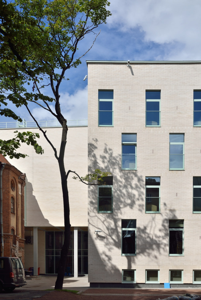
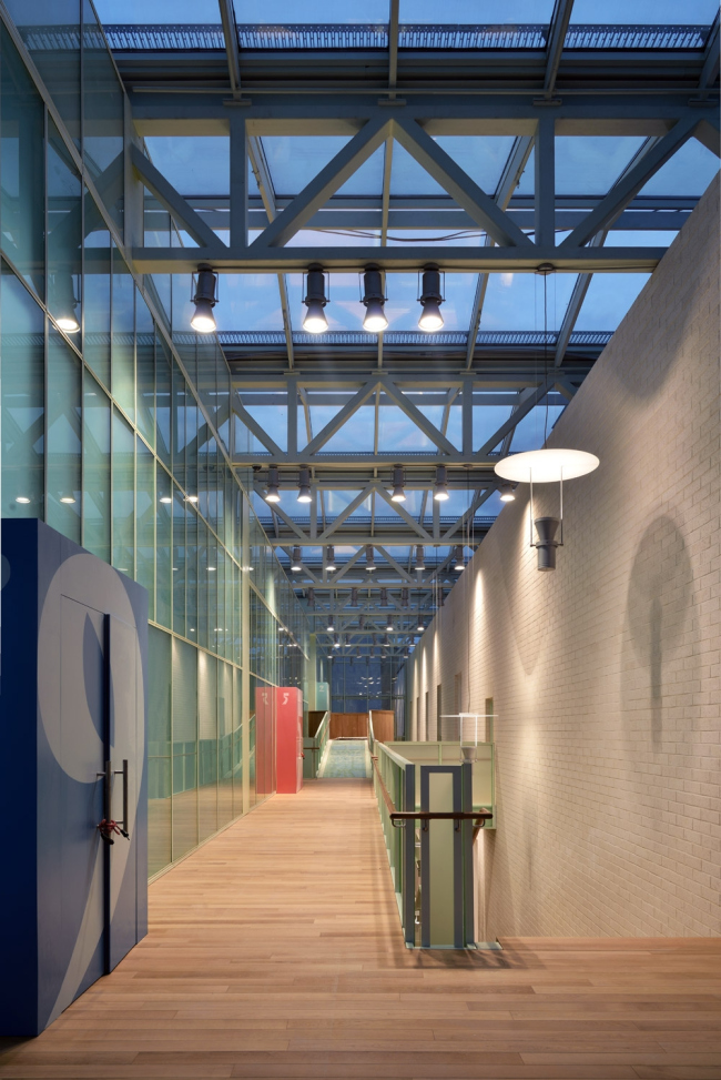
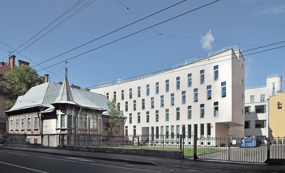
Speaking about bricks! In this project, the architects use the
light-beige Finnish brick that was chosen, in the first place, specifically
because of its color that perfectly matched the restored facade of
"Assambleya". Later on, when the work was already underway, it turned
out that the Finnish regulations allow for significantly larger fluctuations in
the size and smoothness of bricks than the Russian ones do. "At some
places, the brickwork looked downright lopsided and untidy, and we, together
with the customer and the contractor, went all the way to take these places
apart and then straighten out manually each and every brick with our ruler -
Nikita Yavein shares - We are really proud with the result that we ultimately
got: this is arguably the city's best brickwork among its new brickwork projects".
The building was erected on a really constrained land site, and the most
challenging task for the architects was meeting both the land site restrictions
and the regulations for designing educational institutions. "It was a bare
pass" - Nikita Yavein shares while showing the modest-sized yard territory
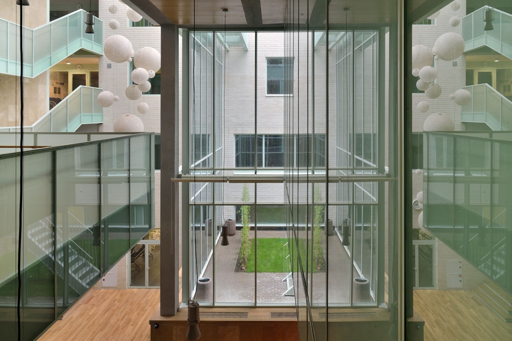
into which "Studio 44" was ultimately able to squeeze two four-story
buildings - the educational and the residential ones, interconnected with an
atrium. The functional agenda of the "Academy" is saturated indeed:
it provides for full board and lodging, its students not only living and
studying here but also doing sports and, if necessary, going through medical
check-ups with the appropriate doctors, the medical center occupying a whole
separate floor. The last thing in the world the architects wanted to do,
though, was distributing all the relevant premises over the two
"boxes" - this would have been boring and not really conductive to a
creative atmosphere - so, instead of the "two buildings and an
atrium" definition, the architects prefer to say "a system of
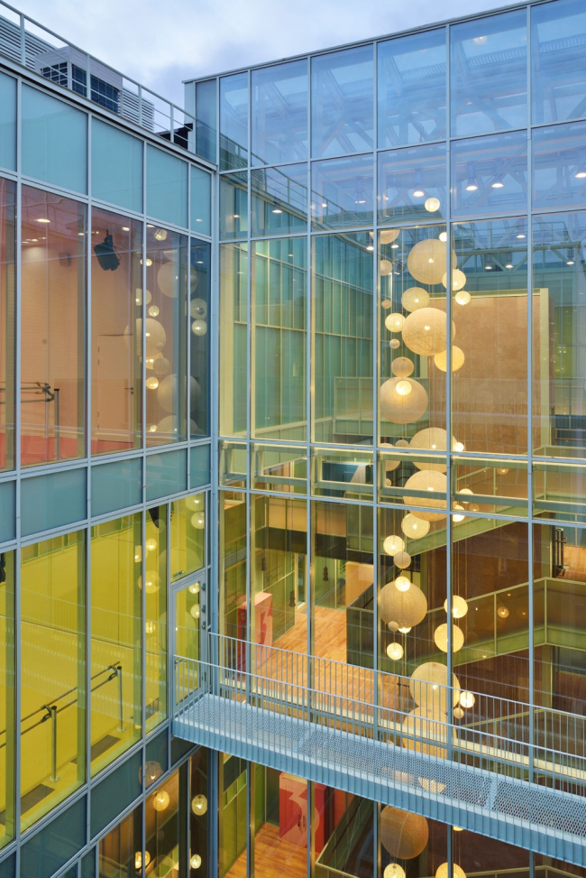
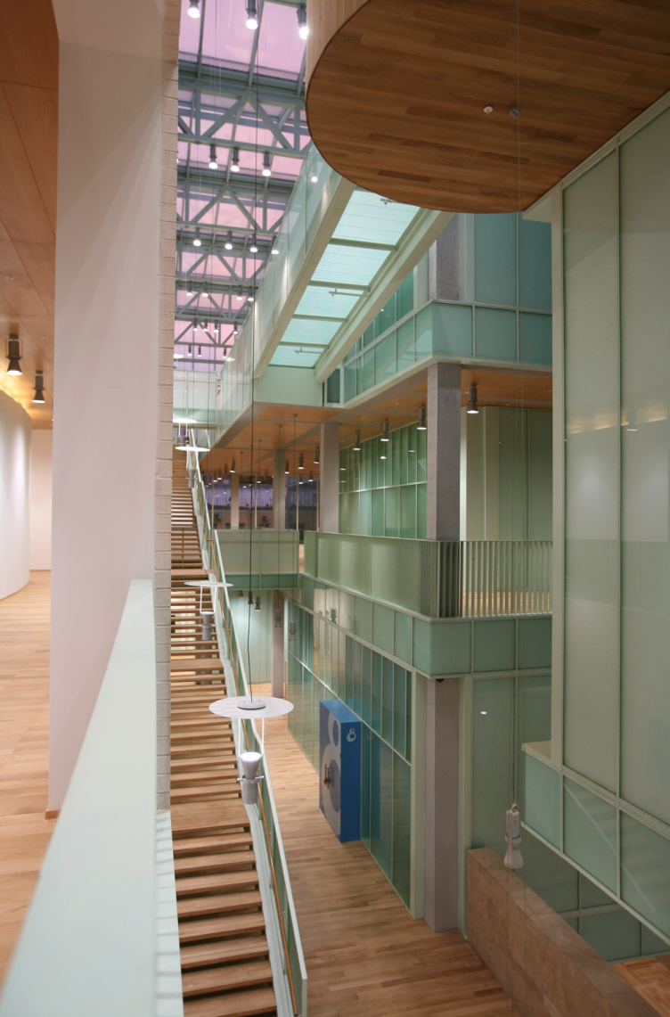
buildings". By means of the atrium, as well as the numerous cantilevers,
overpasses, and stairways, the buildings are engaged into an interesting and
meaningful dialogue.

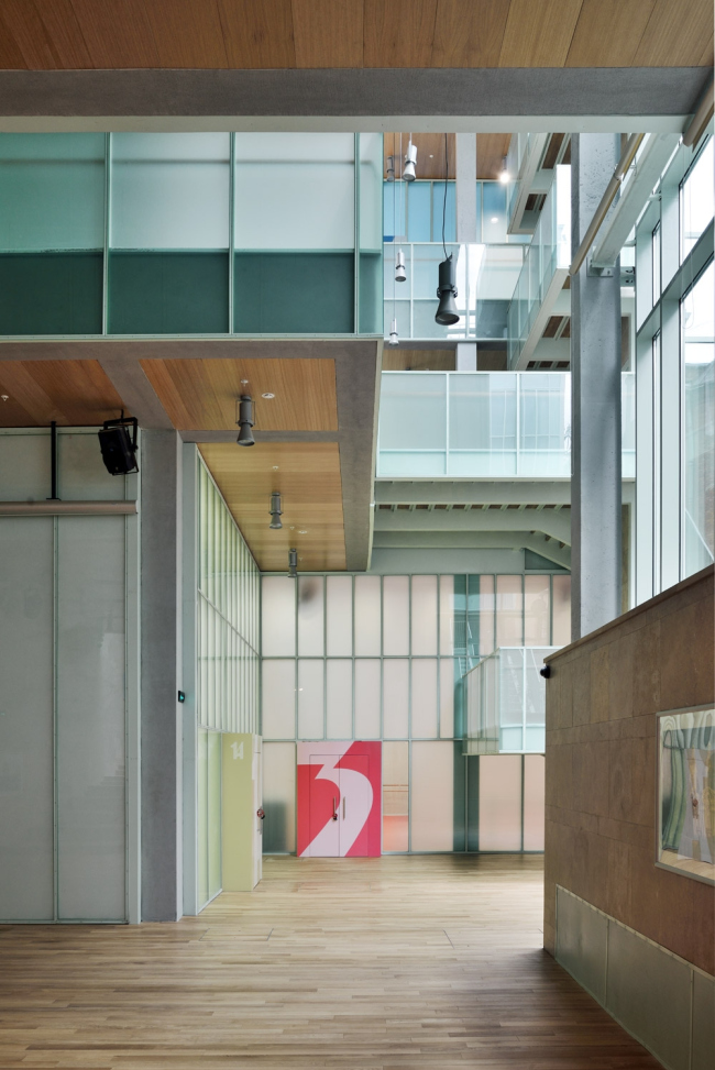
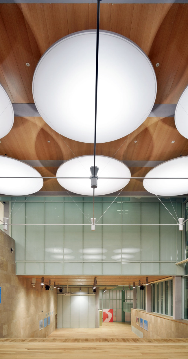
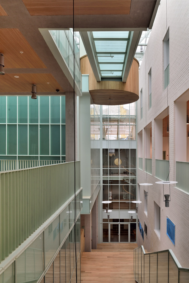
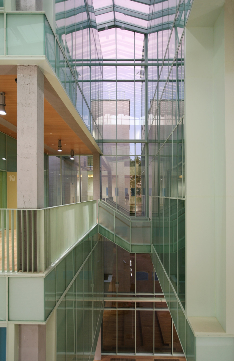
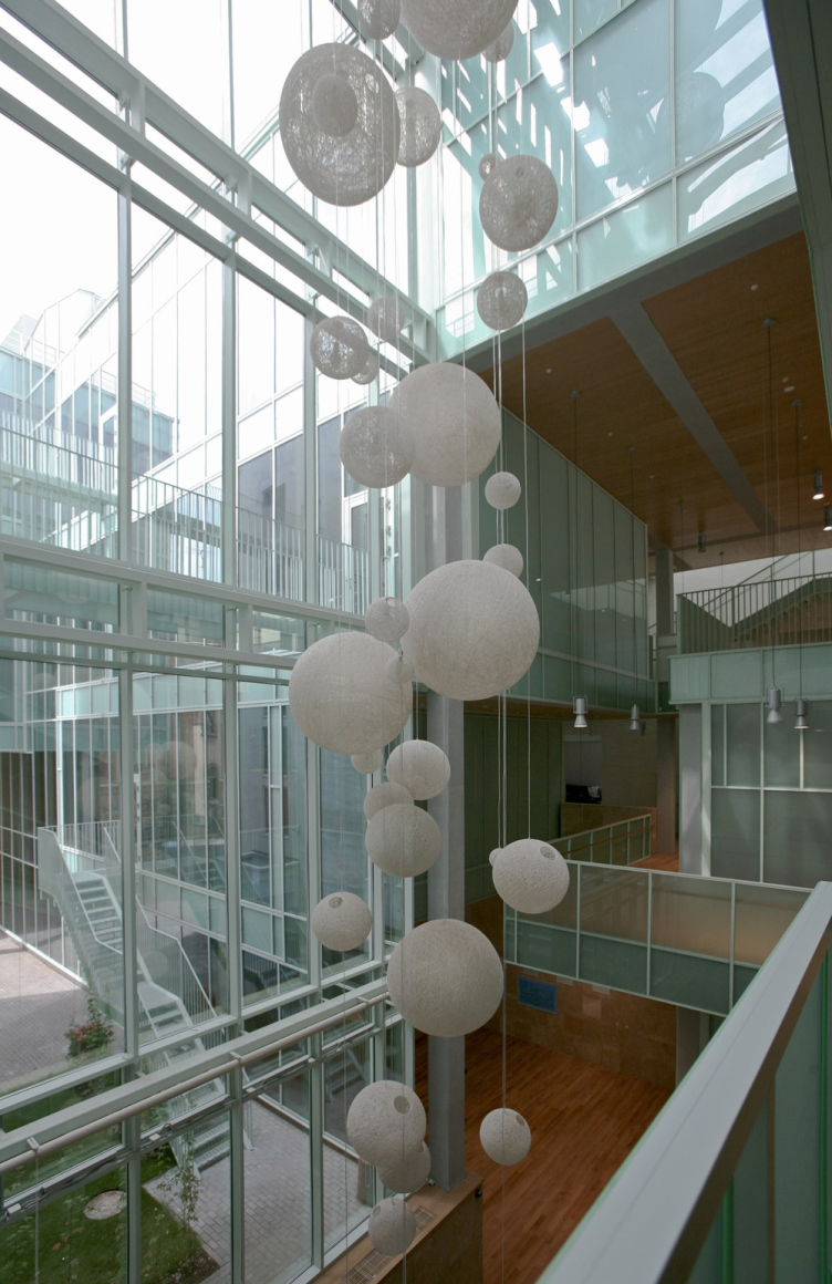
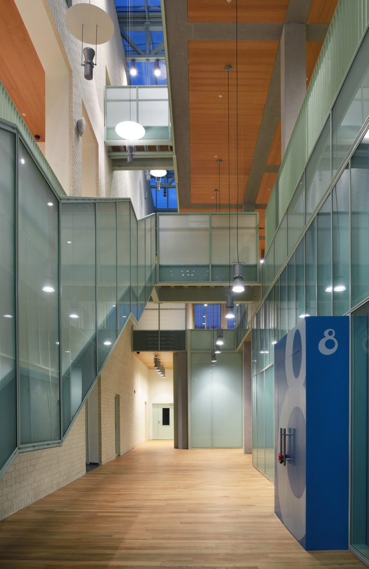
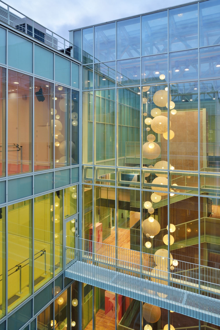
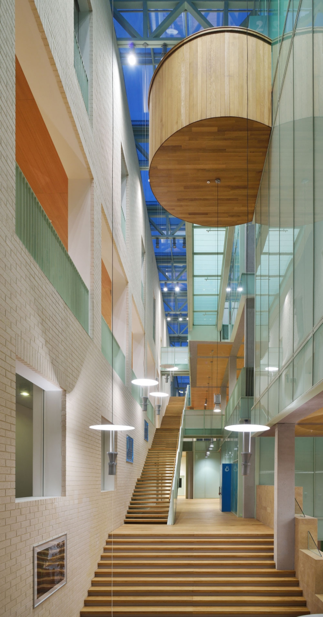
The main public area of "Dance Academy" is literally flooded with light - at the few moments one is really taken aback with its size and planning complexity. The architects made a beautiful spin of contrasts: getting exposed to the building with such a reserved, "buttoned-up" facade, one does not in the least expect to find behind it a multi-level labyrinth with glass walls. The inside layout is based on the "aquarium principle": the teachers will always be able to trace the student's progress from the dormitory to the class or dancing hall, while all the subtleties of the teaching process will be hidden from the passers'-by eyes.
The overall color of the "aquarium" is light chartreuse, and
the architects chose it for a painfully long time: while creating the educational
institution for children, the architects wanted to break away as far as
possible from giving a "hospital" feel to it - meaning, the interiors
that are bright and clean but totally faceless. The softness and expressiveness
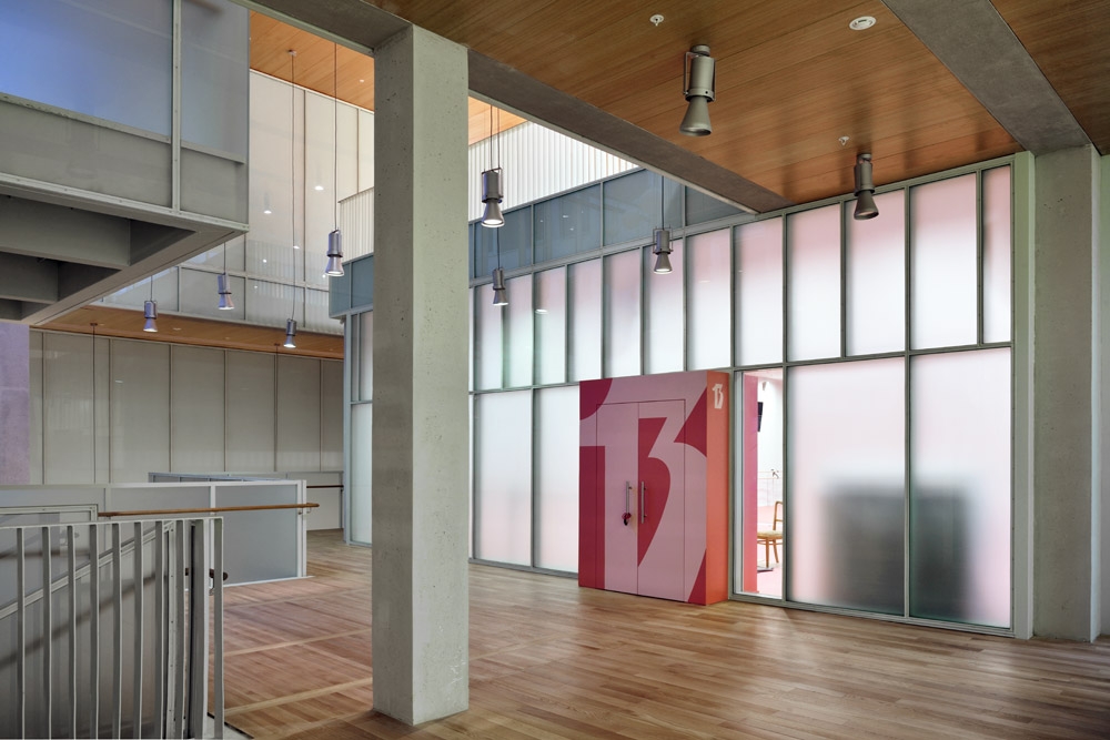
of the chosen shade is enhanced by the floors and staircases of natural wood,
as well as by the multi-colored portals of the dance halls. Beyond the confines
of the atrium, the color palette of the Academy's interiors grows significantly
more complex: the walls of its classrooms and halls are painted pastel colors
of dozens of shades, the halls for the little ones being decorated in brighter
colors, the playrooms in the residential block designed in bright yellow. The
architects confess that, by employing this technique, they tried to make up for
the shortage of sunny days in

Totally, "
The cooperation between "Studio 44" and Boris Eifman and the
school he founded did not end at the point of creating the educational and
residential complex at the

