По-русски

Villas in the Park

For the downtown area of the city of Ufa, Bureau of Vissarionov has developed a project of reconstructing the residential block between the Lenin Street and the Soldatskoe ("Soldier") Lake - project under the self-explanatory name of "Park Housing".

02 July 2013
Object
mainImg
Architect:
Yuri Vissarionov
Object:
Architectural and town-planning concept of building new houses and renovating the residential block between the Lenin Street and the Soldatskoe Lake in the central part of Ufa
Russia, Ufa

Project Team:
R. Maskulov (leader of the project, city of Ufa), Y. Vissarionov (leader of the author collective), K. Savkin, D.Ziborov, D. Leonova

2012

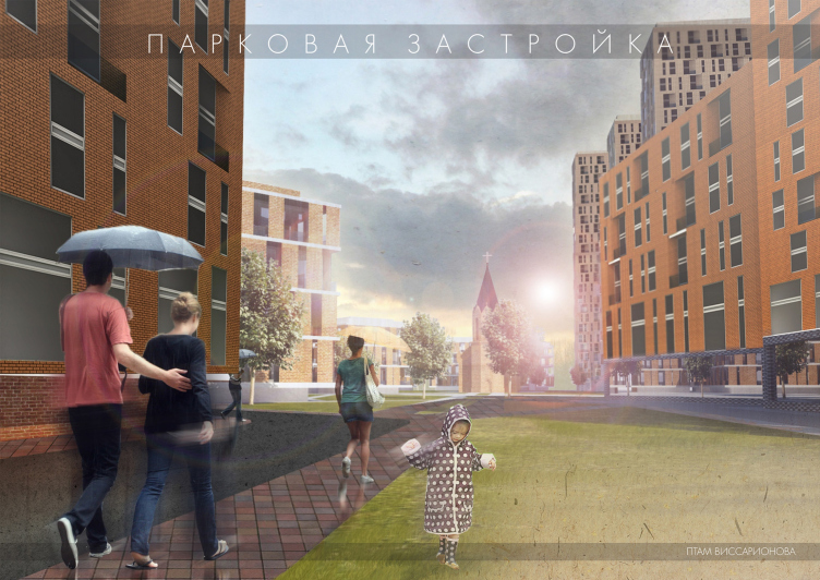
The land site that is going to be completely renovated is located in the very heart of the city of Ufa. It neighbors both on one of the city's main streets on the one side, and a park on the other, the latter arguably being Ufa's most famous public territory - this is the Park for Recreation and Leisure named after Ivan Yakutov, that made Russia's top ten parks in 2004. Naturally, this vicinity could not but leave its mark on the project - developing the architectural concept for reconstructing the site, the architects designed the new block as a balanced union of man and nature.
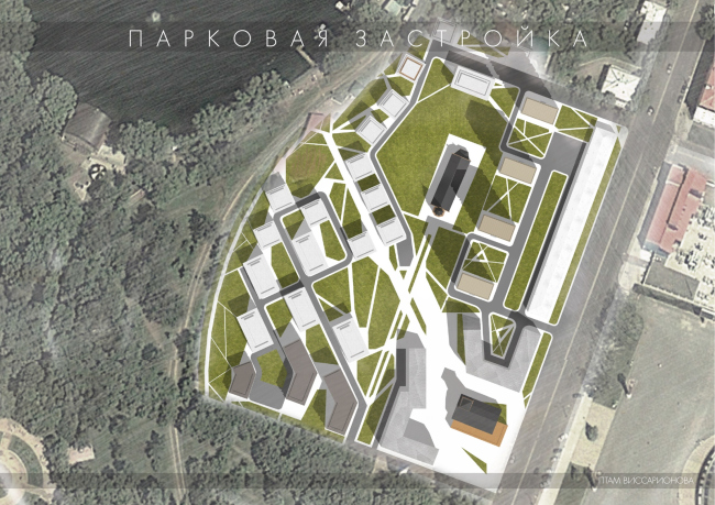
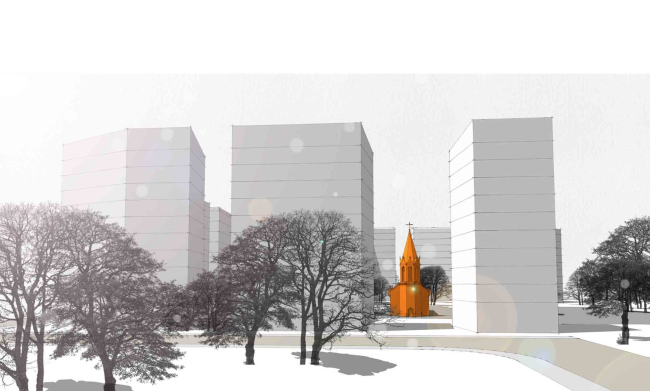
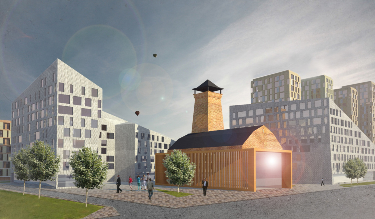
An important starting point in designing the new architectural image was the history of the place, as well. The street, since the mid 1930's bearing the name of Lenin, appeared at the turn of XVIII-XIX centuries, and once it was this particular street that served as the dividing line between the place where the residential area ended and the place where the cemetery began. Back in 1903, looking to use the wasteland to the benefit of the city, the Ufa City Duma (the Russian for "city council" - translator's note), designated it for "laying out a park" that soon became a favorite place for townspeople. A little later between the park and the street there was built a two-story building with a fire tower (1907), while from the rear side its corner was adorned by a protestant church (1910). Both these buildings survived into the present day and were to be included into the composition of the new block "recreating the spirit of the historical place in the renovated environment".

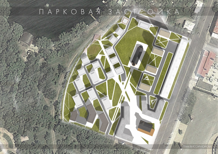
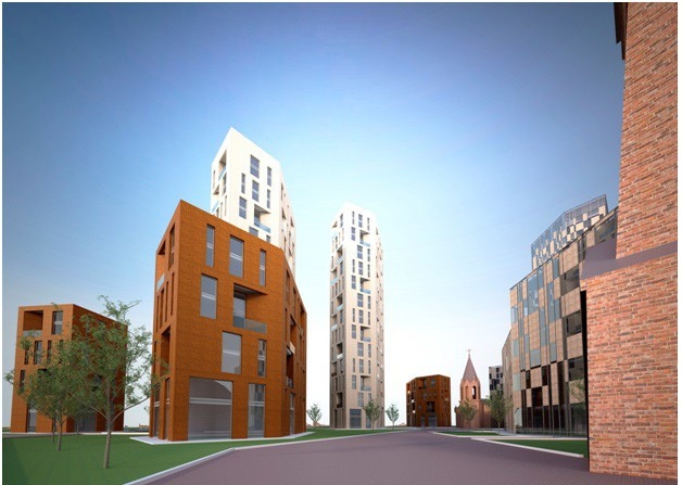
The three-story residential house that was built in the soviet times and that stretched along the Lenin Street with its numerous hallways will also be kept intact. As for the garages and utility premises situated between the house and the park, they are to be taken down, so the site with "city" boundaries fixed by several preserved volumes, faces the lake and the woodland with a fully vacated territory. And, while the streets frame the future block into an austere rectangle, from the side of the park it is only limited by a picturesquely bending foot walk which makes the proximity to the nature even closer. To the architects it was obvious that they had to make use of this situation and at least at the stage of the master plan treat this block more like a villa community rather than a densely built residential cluster.

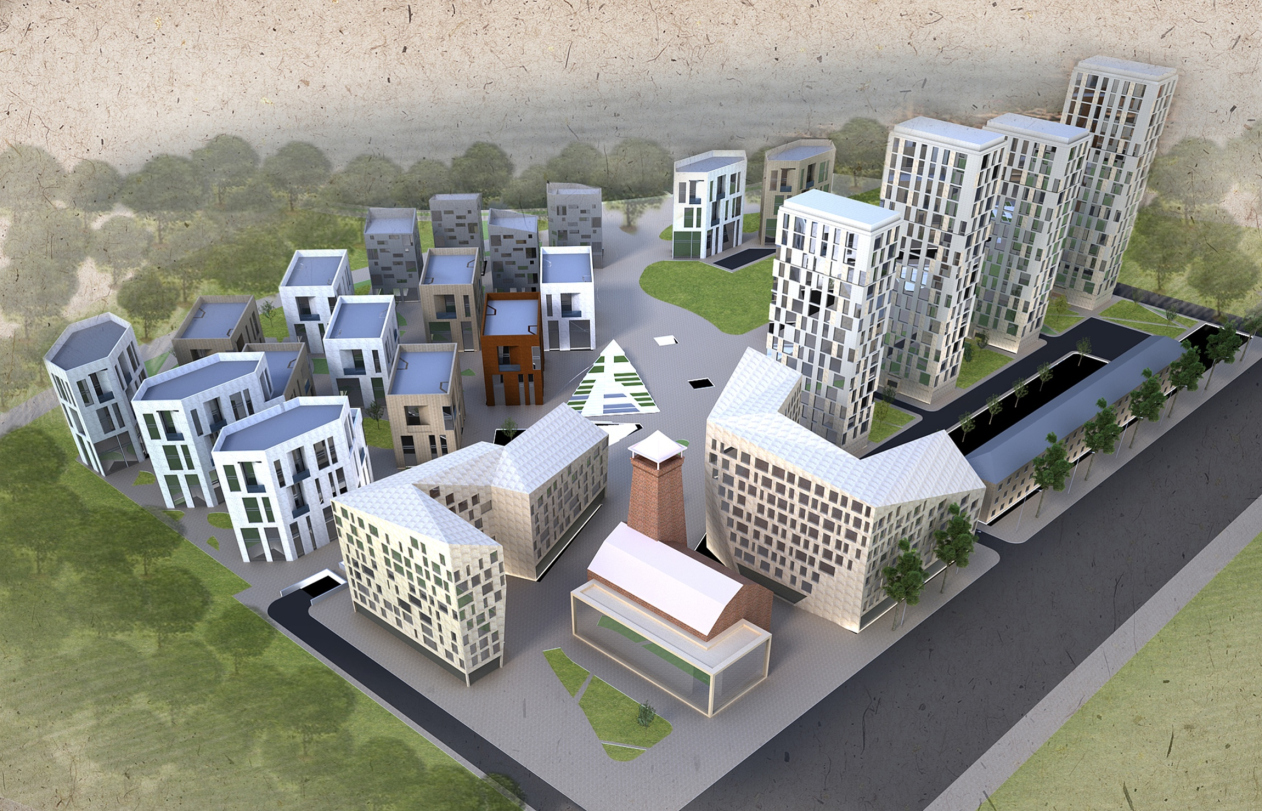
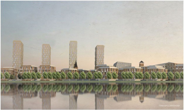
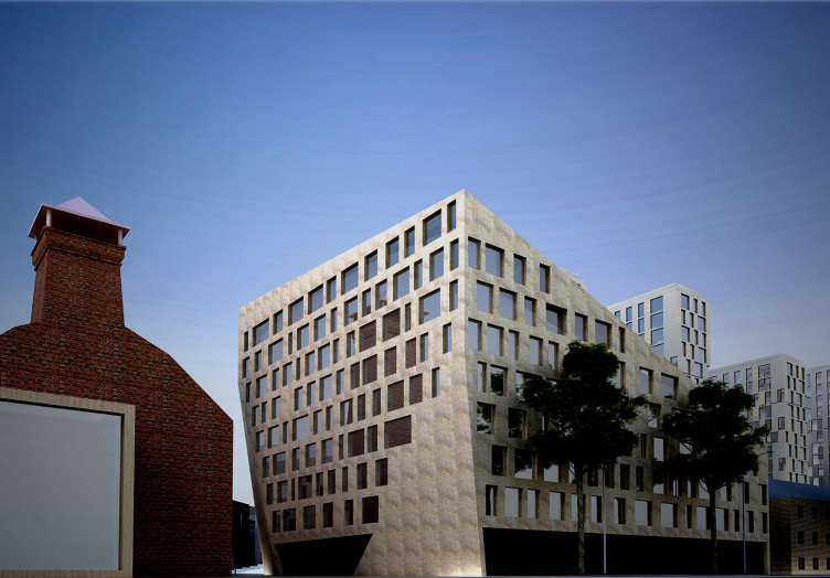
The only catch was the already-existing residential building - the elongated parallelepiped simply would not be in harmony with the aesthetic of the city summer home, so it had to be at least visually separated from the new block. What helped to solve the problem was the commissioner's request to build, within one block, houses of different class. The architects broke the required quantity of "economy class" square footage into four one-hallway towers that they arrayed into one row parallel to the long residential building. In order to prevent these towers from overhanging above the old building too obviously, the architects make large square courtyards in between them, while along the existing building they run a smaller park of similar elongated layout.

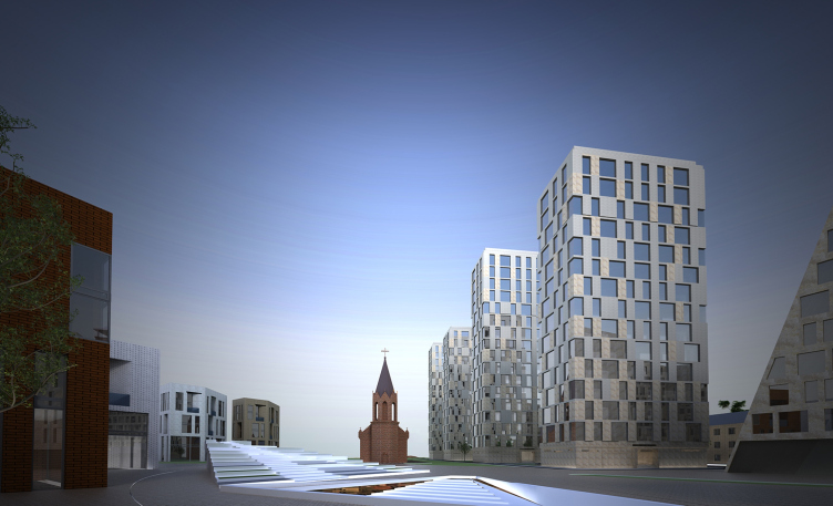
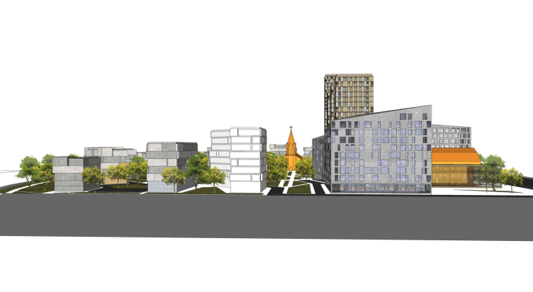
Thus, the only corner of the block that faces the crossroads of two streets is in fact a fragment of a strictly urban environment with traditionally densely placed buildings. The architects deliberately build the towers with different numbers of floors - the rhythmic alternation of height, according to their idea, will give the skyline some visual lightness and will enhance the recreational character of the block that begins directly behind them. The facade solution also serves the same purpose - the window openings of various width are superimposed upon the wall surfaces in a seemingly random, even chaotic, way; some of them even overlap with the corners of the buildings - which does not, of course, dissolve the verticals in the air but visually takes away some of their excessive massiveness.

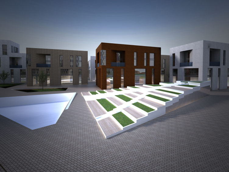
The compositional and the "environmental" centerpiece of the block, according to the architects' plan, is the diagonal that connects the fire tower and the longitudinal axis of the church running parallel to the Lenin Street. This solution allows, on the one hand, for marking the boundaries of the residential clusters of different class, and, on the other hand, for avoiding the trivial splitting the site into two parts. In the place where the two pedestrian routes cross, the architects plan to build not only a landscaped square but also an open-air amphitheater meant for accommodating public events. The architects build the amphitheater in the shape of an acute triangle, turning the stands to the fire tower and the two non-residential buildings skirting it on both sides and accommodating the public and commercial activities of the block with offices, shops, and cafes. 
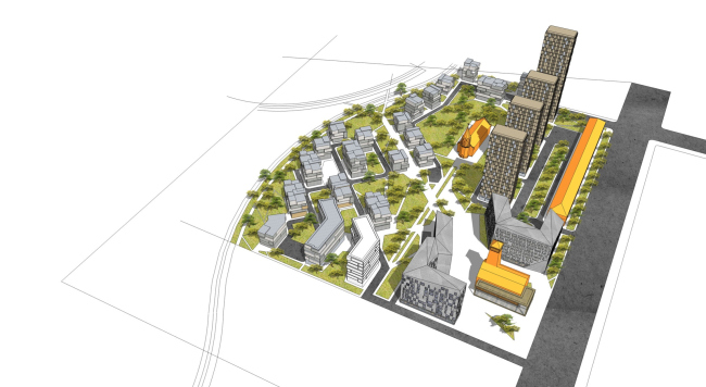
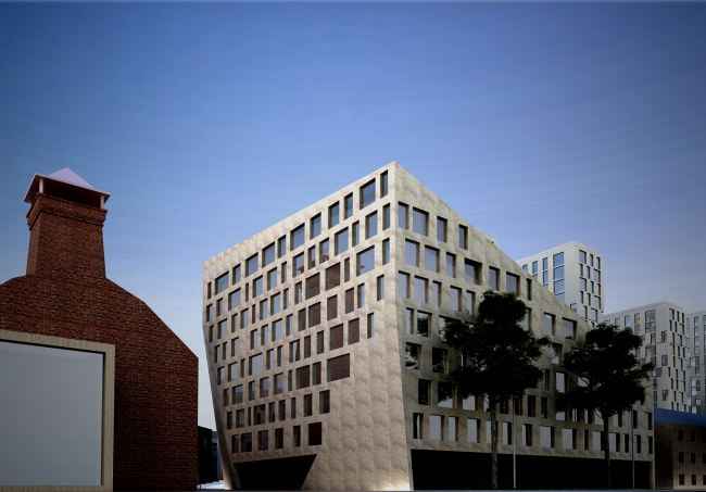
These volumes, in turn, are designed as curvilinear braces, one of them looking as it were lightly hugging the fire brigade building, and the other one looking, conversely, as if it were turning away from it and serving as a curious sort of "pocket" for the preserved residential house. Thanks to such placement, the architects get the opportunity to protect the yards of the residential houses from the direct access to the offices, while the corner of the block gets an entrance portal of sorts - it looks as though some kind of vortex sucks in the people flows inside. The dynamic structures serve as a peculiar "theater decoration" that adorns the territory around the historical building of the fire brigade but the fire tower itself rather looks like a visual reminder of the past: the complex is being restructured for different functions, and its low-rise part is covered with a rectangular transparent prism - the "showcase" of the future business, community, and cultural center.

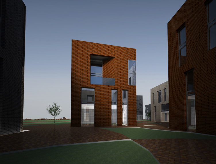
The bigger part of the land site that faces the park is filled with 4 and 6-story houses that the architects place predominantly parallel to the set diagonal of the pedestrian promenade. Such layout allows for giving almost all the buildings the view of the lake and making all the housing of the new block as permeable for the park as possible. Thanks to the abundance of green plants in all the building surrounding grounds, one gets a feeling as if the forestland stretched its green protuberances into the residential block. The official name of the concept - "Park Housing" - is justified, though, not only by the proximity to the in-city woodland area but also by the architectural treatment of the buildings themselves. The architects developed several design options for the houses - stones, bricks, and wood - but what they all have in common is the intimacy of the form and their closeness to the genre of city villas.

Taking the existing park as the key territory- and style-forming factor, the architects were able to integrate into the new block all the diverse features of the adjacent territories - the historical legacy, the residential housing, and the urban community center. It was this comprehensive approach to renovating an important fragment of the city and creating here a diverse and comfortable environment that earned the concept "Park Housing" a Silver Diploma at the contest "Archnovation-2013".


zooming
zooming


Architect:
Yuri Vissarionov
Object:
Architectural and town-planning concept of building new houses and renovating the residential block between the Lenin Street and the Soldatskoe Lake in the central part of Ufa
Russia, Ufa

Project Team:
R. Maskulov (leader of the project, city of Ufa), Y. Vissarionov (leader of the author collective), K. Savkin, D.Ziborov, D. Leonova

2012

02 July 2013

Headlines now
The Golden Crown
The concept for a dental clinic in Yekaterinburg, developed by CNTR Studio, revolves around the idea of a “mouth full of gold”: pristine white porcelain stoneware walls are complemented by matte brass details. To avoid an overly literal interpretation, the architects focused on the building’s proportions, skillfully navigating between sunlight requirements and fire safety regulations.
Flexibility and Integration
Not long ago, we covered the project for the fourth phase of the ÁLIA residential complex, designed by APEX. Now, we’ve been shown different fence concepts they developed to enclose the complex’s private courtyards, incorporating a variety of public functions. We believe that the sheer fact that the complex’s architects were involved in such a detail as fencing speaks volumes.
A Step Forward
The HIDE residential complex represents a major milestone for ADM architects and their leaders Andrey Romanov and Ekaterina Kuznetsova in their quest for a fresh high-rise aesthetic – one that is flexible and layered, capable of bringing vibrancy to mass and silhouette while shaping form. Over recent years, this approach has become ADM’s “signature style”, with the golden HIDE tower playing a pivotal role in its evolution. Here, we delve into the project’s story, explore the details of the complex’s design, and uncover its core essence.
Gold in the Sands
A new office for a transcontinental company specializing in resource extraction and processing has opened in Dubai. Designed by T+T Architects, masters of creating spaces that are contemporary, diverse, flexible, and original, this project exemplifies their expertise. On the executive floor, a massive brass-clad partition dominates, while layered textures of compressed earth create a contextually resonant backdrop.
Layers and Levels of Flight
This project goes way back – Reserve Union won this architectural competition at the end of 2011, and the building was completed in 2018, so it’s practically “archival”. However, despite being relatively unknown, the building can hardly be considered “dated” and remains a prime example of architectural expression, particularly in the headquarters genre. And it’s especially fitting for an aviation company office. In some ways, it resembles the Aeroflot headquarters at Sheremetyevo but with its own unique identity, following the signature style of Vladimir Plotkin. In this article, we take an in-depth look at the United Aircraft Corporation (UAC) headquarters in the Moscow agglomeration town of Zhukovsky, supplemented by recent photographs from Alexey Naroditsky – a shoot that became only recently possible due to the fact that improvements were finally made in the surrounding area.
Light and Shadow
In this article, we delve into the architectural design of the “Chaika” house by DNK ag architects, which was recently completed in 2023 as part of the collection of signature designs at ZILArt. As is well-known, all the buildings in this complex follow a design code, yet each one is distinct. This particular building stands out not only for its whiteness and minimalism but also for the refined use of a limited number of techniques that, together, create what can confidently be called synergy.
Casus Novae
A master plan was developed for a large residential area with a name of “DNS City”, but now that its implementation began, the plan has been arbitrarily reformatted and replaced with something that, while similar on the surface, is actually quite different. This is not the first time such a thing happens, but it’s always frustrating. With permission from the author, we are sharing Maria Elkina’s post.
Treasure Hunting
The GAFA bureau, in collaboration with Tegola and Arkhitail, organized an expedition to the island of Kilpola in Karelia as part of Moskomarkhitektura’s “Open City” festival. There, amidst moss and rocks, the students sought answers to questions like: what is the sacred, where does it dwell, and what sustains it? Assisting the participants in this quest were landscape engineer Evgeny Levin, artist Nicholas Roerich, a moose, and the lack of cellular connection. Here’s how the story unfolded.
Depths of the Earth, Streams of Water
In the Malaya Okhta district, the Akzent building, designed by Stepan Liphart, was constructed. It follows a classic tripartite structure, yet it’s what you might call “hand-drawn”: each façade is unique in its form and details, some of which aren’t immediately noticeable. In this article, we explore the context and, together with the architect, delve into how the form was developed.
Fir Tree Dynamics
The “Airports of Region” holding is planning to build an airport in Karachay-Cherkessia, aiming to make the Arkhyz and Dombay resorts more accessible to travelers. The project that won in an invitation-only competition, submitted by Sergey Nikeshkin’s KPLN, blends natural imagery inspired by the shape of a conifer seed, open-air waiting spaces, majestic large trees, and a green roof elevated on needle-like columns. The result is both nature-inspired and WOW.
​A Brick Shell
In the process of designing a clubhouse situated among pine trees in a prestigious suburban area near Moscow, the architectural firm “A.Len” did the façade design part. The combination of different types of brick and masonry correlates with the volumetric and plastique solutions, further enhanced by the inclusion of wood-painted fragments and metal “glazing”.
Word Forms
ATRIUM architects love ambitious challenges, and for the firm’s thirtieth anniversary, they boldly play a game of words with an exhibition that dives deep into a self-created vocabulary. They immerse their projects – especially art installations – into this glossary, as if plunging into a current of their own. You feel as if you’re flowing through the veins of pure art, immersed in a universe of vertical cities, educational spaces – of which the architects are true masters – and the cultural codes of various locations. But what truly captivates is the bold statement that Vera Butko and Anton Nadtochy make, both through their work and this exhibition: architecture, above all, is art – the art of working with form and space.
Flexibility and Acuteness of Modernity
Luxurious, fluid, large “kokoshniks” and spiral barrel columns, as if made from colorful chewing gum: there seem to be no other mansion like this in Moscow, designed in the “Neo-Russian-Modern” style. And the “Teremok” on Malaya Kaluzhskaya, previously somewhat obscure, has “come alive with new colors” and gained visibility after its restoration for the office of the “architectural ecosystem” as the architects love to call themselves. It’s evident that Julius Borisov and the architects at UNK put their hearts into finding this new office and bringing it up to date. Let’s delve into the paradoxes of this mansion’s history and its plasticity. Spoiler: two versions of modernity meet here, both balancing on the razor’s edge of “what’s current”.
Yuri Vissarionov: “A modular house does not belong to the land”
It belongs to space, or to the air... It turns out that 3D printing is more effective when combined with a modular approach: the house is built in a workshop and then adapted to the site, including on uneven terrain. Yuri Vissarionov shares his latest experience in designing tourist complexes, both in central Russia and in the south. These include houseboats, homes printed from lightweight concrete using a 3D printer, and, of course, frame houses.
​Moscow’s First
“The quality of education largely depends on the quality of the educational environment”. This principle of the last decade has been realized by Sergey Skuratov in the project for the First Moscow Gymnasium on Rostovskaya Embankment in the Khamovniki district. The building seamlessly integrates into the complex urban landscape, responding both to the pedestrian flow of the city and the quiet alleyways. It skillfully takes advantage of the height differences and aligns with modern trends in educational space design. Let’s take a closer look.
Looking at the Water
The site of Villa Sonata stretches from the road to the water’s edge, offering its own shoreline, pier, and a picturesque river panorama. To reveal these sweeping views, Roman Leonidov “cut” the façade diagonally parallel to the river, thus getting two main axes for the house and, consequently, “two heads”. The internal core – two double-height spaces, a living room and a conservatory, with a “bridge” above them – makes the house both “transparent” and filled with light.
The White Wing
Well, it’s not exactly white. It’s more of a beige, white-stone structure that plays with the color of limestone – smoother surfaces are lighter, while rougher ones are darker. This wing unites various elements: it absorbs and interprets the surrounding themes. It responds to everything, yet maintains a cohesive expression – a challenging task! – while also incorporating recognizable features of its own, such as the dynamic cuts at the bottom, top, and middle.
Urban Dunes
The XSA Ramps team designed and built a three-part sports hub for a park in Rostov-on-Don, welcoming people of all ages and fitness levels. The skate plaza, pump track, and playground are all meticulously crafted with details that attract a diverse range of visitors. The technical execution of the shapes and slopes transforms this space into a kind of sculptural composition.
Proportional Growth
The project for the fourth phase of the ÁLIA residential area has been announced. The buildings are situated on an elongated plot – almost a “ray” that shoots out from the center of the area towards the river. Their layout reflects both a response to Moscow’s architectural preferences over the past 15 years, shifting “from blocks to towers”, and an interpretation of the neighboring business park designed by SOM. Additionally, the best apartments here are not located at the very top but closer to the middle, forming a glowing “waistline”.
The “Staircase” Building
In designing the “Details” residential complex in New Moscow, Rais Baishev spiced up the now-popular Moscow theme of a “courtyard” building with an idea drawn from the surrealist drawings by Maurits Escher. He envisioned the stepped silhouettes and descending slopes as a metaphysical mega-staircase, creating a key void within the courtyard that gave the project an internal “spine”. This concept is felt both in the building’s silhouette and on its façades.
Projection of the Quarter
No one doubted that the building that Vladimir Plotkin designed as part of the “Garden Quarters” would be the most modernist of all. And it turned out just that way: while adhering to the common design code, the building successfully combines brick and white stone, rhythmically responding to the neighboring building designed by Ostozhenka, yet tactfully and persistently making a few statements of its own. This includes the projection of the ideal urban development composition “14–9–6”, which can be found right next door, mathematical calculations, including those for various types of terraces (and perhaps the only reminder of the Soviet past of the Kauchuk rubber factory!), and the white “cross-stitch” pattern of the façade grid.
Domus Aurea
In this issue, we examine the “Tessinsky-1” house, designed by Sergey Skuratov and completed in 2023. Located in the middle of the Serebryanicheskaya Embankment district, at the intersection of its main streets, this house assumes a sort of “nodal” role: it not only responds to everything around it and preserves many memories of the former EMA factory within itself, but it weaves all this into a newly directed pattern, reconciling bright “gold” and dark-colored brick, largely with the help of the new, modern-yet-archaic Columba brick, which, come to think about it, is the most precious element here.
The Chimney of Nikola-Lenivets
In this issue, we are examining the “Obelisk House” designed by KATARSIS and built for the Arkhstoyanie 2023 festival. However, it was only finished later on, and this is why we are examining it now. It seems to us that after the “Obelisk House” appeared in Nikola-Lenivets, a dialogue and a few inner connections appeared between the temporary structures built here. These houses no longer look like “accidental neighbors”, more of which below.
​Periscope by the Bay
The jury awarded the second place in the competition for a public and cultural center in Petropavlovsk-Kamchatsky to the companies GORA (“Mountain”) and M4. In the consortium’s proposal, the building resembles a sperm whale with a calf swimming next to it or a periscope, whose lenses capture the most spectacular views from the surrounding landscape.
From Arcs to Dolmens
While working on the competition project for Petropavlovsk-Kamchatsky, ASADOV Architects prioritized the value of the natural and urban environment, aiming to preserve the balance of the location while minimizing the resemblance of the volume that they designed to a “traditional building”. The task was challenging, and the architects created three versions, one of which having been developed after the competition, where their main proposal took third place. However, the point of interest here is not the competition result but the continuity of creative thinking.
Hide and Seek
The ID Moskovskiy house, designed by Stepan Liphart in St. Petersburg, in the courtyards near Moskovskiy Avenue beyond the Obvodny Canal and recently completed, is notable for several reasons. Firstly, it has been realized with considerable accuracy, which is particularly significant as this is the first building where the architect was responsible not only for the facades but also for the layouts, allowing for better integration between the two. On the other hand, this building is interesting as an example of the “germination” of new architecture in the city: it draws on the best examples from the neighborhood and becomes an improved and developed sum of ideas found by the architect in the surrounding context.
The Big Twelve
Yesterday, the winners of the Moscow Mayor’s Architecture Award were announced and honored. Let’s take a look at what was awarded and, in some cases, even critique this esteemed award. After all, there is always room for improvement, right?
Above the Golden Horn
The residential complex “Philosophy” designed by T+T architects in Vladivostok, is one of the new projects in the “Golubinaya Pad” area, changing its development philosophy (pun intended) from single houses to a comprehensive approach. The buildings are organized along public streets, varying in height and format, with one house even executed in gallery typology, featuring a cantilever leaning on an art object.
Nuanced Alternative
How can you rhyme a square and space? Easily! But to do so, you need to rhyme everything you can possibly think of: weave everything together, like in a tensegrity structure, and find your own optics too. The new exhibition at GES-2 does just that, offering its visitor a new perspective on the history of art spanning 150 years, infused with the hope for endless multiplicity of worlds and art histories. Read on to see how this is achieved and how the exhibition design by Evgeny Ace contributes to it.
Blinds for Ice
An ice arena has been constructed in Domodedovo based on a project by Yuri Vissarionov Architects. To prevent the long façade, a technical requirement for winter sports facilities, from appearing monotonous, the architects proposed the use of suspended structures with multidirectional slats. This design protects the ice from direct sunlight while giving the wall texture and detail.