По-русски

A Step Forward

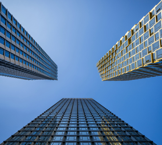
The HIDE residential complex represents a major milestone for ADM architects and their leaders Andrey Romanov and Ekaterina Kuznetsova in their quest for a fresh high-rise aesthetic – one that is flexible and layered, capable of bringing vibrancy to mass and silhouette while shaping form. Over recent years, this approach has become ADM’s “signature style”, with the golden HIDE tower playing a pivotal role in its evolution. Here, we delve into the project’s story, explore the details of the complex’s design, and uncover its core essence.

13 November 2024
Object
mainImg
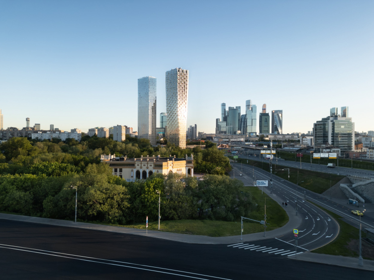
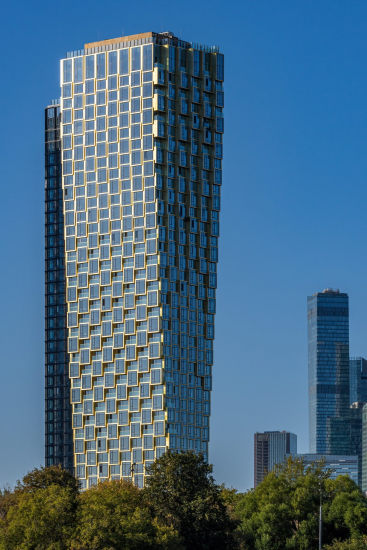
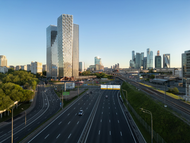
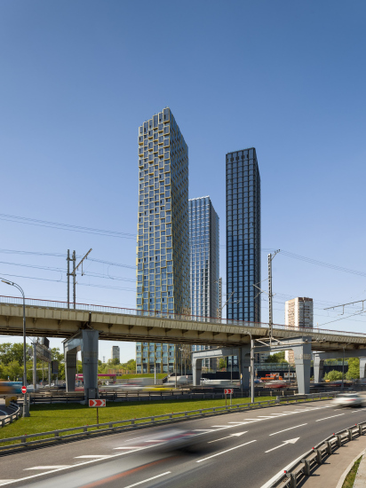
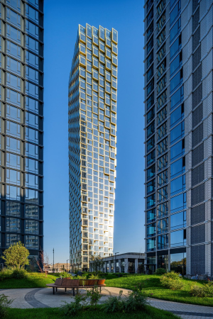
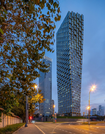
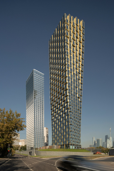
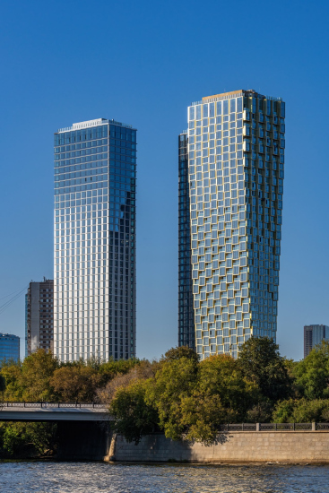
The three HIDE towers were completed in July 2024. Back in the spring and summer, drivers on the Third Ring Road watched as the main tower was gradually “dressed” in golden panels, establishing it as the focal point at the intersection of the Third Ring, the Setun River – though the latter is not visible from the Third Ring – and General Dorokhov Avenue. Now, when swerving from the avenue toward the city center, we can see the full height of the “golden” tower.

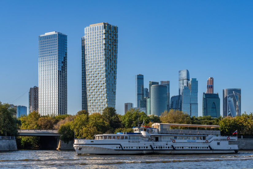
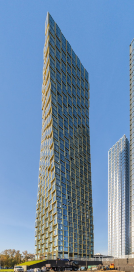
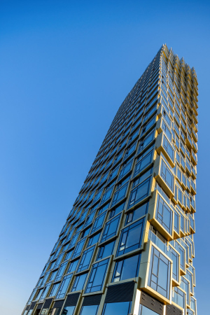
The shiny frames seem to assemble the shape before our very eyes, visually floating around a central axis – a captivating effect. The tower’s form is slender, and from a moving perspective, it changes almost imperceptibly – but continuously. It transforms when viewed from a car or from a boat on the Moscow River, where the golden vertical line also establishes itself as a defining landmark of this area.

  • zooming
    HIDE Housing Complex
    Copyright: Photograph © Andrey Belimov-Guschin / provided by ADM architects
  • zooming
    HIDE Housing Complex
    Copyright: Photograph © Andrey Belimov-Guschin / provided by ADM architects


Situated within direct view of Moscow City, the HIDE towers echo the city’s high-rise accents of recent years and decades.

HIDE Housing Complex
Copyright: Photograph © Dmitry Chebanenko / provided by ADM architects


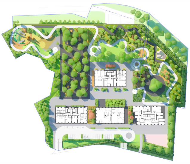
We first covered the HIDE premium residential complex a few years ago: it comprises three towers of equal height, each with 41 floors, standing atop a stylobate embedded into a slope with a height difference of around 5 meters. This slope allowed for the entrance to an underground parking garage from the lower part of 1st Setun Passage, featuring a gabion wall. On the roof of the stylobate lies a calm, city-overlooking space that includes a private courtyard and an “appendix” of a city street-square in front of the entrance to the complex

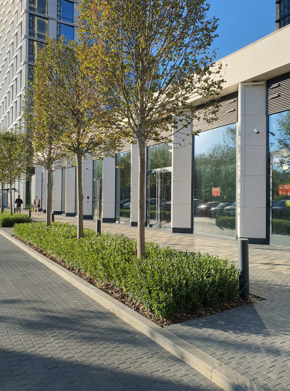
The HIDE complex’s layout shines in its simplicity: the “footprints” of the four buildings are almost identical, yet three are high-rise residential towers, while the fourth is a public center. This structure isn’t vertical but stretches horizontally with large white partitions. The public center houses the main entrance, social spaces, a children’s play area, and a waiting room for delivery persons. Reminiscent in part of modernist “glass box” stores, it exudes a more representative quality, evoking classical pilasters or even a “stoa” portico, yet with floor-to-ceiling glazed facades.

  • zooming
    The paark in front of the entrance and the pylons of the community center. HIDE Housing Complex
    Copyright: Photograph © Julia Tarabarina, Archi.ru
  • zooming
    The masterplan. HIDE Housing Complex
    Copyright: © ADM


The golden tower, however, is the star of the complex’s architectural composition. Initially, all the three towers were designed to look the same. But in the final stages of design – by that time, even the excavation was completed – a new direction took shape. A push for architectural distinction emerged from the city’s leadership, particularly Mayor Sergey Sobyanin, calling for a search for unique forms. Responding enthusiastically, architects Andrey Romanov and Ekaterina Kuznetsova, along with their client, MR Group, proposed a change: instead of placing the stairwell and elevator core along the northern façade as with the other two towers, they positioned it in the very center of the volume. This allowed them to “sculpt” the tower from “pixels” of substantial size, giving it a sculptural quality from all angles.

  • zooming
    HIDE Housing Complex
    Copyright: Photograph © Andrey Belimov-Guschin / provided by ADM architects
  • zooming
    HIDE Housing Complex
    Copyright: Photograph © Andrey Belimov-Guschin / provided by ADM architects


This shift – or refinement – in the design took place in early 2020. For ADM architects, the quest for a new tower aesthetic began with the River Park Towers on Kutuzovsky Avenue, followed by the Famous tower within the Fili Tower complex, and, finally, the golden tower at HIDE that we are examining now. ADM’s approach to high-rise form has since become their signature technique, prioritizing the flexibility to manipulate the building’s silhouette.

Andrey Romanov, leader of ADM architects

The city leadership’s attention to architectural form, to focal points in emerging panoramas, is a crucial trend in Moscow’s development as a modern metropolis. I won’t deny that it’s significant for us as architects; it allows us to propose more complex – though, I stress, always achievable – solutions in form and composition. In a sense, HIDE marks the beginning of this journey, as it was in 2020 that such experiments became possible, and I’m very pleased we managed to change the form of one of the complex’s towers in a way that makes it more interesting and prominent. I like how it looks within the cityscape.

Though I think if we had managed at that moment to change all three towers just as radically, using a single design approach, it would have looked even better.


  • zooming
    HIDE Housing Complex
    Copyright: Photograph © Dmitry Chebanenko / provided by ADM architects
  • zooming
    HIDE Housing Complex
    Copyright: Photograph © Dmitry Chebanenko / provided by ADM architects


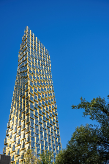
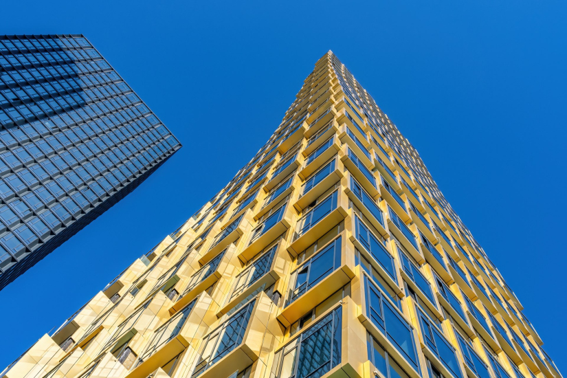
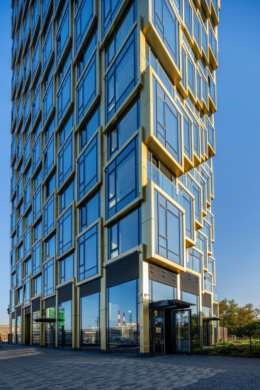
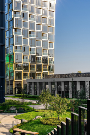
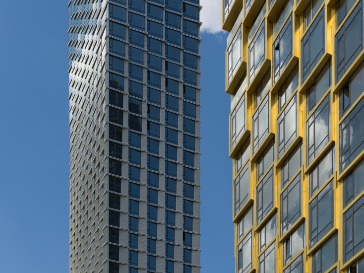
The golden “scales” – a design element that the architects liken to the skin of a scaled creature, as the resemblance is indeed striking – create a unique flexible-yet-discreet articulation. These scales are formed by modules of window bay projections. In HIDE, these projections are clustered along the wider facades at the base and on the narrower facades mid-tower. Rather than noticing this detail specifically, one only sees the flowing “wave” moving across the surface, which either subtly oscillates the entire outline or perhaps seems to be a response to it.

  • zooming
    HIDE Housing Complex
    Copyright: Photograph © Andrey Belimov-Guschin / provided by ADM architects
  • zooming
    HIDE Housing Complex
    Copyright: Photograph © Andrey Belimov-Guschin / provided by ADM architects


The square projections and checkerboard arrangement introduce a regular, rhythmic foundation to the design, anchoring the volume so that, despite its fluidity, it remains calm and stable. This is evident both in the building’s plan and in the cityscape, where the movement embedded in the tower’s form resembles the contrapposto stance of a walking figure: the “leg” extends southward toward the Third Ring Road, while the “shoulder” leans away. This multi-faceted form also gives the impression of a spiral, adding a sense of upward momentum.

Choosing the golden color was a challenge in itself, the architects explain. While neutral gray tones are easily controlled and reproduced using RAL coating, warmer tones, particularly gold, are much more challenging to execute. ADM opted for anodized aluminum with a cool undertone. When asked why they didn’t choose a naturally aging material like copper or bronze, they responded that “The final form wasn’t designed with aging in mind. We selected a material that would retain its color over time so the tower will look the same as it does now”. The color was meticulously tested on mock-ups to achieve the desired effect.

These golden frames are central to the tower’s identity, capturing over the better half of the viewer’s attention.

  • zooming
    1 / 4
    HIDE Housing Complex
    Copyright: Photograph © Andrey Belimov-Guschin / provided by ADM architects
  • zooming
    2 / 4
    HIDE Housing Complex
    Copyright: Photograph © Andrey Belimov-Guschin / provided by ADM architects
  • zooming
    3 / 4
    HIDE Housing Complex
    Copyright: Photograph © Andrey Belimov-Guschin / provided by ADM architects
  • zooming
    4 / 4
    HIDE Housing Complex
    Copyright: Photograph © Andrey Belimov-Guschin / provided by ADM architects


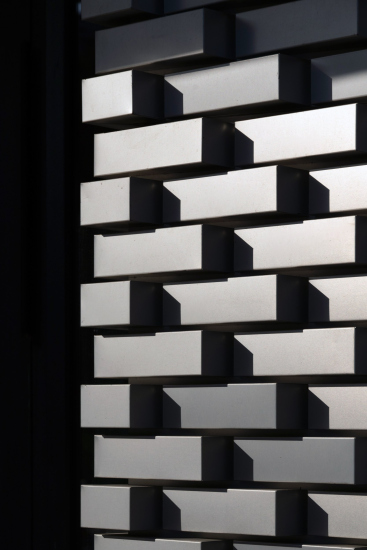
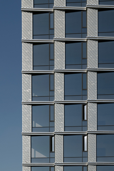
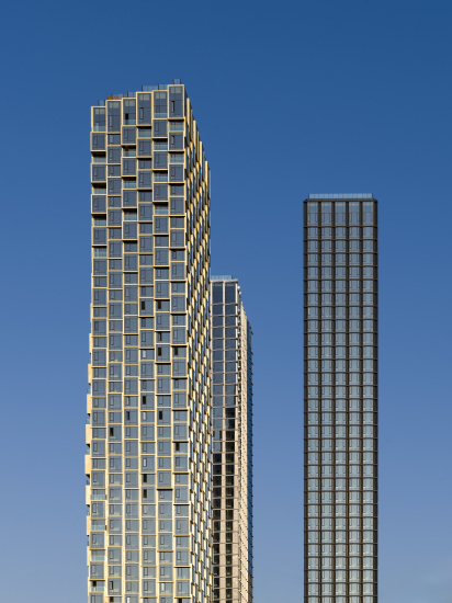
However, the golden tower doesn’t stand alone. The second, silver tower retains aspects of the original design, including vertically narrowing window mullions reminiscent of calligraphy strokes or bird feathers, and a jagged “brick” texture. Here, the “bricks” are crafted from folded aluminum sheets, revealing the material’s subtle detail only up close and further enhanced by reflective highlights.

  • zooming
    HIDE Housing Complex
    Copyright: Photograph © Daniel Annenkov / provided by ADM architects
  • zooming
    HIDE Housing Complex
    Copyright: Photograph © Daniel Annenkov / provided by ADM architects


This detail becomes apparent only upon closer inspection – and also because the silver facade, much like the golden one, produces a multitude of glimmers and reflections. The comparison to Laurelin and Telperion comes naturally, as the two towers seem to echo the radiance of the legendary trees.

  • zooming
    HIDE Housing Complex
    Copyright: Photograph © Dmitry Chebanenko / provided by ADM architects
  • zooming
    HIDE Housing Complex
    Copyright: Photograph © Daniel Annenkov / provided by ADM architects


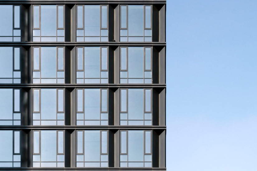
The third tower, set back on the site, creates zones within the courtyard – a smaller court d’honneur and a larger promenade area. Its façade, with glass and deep black partitions, exudes a more restrained style. The surface is composed of flattened bay windows assembled in a flush pattern, reminiscent of the rational modernism of the early 20th century.

Yet perhaps most striking is how the setbacks of the black tower seem like an inversion of the triangular pilasters on the public center. It’s as if the center is a small, white “soul,” while the black tower is its “tall shadow”. The center acts as a simple monochrome core, framed by the silver western and golden eastern towers, like the moon and the sun.

The result is quite cosmic-looking.

  • zooming
    HIDE Housing Complex
    Copyright: Photograph © Daniel Annenkov / provided by ADM architects
  • zooming
    HIDE Housing Complex
    Copyright: Photograph © Andrey Belimov-Guschin / provided by ADM architects


In essence, the four volumes form a dialogue of their own, creating a rhythm and resonance among them. The black tower is like a graphite pillar, lending stability to the composition. The silver tower flutters like a line of flags in the wind. Meanwhile, the golden tower “steps” boldly toward the roadway, standing tall like Nike on the Acropolis. The boldest and most brilliant of the three, it engages in a dialogue with the sprawling, ever-growing city that encircles this new residential complex with its roads. It’s no coincidence that the name of the bureau translates to “Architectural Dialogue with the Megalopolis”.
  • zooming
    HIDE Housing Complex
    Copyright: Photograph © Daniel Annenkov / provided by ADM architects
  • zooming
    HIDE Housing Complex
    Copyright: Photograph © Dmitry Chebanenko / provided by ADM architects


13 November 2024

Headlines now
The Golden Crown
The concept for a dental clinic in Yekaterinburg, developed by CNTR Studio, revolves around the idea of a “mouth full of gold”: pristine white porcelain stoneware walls are complemented by matte brass details. To avoid an overly literal interpretation, the architects focused on the building’s proportions, skillfully navigating between sunlight requirements and fire safety regulations.
Flexibility and Integration
Not long ago, we covered the project for the fourth phase of the ÁLIA residential complex, designed by APEX. Now, we’ve been shown different fence concepts they developed to enclose the complex’s private courtyards, incorporating a variety of public functions. We believe that the sheer fact that the complex’s architects were involved in such a detail as fencing speaks volumes.
A Step Forward
The HIDE residential complex represents a major milestone for ADM architects and their leaders Andrey Romanov and Ekaterina Kuznetsova in their quest for a fresh high-rise aesthetic – one that is flexible and layered, capable of bringing vibrancy to mass and silhouette while shaping form. Over recent years, this approach has become ADM’s “signature style”, with the golden HIDE tower playing a pivotal role in its evolution. Here, we delve into the project’s story, explore the details of the complex’s design, and uncover its core essence.
Gold in the Sands
A new office for a transcontinental company specializing in resource extraction and processing has opened in Dubai. Designed by T+T Architects, masters of creating spaces that are contemporary, diverse, flexible, and original, this project exemplifies their expertise. On the executive floor, a massive brass-clad partition dominates, while layered textures of compressed earth create a contextually resonant backdrop.
Layers and Levels of Flight
This project goes way back – Reserve Union won this architectural competition at the end of 2011, and the building was completed in 2018, so it’s practically “archival”. However, despite being relatively unknown, the building can hardly be considered “dated” and remains a prime example of architectural expression, particularly in the headquarters genre. And it’s especially fitting for an aviation company office. In some ways, it resembles the Aeroflot headquarters at Sheremetyevo but with its own unique identity, following the signature style of Vladimir Plotkin. In this article, we take an in-depth look at the United Aircraft Corporation (UAC) headquarters in the Moscow agglomeration town of Zhukovsky, supplemented by recent photographs from Alexey Naroditsky – a shoot that became only recently possible due to the fact that improvements were finally made in the surrounding area.
Light and Shadow
In this article, we delve into the architectural design of the “Chaika” house by DNK ag architects, which was recently completed in 2023 as part of the collection of signature designs at ZILArt. As is well-known, all the buildings in this complex follow a design code, yet each one is distinct. This particular building stands out not only for its whiteness and minimalism but also for the refined use of a limited number of techniques that, together, create what can confidently be called synergy.
Casus Novae
A master plan was developed for a large residential area with a name of “DNS City”, but now that its implementation began, the plan has been arbitrarily reformatted and replaced with something that, while similar on the surface, is actually quite different. This is not the first time such a thing happens, but it’s always frustrating. With permission from the author, we are sharing Maria Elkina’s post.
Treasure Hunting
The GAFA bureau, in collaboration with Tegola and Arkhitail, organized an expedition to the island of Kilpola in Karelia as part of Moskomarkhitektura’s “Open City” festival. There, amidst moss and rocks, the students sought answers to questions like: what is the sacred, where does it dwell, and what sustains it? Assisting the participants in this quest were landscape engineer Evgeny Levin, artist Nicholas Roerich, a moose, and the lack of cellular connection. Here’s how the story unfolded.
Depths of the Earth, Streams of Water
In the Malaya Okhta district, the Akzent building, designed by Stepan Liphart, was constructed. It follows a classic tripartite structure, yet it’s what you might call “hand-drawn”: each façade is unique in its form and details, some of which aren’t immediately noticeable. In this article, we explore the context and, together with the architect, delve into how the form was developed.
Fir Tree Dynamics
The “Airports of Region” holding is planning to build an airport in Karachay-Cherkessia, aiming to make the Arkhyz and Dombay resorts more accessible to travelers. The project that won in an invitation-only competition, submitted by Sergey Nikeshkin’s KPLN, blends natural imagery inspired by the shape of a conifer seed, open-air waiting spaces, majestic large trees, and a green roof elevated on needle-like columns. The result is both nature-inspired and WOW.
​A Brick Shell
In the process of designing a clubhouse situated among pine trees in a prestigious suburban area near Moscow, the architectural firm “A.Len” did the façade design part. The combination of different types of brick and masonry correlates with the volumetric and plastique solutions, further enhanced by the inclusion of wood-painted fragments and metal “glazing”.
Word Forms
ATRIUM architects love ambitious challenges, and for the firm’s thirtieth anniversary, they boldly play a game of words with an exhibition that dives deep into a self-created vocabulary. They immerse their projects – especially art installations – into this glossary, as if plunging into a current of their own. You feel as if you’re flowing through the veins of pure art, immersed in a universe of vertical cities, educational spaces – of which the architects are true masters – and the cultural codes of various locations. But what truly captivates is the bold statement that Vera Butko and Anton Nadtochy make, both through their work and this exhibition: architecture, above all, is art – the art of working with form and space.
Flexibility and Acuteness of Modernity
Luxurious, fluid, large “kokoshniks” and spiral barrel columns, as if made from colorful chewing gum: there seem to be no other mansion like this in Moscow, designed in the “Neo-Russian-Modern” style. And the “Teremok” on Malaya Kaluzhskaya, previously somewhat obscure, has “come alive with new colors” and gained visibility after its restoration for the office of the “architectural ecosystem” as the architects love to call themselves. It’s evident that Julius Borisov and the architects at UNK put their hearts into finding this new office and bringing it up to date. Let’s delve into the paradoxes of this mansion’s history and its plasticity. Spoiler: two versions of modernity meet here, both balancing on the razor’s edge of “what’s current”.
Yuri Vissarionov: “A modular house does not belong to the land”
It belongs to space, or to the air... It turns out that 3D printing is more effective when combined with a modular approach: the house is built in a workshop and then adapted to the site, including on uneven terrain. Yuri Vissarionov shares his latest experience in designing tourist complexes, both in central Russia and in the south. These include houseboats, homes printed from lightweight concrete using a 3D printer, and, of course, frame houses.
​Moscow’s First
“The quality of education largely depends on the quality of the educational environment”. This principle of the last decade has been realized by Sergey Skuratov in the project for the First Moscow Gymnasium on Rostovskaya Embankment in the Khamovniki district. The building seamlessly integrates into the complex urban landscape, responding both to the pedestrian flow of the city and the quiet alleyways. It skillfully takes advantage of the height differences and aligns with modern trends in educational space design. Let’s take a closer look.
Looking at the Water
The site of Villa Sonata stretches from the road to the water’s edge, offering its own shoreline, pier, and a picturesque river panorama. To reveal these sweeping views, Roman Leonidov “cut” the façade diagonally parallel to the river, thus getting two main axes for the house and, consequently, “two heads”. The internal core – two double-height spaces, a living room and a conservatory, with a “bridge” above them – makes the house both “transparent” and filled with light.
The White Wing
Well, it’s not exactly white. It’s more of a beige, white-stone structure that plays with the color of limestone – smoother surfaces are lighter, while rougher ones are darker. This wing unites various elements: it absorbs and interprets the surrounding themes. It responds to everything, yet maintains a cohesive expression – a challenging task! – while also incorporating recognizable features of its own, such as the dynamic cuts at the bottom, top, and middle.
Urban Dunes
The XSA Ramps team designed and built a three-part sports hub for a park in Rostov-on-Don, welcoming people of all ages and fitness levels. The skate plaza, pump track, and playground are all meticulously crafted with details that attract a diverse range of visitors. The technical execution of the shapes and slopes transforms this space into a kind of sculptural composition.
Proportional Growth
The project for the fourth phase of the ÁLIA residential area has been announced. The buildings are situated on an elongated plot – almost a “ray” that shoots out from the center of the area towards the river. Their layout reflects both a response to Moscow’s architectural preferences over the past 15 years, shifting “from blocks to towers”, and an interpretation of the neighboring business park designed by SOM. Additionally, the best apartments here are not located at the very top but closer to the middle, forming a glowing “waistline”.
The “Staircase” Building
In designing the “Details” residential complex in New Moscow, Rais Baishev spiced up the now-popular Moscow theme of a “courtyard” building with an idea drawn from the surrealist drawings by Maurits Escher. He envisioned the stepped silhouettes and descending slopes as a metaphysical mega-staircase, creating a key void within the courtyard that gave the project an internal “spine”. This concept is felt both in the building’s silhouette and on its façades.
Projection of the Quarter
No one doubted that the building that Vladimir Plotkin designed as part of the “Garden Quarters” would be the most modernist of all. And it turned out just that way: while adhering to the common design code, the building successfully combines brick and white stone, rhythmically responding to the neighboring building designed by Ostozhenka, yet tactfully and persistently making a few statements of its own. This includes the projection of the ideal urban development composition “14–9–6”, which can be found right next door, mathematical calculations, including those for various types of terraces (and perhaps the only reminder of the Soviet past of the Kauchuk rubber factory!), and the white “cross-stitch” pattern of the façade grid.
Domus Aurea
In this issue, we examine the “Tessinsky-1” house, designed by Sergey Skuratov and completed in 2023. Located in the middle of the Serebryanicheskaya Embankment district, at the intersection of its main streets, this house assumes a sort of “nodal” role: it not only responds to everything around it and preserves many memories of the former EMA factory within itself, but it weaves all this into a newly directed pattern, reconciling bright “gold” and dark-colored brick, largely with the help of the new, modern-yet-archaic Columba brick, which, come to think about it, is the most precious element here.
The Chimney of Nikola-Lenivets
In this issue, we are examining the “Obelisk House” designed by KATARSIS and built for the Arkhstoyanie 2023 festival. However, it was only finished later on, and this is why we are examining it now. It seems to us that after the “Obelisk House” appeared in Nikola-Lenivets, a dialogue and a few inner connections appeared between the temporary structures built here. These houses no longer look like “accidental neighbors”, more of which below.
​Periscope by the Bay
The jury awarded the second place in the competition for a public and cultural center in Petropavlovsk-Kamchatsky to the companies GORA (“Mountain”) and M4. In the consortium’s proposal, the building resembles a sperm whale with a calf swimming next to it or a periscope, whose lenses capture the most spectacular views from the surrounding landscape.
From Arcs to Dolmens
While working on the competition project for Petropavlovsk-Kamchatsky, ASADOV Architects prioritized the value of the natural and urban environment, aiming to preserve the balance of the location while minimizing the resemblance of the volume that they designed to a “traditional building”. The task was challenging, and the architects created three versions, one of which having been developed after the competition, where their main proposal took third place. However, the point of interest here is not the competition result but the continuity of creative thinking.
Hide and Seek
The ID Moskovskiy house, designed by Stepan Liphart in St. Petersburg, in the courtyards near Moskovskiy Avenue beyond the Obvodny Canal and recently completed, is notable for several reasons. Firstly, it has been realized with considerable accuracy, which is particularly significant as this is the first building where the architect was responsible not only for the facades but also for the layouts, allowing for better integration between the two. On the other hand, this building is interesting as an example of the “germination” of new architecture in the city: it draws on the best examples from the neighborhood and becomes an improved and developed sum of ideas found by the architect in the surrounding context.
The Big Twelve
Yesterday, the winners of the Moscow Mayor’s Architecture Award were announced and honored. Let’s take a look at what was awarded and, in some cases, even critique this esteemed award. After all, there is always room for improvement, right?
Above the Golden Horn
The residential complex “Philosophy” designed by T+T architects in Vladivostok, is one of the new projects in the “Golubinaya Pad” area, changing its development philosophy (pun intended) from single houses to a comprehensive approach. The buildings are organized along public streets, varying in height and format, with one house even executed in gallery typology, featuring a cantilever leaning on an art object.
Nuanced Alternative
How can you rhyme a square and space? Easily! But to do so, you need to rhyme everything you can possibly think of: weave everything together, like in a tensegrity structure, and find your own optics too. The new exhibition at GES-2 does just that, offering its visitor a new perspective on the history of art spanning 150 years, infused with the hope for endless multiplicity of worlds and art histories. Read on to see how this is achieved and how the exhibition design by Evgeny Ace contributes to it.
Blinds for Ice
An ice arena has been constructed in Domodedovo based on a project by Yuri Vissarionov Architects. To prevent the long façade, a technical requirement for winter sports facilities, from appearing monotonous, the architects proposed the use of suspended structures with multidirectional slats. This design protects the ice from direct sunlight while giving the wall texture and detail.