По-русски

Birds and Streams

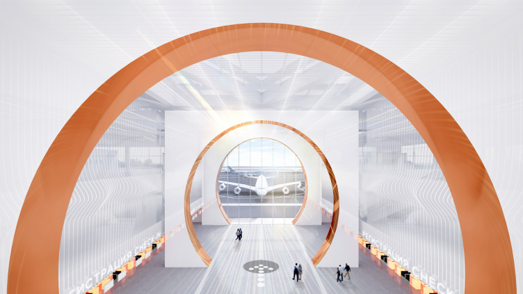
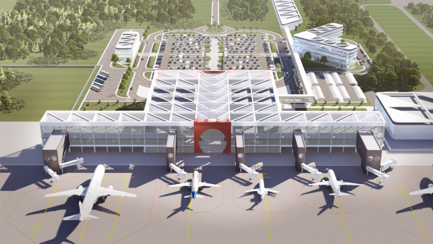
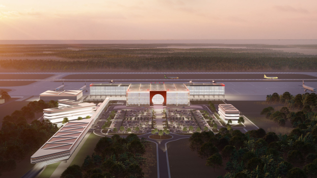
For the competition to design the Omsk airport, DNK ag formed a consortium, inviting VOX architects and Sila Sveta. Their project focuses on intersections, journeys, and flights – both of people and birds – as Omsk is known as a “transfer point” for bird migrations. The educational component is also carefully considered, and the building itself is filled with light, which seems to deconstruct the copper circle of the central entrance portal, spreading it into fantastic hyper-spatial “slices”.

03 May 2024
mainImg
In this article, we continue covering the competition for the Omsk-Fedorovka airport. It should be remembered that for the competition, the results of which were announced at the end of March, 14 projects were submitted, 7 of which were shortlisted, then 4, and then 1 based on the results of the popular vote on Telegram.

The project by the team led by DNK ag is among those that made it to the “semifinals” out of the seven contenders.

Our team’s project made it to the semi-finals and we presented it in person at the Omsk City Council. It was an open and detailed discussion. The participants of the City Council emphasized the importance for the future of the airport of both a spectacular image and realistic implementation from a technical and budgetary point of view.

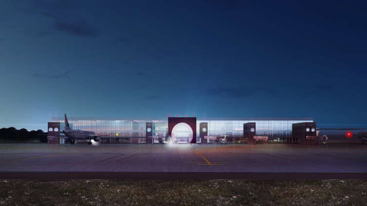
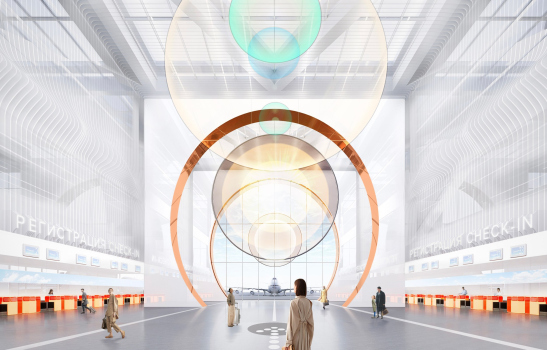
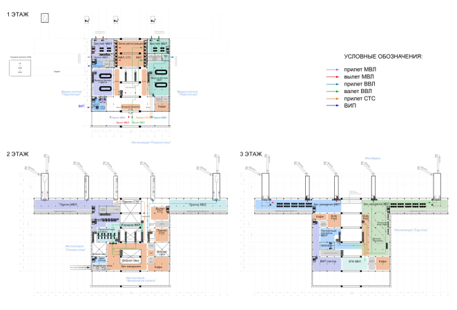
We improved a rather innovative terminal technology proposed by the competition organizers: the visual axis “the area in front of the terminal – the airfield” was treated as an axial space on all three levels, thus linking external and internal volumetric solutions. We proposed to “push” or “expand” the usual airport structure – this is how the image of an “innovative portal” with an active sculptural pattern in the form of circles emerged – it emphasizes the theme of rapid transition from one point to another, which in our day and age is provided by aviation. This structure is very rational and realistic, which facilitates the implementation of the project.

In addition, my colleagues and I presented the airport not only as a transportation hub, but also as a multifunctional hub, accompanying the transportation and logistics functionality with entertaining and educational content.


The project was developed by a consortium: DNK ag brought in VOX architects headed by Boris Voskoboinikov and Maria Akhremenkova, a team experienced in working with V.I.P. and other special halls of modern airports, as well as Sila Sveta, a company with experience, including international, in working with museum installations and media. So, the work was carried out at the “intersection” of different possibilities and even different disciplines and professions.

Omsk-Fedorovka Airport. Innovative portal. Competition project. Semifinal
Copyright: © DNKag / VOX / Sila Sveta


It must be said that the theme of the intersection is crucial for the project. The intersection of the Irtysh River and the Trans-Siberian Railway is depicted on the recent coat of arms of the Omsk region, approved in 2003 and in 2020 – and this coat of arms became one of the starting points for the concept.

However, according to the architects themselves, it is not the intersection that is the main theme here, and the project is ambiguous in its nature – it appeals to both streams and flights, as well as to a hyper-transition portal.

Omsk-Fedorovka Airport. Innovative portal. Competition project. Semifinal
Copyright: © DNKag / VOX / Sila Sveta


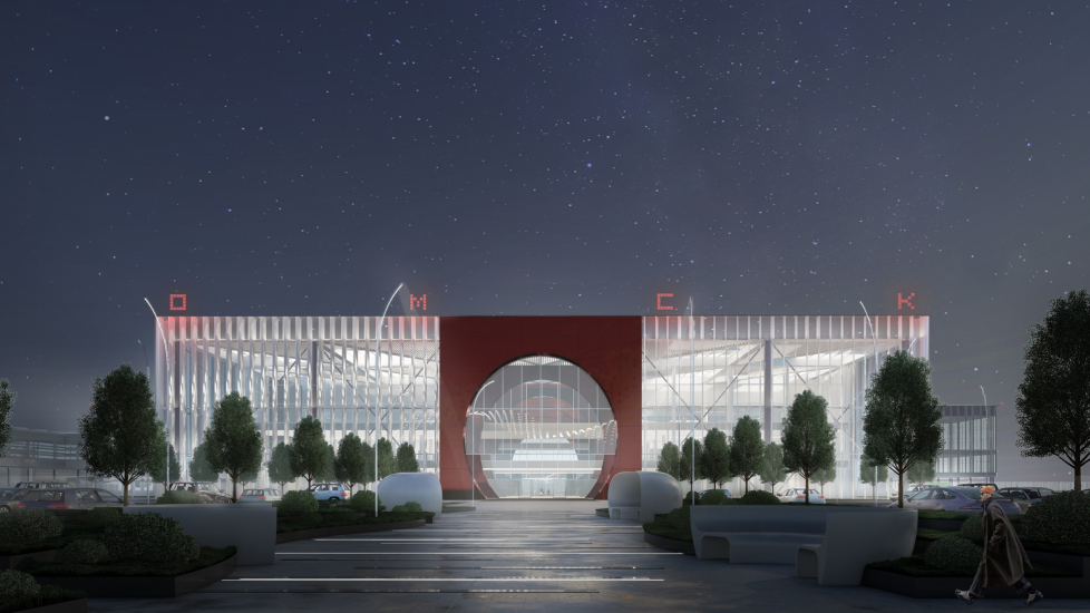
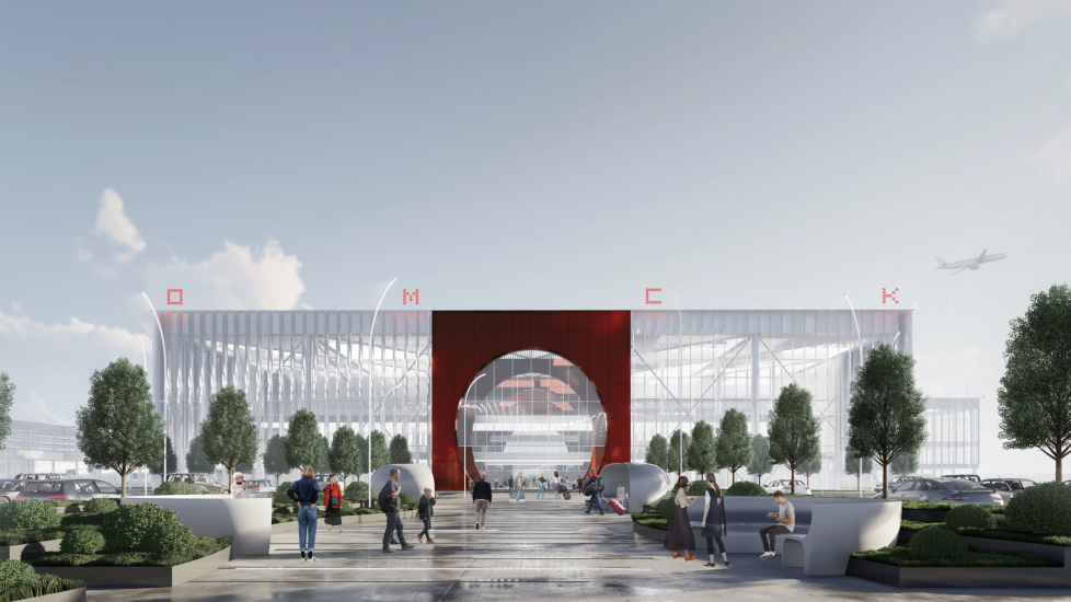
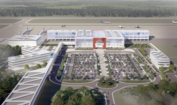
However, if we look at the architecture of the terminal proposed by the consortium, even a casual observer will easily discern the coat of arms of the region “unfolded in volume”: the intersection of two axes, the river and the highway, and the circle of the portal, resembling the outline of a fortress.

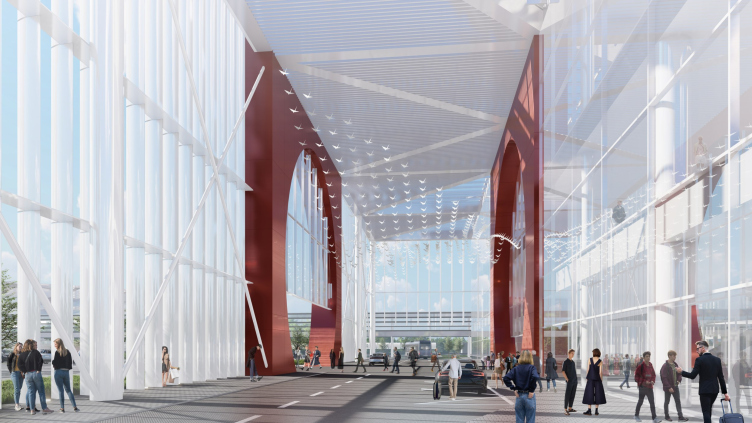
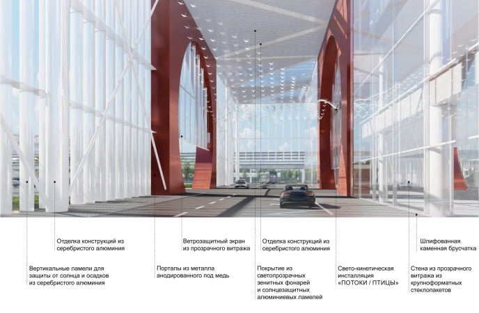
The design is based on simplicity and transparency: a rectangular volume outline, glass walls and ceiling, light aluminum columns, lamellae, and tension cables – with the strictness of the bright “hatching” of the form, everything gravitates towards dematerialization. Such a building should glow from the inside at night – not in parts, but entirely, from all sides, while during the day, it should receive – again, from all sides – plenty of natural sunlight.

  • zooming
    Omsk-Fedorovka Airport. Innovative portal. Competition project. Semifinal
    Copyright: © DNKag / VOX / Sila Sveta
  • zooming
    Omsk-Fedorovka Airport. Innovative portal. Competition project. Semifinal
    Copyright: © DNKag / VOX / Sila Sveta


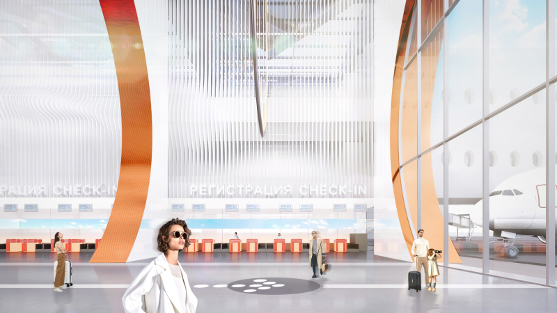
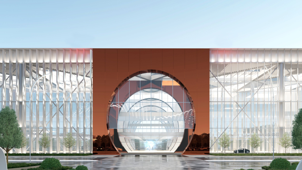
The only material element in this composition of this light and semi-transparent volume is the entrance portal: a metaphorical “pivot”, integrated into the matter or space with properties different from usual, and as a result, subjected to deconstruction, and “sliced” into separate pieces

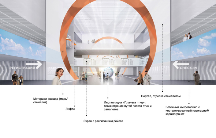
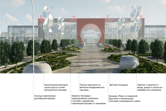
As for the portal, the architects proposed to clad it with a composite of a copper color, the first two layers entirely, and then along the inner circumference, a copper hue, with a light stemalit on the inner plane.

Omsk-Fedorovka Airport. Innovative portal. Competition project. Semifinal
Copyright: © DNKag / VOX / Sila Sveta


One of the most interesting features of this deliberately concise solution is the cold “portico”. Terminal entrances often feature large canopies, but here the first part of the volume is simply designed as a covered space, but it is situated behind the “thread” of the first façade. This creates a very convenient “entrance hub” – after all, for an airport, convenient access, comfortable taxi boarding/alighting is quite important.

From the plastique standpoint, the “layering” and dematerialization of the “portal gate” occurs precisely here, at the intersection of axes. The façade turns out to be not so much a picture as a volumetric structure, the full force of which could only be appreciated by entering this structure. Going “inside the façade”.

Omsk-Fedorovka Airport. Innovative portal. Competition project. Semifinal
Copyright: © DNKag / VOX / Sila Sveta


Here it becomes clear why the architects talk about the primacy of volumetric/spatial construction over “individual elements”.

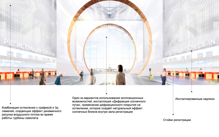
As a result, a light, almost immaterial structure emerges, where the main thing is the section of space by planes and lines. This could create an intriguing effect of light-filled and “outlined” from inside the terminal. The image is akin to a hyper-transition – something, about which we currently don’t know much, and can only imagine and fantasize about.

  • zooming
    1 / 6
    Omsk-Fedorovka Airport. Innovative portal. Competition project. Semifinal
    Copyright: © DNKag / VOX / Sila Sveta
  • zooming
    2 / 6
    Omsk-Fedorovka Airport. Innovative portal. Competition project. Semifinal
    Copyright: © DNKag / VOX / Sila Sveta
  • zooming
    3 / 6
    Omsk-Fedorovka Airport. Innovative portal. Competition project. Semifinal
    Copyright: © DNKag / VOX / Sila Sveta
  • zooming
    4 / 6
    Omsk-Fedorovka Airport. Innovative portal. Competition project. Semifinal
    Copyright: © DNKag / VOX / Sila Sveta
  • zooming
    5 / 6
    Omsk-Fedorovka Airport. Innovative portal. Competition project. Semifinal
    Copyright: © DNKag / VOX / Sila Sveta
  • zooming
    6 / 6
    Omsk-Fedorovka Airport. Innovative portal. Competition project. Semifinal
    Copyright: © DNKag / VOX / Sila Sveta


The architects complement the concise form of the building with a highly developed narrative program, paying a lot of attention to both installations and edutainment modules.

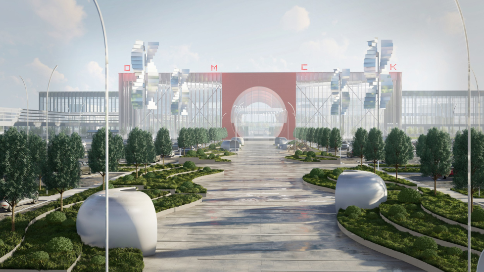
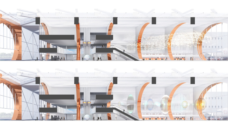
In relation to the theme of flight, the architects recall the aviation factories operating in Omsk – PO “Polet” and the civil aviation plant “OZGA”, as well as… birds – the city is home to a reserve with the telling name “Bird Haven”. Hence the installations proposed by the architects: one with a flock of birds in a spiral airstream at the entrance, just as white and transparent as the facades – as well as spiral windmills in the square, the central axis of which, leading to the portal, is transformed into a “river” boulevard with winding raised edges and greenery, separating the boulevard from the parking lot on the sides.

  • zooming
    Omsk-Fedorovka Airport. Innovative portal. Competition project. Semifinal
    Copyright: © DNKag / VOX / Sila Sveta
  • zooming
    Omsk-Fedorovka Airport. Innovative portal. Competition project. Semifinal
    Copyright: © DNKag / VOX / Sila Sveta


Other types of installations are also proposed here: light lenses on the main axis, holographic birds of the region on trees, an interactive sphere, and more.

Omsk-Fedorovka Airport. Innovative portal. Competition project. Semifinal
Copyright: © DNKag / VOX / Sila Sveta


  • zooming
    Omsk-Fedorovka Airport. Innovative portal. Competition project. Semifinal
    Copyright: © DNKag / VOX / Sila Sveta
  • zooming
    Omsk-Fedorovka Airport. Innovative portal. Competition project. Semifinal
    Copyright: © DNKag / VOX / Sila Sveta


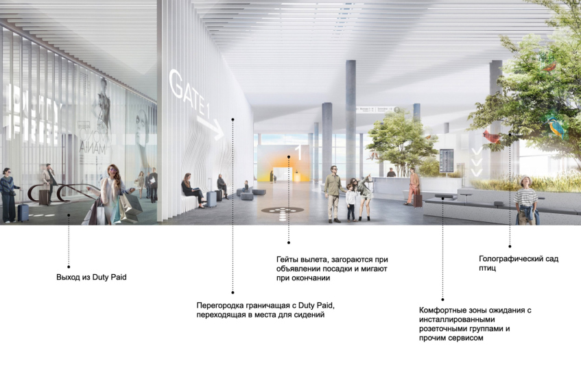
It seemed to me, however, that the most useful and pleasant innovation was the interactive gates, which light up with media illumination at the start of boarding, animating the terminal space in the most functional way possible.

Omsk-Fedorovka Airport. Innovative portal. Competition project. Semifinal
Copyright: © DNKag / VOX / Sila Sveta


A few words must be said about the edutainment modules, as they are everywhere in the project.

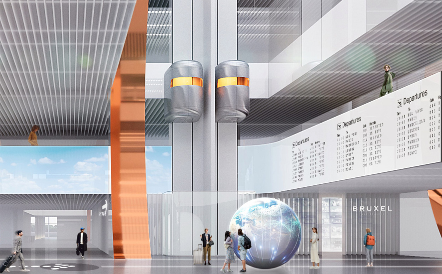
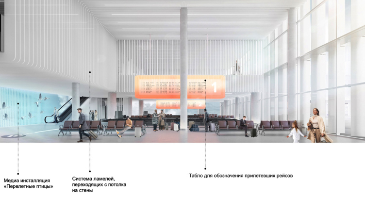
In the registration hall, there is an interactive sphere named “Planet of Birds”, showing the routes of birds and airplanes together. In the baggage claim area, there are media walls based on morphing principles, where one form transforms into another: an umbrella into a jellyfish, a bird into an airplane, and so on. In the pre-security zone, a bird atlas was planned – huge books with interactive pages, and in the waiting area, an installation on the topic of flight physiology, where a passenger could stand at a certain point, project their imaginary skeleton with wings onto the screen, and then save it and retrieve their winged silhouette. And finally, a “paradise garden” with holographic columns in the waiting area.

In short, you are in for a very comprehensive program indeed.

As we can see, the project is multifaceted, characterized by external simplicity, the lightness of form, and internal thoroughness, including in details.

  • zooming
    1 / 5
    Omsk-Fedorovka Airport. Innovative portal. Competition project. Semifinal
    Copyright: © DNKag / VOX / Sila Sveta
  • zooming
    2 / 5
    Omsk-Fedorovka Airport. Innovative portal. Competition project. Semifinal
    Copyright: © DNKag / VOX / Sila Sveta
  • zooming
    3 / 5
    Omsk-Fedorovka Airport. Innovative portal. Competition project. Semifinal
    Copyright: © DNKag / VOX / Sila Sveta
  • zooming
    4 / 5
    Omsk-Fedorovka Airport. Innovative portal. Competition project. Semifinal
    Copyright: © DNKag / VOX / Sila Sveta
  • zooming
    5 / 5
    Omsk-Fedorovka Airport. Innovative portal. Competition project. Semifinal
    Copyright: © DNKag / VOX / Sila Sveta


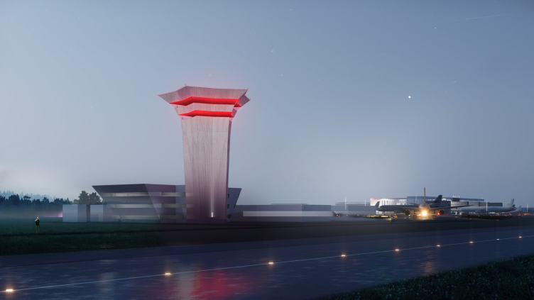
Last but not least: there is also a mesmerizing observation tower with the effect of its upper tiers levitating.

Omsk-Fedorovka Airport. Innovative portal. Competition project. Semifinal


03 May 2024

Headlines now
Gold in the Sands
A new office for a transcontinental company specializing in resource extraction and processing has opened in Dubai. Designed by T+T Architects, masters of creating spaces that are contemporary, diverse, flexible, and original, this project exemplifies their expertise. On the executive floor, a massive brass-clad partition dominates, while layered textures of compressed earth create a contextually resonant backdrop.
Layers and Levels of Flight
This project goes way back – Reserve Union won this architectural competition at the end of 2011, and the building was completed in 2018, so it’s practically “archival”. However, despite being relatively unknown, the building can hardly be considered “dated” and remains a prime example of architectural expression, particularly in the headquarters genre. And it’s especially fitting for an aviation company office. In some ways, it resembles the Aeroflot headquarters at Sheremetyevo but with its own unique identity, following the signature style of Vladimir Plotkin. In this article, we take an in-depth look at the United Aircraft Corporation (UAC) headquarters in the Moscow agglomeration town of Zhukovsky, supplemented by recent photographs from Alexey Naroditsky – a shoot that became only recently possible due to the fact that improvements were finally made in the surrounding area.
Light and Shadow
In this article, we delve into the architectural design of the “Chaika” house by DNK ag architects, which was recently completed in 2023 as part of the collection of signature designs at ZILArt. As is well-known, all the buildings in this complex follow a design code, yet each one is distinct. This particular building stands out not only for its whiteness and minimalism but also for the refined use of a limited number of techniques that, together, create what can confidently be called synergy.
Casus Novae
A master plan was developed for a large residential area with a name of “DNS City”, but now that its implementation began, the plan has been arbitrarily reformatted and replaced with something that, while similar on the surface, is actually quite different. This is not the first time such a thing happens, but it’s always frustrating. With permission from the author, we are sharing Maria Elkina’s post.
Treasure Hunting
The GAFA bureau, in collaboration with Tegola and Arkhitail, organized an expedition to the island of Kilpola in Karelia as part of Moskomarkhitektura’s “Open City” festival. There, amidst moss and rocks, the students sought answers to questions like: what is the sacred, where does it dwell, and what sustains it? Assisting the participants in this quest were landscape engineer Evgeny Levin, artist Nicholas Roerich, a moose, and the lack of cellular connection. Here’s how the story unfolded.
Depths of the Earth, Streams of Water
In the Malaya Okhta district, the Akzent building, designed by Stepan Liphart, was constructed. It follows a classic tripartite structure, yet it’s what you might call “hand-drawn”: each façade is unique in its form and details, some of which aren’t immediately noticeable. In this article, we explore the context and, together with the architect, delve into how the form was developed.
Fir Tree Dynamics
The “Airports of Region” holding is planning to build an airport in Karachay-Cherkessia, aiming to make the Arkhyz and Dombay resorts more accessible to travelers. The project that won in an invitation-only competition, submitted by Sergey Nikeshkin’s KPLN, blends natural imagery inspired by the shape of a conifer seed, open-air waiting spaces, majestic large trees, and a green roof elevated on needle-like columns. The result is both nature-inspired and WOW.
​A Brick Shell
In the process of designing a clubhouse situated among pine trees in a prestigious suburban area near Moscow, the architectural firm “A.Len” did the façade design part. The combination of different types of brick and masonry correlates with the volumetric and plastique solutions, further enhanced by the inclusion of wood-painted fragments and metal “glazing”.
Word Forms
ATRIUM architects love ambitious challenges, and for the firm’s thirtieth anniversary, they boldly play a game of words with an exhibition that dives deep into a self-created vocabulary. They immerse their projects – especially art installations – into this glossary, as if plunging into a current of their own. You feel as if you’re flowing through the veins of pure art, immersed in a universe of vertical cities, educational spaces – of which the architects are true masters – and the cultural codes of various locations. But what truly captivates is the bold statement that Vera Butko and Anton Nadtochy make, both through their work and this exhibition: architecture, above all, is art – the art of working with form and space.
Flexibility and Acuteness of Modernity
Luxurious, fluid, large “kokoshniks” and spiral barrel columns, as if made from colorful chewing gum: there seem to be no other mansion like this in Moscow, designed in the “Neo-Russian-Modern” style. And the “Teremok” on Malaya Kaluzhskaya, previously somewhat obscure, has “come alive with new colors” and gained visibility after its restoration for the office of the “architectural ecosystem” as the architects love to call themselves. It’s evident that Julius Borisov and the architects at UNK put their hearts into finding this new office and bringing it up to date. Let’s delve into the paradoxes of this mansion’s history and its plasticity. Spoiler: two versions of modernity meet here, both balancing on the razor’s edge of “what’s current”.
Yuri Vissarionov: “A modular house does not belong to the land”
It belongs to space, or to the air... It turns out that 3D printing is more effective when combined with a modular approach: the house is built in a workshop and then adapted to the site, including on uneven terrain. Yuri Vissarionov shares his latest experience in designing tourist complexes, both in central Russia and in the south. These include houseboats, homes printed from lightweight concrete using a 3D printer, and, of course, frame houses.
​Moscow’s First
“The quality of education largely depends on the quality of the educational environment”. This principle of the last decade has been realized by Sergey Skuratov in the project for the First Moscow Gymnasium on Rostovskaya Embankment in the Khamovniki district. The building seamlessly integrates into the complex urban landscape, responding both to the pedestrian flow of the city and the quiet alleyways. It skillfully takes advantage of the height differences and aligns with modern trends in educational space design. Let’s take a closer look.
Looking at the Water
The site of Villa Sonata stretches from the road to the water’s edge, offering its own shoreline, pier, and a picturesque river panorama. To reveal these sweeping views, Roman Leonidov “cut” the façade diagonally parallel to the river, thus getting two main axes for the house and, consequently, “two heads”. The internal core – two double-height spaces, a living room and a conservatory, with a “bridge” above them – makes the house both “transparent” and filled with light.
The White Wing
Well, it’s not exactly white. It’s more of a beige, white-stone structure that plays with the color of limestone – smoother surfaces are lighter, while rougher ones are darker. This wing unites various elements: it absorbs and interprets the surrounding themes. It responds to everything, yet maintains a cohesive expression – a challenging task! – while also incorporating recognizable features of its own, such as the dynamic cuts at the bottom, top, and middle.
Urban Dunes
The XSA Ramps team designed and built a three-part sports hub for a park in Rostov-on-Don, welcoming people of all ages and fitness levels. The skate plaza, pump track, and playground are all meticulously crafted with details that attract a diverse range of visitors. The technical execution of the shapes and slopes transforms this space into a kind of sculptural composition.
Proportional Growth
The project for the fourth phase of the ÁLIA residential area has been announced. The buildings are situated on an elongated plot – almost a “ray” that shoots out from the center of the area towards the river. Their layout reflects both a response to Moscow’s architectural preferences over the past 15 years, shifting “from blocks to towers”, and an interpretation of the neighboring business park designed by SOM. Additionally, the best apartments here are not located at the very top but closer to the middle, forming a glowing “waistline”.
The “Staircase” Building
In designing the “Details” residential complex in New Moscow, Rais Baishev spiced up the now-popular Moscow theme of a “courtyard” building with an idea drawn from the surrealist drawings by Maurits Escher. He envisioned the stepped silhouettes and descending slopes as a metaphysical mega-staircase, creating a key void within the courtyard that gave the project an internal “spine”. This concept is felt both in the building’s silhouette and on its façades.
Projection of the Quarter
No one doubted that the building that Vladimir Plotkin designed as part of the “Garden Quarters” would be the most modernist of all. And it turned out just that way: while adhering to the common design code, the building successfully combines brick and white stone, rhythmically responding to the neighboring building designed by Ostozhenka, yet tactfully and persistently making a few statements of its own. This includes the projection of the ideal urban development composition “14–9–6”, which can be found right next door, mathematical calculations, including those for various types of terraces (and perhaps the only reminder of the Soviet past of the Kauchuk rubber factory!), and the white “cross-stitch” pattern of the façade grid.
Domus Aurea
In this issue, we examine the “Tessinsky-1” house, designed by Sergey Skuratov and completed in 2023. Located in the middle of the Serebryanicheskaya Embankment district, at the intersection of its main streets, this house assumes a sort of “nodal” role: it not only responds to everything around it and preserves many memories of the former EMA factory within itself, but it weaves all this into a newly directed pattern, reconciling bright “gold” and dark-colored brick, largely with the help of the new, modern-yet-archaic Columba brick, which, come to think about it, is the most precious element here.
The Chimney of Nikola-Lenivets
In this issue, we are examining the “Obelisk House” designed by KATARSIS and built for the Arkhstoyanie 2023 festival. However, it was only finished later on, and this is why we are examining it now. It seems to us that after the “Obelisk House” appeared in Nikola-Lenivets, a dialogue and a few inner connections appeared between the temporary structures built here. These houses no longer look like “accidental neighbors”, more of which below.
​Periscope by the Bay
The jury awarded the second place in the competition for a public and cultural center in Petropavlovsk-Kamchatsky to the companies GORA (“Mountain”) and M4. In the consortium’s proposal, the building resembles a sperm whale with a calf swimming next to it or a periscope, whose lenses capture the most spectacular views from the surrounding landscape.
From Arcs to Dolmens
While working on the competition project for Petropavlovsk-Kamchatsky, ASADOV Architects prioritized the value of the natural and urban environment, aiming to preserve the balance of the location while minimizing the resemblance of the volume that they designed to a “traditional building”. The task was challenging, and the architects created three versions, one of which having been developed after the competition, where their main proposal took third place. However, the point of interest here is not the competition result but the continuity of creative thinking.
Hide and Seek
The ID Moskovskiy house, designed by Stepan Liphart in St. Petersburg, in the courtyards near Moskovskiy Avenue beyond the Obvodny Canal and recently completed, is notable for several reasons. Firstly, it has been realized with considerable accuracy, which is particularly significant as this is the first building where the architect was responsible not only for the facades but also for the layouts, allowing for better integration between the two. On the other hand, this building is interesting as an example of the “germination” of new architecture in the city: it draws on the best examples from the neighborhood and becomes an improved and developed sum of ideas found by the architect in the surrounding context.
The Big Twelve
Yesterday, the winners of the Moscow Mayor’s Architecture Award were announced and honored. Let’s take a look at what was awarded and, in some cases, even critique this esteemed award. After all, there is always room for improvement, right?
Above the Golden Horn
The residential complex “Philosophy” designed by T+T architects in Vladivostok, is one of the new projects in the “Golubinaya Pad” area, changing its development philosophy (pun intended) from single houses to a comprehensive approach. The buildings are organized along public streets, varying in height and format, with one house even executed in gallery typology, featuring a cantilever leaning on an art object.
Nuanced Alternative
How can you rhyme a square and space? Easily! But to do so, you need to rhyme everything you can possibly think of: weave everything together, like in a tensegrity structure, and find your own optics too. The new exhibition at GES-2 does just that, offering its visitor a new perspective on the history of art spanning 150 years, infused with the hope for endless multiplicity of worlds and art histories. Read on to see how this is achieved and how the exhibition design by Evgeny Ace contributes to it.
Blinds for Ice
An ice arena has been constructed in Domodedovo based on a project by Yuri Vissarionov Architects. To prevent the long façade, a technical requirement for winter sports facilities, from appearing monotonous, the architects proposed the use of suspended structures with multidirectional slats. This design protects the ice from direct sunlight while giving the wall texture and detail.
Frozen Magma
A competition for the creation of a public and cultural center was held in Petropavlovsk-Kamchatsky. Three architectural companies made it to the final, and we consider it important to share about the work of each. Let’s start with the winner – the consortium led by Wowhaus.
Campus within a Day
In this article, we talk about what the participants of Genplan Institute of Moscow’s hackathon were doing at the MosComArchitecture booth at the “ArchMoscow” exhibition. We also discuss who won the prize and why, and what can be done with the territory of a small university on the outskirts of Moscow.
Vertical Civilization
Genpro considered the development of the vertical city concept and made it the theme of their pavilion at the “ArchMoscow” exhibition.