По-русски

Inverted Fortress

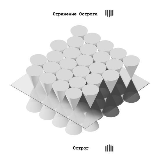
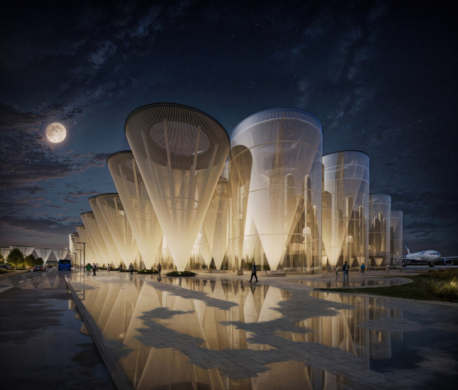
This year, there has been no shortage of intriguing architectural ideas around the Omsk airport. The project developed by the architectural company KPLN appeals to Omsk’s history as a wooden fortress that it was back in the day, but transforms the concept of a fortress beyond recognition: it “shaves off” the conical ends of “wooden logs”, then enlarges them, and then flips them over. The result is a hypostyle – a forest of conical columns on point supports, with skylights on top.

24 April 2024
mainImg
Not long ago, in March, intermediate results of the competition for the new Omsk-Fedorovka airport were announced, and then the winner was named – it was HVOYA.

A month ago, when we began to delve into the competition projects, it seemed that there were seven finalists, of which four were selected, and then one. In fact, there were more finalists; initially, about 14 projects participated in the competition. Half of the projects did not make it to the finals, but judging by what we managed to see, none of the projects lacked boldness. We hope to showcase at least some of them.

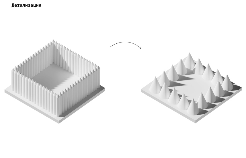
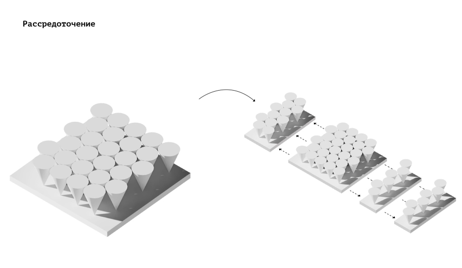
The architects of KPLN (this acronym stands for “close-up” in Russian), drawing inspiration from Omsk’s history – a city founded as a stronghold on the Siberian frontiers and having existed for quite some time in this capacity – were inspired by the image of an “ostrog” or “wooden fortress”. However, they turned the fortress upside down, or rather not the entire fortress, but the sharpened ends of logs, separating them from the bases and increasing them by a factor of fifty.

  • zooming
    Omsk-Fedorovka Airport. Guardian of the southern borders
    Copyright: © KPLN
  • zooming
    Omsk-Fedorovka Airport. Guardian of the southern borders
    Copyright: © KPLN


  • zooming
    The search for form. Omsk-Fedorovka Airport. Guardian of the southern borders
    Copyright: © KPLN
  • zooming
    Omsk-Fedorovka Airport. Guardian of the southern borders
    Copyright: © KPLN


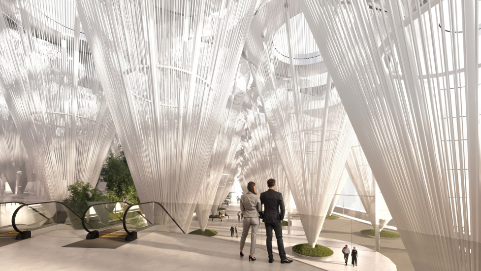
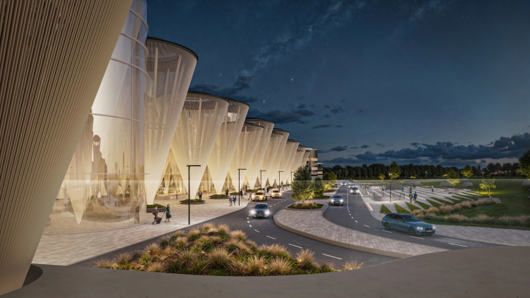
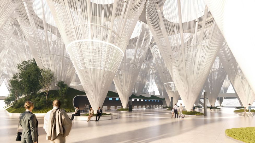
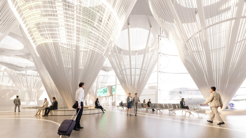
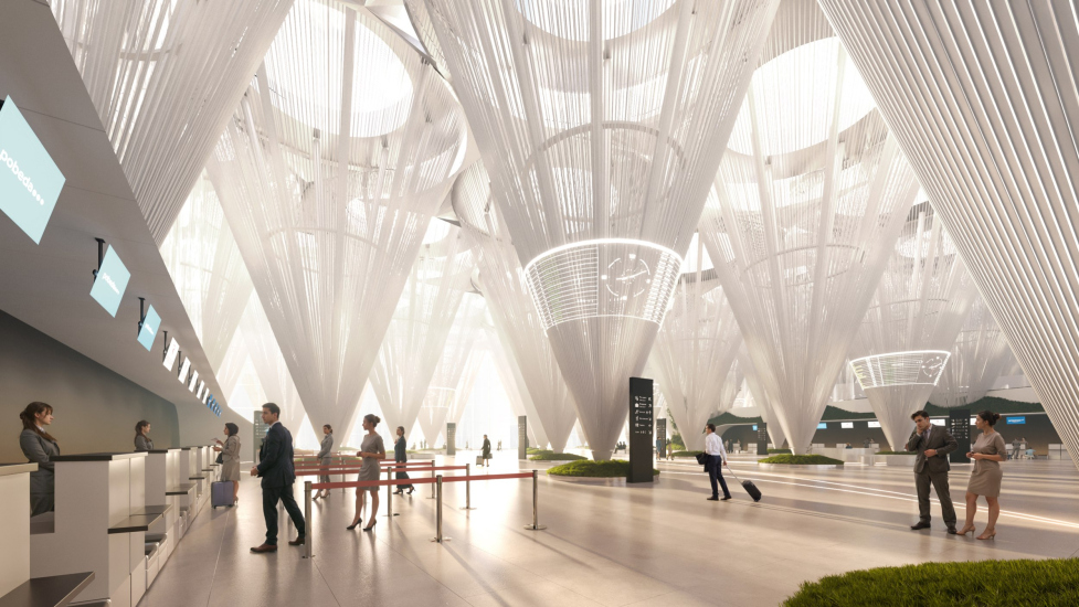
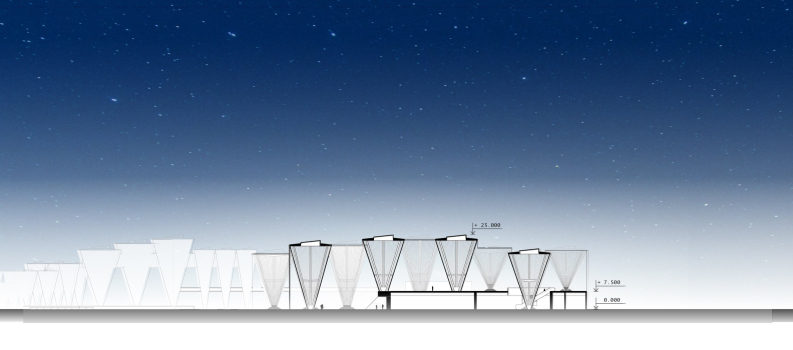
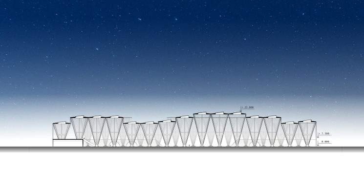
The gigantic inverted cones are as tall as the terminal itself, and honestly, at first glance, you wouldn’t guess that they are the sharpened ends of some imaginary fortress logs. That is, Shklovsky’s “defamiliarization” phenomenon indeed occurred. The cones are composed of steel supports, fan-like and diverging from a common support point at the bottom to a ring at the top. Inside the ring is a skylight, and along the surface of the cone are thin steel cables that camouflage the main supports and accentuate the stereometric surface. The structure is transparent, and natural light from the skylights could illuminate the entire space, while in the evening, conversely, the conical volumes would glow from within.

  • zooming
    Omsk-Fedorovka Airport. Guardian of the southern borders. View of the terminal as seen from the plaza
    Copyright: © KPLN
  • zooming
    Omsk-Fedorovka Airport. Guardian of the southern borders. The main hall of the airport
    Copyright: © KPLN


Omsk-Fedorovka Airport. Guardian of the southern borders. View of the building as seen from the railway platform
Copyright: © KPLN


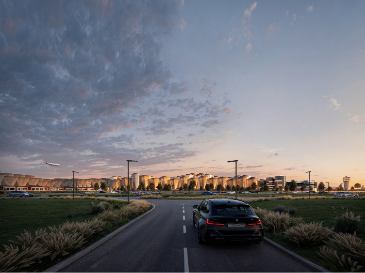
Omsk-Fedorovka Airport. Guardian of the southern borders. An overview from the driveway
Copyright: © KPLN


These luminous “vessels” standing on one point, looking like glasses or giant “office buttons”, are a stunning sight to see. They certainly set the module pitch, and the building construction becomes somewhat atypical for an airport, where typically a decorated hangar forms the basis. Here, the entire plan is subordinated to circles, which, however, is no less rational. The architects even devised a logo for the project – made up of circles.

  • zooming
    Omsk-Fedorovka Airport. Guardian of the southern borders
    Copyright: © KPLN
  • zooming
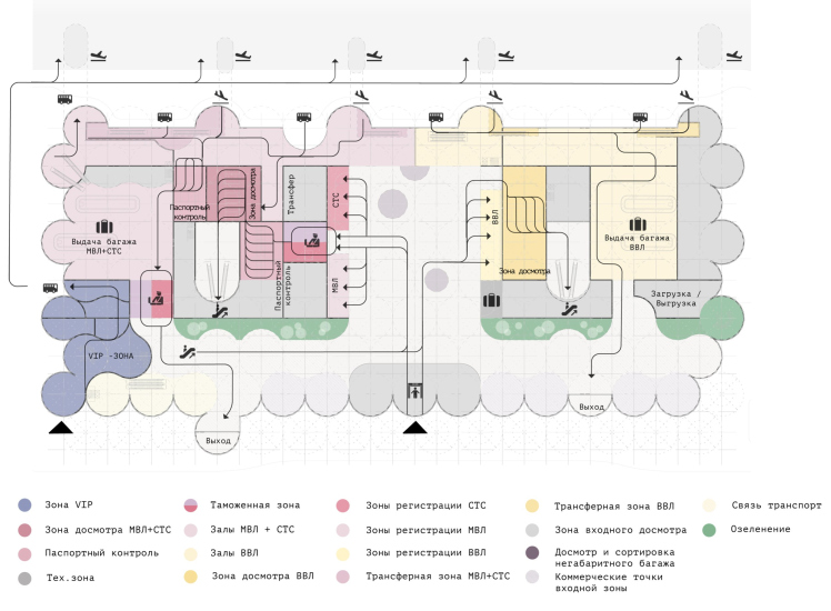
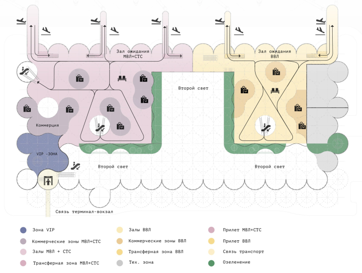
    The passenger flow of the 2nd floor. Omsk-Fedorovka Airport. Guardian of the southern borders
    Copyright: © KPLN


Inside, benches or green hillocks of buffer zones were planned around the supports. The architects also proposed a winter garden with live trees and geoplastics inside the interior. Different light messages could be projected onto the surface of the cones.

  • zooming
    Omsk-Fedorovka Airport. Guardian of the southern borders. The registration area
    Copyright: © KPLN
  • zooming
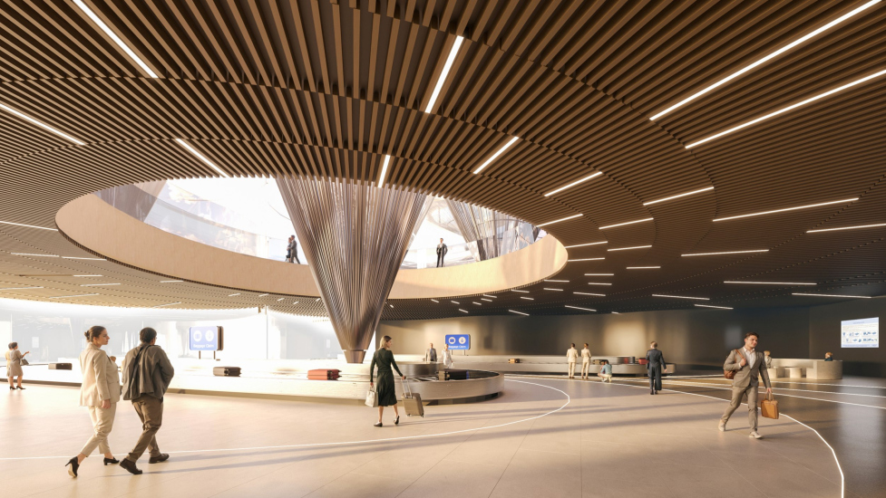
    Omsk-Fedorovka Airport. Guardian of the southern borders. The luggage claim hall
    Copyright: © KPLN


The cones penetrate even in the two-tiered parts of the space, along with natural light and spatial scenography.

This was supposed to create a strong sensation akin to a hypostyle hall filled with columns. The difference is that the classic historical hypostyle is usually dark, which also captivates the imagination, while this one is bright and is entirely strung on the floating strings. It would likely be an intriguing impression.

  • zooming
    Omsk-Fedorovka Airport. Guardian of the southern borders. View of the arrival/departure hall
    Copyright: © KPLN
  • zooming
    Omsk-Fedorovka Airport. Guardian of the southern borders. The registration area
    Copyright: © KPLN


Of course, this approach somewhat disrupts the usual notion that the more open the terminal hall, the better. But then again, on the other hand, the supports are point-like, the cones of the columns are high enough, and the emotional effect of the interior is entirely unexpected, although some resemblance to airports with their mushroom-shaped columns may be felt here.

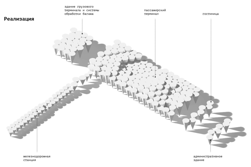
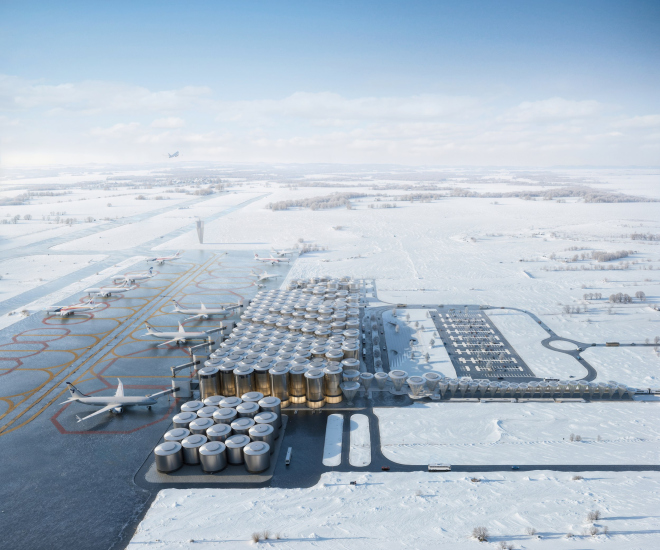
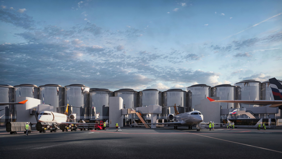
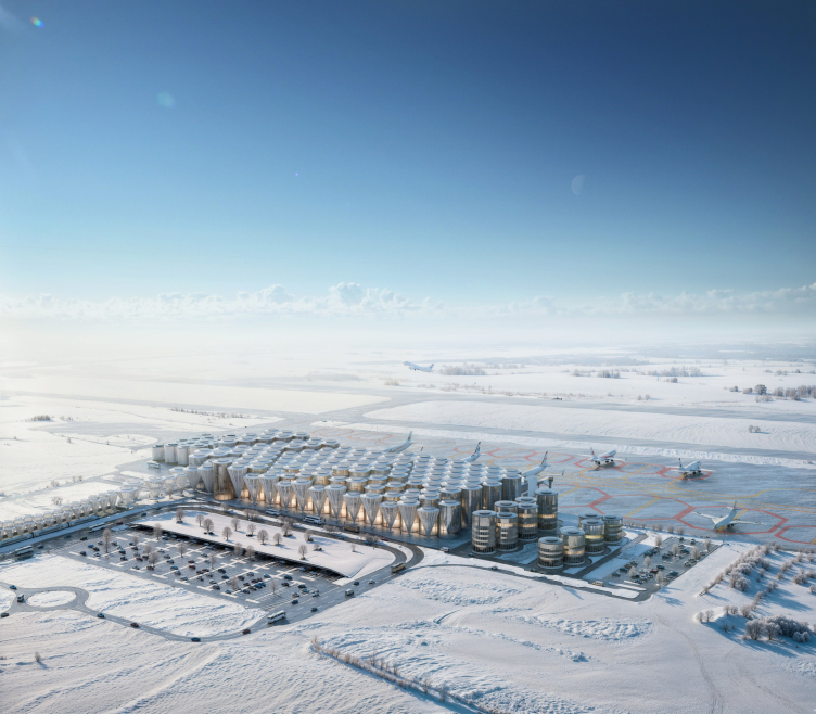
Cones are not the only modules for constructing volume and space here. In unison with them, albeit in the background where things by default must be less exposed, metal and glass cylinders are used for technical rooms and some other facilities. Their pitch is different but they are subject to the same module. From a birds-eye view, the airport would look astonishing: like an imposing conglomerate of buttons, or perhaps nails, submerged to varying depths, or perhaps like some kind of giant keyboard.

  • zooming
    Omsk-Fedorovka Airport. Guardian of the southern borders. General view from above from the apron
    Copyright: © KPLN
  • zooming
    Omsk-Fedorovka Airport. Guardian of the southern borders. SView of the building from the airfield
    Copyright: © KPLN


Omsk-Fedorovka Airport. Guardian of the southern borders. General view from the top from the side of the plaza
Copyright: © KPLN


The string of small cones covering the railway station is also intriguing. They are like mushrooms, larger at the main spot, and smaller on the periphery.

Cones and cylinders, all these “buttons” are the main sculptural gesture, but not the only architectural solution of the project. In particular, the architects propose a two-story terminal for saving space and streamlining passenger flows.

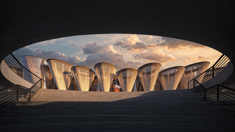
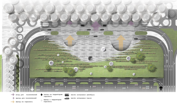
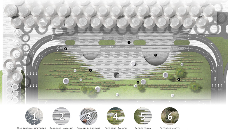
The plaza in front of the airport is made two-tiered: there is both parking and a landscaped area closer to the entrance to the airport. But its main feature is the “gaping holes”. The exits from the underground level, equipped with arc-shaped steps, look almost like natural caves. From them, there is an impressive view of the terminal cones, energetically belligerent. It looks like a true guardian of the country’s southern borders.

Omsk-Fedorovka Airport. Guardian of the southern borders
Copyright: © KPLN


The underground square in front of the entrance was also planned to be illuminated with round skylights, which, besides their practical function, also carried a conceptual load, resembling small buttons scattered outside the contour of the main lines and spots.

  • zooming
    1 / 6
    Omsk-Fedorovka Airport. Guardian of the southern borders. The location plan of the airport
    Copyright: © KPLN
  • zooming
    2 / 6
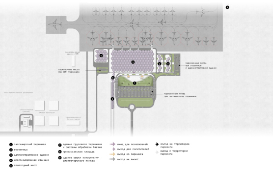
    Omsk-Fedorovka Airport. Guardian of the southern borders. The master plan
    Copyright: © KPLN
  • zooming
    3 / 6
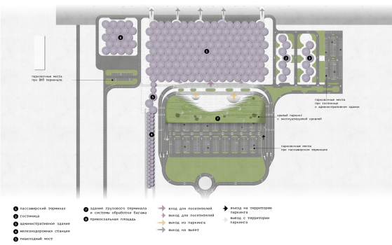
    Omsk-Fedorovka Airport. Guardian of the southern borders. The front plaza
    Copyright: © KPLN
  • zooming
    4 / 6
    Omsk-Fedorovka Airport. Guardian of the southern borders. The territory improvement
    Copyright: © KPLN
  • zooming
    5 / 6
    Omsk-Fedorovka Airport. Guardian of the southern borders. Section 2-2
    Copyright: © KPLN
  • zooming
    6 / 6
    Omsk-Fedorovka Airport. Guardian of the southern borders. Section 1-1
    Copyright: © KPLN


Bunch columns with support at one point are a common technique in modern architecture, but in this case, an explanation for the form has been found, and precisely the way it should be: historical, rooted in context, but completely unrecognizable literally. In other words, if the project were implemented – and we are reminding you at this point that it did not win the competition – if it were implemented, one can imagine the surprise of a tourist or a city guest, being told that these cones made of steel cables serve as a reminder of the old wooden turrets of the fortress walls.

Well, maybe they would have believed it, but not right away.

24 April 2024

Headlines now
Gold in the Sands
A new office for a transcontinental company specializing in resource extraction and processing has opened in Dubai. Designed by T+T Architects, masters of creating spaces that are contemporary, diverse, flexible, and original, this project exemplifies their expertise. On the executive floor, a massive brass-clad partition dominates, while layered textures of compressed earth create a contextually resonant backdrop.
Layers and Levels of Flight
This project goes way back – Reserve Union won this architectural competition at the end of 2011, and the building was completed in 2018, so it’s practically “archival”. However, despite being relatively unknown, the building can hardly be considered “dated” and remains a prime example of architectural expression, particularly in the headquarters genre. And it’s especially fitting for an aviation company office. In some ways, it resembles the Aeroflot headquarters at Sheremetyevo but with its own unique identity, following the signature style of Vladimir Plotkin. In this article, we take an in-depth look at the United Aircraft Corporation (UAC) headquarters in the Moscow agglomeration town of Zhukovsky, supplemented by recent photographs from Alexey Naroditsky – a shoot that became only recently possible due to the fact that improvements were finally made in the surrounding area.
Light and Shadow
In this article, we delve into the architectural design of the “Chaika” house by DNK ag architects, which was recently completed in 2023 as part of the collection of signature designs at ZILArt. As is well-known, all the buildings in this complex follow a design code, yet each one is distinct. This particular building stands out not only for its whiteness and minimalism but also for the refined use of a limited number of techniques that, together, create what can confidently be called synergy.
Casus Novae
A master plan was developed for a large residential area with a name of “DNS City”, but now that its implementation began, the plan has been arbitrarily reformatted and replaced with something that, while similar on the surface, is actually quite different. This is not the first time such a thing happens, but it’s always frustrating. With permission from the author, we are sharing Maria Elkina’s post.
Treasure Hunting
The GAFA bureau, in collaboration with Tegola and Arkhitail, organized an expedition to the island of Kilpola in Karelia as part of Moskomarkhitektura’s “Open City” festival. There, amidst moss and rocks, the students sought answers to questions like: what is the sacred, where does it dwell, and what sustains it? Assisting the participants in this quest were landscape engineer Evgeny Levin, artist Nicholas Roerich, a moose, and the lack of cellular connection. Here’s how the story unfolded.
Depths of the Earth, Streams of Water
In the Malaya Okhta district, the Akzent building, designed by Stepan Liphart, was constructed. It follows a classic tripartite structure, yet it’s what you might call “hand-drawn”: each façade is unique in its form and details, some of which aren’t immediately noticeable. In this article, we explore the context and, together with the architect, delve into how the form was developed.
Fir Tree Dynamics
The “Airports of Region” holding is planning to build an airport in Karachay-Cherkessia, aiming to make the Arkhyz and Dombay resorts more accessible to travelers. The project that won in an invitation-only competition, submitted by Sergey Nikeshkin’s KPLN, blends natural imagery inspired by the shape of a conifer seed, open-air waiting spaces, majestic large trees, and a green roof elevated on needle-like columns. The result is both nature-inspired and WOW.
​A Brick Shell
In the process of designing a clubhouse situated among pine trees in a prestigious suburban area near Moscow, the architectural firm “A.Len” did the façade design part. The combination of different types of brick and masonry correlates with the volumetric and plastique solutions, further enhanced by the inclusion of wood-painted fragments and metal “glazing”.
Word Forms
ATRIUM architects love ambitious challenges, and for the firm’s thirtieth anniversary, they boldly play a game of words with an exhibition that dives deep into a self-created vocabulary. They immerse their projects – especially art installations – into this glossary, as if plunging into a current of their own. You feel as if you’re flowing through the veins of pure art, immersed in a universe of vertical cities, educational spaces – of which the architects are true masters – and the cultural codes of various locations. But what truly captivates is the bold statement that Vera Butko and Anton Nadtochy make, both through their work and this exhibition: architecture, above all, is art – the art of working with form and space.
Flexibility and Acuteness of Modernity
Luxurious, fluid, large “kokoshniks” and spiral barrel columns, as if made from colorful chewing gum: there seem to be no other mansion like this in Moscow, designed in the “Neo-Russian-Modern” style. And the “Teremok” on Malaya Kaluzhskaya, previously somewhat obscure, has “come alive with new colors” and gained visibility after its restoration for the office of the “architectural ecosystem” as the architects love to call themselves. It’s evident that Julius Borisov and the architects at UNK put their hearts into finding this new office and bringing it up to date. Let’s delve into the paradoxes of this mansion’s history and its plasticity. Spoiler: two versions of modernity meet here, both balancing on the razor’s edge of “what’s current”.
Yuri Vissarionov: “A modular house does not belong to the land”
It belongs to space, or to the air... It turns out that 3D printing is more effective when combined with a modular approach: the house is built in a workshop and then adapted to the site, including on uneven terrain. Yuri Vissarionov shares his latest experience in designing tourist complexes, both in central Russia and in the south. These include houseboats, homes printed from lightweight concrete using a 3D printer, and, of course, frame houses.
​Moscow’s First
“The quality of education largely depends on the quality of the educational environment”. This principle of the last decade has been realized by Sergey Skuratov in the project for the First Moscow Gymnasium on Rostovskaya Embankment in the Khamovniki district. The building seamlessly integrates into the complex urban landscape, responding both to the pedestrian flow of the city and the quiet alleyways. It skillfully takes advantage of the height differences and aligns with modern trends in educational space design. Let’s take a closer look.
Looking at the Water
The site of Villa Sonata stretches from the road to the water’s edge, offering its own shoreline, pier, and a picturesque river panorama. To reveal these sweeping views, Roman Leonidov “cut” the façade diagonally parallel to the river, thus getting two main axes for the house and, consequently, “two heads”. The internal core – two double-height spaces, a living room and a conservatory, with a “bridge” above them – makes the house both “transparent” and filled with light.
The White Wing
Well, it’s not exactly white. It’s more of a beige, white-stone structure that plays with the color of limestone – smoother surfaces are lighter, while rougher ones are darker. This wing unites various elements: it absorbs and interprets the surrounding themes. It responds to everything, yet maintains a cohesive expression – a challenging task! – while also incorporating recognizable features of its own, such as the dynamic cuts at the bottom, top, and middle.
Urban Dunes
The XSA Ramps team designed and built a three-part sports hub for a park in Rostov-on-Don, welcoming people of all ages and fitness levels. The skate plaza, pump track, and playground are all meticulously crafted with details that attract a diverse range of visitors. The technical execution of the shapes and slopes transforms this space into a kind of sculptural composition.
Proportional Growth
The project for the fourth phase of the ÁLIA residential area has been announced. The buildings are situated on an elongated plot – almost a “ray” that shoots out from the center of the area towards the river. Their layout reflects both a response to Moscow’s architectural preferences over the past 15 years, shifting “from blocks to towers”, and an interpretation of the neighboring business park designed by SOM. Additionally, the best apartments here are not located at the very top but closer to the middle, forming a glowing “waistline”.
The “Staircase” Building
In designing the “Details” residential complex in New Moscow, Rais Baishev spiced up the now-popular Moscow theme of a “courtyard” building with an idea drawn from the surrealist drawings by Maurits Escher. He envisioned the stepped silhouettes and descending slopes as a metaphysical mega-staircase, creating a key void within the courtyard that gave the project an internal “spine”. This concept is felt both in the building’s silhouette and on its façades.
Projection of the Quarter
No one doubted that the building that Vladimir Plotkin designed as part of the “Garden Quarters” would be the most modernist of all. And it turned out just that way: while adhering to the common design code, the building successfully combines brick and white stone, rhythmically responding to the neighboring building designed by Ostozhenka, yet tactfully and persistently making a few statements of its own. This includes the projection of the ideal urban development composition “14–9–6”, which can be found right next door, mathematical calculations, including those for various types of terraces (and perhaps the only reminder of the Soviet past of the Kauchuk rubber factory!), and the white “cross-stitch” pattern of the façade grid.
Domus Aurea
In this issue, we examine the “Tessinsky-1” house, designed by Sergey Skuratov and completed in 2023. Located in the middle of the Serebryanicheskaya Embankment district, at the intersection of its main streets, this house assumes a sort of “nodal” role: it not only responds to everything around it and preserves many memories of the former EMA factory within itself, but it weaves all this into a newly directed pattern, reconciling bright “gold” and dark-colored brick, largely with the help of the new, modern-yet-archaic Columba brick, which, come to think about it, is the most precious element here.
The Chimney of Nikola-Lenivets
In this issue, we are examining the “Obelisk House” designed by KATARSIS and built for the Arkhstoyanie 2023 festival. However, it was only finished later on, and this is why we are examining it now. It seems to us that after the “Obelisk House” appeared in Nikola-Lenivets, a dialogue and a few inner connections appeared between the temporary structures built here. These houses no longer look like “accidental neighbors”, more of which below.
​Periscope by the Bay
The jury awarded the second place in the competition for a public and cultural center in Petropavlovsk-Kamchatsky to the companies GORA (“Mountain”) and M4. In the consortium’s proposal, the building resembles a sperm whale with a calf swimming next to it or a periscope, whose lenses capture the most spectacular views from the surrounding landscape.
From Arcs to Dolmens
While working on the competition project for Petropavlovsk-Kamchatsky, ASADOV Architects prioritized the value of the natural and urban environment, aiming to preserve the balance of the location while minimizing the resemblance of the volume that they designed to a “traditional building”. The task was challenging, and the architects created three versions, one of which having been developed after the competition, where their main proposal took third place. However, the point of interest here is not the competition result but the continuity of creative thinking.
Hide and Seek
The ID Moskovskiy house, designed by Stepan Liphart in St. Petersburg, in the courtyards near Moskovskiy Avenue beyond the Obvodny Canal and recently completed, is notable for several reasons. Firstly, it has been realized with considerable accuracy, which is particularly significant as this is the first building where the architect was responsible not only for the facades but also for the layouts, allowing for better integration between the two. On the other hand, this building is interesting as an example of the “germination” of new architecture in the city: it draws on the best examples from the neighborhood and becomes an improved and developed sum of ideas found by the architect in the surrounding context.
The Big Twelve
Yesterday, the winners of the Moscow Mayor’s Architecture Award were announced and honored. Let’s take a look at what was awarded and, in some cases, even critique this esteemed award. After all, there is always room for improvement, right?
Above the Golden Horn
The residential complex “Philosophy” designed by T+T architects in Vladivostok, is one of the new projects in the “Golubinaya Pad” area, changing its development philosophy (pun intended) from single houses to a comprehensive approach. The buildings are organized along public streets, varying in height and format, with one house even executed in gallery typology, featuring a cantilever leaning on an art object.
Nuanced Alternative
How can you rhyme a square and space? Easily! But to do so, you need to rhyme everything you can possibly think of: weave everything together, like in a tensegrity structure, and find your own optics too. The new exhibition at GES-2 does just that, offering its visitor a new perspective on the history of art spanning 150 years, infused with the hope for endless multiplicity of worlds and art histories. Read on to see how this is achieved and how the exhibition design by Evgeny Ace contributes to it.
Blinds for Ice
An ice arena has been constructed in Domodedovo based on a project by Yuri Vissarionov Architects. To prevent the long façade, a technical requirement for winter sports facilities, from appearing monotonous, the architects proposed the use of suspended structures with multidirectional slats. This design protects the ice from direct sunlight while giving the wall texture and detail.
Frozen Magma
A competition for the creation of a public and cultural center was held in Petropavlovsk-Kamchatsky. Three architectural companies made it to the final, and we consider it important to share about the work of each. Let’s start with the winner – the consortium led by Wowhaus.
Campus within a Day
In this article, we talk about what the participants of Genplan Institute of Moscow’s hackathon were doing at the MosComArchitecture booth at the “ArchMoscow” exhibition. We also discuss who won the prize and why, and what can be done with the territory of a small university on the outskirts of Moscow.
Vertical Civilization
Genpro considered the development of the vertical city concept and made it the theme of their pavilion at the “ArchMoscow” exhibition.