По-русски

The Snowstorm Fish

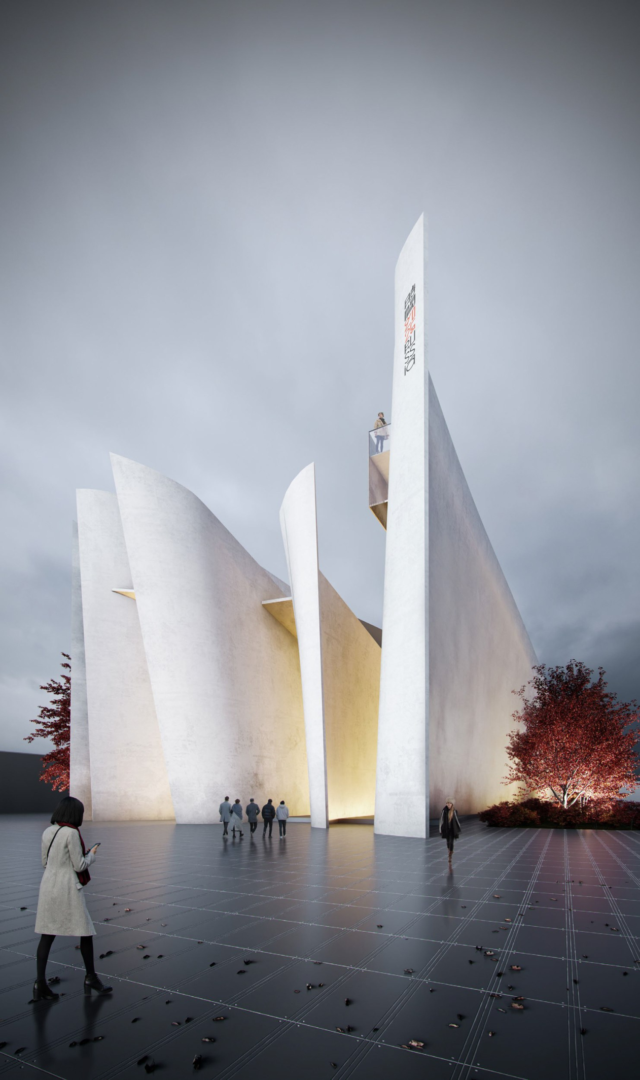
The next project from the unfinished competition for the Russian Pavilion at EXPO 2025, which will be held in Osaka, Japan, is by Dashi Namdakov and Parsec Architects. The pavilion describes itself as an “architectural/sculptural” one, with its shape clearly reminiscent of abstract sculpture of the 1970s. It complements its program with a meditative hall named “Mendeleev’s Dreams”, and offers its visitors to slide from its roof at the end of the tour.

17 April 2024
mainImg
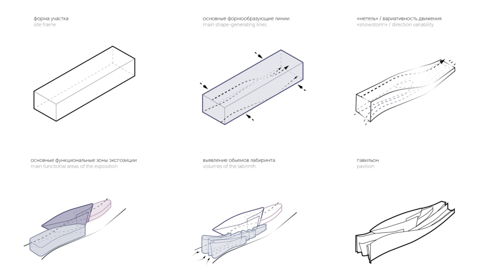
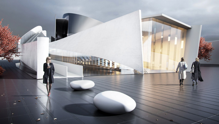
The architects at Parsec associate the form of their pavilion with a snowstorm, and the design of the sculptural entrance with its “antae” made of flexible light-colored walls can be traced back to the sculptures of minimalists from the 1970s.

The concept “Russian pavilion at EXPO 2025”.
Copyright: © PARSEC architects


This is not surprising, as the leader of the bureau, Dashi Namdakov, is primarily a sculptor, and Parsec’s architecture is mainly sculptural, built on flexible surfaces, as seen in the architecture of “Potapovo” metro station on Moscow’s Sokolnicheskaya Line. In this case, it’s interesting that the “sculptural” direction, known in architecture as “neo modernism” or “starchitecture”, is indeed closely related to a sculptor’s work, and there is indeed some historical truth in it.

This style is rightfully valued at EXPOs; the first thing that comes to mind is the UAE pavilion with its wings, designed by Santiago Calatrava, which we saw at EXPO 2022 in Dubai, and the Qatar pavilion, also designed by this architect. Grigory Revzin once said that “they don’t do this anymore in Europe” – but who cares? However, Parsec’s proposal resonates most of all with Norman Foster’s UAE Pavilion at the Milan EXPO 2015. There, too, flexible walls formed the path for the visitors to proceed to the core of the central hall.

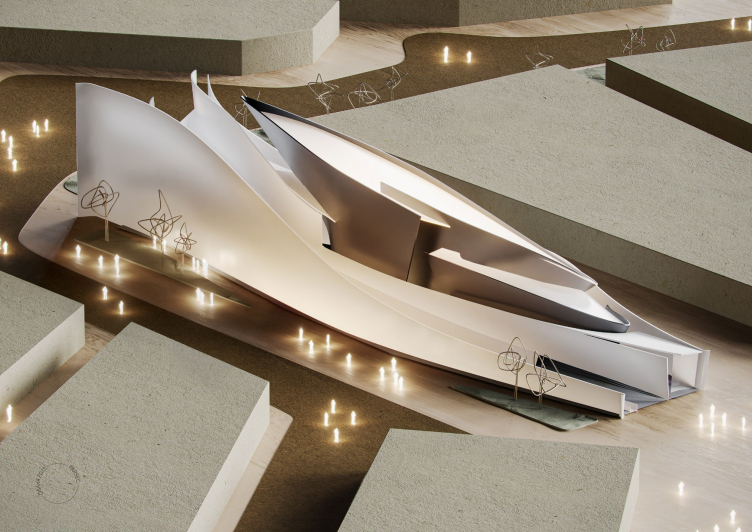
To me, Parsec’s pavilion looked like a fish.

More precisely, like a semi-abstract suspension in the shape of a fish, made by one of the artists of the Moscow Artists’ Union during the late Soviet era, which correlates well with references to 1970s sculpture.

The concept “Russian pavilion at EXPO 2025”.
Copyright: © PARSEC architects


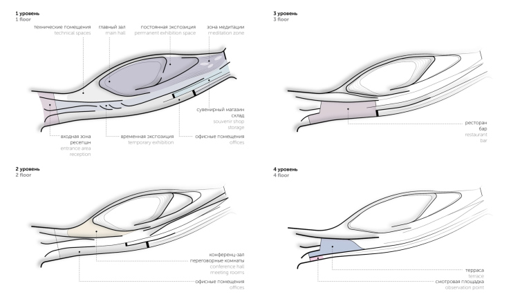
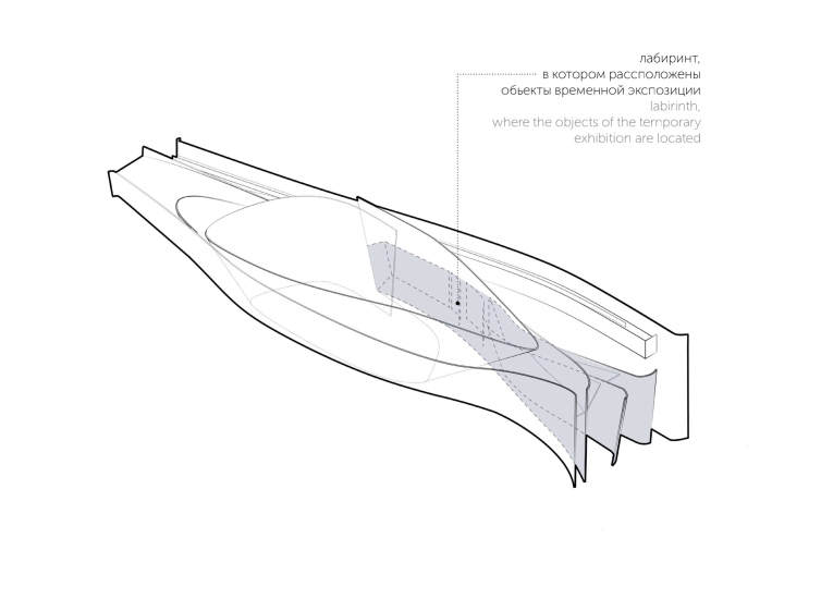
In the Parsec project, the visitors are not escorted out, but greeted by the hall hosting temporary exhibitions – a kind of corridor symbolizing the life path of a human being. The walls, both solid and incrementally divided, block three narrow passages on the right, not winding but undulating, while on the left, the path is straight and slightly wider. Here you cannot help but recall Jesus Christ’s words about the broad and narrow paths; in some monasteries, by the way, the wide path through the gate is deliberately closed so that the pilgrim (or in our case, the visitor) enters by the narrow path of the righteous.

But then again, however, in this case, the choice depends not on the unwillingness to squeeze through the small door, but on the interest in the exhibition – you will definitely learn more by taking “the narrow path”.

The concept “Russian pavilion at EXPO 2025”. The functional layout
Copyright: © PARSEC architects


  • zooming
    The concept “Russian pavilion at EXPO 2025”. The entrance group
    Copyright: © PARSEC architects
  • zooming
    The concept “Russian pavilion at EXPO 2025”. The form making
    Copyright: © PARSEC architects


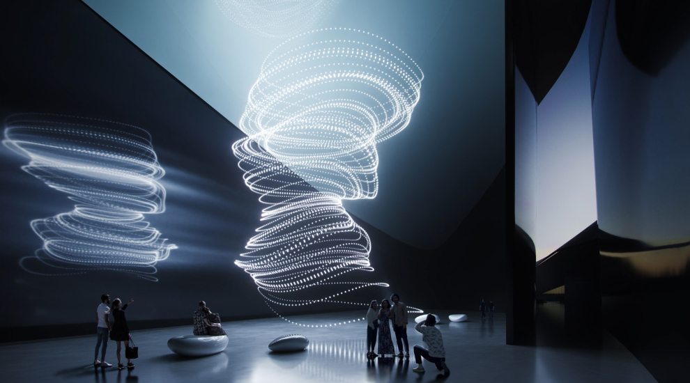
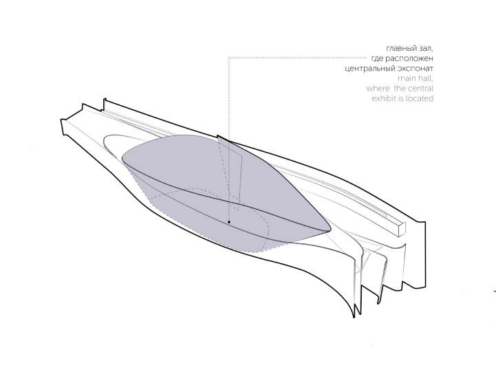
Next, we enter the main hall, whose plan resembles a fish’s swim bladder. According to the program, this main hall should host the Tree of Time. For Parsec, it turned out to be abstract and media-oriented – no literalism, just a light sculptural whirlwind. One can imagine that here lies a metaphorical “nuclear reactor”, generating all the sculptural whirls of the pavilion.

  • zooming
    The concept “Russian pavilion at EXPO 2025”.
    Copyright: © PARSEC architects
  • zooming
    The concept “Russian pavilion at EXPO 2025”. The central hall
    Copyright: © PARSEC architects


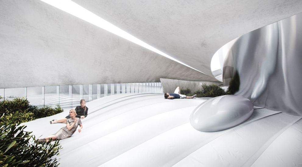
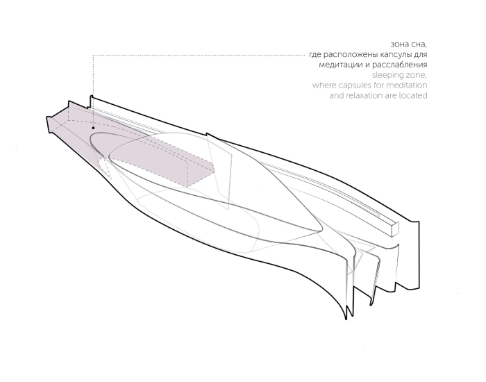
There is an intriguing detail, not related to the competition brief in any way – a large relaxation hall at the end of the pavilion. The architects call it “Mendeleev’s Dreams Hall” – I’ll remind you that the scientist saw his table of elements in a dream (or so we are told) – and the architects speak about the importance of sleep for the transition from short-term to long-term memory – in short, they suggest that we should take a rest here.

  • zooming
    The concept “Russian pavilion at EXPO 2025”.
    Copyright: © PARSEC architects
  • zooming
    The concept “Russian pavilion at EXPO 2025”. The meditation zone
    Copyright: © PARSEC architects


In the project by Reserve Union, such a relaxation area was the connecting interior space of the amphitheaters, and in the ASADOV Architects project it was a terrace on the roof. But what’s interesting here is that they’re not just talking about rest, but even say that we can actually take a nap here. Indeed, at trade shows and exhibitions, you sometimes do feel like curling up somewhere and grabbing some shuteye.

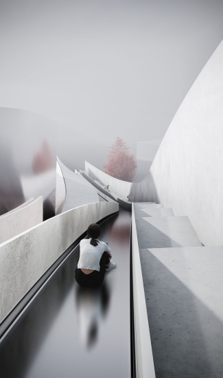
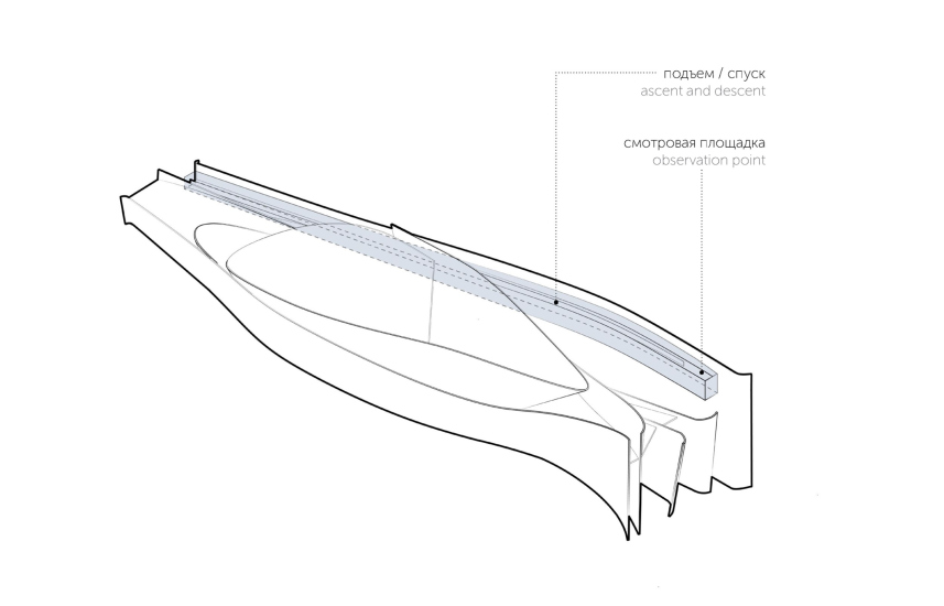
Finally, to conclude the exposition for, I assume, well-rested people, there’s a ramp leading up to the terrace at the top. From there, according to the architects’ proposal, one could slide down a slide. It brings to mind the Luxembourg Pavilion Metaform in Dubai 2020, only there the slide was winding and enclosed, while here it’s open and gently sloping – like the Russian soul, evidently. What’s even more impressive here is the architects’ comment: “...this unexpected accent will allow the visitors heading to other pavilions to unwind and tune into the wave of joy, lightness, and pleasure so rarely associated with Russia”.

  • zooming
    The concept “Russian pavilion at EXPO 2025”.
    Copyright: © PARSEC architects
  • zooming
    The concept “Russian pavilion at EXPO 2025”. Ascent / descent
    Copyright: © PARSEC architects


The project is attractive with its flexible lines, respect for human fatigue, and somewhat meditative attitude towards space. Although, to be honest, judging from the images shown, it’s difficult to say how, for example, the narrow entrance corridor would be perceived. And at the far end, the “tail” (or mouth?) of the “fish” is not as impressive as at the entrance, speaking more about deconstruction than sculpture.

The concept “Russian pavilion at EXPO 2025”.
Copyright: © PARSEC architects


17 April 2024

Headlines now
Gold in the Sands
A new office for a transcontinental company specializing in resource extraction and processing has opened in Dubai. Designed by T+T Architects, masters of creating spaces that are contemporary, diverse, flexible, and original, this project exemplifies their expertise. On the executive floor, a massive brass-clad partition dominates, while layered textures of compressed earth create a contextually resonant backdrop.
Layers and Levels of Flight
This project goes way back – Reserve Union won this architectural competition at the end of 2011, and the building was completed in 2018, so it’s practically “archival”. However, despite being relatively unknown, the building can hardly be considered “dated” and remains a prime example of architectural expression, particularly in the headquarters genre. And it’s especially fitting for an aviation company office. In some ways, it resembles the Aeroflot headquarters at Sheremetyevo but with its own unique identity, following the signature style of Vladimir Plotkin. In this article, we take an in-depth look at the United Aircraft Corporation (UAC) headquarters in the Moscow agglomeration town of Zhukovsky, supplemented by recent photographs from Alexey Naroditsky – a shoot that became only recently possible due to the fact that improvements were finally made in the surrounding area.
Light and Shadow
In this article, we delve into the architectural design of the “Chaika” house by DNK ag architects, which was recently completed in 2023 as part of the collection of signature designs at ZILArt. As is well-known, all the buildings in this complex follow a design code, yet each one is distinct. This particular building stands out not only for its whiteness and minimalism but also for the refined use of a limited number of techniques that, together, create what can confidently be called synergy.
Casus Novae
A master plan was developed for a large residential area with a name of “DNS City”, but now that its implementation began, the plan has been arbitrarily reformatted and replaced with something that, while similar on the surface, is actually quite different. This is not the first time such a thing happens, but it’s always frustrating. With permission from the author, we are sharing Maria Elkina’s post.
Treasure Hunting
The GAFA bureau, in collaboration with Tegola and Arkhitail, organized an expedition to the island of Kilpola in Karelia as part of Moskomarkhitektura’s “Open City” festival. There, amidst moss and rocks, the students sought answers to questions like: what is the sacred, where does it dwell, and what sustains it? Assisting the participants in this quest were landscape engineer Evgeny Levin, artist Nicholas Roerich, a moose, and the lack of cellular connection. Here’s how the story unfolded.
Depths of the Earth, Streams of Water
In the Malaya Okhta district, the Akzent building, designed by Stepan Liphart, was constructed. It follows a classic tripartite structure, yet it’s what you might call “hand-drawn”: each façade is unique in its form and details, some of which aren’t immediately noticeable. In this article, we explore the context and, together with the architect, delve into how the form was developed.
Fir Tree Dynamics
The “Airports of Region” holding is planning to build an airport in Karachay-Cherkessia, aiming to make the Arkhyz and Dombay resorts more accessible to travelers. The project that won in an invitation-only competition, submitted by Sergey Nikeshkin’s KPLN, blends natural imagery inspired by the shape of a conifer seed, open-air waiting spaces, majestic large trees, and a green roof elevated on needle-like columns. The result is both nature-inspired and WOW.
​A Brick Shell
In the process of designing a clubhouse situated among pine trees in a prestigious suburban area near Moscow, the architectural firm “A.Len” did the façade design part. The combination of different types of brick and masonry correlates with the volumetric and plastique solutions, further enhanced by the inclusion of wood-painted fragments and metal “glazing”.
Word Forms
ATRIUM architects love ambitious challenges, and for the firm’s thirtieth anniversary, they boldly play a game of words with an exhibition that dives deep into a self-created vocabulary. They immerse their projects – especially art installations – into this glossary, as if plunging into a current of their own. You feel as if you’re flowing through the veins of pure art, immersed in a universe of vertical cities, educational spaces – of which the architects are true masters – and the cultural codes of various locations. But what truly captivates is the bold statement that Vera Butko and Anton Nadtochy make, both through their work and this exhibition: architecture, above all, is art – the art of working with form and space.
Flexibility and Acuteness of Modernity
Luxurious, fluid, large “kokoshniks” and spiral barrel columns, as if made from colorful chewing gum: there seem to be no other mansion like this in Moscow, designed in the “Neo-Russian-Modern” style. And the “Teremok” on Malaya Kaluzhskaya, previously somewhat obscure, has “come alive with new colors” and gained visibility after its restoration for the office of the “architectural ecosystem” as the architects love to call themselves. It’s evident that Julius Borisov and the architects at UNK put their hearts into finding this new office and bringing it up to date. Let’s delve into the paradoxes of this mansion’s history and its plasticity. Spoiler: two versions of modernity meet here, both balancing on the razor’s edge of “what’s current”.
Yuri Vissarionov: “A modular house does not belong to the land”
It belongs to space, or to the air... It turns out that 3D printing is more effective when combined with a modular approach: the house is built in a workshop and then adapted to the site, including on uneven terrain. Yuri Vissarionov shares his latest experience in designing tourist complexes, both in central Russia and in the south. These include houseboats, homes printed from lightweight concrete using a 3D printer, and, of course, frame houses.
​Moscow’s First
“The quality of education largely depends on the quality of the educational environment”. This principle of the last decade has been realized by Sergey Skuratov in the project for the First Moscow Gymnasium on Rostovskaya Embankment in the Khamovniki district. The building seamlessly integrates into the complex urban landscape, responding both to the pedestrian flow of the city and the quiet alleyways. It skillfully takes advantage of the height differences and aligns with modern trends in educational space design. Let’s take a closer look.
Looking at the Water
The site of Villa Sonata stretches from the road to the water’s edge, offering its own shoreline, pier, and a picturesque river panorama. To reveal these sweeping views, Roman Leonidov “cut” the façade diagonally parallel to the river, thus getting two main axes for the house and, consequently, “two heads”. The internal core – two double-height spaces, a living room and a conservatory, with a “bridge” above them – makes the house both “transparent” and filled with light.
The White Wing
Well, it’s not exactly white. It’s more of a beige, white-stone structure that plays with the color of limestone – smoother surfaces are lighter, while rougher ones are darker. This wing unites various elements: it absorbs and interprets the surrounding themes. It responds to everything, yet maintains a cohesive expression – a challenging task! – while also incorporating recognizable features of its own, such as the dynamic cuts at the bottom, top, and middle.
Urban Dunes
The XSA Ramps team designed and built a three-part sports hub for a park in Rostov-on-Don, welcoming people of all ages and fitness levels. The skate plaza, pump track, and playground are all meticulously crafted with details that attract a diverse range of visitors. The technical execution of the shapes and slopes transforms this space into a kind of sculptural composition.
Proportional Growth
The project for the fourth phase of the ÁLIA residential area has been announced. The buildings are situated on an elongated plot – almost a “ray” that shoots out from the center of the area towards the river. Their layout reflects both a response to Moscow’s architectural preferences over the past 15 years, shifting “from blocks to towers”, and an interpretation of the neighboring business park designed by SOM. Additionally, the best apartments here are not located at the very top but closer to the middle, forming a glowing “waistline”.
The “Staircase” Building
In designing the “Details” residential complex in New Moscow, Rais Baishev spiced up the now-popular Moscow theme of a “courtyard” building with an idea drawn from the surrealist drawings by Maurits Escher. He envisioned the stepped silhouettes and descending slopes as a metaphysical mega-staircase, creating a key void within the courtyard that gave the project an internal “spine”. This concept is felt both in the building’s silhouette and on its façades.
Projection of the Quarter
No one doubted that the building that Vladimir Plotkin designed as part of the “Garden Quarters” would be the most modernist of all. And it turned out just that way: while adhering to the common design code, the building successfully combines brick and white stone, rhythmically responding to the neighboring building designed by Ostozhenka, yet tactfully and persistently making a few statements of its own. This includes the projection of the ideal urban development composition “14–9–6”, which can be found right next door, mathematical calculations, including those for various types of terraces (and perhaps the only reminder of the Soviet past of the Kauchuk rubber factory!), and the white “cross-stitch” pattern of the façade grid.
Domus Aurea
In this issue, we examine the “Tessinsky-1” house, designed by Sergey Skuratov and completed in 2023. Located in the middle of the Serebryanicheskaya Embankment district, at the intersection of its main streets, this house assumes a sort of “nodal” role: it not only responds to everything around it and preserves many memories of the former EMA factory within itself, but it weaves all this into a newly directed pattern, reconciling bright “gold” and dark-colored brick, largely with the help of the new, modern-yet-archaic Columba brick, which, come to think about it, is the most precious element here.
The Chimney of Nikola-Lenivets
In this issue, we are examining the “Obelisk House” designed by KATARSIS and built for the Arkhstoyanie 2023 festival. However, it was only finished later on, and this is why we are examining it now. It seems to us that after the “Obelisk House” appeared in Nikola-Lenivets, a dialogue and a few inner connections appeared between the temporary structures built here. These houses no longer look like “accidental neighbors”, more of which below.
​Periscope by the Bay
The jury awarded the second place in the competition for a public and cultural center in Petropavlovsk-Kamchatsky to the companies GORA (“Mountain”) and M4. In the consortium’s proposal, the building resembles a sperm whale with a calf swimming next to it or a periscope, whose lenses capture the most spectacular views from the surrounding landscape.
From Arcs to Dolmens
While working on the competition project for Petropavlovsk-Kamchatsky, ASADOV Architects prioritized the value of the natural and urban environment, aiming to preserve the balance of the location while minimizing the resemblance of the volume that they designed to a “traditional building”. The task was challenging, and the architects created three versions, one of which having been developed after the competition, where their main proposal took third place. However, the point of interest here is not the competition result but the continuity of creative thinking.
Hide and Seek
The ID Moskovskiy house, designed by Stepan Liphart in St. Petersburg, in the courtyards near Moskovskiy Avenue beyond the Obvodny Canal and recently completed, is notable for several reasons. Firstly, it has been realized with considerable accuracy, which is particularly significant as this is the first building where the architect was responsible not only for the facades but also for the layouts, allowing for better integration between the two. On the other hand, this building is interesting as an example of the “germination” of new architecture in the city: it draws on the best examples from the neighborhood and becomes an improved and developed sum of ideas found by the architect in the surrounding context.
The Big Twelve
Yesterday, the winners of the Moscow Mayor’s Architecture Award were announced and honored. Let’s take a look at what was awarded and, in some cases, even critique this esteemed award. After all, there is always room for improvement, right?
Above the Golden Horn
The residential complex “Philosophy” designed by T+T architects in Vladivostok, is one of the new projects in the “Golubinaya Pad” area, changing its development philosophy (pun intended) from single houses to a comprehensive approach. The buildings are organized along public streets, varying in height and format, with one house even executed in gallery typology, featuring a cantilever leaning on an art object.
Nuanced Alternative
How can you rhyme a square and space? Easily! But to do so, you need to rhyme everything you can possibly think of: weave everything together, like in a tensegrity structure, and find your own optics too. The new exhibition at GES-2 does just that, offering its visitor a new perspective on the history of art spanning 150 years, infused with the hope for endless multiplicity of worlds and art histories. Read on to see how this is achieved and how the exhibition design by Evgeny Ace contributes to it.
Blinds for Ice
An ice arena has been constructed in Domodedovo based on a project by Yuri Vissarionov Architects. To prevent the long façade, a technical requirement for winter sports facilities, from appearing monotonous, the architects proposed the use of suspended structures with multidirectional slats. This design protects the ice from direct sunlight while giving the wall texture and detail.
Frozen Magma
A competition for the creation of a public and cultural center was held in Petropavlovsk-Kamchatsky. Three architectural companies made it to the final, and we consider it important to share about the work of each. Let’s start with the winner – the consortium led by Wowhaus.
Campus within a Day
In this article, we talk about what the participants of Genplan Institute of Moscow’s hackathon were doing at the MosComArchitecture booth at the “ArchMoscow” exhibition. We also discuss who won the prize and why, and what can be done with the territory of a small university on the outskirts of Moscow.
Vertical Civilization
Genpro considered the development of the vertical city concept and made it the theme of their pavilion at the “ArchMoscow” exhibition.