По-русски

Feed ’Em All

A “House of Russian Cuisine” was designed and built by KROST Group at VDNKh for the “Rossiya” exhibition in record-breaking time. The pavilion is masterfully constructed in terms of the standards of modern public catering industry multiplied by the bustling cultural program of the exhibition, and it interprets the stylistically diverse character of VDNKh just as successfully. At the same time, much of its interior design can be traced back to the prototypes of the 1960s – so much so that even scenes from iconic Soviet movies of those years persistently come to mind.

19 February 2024
Object
mainImg


Currently, VDNKh is hosting the “Rossiya” exhibition and forum. This exhibition opened in early November, will end in April, and it is just enormous. Several new large pavilions appeared on the territory of VDNKh, some of them being probably temporary; in addition, the exhibition also occupied a few of the existing pavilions, and a grand scale permanent facility, the ATOM pavilion, was built specifically for the purpose. The exhibition demonstrates the achievements of the national economy loudly and brightly, sometimes even in a fair-like fashion – which is very much in the spirit of VDNKh of the past years – but with an emphasis on new technologies and media. Everything is shining, sparkling and shimmering. There are a lot of visitors on the grounds – they come in groups and individually.

And you need to feed them all.

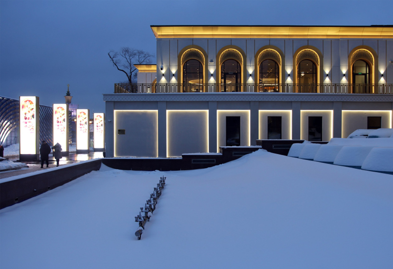
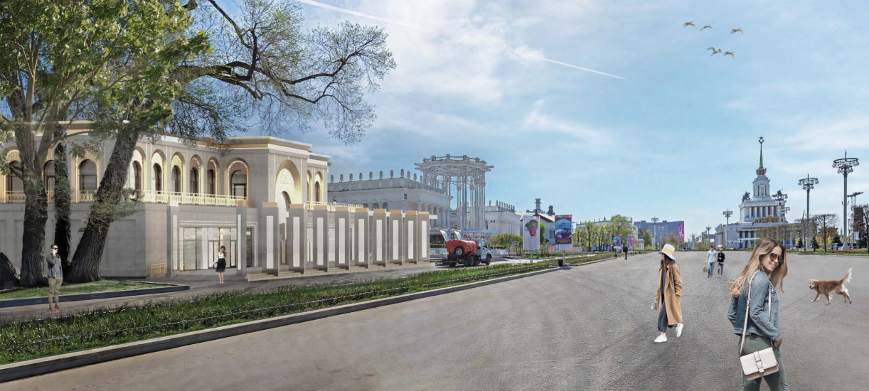
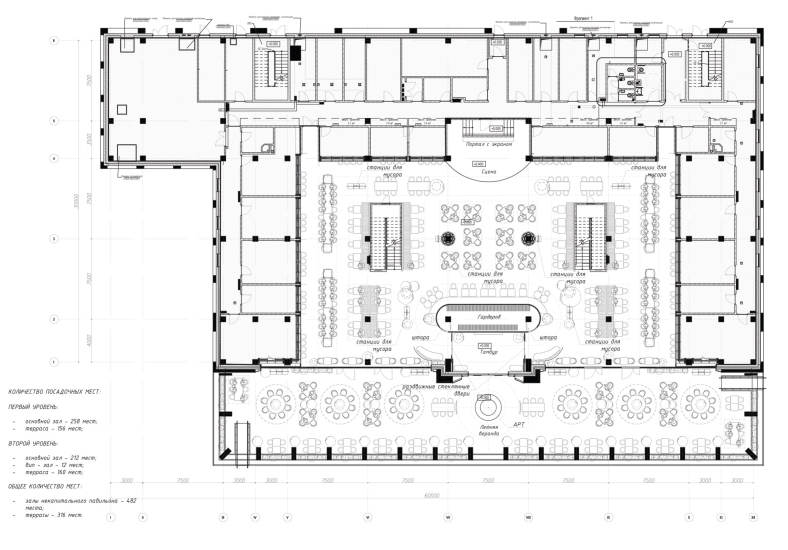
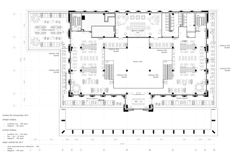
Commissioned by the Moscow government, KROST Group built a pavilion – a food court – for the opening of the exhibition. It is called “House of Russian Cuisine”, is located in the middle of the central avenue, and is designed to serve almost 800 visitors at a time (482 + 316 on the terrace). The pavilion was built and designed in record-breaking time – within 5 months from June to October, with all the stuffing, decor, and occupancy. Well, and one more figure – the authors of the project produced 300 sheets of working documentation within one month.

  • zooming
    House of Russian Cuisine: the building,
    Copyright: Photograph © Julia Tarabarina, Archi.ru
  • zooming
    House of Russian Cuisine: building / project
    Copyright: © A-Project.K


  • zooming
    House of Russian Cuisine: interior
    Copyright: © A-Project.K
  • zooming
    Copyright: © DBA-GROUP


  • zooming
    House of Russian Cuisine: interior / project
    Copyright: © DBA-GROUP
  • zooming
    Plan of the 2 floor. House of Russian Cuisine: interior / project
    Copyright: © DBA-GROUP


Perhaps, only KROST Group is capable of such a feat, having previously shown records of high-speed design and construction in Zaryadye Park, and also having realized Sergey Kuznetsov’s pipe house in Nikola-Lenivets with its complicated cantilever – quickly, in full, and meeting all the deadlines.

“Thanks to the development of the industrial and construction complex of Russia, today we have a unique opportunity to continue the traditions of the great architects of the USSR, complementing the architectural ensemble of such iconic places of our country as VDNKh – says Alexey Dobashin, General Director of KROST Group – it is a great professional honor to work on such projects. Our whole big team – builders who worked day and night at the construction site, factory workers who produced industrial products, and, of course, architects and designers – are eternally grateful for the trust placed in us”.

The “House of Russian Cuisine” was in fact designed by two architectural companies: A-Project.K, a subsidiary of KROST, was responsible for the building itself, while the interior was designed by DBA-GROUP architects led by Vladislav Andreev, who are confident professionals in the field of public interiors, including cafes and restaurants. In particular, this company worked for the chain “Chaikhana №1” owned by Vasilchuk Brothers, whose company Restart Vasilchuk Brothers was engaged in functional filling of the new food court on the central avenue.

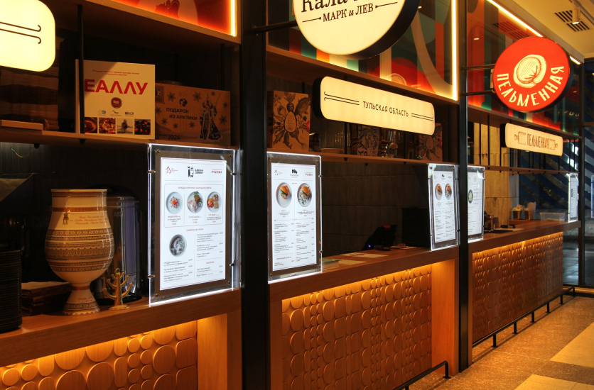
DBA-GROUP also worked on the interior of the first “restomarket” at VDNKh, in the building designed by Arseniy Leonovich. “House of Russian Cuisine” is the next step on the way to the development of the gastronomic part of the exhibition. It is somewhat larger, two-tiered, and now it purposefully collects local cuisines from different parts of Russia, be it Tatarstan, Yakutia or, let’s say, Tula.

  • zooming
    House of Russian Cuisine: interior
    Copyright: Photograph © Julia Tarabarina, Archi.ru
  • zooming
    House of Russian Cuisine: interior
    Copyright: Photograph © Julia Tarabarina, Archi.ru


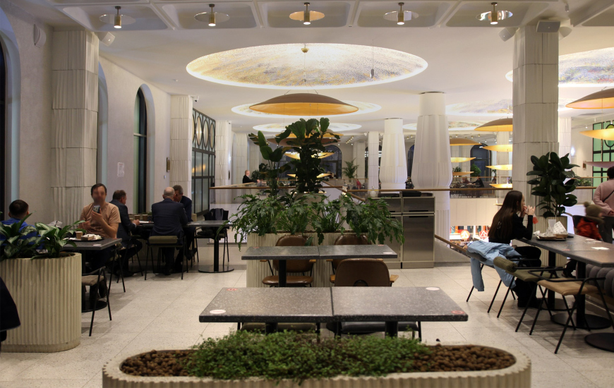
In some ways, it reminds us of the WORLD EXPO exhibitions – on a much smaller scale, of course, but nevertheless, national cuisines are often offered there too. In addition to the collection of local cuisines on the first floor, a stage is set up in the center, where presentations of different cultures and places are going on almost non-stop, usually to the accompaniment of national music, which feels pretty noisy, but at the same time quite interesting and fun.

One would expect that the design of such a gastronomic event, combining a meal with a cultural and educational program, would be like Topuridze/Konstantinovsky’s “Friendship of Peoples” fountain – with symbols of Russian cities or regions. But no – contrary to our expectations, the architects were asked to pay tribute to the modernist side of VDNKh. And the architects set themselves a goal of getting into the historical context of the neighboring buildings, all of which are cultural heritage sites.

We saw our task as twofold: first, we had to create a versatile space that would work regardless of the change of occupancy after the exhibition is over – or simply work as needed. Second, we wanted the interior not to be similar to other food courts, whose imagery and typology is very predictable. We wanted the pavilion to make a different impression, to be different, to feel that it belonged to VDNKh as a unique place in many respects. And finally, we did not want to compete with the masters of the old VDNKh pavilions. We tried to respond, but by no means “outshout” them – first of all, of course, the Uzbekistan pavilion located nearby.


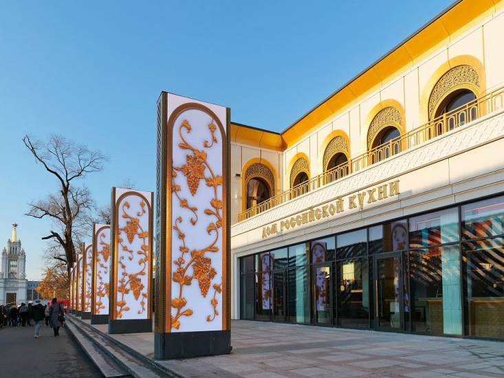
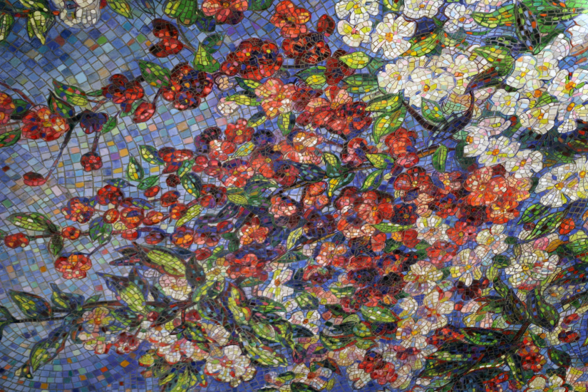
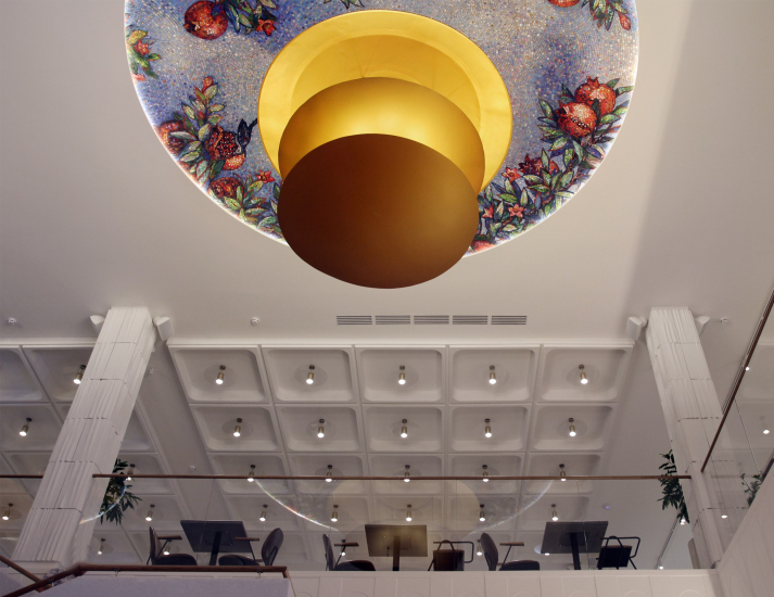
Ultimately, including the results of all the changes that took place in the course of implementation for objective and subjective reasons, the result turned out to be quite interesting. The pavilion responds to the eclecticism of VDNKh as a whole, with ornaments and arches outside, cheerful grapes on the pylons that flank the avenue, and just as cheerful mosaics in the plafonds inside.

  • zooming
    House of Russian Cuisine at VDNKh: the building
    Copyright: Photograph: provided by A-Project.K
  • zooming
    House of Russian Cuisine: fragment of the plafond in the central part
    Copyright: Photograph © Julia Tarabarina, Archi.ru


However, the deeper we delve into the interior, the more we feel the fulfillment of the very “order for modernism”, the imagery of Soviet cafes of the 1960s – exactly the way we know them from cult Soviet films of that era. One thing is strung on top of another, and they coexist in a friendly way.

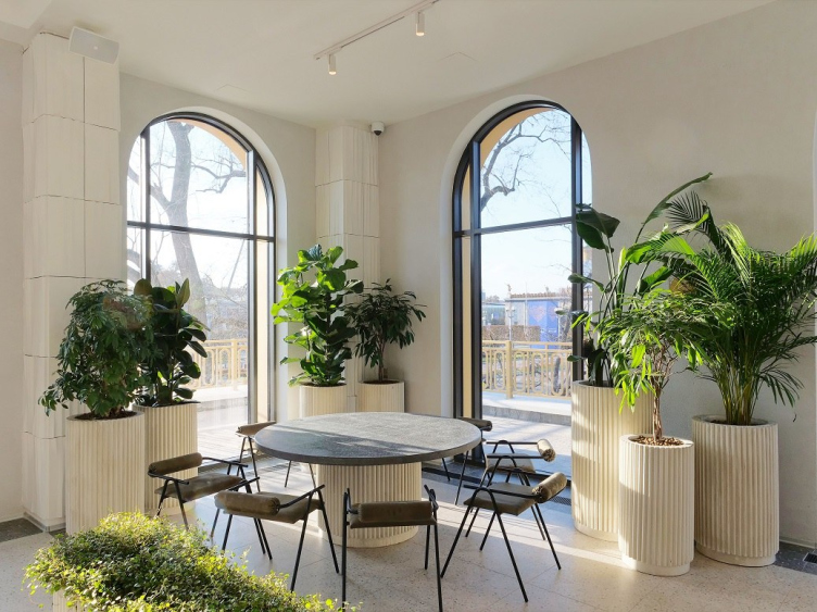
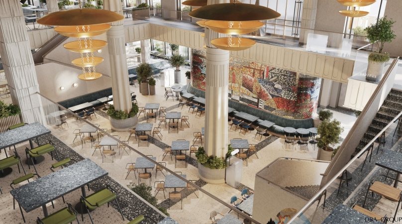
Here I would like to start from the farthest corners of the second tier, where round tables for large companies are nestled, each surrounded by a rather impressive “winter garden” of mature tropical plants in tubs.

House of Russian Cuisine: interior the corner part
Copyright: Photograph: provided by A-Project.K


  • zooming
    House of Russian Cuisine: interior
    Copyright: Photograph © Julia Tarabarina, Archi.ru
  • zooming
    House of Russian Cuisine: interior
    Copyright: Photograph © Julia Tarabarina, Archi.ru


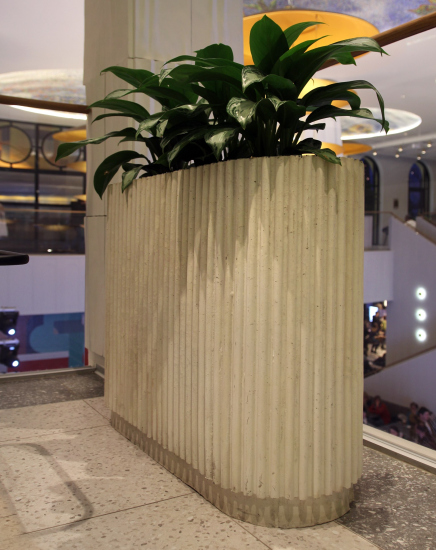
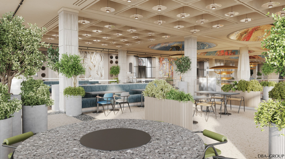
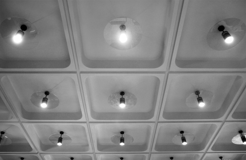
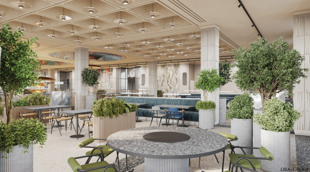
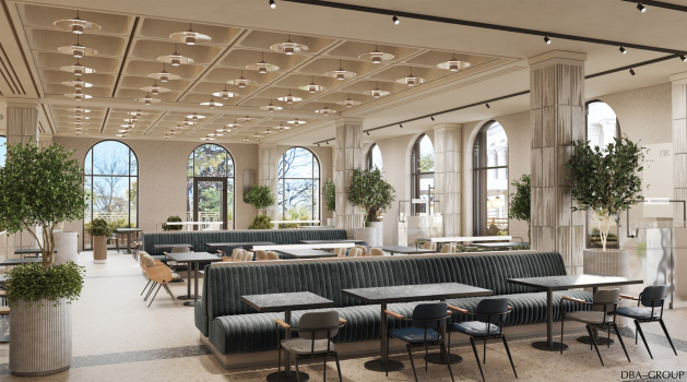
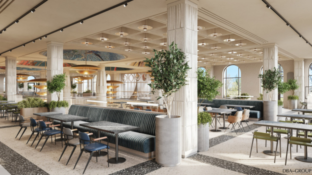
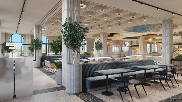
In the same style of the sixties, chairs designed by DBA-GROUP, rectangular columns with stepped and wavy textures (which prevail in the periphery of the space), and especially – the ceiling of the second tier, made of characteristic rectangular “tubs” with lamps in the center – very similar ones can be seen, for example, in the TASS building on Nikitsky Boulevard.

  • zooming
    House of Russian Cuisine: interior / project
    Copyright: © DBA-GROUP
  • zooming
    House of Russian Cuisine: interior
    Copyright: Photograph © Julia Tarabarina, Archi.ru


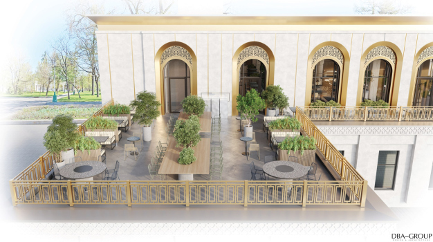
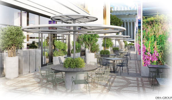
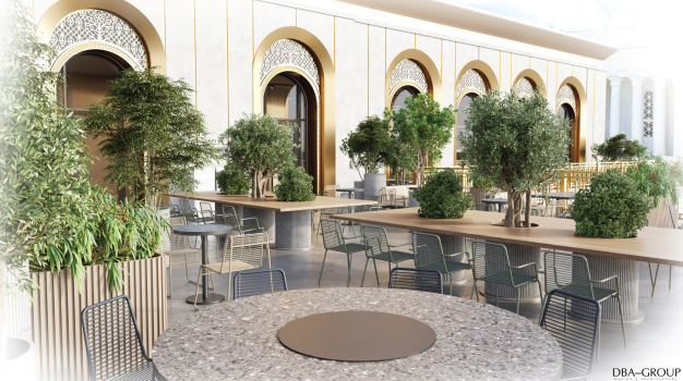
The top level is green and a bit quieter than the bottom level – you can stroll around looking down from the balcony, and the live plants and terrazzos used for the floors, tables and plant tubs somehow make the whole place look very fresh. Add to that the fact that from the second tier you can go out onto the terrace in the summer – it’s definitely nice there. And the effect of stylization of the sixties is quite tangible, as if we were in a feature film of those years – already a color one, but not yet very bright.

  • zooming
    1 / 7
    House of Russian Cuisine: interior / project
    Copyright: © DBA-GROUP
  • zooming
    2 / 7
    House of Russian Cuisine: interior / project
    Copyright: © DBA-GROUP
  • zooming
    3 / 7
    House of Russian Cuisine: interior / project
    Copyright: © DBA-GROUP
  • zooming
    4 / 7
    House of Russian Cuisine: interior / project
    Copyright: © DBA-GROUP
  • zooming
    5 / 7
    House of Russian Cuisine: interior / project
    Copyright: © DBA-GROUP
  • zooming
    6 / 7
    House of Russian Cuisine: interior / project
    Copyright: © DBA-GROUP
  • zooming
    7 / 7
    House of Russian Cuisine: interior / project
    Copyright: © DBA-GROUP


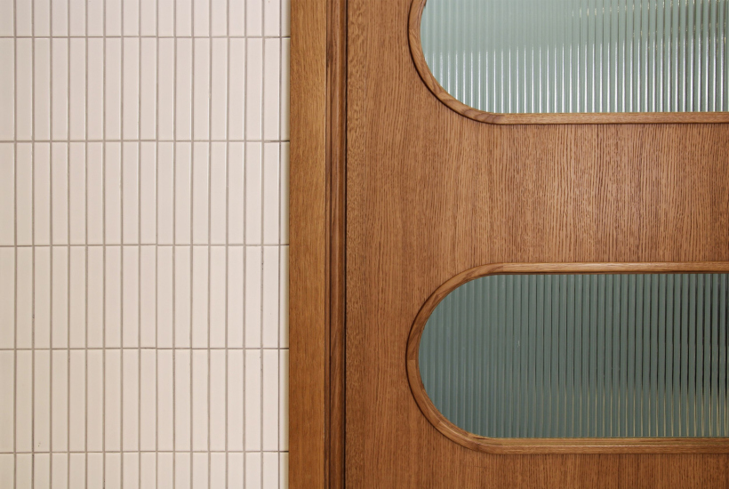
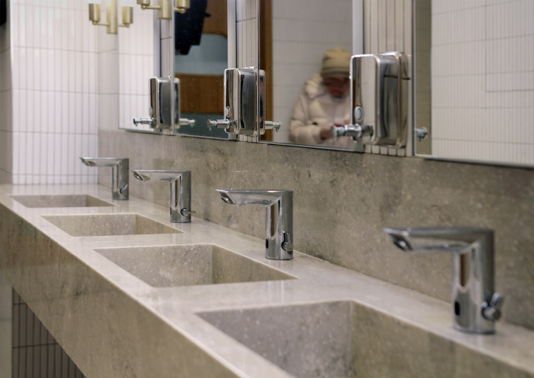
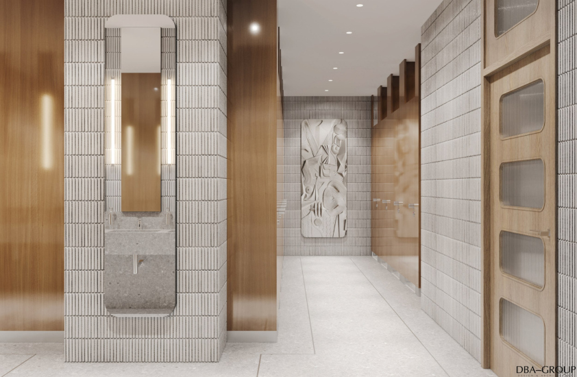
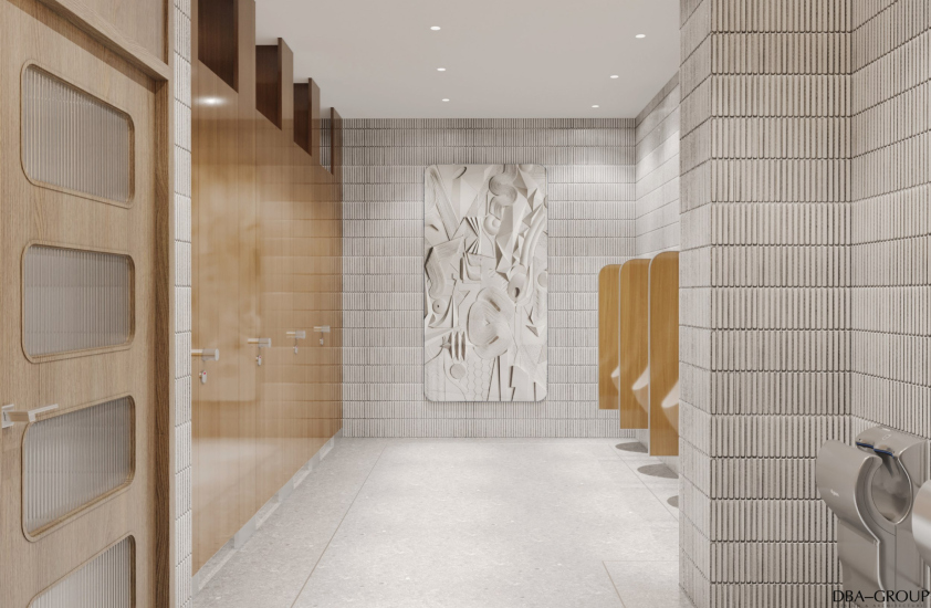
The idea is further picked up by another form – a rectangle with rounded corners, a kind of “TV set”, or, rather, a radio receiver: they are here in the form of relief on all the parapets and on the doors of the bathrooms – the latter, as it has been long and firmly accepted in HoReCa interiors, are drawn carefully and implemented quite diligently: white vertical tiles, rows of gray sinks, also reminiscent of terrazzos, and wooden doors with rhythmic rounded openings.

  • zooming
    House of Russian Cuisine at VDNKh
    Copyright: Photograph © Julia Tarabarina, Archi.ru
  • zooming
    House of Russian Cuisine at VDNKh
    Copyright: Photograph © Julia Tarabarina, Archi.ru


  • zooming
    House of Russian Cuisine: interior / project
    Copyright: © DBA-GROUP
  • zooming
    House of Russian Cuisine: interior / project
    Copyright: © DBA-GROUP


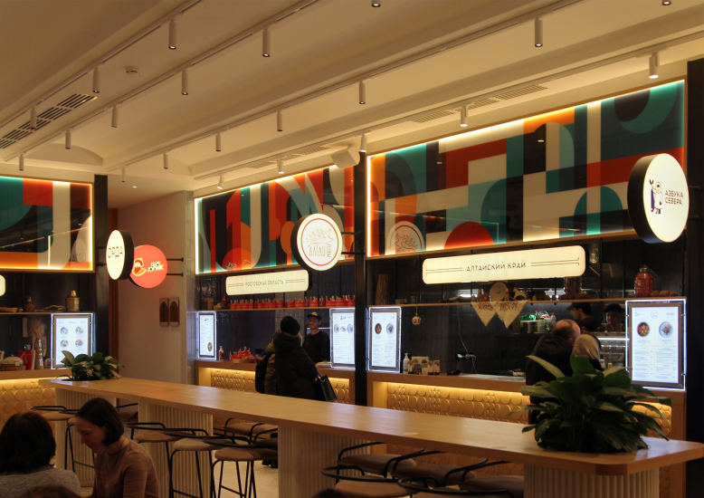
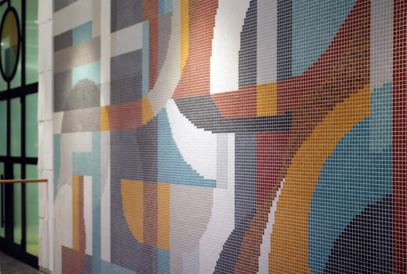
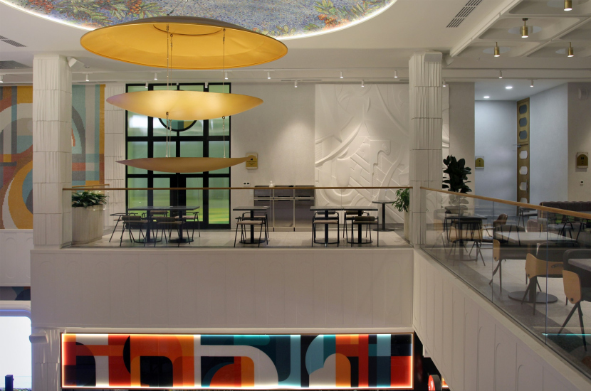
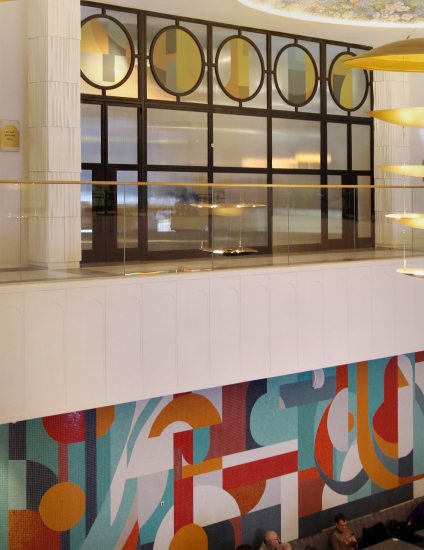
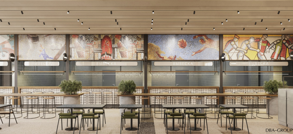
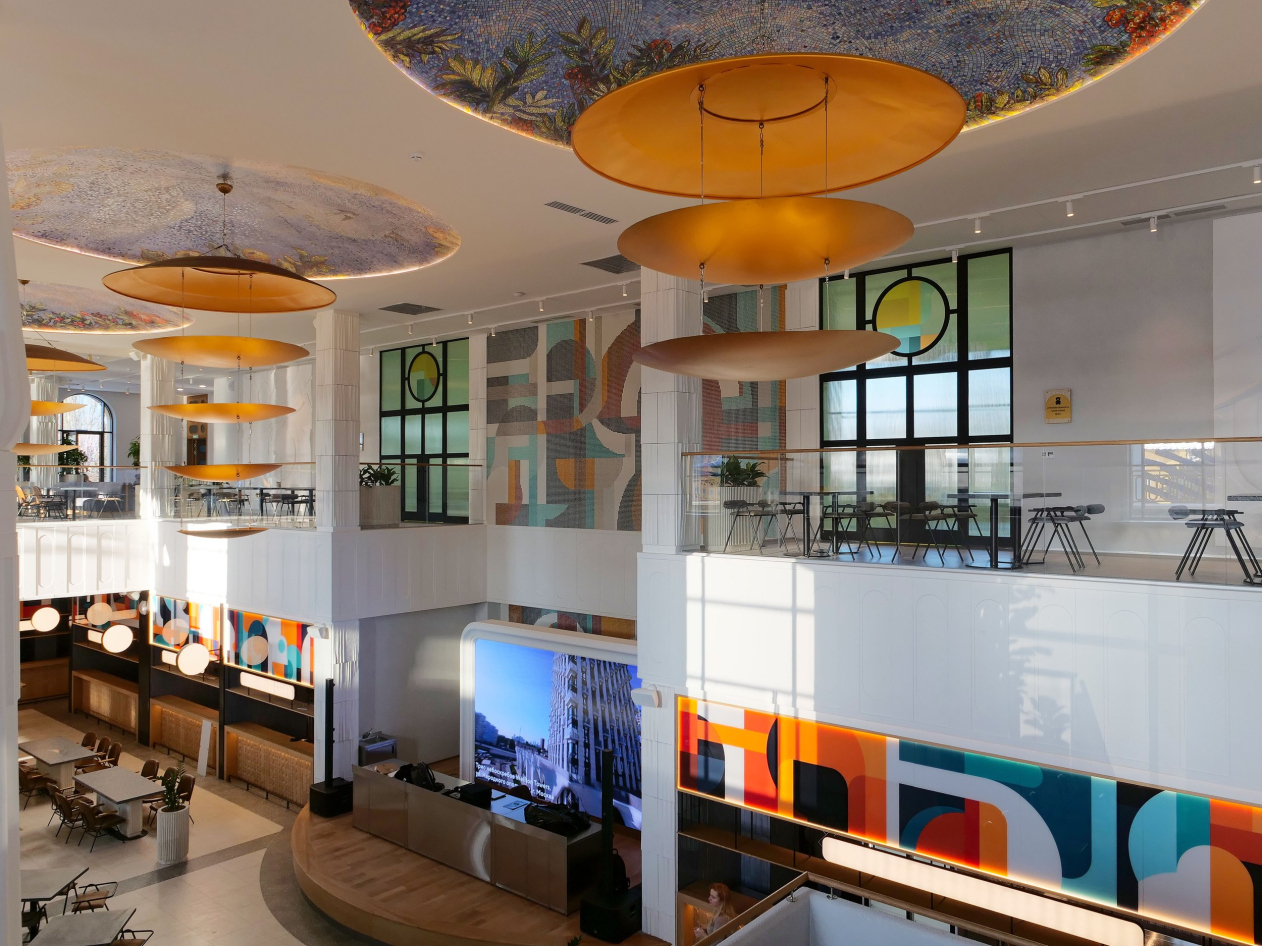
However, the interior designers emphasize that the abstract frieze above the counters on the first floor was conceived as the main unifying form: all of them are designed in the same key, and encircled by a bright ribbon of composition almost cubistic, quite in the spirit of the 1960s and 1970s. The basic form is echoed by the mosaics: the mosaics in the entrance group and on the wall of the second floor, designed in the same spirit; the theme is picked up by the neighboring reliefs and even the interior stained glass windows.

  • zooming
    House of Russian Cuisine: interior
    Copyright: Photograph © Julia Tarabarina, Archi.ru
  • zooming
    House of Russian Cuisine: interior
    Copyright: Photograph © Julia Tarabarina, Archi.ru


  • zooming
    House of Russian Cuisine: interior
    Copyright: Photograph © Julia Tarabarina, Archi.ru
  • zooming
    House of Russian Cuisine: interior
    Copyright: Photograph © Julia Tarabarina, Archi.ru


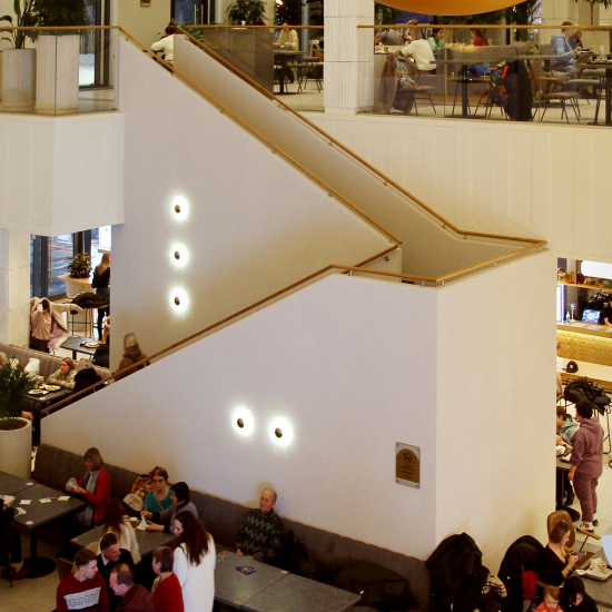
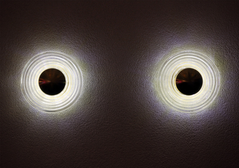
The same group of statements includes exposed two-marched staircases with wooden handrails and rhythmic spots of “space age” round lamps, as if marking the volumes with some kind of code. They work well in this space, balancing between the symmetry of the arrangement and the energy of turning the volumes, folded almost like origami from the frames of white walls.

  • zooming
    House of Russian Cuisine: interior, staircase
    Copyright: Photograph © Julia Tarabarina, Archi.ru
  • zooming
    Copyright: Photograph © Julia Tarabarina, Archi.ru


House of Russian Cuisine: interior / project
Copyright: © DBA-GROUP


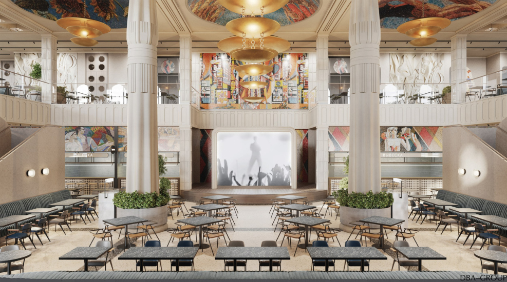
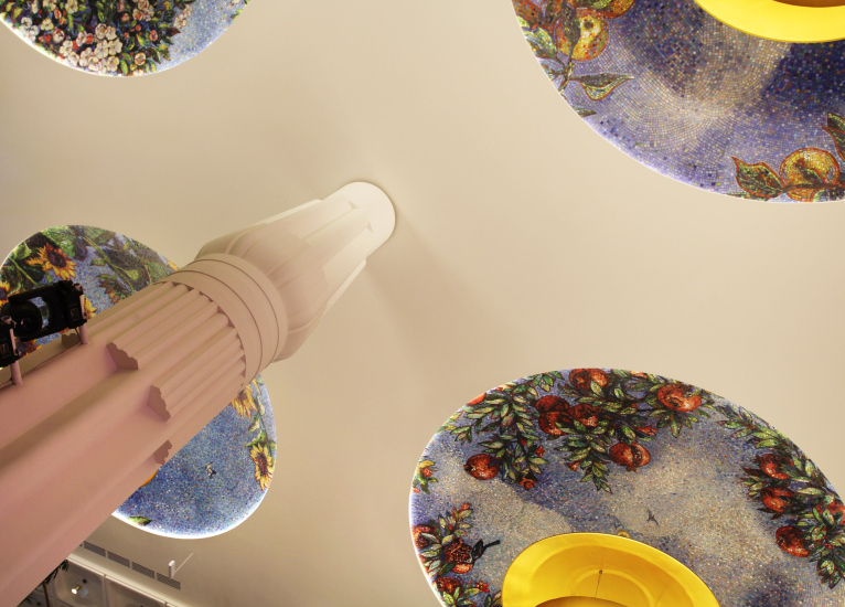
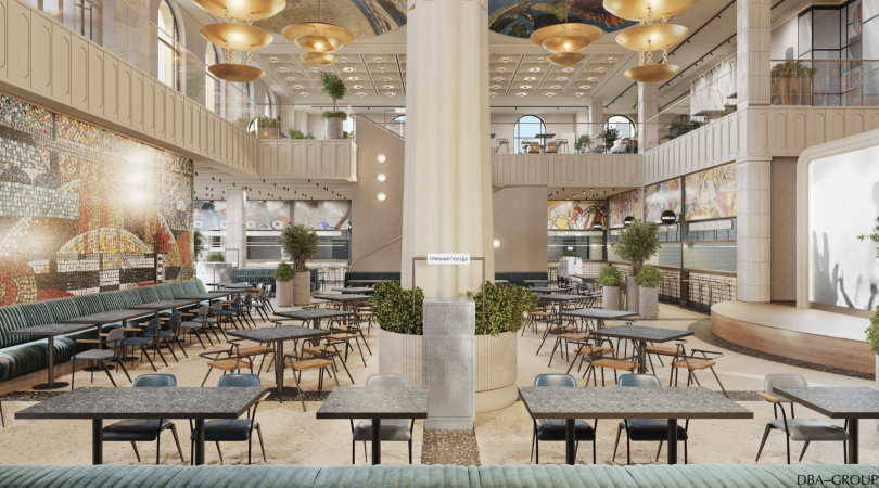
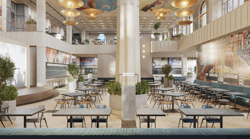
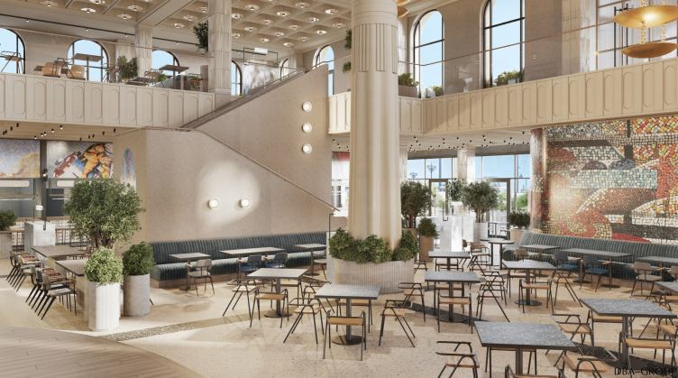
The central part is a different matter. It turns out to be suddenly very stylized. The first thing that meets the eye is two lotus-shaped columns – almost like in Luxor – the architects say they “borrowed” them in the interior of some of the Soviet health centers, but made thinner and slimmer, and then in the process of realization the upper bundle came together even tighter at the top.

Thus, the double-height high central part received a “two-column” space that also serves as the auditorium in front of the stage; at first, however, it seems that this space was invented specifically to accommodate the two columns. By the way, if one does not know about Luxor, one can see some giant ears of wheat in the columns – a generalized sign of fertility, reminiscent of the USSR coat of arms, quite in the spirit of this place.

  • zooming
    House of Russian Cuisine: interior
    Copyright: Photograph: provided by A-Project.K
  • zooming
    House of Russian Cuisine: interior / project
    Copyright: © DBA-GROUP


What does it tell us? For one, it tells us that the architecture of Soviet-era health houses, just like the architecture of VDNKh, was quite labile and often deviated from the purity of forms in favor of a certain entertainment element, which is quite appropriate in a health house and restaurant. It also tells us that we are dealing with copying of the second order: the columns are borrowed from an already mastered context, and not directly from Egyptian architecture.

On the other hand, for the authors of the interior design, the main thing here was not the resemblance to Luxor – it seems like they let it pass them by and dismissed it as unimportant – but an attempt to make the columns slender and, as a consequence, consonant with the slender columns of the pergola of the neighboring Uzbekistan pavilion. If we look at the map, we can see that the two columns of the “House of Russian Cuisine” and the front pillars of Uzbekistan are lined up on the same axis. We cannot say that this is obvious when you are inside on the first floor, but being on the second floor, we can see the axis at least looking through the window or down into the atrium from the correct angle.

Pergola of the Uzbekistan pavilion
Copyright: Photograph © Julia Tarabarina, Archi.ru


We admit that this construct of ours is not without speculation. However, there is another thing that is more noticeable: the two “lotus-shaped” columns in the food court pavilion look as unexpectedly surprising as the pergola in front of the Uzbekistan pavilion. However, in both cases these are gestures that are not devoid of theatricality and are quite appropriate for the territory of VDNKh. Come to think of it, VDNKh was conceived as a “wow” place, a place designed to surprise as an intrinsic value; a place meant to mesmerize you. This place implies, and maybe even requires, a certain unmotivated gesture.

As a consequence, once stated, the architectural narratives may develop according to different laws in this place. For example, the plafonds of the central part were originally conceived by the architects to look more like Deineka’s Mayakovskaya metro station, only with scenes from Moscow architecture, but in the end they became academic paintings depicting flowers and birds, very bright and quite in the spirit of VDNKh. The architects themselves are critical of such changes, but I, on the contrary, like it: the elements have fallen into a kind of “sculptural resonance”, the core has become more consistent, and it now more clearly opposes both the “modernist” periphery of the upper floor and the confidently modern contour of the first floor with its bright ribbon. The difference in impressions becomes more tangible – these two spaces are very different and at the same time related.

  • zooming
    House of Russian Cuisine: interior
    Copyright: Photograph © Julia Tarabarina, Archi.ru
  • zooming
    House of Russian Cuisine: interior
    Copyright: Photograph © Julia Tarabarina, Archi.ru


The exterior of the building, symmetrical with ornaments made of cut metal and golden decoration is in tune with our time and at the same time is in tune with the eclectic character of VDNKh. It turns out that today’s interpretation of the modernist interior is taken in the contour of arched windows and at the same time encircles the two lotus-shaped columns with mosaic plafonds reminiscent of Moscow’s subway. The pavilion seems to have absorbed , like a sponge, not only the fairground character of the exhibition, but also the layered alternation of its history, which in this task and under these circumstances must be recognized as more than appropriate.

  • zooming
    1 / 4
    House of Russian Cuisine: interior / project
    Copyright: © DBA-GROUP
  • zooming
    2 / 4
    House of Russian Cuisine: interior / project
    Copyright: © DBA-GROUP
  • zooming
    3 / 4
    House of Russian Cuisine: interior / project
    Copyright: © DBA-GROUP
  • zooming
    4 / 4
    House of Russian Cuisine: interior / project
    Copyright: © DBA-GROUP


19 February 2024

Headlines now
The Golden Crown
The concept for a dental clinic in Yekaterinburg, developed by CNTR Studio, revolves around the idea of a “mouth full of gold”: pristine white porcelain stoneware walls are complemented by matte brass details. To avoid an overly literal interpretation, the architects focused on the building’s proportions, skillfully navigating between sunlight requirements and fire safety regulations.
Flexibility and Integration
Not long ago, we covered the project for the fourth phase of the ÁLIA residential complex, designed by APEX. Now, we’ve been shown different fence concepts they developed to enclose the complex’s private courtyards, incorporating a variety of public functions. We believe that the sheer fact that the complex’s architects were involved in such a detail as fencing speaks volumes.
A Step Forward
The HIDE residential complex represents a major milestone for ADM architects and their leaders Andrey Romanov and Ekaterina Kuznetsova in their quest for a fresh high-rise aesthetic – one that is flexible and layered, capable of bringing vibrancy to mass and silhouette while shaping form. Over recent years, this approach has become ADM’s “signature style”, with the golden HIDE tower playing a pivotal role in its evolution. Here, we delve into the project’s story, explore the details of the complex’s design, and uncover its core essence.
Gold in the Sands
A new office for a transcontinental company specializing in resource extraction and processing has opened in Dubai. Designed by T+T Architects, masters of creating spaces that are contemporary, diverse, flexible, and original, this project exemplifies their expertise. On the executive floor, a massive brass-clad partition dominates, while layered textures of compressed earth create a contextually resonant backdrop.
Layers and Levels of Flight
This project goes way back – Reserve Union won this architectural competition at the end of 2011, and the building was completed in 2018, so it’s practically “archival”. However, despite being relatively unknown, the building can hardly be considered “dated” and remains a prime example of architectural expression, particularly in the headquarters genre. And it’s especially fitting for an aviation company office. In some ways, it resembles the Aeroflot headquarters at Sheremetyevo but with its own unique identity, following the signature style of Vladimir Plotkin. In this article, we take an in-depth look at the United Aircraft Corporation (UAC) headquarters in the Moscow agglomeration town of Zhukovsky, supplemented by recent photographs from Alexey Naroditsky – a shoot that became only recently possible due to the fact that improvements were finally made in the surrounding area.
Light and Shadow
In this article, we delve into the architectural design of the “Chaika” house by DNK ag architects, which was recently completed in 2023 as part of the collection of signature designs at ZILArt. As is well-known, all the buildings in this complex follow a design code, yet each one is distinct. This particular building stands out not only for its whiteness and minimalism but also for the refined use of a limited number of techniques that, together, create what can confidently be called synergy.
Casus Novae
A master plan was developed for a large residential area with a name of “DNS City”, but now that its implementation began, the plan has been arbitrarily reformatted and replaced with something that, while similar on the surface, is actually quite different. This is not the first time such a thing happens, but it’s always frustrating. With permission from the author, we are sharing Maria Elkina’s post.
Treasure Hunting
The GAFA bureau, in collaboration with Tegola and Arkhitail, organized an expedition to the island of Kilpola in Karelia as part of Moskomarkhitektura’s “Open City” festival. There, amidst moss and rocks, the students sought answers to questions like: what is the sacred, where does it dwell, and what sustains it? Assisting the participants in this quest were landscape engineer Evgeny Levin, artist Nicholas Roerich, a moose, and the lack of cellular connection. Here’s how the story unfolded.
Depths of the Earth, Streams of Water
In the Malaya Okhta district, the Akzent building, designed by Stepan Liphart, was constructed. It follows a classic tripartite structure, yet it’s what you might call “hand-drawn”: each façade is unique in its form and details, some of which aren’t immediately noticeable. In this article, we explore the context and, together with the architect, delve into how the form was developed.
Fir Tree Dynamics
The “Airports of Region” holding is planning to build an airport in Karachay-Cherkessia, aiming to make the Arkhyz and Dombay resorts more accessible to travelers. The project that won in an invitation-only competition, submitted by Sergey Nikeshkin’s KPLN, blends natural imagery inspired by the shape of a conifer seed, open-air waiting spaces, majestic large trees, and a green roof elevated on needle-like columns. The result is both nature-inspired and WOW.
​A Brick Shell
In the process of designing a clubhouse situated among pine trees in a prestigious suburban area near Moscow, the architectural firm “A.Len” did the façade design part. The combination of different types of brick and masonry correlates with the volumetric and plastique solutions, further enhanced by the inclusion of wood-painted fragments and metal “glazing”.
Word Forms
ATRIUM architects love ambitious challenges, and for the firm’s thirtieth anniversary, they boldly play a game of words with an exhibition that dives deep into a self-created vocabulary. They immerse their projects – especially art installations – into this glossary, as if plunging into a current of their own. You feel as if you’re flowing through the veins of pure art, immersed in a universe of vertical cities, educational spaces – of which the architects are true masters – and the cultural codes of various locations. But what truly captivates is the bold statement that Vera Butko and Anton Nadtochy make, both through their work and this exhibition: architecture, above all, is art – the art of working with form and space.
Flexibility and Acuteness of Modernity
Luxurious, fluid, large “kokoshniks” and spiral barrel columns, as if made from colorful chewing gum: there seem to be no other mansion like this in Moscow, designed in the “Neo-Russian-Modern” style. And the “Teremok” on Malaya Kaluzhskaya, previously somewhat obscure, has “come alive with new colors” and gained visibility after its restoration for the office of the “architectural ecosystem” as the architects love to call themselves. It’s evident that Julius Borisov and the architects at UNK put their hearts into finding this new office and bringing it up to date. Let’s delve into the paradoxes of this mansion’s history and its plasticity. Spoiler: two versions of modernity meet here, both balancing on the razor’s edge of “what’s current”.
Yuri Vissarionov: “A modular house does not belong to the land”
It belongs to space, or to the air... It turns out that 3D printing is more effective when combined with a modular approach: the house is built in a workshop and then adapted to the site, including on uneven terrain. Yuri Vissarionov shares his latest experience in designing tourist complexes, both in central Russia and in the south. These include houseboats, homes printed from lightweight concrete using a 3D printer, and, of course, frame houses.
​Moscow’s First
“The quality of education largely depends on the quality of the educational environment”. This principle of the last decade has been realized by Sergey Skuratov in the project for the First Moscow Gymnasium on Rostovskaya Embankment in the Khamovniki district. The building seamlessly integrates into the complex urban landscape, responding both to the pedestrian flow of the city and the quiet alleyways. It skillfully takes advantage of the height differences and aligns with modern trends in educational space design. Let’s take a closer look.
Looking at the Water
The site of Villa Sonata stretches from the road to the water’s edge, offering its own shoreline, pier, and a picturesque river panorama. To reveal these sweeping views, Roman Leonidov “cut” the façade diagonally parallel to the river, thus getting two main axes for the house and, consequently, “two heads”. The internal core – two double-height spaces, a living room and a conservatory, with a “bridge” above them – makes the house both “transparent” and filled with light.
The White Wing
Well, it’s not exactly white. It’s more of a beige, white-stone structure that plays with the color of limestone – smoother surfaces are lighter, while rougher ones are darker. This wing unites various elements: it absorbs and interprets the surrounding themes. It responds to everything, yet maintains a cohesive expression – a challenging task! – while also incorporating recognizable features of its own, such as the dynamic cuts at the bottom, top, and middle.
Urban Dunes
The XSA Ramps team designed and built a three-part sports hub for a park in Rostov-on-Don, welcoming people of all ages and fitness levels. The skate plaza, pump track, and playground are all meticulously crafted with details that attract a diverse range of visitors. The technical execution of the shapes and slopes transforms this space into a kind of sculptural composition.
Proportional Growth
The project for the fourth phase of the ÁLIA residential area has been announced. The buildings are situated on an elongated plot – almost a “ray” that shoots out from the center of the area towards the river. Their layout reflects both a response to Moscow’s architectural preferences over the past 15 years, shifting “from blocks to towers”, and an interpretation of the neighboring business park designed by SOM. Additionally, the best apartments here are not located at the very top but closer to the middle, forming a glowing “waistline”.
The “Staircase” Building
In designing the “Details” residential complex in New Moscow, Rais Baishev spiced up the now-popular Moscow theme of a “courtyard” building with an idea drawn from the surrealist drawings by Maurits Escher. He envisioned the stepped silhouettes and descending slopes as a metaphysical mega-staircase, creating a key void within the courtyard that gave the project an internal “spine”. This concept is felt both in the building’s silhouette and on its façades.
Projection of the Quarter
No one doubted that the building that Vladimir Plotkin designed as part of the “Garden Quarters” would be the most modernist of all. And it turned out just that way: while adhering to the common design code, the building successfully combines brick and white stone, rhythmically responding to the neighboring building designed by Ostozhenka, yet tactfully and persistently making a few statements of its own. This includes the projection of the ideal urban development composition “14–9–6”, which can be found right next door, mathematical calculations, including those for various types of terraces (and perhaps the only reminder of the Soviet past of the Kauchuk rubber factory!), and the white “cross-stitch” pattern of the façade grid.
Domus Aurea
In this issue, we examine the “Tessinsky-1” house, designed by Sergey Skuratov and completed in 2023. Located in the middle of the Serebryanicheskaya Embankment district, at the intersection of its main streets, this house assumes a sort of “nodal” role: it not only responds to everything around it and preserves many memories of the former EMA factory within itself, but it weaves all this into a newly directed pattern, reconciling bright “gold” and dark-colored brick, largely with the help of the new, modern-yet-archaic Columba brick, which, come to think about it, is the most precious element here.
The Chimney of Nikola-Lenivets
In this issue, we are examining the “Obelisk House” designed by KATARSIS and built for the Arkhstoyanie 2023 festival. However, it was only finished later on, and this is why we are examining it now. It seems to us that after the “Obelisk House” appeared in Nikola-Lenivets, a dialogue and a few inner connections appeared between the temporary structures built here. These houses no longer look like “accidental neighbors”, more of which below.
​Periscope by the Bay
The jury awarded the second place in the competition for a public and cultural center in Petropavlovsk-Kamchatsky to the companies GORA (“Mountain”) and M4. In the consortium’s proposal, the building resembles a sperm whale with a calf swimming next to it or a periscope, whose lenses capture the most spectacular views from the surrounding landscape.
From Arcs to Dolmens
While working on the competition project for Petropavlovsk-Kamchatsky, ASADOV Architects prioritized the value of the natural and urban environment, aiming to preserve the balance of the location while minimizing the resemblance of the volume that they designed to a “traditional building”. The task was challenging, and the architects created three versions, one of which having been developed after the competition, where their main proposal took third place. However, the point of interest here is not the competition result but the continuity of creative thinking.
Hide and Seek
The ID Moskovskiy house, designed by Stepan Liphart in St. Petersburg, in the courtyards near Moskovskiy Avenue beyond the Obvodny Canal and recently completed, is notable for several reasons. Firstly, it has been realized with considerable accuracy, which is particularly significant as this is the first building where the architect was responsible not only for the facades but also for the layouts, allowing for better integration between the two. On the other hand, this building is interesting as an example of the “germination” of new architecture in the city: it draws on the best examples from the neighborhood and becomes an improved and developed sum of ideas found by the architect in the surrounding context.
The Big Twelve
Yesterday, the winners of the Moscow Mayor’s Architecture Award were announced and honored. Let’s take a look at what was awarded and, in some cases, even critique this esteemed award. After all, there is always room for improvement, right?
Above the Golden Horn
The residential complex “Philosophy” designed by T+T architects in Vladivostok, is one of the new projects in the “Golubinaya Pad” area, changing its development philosophy (pun intended) from single houses to a comprehensive approach. The buildings are organized along public streets, varying in height and format, with one house even executed in gallery typology, featuring a cantilever leaning on an art object.
Nuanced Alternative
How can you rhyme a square and space? Easily! But to do so, you need to rhyme everything you can possibly think of: weave everything together, like in a tensegrity structure, and find your own optics too. The new exhibition at GES-2 does just that, offering its visitor a new perspective on the history of art spanning 150 years, infused with the hope for endless multiplicity of worlds and art histories. Read on to see how this is achieved and how the exhibition design by Evgeny Ace contributes to it.
Blinds for Ice
An ice arena has been constructed in Domodedovo based on a project by Yuri Vissarionov Architects. To prevent the long façade, a technical requirement for winter sports facilities, from appearing monotonous, the architects proposed the use of suspended structures with multidirectional slats. This design protects the ice from direct sunlight while giving the wall texture and detail.