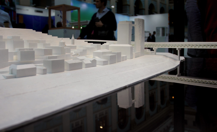
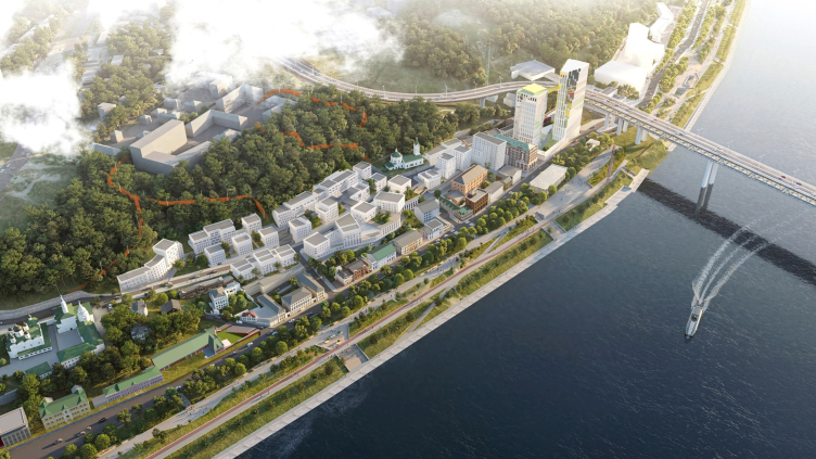
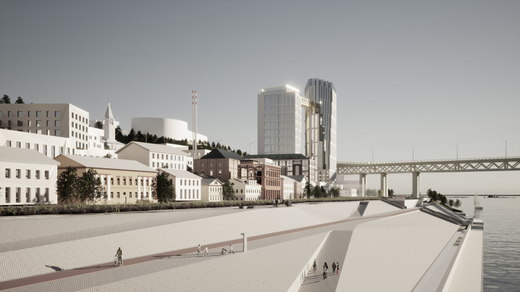
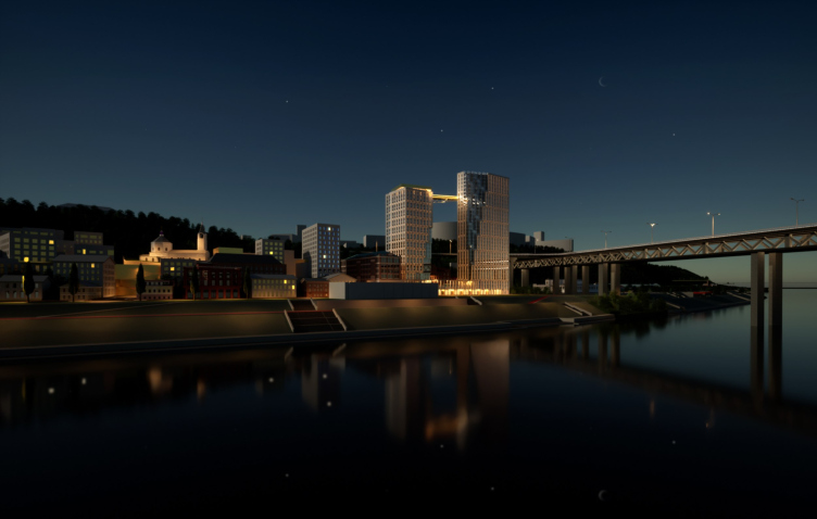
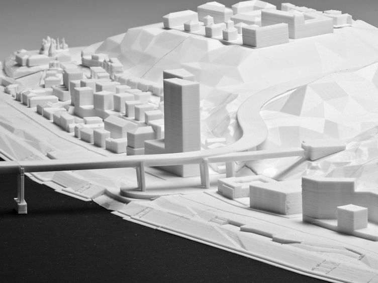
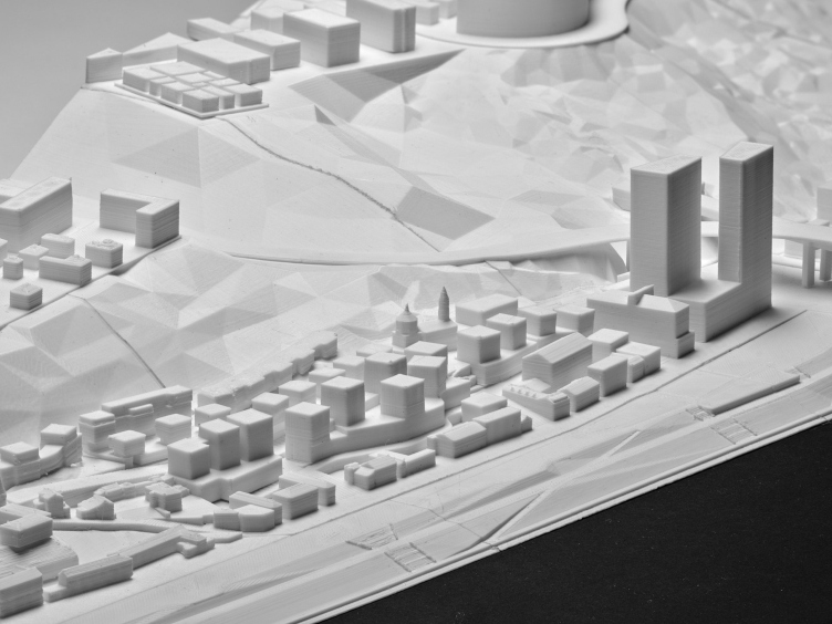
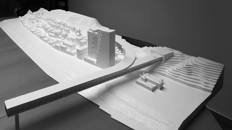
The model showcased at the Zodchestvo 2023 Festival. The “Project” stage of the development of four clusters of the Blagoveshchenskaya Sloboda territory in Nizhny Novgorod
Copyright: © Ostozhenka / Photograph © Julia Tarabarina, Archi.ru
What is more important is the fact that the task of the master plan is to regenerate the urban fabric, to include the territory, about which not every taxi driver knows yet, into the life of the central part of Nizhny Novgorod, without damaging monuments and preserving the morphology based on patterns of historical development and the history of the place. Sapienti sat – this is a task suitable for Ostozhenka, a company that is not just interested in the topic but was also created more than 30 years ago specifically to solve a similar problem in the center of Moscow. So it’s not surprising that two years ago, its architects won a competition for the concept of the master plan to be implemented in Nizhny Novgorod.
Pavel Gavrilov, Vice President of the Design Unit at GloraX
The site is very complex, with an elevation difference of about 30 meters and a lot of restrictions, both in terms of elevation and landscape and visual analysis. We knew from the beginning that this would be the case – and we wanted to turn the limitations into an advantage, creating a decent background for the architectural monuments, and implementing a history-based approach... For example, we are now working on an immersive route that will tell the history of the place through QR codes.
So, in the brief for the 2021 competition, we included a wish for small-scale development in the historical part – some people heard this recommendation, some did not, but of the three participants, it was the Ostozhenka architects who solved this problem most accurately.
So, in the brief for the 2021 competition, we included a wish for small-scale development in the historical part – some people heard this recommendation, some did not, but of the three participants, it was the Ostozhenka architects who solved this problem most accurately.
Integrated development of the Blagoveshchenskaya Sloboda area in Nizhny Novgorod
Copyright: © Ostozhenka Architects
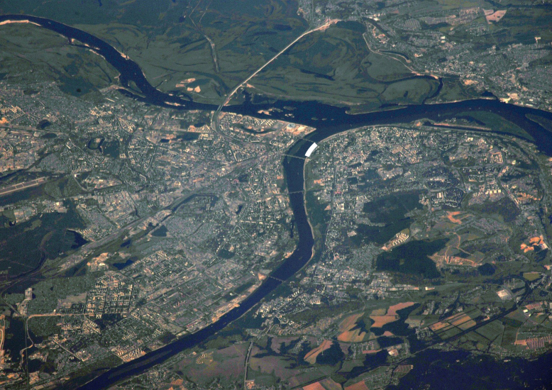
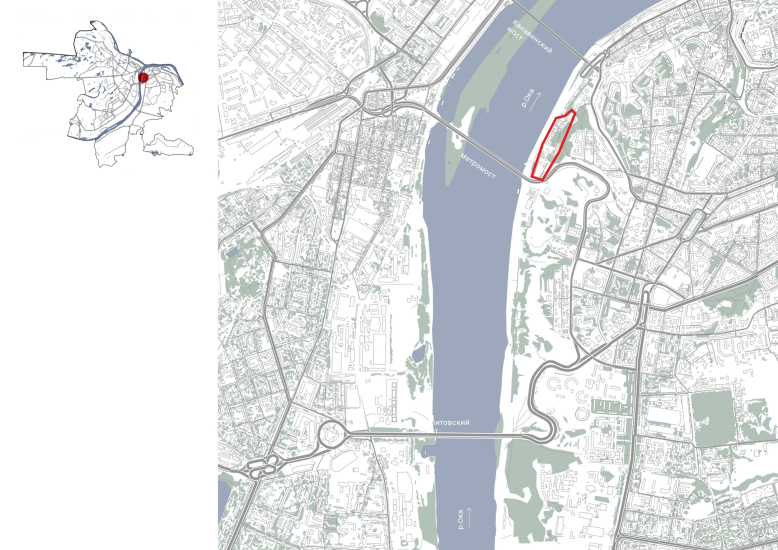
In 2021, a competition was held for the territory on both sides of the Metro Bridge – we are now talking about the area between the Metro Bridge and the Kanavinsky Bridge, just behind the Blagoveshchensky Monastery.
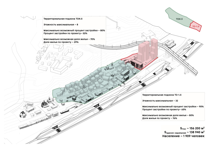
The monastery is a monument from the 17th century and is one of the primary tourist attractions in the city. The bridge, however, was only recently built and launched in 2012. So the territory is divided into two obvious parts: the high-rise modern one, which gravitates towards the bridge and forms a compositional pair with it, and the historical one, burdened with numerous restrictions but rightfully inheriting the morphology of the city center’s development.
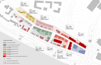
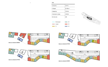
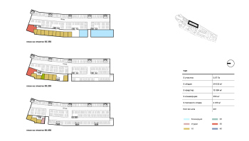
Master Plan stage of the Blagoveshchenskaya Sloboda territory in Nizhny Novgorod. Development parameters of territorial sub-zones TOI.5 and TO-1.5
Copyright: © Ostozhenka Architects
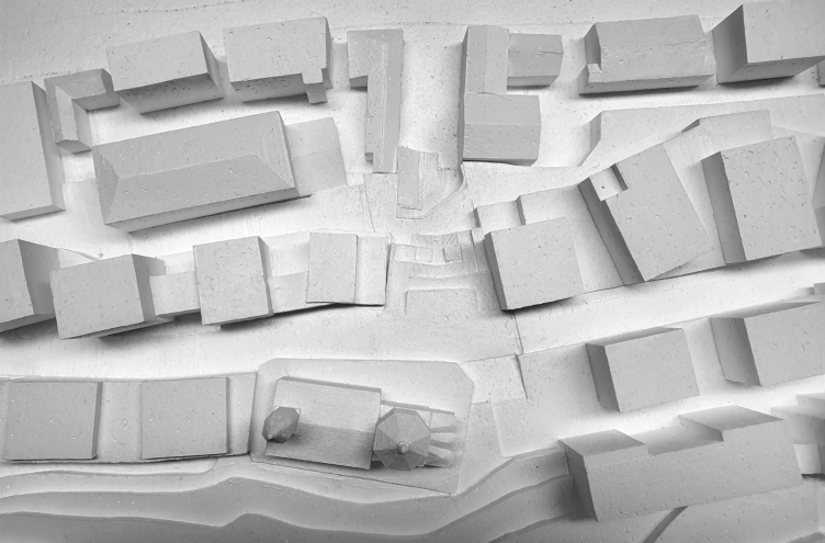
In addition to the monastery in the historical part, the Church of John the Baptist has been preserved. Built in 1725 and rebuilt in the 19th century, it stands closer to the mills in a relatively elevated position, on the slope, and can serve as a landmark if it is competently restored.
A model. Below is the Church of John the Baptist and the staircases leading, according to the project, from it towards the river. Integrated development of the Blagoveshchenskaya Sloboda area in Nizhny Novgorod
Copyright: Photograph © Julia Tarabarina, Archi.ru
In Nizhny Novgorod, the design work for the territory around Chernigovskaya Street has been ongoing for 10 years, and there have been plenty of options. So, if you look at the project in conjunction with its history, it resembles a sum of “underpaintings”, like in the works of old masters – refinements and variations. You can see the previous concepts for Chernigovskaya Street here.
The significance of preliminary research and discussions in the working process is emphasized by the head of Ostozhenka’s project group, Rais Baishev.
We are not the first to work with this site – the heights, parameters and approaches have been determined before us. In addition, the project was born in repeated discussions with our colleagues, and we have great respect for the Nizhny Novgorod architects and the Nizhny Novgorod school – they are all our friends and excellent professionals, we consider them full-fledged co-authors. Of course, we took into account both historical and architectural research, and the data of visual-landscape analysis. We restored and developed the historic street network and did everything to pick up the morphology of the historic building in terms of modularity, so that the new background fabric would not be alien. We positioned the buildings at angles to create more interesting views.
The towers near the bridge are a different story – they were needed as a counterpoint to the powerful horizontality of the Metro Bridge: its length is about a kilometer, and here we needed to work on a different scale.
The towers near the bridge are a different story – they were needed as a counterpoint to the powerful horizontality of the Metro Bridge: its length is about a kilometer, and here we needed to work on a different scale.
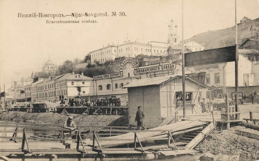
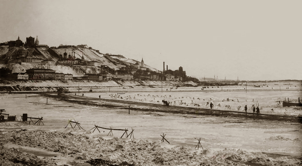
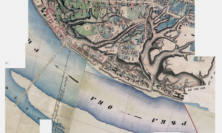
In short, the essence is as follows. Initially, Blagoveshchenskaya Sloboda (the area lying just behind the monastery) developed as a merchant district, that is, as a residential urban area. By the mid-19th century, mills with their berths appeared here, as it was convenient at that time to bring grain along the Oka River and then take away flour. The settlement gradually merged with the mills during the industrial revolution, along with their warehouses and similar establishments.
Blagoveshchenskaya Sloboda area and its surroundings. Map of 1859
Copyright: Zodchestvo 2023. Source: retromap.ru
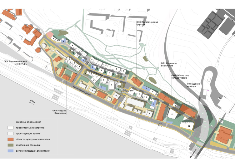
Subsequently, the wooden buildings that once created significant density gradually disappeared, and the place became semi-empty. What remained was the monastery, the Church of John the Baptist, and the stone houses along Chernigovskaya Street – these three buildings, which bear the status of cultural heritage sites, are still present. These buildings are occupied by tenants and are not directly involved in the immediate development, but GloraX plans to restore their facades as part of the company’s contribution to the development of the area and the city.
From the industrial period, several red-brick buildings remain, four of which also have a protected status. The largest building, the Bashkirov Mill, is planned by GloraX for restoration as loft apartments.
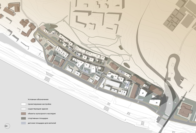
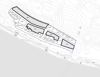
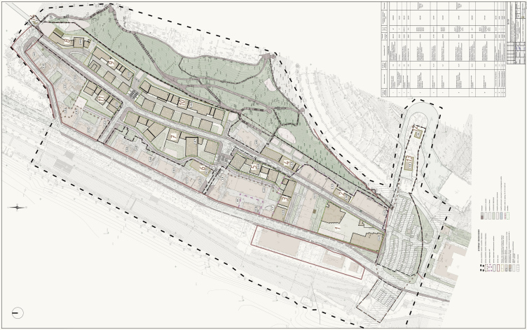
Integrated development of the Blagoveshchenskaya Sloboda area in Nizhny Novgorod. The master plan
Copyright: © Ostozhenka Architects
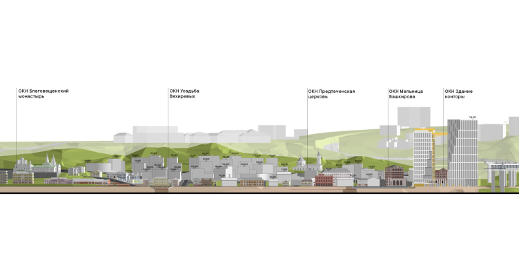
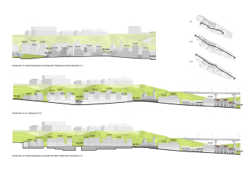
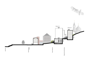
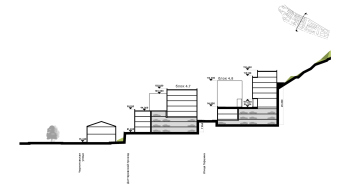
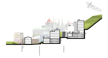
Integrated development of the Blagoveshchenskaya Sloboda area in Nizhny Novgorod. The elevation marks of the buildings
Copyright: © Ostozhenka Architects
Below it, near the river across Chernigovskaya Street, Alexander Dekhtyar designed (for a different client) the reconstruction of an abandoned hangar into a public center with restaurants. Further south and higher up on the slope behind the bridge, the construction of a large educational building for the IT campus Neymark is planned, designed by Studio 44, also commissioned by GloraX. KOSMOS Architects have already developed an urban fabric development project for this area, connecting Chernigovskaya Street and the campus. Additionally, the project includes the building of the former Romodanovsky Railway Station, a pseudo-Renaissance edifice from 1904 on the other side of the Metro Bridge, with surrounding pedestrian space.
Finally, the embankment fortification and improvement of the riverside, which occupies a wide strip west of Chernigovskaya Street, are planned to be implemented through urban programs, closely linked to the public spaces of the new district. For example, near the Pretechenskaya Church, a square and a complex of restaurants are planned, and still closer to the river, there will be a market – a kind of cross-axis of urban public spaces with a vibrant atmosphere, connecting the residential area and the waterfront promenade.
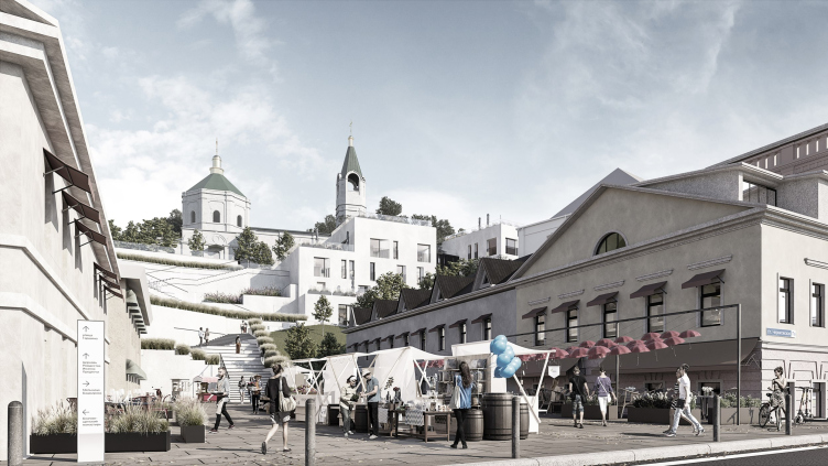
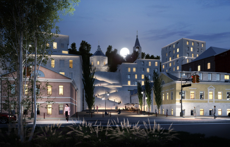
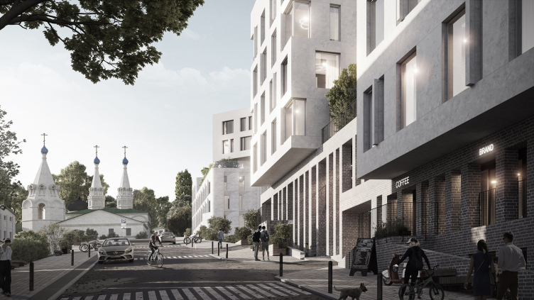
The “Project” stage of development of four clusters of Blagoveshchenskaya Sloboda. Square and stairs leading to the Church of St. John the Baptist, Cluster 4, version proposed by Ostozhenka
Copyright: © Ostozhenka Architects / Visualization © Framestudio
The “Project” stage of the development of the towers. Stage “Master Plan” of the development of four clusters of Blagoveshchenskaya Sloboda
Copyright: © Ostozhenka Architects
Behind the Bashkirov Mill, a grain elevator, 75 meters high, was built during the Soviet era, but it was recently demolished as its concrete walls were deemed unstable. The idea of reconstructing the elevator into housing, suggested in several projects, was considered unsuccessful. Sergey Popov characterizes those projects as being “mostly student ones” (one of the projects preserving the elevator can be found here). Meanwhile, the elevator determined the significant height of the future “centerpiece” in its place, and it is supported by the Metro Bridge, whose horizontal kilometer-long structure requires a counterbalance.
Integrated development of the Blagoveshchenskaya Sloboda area in Nizhny Novgorod
Copyright: © Ostozhenka Architects
Competition project for the development of the Blagoveshchenskaya Sloboda area in Nizhny Novgorod
Copyright: © Ostozhenka Architects / Pgotograph of the model © Ivan Boiko
Competition project for the development of the Blagoveshchenskaya Sloboda area in Nizhny Novgorod
Copyright: © Ostozhenka Architects / Pgotograph of the model © Ivan Boiko
A model. View from the south-west, from the side of the Oka River and the Metro Bridge. Integrated development of the Blagoveshchenskaya Sloboda area in Nizhny Novgorod
Copyright: © Ostozhenka Architects / Pgotograph of the model © Julia Tarabarina, Archi.ru
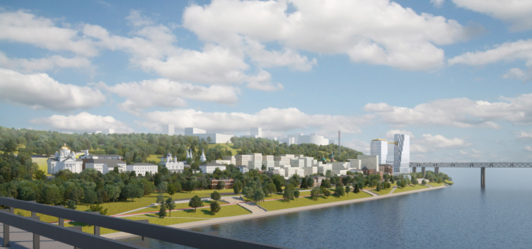
Integrated development of the Blagoveshchenskaya Sloboda area in Nizhny Novgorod. Photo montage from the Kanavinsky Bridge
Copyright: © Ostozhenka Architects
The entire project is all about “breathing life” into the currently semi-abandoned place. Someday, says Sergey Popov, Chernigovskaya Street will become part of a larger continuous route along the waterfront, from Nizhnevolzhskaya to the “Switzerland” park.
Sergey Popov, Chief Architect of Nizhny Novgorod Region (since 2011)
The territory of Chernigovskaya Street and Garshina Street is located in the center – and at the same time on the outskirts. But due to the fact that the place is a dead end, the historical environment has been preserved here, but only partly – stone houses, and wooden houses, which were also quite numerous back in the day, have been lost. So from the very beginning, in 2012-2013, when the first attempts to offer something for the site occupied by the bakery appeared, we insisted on considering the territory up to Melnychny Lane in an integrated way. Then the idea of “spontaneous” development appeared, subordinated to the relief and the street grid, and with a small number of stories – all the attempts to increase the height in the central and northern parts were “grounded”.
I believe that the concept is successful, if it is implemented, the city will have a good comfortable place, a pedestrian zone, and development, combining the historical scale with the modern one. Public transportation should appear – the site will be fully involved in the urban fabric.
I believe that the concept is successful, if it is implemented, the city will have a good comfortable place, a pedestrian zone, and development, combining the historical scale with the modern one. Public transportation should appear – the site will be fully involved in the urban fabric.
So far, we have described and discussed some aspects of the master plan designed by Ostozhenka. Its key characteristic seems to be inclusivity – I would say, “in everything”: in the historical context, the landscape, the history, prehistory, as well as sensitivity to the opinions of the professional community – sensitivity to everything.
The distinguishing feature of the master plan from all other earlier projects lies in the mentioned granularity, delicate and fractional craftsmanship, turns, and perspectives of the volumes in the “historical” part – also known as the premium part, as there are few houses, they are not tall, thanks to the variation in height, they do not overlook each other’s windows, and they feature terraces, balconies, views of the river, and monuments.
Master Plan stage of the Blagoveshchenskaya Sloboda development in Nizhny Novgorod. Simplified master plan with indication of the number of stories of the designed buildings
Copyright: © Ostozhenka Architects
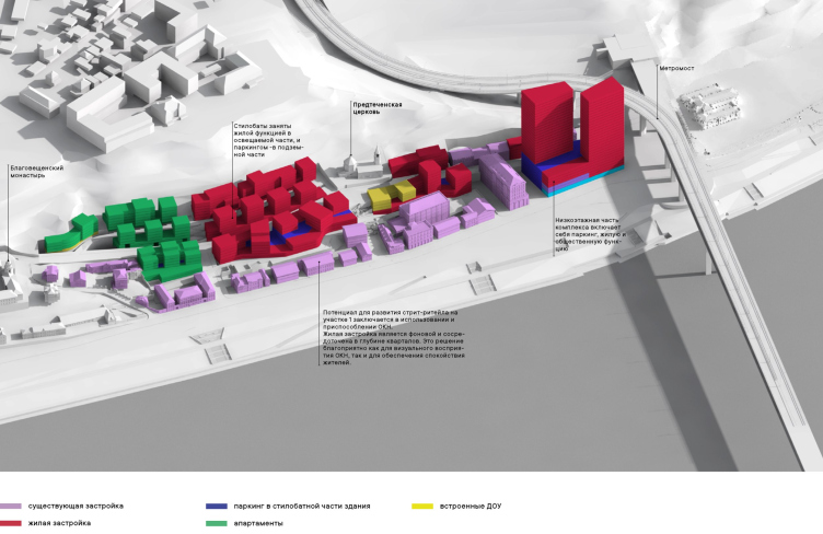
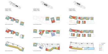
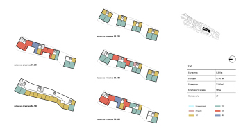
Master Plan stage of the Blagoveshchenskaya Sloboda development in Nizhny Novgorod. The functional layout
Copyright: © Ostozhenka Architects
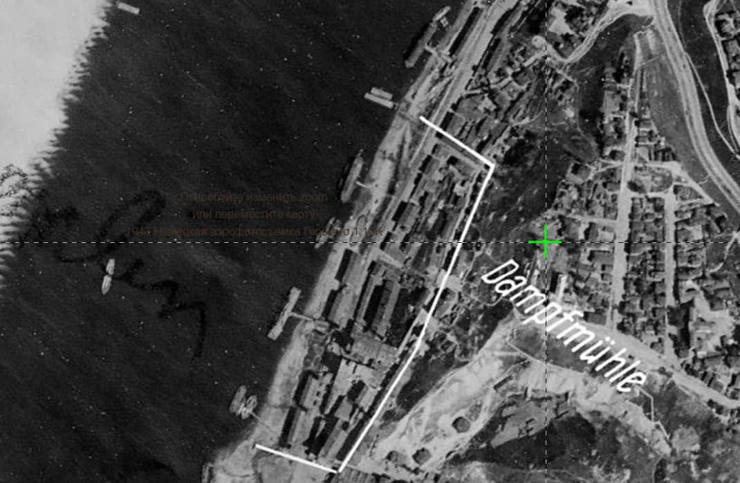
Aerial photography 1943
Copyright: Source: retromap.ru
However, as a historian of architecture, I would note that, although the proposed morphology indeed corresponds to the principles of an old city, neither in Nizhny Novgorod nor in other central Russian cities, such historical development of construction ever existed. Central Russian cities, even those built on slopes, did not adhere to them in the same way. Unlike Italian cities with gardens on rooftops, Russian cities usually had reserved spaces, such as yards and gardens, which served as resources for a more expansive development. Therefore, I agree with Alexander Dekhtyar’s opinion that the resulting streets resemble Mediterranean ones, but in my view, the resemblance is not in the white color, as the Nizhny Novgorod architect believes, but in their plastique as such.
This, in my opinion, is neither good nor bad. The point is that modern requirements for construction are different, and immersing it entirely in “retro development” would not be a wise thing to do, and would hardly be technically possible. Let’s just imagine for a second the regeneration of the buildings of a steam mill that operated here on a densely built-up territory in 1943.
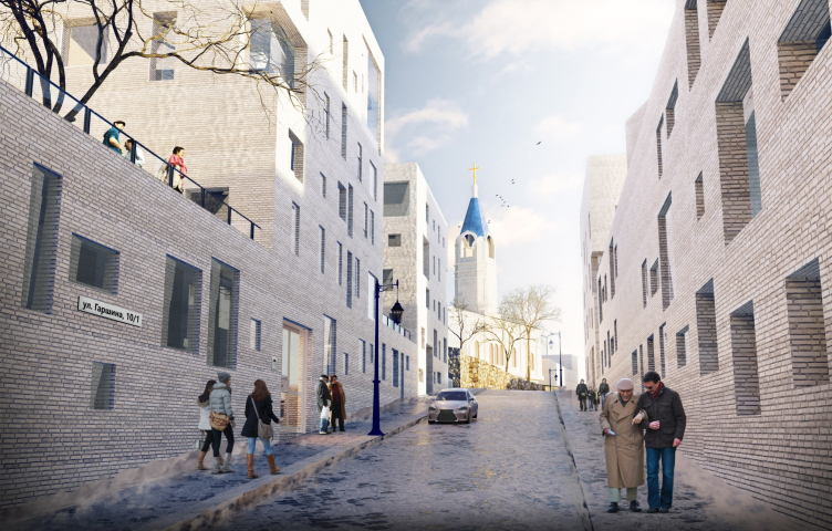
Stage “Master Plan Concept Competition”. View from Garshina Street to the Church of St. John the Baptist
Copyright: © Ostozhenka Architects
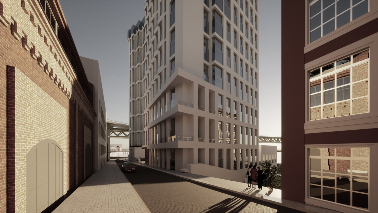
Strictly speaking, one could replicate all those extended sheds and unremarkable structures identically, but it wouldn’t be even close to a premium-class residential complex. Now, in new conditions and with new requirements, the proposed terraced development with stylobates running along the streets, courtyards on their roofs, unique perspectives of facades, and parking spaces recessed into the ground is a sensible solution. It is based on the scale of historical development, but it is new and modern – not copying the old morphology but evolving it.
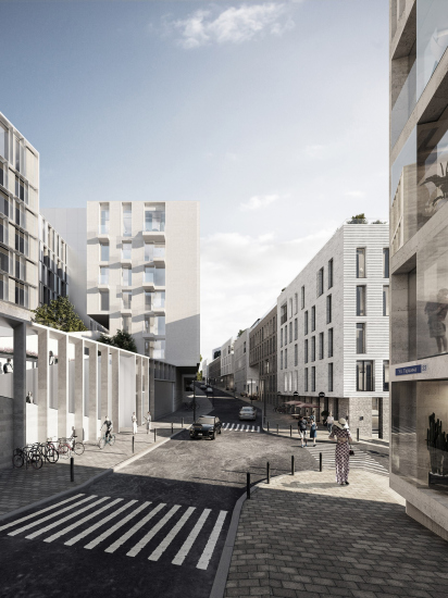
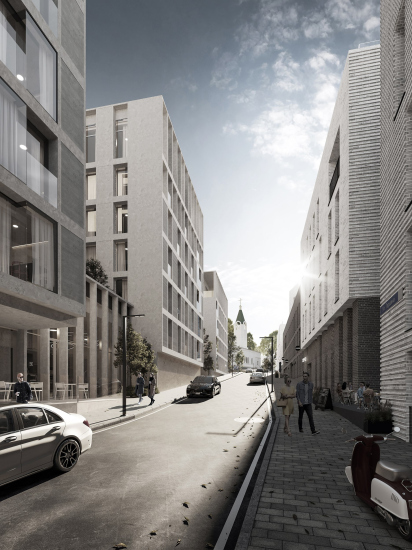
Another feature of the design code proposed by Ostozhenka is the use of white color, or “all shades of white” as described by Rais Baishev, comparing this solution to the “glove-like plaster” of the monastery walls: it is a medieval technique, pretty simple, yet the wall looks like a treasure – the architect explains. The white color does not exclude material quality and texture, such as simple or striped brickwork, stone, fiber-reinforced concrete, and so on. Still, it should unify all the new volumes of the northern part into a common, terrace-climbing mountain background – a backdrop for colorful historical and even pseudo-historical houses on the first line of Chernigovskaya Street, as well as the red-brick industrial buildings.
Integrated development of the Blagoveshchenskaya Sloboda territory in Nizhny Novgorod. Unfolding along the Oka River with allocation of the cultural heritage sites
Copyright: © Ostozhenka Architects
This solution has both advocates and opponents. Alexander Dekhtyar, the author of several earlier projects for Chernigovskaya Street, is convinced that the predominant tone of the new development on Chernigovskaya Street should be “all shades of earth” from terracotta to yellow and brown, which are characteristic of existing houses. This, he believes, would make the church and monastery stand out better against the overall background. Dekhtyar considers white color to be uncharacteristic of Nizhny Novgorod architecture, much too “seaside-like”.
However, even at the master plan stage, whiteness was not total.
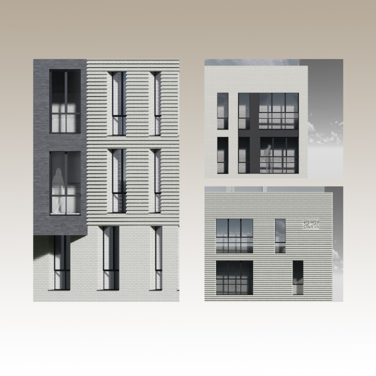
The “Project” stage of development of four clusters of Blagoveshchenskaya Sloboda area in Nizhny Novgorod. Fragments of facade design
Copyright: © Arkhstroy
I also identified a southern “twist” in the project – as I mentioned earlier, not in color but in form. An interesting color story unfolds in the project, but first, it must be said that both architects are right since architectural monuments here have shades of terracotta and white. The city estates and factory buildings fall into the terracotta category, while churches fall into the white category – it’s as simple as that. In other words, if the new development is not made entirely of copper-green or black, then a choice must be made about which part of history to align with and which part to distance oneself from in terms of color. Arkhstroi leaned towards terracotta in its time, and Ostozhenka is now leaning towards white – this is a matter of individual design preferences. However, as we will see later, it’s not that simple.
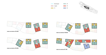
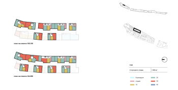
Let’s return, however, to the fine-grained part of the master plan. Two kindergartens are integrated into the stylobates, and the school, according to the city’s decision, is assigned to the area located at the top, to the south. Various format apartment layouts are well thought out, ranging from smaller to larger, with views from windows, connections to terraces, access to courtyards, and underground spaces. Parking lots are mainly embedded in the slope; based on insolation considerations, the stylobates house either residential units or shops and salons facing the streets.
What I like most about this project are the multi-flight staircases. They not only create cross connections, descents, and ascents but also give a different, imposing dimension to the space, allowing you to feel the grandeur of the mountain. I would like to note that because of them, the district becomes, once again, somewhat “Roman”. I don’t deny the fact that Nizhny Novgorod has its own famous staircases, such as Chkalov Stairs, but the first analogy that comes to mind when looking at the Church of John the Baptist and its staircase is not even San Miniato but Trinità dei Monti with its Spanish Steps.
Stage “Master Plan Concept Competition” of the territory of Blagoveshchenskaya Sloboda area in Nizhny Novgorod
Copyright: © Ostozhenka Architects
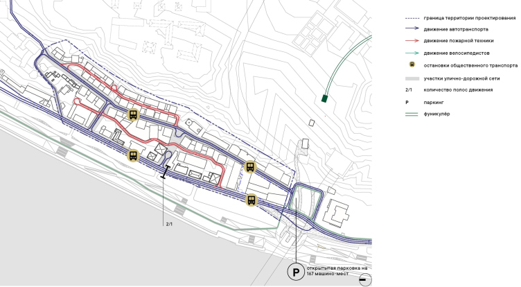
Another feature of the master plan is the development of the street network, both for vehicles and pedestrians. Currently, there is only one drive-through artery, Chernigovskaya Street running along the waterfront, with Mill Lane descending to it behind the monastery, and the upper Garschina Street ending in a dead-end near the church. But if you look at old maps, historically it wasn’t like that: Predtechenskaya Street, also known as Garschina, extended to the ravine and only descended to Chernigovskaya Street there. In addition to Mill Lane, there were three (!) cross connections between them, all now completely lost.
Proceeding from the history of the site, the architects make the entire area more connected: they extend Garschina Street to the bridge, and within the development, they find a place for two internal streets above and below it. At some point, it was assumed that they could become pedestrian but open to the public; however, in the end, the internal streets became private courtyards only accessible to emergency vehicles.
Integrated development of the Blagoveshchenskaya Sloboda territory in Nizhny Novgorod. The transport layout
Copyright: © Ostozhenka Architects
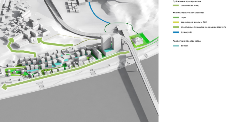
Master Plan stage. Scheme of pedestrian connections of the Blagoveshchenskaya Sloboda area in Nizhny Novgorod
Copyright: © Ostozhenka Architects
Area Planning Project (APP) of Blagoveshchenskaya Sloboda in Nizhny Novgorod
Copyright: © Golden Section
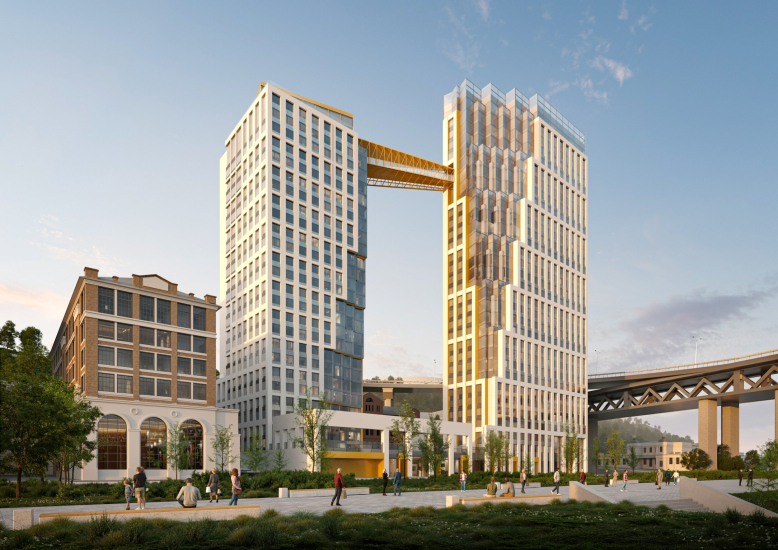
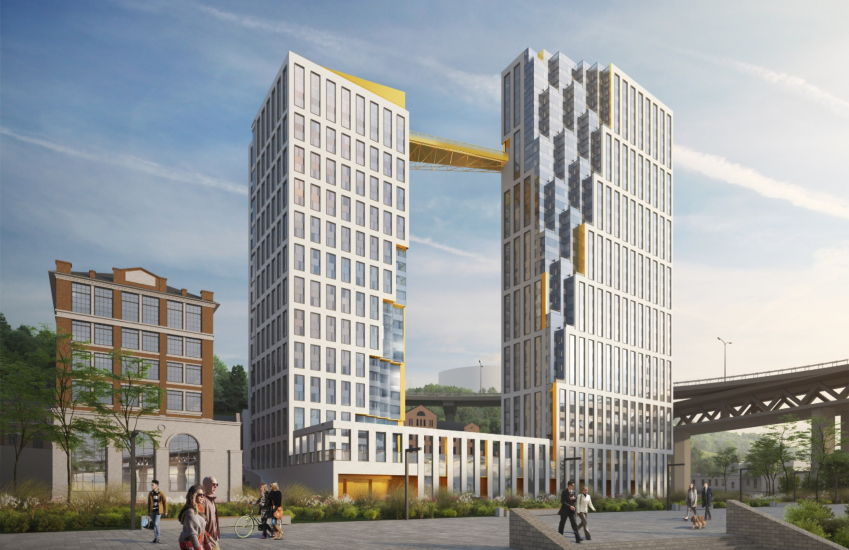
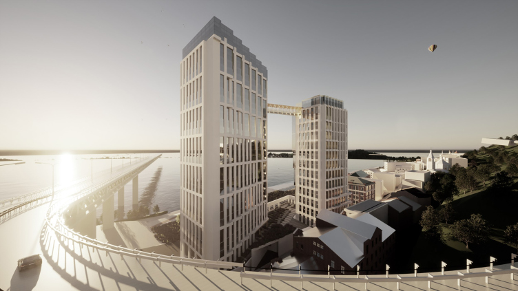
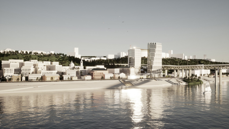
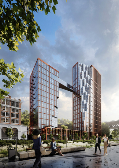
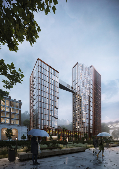
The third feature, or rather a fundamental component of the project, is the towers. As mentioned earlier, they form a pair with the Metro Bridge: the bridge is long, the towers are tall, and they inherit the height of the demolished Soviet elevator with a slight correction—the elevator’s height was 75 m, and now a full 100 is allowed. It is even rumored that if a taller height were permitted, it would have turned out even better. However, 100 m is considered optimal from an economic point of view. These will also be the first 100-meter towers in Nizhny; technically, their height is 99.9 m.
Both the architects and the architectural council considered several options for the towers, all consisting of two volumes, with parking, a restaurant, and a multi-level stylobate with a courtyard on its roof. The final version became plate-like towers with a white vertical lattice on the facades and colonnade of the stylobate and volumetric stepped glass slices that mirror each other – as if someone with a very large and coarse saw walked between the towers. The colors chosen were GloraX’s “signature” colors – white and gold – so that depending on the sun’s position, the gaps and ends were supposed to appear either golden or textured and volumetric.
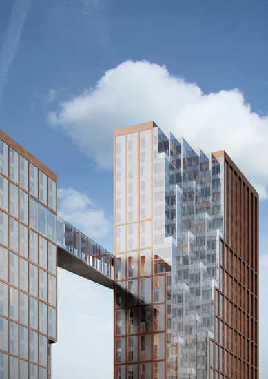
The height of the larger tower is 99.9 m, and the smaller one is 86 m. At the height of the 26th floor, the towers are connected by the same golden cantilever, with a truss that unmistakably echoes the Metro Bridge, emphasizing its compositional connection with the towers: as if here, at a great height, another bridge was thrown.
The “Project” stage of tower development. View from the side of the Metro Bridge
Copyright: © Ostozhenka Architects
The “Project” stage of tower development. View from the side of the Metro Bridge
Copyright: © Ostozhenka Architects
If you look at the future district from the side of the Fair, you can see how the buildings gradually grow towards the bridge, primarily due to historical buildings, mills, and even a church high on the slope – and then “shoot out” with two towers, marking the beginning of another part of the city.
The “Project” stage of tower development. Stage “Project” development of four clusters of the Blagoveshchenskaya Sloboda territory in Nizhny Novgorod. View from the Oka side
Copyright: © Ostozhenka Architects
The white color, meanwhile, unified all parts of the project, serving as a common base despite differences in height, form, and material – the facades of the towers were planned to be aluminum, with natural materials prevailing in the mid-rise section.
The master plan has been approved, as well as the detailed development plan based on it, as well as the general architectural solutions for the towers.
Meanwhile, while still working on the project, Ostozhenka architects in agreement with the client, introduced another nuance – they proposed to divide the slope into 5 parts and invited Nizhny Novgorod architects to work on the Project stage within the master plan. Thus, Arkhstroi and Alexander Dekhtyar, who had previously worked on this site multiple times, returned to the project.
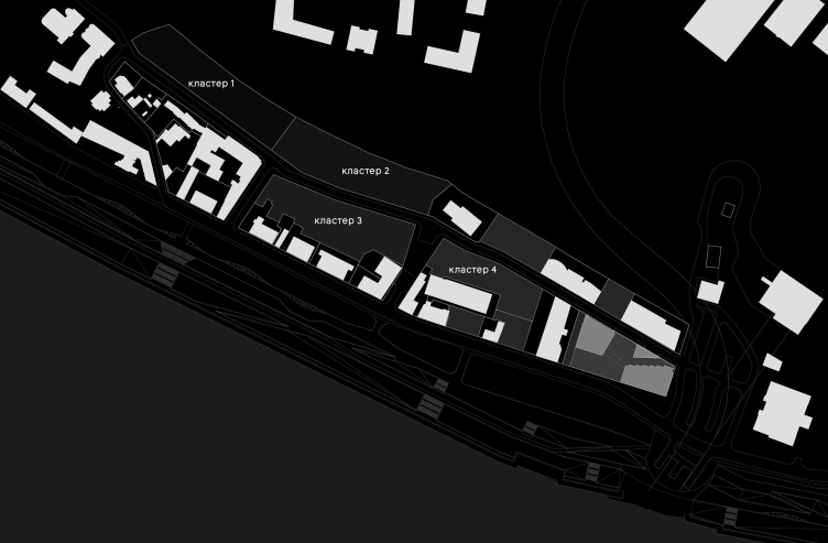
The “Project” stage of development of four clusters of Blagoveshchenskaya Sloboda area in Nizhny Novgorod. The clusters
Copyright: © Ostozhenka Architects
The work on the Project stage, in anticipation of obtaining the general architectural solutions, is approaching completion. All parameters, including heights and insolation, are being refined. In some cases, based on the remarks of the architectural council, the heights are slightly reduced. The renders of individual clusters shown here are not related to the Project stage but belong to the 2023 master plan.
However, we talked to all the participants working on the development of Chernigovskaya Street, and asked each of them to comment on their decisions.
We know the area well; several years ago we worked on development projects here. We looked closely at the bakery site, but we studied it in connection with the entire territory as a whole – in the status of preliminary studies. In our projects, the density of the mid-rise part was somewhat less, and the morphology of its construction was stricter and slightly more rigid: the plans were in the form of the Cyrillic letter Ш, open to the river. And our color – on the contrary – was more picturesque, adaptively immersed in the “earthy” range of brick and plaster. I still believe that only the Church of St. John the Baptist and the monastery should remain white, so they stand out better against the background of the buildings, both old and new. White-colored houses seem to me... not meant from our latitudes, they look as if they were taken from some seaside town – I said this at the Architectural Council, and I told the authors about it too.
But now we are working in the direction set by Ostozhenka, within the framework of the master plan, so our color set is also light gray, conditionally white stone. And the texture of the facades is brick, in two variants: a simple brick surface and a relief-striped one, designed for oblique light. In addition, we suggested adding texture, most likely fiber cement, and inserts – to build up references to the XVII century and to the Annunciation Monastery. Perhaps even tiles would be appropriate here.
But now we are working in the direction set by Ostozhenka, within the framework of the master plan, so our color set is also light gray, conditionally white stone. And the texture of the facades is brick, in two variants: a simple brick surface and a relief-striped one, designed for oblique light. In addition, we suggested adding texture, most likely fiber cement, and inserts – to build up references to the XVII century and to the Annunciation Monastery. Perhaps even tiles would be appropriate here.
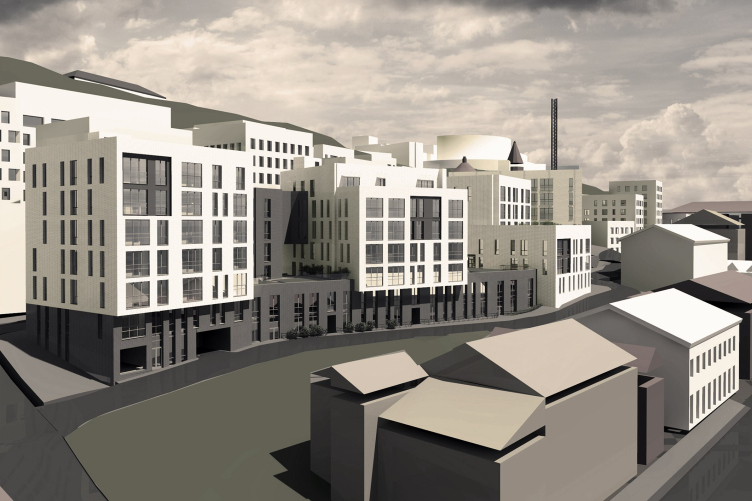
The “Project” stage of development of four clusters of Blagoveshchenskaya Sloboda in Nizhny Novgorod. Cluster 3, view from the Oka side
Copyright: © Arkhstroy
The first section, low-height due to its proximity to the monastery, is handled by GORA architects led by Stanislav Gorshunov. One of the kindergartens is integrated here, in the northernmost part of the complex.
I think this project is appropriate, it fits in correctly with the existing development, and I do not agree with those who oppose any development of the territory of Chernigovskaya and Garshina Streets in principle. It seems to me that this territory should be developed, to make it better for both residents and tourists.
Our site is located in the western part, next to the Annunciation Monastery, so we tried to keep on the edge between minimalist architecture and some very light “Old Russia” allusions. The building next to the monastery, with a built-in kindergarten, is light brick with wide slopes, and for the neighboring one we proposed a motif similar to open shutters – with transverse inserts. Further on, everything dissolves, becoming more modern. We did not deviate from Ostozhenka’s proposal; we tried to stay within the master plan. I would say that there was a little more certainty than usual.
Our site is located in the western part, next to the Annunciation Monastery, so we tried to keep on the edge between minimalist architecture and some very light “Old Russia” allusions. The building next to the monastery, with a built-in kindergarten, is light brick with wide slopes, and for the neighboring one we proposed a motif similar to open shutters – with transverse inserts. Further on, everything dissolves, becoming more modern. We did not deviate from Ostozhenka’s proposal; we tried to stay within the master plan. I would say that there was a little more certainty than usual.
Cluster 1. “Project” stage of development of four clusters of the Blagoveshchenskaya Sloboda area in Nizhny Novgorod
Copyright: © GORA Architects / Visualization © Framestudio
Now, at the Project stage, about half of the entire complex, including clusters 2, 4, and the towers, is being handled by the Moscow-based MIR bureau headed by Arkady Smirnov.
We faced many challenges in our work.
We had to comprehensively design a complex site and a non-standard compositional solution.
In the entire development we strived to realize the transition from history to modernity, using actual materials and solutions, but preserving the proportions and techniques typical of the historical environment.
The alternative facades of the Towers were designed in two materials – ceramic and aluminum panel: terracotta as a tribute to the historical context, and aluminum as a modern and technological response.
Blocks 2 and 4 are located in the southern part of the territory, closer to the mills and future towers. Their area includes the John the Baptist Church, the urban square in front of it with cross-links – a descent towards the embankment, and another of the two integrated kindergartens. As far as I could understand, the facades designed by MIR will not be very similar to the preliminary developments of the master plan, but the volumes and functional structure will be approximately the same, with minor adjustments and corrections.
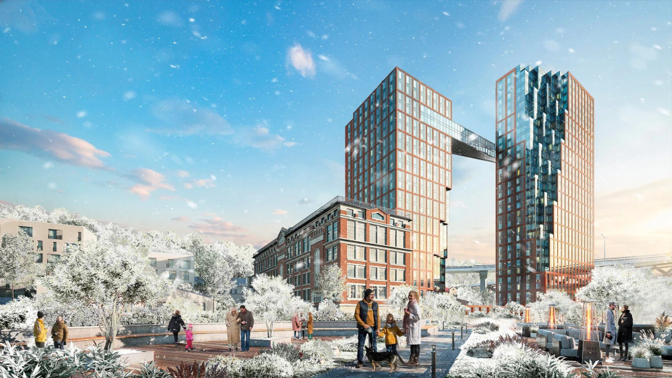
The history of the towers, in turn, developed as follows: the client asked Arkady Smirnov to make another “approach” to their facades, and preferred the red color of the facades with a transition to metallic gray.
The towers became red again, and after the departure of the Ostozhenka architects the project turned again towards the direction explored in previous proposals, particularly in the towers by Evgeny Gerasimov in 2018. Even the truss, which became a glass bridge, remotely resembles the glass horizontal in Gerasimov’s project. The shade – judging from the renders – is more purplish than terracotta, but the towers became more resonant with Bashkirov’s mill, merging with it in a single row.
As for their departure from the project of Blagoveshchenskaya Sloboda, the Ostozhenka architects explained it to me like this: “we did our job and parted ways peacefully”.
***
However, what is interesting is not just another episode of the creative search, but the entire project as a whole. It strongly reveals a sequence of overlays, discussions, and contradictory opinions: one person dislikes one thing, another dislikes something else, someone pulls in their direction more strongly, someone does not... Someone doubts the feasibility, someone is glad that history has finally moved forward. Isn’t this how the development of a city usually unfolds? Codes transform, ideas are reworked, their core – well, at least for some time – is preserved and takes on a unifying role. But everything is constantly moving, not standing still.In the last 15, or perhaps 25 years, it has become terribly fashionable to simulate the natural development of the city in new projects. Especially since these new projects have become so enormous that they constantly risk losing the human dimension. Hence, the architects integrate diversity into them – and sometimes it reaches desperate gaudiness, for example, in multicolored sections. Sometimes they invite different architects to make the project “naturally diverse”; this is also a trend. The Chernigovskaya Street project falls into this preference, but it differs, in my opinion, in two things. First, from the very beginning, it was not only a striving for diversity but also the ways of integrating it into a holistic solution. Second, it is so integrated “into life itself” with all its limitations, elaborations, and discussions that diversity here turns out to be more than a natural consequence of the convergence of a large number of circumstances.
It’s interesting to see what the outcome will be. Construction of the first phase – the towers near the bridge with high-end housing – has now begun, and the second phase will involve adapting Bashkirov’s mill.


