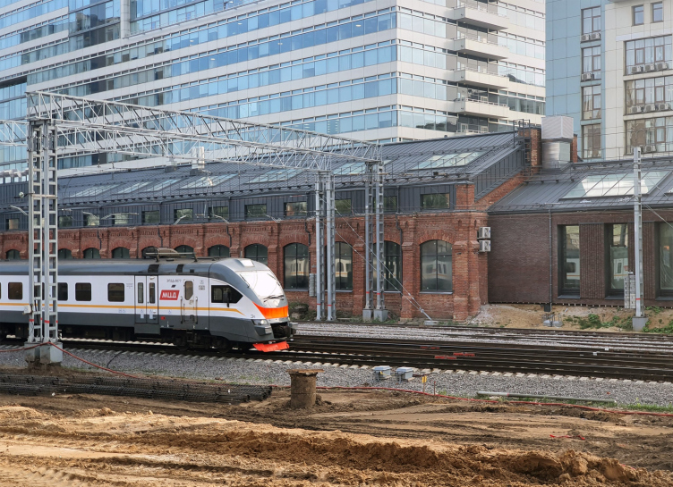
However, there are no authentic buildings of Matvei Kazakov’s authorship on this street, and the context, in which the new loft clubhouse appeared, is quite different. The street only starts with a remarkable monument of classicism, the Church of the Ascension, and comes to the Arma Factory and brick buildings of the industrial estate situated on either side of the Gorky railroad.
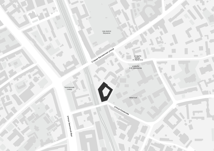
The location plan. Kazakov Grand Loft
Copyright: © Ostozhenka
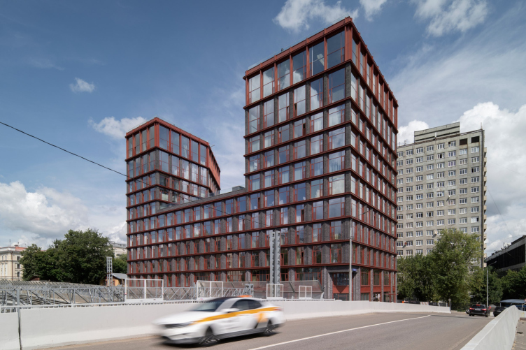
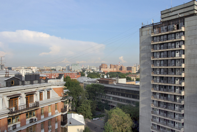
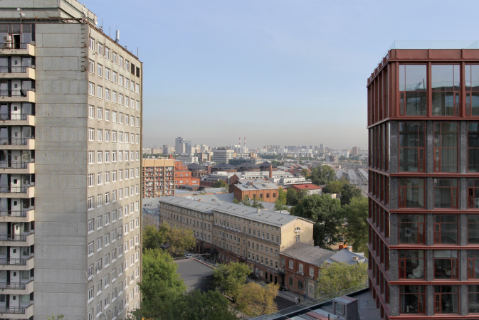
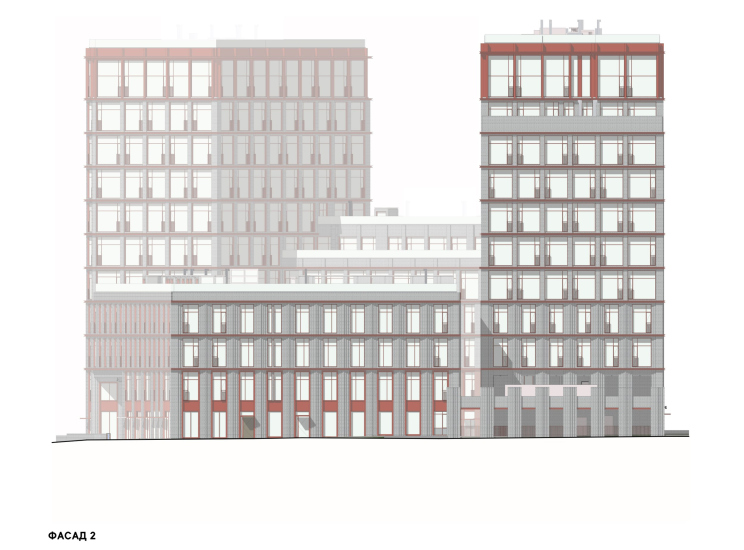
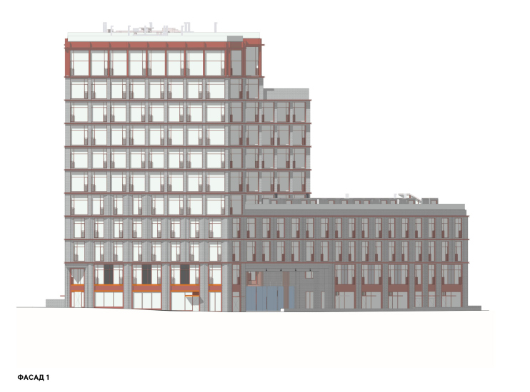
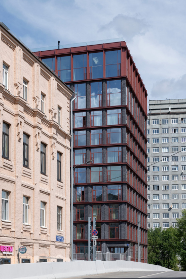
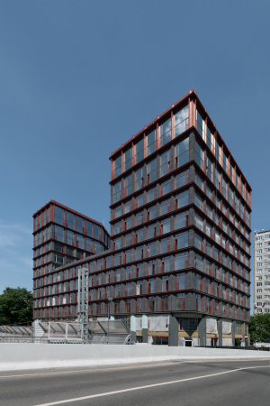
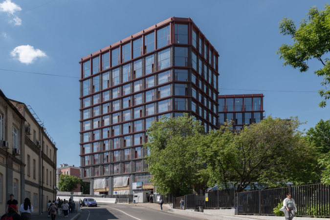
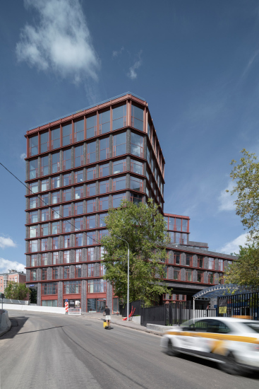
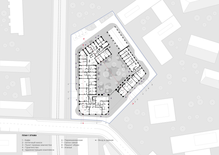
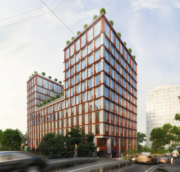
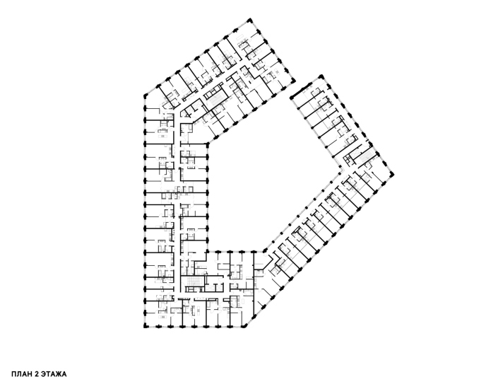
Kazakov Grand Loft faces Kazakov Street with the shortest side of its irregular pentagonal plan – you could say it “peeps out”. The street itself makes a wide-angle turn here and turns into a bridge: you enter it from the Garden Ring and immediately feel that the two towers of the new building “hold sway” over the neighborhood, being shaded by the gray outline of their plain and brutal-looking neighbor – a 17-story tower of the dormitory of the Institute of Geodesy and Cartography.
Kazakov Grand Loft
Copyright: © Ostozhenka
The Institute of Geodesy and Cartography, by the way, also owns the Demidov House in Gorokhovsky Lane, which was definitely built by Matvey Kazakov and is one of the best examples of Moscow classicism. The building is located right next to the dormitory. In this small neighborhood, you can find almost anything, and everything is close by.
However, the immediate surroundings are brick industrial buildings, both residential and factory ones, which historically gravitated towards the railroad as a convenient means of transportation. It is not surprising that the style for the project of the new premium-class apartment complex was chosen according to the client’s preferences, and that was the loft style.
For Coldy, a company that had previously dealt mainly with renovations, the house at 7 Kazakova Street was the first project to be built entirely from scratch. Partly because of this, and also, of course, because the theme of industrial allusions is still popular, we were asked to do a loft-style project. At first they even considered a version with very high ceilings, but in the end only the apartments on the top two floors remained like that, i.e. almost two stories high.
We agreed with the “loft” direction, as it was in tune with the context, and willingly developed the theme.
Working with the client was quite comfortable, in some respects we met them halfway, and some of our ideas, on the other hand, we managed to justify and preserve. For example, nowadays it is popular to make one big lobby for the whole block – and we made three lobbies, so that each entrance had a concierge and its own set of mailboxes... It is more convenient for people.
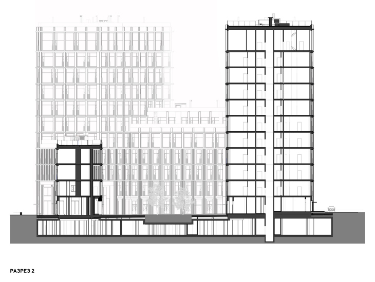
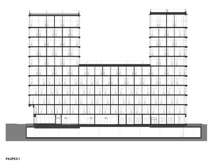
Our special pride is the terraces – they are here on three levels, residents of the upper apartments have access to them, and these terraces command sweeping views. It turned out to be very cozy, and not only for those who will use the terraces: when looking from the courtyard you can see people upstairs, it creates a completely different feeling of inhabitability of the house, which is not yet quite typical for Moscow.
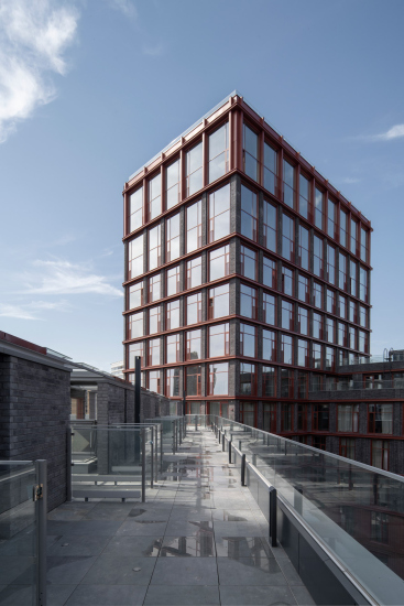
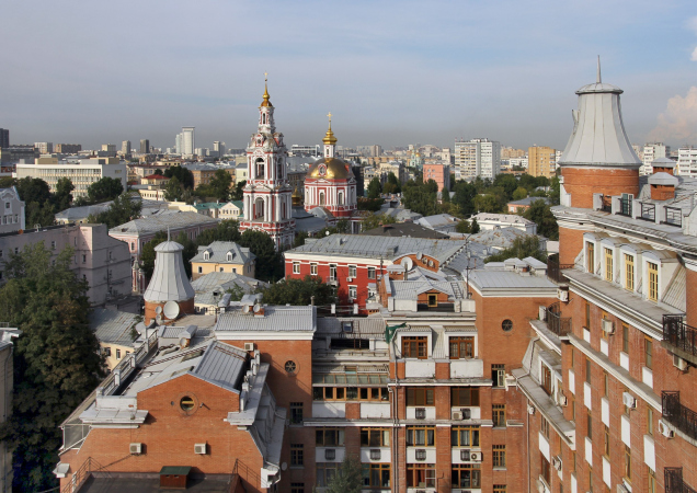
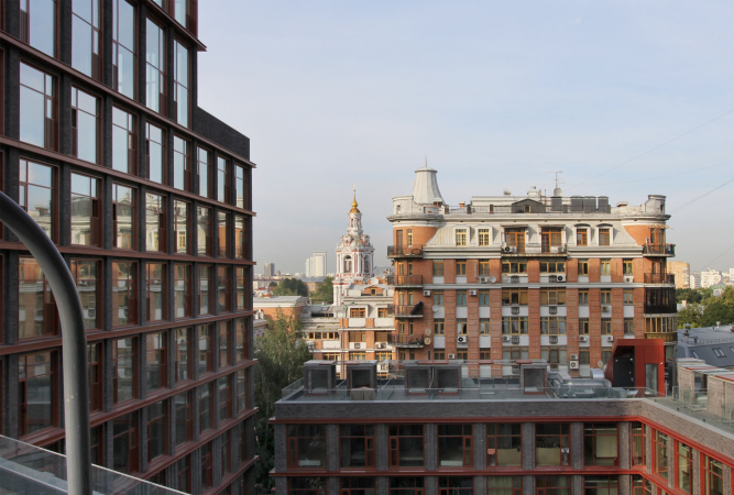
The terraces on the roofs of the 4th, 5th, 6th, 9th and 11th floors, and the views that open up from them, are truly one of the most winning ideas implemented of this house. The neighborhood panoramas have real gems in them, such as the baroque church of Nikita Martyr on Staraya Basmannaya, and at the same time the distant views are truly majestic. The tower of the hostel somehow does not interfere much. The plus is that from here we see the city, first of all, historical, that is really possessing quality and interesting inclusions, and, secondly, not from an eagle’s flight, but so that something can be seen. Such panoramas were made by photographers at the beginning of the XX century: they do have things in them that catch the eye.
The terraces are different: since the roofs are stepped, some of them can be accessed directly from the apartments through glass doors, while others – through skylights on the roof. The largest skylights are located on the highest open-air roof on the 11th floor, on the tower. The terraces of the apartments are separated from each other by a barrier made of postless glass, but there is also an end-to-end “gallery” along them, which is accessible to all residents of the building.
Needless to say, the presence of a private terrace affects the price of the apartments, and they are almost all sold out by now.
I asked the management company if there was any danger of the residents glazing their terraces, and of “glass boxes” thus appearing on them? I was assured that the residents are still sympathetic to the prohibition of glazing, and the house rules are almost ready, and when they are approved at the meeting, nothing will threaten the architectural solution.
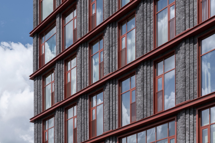
The combination of brick and metal is, of course, responsible for creating the “loft” imagery.
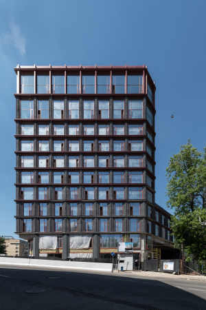
In our case, however, we are witnessing a “reverse” situation. Usually, brick is red and metal is black (aren’t they?), but here the architects switched their places: brick is black and metal is red. The result is both traditional and contextual, yet at the same time original and fresh: there is nothing like it around, although there are plenty of brick buildings in the area, both exposed and painted in various lovely colors, from yellow to pink.
The black and gray color helps to separate the house from its surroundings and turn it into an accent. Perhaps only the freshly repaired extension to the nearby carriage repair depot, which is now being transformed into a community center designed by Sergei Trukhanov, can make a small exception to it, but, as usual, it confirms the general rule: one of the ways for a modern architect to dialogically approach the brick style of the 19th century is to choose a darker material.
View of the former car repair depot building on the opposite side of the street and railroad tracks
Copyright: © Ostozhenka
We can see it in Arma’s “gas holders”, which can be seen quite well from the terraces of the Kazakov Grand Loft. However, in both cases the brick is brown, while here it is monochromatic gray.
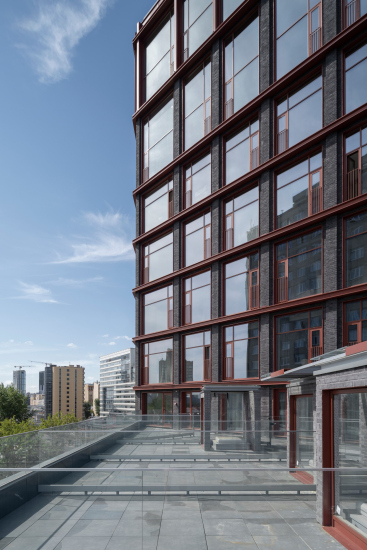
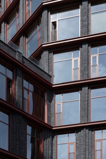
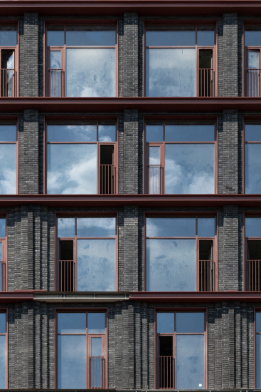
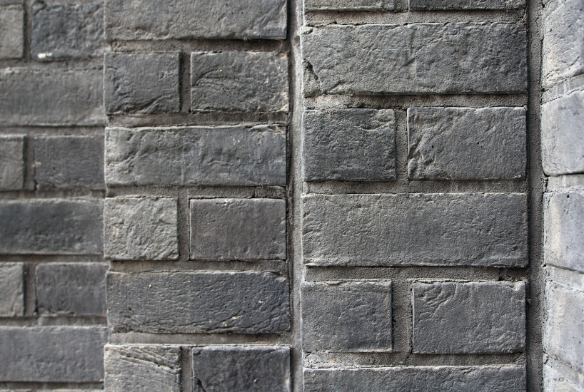
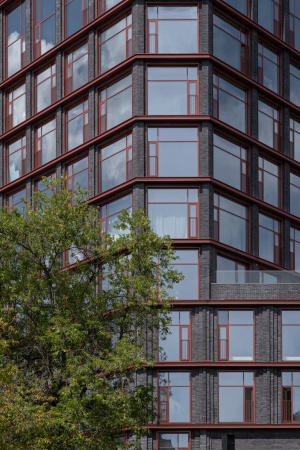
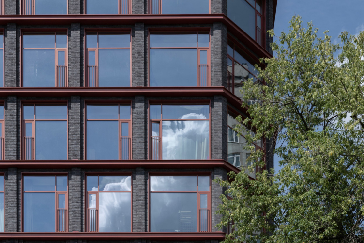
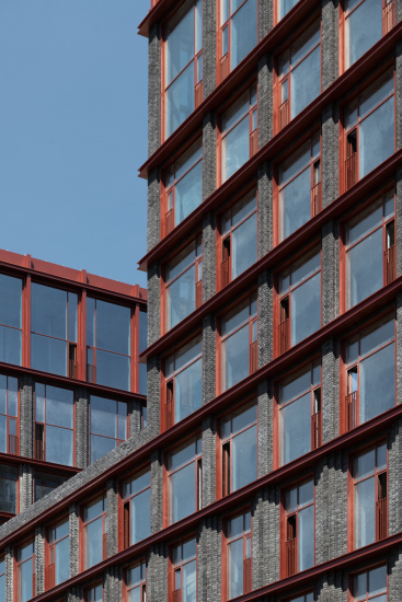
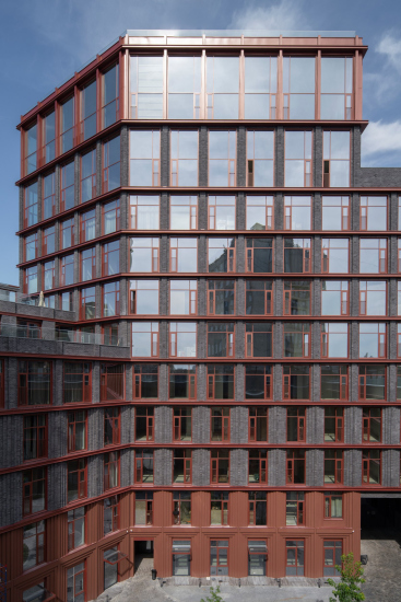
On the facades of Kazakov 7 building, the brick is replaced by concrete tiles, which is not always a good idea, but in this case it looks good for several reasons. First of all, the partitions, especially the lower ones, have been given a layered stepped structure, which modern Moscow borrowed from the 1930s and which is very relevant at the moment – it is a fashion trend in club houses. Layering gives light and shade, the surface is not flat, so not everything depends on the brick texture alone. Secondly, the fashionable stepped quality is usually implemented in something that is respectable beige, like limestone or fiber concrete, but here it is dark gray matte tiles displaying this characteristic “gray hair” – it ends up a little more brutal-looking than usual, which removes the glamorous flair from the excessively fashionable technique.
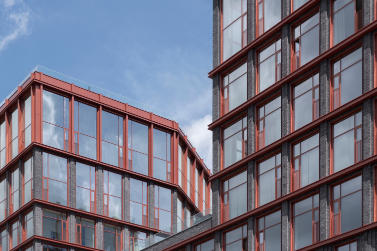
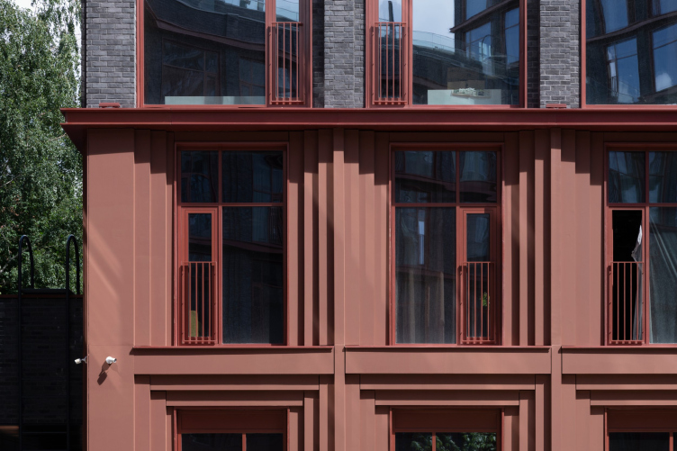
And finally, the project is crowned with detailed drawing in red: both the window frames, and the French balconies arranged in a strictly staggered order, are neatly accentuated. Dark brick and red – sometimes terracotta and sometimes, especially in the foreshortening, burgundy-copper – equally share the viewer’s attention, which is to the benefit of both. The main thing is their unusual contrast and lines emphasized by the shadows of the relief, rather than the subtleties of each material. It should be noted that Valery Kanyashin originally planned to use Corten steel, which was later replaced by metal, which was painted to imitate copper and red frames. Paradoxically, this made the house look much more original.
Again, surprisingly, red frames are usually irritating, but here they are not. In combination with the double L-beam-like, again red, inter-floor tie-beams, which are especially good in the perspective, and with the partitions of the upper tier of the penthouses, the “red” theme turns into a full-fledged part of the facade grid with its own rhythm and laws.
Kazakov Grand Loft
Copyright: © Ostozhenka
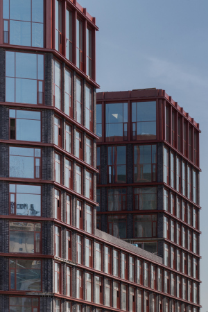
It seems that the metal lattice, like a kind of framework, extends the brick surface of the facade from the lower tiers to the upper tiers, making more space for the windows and gradually gaining more and more rights, “taking over” the facade from the bottom to the fully “copper” top.
Kazakov Grand Loft
Copyright: © Ostozhenka
The metal lattice seems to extend the brick surface of the façade from the lower tiers to the upper tiers, making more space for the glass and gradually gaining more rights, “taking over” the façade from the bottom to the fully “copper” top.
Kazakov Grand Loft
Copyright: © Ostozhenka
I should note that this whole game, in which metal and glass acquire, from an aesthetic point of view, much more rights than in ordinary historical industrial architecture, indicates quite unambiguously that “loft” in this case is just a theme, and nothing more.
Interpreted through contemporary means, focused on the plastique reflection of the subjects inspired by the urban environment, in search of a solution that is contextual, yet notable and exceptional.
Kazakov Grand Loft
Copyright: © Ostozhenka
In this case, for example, the inter-floor double-L-beams – although this is a widespread technique for modern facades – seem to me to be an allusion to the proximity of the railroad. And the asymmetrical pentagonal configuration of the block seems to echo the pointed nose of the small factory building across the street.
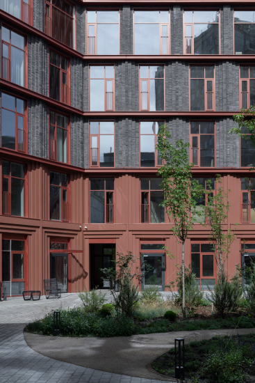
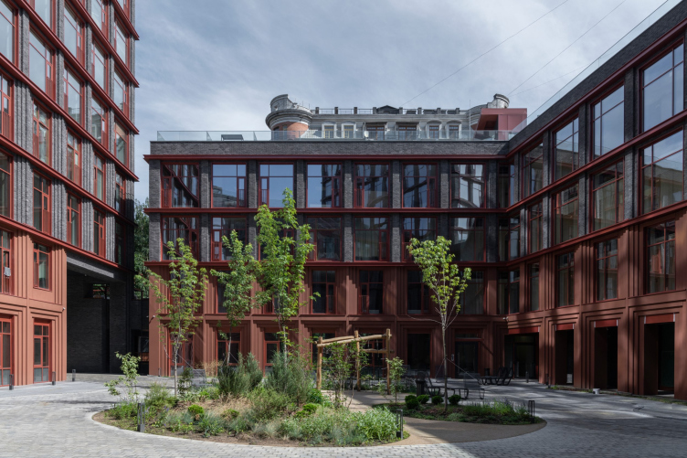
The courtyard is just as interesting as the terraces and facades. It is small and surprisingly quiet.
The main facade theme is realized here in the same way as on the outside, but to emphasize the internal character of the space, the two lower floors have become terracotta without losing their layered structure. They are faced with painted concrete panels, their color slightly different from the frames and window frames, so that we get three close but different shades. This is the result of a coincidence, the architects wanted to choose close colors, but given the difference in materials, it was not possible to completely “hit” the shade. Now it seems that this coincidence was a very lucky one. Warm terracotta color of the panels is appropriate for the courtyard as an internal space, it emphasizes the uniform layering of partitions – but at the same time, somewhere on the periphery of consciousness, there is still a slight surprise: such surfaces are not common and therefore anything but trivial.
Kazakov Grand Loft
Copyright: © Ostozhenka
Once inside, you can feel how important the varying height of stories is. Since the courtyard is enclosed, the architects had to make sure that it was not a “well” – the small height of the four-story linking volumes is very appropriate, as well as the division into two colors: the lower terracotta and the upper dark gray reduce the scale. The fact that at the top you can see the glass fences of the terraces adds both urban coziness and intrigue, because it is always interesting to see what is there on the roof. Besides, the courtyard contour is not square, the walls are turned at an angle and are perceived from different vantage points.
Master plan and plan of the first floor. Kazakov Grand Loft
Copyright: © Ostozhenka
Ostozhenka would not be Ostozhenka if it hadn’t designed small galleries on poles along two walls of the courtyard, which also adds to the architectural intrigue. One, quite small, disguises the main entrance lobby, while the rear doors of the first floor premises, some of which are already occupied by cafes, open into the other.
The portals leading to the courtyard are a highlight. There are two of them, and they are large, two stories high, which works well for managing the scale – and they are installed diagonally one opposite the other: the main one on the street side and the far one, next to the ramp of the entrance to the underground parking lot.
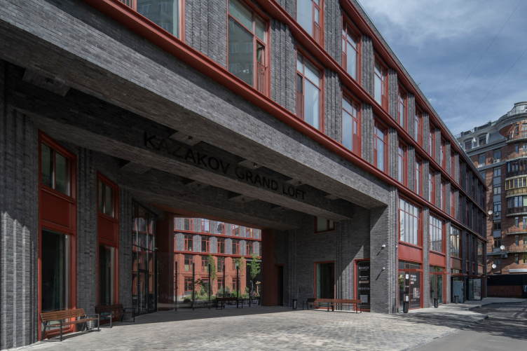
Personally, I was fascinated by these two arches. The first and main one is trapezoidal and expands like a socket towards the street so that its left side is directly perpendicular to the western part of Kazakova Street, but it comes out on it at the turning point – it “catches” the person walking by, indicating its presence at the very last moment. The right side of this arch is perpendicular to the walls of its section and at the same time to the eastern part of Kazakov Street, the one that starts after the turn. One might think that the arch reflects to some extent the atypical position of the house in the city and its relation to the street direction.
Kazakov Grand Loft
Copyright: © Ostozhenka
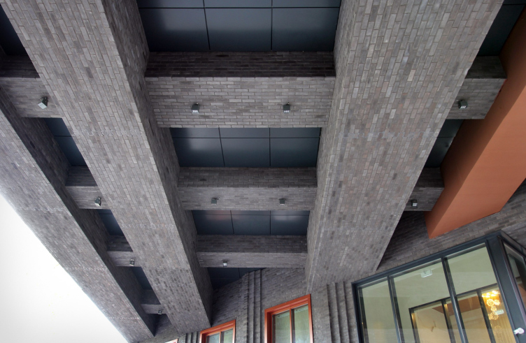
Emotion-wise, however, the “arch” itself is more impressive, because its flooring is accentuated by volumetric beams – a whole network of them – longitudinal and transverse, in two levels. The sidewalls of the socket sport the same stepped vanes and red bindings; they emphasize the fact that the walls belong to the facade – but because of the beams, the impression is created that the house was cut through, revealing the inner matter on the cut.
Curiously, at the entrance, where the house presents its ideas, the “loft” theme, brutal and severe, is especially strong, while the “jewelry” shade inherent in the facade, created by gloss of metal and glass, is weakened here: we enter a deep shaded loggia, almost like a cave, but even with a tinge of “wagon-repair” imagery.
I would like to emphasize that the Kazakov Grand Loft entrance sign is black, and it is placed not on the first frieze, but on the second beam, in the depths – a beautiful idea.
The structure of the beams inside of the arch. Kazakov Grand Loft
Copyright: © Ostozhenka
An arch is an arch; compositionally, it is the main entrance, but you cannot enter through it, which is also one of the paradoxes of this building. You can’t drive into it either – the aperture is closed by a glass partition – and special vehicles enter the courtyard through the grating of the rear driveway. The current main entrance from the city, which also leads to the courtyard, is on the left, in a two-light lobby on the corner. The archway, on the other hand, is just a plaza in front of it, an imposing protection from the rain (a very handy place, I’ve seen delivery men hide in there) and a way of organizing the space. Quite impressive.
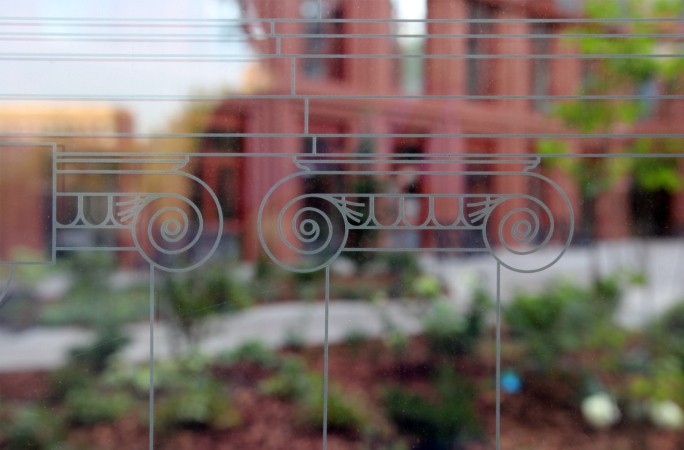
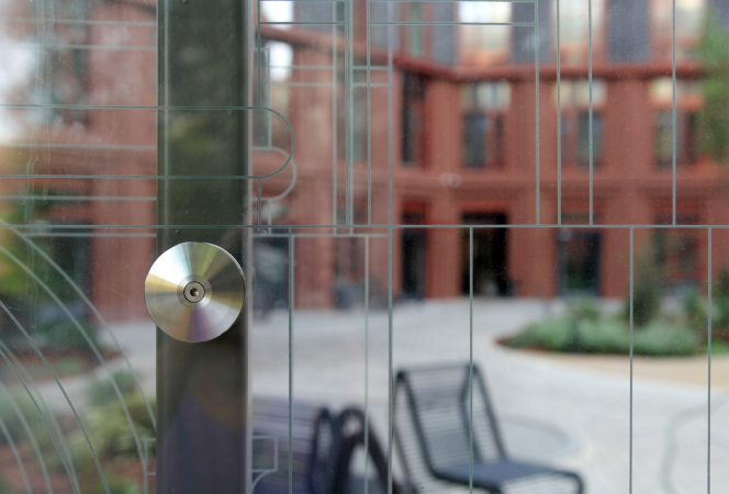
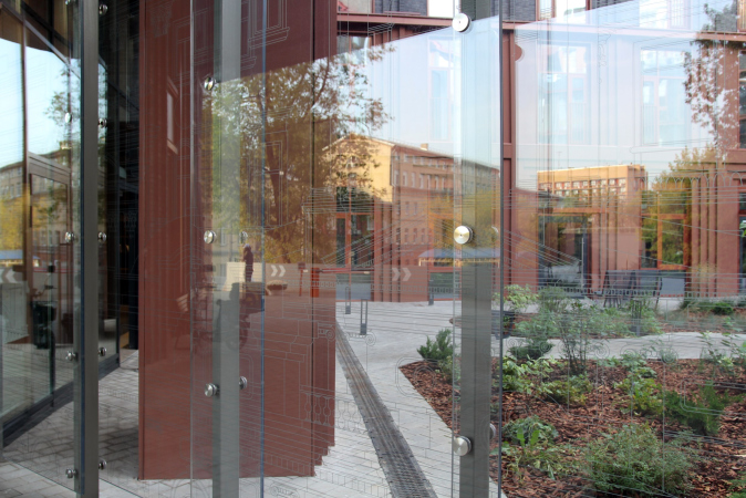
The decisive brutality of the horizontal beams is balanced by a glass partition, the same one that separates the courtyard from the city. The glass is securely fastened on metal supports in several different positions, closer and farther away; they create an insurmountable barrier, but not for the human eye: you can look into the courtyard, and the glass, it should be noted, is much less annoying than metal bars. In addition, the generalized contours of pediments, windows, balustrades and capitals are silk-screened onto the glass – bringing us back to thoughts of Kazakov Street and the beauties of Moscow classicism. This creates a new semantic accent, making us at least guess that from the terraces of the house we can see the Baroque Church of Nikita Martyr, and even the roof of Ivan Demidov’s Golden House.
Printing images on glass is a technique of modern exhibition and park design; in addition, it creates quite distinct layering.
The interiors of the lobbies are based on the same theme – there are three of them: one, at the main entrance, the one that lets us into the courtyard, is larger and double-height; in addition to armchairs and a reception desk, there is a bookcase with books for bookcrossing. The interiors of all the lobbies continue the theme set by the glass of the entrance arch, either the shallow relief or the glass display architectural compositions in the spirit of stylized panoramas of Basmanny district. However, according to the architects, they remind us of the overall idea, which was set earlier to be finalized by other architects, and the interior somehow falls out of the discourse.
***
In conclusion, however, I would like to return to something else: to the thought that slipped in here at the beginning about the house’s resemblance to a fortress. It does indeed look like one, with its two towers and a huge gate, through which one cannot pass, but must go through the guards, and it resembles – remotely, of course – something of the Gwelphs and Ghibellines. The stepped vanes then seem like Gothic wispy columns, and the very small projections at the top of the copper pylons of the top almost like pinnacles or even dentils. And at this point we suddenly remember that industrial brick architecture of the turn of the XIX-XX centuries, of which most “lofts” are made today, was characterized by a romantic note, various kinds of stylizations of castles and fortresses.
Then everything falls into place and starts making perfect sense. Exploring the theme, the architects of Kazakov Grand Loft not just made a color reversal of characteristic materials, increased the height of the upper floors and divided the floors with double-L-beams – they have also offered their own version of the main theme, a kind of Winterfell, refreshed with a modern approach and materials. Here the necessity to walk on the roofs of small volumes as on walls becomes clear and logical, the galleries from inside the courtyard show some new meaning, and the detour/bypass of the building, surrounded on two sides by a brick wall and on the third by a plastic screen, acquires a resemblance not so much to a new city street as to a drained castle moat. But this is all, of course, a play of imagination, and you don’t have to take my words at face value.
It is surprising to remember that in 2015 the Arch Council rejected the project of this building on the same site.


