По-русски

A Complex Dimension of a Dream

The TOTEMENT/PAPER project by Levon Airapetov and Valeria Preobrazhenskaya became, as was announced in the beginning of August, the winner of the competition for designing “Ostrov Mechty” (“Dream Island”) metro station. Contrastive graphics, united by a common method of geometric composition, “grows into the volume”, gets embellished with color, and ultimately results in a compound solution that seemed to us nothing short of exceptional. Below, we examine the construction method and keep our fingers crossed for the project to be implemented the way it should be – it would be exciting to see it become a reality.

23 August 2022
Contest Results
mainImg
The competition for the architectural image of the stations of the Biryulevo metro line “Ostrov Mechty” and “Zagorye” was announced in March on the initiative of Mosinzhproekt Group. The operator of the competition was the agency for strategic development TSENTR. First, there was a qualification round where the applicants were screened by portfolios and essays. Applications came in from 7 consortiums and 56 individual contestants. For each of the stations, five finalists were shortlisted that got down to developing the projects.

The final session of the judging panel took place on August 3. For the “Dream Island” station, the winner was the project submitted by TOTEMENT/PAPER.

Ostrov Mechty (“Dream Island”) metro station. A competition ptroject 2022
Copyright: © TOTEMENT/PAPER


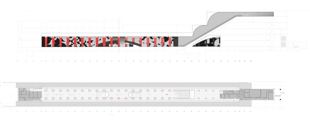
This station is shallow-depth, located in the bend of the Moskva River, with one platform, tracks running on either side of it, and a gallery for transferring to the “Technopark” station of the Zamoskvoretskaya (“green”) line situated on the second tier of the inner space.

The future “Ostrov Mechty” station will be situated between the namesake amusement park and west of the Andropov Avenue, Technopark, Nagatino i-Land and NOW housing complexes, and, situated a little bit further away, the Shagal housing complex belonging to the giant ZIL-South residential area. Currently, this whole territory is developing really fast, and the new station will facilitate access both to the residential function and to the amusement park; the latter, by the way, is a pretty controversial project, particularly from the standpoint of architectural solutions, but there is no denying the fact that the park is large and very popular. In a word, in this location the city needed a station that is big and bright – at least, noticeable both in the city environment and among the multiplying new metro stations. A station that no one would miss.

The project proposed by TOTEMENT/PAPER responds to these challenges confidently and unambiguously, maybe even with some “margin” of expression of plastique statement “for the future”, which, after all, is not a bad thing.

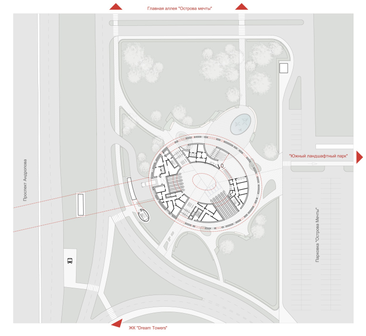
The master plan. Ostrov Mechty (“Dream Island”) metro station. A competition ptroject 2022
Copyright: © TOTEMENT/PAPER


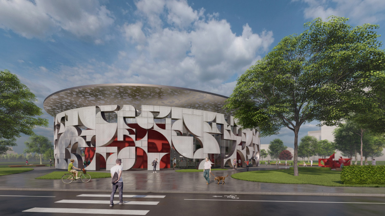
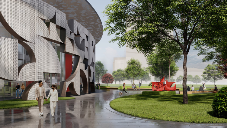
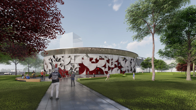
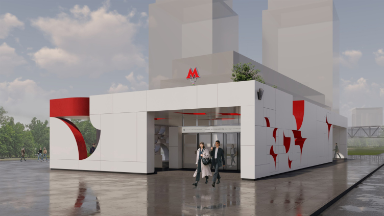
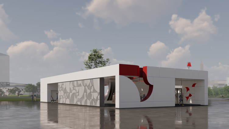
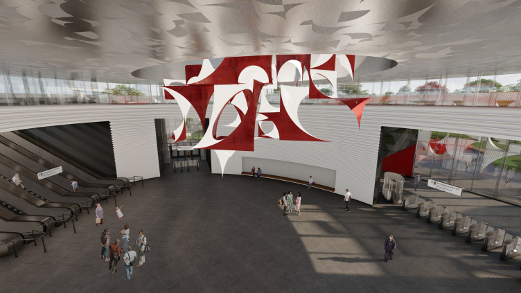
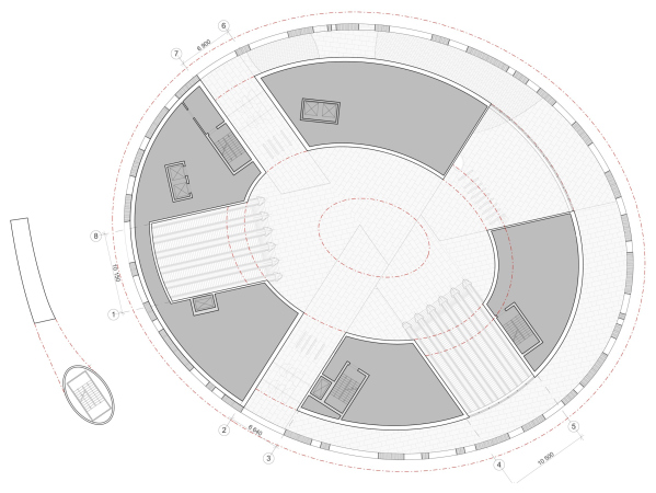
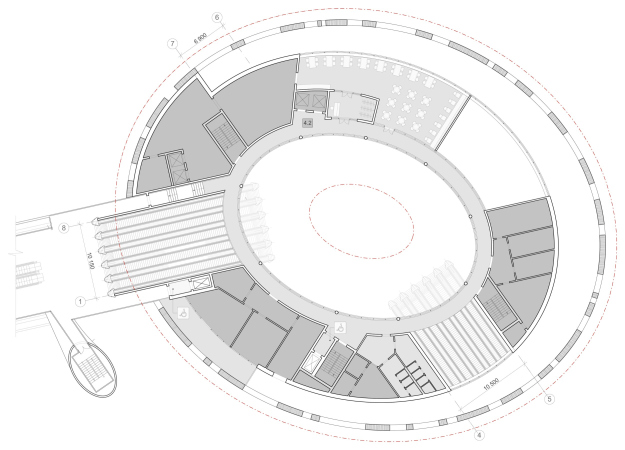
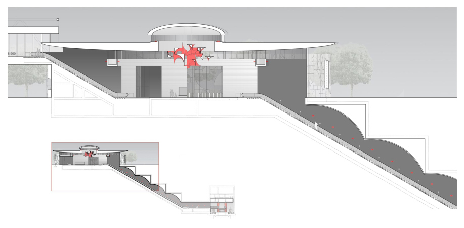
The underground platform of the station will be situated underneath Andropov Avenue, perpendicular to its direction. On either side of it, there will be overland entrance vestibules – one larger and one smaller. Within the framework of the competition concept, the authors developed versions with one vestibule and one pavilion – two versions of overland facilities for entering the station from the city. The larger one, oval and consisting of three tiers, is placed East of the avenue, next to the Dream Towers housing complex. The smaller pavilion is situated west of the avenue, on the Technopark side; currently, however, both volumes must merely demonstrate the idea. Eventually, there will be more vestibules and pavilions. And then again, it’s not about the number of pavilions and vestibules but about the approach to plastique that unites them and connects them to the space of the underground platform, making the station look flashy and recognizable.

Ostrov Mechty (“Dream Island”) metro station. A competition ptroject 2022
Copyright: © TOTEMENT/PAPER


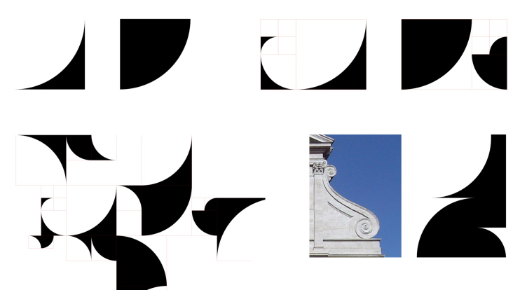
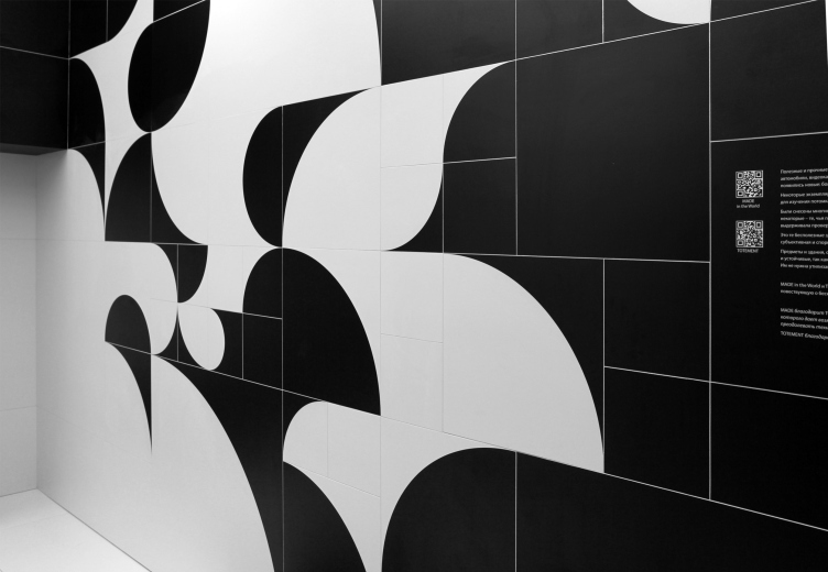
As is known, Levon Airapetov and Valeria Preobrazhenskaya [TOTEMENT/PAPER] are the advocates of a complex shape – the kind that you can examine, visually “decipher”, and follow infinitely: you will never get tired of this. This is a great responsibility – finding a solution that is both compound and integral. In this case, the architects achieved this balance thanks to a technique, or should we say method, invented a few decades ago by Valeria’s father, engineer Oleg Preobrazhensky. In a nutshell, the picture is composed of quarters of a circle of two contrasting colors. The simplest option is black and white; the “bulgy” quarter of the circle can be either white or black part, which, when you put the two shapes together, results in a smooth line of an S-shaped silhouette or, conversely, looking like figure 3.

On the other hand, each quarter of the circle is inscribed into a square, and these squares are not identical, although aliquot in size, which dramatically increases the number of possible combinations. Following the logic of diminishing, the arches can be fitted into a spiral “ear” that literally resembles the “golden section”, although of slightly different proportions. By combining the curves, you can also get a shape similar to the scroll of a baroque facade – it is for a reason that the architects define their style as “neo-baroque”.

The schemes for developing the drawing. Ostrov Mechty (“Dream Island”) metro station. A competition ptroject 2022
Copyright: © TOTEMENT/PAPER


The first time that the experiments with this method of developing the design were shown by Valeria Preobrazhenskaya was at the ArchMoscow convention in the beginning of summer.

The MADE/ARCHSKIN booth at ArchMoscow convention. Author: Valeria Preobrazhenskaya
Copyright: Photograph: Julia Tarabarina, Archi.ru


The pattern is abstract, subjugated to simple rules, and almost infinitely diverse and rich in probable associations, spurring the imagination of the passengers hurrying by. The first thing that comes to mind when you look at it is stylized leaves.

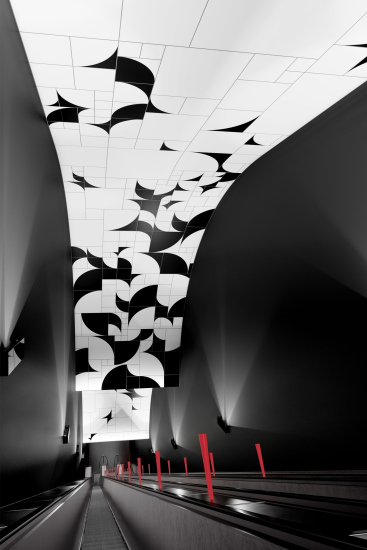
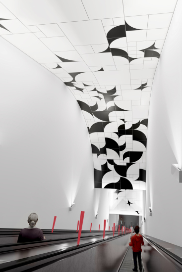
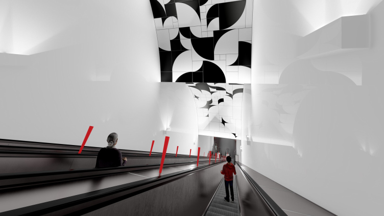
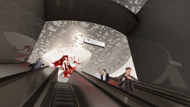
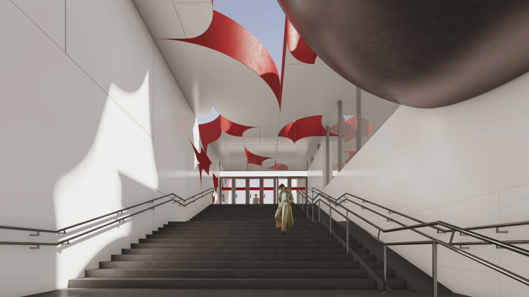
However – participants in the entrance part – it resembles flocks of birds: curiously, the flock on the roof of the large pavilion is dense, flickering up high like a silver cloud, while above the escalators, where the graphics are enhanced with an arc-shaped bend of volumetric waves on the ceiling, the birds look as if they were taking off or landing. We will note here that this method goes from finer shapes to larger ones: black and white walls of the escalators, limited by the arcs of the ceiling, respond to the same theme of the quarter circle.

  • zooming
    The escalator. Ostrov Mechty (“Dream Island”) metro station. A competition ptroject 2022
    Copyright: © TOTEMENT/PAPER
  • zooming
    The escalator. Ostrov Mechty (“Dream Island”) metro station. A competition ptroject 2022
    Copyright: © TOTEMENT/PAPER


Ostrov Mechty (“Dream Island”) metro station. A competition ptroject 2022
Copyright: © TOTEMENT/PAPER


Ostrov Mechty (“Dream Island”) metro station. A competition ptroject 2022
Copyright: © TOTEMENT/PAPER


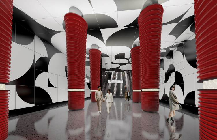
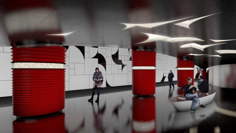
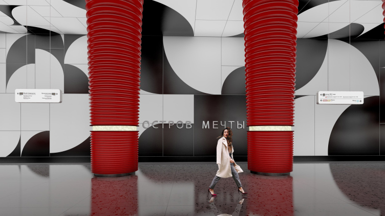
On the walls and the ceiling of the platform itself the pattern becomes larger, and not so much levitates, but simply is in space. The resemblance to birds is rather lost here – waiting for the train, the passenger may only guess what this or that node resembles. However, thanks to the large scale of the elements and the optical effect produced by the contrast of black and white, the figures conceal the corners between the walls and the ceiling, turning the simple parallelepiped of the platform into a paradoxical, not to say “Escher’s” space – about which you begin to suspect that it was built not quite in accordance with Euclidean geometry. In a word, once we get to the station itself, we (to a certain degree) find ourselves “inside” the drawing, which invites you to perceive yourself as a wanton element of an ornament that is also far from predictable.

Ostrov Mechty (“Dream Island”) metro station. A competition ptroject 2022
Copyright: © TOTEMENT/PAPER


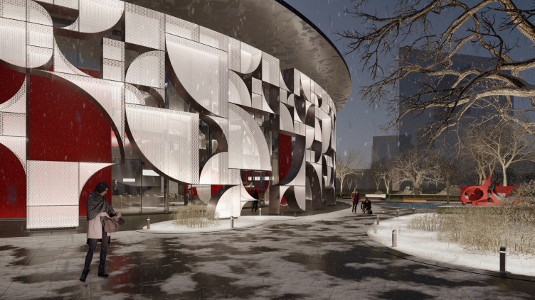
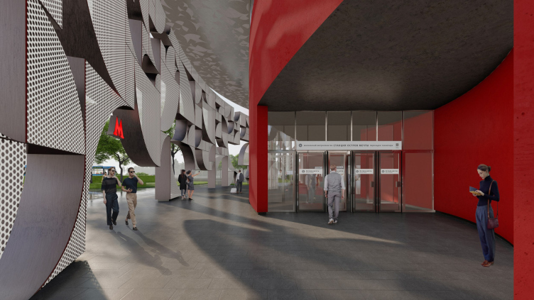
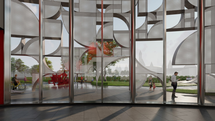
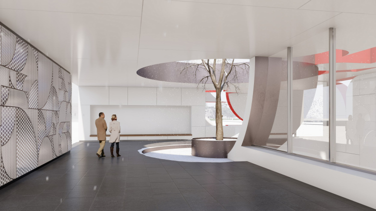
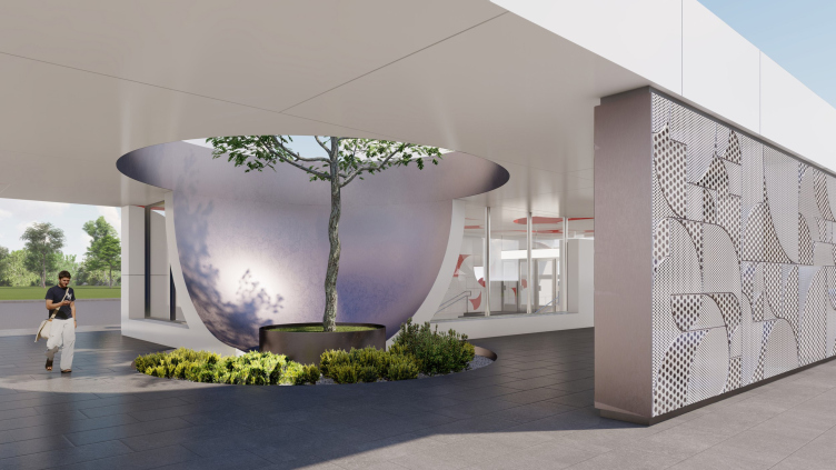
However, let’s get back from the underground to the overland entrance buildings. Already at this point, the 2D space takes on a third dimension and becomes volumetric; curiously, work with the volume goes in two different directions: the thickness of the element “cut away” in the wall or in the ceiling, and its contact with the sphere. Both are interesting. First, we admire the curves of the volumetric cutaways that fully demonstrate the thickness of the walls to us. Second, in the large entrance lobby, the permeable wall of the outer contour is twice transparent: large holes between the elements are combined with the fine-grained holes in their metal surface. In the small pavilion, the emphasis is on large slits, especially spectacular on the ceiling.

Ostrov Mechty (“Dream Island”) metro station. A competition ptroject 2022
Copyright: © TOTEMENT/PAPER


Ostrov Mechty (“Dream Island”) metro station. A competition ptroject 2022
Copyright: © TOTEMENT/PAPER


Ostrov Mechty (“Dream Island”) metro station. A competition ptroject 2022
Copyright: © TOTEMENT/PAPER


The abundance of slots is a feature of the entrance volumes in this project. As a rule, our metro pavilions, unlike the stairs of underground passages, are essentially completely closed “boxes” – all openings are usually glazed, so that when entering through the first row of doors to the stairs, we immediately get into a space isolated from the external environment – we are “inside the subway” now.

In the project by TOTEMENT/PAPER, the entrances are designed in a more sophisticated way – the inner space of the closed warm contour is juxtaposed to a “middle” aired one: you could easily compare it to the portico in classic architecture, for example, to the portico of the entrance pavilion at Novoslobodskaya metro station, the circular pylons at Novokuznetskaya station, the recessed entrance to the classicist Oktyabrskaya circular or the cantilever structure at the Modernist Oktyabrskaya linear, or to the arch at Kropotkinskaya.

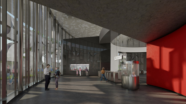
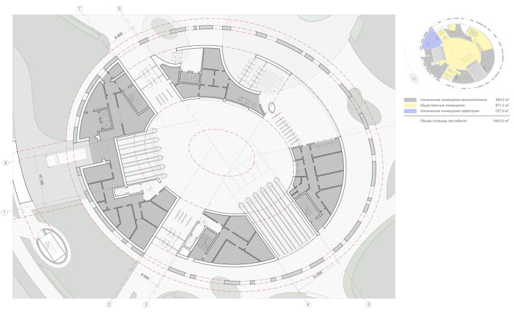
These transitional spaces are arranged in different ways. The oval volume consists of three mutually decreasing contours, the closeness of which increases gradually as we go deeper inside. The external ventilated contour is formed by the permeable structure mentioned above – the “screen”. Then there is a red wall, and even further there is an aluminum metal, white, with horizontal corrugation. Between the red and white walls there are built-in technical rooms of the metro, which alternate with openings of entrances and exits. In these gaps, the metal structure of the outer wall is visible through the stained glass windows; they also allow a bit of diffused daylight to the escalators.

On the inside, a tall “triple-height” atrium space is formed, to which all the escalators lead – something like a circular hall at Kurskaya – impressively high.

Ostrov Mechty (“Dream Island”) metro station. A competition ptroject 2022
Copyright: © TOTEMENT/PAPER


Ostrov Mechty (“Dream Island”) metro station. A competition ptroject 2022
Copyright: © TOTEMENT/PAPER


Ostrov Mechty (“Dream Island”) metro station. A competition ptroject 2022
Copyright: © TOTEMENT/PAPER


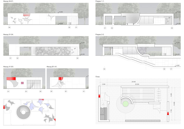
The smaller rectangular pavilion is not so sophisticated, but it also has its own surprise – here in the intermediate space hides a tree whose crown grows above the roof, into a round hole. So there is a courtyard in front of the entrance to the subway – a narrative very unusual for public transport, designed for the flow of people: a quiet courtyard, either Italian or Japanese, to make a pause in the never-ending run.

Ostrov Mechty (“Dream Island”) metro station. A competition ptroject 2022
Copyright: © TOTEMENT/PAPER


Just as interesting is the volumetric framework constructed around the tree: it is based on the same earlier mentioned module, but instead of a quarter circle we are getting a quarter of a sphere, as if the tree hatched out of some egg with silvery or mother-of-pearl surface inside. The project is abundant in bright solutions, but this specific one is my personal favorite.

Ostrov Mechty (“Dream Island”) metro station. A competition ptroject 2022
Copyright: © TOTEMENT/PAPER


Ostrov Mechty (“Dream Island”) metro station. A competition ptroject 2022
Copyright: © TOTEMENT/PAPER


Ostrov Mechty (“Dream Island”) metro station. A competition ptroject 2022
Copyright: © TOTEMENT/PAPER


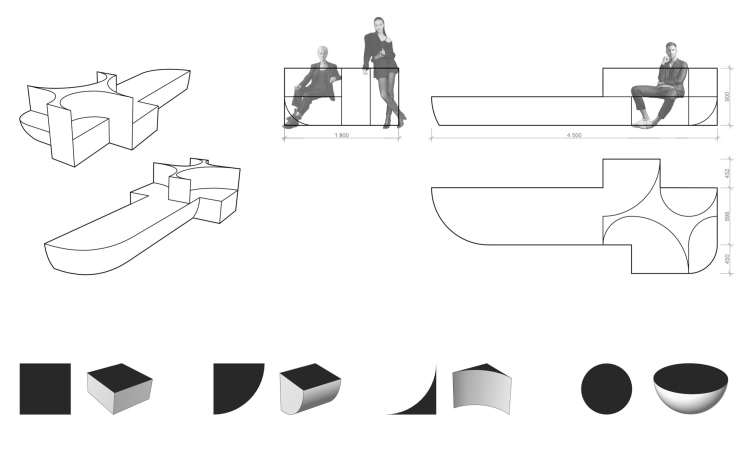
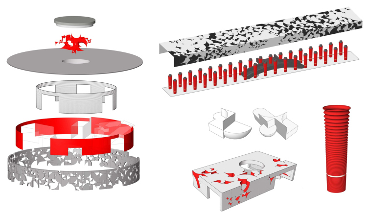
This “growing” of the flat quarter of a circle into a volumetric quarter of a sphere that encircles the tree is the most vivid example of interaction between a 2D pattern and a 3D object. A similar approach can be traced in the minor shapes proposed by the architects: the furniture and the light that hovers in the atrium of the large vestibule. In this instance, the architects take the liberty of breaking their rules a little bit by introducing semicircles and semi-spheres.

Ostrov Mechty (“Dream Island”) metro station. A competition ptroject 2022
Copyright: © TOTEMENT/PAPER


The furniture. Ostrov Mechty (“Dream Island”) metro station. A competition ptroject 2022
Copyright: © TOTEMENT/PAPER


This way, the ornament, or the module/method taken as the basis for form making, receives a development that is much more than just decorative – breaking the boundaries of its “plane”, it grows into different dimensions, subjugating everything in its path and forming a sort of Gesamtkunstwerk.

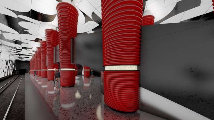
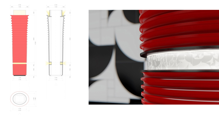
And, finally, yet another interesting thing is the columns inside the station. Here, we can rather speak about expanding this method: probably, the only thing that connects the columns to the main paradigm is the red color and the semicircular profile of the grooves. Curiously, the columns are anything but classic – the grooves run horizontally, which excludes any likeness to classic flutes, but can rather put you in the mind of an induction coil or some similar technical device. In addition, the supports expand upwards – which, just as the dark terra cotta hue, hints at the relationship with the columns of the Knossos Palace. This makes perfect sense for the underground space because it was the Knossos, under which the Minotaur Labyrinth was situated. It is easier to unite such columns with gallery of the passage, whose black color is also able to remind of the capitals of the Knossos columns, and in the reduced space under the balcony, thoughts also come about the labyrinth.

Ostrov Mechty (“Dream Island”) metro station. A competition ptroject 2022
Copyright: © TOTEMENT/PAPER


We will note here that you can find an analogy, albeit a distant one, with the white tulip–shaped columns of the Kropotkinskaya metro station – so the solution is consonant with the well-known samples of the Moscow metro.

Ostrov Mechty (“Dream Island”) metro station. A competition ptroject 2022
Copyright: © TOTEMENT/PAPER


Ostrov Mechty (“Dream Island”) metro station. A competition ptroject 2022
Copyright: © TOTEMENT/PAPER


The column. Ostrov Mechty (“Dream Island”) metro station. A competition ptroject 2022
Copyright: © TOTEMENT/PAPER


The exposion diagrams. Ostrov Mechty (“Dream Island”) metro station. A competition ptroject 2022
Copyright: © TOTEMENT/PAPER


On the whole, the station, as mentioned above, lives up to its location in the center of a developing area. The project – if it can be implemented as planned – goes beyond the complexity of the unique solutions of new stations designed by the competition. Which is quite consistent with the intriguing name of “Dream Island”.

  • zooming
    1 / 6
    Vestibule. The first floor. Ostrov Mechty (“Dream Island”) metro station. A competition ptroject 2022
    Copyright: © TOTEMENT/PAPER
  • zooming
    2 / 6
    Vestibule. THe second floor. Ostrov Mechty (“Dream Island”) metro station. A competition ptroject 2022
    Copyright: © TOTEMENT/PAPER
  • zooming
    3 / 6
    Vestibule. THe third floor. Ostrov Mechty (“Dream Island”) metro station. A competition ptroject 2022
    Copyright: © TOTEMENT/PAPER
  • zooming
    4 / 6
    The plan and the cross-section view of the platform. Ostrov Mechty (“Dream Island”) metro station. A competition ptroject 2022
    Copyright: © TOTEMENT/PAPER
  • zooming
    5 / 6
    The small entrance pavilion. Ostrov Mechty (“Dream Island”) metro station. A competition ptroject 2022
    Copyright: © TOTEMENT/PAPER
  • zooming
    6 / 6
    Cross-section view along the oval vestibule. Ostrov Mechty (“Dream Island”) metro station. A competition ptroject 2022
    Copyright: © TOTEMENT/PAPER


23 August 2022

Headlines now
A Unique Representative
The recently concluded year 2024 can be considered the year of completion for the “Garden Quarters” residential complex in Moscow’s Khamovniki. This project is well-known and, in many ways, iconic. Rarely does one manage to preserve such a number of original ideas, achieving in the end a kind of urban planning Gesamtkunstwerk. Here is a subjective view from an architecture journalist, with an interview with Sergey Skuratov soon to follow.
Field of Life
The new project by the architectural company PNKB (an acronym for “Design, Research, and Advisory Bureau”), led by Sergey Gnedovsky and Anton Lyubimkin, for the Kulikovo Field Museum is dedicated to the field as a concept in its own right. The field has long been a focus of the museum’s thorough and successful research. Accordingly, the exterior of the new museum building is gentler than that of its predecessor, which was also designed by PNKB and dedicated specifically to the historic battle. Inside, however, the building confidently guides the visitor from a luminous atrium along a spiral path to the field – interpreted here as a field of life.
A Paper Clip above the River
In this article, we talk with Vitaly Lutz from the Genplan Institute of Moscow about the design and unique features of the pedestrian bridge that now links the two banks of the Yauza River in the new cluster of Bauman Moscow State Technical University (MSTU). The bridge’s form and functionality – particularly the inclusion of an amphitheater suspended over the river – were conceived during the planning phase of the territory’s development. Typically, this approach is not standard practice, but the architects advocate for it, referring to this intermediate project phase as the “pre-AGR” stage (AGR stands for Architectural and Urban Planning Approval). Such a practice, they argue, helps define key parameters of future projects and bridge the gap between urban planning and architectural design.
Living in the Architecture of One’s Own Making
Do architects design houses for themselves? You bet! In this article, we are examining a new book by TATLIN publishing house. This book – unprecedented for Russia – features 52 private homes designed and built by contemporary architects for themselves. It includes houses that are famous, even iconic, as well as lesser-known ones; large and small, stylish and eccentric. To some extent, the book reflects the history of Russian architecture over the past 30 years.
A City Block Isoline
Another competition project for a residential complex on the banks of the Volga in Nizhny Novgorod has been prepared by Studio 44. A team of architects led by Ivan Kozhin concluded that using a regular block layout in such a location would be inappropriate and developed a “custom design” approach: a chain of parceled multi-section buildings stretching along the entire embankment. Let’s explore the features and advantages of this unconventional method.
Competition: The Price of Creativity?
Any day now, we’re expecting the results of a competition held by the “Samolet” development group for a plot in Kommunarka. In the meantime, we share the impressions of Editor-in-Chief Julia Tarabarina, who managed to conduct a public talk. Though technically focused on the interaction between developers and architects, the public talk turned into a discussion about the pros and cons of architectural competitions.
Terraced Design
The “River Park” residential complex has confidently and securely shaped the Nagatinsky Backwater shoreline. Featuring a public embankment, elevated courtyards connected by pedestrian bridges, and brick façades, the development invites exploration of its nuanced response to the surrounding context, as well as hints of the architects’ megalithic design thinking.
A Kremlin’s Core and Meteorite Fragments
We continue our coverage of the competition projects for the residential district that the development company GloraX plans to build along the embankment of the Rowing Channel in Nizhny Novgorod. ASADOV Architects approached the concept through a deep dive into local identity, using storytelling to pinpoint a central idea for the design: the master plan and composition are imagined as if a meteorite had struck a “proto-Kremlin”. Sounds weird? Find more details below!
The Volga Regatta
GloraX plans to develop a residential complex spanning 14 hectares along the Volga River in Nizhny Novgorod. The winning design in a closed-door competition, created by GORA Architects, features housing typologies ranging from townhouses to terraced high-rise slabs, a balance of functions, diverse ways of engaging with the water, and even a dedicated island (no less!) for the city residents.
Life Plans
The master plan for the residential district “Prityazheniye” (“Gravity”) in Naberezhnye Chelny was developed by the architectural company A.Len, taking into account the specific urban planning context and partially implemented solutions of the first phase. However, the master plan prioritized its own values: a green framework, a system of focal points, a hierarchy of spaces, and pedestrian priority. After this, the question of what residents will do in their neighborhood simply doesn’t arise.
A New Track
We took a thorough look at D_Station, a railcar repair depot dating back to 1906, recently reconstructed while preserving its century-old industrial structure, upon the project by Sergey Trukhanov and T+T Architects. Though work on the interiors – set to house restaurants and public spaces – is still underway, the building’s exterior already offers plenty to see. Visitors can explore the blend of old and new brickwork, appreciate the architect’s unique interpretation of ruin aesthetics, and enjoy the newly built pedestrian route that connects the Citydel Business Center’s arches to Kazakova Street.
Four Different Surveys
The “Explore the City” competition, organized this year by the Genplan Institute of Moscow, stands out as a pretty unconventional one for the architectural field but aligns perfectly well with the character of urban planning work. The winning project analyzed contemporary residential complexes, combining urban planning insights with a realtor’s perspective to propose a hybrid approach. Other entries explored public centers, motivations for car ownership, and housing vacancy rates. A fifth participant withdrew. Here’s a closer look at the four completed works.
Scheduled Evolution
ASADOV Architects unveiled the EvyCenter pavilion, a microcultural hub for fostering personal growth, organizing workshops, and doing gymnastics. Additionally, this pavilion serves as a prototype for a scalable country house, drawing inspiration from the “Loskutok” project, and constructed from CLT panels in a factory. This marks the beginning of a developer project initiated by the architectural firm (sic!), which is seeking partners to expand both small Evy settlements and even larger Evy cities, which are, according to Andrey Asadov, aimed at fostering the “evolutionary” development of the people who will inhabit them.
The Golden Crown
The concept for a dental clinic in Yekaterinburg, developed by CNTR Studio, revolves around the idea of a “mouth full of gold”: pristine white porcelain stoneware walls are complemented by matte brass details. To avoid an overly literal interpretation, the architects focused on the building’s proportions, skillfully navigating between sunlight requirements and fire safety regulations.
Flexibility and Integration
Not long ago, we covered the project for the fourth phase of the ÁLIA residential complex, designed by APEX. Now, we’ve been shown different fence concepts they developed to enclose the complex’s private courtyards, incorporating a variety of public functions. We believe that the sheer fact that the complex’s architects were involved in such a detail as fencing speaks volumes.
A Step Forward
The HIDE residential complex represents a major milestone for ADM architects and their leaders Andrey Romanov and Ekaterina Kuznetsova in their quest for a fresh high-rise aesthetic – one that is flexible and layered, capable of bringing vibrancy to mass and silhouette while shaping form. Over recent years, this approach has become ADM’s “signature style”, with the golden HIDE tower playing a pivotal role in its evolution. Here, we delve into the project’s story, explore the details of the complex’s design, and uncover its core essence.
Gold in the Sands
A new office for a transcontinental company specializing in resource extraction and processing has opened in Dubai. Designed by T+T Architects, masters of creating spaces that are contemporary, diverse, flexible, and original, this project exemplifies their expertise. On the executive floor, a massive brass-clad partition dominates, while layered textures of compressed earth create a contextually resonant backdrop.
Layers and Levels of Flight
This project goes way back – Reserve Union won this architectural competition at the end of 2011, and the building was completed in 2018, so it’s practically “archival”. However, despite being relatively unknown, the building can hardly be considered “dated” and remains a prime example of architectural expression, particularly in the headquarters genre. And it’s especially fitting for an aviation company office. In some ways, it resembles the Aeroflot headquarters at Sheremetyevo but with its own unique identity, following the signature style of Vladimir Plotkin. In this article, we take an in-depth look at the United Aircraft Corporation (UAC) headquarters in the Moscow agglomeration town of Zhukovsky, supplemented by recent photographs from Alexey Naroditsky – a shoot that became only recently possible due to the fact that improvements were finally made in the surrounding area.
Light and Shadow
In this article, we delve into the architectural design of the “Chaika” house by DNK ag architects, which was recently completed in 2023 as part of the collection of signature designs at ZILArt. As is well-known, all the buildings in this complex follow a design code, yet each one is distinct. This particular building stands out not only for its whiteness and minimalism but also for the refined use of a limited number of techniques that, together, create what can confidently be called synergy.
Casus Novae
A master plan was developed for a large residential area with a name of “DNS City”, but now that its implementation began, the plan has been arbitrarily reformatted and replaced with something that, while similar on the surface, is actually quite different. This is not the first time such a thing happens, but it’s always frustrating. With permission from the author, we are sharing Maria Elkina’s post.
Treasure Hunting
The GAFA bureau, in collaboration with Tegola and Arkhitail, organized an expedition to the island of Kilpola in Karelia as part of Moskomarkhitektura’s “Open City” festival. There, amidst moss and rocks, the students sought answers to questions like: what is the sacred, where does it dwell, and what sustains it? Assisting the participants in this quest were landscape engineer Evgeny Levin, artist Nicholas Roerich, a moose, and the lack of cellular connection. Here’s how the story unfolded.
Depths of the Earth, Streams of Water
In the Malaya Okhta district, the Akzent building, designed by Stepan Liphart, was constructed. It follows a classic tripartite structure, yet it’s what you might call “hand-drawn”: each façade is unique in its form and details, some of which aren’t immediately noticeable. In this article, we explore the context and, together with the architect, delve into how the form was developed.
Fir Tree Dynamics
The “Airports of Region” holding is planning to build an airport in Karachay-Cherkessia, aiming to make the Arkhyz and Dombay resorts more accessible to travelers. The project that won in an invitation-only competition, submitted by Sergey Nikeshkin’s KPLN, blends natural imagery inspired by the shape of a conifer seed, open-air waiting spaces, majestic large trees, and a green roof elevated on needle-like columns. The result is both nature-inspired and WOW.
​A Brick Shell
In the process of designing a clubhouse situated among pine trees in a prestigious suburban area near Moscow, the architectural firm “A.Len” did the façade design part. The combination of different types of brick and masonry correlates with the volumetric and plastique solutions, further enhanced by the inclusion of wood-painted fragments and metal “glazing”.
Word Forms
ATRIUM architects love ambitious challenges, and for the firm’s thirtieth anniversary, they boldly play a game of words with an exhibition that dives deep into a self-created vocabulary. They immerse their projects – especially art installations – into this glossary, as if plunging into a current of their own. You feel as if you’re flowing through the veins of pure art, immersed in a universe of vertical cities, educational spaces – of which the architects are true masters – and the cultural codes of various locations. But what truly captivates is the bold statement that Vera Butko and Anton Nadtochy make, both through their work and this exhibition: architecture, above all, is art – the art of working with form and space.
Flexibility and Acuteness of Modernity
Luxurious, fluid, large “kokoshniks” and spiral barrel columns, as if made from colorful chewing gum: there seem to be no other mansion like this in Moscow, designed in the “Neo-Russian-Modern” style. And the “Teremok” on Malaya Kaluzhskaya, previously somewhat obscure, has “come alive with new colors” and gained visibility after its restoration for the office of the “architectural ecosystem” as the architects love to call themselves. It’s evident that Julius Borisov and the architects at UNK put their hearts into finding this new office and bringing it up to date. Let’s delve into the paradoxes of this mansion’s history and its plasticity. Spoiler: two versions of modernity meet here, both balancing on the razor’s edge of “what’s current”.
Yuri Vissarionov: “A modular house does not belong to the land”
It belongs to space, or to the air... It turns out that 3D printing is more effective when combined with a modular approach: the house is built in a workshop and then adapted to the site, including on uneven terrain. Yuri Vissarionov shares his latest experience in designing tourist complexes, both in central Russia and in the south. These include houseboats, homes printed from lightweight concrete using a 3D printer, and, of course, frame houses.
​Moscow’s First
“The quality of education largely depends on the quality of the educational environment”. This principle of the last decade has been realized by Sergey Skuratov in the project for the First Moscow Gymnasium on Rostovskaya Embankment in the Khamovniki district. The building seamlessly integrates into the complex urban landscape, responding both to the pedestrian flow of the city and the quiet alleyways. It skillfully takes advantage of the height differences and aligns with modern trends in educational space design. Let’s take a closer look.
Looking at the Water
The site of Villa Sonata stretches from the road to the water’s edge, offering its own shoreline, pier, and a picturesque river panorama. To reveal these sweeping views, Roman Leonidov “cut” the façade diagonally parallel to the river, thus getting two main axes for the house and, consequently, “two heads”. The internal core – two double-height spaces, a living room and a conservatory, with a “bridge” above them – makes the house both “transparent” and filled with light.
The White Wing
Well, it’s not exactly white. It’s more of a beige, white-stone structure that plays with the color of limestone – smoother surfaces are lighter, while rougher ones are darker. This wing unites various elements: it absorbs and interprets the surrounding themes. It responds to everything, yet maintains a cohesive expression – a challenging task! – while also incorporating recognizable features of its own, such as the dynamic cuts at the bottom, top, and middle.