По-русски

Upping the Stakes

The concept of a housing complex in Samara from T+T Architects: a new landmark in the cityscape, view of the Zhiguli Mountains, and VR technologies.

28 April 2022
Object
mainImg
Over the last decade, Samara has become known, among other things, for its active high-rise construction – the grand-scale housing complexes are appearing even in the center of the city next to the Volga River. It is enough to take a brief walk around the city to appreciate the alternation of the bourgeois buildings of the 19th century and the new high-rise inclusions that quite recently replaced their old wooden neighbors.

The land site on the Moskovskaya street next to the Moskovskaya metro station, however, is quite different. It is part of the spacious territory of the former Bearing plant GPZ-4, intended to be turned into a residential area, i.e. an example of post-industrial redevelopment and transforming industrial estate into an urban fabric. The former plant is surrounded by the 1970’s construction, and is situated, speaking in general terms, at the border between the historical center and the Soviet part of Samara; a kilometer and a half in a straight line in the direction of the Volga, there is yet another large plant – the Maslennikov Factory, and its “wholesale kitchen and restaurant” building has been recently renovated to host a branch of the Tretyakov gallery.

The outlines of the territory of the former Bearing plan form a triangle because the Moscow Highway makes a 45° turn in the direction of the river. The entrance to the city from the side of Moscow and from the Kurumoch airport is hailed by the sharp nose of the triangle – by all the parameters, it looks like it lends itself for an entrance highlight, such as a tower or propylaea. All the more so because the left half of the “propylaea” at the fork is already there – this is the shopping and office center “Vertical” that features a 27-story tower, which is currently considered to be the city’s second highest. 
 

The roundabout before the territory of the Bearing Plant, view in the direction of the city center, left of the Vertical mall
Samara – Yandex Maps


Judging by the views commanded by Vertical, the residents’ apartments will also command sweeping views: the Volga with its islands and backwaters, as well as the hills of the “Samarskaya Luka” national park on the opposite bank, and the Zhiguli Mountains in the distance.

Hence, it comes as no surprise that the maximum allowed height of construction here is 125m. 

In 2020, a Samara-based developer held a competition for the concept of a high-rise multifunctional complex that will be built in the most advantageous of locations – in the triangular “nose” part of the territory of the former plan, a site with an area of 1.04 hectares. From the very start, the height was set at a maximum. The competition was won by Moscow-based T+T architects led by Sergey Trukhanov. Currently, the architects are working on the detailed concept.

The client set the task of offering interesting architectural solutions both at the competition and during the subsequent revision. We had to design, if not an iconic building, then at least a noticeable landmark, modern and matching the business class of the project.
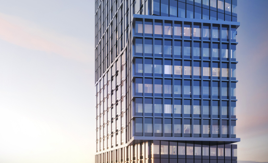
I should note that the customer supported our original idea with “swivel” cantilevered structures, an emphasis on the plastique of the side-end facades, despite the fact that its implementation, of course, would be fraught with certain challenges, although they cannot be called prohibitively complex.… In particular, the “swivel” places yielded particularly spacious apartments; had it been without the swivels, we could have cut out smaller apartment, but the architectural solution turned out to be more important – we, as the authors of the project, of course, are very happy with this approach.


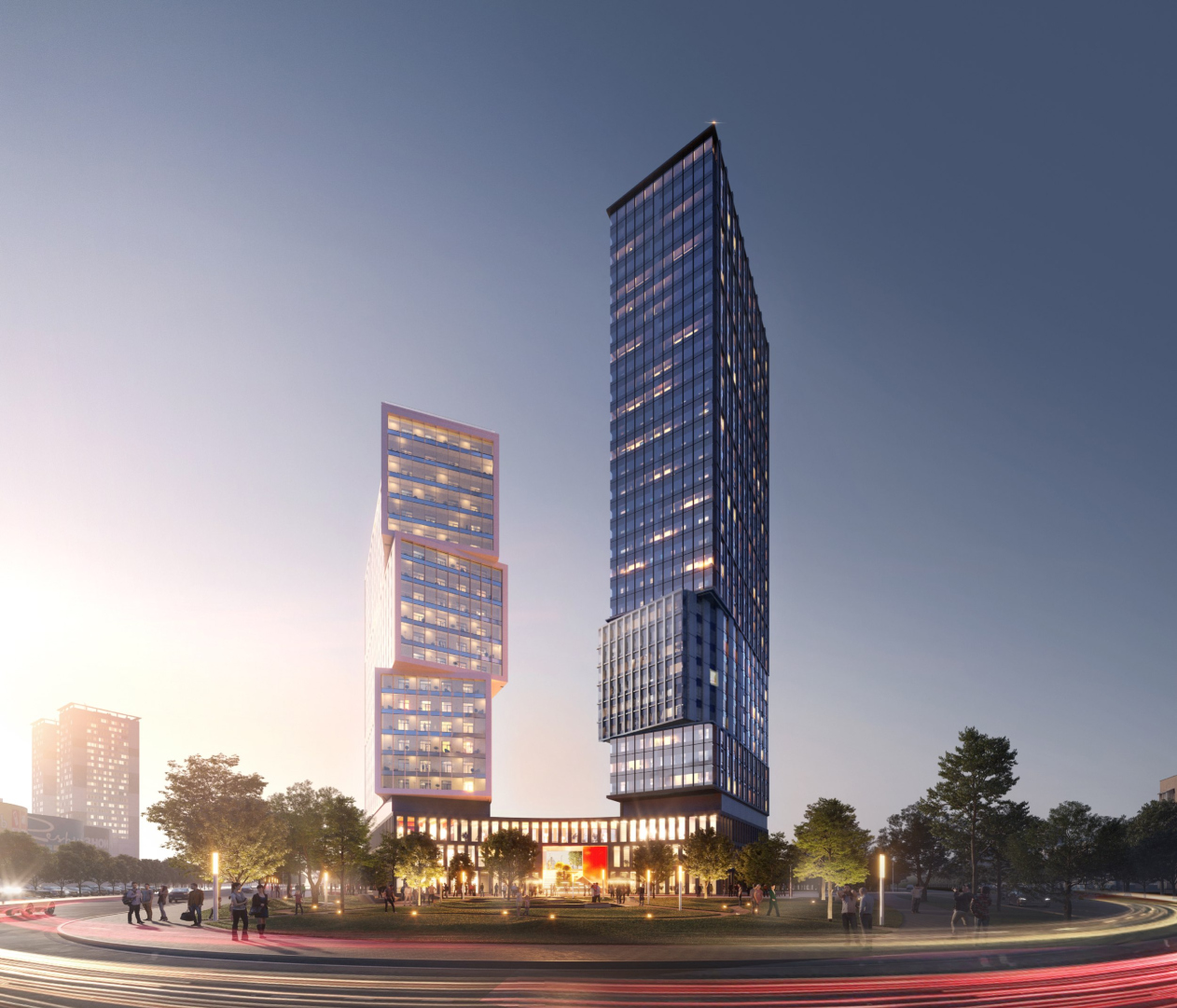
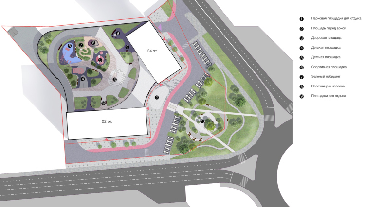
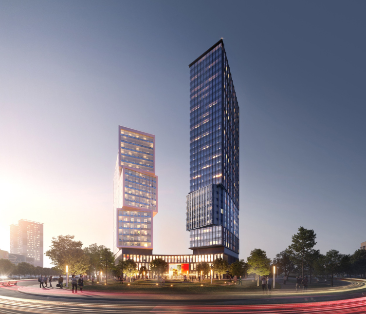
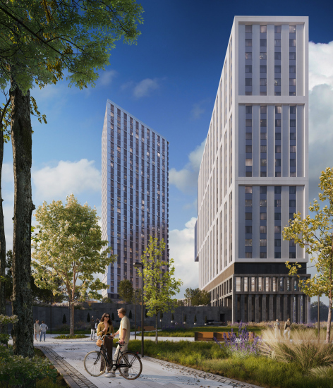
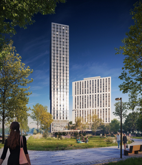
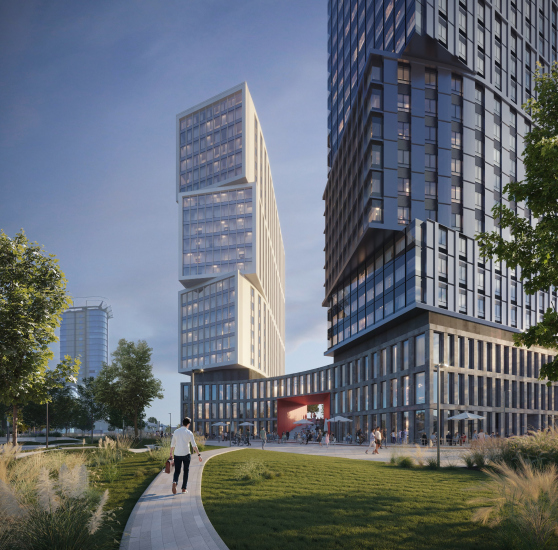
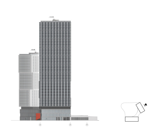
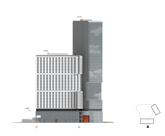
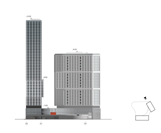
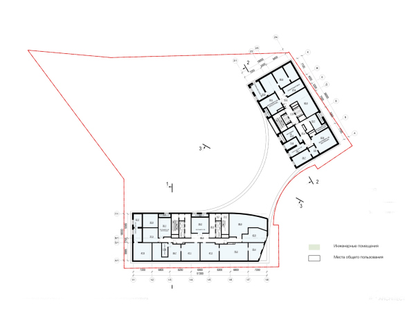
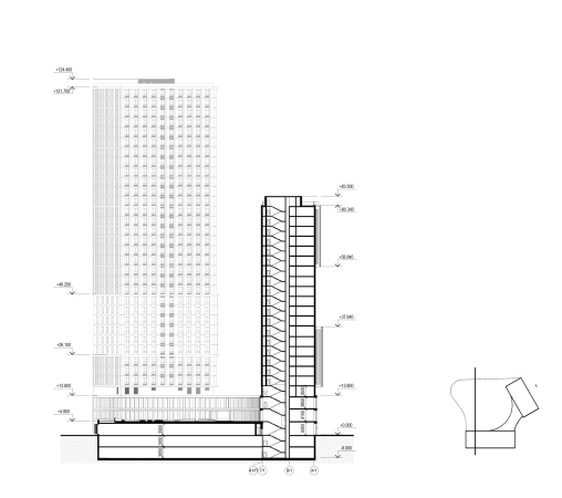
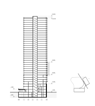
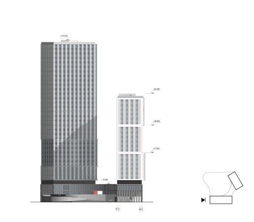
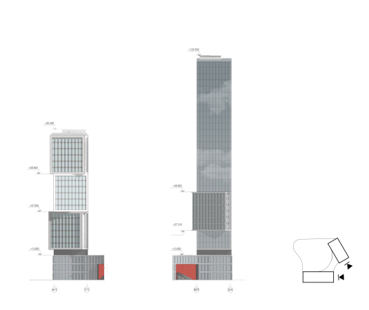
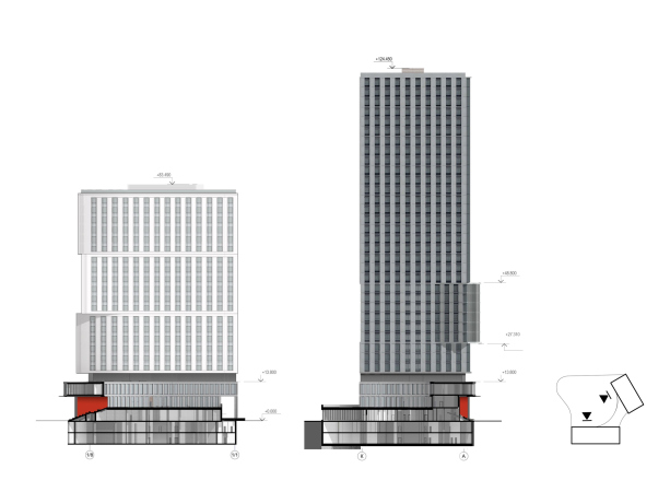
In spite of the fact that theoretically the architects could propose two towers of equal height, they discarded this approach as excessive, and ultimately, after the detailed concept was finished, the housing complex was composed of two different buildings. The buildings stand at an angle to one another, opening up towards the Volga and converging to the road junction. The volumes follow the directions of the main highways that form the site: the 22-story 2-section Building B on the left, from the side of the Vertical mall, stretches parallel to the Moscow Highway, and the 34-story 125m tower of Building A is turned to stand parallel to the Lunacharskogo Street.

The architectural concept of the multifunctional housing complex. The master plan
Copyright: © Т+Т Architects


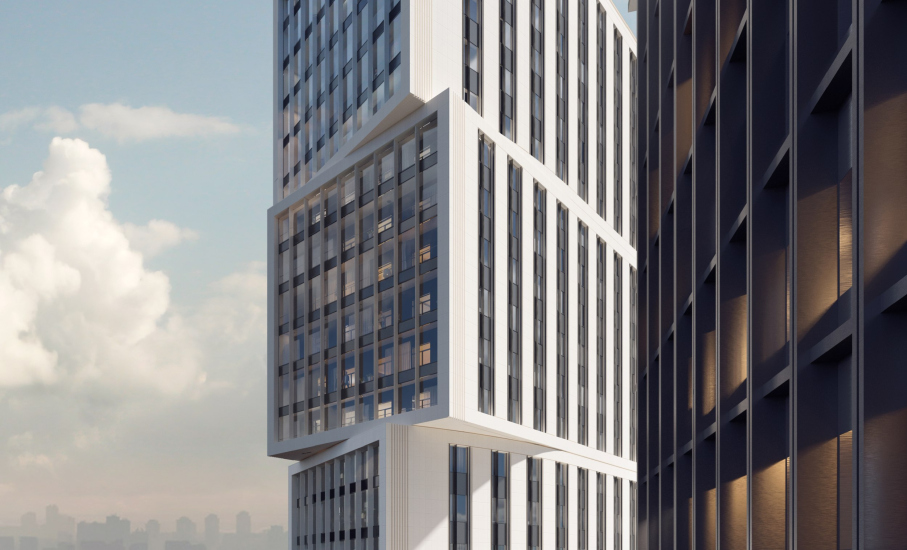
The main side-end facades are designed like a giant Jenga, and are composed of cantilevers, turned one after another: the high-rises look, as if they are “put together” in front of our eyes of several parallelepipeds. The side end of the minor house is designed in a more reserved way – it is divided into three equal parts six stories high each, while the cantilevered volumes of the main tower are rapidly growing: 3-6-21, emphasizing the slenderness of the high-rise silhouette.

The architectural concept of the multifunctional housing complex
Copyright: © Т+Т Architects


An important part in forming the “main façade” of the complex is played by the turns of the cantilevers, mentioned by Sergey Trukhanov. They do not just break at an angle – the outer surface bends smoothly, like a “gooseneck”, despite the fact that the “heads” seem to be examining the views of the crossroads and “exchange glances”. This adds some intrigue and dynamics and helps to fully explore the potential of the two volumes as a meaningful accent in the city space. At the same time, the above mentioned turns of the blocks add to the diversity of the views commanded by the apartments. 

The buildings also differ from each other in their color, materials, decoration techniques, and even some stylistic preferences. The architects plan to clad the smaller volume in semi-opaque ceramic panels; the side-end cantilevers are encircled with “television” frameworks. The taller tower, more energetic by many parameters, is biased towards black: dark tinted glass, dark metal, and slender vertical faceting on the sidewalls.

  • zooming
    The architectural concept of the multifunctional housing complex
    Copyright: © Т+Т Architects
  • zooming
    The architectural concept of the multifunctional housing complex
    Copyright: © Т+Т Architects


The warm hue of the light-colored ceramics looks like plaster – the main “body” material of “classic” architecture. The material part is further strengthened by broad contour lines at the corners; on the farther sidewall, the verticals of the piers get grooves that look like flutes, which in a nuanced way echo Art-Deco architecture, consistently popular with developers.

  • zooming
    The architectural concept of the multifunctional housing complex
    Copyright: © Т+Т Architects
  • zooming
    The architectural concept of the multifunctional housing complex
    Copyright: © Т+Т Architects


The black tower, on the other hand, is closer to hi-tech due to its color, abundance of metal, and even the graphic horizontal “strokes” on the inner façade. All these allusions, however, are given merely as a hint: the houses are just as different as they are similar, just like “kin” towers should be within a single complex. For example, the main side ends are dominated by glass: combined with stemalite, it forms striking glass surfaces adorned by a fine relief grid. 

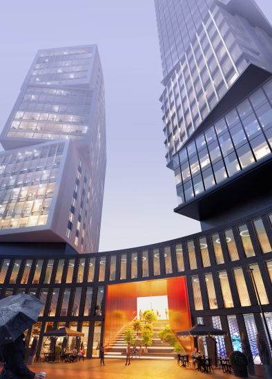
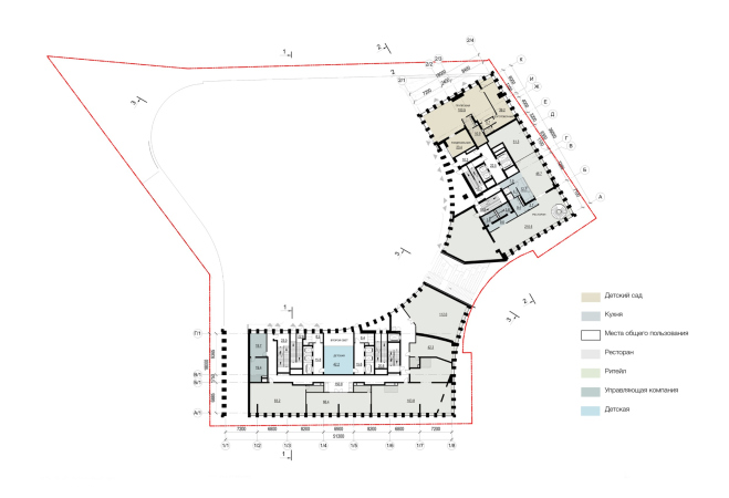
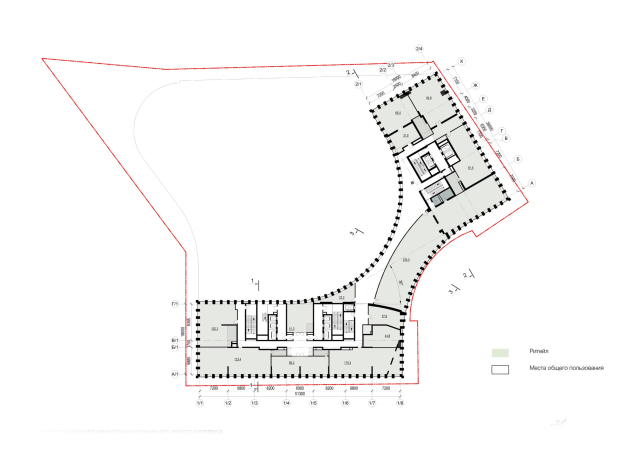
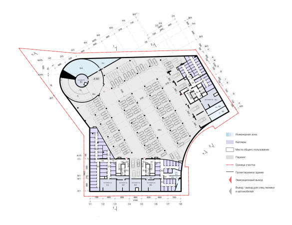
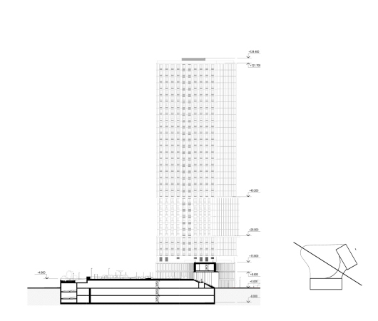
The two buildings spring from a three-story stylobate with retail – stores, restaurants, a kindergarten, as well as playgrounds and public functions on all the three levels. On the plan, the stylobate is formed by two arcs – the elegant curve of its outer façade forms a plaza with a little park on the triangular “nose” in front of it. All of these spaces are open to the city people. 

The plaza and the promenade running along the shop windows are continued by an amphitheater in a tell “arch” – a two-story rectangular opening with a slight perspective narrowing, cut along the stylobate’s symmetry axis. The arch is red–gold because of the reddish metal of the facing cassettes. Its upper opening faces west and, presumably, the red metal will catch and enhance the sunset light, making the evening time in the amphitheater space cozy and pleasant thanks to the opportunity to sit on the steps in the warm rays of the setting sun.

  • zooming
    The architectural concept of the multifunctional housing complex
    Copyright: © Т+Т Architects
  • zooming
    The architectural concept of the multifunctional housing complex
    Copyright: © Т+Т Architects


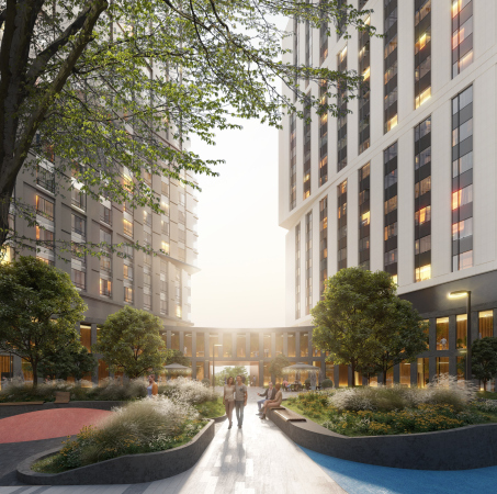
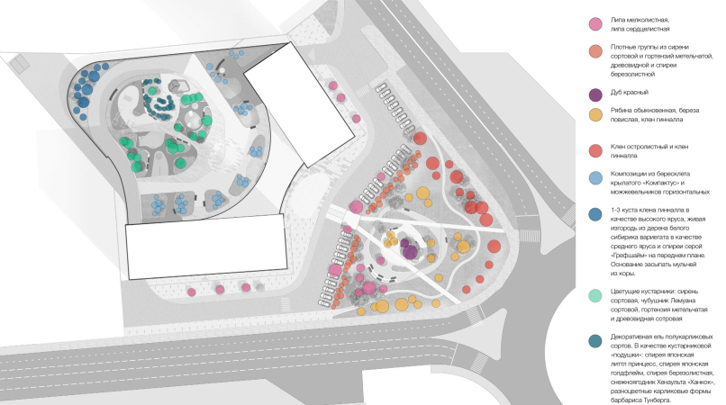
Residents will be able to climb the stairs inside the arch to their fenced yard on the roof of the stylobate; here, at the top, the boundary of the urban and private space of the complex will pass. The greenery of the yard, figuratively speaking, “descends” to the steps of the amphitheater: there will be both bushes and trees in there. 

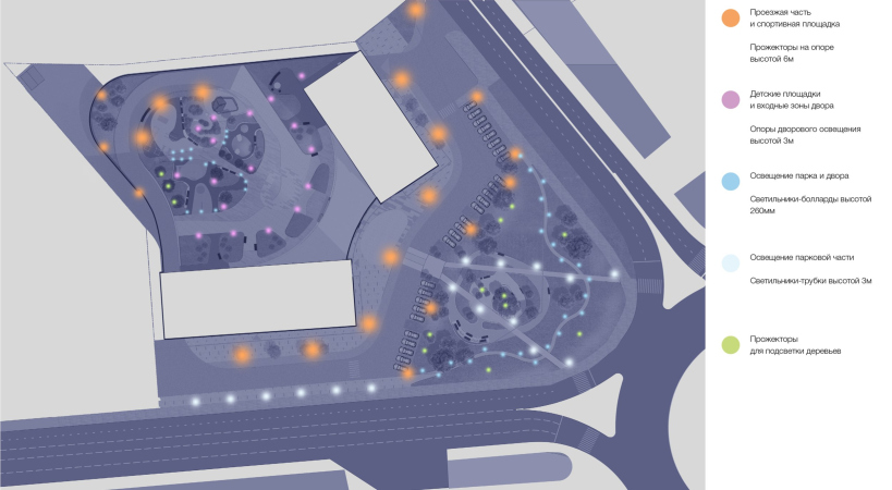
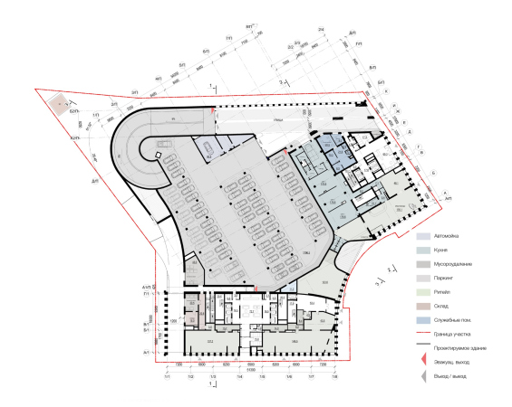
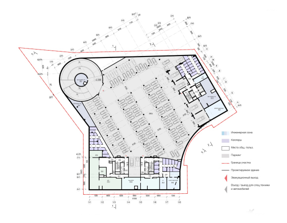
As for the yard on the roof of the stylobate, which covers an underground parking garage (2 levels underground, and one “behind the back” of the retail on the zero level), it is planned that it will be very green, very well lit, and landscaped abundantly enough – we will note here that the T+T portfolio includes quite a lot of projects of landscaping large housing complexes (including Moscow ones),and this expertise will surely be used.

  • zooming
    1 / 5
    The architectural concept of the multifunctional housing complex
    Copyright: © Т+Т Architects
  • zooming
    2 / 5
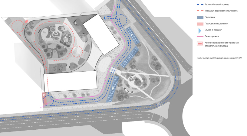
    The architectural concept of the multifunctional housing complex. THe transport pattern
    Copyright: © Т+Т Architects
  • zooming
    3 / 5
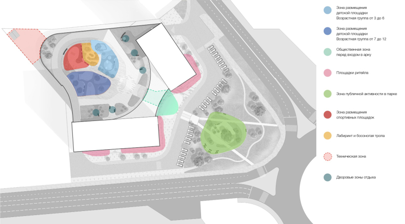
    The architectural concept of the multifunctional housing complex. THe function pattern
    Copyright: © Т+Т Architects
  • zooming
    4 / 5
    The architectural concept of the multifunctional housing complex. The lighting pattern
    Copyright: © Т+Т Architects
  • zooming
    5 / 5
    The architectural concept of the multifunctional housing complex. THe greenery pattern
    Copyright: © Т+Т Architects


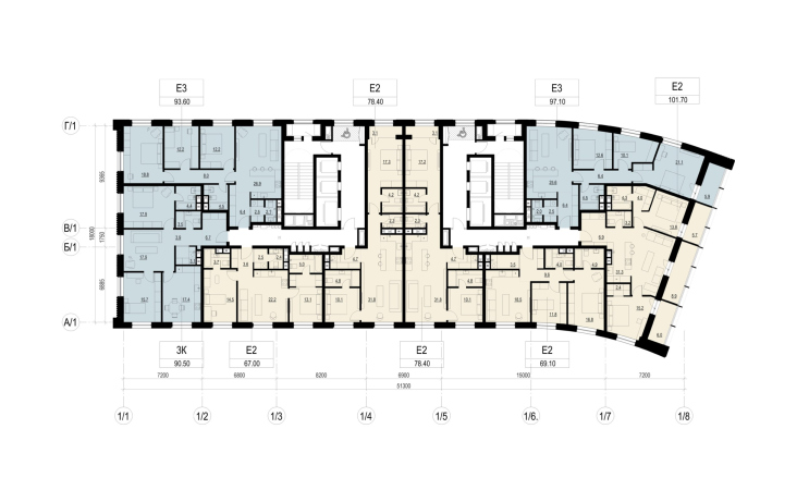
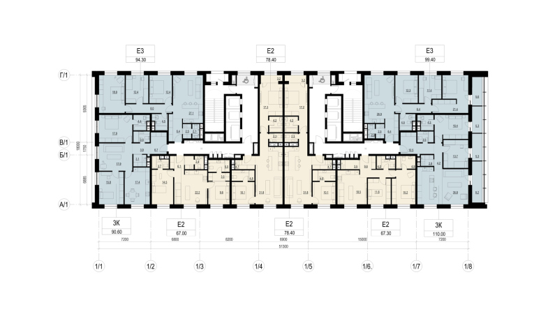
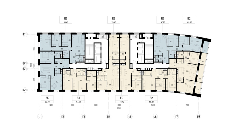
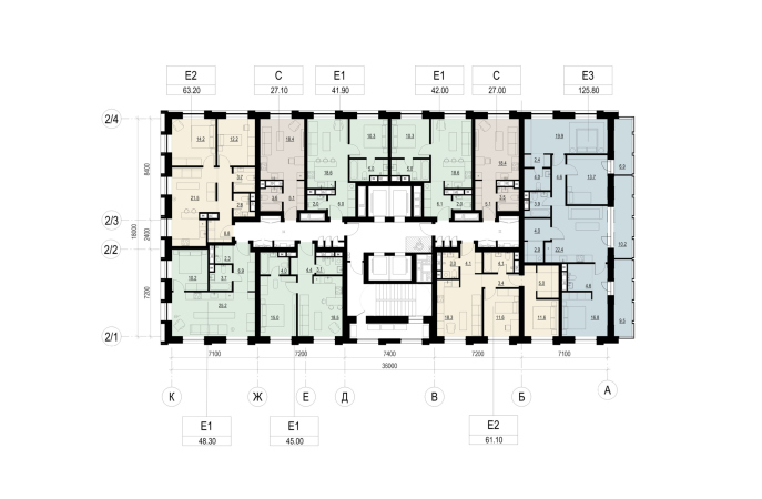
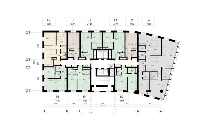
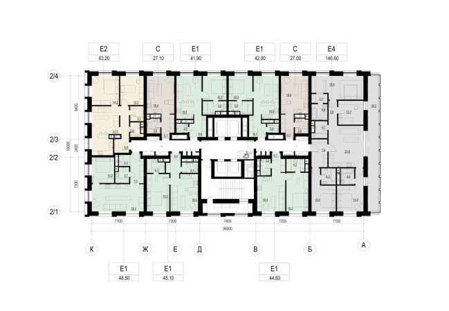
The selection of apartments, as we usually say in such cases, is as diverse as the business class of the complex implies. The high-rise building A has more three-room apartments with an odd inclusion of a four-room one – not counting the living rooms; the 22-story building B is more biased to two- and single-room apartments; there are also studios, but they are not numerous.

  • zooming
    1 / 6
    The architectural concept of the multifunctional housing complex. Building A
    Copyright: © Т+Т Architects
  • zooming
    2 / 6
    The architectural concept of the multifunctional housing complex. Building A
    Copyright: © Т+Т Architects
  • zooming
    3 / 6
    The architectural concept of the multifunctional housing complex. Building A
    Copyright: © Т+Т Architects
  • zooming
    4 / 6
    The architectural concept of the multifunctional housing complex. Building B
    Copyright: © Т+Т Architects
  • zooming
    5 / 6
    The architectural concept of the multifunctional housing complex. Building B
    Copyright: © Т+Т Architects
  • zooming
    6 / 6
    The architectural concept of the multifunctional housing complex. Building B
    Copyright: © Т+Т Architects


Curiously, this housing complex on the Moscow Highway in Samara is one of the first cases when T+T Architects actively used VR technologies as a design tool and a way to shortcut the distance between the architect and the developer. The VR model allowed the team to assess the scale, work on improving the composition, proportions, and even ergonomics. The client, on the other hand, got an opportunity to see the project through the eyes of the architects – and NOT as a “glamorous” presentation, but in a state of a real working process – Sergey Trukhanov emphasizes. The experience turned out to be positive, and allowed the team to save up their nerve cells and time; the architects are planning to continue to work with VR technologies.

Examples of VR videos made in the process of working on the project:


In the future, the company plans to continue working with the Samara-based company “APK Ritm”, which handles the Project and Working Documents stages; however, T+T Architects do author supervision at all stages of construction. 

Thus, the complex, which together with the existing “Vertical” forms a high-rise “gate” of the entrance to the central part of the city, fits in with many metropolitan trends of recent years. Starting from the prestigious height –it is known that apartments are bought better and are more expensive in skyscrapers – and ending with the public spaces that the architects are planning to provide. Despite the fact that the Moskovskaya station area is still not deprived of public functions and retail, there are parks, clinics, and cafes with shops around – those additions that the stylobate part of the residential complex is designed to give the city seem useful. The complex is not just integrated into the existing system of public spaces, but develops it, offering a better organized and “advanced” version of the “urban scene”, designed both to intensify life, create some kind of active “hub” and simply give people yet another chance to admire the city, experiencing its space in a new capacity.
  • zooming
    1 / 15
    The architectural concept of the multifunctional housing complex. facades A-P
    Copyright: © Т+Т Architects
  • zooming
    2 / 15
    The architectural concept of the multifunctional housing complex. Facade 1/1-1/8
    Copyright: © Т+Т Architects
  • zooming
    3 / 15
    The architectural concept of the multifunctional housing complex. Facade 2/4-2/1
    Copyright: © Т+Т Architects
  • zooming
    4 / 15
    The architectural concept of the multifunctional housing complex. Plan of the technical floor
    Copyright: © Т+Т Architects
  • zooming
    5 / 15
    The architectural concept of the multifunctional housing complex. Plan of the 2nd floor
    Copyright: © Т+Т Architects
  • zooming
    6 / 15
    The architectural concept of the multifunctional housing complex. Plan 3
    Copyright: © Т+Т Architects
  • zooming
    7 / 15
    The architectural concept of the multifunctional housing complex. Plan of the 1st floor
    Copyright: © Т+Т Architects
  • zooming
    8 / 15
    The architectural concept of the multifunctional housing complex. Plan of the -1st floor
    Copyright: © Т+Т Architects
  • zooming
    9 / 15
    The architectural concept of the multifunctional housing complex. Plan of the -2nd floor
    Copyright: © Т+Т Architects
  • zooming
    10 / 15
    The architectural concept of the multifunctional housing complex. Section view 1-1
    Copyright: © Т+Т Architects
  • zooming
    11 / 15
    The architectural concept of the multifunctional housing complex. Section view 2-2
    Copyright: © Т+Т Architects
  • zooming
    12 / 15
    The architectural concept of the multifunctional housing complex. Section view 3-3
    Copyright: © Т+Т Architects
  • zooming
    13 / 15
    The architectural concept of the multifunctional housing complex. Facade G/1-A/1
    Copyright: © Т+Т Architects
  • zooming
    14 / 15
    The architectural concept of the multifunctional housing complex. Facades A/1-G/1 and 8/P-2/4
    Copyright: © Т+Т Architects
  • zooming
    15 / 15
    The architectural concept of the multifunctional housing complex. Facades 1/8-1/1 and K-A
    Copyright: © Т+Т Architects


28 April 2022

Headlines now
The Golden Crown
The concept for a dental clinic in Yekaterinburg, developed by CNTR Studio, revolves around the idea of a “mouth full of gold”: pristine white porcelain stoneware walls are complemented by matte brass details. To avoid an overly literal interpretation, the architects focused on the building’s proportions, skillfully navigating between sunlight requirements and fire safety regulations.
Flexibility and Integration
Not long ago, we covered the project for the fourth phase of the ÁLIA residential complex, designed by APEX. Now, we’ve been shown different fence concepts they developed to enclose the complex’s private courtyards, incorporating a variety of public functions. We believe that the sheer fact that the complex’s architects were involved in such a detail as fencing speaks volumes.
A Step Forward
The HIDE residential complex represents a major milestone for ADM architects and their leaders Andrey Romanov and Ekaterina Kuznetsova in their quest for a fresh high-rise aesthetic – one that is flexible and layered, capable of bringing vibrancy to mass and silhouette while shaping form. Over recent years, this approach has become ADM’s “signature style”, with the golden HIDE tower playing a pivotal role in its evolution. Here, we delve into the project’s story, explore the details of the complex’s design, and uncover its core essence.
Gold in the Sands
A new office for a transcontinental company specializing in resource extraction and processing has opened in Dubai. Designed by T+T Architects, masters of creating spaces that are contemporary, diverse, flexible, and original, this project exemplifies their expertise. On the executive floor, a massive brass-clad partition dominates, while layered textures of compressed earth create a contextually resonant backdrop.
Layers and Levels of Flight
This project goes way back – Reserve Union won this architectural competition at the end of 2011, and the building was completed in 2018, so it’s practically “archival”. However, despite being relatively unknown, the building can hardly be considered “dated” and remains a prime example of architectural expression, particularly in the headquarters genre. And it’s especially fitting for an aviation company office. In some ways, it resembles the Aeroflot headquarters at Sheremetyevo but with its own unique identity, following the signature style of Vladimir Plotkin. In this article, we take an in-depth look at the United Aircraft Corporation (UAC) headquarters in the Moscow agglomeration town of Zhukovsky, supplemented by recent photographs from Alexey Naroditsky – a shoot that became only recently possible due to the fact that improvements were finally made in the surrounding area.
Light and Shadow
In this article, we delve into the architectural design of the “Chaika” house by DNK ag architects, which was recently completed in 2023 as part of the collection of signature designs at ZILArt. As is well-known, all the buildings in this complex follow a design code, yet each one is distinct. This particular building stands out not only for its whiteness and minimalism but also for the refined use of a limited number of techniques that, together, create what can confidently be called synergy.
Casus Novae
A master plan was developed for a large residential area with a name of “DNS City”, but now that its implementation began, the plan has been arbitrarily reformatted and replaced with something that, while similar on the surface, is actually quite different. This is not the first time such a thing happens, but it’s always frustrating. With permission from the author, we are sharing Maria Elkina’s post.
Treasure Hunting
The GAFA bureau, in collaboration with Tegola and Arkhitail, organized an expedition to the island of Kilpola in Karelia as part of Moskomarkhitektura’s “Open City” festival. There, amidst moss and rocks, the students sought answers to questions like: what is the sacred, where does it dwell, and what sustains it? Assisting the participants in this quest were landscape engineer Evgeny Levin, artist Nicholas Roerich, a moose, and the lack of cellular connection. Here’s how the story unfolded.
Depths of the Earth, Streams of Water
In the Malaya Okhta district, the Akzent building, designed by Stepan Liphart, was constructed. It follows a classic tripartite structure, yet it’s what you might call “hand-drawn”: each façade is unique in its form and details, some of which aren’t immediately noticeable. In this article, we explore the context and, together with the architect, delve into how the form was developed.
Fir Tree Dynamics
The “Airports of Region” holding is planning to build an airport in Karachay-Cherkessia, aiming to make the Arkhyz and Dombay resorts more accessible to travelers. The project that won in an invitation-only competition, submitted by Sergey Nikeshkin’s KPLN, blends natural imagery inspired by the shape of a conifer seed, open-air waiting spaces, majestic large trees, and a green roof elevated on needle-like columns. The result is both nature-inspired and WOW.
​A Brick Shell
In the process of designing a clubhouse situated among pine trees in a prestigious suburban area near Moscow, the architectural firm “A.Len” did the façade design part. The combination of different types of brick and masonry correlates with the volumetric and plastique solutions, further enhanced by the inclusion of wood-painted fragments and metal “glazing”.
Word Forms
ATRIUM architects love ambitious challenges, and for the firm’s thirtieth anniversary, they boldly play a game of words with an exhibition that dives deep into a self-created vocabulary. They immerse their projects – especially art installations – into this glossary, as if plunging into a current of their own. You feel as if you’re flowing through the veins of pure art, immersed in a universe of vertical cities, educational spaces – of which the architects are true masters – and the cultural codes of various locations. But what truly captivates is the bold statement that Vera Butko and Anton Nadtochy make, both through their work and this exhibition: architecture, above all, is art – the art of working with form and space.
Flexibility and Acuteness of Modernity
Luxurious, fluid, large “kokoshniks” and spiral barrel columns, as if made from colorful chewing gum: there seem to be no other mansion like this in Moscow, designed in the “Neo-Russian-Modern” style. And the “Teremok” on Malaya Kaluzhskaya, previously somewhat obscure, has “come alive with new colors” and gained visibility after its restoration for the office of the “architectural ecosystem” as the architects love to call themselves. It’s evident that Julius Borisov and the architects at UNK put their hearts into finding this new office and bringing it up to date. Let’s delve into the paradoxes of this mansion’s history and its plasticity. Spoiler: two versions of modernity meet here, both balancing on the razor’s edge of “what’s current”.
Yuri Vissarionov: “A modular house does not belong to the land”
It belongs to space, or to the air... It turns out that 3D printing is more effective when combined with a modular approach: the house is built in a workshop and then adapted to the site, including on uneven terrain. Yuri Vissarionov shares his latest experience in designing tourist complexes, both in central Russia and in the south. These include houseboats, homes printed from lightweight concrete using a 3D printer, and, of course, frame houses.
​Moscow’s First
“The quality of education largely depends on the quality of the educational environment”. This principle of the last decade has been realized by Sergey Skuratov in the project for the First Moscow Gymnasium on Rostovskaya Embankment in the Khamovniki district. The building seamlessly integrates into the complex urban landscape, responding both to the pedestrian flow of the city and the quiet alleyways. It skillfully takes advantage of the height differences and aligns with modern trends in educational space design. Let’s take a closer look.
Looking at the Water
The site of Villa Sonata stretches from the road to the water’s edge, offering its own shoreline, pier, and a picturesque river panorama. To reveal these sweeping views, Roman Leonidov “cut” the façade diagonally parallel to the river, thus getting two main axes for the house and, consequently, “two heads”. The internal core – two double-height spaces, a living room and a conservatory, with a “bridge” above them – makes the house both “transparent” and filled with light.
The White Wing
Well, it’s not exactly white. It’s more of a beige, white-stone structure that plays with the color of limestone – smoother surfaces are lighter, while rougher ones are darker. This wing unites various elements: it absorbs and interprets the surrounding themes. It responds to everything, yet maintains a cohesive expression – a challenging task! – while also incorporating recognizable features of its own, such as the dynamic cuts at the bottom, top, and middle.
Urban Dunes
The XSA Ramps team designed and built a three-part sports hub for a park in Rostov-on-Don, welcoming people of all ages and fitness levels. The skate plaza, pump track, and playground are all meticulously crafted with details that attract a diverse range of visitors. The technical execution of the shapes and slopes transforms this space into a kind of sculptural composition.
Proportional Growth
The project for the fourth phase of the ÁLIA residential area has been announced. The buildings are situated on an elongated plot – almost a “ray” that shoots out from the center of the area towards the river. Their layout reflects both a response to Moscow’s architectural preferences over the past 15 years, shifting “from blocks to towers”, and an interpretation of the neighboring business park designed by SOM. Additionally, the best apartments here are not located at the very top but closer to the middle, forming a glowing “waistline”.
The “Staircase” Building
In designing the “Details” residential complex in New Moscow, Rais Baishev spiced up the now-popular Moscow theme of a “courtyard” building with an idea drawn from the surrealist drawings by Maurits Escher. He envisioned the stepped silhouettes and descending slopes as a metaphysical mega-staircase, creating a key void within the courtyard that gave the project an internal “spine”. This concept is felt both in the building’s silhouette and on its façades.
Projection of the Quarter
No one doubted that the building that Vladimir Plotkin designed as part of the “Garden Quarters” would be the most modernist of all. And it turned out just that way: while adhering to the common design code, the building successfully combines brick and white stone, rhythmically responding to the neighboring building designed by Ostozhenka, yet tactfully and persistently making a few statements of its own. This includes the projection of the ideal urban development composition “14–9–6”, which can be found right next door, mathematical calculations, including those for various types of terraces (and perhaps the only reminder of the Soviet past of the Kauchuk rubber factory!), and the white “cross-stitch” pattern of the façade grid.
Domus Aurea
In this issue, we examine the “Tessinsky-1” house, designed by Sergey Skuratov and completed in 2023. Located in the middle of the Serebryanicheskaya Embankment district, at the intersection of its main streets, this house assumes a sort of “nodal” role: it not only responds to everything around it and preserves many memories of the former EMA factory within itself, but it weaves all this into a newly directed pattern, reconciling bright “gold” and dark-colored brick, largely with the help of the new, modern-yet-archaic Columba brick, which, come to think about it, is the most precious element here.
The Chimney of Nikola-Lenivets
In this issue, we are examining the “Obelisk House” designed by KATARSIS and built for the Arkhstoyanie 2023 festival. However, it was only finished later on, and this is why we are examining it now. It seems to us that after the “Obelisk House” appeared in Nikola-Lenivets, a dialogue and a few inner connections appeared between the temporary structures built here. These houses no longer look like “accidental neighbors”, more of which below.
​Periscope by the Bay
The jury awarded the second place in the competition for a public and cultural center in Petropavlovsk-Kamchatsky to the companies GORA (“Mountain”) and M4. In the consortium’s proposal, the building resembles a sperm whale with a calf swimming next to it or a periscope, whose lenses capture the most spectacular views from the surrounding landscape.
From Arcs to Dolmens
While working on the competition project for Petropavlovsk-Kamchatsky, ASADOV Architects prioritized the value of the natural and urban environment, aiming to preserve the balance of the location while minimizing the resemblance of the volume that they designed to a “traditional building”. The task was challenging, and the architects created three versions, one of which having been developed after the competition, where their main proposal took third place. However, the point of interest here is not the competition result but the continuity of creative thinking.
Hide and Seek
The ID Moskovskiy house, designed by Stepan Liphart in St. Petersburg, in the courtyards near Moskovskiy Avenue beyond the Obvodny Canal and recently completed, is notable for several reasons. Firstly, it has been realized with considerable accuracy, which is particularly significant as this is the first building where the architect was responsible not only for the facades but also for the layouts, allowing for better integration between the two. On the other hand, this building is interesting as an example of the “germination” of new architecture in the city: it draws on the best examples from the neighborhood and becomes an improved and developed sum of ideas found by the architect in the surrounding context.
The Big Twelve
Yesterday, the winners of the Moscow Mayor’s Architecture Award were announced and honored. Let’s take a look at what was awarded and, in some cases, even critique this esteemed award. After all, there is always room for improvement, right?
Above the Golden Horn
The residential complex “Philosophy” designed by T+T architects in Vladivostok, is one of the new projects in the “Golubinaya Pad” area, changing its development philosophy (pun intended) from single houses to a comprehensive approach. The buildings are organized along public streets, varying in height and format, with one house even executed in gallery typology, featuring a cantilever leaning on an art object.
Nuanced Alternative
How can you rhyme a square and space? Easily! But to do so, you need to rhyme everything you can possibly think of: weave everything together, like in a tensegrity structure, and find your own optics too. The new exhibition at GES-2 does just that, offering its visitor a new perspective on the history of art spanning 150 years, infused with the hope for endless multiplicity of worlds and art histories. Read on to see how this is achieved and how the exhibition design by Evgeny Ace contributes to it.
Blinds for Ice
An ice arena has been constructed in Domodedovo based on a project by Yuri Vissarionov Architects. To prevent the long façade, a technical requirement for winter sports facilities, from appearing monotonous, the architects proposed the use of suspended structures with multidirectional slats. This design protects the ice from direct sunlight while giving the wall texture and detail.