По-русски

​The Northern Versailles

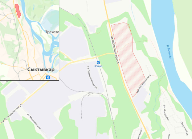
On the bank of the magnificent Vychegda River, in a picturesque location six kilometers away from Syktyvkar, the capital of the Komi republic, the renowned neoclassical architect Mikhail Filippov has designed the town of Yugyd-Choi in the traditional aesthetics inspired by the center of St. Petersburg. The customer Elena Soboleva, the head of the Syktyvkar Housing Construction Fund, sees her mission in making Yugyd-Choi the hallmark of the republic.

12 October 2021
Object
mainImg
The project of Yugyd-Choi, which translates from Komi as “Bright Mountain”, continues the ideas of Sochi’s Gorky Gorod, designed and built by Mikhail Filippov for the Sochi Olympics 2014. Both towns are based on the town planning system developed by Mikhail Filippov, which summarizes the experience of the great Russian and European traditional cities. However, while Gorky Gorod, which today is a flourishing year-round mountain resort, consists solely of hotels and apartment complexes, Yugyd-Choi was devised as a settlement offering a full range of city functions. According to the project, the town will include schools, a church, a hospital, museums and galleries, and a park with a full-fledged recreational infrastructure – in a word, everything that will do good not only to the residents but to the entire Syktyvkar as well.

The project of Yugyd-Choi (“Bright Mountain”). Syktyvkar, Komi Republic. Mikhail Filippov architects
Copyright: © Mikhail Filippov


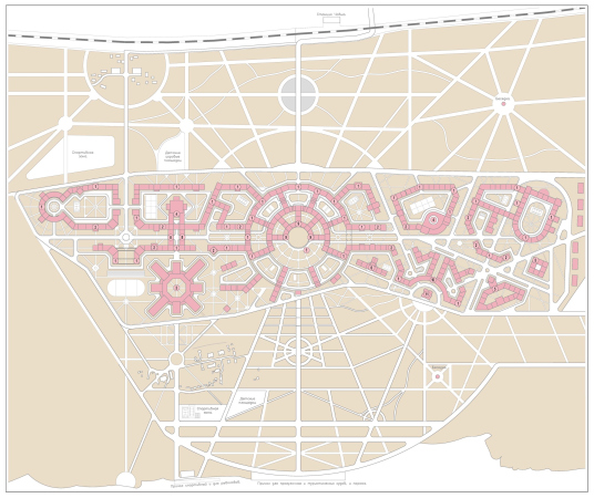
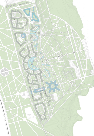
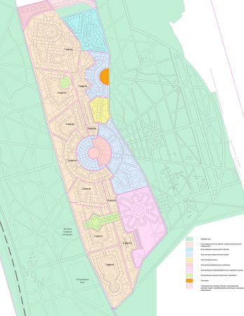
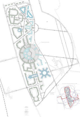
A 45-hectare town will be situated on a terrain with a height difference of 14 meters. The architectural ensembles occupy the elongated top part, gradually descending to the river in terraces. On the bank of the river, there is a large chunk of woodland, which, according to the project, will be made into a landscaped park. If we take a look at the master plan, we will see that the Vychegda River (which is, by the way, is 600 meters wide here, almost like the Neva, so there is an opportunity for creating sweeping city views seen from the water) flows down below, while the city is centered around a cultural cluster with a circular square, museums, theaters, and galleries. In the left part of Yugyd-Choi, there is a school with a kindergarten adjoining it, as well as a sports, music, and art schools. In the right part, according to the architect’s plan, there will be the Church of St. Spiridon Trimifuntsky and the spiritual center, and then, even more to the right, there will be a medical cluster.

  • zooming
    1 / 5
    The project of Yugyd-Choi (“Bright Mountain”). Syktyvkar, Komi Republic. The master plan Mikhail Filippov architects
    Copyright: © Mikhail Filippov
  • zooming
    2 / 5
    The project of Yugyd-Choi (“Bright Mountain”). Syktyvkar, Komi Republic. Mikhail Filippov architects
    Copyright: © Mikhail Filippov
  • zooming
    3 / 5
    The project of Yugyd-Choi (“Bright Mountain”). Syktyvkar, Komi Republic. Mikhail Filippov architects
    Copyright: © Mikhail Filippov
  • zooming
    4 / 5
    Yugyd-Choi. The location
    Copyright: © Mikhail Filippov
  • zooming
    5 / 5
    The project of Yugyd-Choi (“Bright Mountain”). Syktyvkar, Komi Republic. Mikhail Filippov architects
    Copyright: © Mikhail Filippov


Along the entire length of the city, there are nine residential blocks from 3 to 6 stories high, designed in the traditional aesthetics and inspired, as was already said, by the center of St. Petersburg, the most beautiful city in the world, protected by UNESCO. This choice was not accidental. St. Petersburg is one of the few cities that have retained the hierarchy of their skylines: it is dominated by golden spires and domes, which mark the churches and important public buildings. And here, in Yugyd-Choi, the skyline will be dominated by the church dome and the belfry.

The project of Yugyd-Choi (“Bright Mountain”). Syktyvkar, Komi Republic. Mikhail Filippov architects
Copyright: © Mikhail Filippov


The terraced composition of the Bright Mountain

The above-mentioned Gorky Gorod became the starting point of the project for a number of reasons. First, this is a fulfilled prophecy (back in 1984, Mikhail Filippov won an international competition “Style 2001”, organized by the magazines JA and A+U, displaying a series of watercolor paintings, in which the average neighborhood consisting of prefabricated houses gradually gave way to classic architecture, and more than 30 years later the architect did build such a town). Second, Gorky Gorod, in which Filippov’s town planning ideas were tested, became an incredibly popular ski resort, the gem in the crown of Sochi. And third, the customer of Yugyd-Choi, Elena Soboleva, head of the Syktyvkar Housing Construction Fund, specially began to look for the architect Filippov, having visited Gorky Gorod and being amazed at the beauty of the architecture and the town’s festive atmosphere.

The project of Yugyd-Choi (“Bright Mountain”). Syktyvkar, Komi Republic. Mikhail Filippov architects
Copyright: © Mikhail Filippov


For Yugyd-Choi, Mikhail Filippov came up with a terraced composition, which is a favorite technique of his. The first things that come to mind are the terraced ensembles in the Pavchinskaya Poima, on the Krymskaya Embankment, or, again, in Gorky Gorod. Even on a site with a zero height difference – like in “Italian Quarter” on Moscow’s Dolgorukovskaya Street – the architect designs buildings that descend gradually in terraces, recreating a town on a hill, which is always a pretty sight to see. Yugyd-Choi has a natural height difference of 14 meters, descending to the river, and the architecture additionally emphasizes it. The terraced composition of the main residential quarter of Yugyd-Choi, which surrounds the main square, does look striking. Just like in “Italian Quarter”, the buildings gradually decrease in height as they get closer to the square. The buildings that form the square are low-rise galleries and museums. The overall composition is like an antique theater, in the spirit of the Roman theater of Marcellus of II century A.D., which was completed in the later centuries. Courtyards are formed between the residential buildings – and this is a separate subject.

The project of Yugyd-Choi (“Bright Mountain”). Syktyvkar, Komi Republic. Mikhail Filippov architects
Copyright: © Mikhail Filippov


The courtyards of the Silver and Platinum ages

The housing stock in Yugyd-Choi is presented by large “city block” houses of various shapes interspersed with a system of courtyards. The houses overlook the streets with seamless classicist facades, the way you would expect to see in most historical cities. The inner yards are significantly improved in comparison with old cities. What may serve as an example are the famous silver-age buildings of St. Petersburg. These are the courtyards with the colonnade of the Benois House on Kamennoostrovsky avenue and the Tolstoy House designed by Lidval on Rubinstein Street. It was in these buildings that the courtyards became spacious for the first time and received grand facades, solemn arches and propylaea. Today it is extremely fashionable and expensive housing, a hallmark of the city. Mikhail Filippov explored the theme of a grand facade in the courtyard in many of his projects: in “Roman House”, in “Italian Quarters”, and others – now he is taking it to a new level in Yudyd-Choi. The difference is that the yards will become even more spacious and still greener, and the distance between the buildings will be at least 42m, which will help to avoid the undesirable “window-to-window” effect.

The project of Yugyd-Choi (“Bright Mountain”). Syktyvkar, Komi Republic. Mikhail Filippov architects
Copyright: © Mikhail Filippov


This means that in addition to the city facades, executed in the “human-friendly” classical scale, based on architecture of orders, the residents will get excellent yard facades, as well as semi-private vehicle-free spaces (the cars will be forwarded to underground parking garages).

The project of Yugyd-Choi (“Bright Mountain”). Syktyvkar, Komi Republic. Mikhail Filippov architects
Copyright: © Mikhail Filippov


The five rays of the Northern Versailles

The secret of Mikhail Filippov’s town planning system lies in superimposing the radial system over the rectangular Hippodamus grid, plus the curves of the rivers and ravines, made into embankments. Basically, this is how all the great cities of the world are wired. This complexity, brought to order, and this balance of system and freedom, make the city look picturesque, creating vantage points commanding beautiful views, on condition that you have traditional architecture. In Yugyd-Choi, the architect masterfully combines several radial and rectangular systems. Wherever they cross, the city blocks take on a more complex shape, the houses even sometimes stand with their corners facing the street, the way you can sometimes see in Rome, giving the city fabric liveliness and compositional dynamics. The five rays of Yugyd Choi’s park promenades put one in the mind of the famous three rays of Versailles or St. Petersburg, because the rays run from the city’s central square. What it ends up being is some kind of a “radiant city” executed in a classical manner.

Fly, Petal, Fly!

The educational cluster of Yugyd-Choi is represented in full effect. The secondary school was designed by Mikhail Filippov according to modern standards, and in accordance with the requirements of the Ministry of Education – with computer classes and everything else that is needed for modern education. The building consists of eight independent units, which form the heart of the circular schoolyard like flower petals. The courtyard is circled by a warm passage connecting all the buildings and functions: elementary, middle and high school, assembly hall, gymnasium and swimming pool, and so on. There is also a kindergarten adjacent to the school; there are music, art and sports schools nearby.

The project of Yugyd-Choi (“Bright Mountain”). Syktyvkar, Komi Republic. Mikhail Filippov architects
Copyright: © Mikhail Filippov


The church dome as a city landmark 

Particular importance in the Yugyd-Choi project is attached to the position of the Church of St. Spiridon Trimifuntsky. The church stands over a steep precipice, and is seen from everywhere: from below, i.e from the side of the river and the park, and from the city. All the streets from the northern residential areas, from the hospital, and from the city center lead to the church. The church’s belfry is the highest point of Yudyd-Choi, just like the belfry of Ivan the Great in the Moscow Kremlin. It is designed as a landmark of this place.

The project of Yugyd-Choi (“Bright Mountain”). Syktyvkar, Komi Republic. Mikhail Filippov architects
Copyright: © Mikhail Filippov


Unlike in a European city, where cathedrals are immersed in a dense urban fabric, the traditions of Russian urban planning are different: here the church is self-sufficient: it stands in the middle of the square, and you can go around it and see it from all sides. The Church of St. Spiridon Trimifuntsky follows the same town planning logic: it stands on a circular square, which in this case is deliberately separated from the town’s main square (also circular) by a shopping mall. According to Mikhail Filippov, the building of the church will be there at the end of several streets, which will definitely “lead to the temple”.

The project of Yugyd-Choi (“Bright Mountain”). Syktyvkar, Komi Republic. Mikhail Filippov architects
Copyright: © Mikhail Filippov


We recover faster in beautiful surroundings

Not far away from the Church of St. Spiridon Trimifuntsky, literally across the street, there will be a medical cluster bordering an enormous park. The hospital, just like the entire town, is designed in the classical tradition of architecture of orders. According to the Russian tradition, hospitals were built in the form of palaces and estates among the greenery, and often these buildings looked more luxurious than royal residences, despite the fact that not necessarily the ruling classes were treated there. Everyone knows the Moscow Sklifosovsky Institute, the former Count Sheremetev Infirmary – a hospital for the poor, as well as the First Gradskaya Hospital on Leninsky Avenue – the former Golitsyn Hospital, built in 1802 by Matvey Kazakov, which today is intended for all segments of the population, but still looks as representative as a royal estate. This was done because we recover faster in beautiful surroundings. That is why, when in London, in 2013, the Chelsea Veterans Society decided to replace a utilitarian 1960s hospital building in the Chelsea Hospital ensemble, which did not suit them aesthetically, they called in a neoclassical architect. The Yugyd-Choi medical cluster is also designed as a classical ensemble immersed in greenery and commanding beautiful views of the city, the river, and the temple.

The project of Yugyd-Choi (“Bright Mountain”). Syktyvkar, Komi Republic. Mikhail Filippov architects
Copyright: © Mikhail Filippov


The “garden city” and the hallmark of the Komi Republic

Since the residential blocks of Yugyd-Choi have a human-friendly height from 3 to 6 floors (which does not affect a rather large yield of useful floor space per hectare), the houses do not rise above the trees, and the city literally swims in greenery. This turns Yugyd-Choi into a garden city – not in the sense of following Howard’s model (even though there are parallels with it) but because of the enormous amount of vegetation. The extensive park with “ray” promenades descends down to the water, where recreational facilities for all generations will be created, including bicycle roads, fishing spots, and a quay yard for rowboats and small riverboats. It is obvious that Yugyd-Choi – “Bright Mountain” will become a center of attraction not only for the residents of the town itself, but for the whole of Syktyvkar. And the beauty of the streets, the dignity and variety of classical architecture, and the picturesque city panoramas can make it the hallmark of the Komi Republic and the entire North-West region.

12 October 2021

Headlines now
The Golden Crown
The concept for a dental clinic in Yekaterinburg, developed by CNTR Studio, revolves around the idea of a “mouth full of gold”: pristine white porcelain stoneware walls are complemented by matte brass details. To avoid an overly literal interpretation, the architects focused on the building’s proportions, skillfully navigating between sunlight requirements and fire safety regulations.
Flexibility and Integration
Not long ago, we covered the project for the fourth phase of the ÁLIA residential complex, designed by APEX. Now, we’ve been shown different fence concepts they developed to enclose the complex’s private courtyards, incorporating a variety of public functions. We believe that the sheer fact that the complex’s architects were involved in such a detail as fencing speaks volumes.
A Step Forward
The HIDE residential complex represents a major milestone for ADM architects and their leaders Andrey Romanov and Ekaterina Kuznetsova in their quest for a fresh high-rise aesthetic – one that is flexible and layered, capable of bringing vibrancy to mass and silhouette while shaping form. Over recent years, this approach has become ADM’s “signature style”, with the golden HIDE tower playing a pivotal role in its evolution. Here, we delve into the project’s story, explore the details of the complex’s design, and uncover its core essence.
Gold in the Sands
A new office for a transcontinental company specializing in resource extraction and processing has opened in Dubai. Designed by T+T Architects, masters of creating spaces that are contemporary, diverse, flexible, and original, this project exemplifies their expertise. On the executive floor, a massive brass-clad partition dominates, while layered textures of compressed earth create a contextually resonant backdrop.
Layers and Levels of Flight
This project goes way back – Reserve Union won this architectural competition at the end of 2011, and the building was completed in 2018, so it’s practically “archival”. However, despite being relatively unknown, the building can hardly be considered “dated” and remains a prime example of architectural expression, particularly in the headquarters genre. And it’s especially fitting for an aviation company office. In some ways, it resembles the Aeroflot headquarters at Sheremetyevo but with its own unique identity, following the signature style of Vladimir Plotkin. In this article, we take an in-depth look at the United Aircraft Corporation (UAC) headquarters in the Moscow agglomeration town of Zhukovsky, supplemented by recent photographs from Alexey Naroditsky – a shoot that became only recently possible due to the fact that improvements were finally made in the surrounding area.
Light and Shadow
In this article, we delve into the architectural design of the “Chaika” house by DNK ag architects, which was recently completed in 2023 as part of the collection of signature designs at ZILArt. As is well-known, all the buildings in this complex follow a design code, yet each one is distinct. This particular building stands out not only for its whiteness and minimalism but also for the refined use of a limited number of techniques that, together, create what can confidently be called synergy.
Casus Novae
A master plan was developed for a large residential area with a name of “DNS City”, but now that its implementation began, the plan has been arbitrarily reformatted and replaced with something that, while similar on the surface, is actually quite different. This is not the first time such a thing happens, but it’s always frustrating. With permission from the author, we are sharing Maria Elkina’s post.
Treasure Hunting
The GAFA bureau, in collaboration with Tegola and Arkhitail, organized an expedition to the island of Kilpola in Karelia as part of Moskomarkhitektura’s “Open City” festival. There, amidst moss and rocks, the students sought answers to questions like: what is the sacred, where does it dwell, and what sustains it? Assisting the participants in this quest were landscape engineer Evgeny Levin, artist Nicholas Roerich, a moose, and the lack of cellular connection. Here’s how the story unfolded.
Depths of the Earth, Streams of Water
In the Malaya Okhta district, the Akzent building, designed by Stepan Liphart, was constructed. It follows a classic tripartite structure, yet it’s what you might call “hand-drawn”: each façade is unique in its form and details, some of which aren’t immediately noticeable. In this article, we explore the context and, together with the architect, delve into how the form was developed.
Fir Tree Dynamics
The “Airports of Region” holding is planning to build an airport in Karachay-Cherkessia, aiming to make the Arkhyz and Dombay resorts more accessible to travelers. The project that won in an invitation-only competition, submitted by Sergey Nikeshkin’s KPLN, blends natural imagery inspired by the shape of a conifer seed, open-air waiting spaces, majestic large trees, and a green roof elevated on needle-like columns. The result is both nature-inspired and WOW.
​A Brick Shell
In the process of designing a clubhouse situated among pine trees in a prestigious suburban area near Moscow, the architectural firm “A.Len” did the façade design part. The combination of different types of brick and masonry correlates with the volumetric and plastique solutions, further enhanced by the inclusion of wood-painted fragments and metal “glazing”.
Word Forms
ATRIUM architects love ambitious challenges, and for the firm’s thirtieth anniversary, they boldly play a game of words with an exhibition that dives deep into a self-created vocabulary. They immerse their projects – especially art installations – into this glossary, as if plunging into a current of their own. You feel as if you’re flowing through the veins of pure art, immersed in a universe of vertical cities, educational spaces – of which the architects are true masters – and the cultural codes of various locations. But what truly captivates is the bold statement that Vera Butko and Anton Nadtochy make, both through their work and this exhibition: architecture, above all, is art – the art of working with form and space.
Flexibility and Acuteness of Modernity
Luxurious, fluid, large “kokoshniks” and spiral barrel columns, as if made from colorful chewing gum: there seem to be no other mansion like this in Moscow, designed in the “Neo-Russian-Modern” style. And the “Teremok” on Malaya Kaluzhskaya, previously somewhat obscure, has “come alive with new colors” and gained visibility after its restoration for the office of the “architectural ecosystem” as the architects love to call themselves. It’s evident that Julius Borisov and the architects at UNK put their hearts into finding this new office and bringing it up to date. Let’s delve into the paradoxes of this mansion’s history and its plasticity. Spoiler: two versions of modernity meet here, both balancing on the razor’s edge of “what’s current”.
Yuri Vissarionov: “A modular house does not belong to the land”
It belongs to space, or to the air... It turns out that 3D printing is more effective when combined with a modular approach: the house is built in a workshop and then adapted to the site, including on uneven terrain. Yuri Vissarionov shares his latest experience in designing tourist complexes, both in central Russia and in the south. These include houseboats, homes printed from lightweight concrete using a 3D printer, and, of course, frame houses.
​Moscow’s First
“The quality of education largely depends on the quality of the educational environment”. This principle of the last decade has been realized by Sergey Skuratov in the project for the First Moscow Gymnasium on Rostovskaya Embankment in the Khamovniki district. The building seamlessly integrates into the complex urban landscape, responding both to the pedestrian flow of the city and the quiet alleyways. It skillfully takes advantage of the height differences and aligns with modern trends in educational space design. Let’s take a closer look.
Looking at the Water
The site of Villa Sonata stretches from the road to the water’s edge, offering its own shoreline, pier, and a picturesque river panorama. To reveal these sweeping views, Roman Leonidov “cut” the façade diagonally parallel to the river, thus getting two main axes for the house and, consequently, “two heads”. The internal core – two double-height spaces, a living room and a conservatory, with a “bridge” above them – makes the house both “transparent” and filled with light.
The White Wing
Well, it’s not exactly white. It’s more of a beige, white-stone structure that plays with the color of limestone – smoother surfaces are lighter, while rougher ones are darker. This wing unites various elements: it absorbs and interprets the surrounding themes. It responds to everything, yet maintains a cohesive expression – a challenging task! – while also incorporating recognizable features of its own, such as the dynamic cuts at the bottom, top, and middle.
Urban Dunes
The XSA Ramps team designed and built a three-part sports hub for a park in Rostov-on-Don, welcoming people of all ages and fitness levels. The skate plaza, pump track, and playground are all meticulously crafted with details that attract a diverse range of visitors. The technical execution of the shapes and slopes transforms this space into a kind of sculptural composition.
Proportional Growth
The project for the fourth phase of the ÁLIA residential area has been announced. The buildings are situated on an elongated plot – almost a “ray” that shoots out from the center of the area towards the river. Their layout reflects both a response to Moscow’s architectural preferences over the past 15 years, shifting “from blocks to towers”, and an interpretation of the neighboring business park designed by SOM. Additionally, the best apartments here are not located at the very top but closer to the middle, forming a glowing “waistline”.
The “Staircase” Building
In designing the “Details” residential complex in New Moscow, Rais Baishev spiced up the now-popular Moscow theme of a “courtyard” building with an idea drawn from the surrealist drawings by Maurits Escher. He envisioned the stepped silhouettes and descending slopes as a metaphysical mega-staircase, creating a key void within the courtyard that gave the project an internal “spine”. This concept is felt both in the building’s silhouette and on its façades.
Projection of the Quarter
No one doubted that the building that Vladimir Plotkin designed as part of the “Garden Quarters” would be the most modernist of all. And it turned out just that way: while adhering to the common design code, the building successfully combines brick and white stone, rhythmically responding to the neighboring building designed by Ostozhenka, yet tactfully and persistently making a few statements of its own. This includes the projection of the ideal urban development composition “14–9–6”, which can be found right next door, mathematical calculations, including those for various types of terraces (and perhaps the only reminder of the Soviet past of the Kauchuk rubber factory!), and the white “cross-stitch” pattern of the façade grid.
Domus Aurea
In this issue, we examine the “Tessinsky-1” house, designed by Sergey Skuratov and completed in 2023. Located in the middle of the Serebryanicheskaya Embankment district, at the intersection of its main streets, this house assumes a sort of “nodal” role: it not only responds to everything around it and preserves many memories of the former EMA factory within itself, but it weaves all this into a newly directed pattern, reconciling bright “gold” and dark-colored brick, largely with the help of the new, modern-yet-archaic Columba brick, which, come to think about it, is the most precious element here.
The Chimney of Nikola-Lenivets
In this issue, we are examining the “Obelisk House” designed by KATARSIS and built for the Arkhstoyanie 2023 festival. However, it was only finished later on, and this is why we are examining it now. It seems to us that after the “Obelisk House” appeared in Nikola-Lenivets, a dialogue and a few inner connections appeared between the temporary structures built here. These houses no longer look like “accidental neighbors”, more of which below.
​Periscope by the Bay
The jury awarded the second place in the competition for a public and cultural center in Petropavlovsk-Kamchatsky to the companies GORA (“Mountain”) and M4. In the consortium’s proposal, the building resembles a sperm whale with a calf swimming next to it or a periscope, whose lenses capture the most spectacular views from the surrounding landscape.
From Arcs to Dolmens
While working on the competition project for Petropavlovsk-Kamchatsky, ASADOV Architects prioritized the value of the natural and urban environment, aiming to preserve the balance of the location while minimizing the resemblance of the volume that they designed to a “traditional building”. The task was challenging, and the architects created three versions, one of which having been developed after the competition, where their main proposal took third place. However, the point of interest here is not the competition result but the continuity of creative thinking.
Hide and Seek
The ID Moskovskiy house, designed by Stepan Liphart in St. Petersburg, in the courtyards near Moskovskiy Avenue beyond the Obvodny Canal and recently completed, is notable for several reasons. Firstly, it has been realized with considerable accuracy, which is particularly significant as this is the first building where the architect was responsible not only for the facades but also for the layouts, allowing for better integration between the two. On the other hand, this building is interesting as an example of the “germination” of new architecture in the city: it draws on the best examples from the neighborhood and becomes an improved and developed sum of ideas found by the architect in the surrounding context.
The Big Twelve
Yesterday, the winners of the Moscow Mayor’s Architecture Award were announced and honored. Let’s take a look at what was awarded and, in some cases, even critique this esteemed award. After all, there is always room for improvement, right?
Above the Golden Horn
The residential complex “Philosophy” designed by T+T architects in Vladivostok, is one of the new projects in the “Golubinaya Pad” area, changing its development philosophy (pun intended) from single houses to a comprehensive approach. The buildings are organized along public streets, varying in height and format, with one house even executed in gallery typology, featuring a cantilever leaning on an art object.
Nuanced Alternative
How can you rhyme a square and space? Easily! But to do so, you need to rhyme everything you can possibly think of: weave everything together, like in a tensegrity structure, and find your own optics too. The new exhibition at GES-2 does just that, offering its visitor a new perspective on the history of art spanning 150 years, infused with the hope for endless multiplicity of worlds and art histories. Read on to see how this is achieved and how the exhibition design by Evgeny Ace contributes to it.
Blinds for Ice
An ice arena has been constructed in Domodedovo based on a project by Yuri Vissarionov Architects. To prevent the long façade, a technical requirement for winter sports facilities, from appearing monotonous, the architects proposed the use of suspended structures with multidirectional slats. This design protects the ice from direct sunlight while giving the wall texture and detail.