По-русски

​Inside of a Drawn Grid

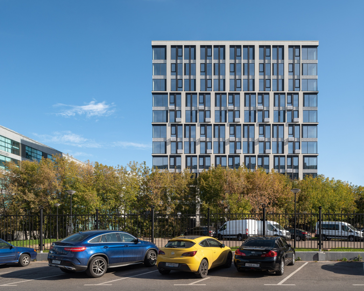
Designing the apartment complex PLAY in Danilovskaya Sloboda, ADM architects placed their bet on the imagery of construction. The area where it manifested itself the most vividly was the sophisticated grid of the facades.

19 May 2021
Object
mainImg
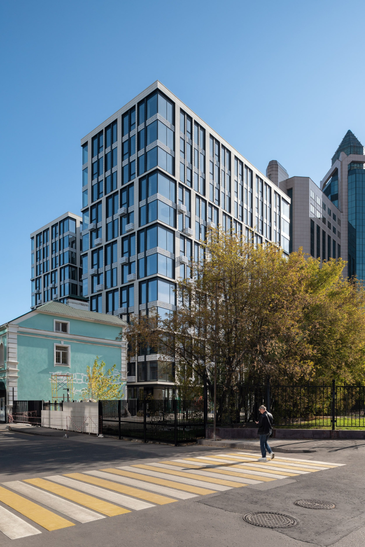
The diverse, to the point of chaotic, urban environment between Bolshaya Tulskaya Street and the waterfront of the Moskva River leaves the architect without a single contextual clue. The place includes low-rise buildings, well-maintained and dilapidated alike, which reflect the industrial history of this area in the 19 century, and huge high-end buildings of the brink of this day and age, the latter being designed more to be perceived from the nearby highways than to harmonize the surrounding side streets. At the same time one must note that these side streets do have their charm due to the human-friendly scale of the houses, as well as due to the tram tracks winding through them, and the bells ringing from the trams going by, which certainly puts you in the mood of “the good old days”.

PLAY apartment complex
Copyright: Photograph © Yaroslav Lukyanchenko / provided by ADM architects


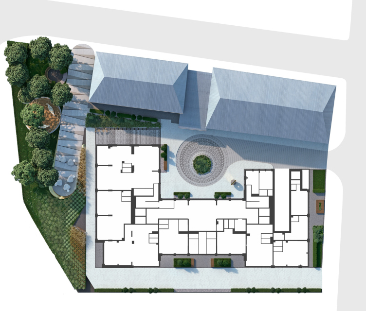
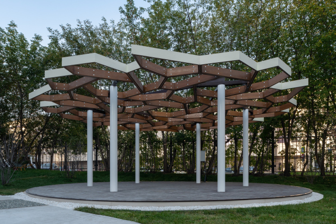
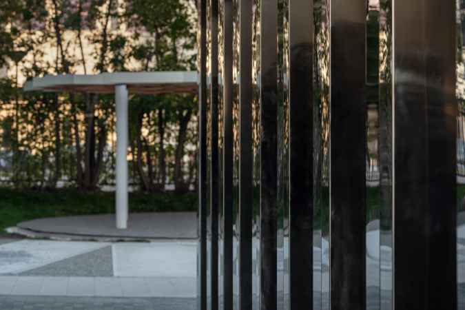
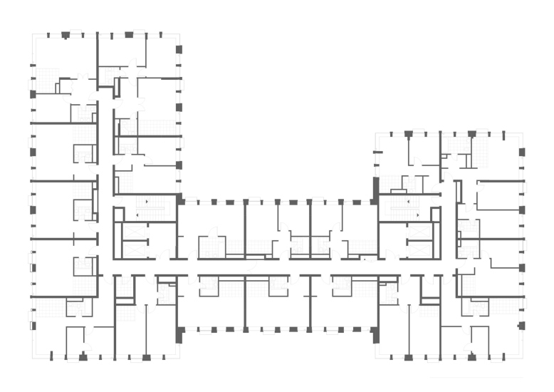
In order to fulfill the task of improving the quality of this potentially livable environment, the authors of the project decided to first of all rely on professional urban planning solutions. The land site occupied by the apartment complex is rather small, and is sandwiched between two neighboring buildings; in addition, part of the territory is limited by the municipal heating network. Despite the high density of construction, inevitable in such a case, the architects paid special attention to designing convenient walking and driving entrances, and even found room for a tiny strip of parkland. In front of the entrance, there is a courtyard with decorative plants in the middle of it, and a drop-off area – a technique borrowed from classic architecture and testifying to the high status of the housing. The courtyard is hidden inside of the block, and its very existence became possible because the house has just one central entrance – the building has an “apartment” status, and, therefore, the layout featuring a central lobby turned out to be the most appropriate, two corridors running in two opposite directions from it.

The master plan. PLAY apartment complex
Copyright: © ADM


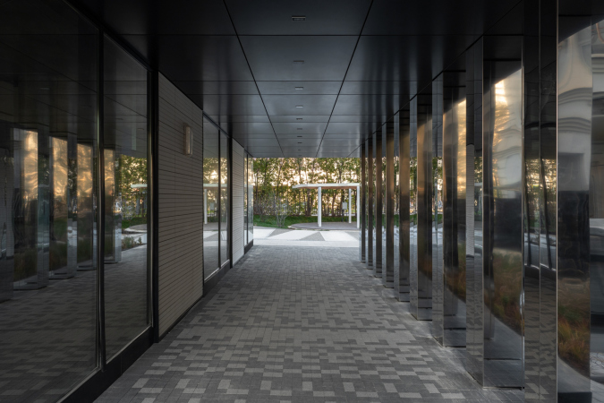
The yard and the little park belong to the residents of the house, creating the coveted “private” feel. For the other residents of this area, the architects created a passage running along the side of the house opposite to the courtyard – this in-block promenade can be accessed from the side-street because the first floor of the complex is designed to host the retail function; the whole composition creates a lit of “air” – something that turns city space into living environment. This way, the planning solution, developed in the circumstances of a very constrained jigsaw puzzle, allowed the architects to both take into account the interests of the residents and make the urban space even livelier and more convenient, enriching it with new possibilities.

  • zooming
    1 / 4
    PLAY apartment complex
    Copyright: Photograph © Yaroslav Lukyanchenko / provided by ADM architects
  • zooming
    2 / 4
    PLAY apartment complex
    Copyright: Photograph © Yaroslav Lukyanchenko / provided ADM architects
  • zooming
    3 / 4
    PLAY apartment complex
    Copyright: Photograph © Yaroslav Lukyanchenko / provided by ADM architects
  • zooming
    4 / 4
    PLAY apartment complex
    Copyright: Photograph © Yaroslav Lukyanchenko / provided ADM architects


Generally speaking, this master plan of a housing complex, where the outside contours of the construction are focused on the city, and the yard space is designed solely for the residents, is something that ADM architects consider to be the best solution, trying to stick to it in their every project.

PLAY apartment complex
Copyright: Photograph © Yaroslav Lukyanchenko / provided by ADM architects


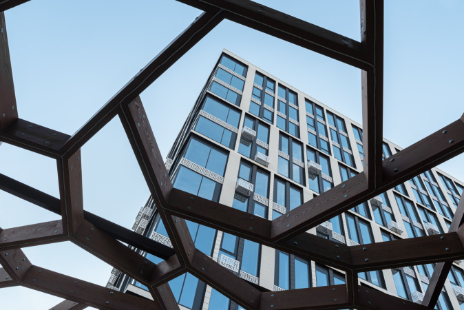
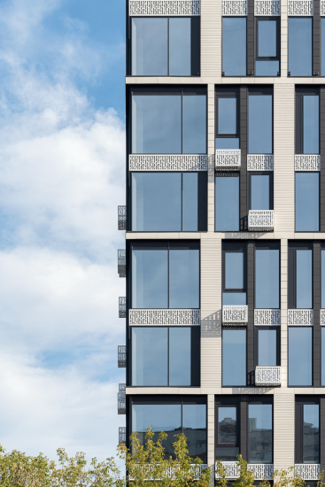
Yet another means of enriching the environment, just as important, is the building of the apartment complex itself – according to the architect of the project, Andrey Romanov; a high-quality architecture will always make the city space better, whatever the context. As far as its volumetric and spatial composition is concerned, the complex is rather laconic: all its beauty lies in the facade development. The authors of the project intuitively tied in the facade with the genius loci: they gave it an industrial character, undaunted either by its conflict with the residential function or by the inevitable “coldness” of such allusions. The facade echoes the industrial past of Danilovskaya Sloboda, and this solution appears to be very appropriate, even if the architects themselves deny the reasoned rationale of their choice and even the presence of such methods in their work.

  • zooming
    PLAY apartment complex
    Copyright: Photograph © Yaroslav Lukyanchenko / provided by ADM architects
  • zooming
    PLAY apartment complex
    Copyright: Photograph © Yaroslav Lukyanchenko / provided by ADM architects


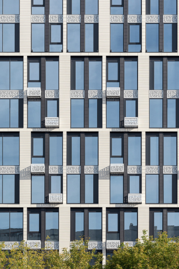
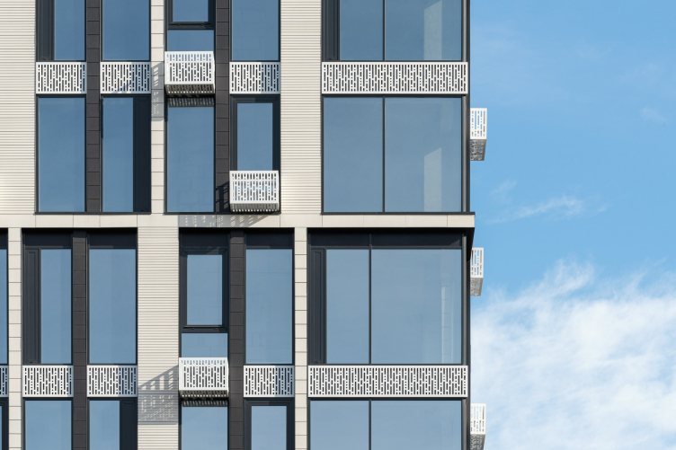
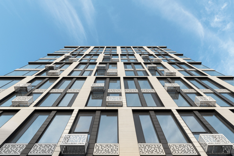
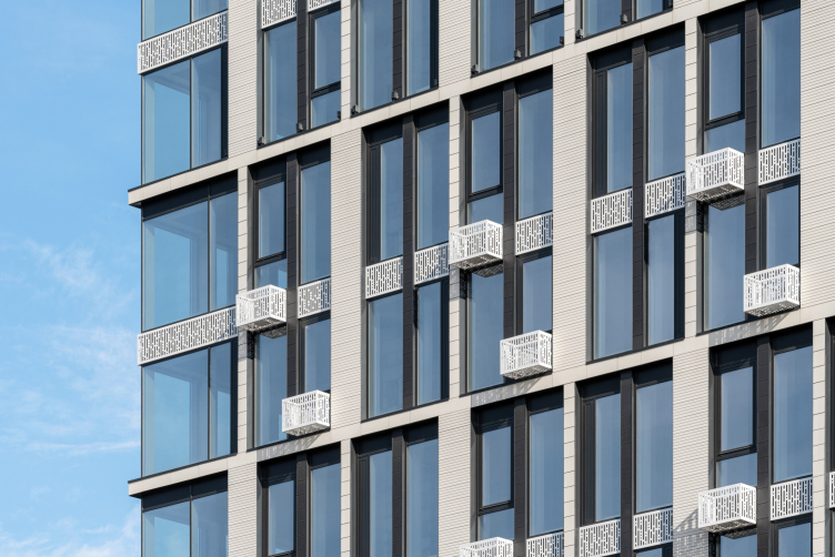
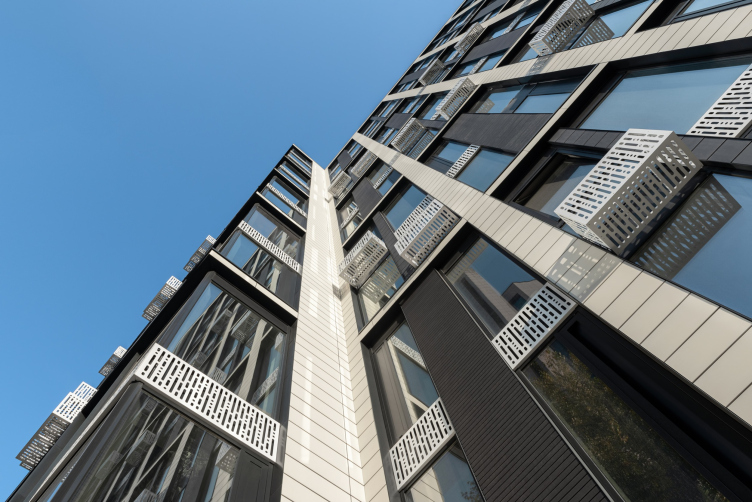
Shining with the contrast of black and white, the facade becomes the centerpiece of the city block – perception-wise, not in terms of mass or height. This black-and-white grid was created by the architects using the method of freehand drawing, when the author relies on his or her intuition and sense of beauty. The “disrupted” scale of the facade, visually uniting two floors into one, again refers to the techniques of classical architecture, and I must say that at the time of its design, this technique was super relevant – architecture is also subject to fashion. Here, however, the dual grid was not drawn in a mechanical way – its proportional structure is sophisticated and defies logical calculations, it is full of shimmering rhythms, sometimes overlapping, sometimes growing thinner. Thanks to it, the facade looks non-static and expresses an irrational understanding of proportions – one that cannot be explained, but is perceived by the observer. In its meaning, the rhythm of this grid is close to curvatures, and, even though this speculation is a bit far-fetched, it does reflect its intuitive and humanistic meaning.

PLAY apartment complex
Copyright: Photograph © Yaroslav Lukyanchenko / provided by ADM architects


PLAY apartment complex
Copyright: Photograph © Yaroslav Lukyanchenko / provided ADM architects


The image of the building also determined the decoration of the facade – the architects selected volumetric porcelain slabs for it. According to the authors of the project, this sturdy and durable material is more appropriate for public buildings, and it is a little bit too pristine for a housing complex. However, the “industrial” image of the building required precisely this kind of decoration – a luminous satin cool sheen and a grid emphasizing the contrast. The industrial image of the building is further enhanced by the large glass surfaces – these are not openable, and, therefore, are not fractured with imposts. The contrast is also softened by openwork panels of the air conditioning unit baskets. The presence of these baskets is considered to be a compromise by the architects because they normally prefer to install central heating and air conditioning systems in the buildings that they design.

PLAY apartment complex
Copyright: Photograph © Yaroslav Lukyanchenko / provided by ADM architects


The tall first floor, as was already mentioned, is meant to be rented out to shops and other local businesses: on the facade, this part is visually turned into a gallery – again, with a reference to the classic examples and just to tradition, because this is how, with a covered loggia on supports, it was customary to decorate trading rows with shops in all eras, from antiquity to Russian classicism.

Summarizing the impression of the new housing complex, we can say that through its intuitive references to patterns lying in the subconscious, references that barely denote the original source and are reproduced within the framework of completely modern forms and approaches, ADM architects deliver an architecture from which anyone who is exposed to it -be that a resident or a casual passer-by – get satisfaction. And when a space becomes attractive to the public, a high-quality environment is drawn to it automatically.


PLAY apartment complex
Copyright: Photograph © Yaroslav Lukyanchenko / provided by ADM architects
  • zooming
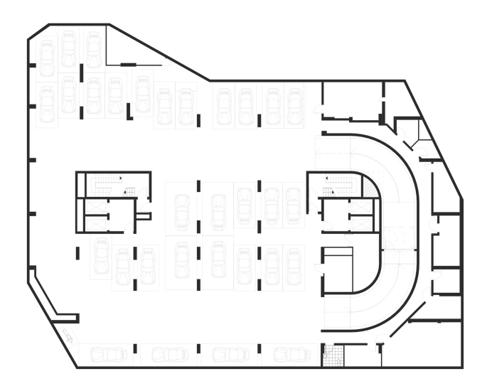
    Plan of the 1st floor. PLAY apartment complex
    Copyright: © ADM
  • zooming
    Plan of the 2-8 floor. PLAY apartment complex
    Copyright: © ADM


19 May 2021

Headlines now
Gold in the Sands
A new office for a transcontinental company specializing in resource extraction and processing has opened in Dubai. Designed by T+T Architects, masters of creating spaces that are contemporary, diverse, flexible, and original, this project exemplifies their expertise. On the executive floor, a massive brass-clad partition dominates, while layered textures of compressed earth create a contextually resonant backdrop.
Layers and Levels of Flight
This project goes way back – Reserve Union won this architectural competition at the end of 2011, and the building was completed in 2018, so it’s practically “archival”. However, despite being relatively unknown, the building can hardly be considered “dated” and remains a prime example of architectural expression, particularly in the headquarters genre. And it’s especially fitting for an aviation company office. In some ways, it resembles the Aeroflot headquarters at Sheremetyevo but with its own unique identity, following the signature style of Vladimir Plotkin. In this article, we take an in-depth look at the United Aircraft Corporation (UAC) headquarters in the Moscow agglomeration town of Zhukovsky, supplemented by recent photographs from Alexey Naroditsky – a shoot that became only recently possible due to the fact that improvements were finally made in the surrounding area.
Light and Shadow
In this article, we delve into the architectural design of the “Chaika” house by DNK ag architects, which was recently completed in 2023 as part of the collection of signature designs at ZILArt. As is well-known, all the buildings in this complex follow a design code, yet each one is distinct. This particular building stands out not only for its whiteness and minimalism but also for the refined use of a limited number of techniques that, together, create what can confidently be called synergy.
Casus Novae
A master plan was developed for a large residential area with a name of “DNS City”, but now that its implementation began, the plan has been arbitrarily reformatted and replaced with something that, while similar on the surface, is actually quite different. This is not the first time such a thing happens, but it’s always frustrating. With permission from the author, we are sharing Maria Elkina’s post.
Treasure Hunting
The GAFA bureau, in collaboration with Tegola and Arkhitail, organized an expedition to the island of Kilpola in Karelia as part of Moskomarkhitektura’s “Open City” festival. There, amidst moss and rocks, the students sought answers to questions like: what is the sacred, where does it dwell, and what sustains it? Assisting the participants in this quest were landscape engineer Evgeny Levin, artist Nicholas Roerich, a moose, and the lack of cellular connection. Here’s how the story unfolded.
Depths of the Earth, Streams of Water
In the Malaya Okhta district, the Akzent building, designed by Stepan Liphart, was constructed. It follows a classic tripartite structure, yet it’s what you might call “hand-drawn”: each façade is unique in its form and details, some of which aren’t immediately noticeable. In this article, we explore the context and, together with the architect, delve into how the form was developed.
Fir Tree Dynamics
The “Airports of Region” holding is planning to build an airport in Karachay-Cherkessia, aiming to make the Arkhyz and Dombay resorts more accessible to travelers. The project that won in an invitation-only competition, submitted by Sergey Nikeshkin’s KPLN, blends natural imagery inspired by the shape of a conifer seed, open-air waiting spaces, majestic large trees, and a green roof elevated on needle-like columns. The result is both nature-inspired and WOW.
​A Brick Shell
In the process of designing a clubhouse situated among pine trees in a prestigious suburban area near Moscow, the architectural firm “A.Len” did the façade design part. The combination of different types of brick and masonry correlates with the volumetric and plastique solutions, further enhanced by the inclusion of wood-painted fragments and metal “glazing”.
Word Forms
ATRIUM architects love ambitious challenges, and for the firm’s thirtieth anniversary, they boldly play a game of words with an exhibition that dives deep into a self-created vocabulary. They immerse their projects – especially art installations – into this glossary, as if plunging into a current of their own. You feel as if you’re flowing through the veins of pure art, immersed in a universe of vertical cities, educational spaces – of which the architects are true masters – and the cultural codes of various locations. But what truly captivates is the bold statement that Vera Butko and Anton Nadtochy make, both through their work and this exhibition: architecture, above all, is art – the art of working with form and space.
Flexibility and Acuteness of Modernity
Luxurious, fluid, large “kokoshniks” and spiral barrel columns, as if made from colorful chewing gum: there seem to be no other mansion like this in Moscow, designed in the “Neo-Russian-Modern” style. And the “Teremok” on Malaya Kaluzhskaya, previously somewhat obscure, has “come alive with new colors” and gained visibility after its restoration for the office of the “architectural ecosystem” as the architects love to call themselves. It’s evident that Julius Borisov and the architects at UNK put their hearts into finding this new office and bringing it up to date. Let’s delve into the paradoxes of this mansion’s history and its plasticity. Spoiler: two versions of modernity meet here, both balancing on the razor’s edge of “what’s current”.
Yuri Vissarionov: “A modular house does not belong to the land”
It belongs to space, or to the air... It turns out that 3D printing is more effective when combined with a modular approach: the house is built in a workshop and then adapted to the site, including on uneven terrain. Yuri Vissarionov shares his latest experience in designing tourist complexes, both in central Russia and in the south. These include houseboats, homes printed from lightweight concrete using a 3D printer, and, of course, frame houses.
​Moscow’s First
“The quality of education largely depends on the quality of the educational environment”. This principle of the last decade has been realized by Sergey Skuratov in the project for the First Moscow Gymnasium on Rostovskaya Embankment in the Khamovniki district. The building seamlessly integrates into the complex urban landscape, responding both to the pedestrian flow of the city and the quiet alleyways. It skillfully takes advantage of the height differences and aligns with modern trends in educational space design. Let’s take a closer look.
Looking at the Water
The site of Villa Sonata stretches from the road to the water’s edge, offering its own shoreline, pier, and a picturesque river panorama. To reveal these sweeping views, Roman Leonidov “cut” the façade diagonally parallel to the river, thus getting two main axes for the house and, consequently, “two heads”. The internal core – two double-height spaces, a living room and a conservatory, with a “bridge” above them – makes the house both “transparent” and filled with light.
The White Wing
Well, it’s not exactly white. It’s more of a beige, white-stone structure that plays with the color of limestone – smoother surfaces are lighter, while rougher ones are darker. This wing unites various elements: it absorbs and interprets the surrounding themes. It responds to everything, yet maintains a cohesive expression – a challenging task! – while also incorporating recognizable features of its own, such as the dynamic cuts at the bottom, top, and middle.
Urban Dunes
The XSA Ramps team designed and built a three-part sports hub for a park in Rostov-on-Don, welcoming people of all ages and fitness levels. The skate plaza, pump track, and playground are all meticulously crafted with details that attract a diverse range of visitors. The technical execution of the shapes and slopes transforms this space into a kind of sculptural composition.
Proportional Growth
The project for the fourth phase of the ÁLIA residential area has been announced. The buildings are situated on an elongated plot – almost a “ray” that shoots out from the center of the area towards the river. Their layout reflects both a response to Moscow’s architectural preferences over the past 15 years, shifting “from blocks to towers”, and an interpretation of the neighboring business park designed by SOM. Additionally, the best apartments here are not located at the very top but closer to the middle, forming a glowing “waistline”.
The “Staircase” Building
In designing the “Details” residential complex in New Moscow, Rais Baishev spiced up the now-popular Moscow theme of a “courtyard” building with an idea drawn from the surrealist drawings by Maurits Escher. He envisioned the stepped silhouettes and descending slopes as a metaphysical mega-staircase, creating a key void within the courtyard that gave the project an internal “spine”. This concept is felt both in the building’s silhouette and on its façades.
Projection of the Quarter
No one doubted that the building that Vladimir Plotkin designed as part of the “Garden Quarters” would be the most modernist of all. And it turned out just that way: while adhering to the common design code, the building successfully combines brick and white stone, rhythmically responding to the neighboring building designed by Ostozhenka, yet tactfully and persistently making a few statements of its own. This includes the projection of the ideal urban development composition “14–9–6”, which can be found right next door, mathematical calculations, including those for various types of terraces (and perhaps the only reminder of the Soviet past of the Kauchuk rubber factory!), and the white “cross-stitch” pattern of the façade grid.
Domus Aurea
In this issue, we examine the “Tessinsky-1” house, designed by Sergey Skuratov and completed in 2023. Located in the middle of the Serebryanicheskaya Embankment district, at the intersection of its main streets, this house assumes a sort of “nodal” role: it not only responds to everything around it and preserves many memories of the former EMA factory within itself, but it weaves all this into a newly directed pattern, reconciling bright “gold” and dark-colored brick, largely with the help of the new, modern-yet-archaic Columba brick, which, come to think about it, is the most precious element here.
The Chimney of Nikola-Lenivets
In this issue, we are examining the “Obelisk House” designed by KATARSIS and built for the Arkhstoyanie 2023 festival. However, it was only finished later on, and this is why we are examining it now. It seems to us that after the “Obelisk House” appeared in Nikola-Lenivets, a dialogue and a few inner connections appeared between the temporary structures built here. These houses no longer look like “accidental neighbors”, more of which below.
​Periscope by the Bay
The jury awarded the second place in the competition for a public and cultural center in Petropavlovsk-Kamchatsky to the companies GORA (“Mountain”) and M4. In the consortium’s proposal, the building resembles a sperm whale with a calf swimming next to it or a periscope, whose lenses capture the most spectacular views from the surrounding landscape.
From Arcs to Dolmens
While working on the competition project for Petropavlovsk-Kamchatsky, ASADOV Architects prioritized the value of the natural and urban environment, aiming to preserve the balance of the location while minimizing the resemblance of the volume that they designed to a “traditional building”. The task was challenging, and the architects created three versions, one of which having been developed after the competition, where their main proposal took third place. However, the point of interest here is not the competition result but the continuity of creative thinking.
Hide and Seek
The ID Moskovskiy house, designed by Stepan Liphart in St. Petersburg, in the courtyards near Moskovskiy Avenue beyond the Obvodny Canal and recently completed, is notable for several reasons. Firstly, it has been realized with considerable accuracy, which is particularly significant as this is the first building where the architect was responsible not only for the facades but also for the layouts, allowing for better integration between the two. On the other hand, this building is interesting as an example of the “germination” of new architecture in the city: it draws on the best examples from the neighborhood and becomes an improved and developed sum of ideas found by the architect in the surrounding context.
The Big Twelve
Yesterday, the winners of the Moscow Mayor’s Architecture Award were announced and honored. Let’s take a look at what was awarded and, in some cases, even critique this esteemed award. After all, there is always room for improvement, right?
Above the Golden Horn
The residential complex “Philosophy” designed by T+T architects in Vladivostok, is one of the new projects in the “Golubinaya Pad” area, changing its development philosophy (pun intended) from single houses to a comprehensive approach. The buildings are organized along public streets, varying in height and format, with one house even executed in gallery typology, featuring a cantilever leaning on an art object.
Nuanced Alternative
How can you rhyme a square and space? Easily! But to do so, you need to rhyme everything you can possibly think of: weave everything together, like in a tensegrity structure, and find your own optics too. The new exhibition at GES-2 does just that, offering its visitor a new perspective on the history of art spanning 150 years, infused with the hope for endless multiplicity of worlds and art histories. Read on to see how this is achieved and how the exhibition design by Evgeny Ace contributes to it.
Blinds for Ice
An ice arena has been constructed in Domodedovo based on a project by Yuri Vissarionov Architects. To prevent the long façade, a technical requirement for winter sports facilities, from appearing monotonous, the architects proposed the use of suspended structures with multidirectional slats. This design protects the ice from direct sunlight while giving the wall texture and detail.
Frozen Magma
A competition for the creation of a public and cultural center was held in Petropavlovsk-Kamchatsky. Three architectural companies made it to the final, and we consider it important to share about the work of each. Let’s start with the winner – the consortium led by Wowhaus.
Campus within a Day
In this article, we talk about what the participants of Genplan Institute of Moscow’s hackathon were doing at the MosComArchitecture booth at the “ArchMoscow” exhibition. We also discuss who won the prize and why, and what can be done with the territory of a small university on the outskirts of Moscow.
Vertical Civilization
Genpro considered the development of the vertical city concept and made it the theme of their pavilion at the “ArchMoscow” exhibition.