По-русски

This Beetle Has Flown

The story of designing a business center in the Zhukov (“Beetle”) Drive: a number of attempts to preserve a hundred-year-old cold storage facility, at the same time introducing modern buildings interpreting the industrial theme. The project remained on paper, but the story behind it seems to be worth our attention.

30 April 2021
Object
mainImg
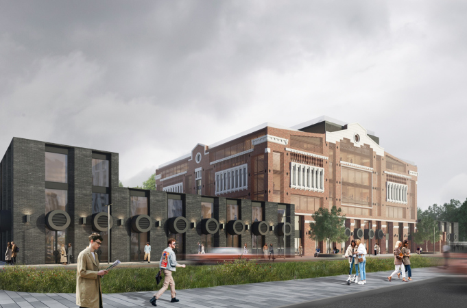
The Beetle office center was designed by KPLN (headed by Sergey Nikeshkin) during a two-year span, in 2019-2020, commissioned by Coldy. The project went through a few stages, three of which had to do with the dilemma of whether to preserve or tear down the “refrigerator” – a brick industrial structure built in the beginning of the XX century. And, if to preserve, then in which format.

The building of the “refrigerator” when the design process began. The Beetle office center. A photograph. The west facade
Copyright: © KPLN


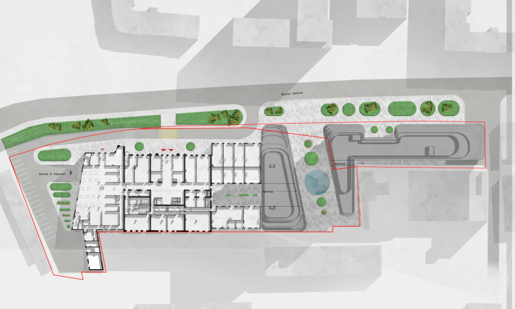
The land site stretches along the Zhukov Drive between the Paveletskaya railroad lines and the Derbenevskaya Street; narrow in its east part, it is almost square in the west, where the “refrigerator” is located. Originally, the project of the business center consisted of two parts: the renovation of the “refrigerator” (according to the 2000 data), which was to become the first stage, and the construction of new office buildings, which was to become the second one.

The Beetle office center. Outlines of the land site
Copyright: © KPLN


The building of the early XX century

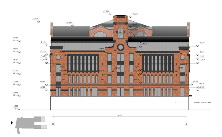
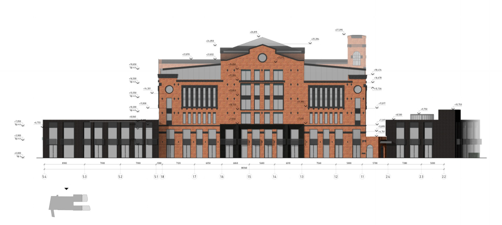
The “refrigerator” – a large parallelepiped with a 40x45 meter base and an elevation of the central axis decorated by frontons – was almost completely devoid of windows because they violate the thermal insulation necessary for uniform cooling, which was achieved here through the circulation of air between the floors. The only place that was lit by natural light was the staircase of the main entrance underneath the turret on the west facade, but the entire building was decorated in the spirit of “industrial romanticism”: imitations of windows with bulging fascias, balusters, and cantilevers – all these things visually divided the volume into elements organized in a symmetrical composition, successfully combating the inertia of form.

Later on, the stained-glass window of the staircase was stopped with bricks, and several sloppy windows pierced over the decor. The brick facades right on top of the masonry were covered with yellow heat-insulating foam that looked like lichen from a distance.

The building of the “refrigerator” when the design process began. The Beetle office center. A photograph. The north facade
Copyright: © KPLN


According to the Arkhnadzor records, the building in the Zhukov Drive was built back in the day by the joint-stock company “Astrakhansky Kholodilnik” (“Astrakhan Refrigerator”). The construction probably began in 1915-1916, when the company bought the land, but was apparently finished after the Great October Socialist Revolution (when no private property was allowed).  

Meanwhile, it must be noted that this was not the only cold storage building in the Paveletskaya industrial park: to a certain extent, the architecture of this brick building echoes that of another brick hangar, situated 400 meters to the north at the address of 41c4, Dubininskaya Street (Alexander Frolov, the author of the application for giving this building a status of an architectural heritage site, dated this neighboring refrigerator to 1905–1912 and even, with some probability, attributed it to the master of Northern Art Nouveau Fyodor Fyodorovich von Postels;  more about the preservation project, see here).

Reconstruction: Version 1

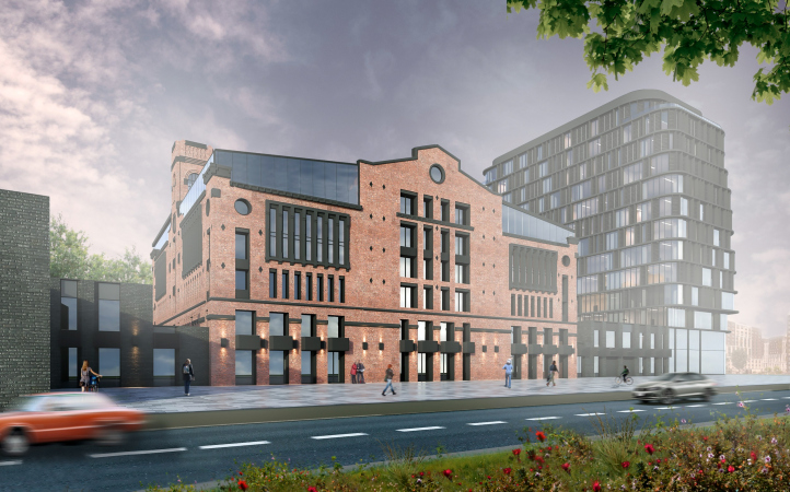
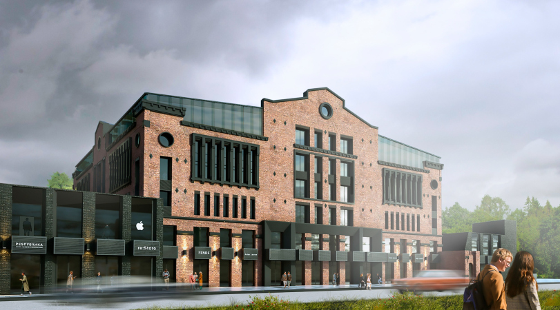
The first of the reconstruction versions proposed by the KPLN architects was the most non-invasive in relation to the building of the early XX century, which, according to the project, had to change its function altogether. Due to the fact that a cold storage facility does not need any windows at all, but with an office center it’s the other way around, the architects proposed to make wide openings in the walls, at the same time covering them up with striped ceramic lattices. When viewed from a distance, the volume would look solid and retain the semblance of its former monumental self. It was expected that all the details (light-colored against the brick background) would be repaired and restored , while the rows of vertical recessions would be further drilled and turned into real windows.

The Beetle office center. Phase 1, Stage 1
Copyright: © KPLN


The Beetle office center. Phase 1, Stage 1
Copyright: © KPLN


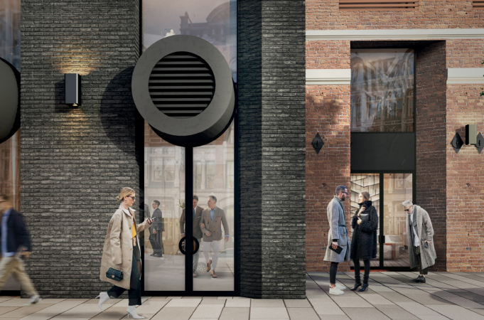
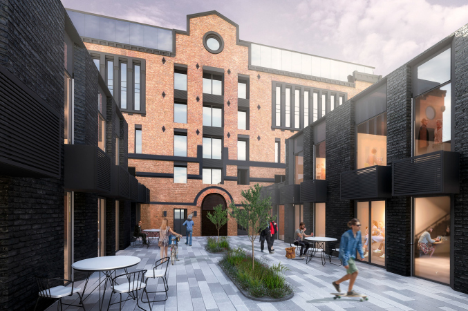
The expanded underground tier contains an underground parking garage, while the low-ride volumes of the public spaces, which replaced the later-on Soviet additions of the ice-cream factory, are emphasized by the architects in a deliberately brutal way: with black facades and protruding round “chimneys”. 

  • zooming
    1 / 12
    The Beetle office center. Phase 1, Stage 1
    Copyright: © KPLN
  • zooming
    2 / 12
    The Beetle office center. Phase 1, Stage 1
    Copyright: © KPLN
  • zooming
    3 / 12
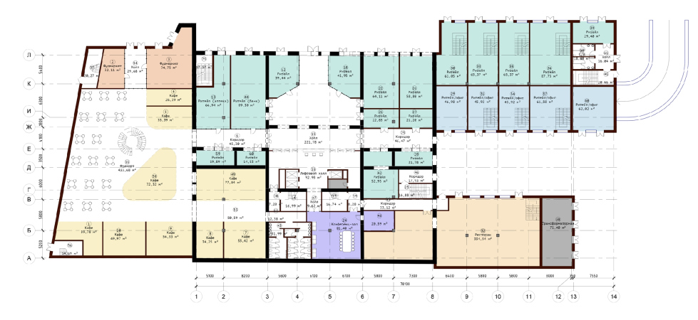
    The Beetle office center. Phase 1, Stage 1. Plan at +0.000 elevation
    Copyright: © KPLN
  • zooming
    4 / 12
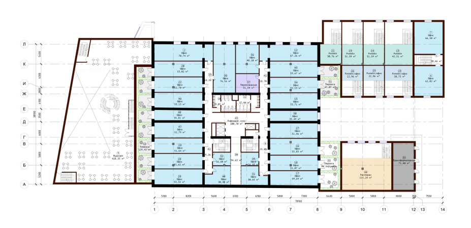
    The Beetle office center. Phase 1, Stage 1. Plan at +3.900 elevation
    Copyright: © KPLN
  • zooming
    5 / 12
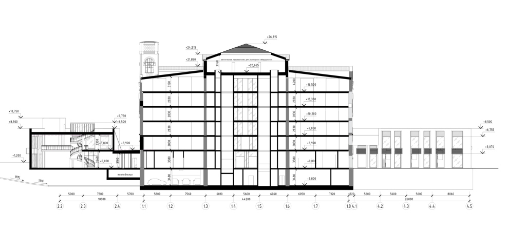
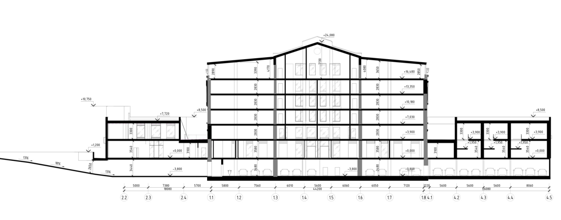
    The Beetle office center. Phase 2. Section 2-2
    Copyright: © KPLN
  • zooming
    6 / 12
    The Beetle office center. Phase 2. Section 1-1
    Copyright: © KPLN
  • zooming
    7 / 12
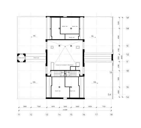
    The Beetle office center. Stage 2. Plan of the site for placing the equipment at +19.650 elevation
    Copyright: © KPLN
  • zooming
    8 / 12
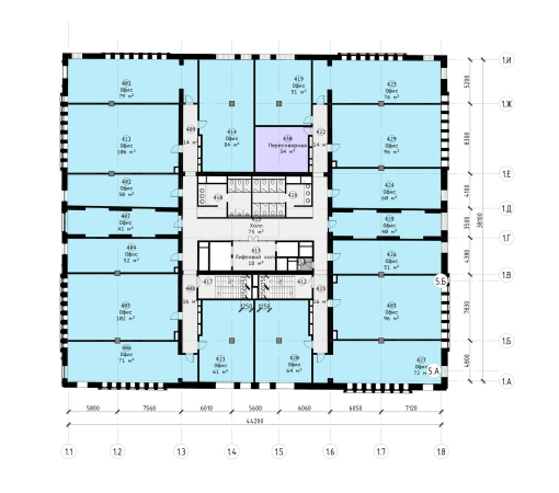
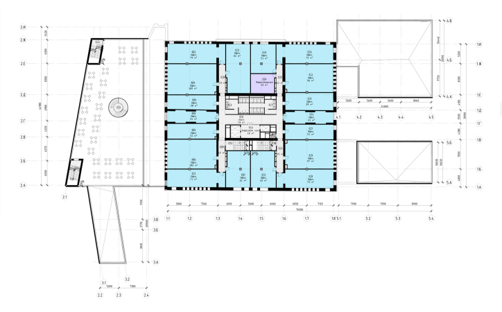
    The Beetle office center. Stage 2. Plan of the 4th floor at +10.200 elevation
    Copyright: © KPLN
  • zooming
    9 / 12
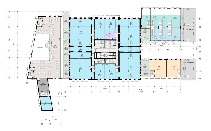
    The Beetle office center. Stage 2. Plan of the 3rd floor at +7.050 elevation
    Copyright: © KPLN
  • zooming
    10 / 12
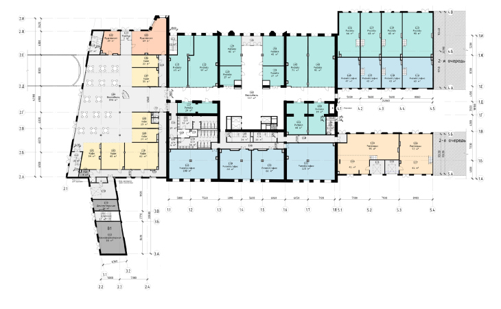
    The Beetle office center. Stage 2. Plan of the 2nd floor at +3.900 elevation
    Copyright: © KPLN
  • zooming
    11 / 12
    The Beetle office center. Stage 2. Plan of the 2nd floor at 0.000 elevation
    Copyright: © KPLN
  • zooming
    12 / 12
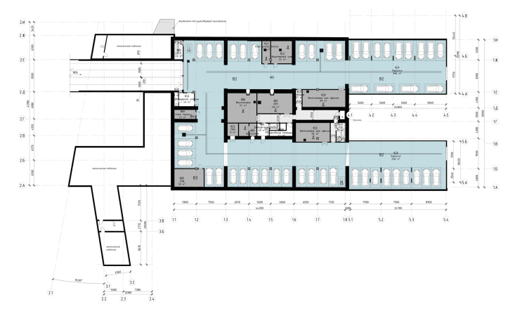
    The Beetle office center. Stage 2. Plan of the -1st floor at -3.800 elevation
    Copyright: © KPLN
 

New buildings: Version 1, Stage 2

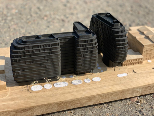
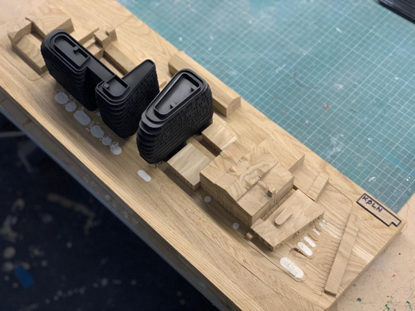
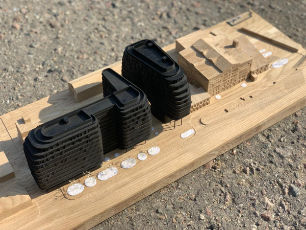
The new office buildings of the Beetle were to be placed in the narrow eastern part, along the driveway, east of the “fridge”. The reconstruction was to be Stage 1, new construction Stage 2 of the project. For the new buildings, in 2019 the developer organized a closed-door competition that involved DNK ag, Ostozhenka, and a few other established architectural companies. The concept proposed by KPLN won the competition, and later on preserved its imagery at all of the stages while the company still participated in the project. 

  • zooming
    1 / 3
    The Beetle office center. Phase 1, Stage 2. The competition project, a model
    Copyright: © KPLN
  • zooming
    2 / 3
    The Beetle office center. Phase 1, Stage 2. The competition project, a model
    Copyright: © KPLN
  • zooming
    3 / 3
    The Beetle office center. Phase 1, Stage 1. The competition project, a model
    Copyright: © KPLN


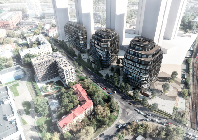
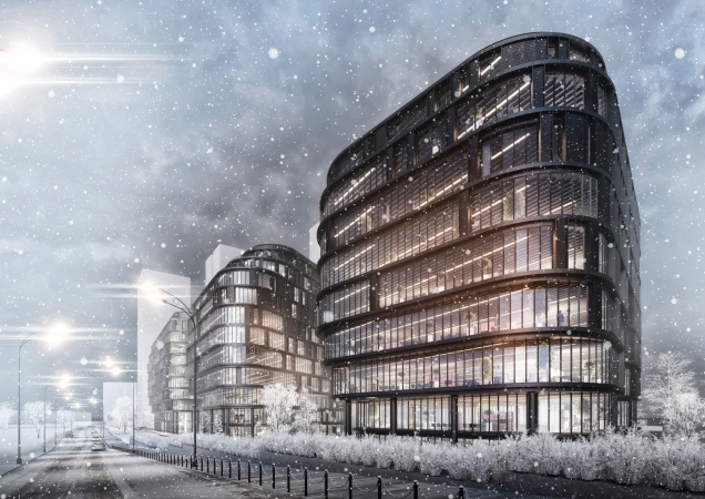
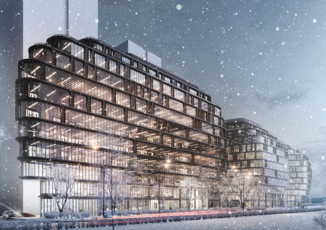
So! The streamlined pitch-black volumes are composed of flexible floor-by-floor bands, receding at the top and bottom: in the first case, this vacates room for the terraces, which smoothly rise towards an operated roof; in the second case, this vacates room for the sidewalks and the land improvement. Interestingly, in the opening of the traversal pedestrian “park” street, the cantilevers were supported by slender metallic columns. At the same time, the recessions of the terraces delicately concealed the height: when viewed from a distance, the top floors are no different than the rest, and, when viewed from a close range, they are invisible, and the height of the street looks smaller than it really is.

The Beetle office center. Phase 3, Stage 2
Copyright: © KPLN


As is the custom with office buildings, there is lots of glass here, even though, in spite of the rounded contours of the volumes, the architects did not plan to use curvilinear glass extensively, and the jagged outline of the top floors looked like some glass angle protractor, making turns in the corners within guidelines. The distribution of glass on the facades depends upon isolation – in the north parts, where there is less light, the stained glass windows are more abundant.

The Beetle office center. Phase 5. The insolation
Copyright: © KPLN


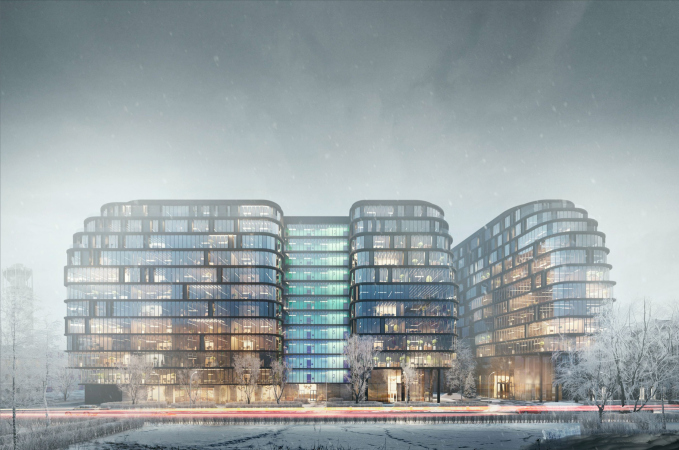
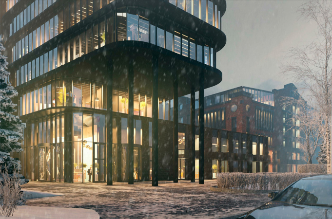
The inter-floor bands are of black metal, the occasional verticals are of dark ceramics, laid with overlaps and looking like medieval black-glazed roof tiles. All these things work together to create an impression partially “geologic” (because the bands of the floors stand out and stand back like some slate formation), and partially industrial, which reads like a logical contextual reference to the history of this place. In general, the buildings look like a mechanism, some kind of conveyor unit, but at the same time they shine, both in the sun and with internal illumination – so this is definitely some kind of post-industrial conveyor, not devoid of glamor combined with a bit of actual brutality. The impression is further supported by the winter 3D renders – but then again, according to the architects, it was the client that chose this season: “because we have winter 2/3 of the year here.”

The Beetle office center. Phase 3. Visualization from the Zhukov Drive
Copyright: © KPLN


The flowing outlines of the volumes were something that the architects resorted to due to the specifics of the land site – Sergey Nikeshkin shares. On the grounds of the complex, there are two round wells of deep sewerage, with a diameter of about 6m. Since moving them to another place was out of the question, the wells had to be bypassed, and this is how the idea of a stepped cantilever indentation arose.  Above the wells, the architects conceived round fountains with a thin layer of recirculated water.

In this particular instance, the bypasses of the well are shown on the example of the fifth and last version of the project, where the new buildings occupy the entire land site but the morphology of the buildings inherits the principles of the 1st version of Stage 2: 

zooming
The Beetle office center. Phase 5 (in which the new construction occupies the whole of the land site). The north facade
Copyright: © KPLN


The black-glass, streamlined and faceted, from a distance somewhat “pot-bellied” buildings, in addition to the obvious “industrial” imagery, may also seem to be an interpretation of the romantic and at the same time contextual name of “Beetle”. The glass elements on the corners are like transparent wings, the black frames are like chitinous flaps, and the evening glow reminds of fireflies. The comparison is not literal, of course, but the resemblance is there, as if a giant metallic transformer beetle landed next to the old brick hangar. The architects interpreted this proximity as a contrast between the old and the new: the cold storage is half the height of the new buildings, it is all brick with white details, whilst the new office buildings are black, glass, and streamlined.

  • zooming
    1 / 10
    The Beetle office center. Phase 5. The north facade
    Copyright: © KPLN
  • zooming
    2 / 10
    The Beetle office center. Stage 3, Phase 5. The entrance group
    Copyright: © KPLN
  • zooming
    3 / 10
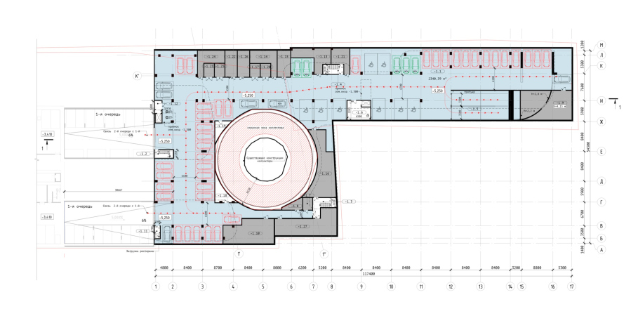
    The Beetle office center. Phase 3. The car park
    Copyright: © KPLN
  • zooming
    4 / 10
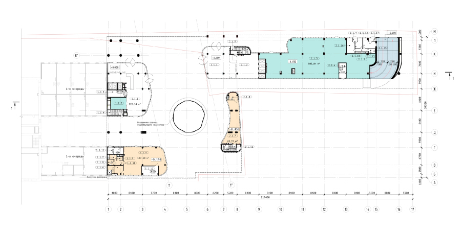
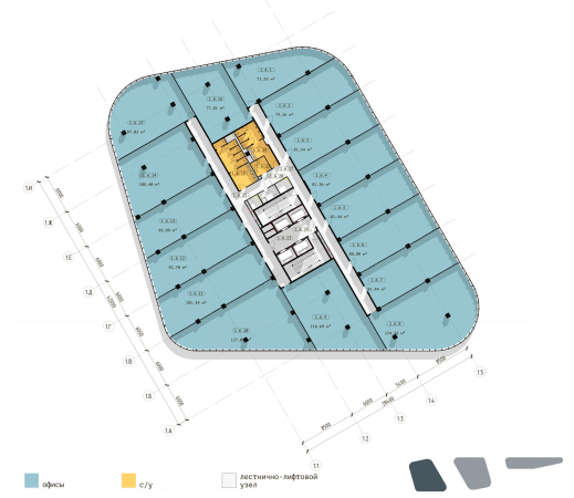
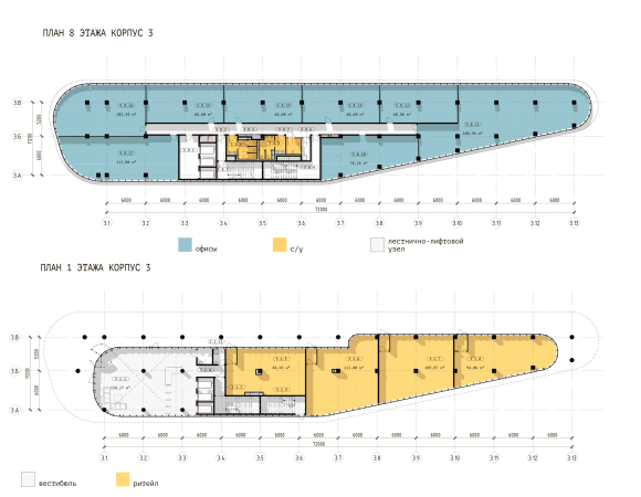
    The Beetle office center. Phase 3. Plan of the 1st floor at 0,000 elevation
    Copyright: © KPLN
  • zooming
    5 / 10
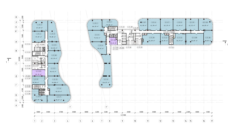
    The Beetle office center. Phase 3. Plan of the 5th floor at +15,000 elevation
    Copyright: © KPLN
  • zooming
    6 / 10
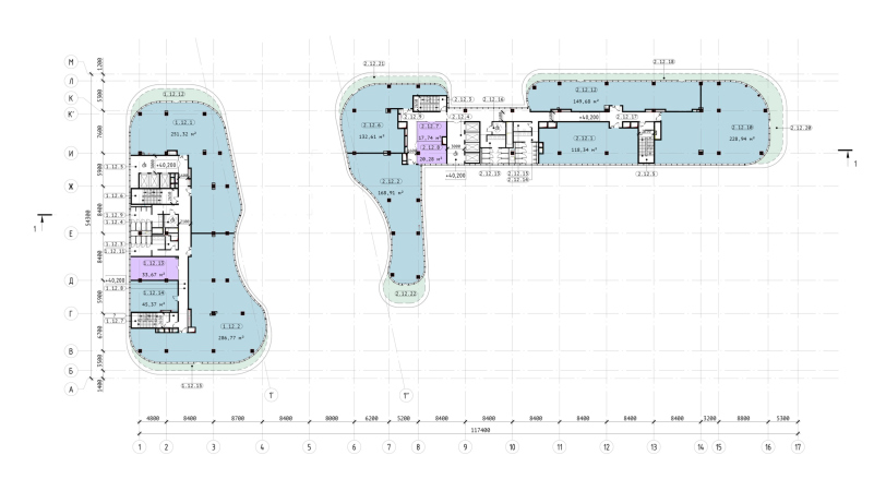
    The Beetle office center. Phase 3. Plan of the 12th floor at +40,500 elevation
    Copyright: © KPLN
  • zooming
    7 / 10
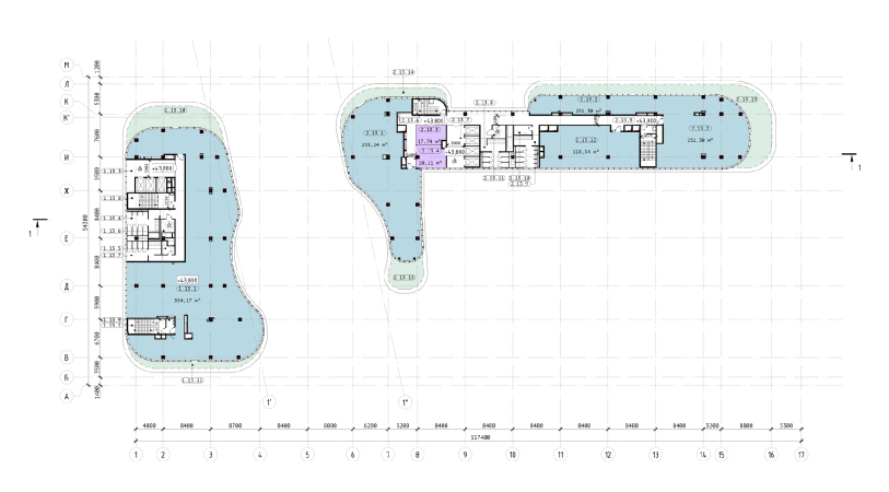
    The Beetle office center. Phase 3. Plan of the 13th floor at +43,800 elevation
    Copyright: © KPLN
  • zooming
    8 / 10
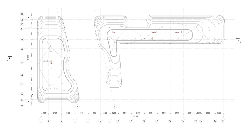
    The Beetle office center. Phase 3. The roof plan
    Copyright: © KPLN
  • zooming
    9 / 10
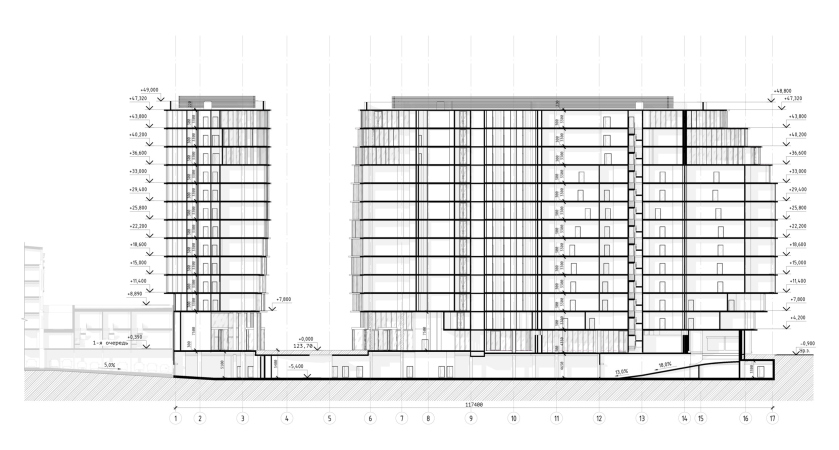
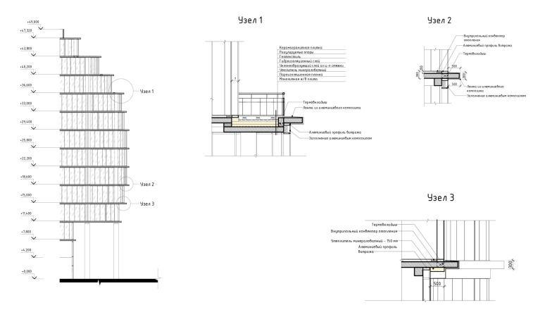
    The Beetle office center. Phase 3. Section 1-1
    Copyright: © KPLN
  • zooming
    10 / 10
    The Beetle office center. Phase 3. The hubs
    Copyright: © KPLN


Reconstruction: Version 2

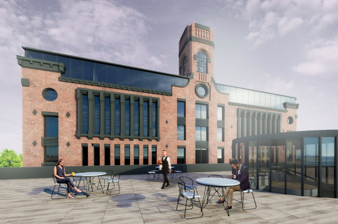
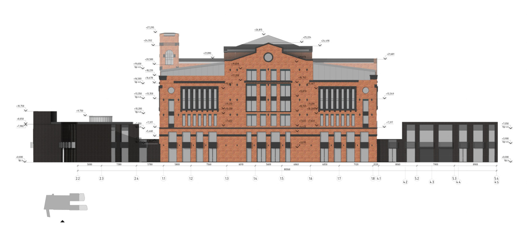
In the second version of the reconstruction project, the details of the refrigerator turned black, and the refrigerator itself grew larger – both was done at the client’s request, the former for the sake of harmony with the modern buildings, the latter for the bigger output of useful floor space, extended in the top floor with a glass mansard. The lattices, proposed by the architects for concealing the windows, were also declined by the client: the windows became just windows. However, the building, although it lost a significant part of the similarity with the historical prototype due to its new function, was still supposed to be preserved in February 2020.

  • zooming
    1 / 8
    The Beetle office center. Phase 2. Visualization of the north facade
    Copyright: © KPLN
  • zooming
    2 / 8
    The Beetle office center. Phase 2. Visualization of the south facade
    Copyright: © KPLN
  • zooming
    3 / 8
    The Beetle office center. Stage 2. Visualization of the east facade
    Copyright: © KPLN
  • zooming
    4 / 8
    The Beetle office center. Stage 2. Visualization of the west facade
    Copyright: © KPLN
  • zooming
    5 / 8
    The Beetle office center. Stage 2. The south facade
    Copyright: © KPLN
  • zooming
    6 / 8
    The Beetle office center. Stage 2. The west facade
    Copyright: © KPLN
  • zooming
    7 / 8
    The Beetle office center. Stage 2. The north facade
    Copyright: © KPLN
  • zooming
    8 / 8
    The Beetle office center. Phase 2. A simplified master plan
    Copyright: © KPLN


The final version

In the first half of 2020, the developer asked KPLN to propose an option without preservation of the refrigerator building: it consisted of new buildings with an already specified morphology spread all over the site.

  • zooming
    1 / 7
    The Beetle office center. Phase 1
    Copyright: © KPLN
  • zooming
    2 / 7
    The Beetle office center. Phase 5
    Copyright: © KPLN
  • zooming
    3 / 7
    The Beetle office center. Phase 5
    Copyright: © KPLN
  • zooming
    4 / 7
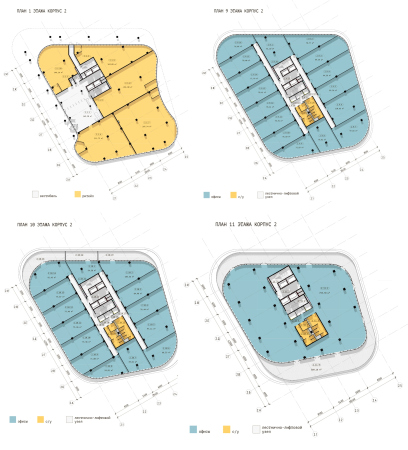
    The Beetle office center. Phase 5. Plan of the 6th floor, Building 1
    Copyright: © KPLN
  • zooming
    5 / 7
    The Beetle office center. Phase 5.
    Copyright: © KPLN
  • zooming
    6 / 7
    The Beetle office center. Phase 5.
    Copyright: © KPLN
  • zooming
    7 / 7
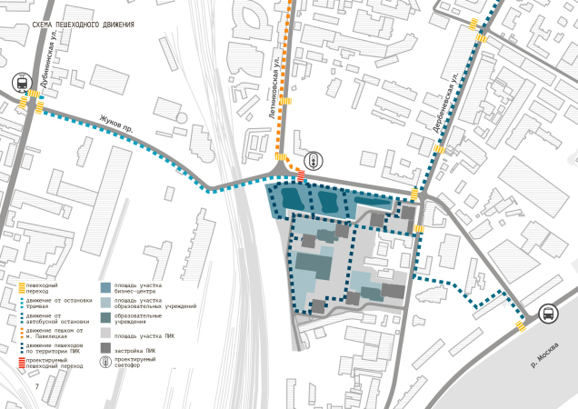
    The Beetle office center. Phase 5. The pedestrian flows
    Copyright: © KPLN


At this point, the participation of KPLN in the project came to an end – then two completely different concepts came about, called not Beetle but Taller. One of the projects, announced in the summer of 2020, is called Taller Loft, and is already positioned as a housing complex, or, to be more exact, a mixed-use development, combining apartments and offices. The developer did not disclose the authors of the new project, explaining that “Taller Loft is not yet on sale”.  For all intents and purposes, the new project appeared in summer, while the demolition of the “refrigerator” began in October: on November 10, the Department of Cultural Heritage refused the building its protected status, on November 16, an article by Arkhnadzor was published, then, a week later a few articles to the opposite effect appeared (here, here, and here). Still another project, which, most likely, appeared recently, is now featured on developer’s website – in the form of two office prisms, combining brick verticals with prevalent glass; what it inherits from the fridge is the tower before the west facade – one can hardly tell if it is preserved or (which is more probable) reconstructed.  

***

One should say that the transformations of the Beetle project fit into many modern trends; they can even be interpreted as a kind of guideline for step-by-step development: first, maximum preservation, then compromise preservation, then modern construction, then a new project combined with housing. In a sense, this story repeats on a miniature scale the story of developing the Paveletskaya industrial estate: a while ago, it was the territory of new offices and redevelopments of old factories. During the early days of turning unused factory buildings into offices, they even had guided tours here. Over the recent years, the prevailing typology of new projects shifted in the “housing” direction, and the scale became huge.  South of the southern border of the Beetle business center, which was once owned by the German chemical factory Fabwerke, PIK development is building a high-rise housing complex, while three hundred meters to the north, on the Letnikovskaya Street, a large-scale housing complex for Pioneer Development is being built. The history of designing the Beetle business center – from “loft” redevelopment with preserving the historical building to completely new construction with a small share (we do not know exactly how big) of the housing typology – generally repeats the trends inherent to this industrial park on the whole.

One must say that cold storage facilities are not really lucky in terms of reconstruction – probably because they are not just workshops but buildings without windows that require quite a lot of work to change their function. The necessity for punching windows in the walls radically transforms them, hence, questioning the very necessity of preservation: because we either preserve it as it is because its a piece of architectural heritage, or, if we can drill holes in it, we cannot give the building a protected status. Nevertheless, the design experience itself, including an attempt to preserve not only parts of the walls and the volume, but also, especially in the first version, the image of a building from the beginning of the XX century arouses interest and respect. However, the task was very complex, not in the least because of the market conditions.  Hence, it comes as no surprise that the beetle flew away from the Beetle Drive.

30 April 2021

Headlines now
A Step Forward
The HIDE residential complex represents a major milestone for ADM architects and their leaders Andrey Romanov and Ekaterina Kuznetsova in their quest for a fresh high-rise aesthetic – one that is flexible and layered, capable of bringing vibrancy to mass and silhouette while shaping form. Over recent years, this approach has become ADM’s “signature style”, with the golden HIDE tower playing a pivotal role in its evolution. Here, we delve into the project’s story, explore the details of the complex’s design, and uncover its core essence.
Gold in the Sands
A new office for a transcontinental company specializing in resource extraction and processing has opened in Dubai. Designed by T+T Architects, masters of creating spaces that are contemporary, diverse, flexible, and original, this project exemplifies their expertise. On the executive floor, a massive brass-clad partition dominates, while layered textures of compressed earth create a contextually resonant backdrop.
Layers and Levels of Flight
This project goes way back – Reserve Union won this architectural competition at the end of 2011, and the building was completed in 2018, so it’s practically “archival”. However, despite being relatively unknown, the building can hardly be considered “dated” and remains a prime example of architectural expression, particularly in the headquarters genre. And it’s especially fitting for an aviation company office. In some ways, it resembles the Aeroflot headquarters at Sheremetyevo but with its own unique identity, following the signature style of Vladimir Plotkin. In this article, we take an in-depth look at the United Aircraft Corporation (UAC) headquarters in the Moscow agglomeration town of Zhukovsky, supplemented by recent photographs from Alexey Naroditsky – a shoot that became only recently possible due to the fact that improvements were finally made in the surrounding area.
Light and Shadow
In this article, we delve into the architectural design of the “Chaika” house by DNK ag architects, which was recently completed in 2023 as part of the collection of signature designs at ZILArt. As is well-known, all the buildings in this complex follow a design code, yet each one is distinct. This particular building stands out not only for its whiteness and minimalism but also for the refined use of a limited number of techniques that, together, create what can confidently be called synergy.
Casus Novae
A master plan was developed for a large residential area with a name of “DNS City”, but now that its implementation began, the plan has been arbitrarily reformatted and replaced with something that, while similar on the surface, is actually quite different. This is not the first time such a thing happens, but it’s always frustrating. With permission from the author, we are sharing Maria Elkina’s post.
Treasure Hunting
The GAFA bureau, in collaboration with Tegola and Arkhitail, organized an expedition to the island of Kilpola in Karelia as part of Moskomarkhitektura’s “Open City” festival. There, amidst moss and rocks, the students sought answers to questions like: what is the sacred, where does it dwell, and what sustains it? Assisting the participants in this quest were landscape engineer Evgeny Levin, artist Nicholas Roerich, a moose, and the lack of cellular connection. Here’s how the story unfolded.
Depths of the Earth, Streams of Water
In the Malaya Okhta district, the Akzent building, designed by Stepan Liphart, was constructed. It follows a classic tripartite structure, yet it’s what you might call “hand-drawn”: each façade is unique in its form and details, some of which aren’t immediately noticeable. In this article, we explore the context and, together with the architect, delve into how the form was developed.
Fir Tree Dynamics
The “Airports of Region” holding is planning to build an airport in Karachay-Cherkessia, aiming to make the Arkhyz and Dombay resorts more accessible to travelers. The project that won in an invitation-only competition, submitted by Sergey Nikeshkin’s KPLN, blends natural imagery inspired by the shape of a conifer seed, open-air waiting spaces, majestic large trees, and a green roof elevated on needle-like columns. The result is both nature-inspired and WOW.
​A Brick Shell
In the process of designing a clubhouse situated among pine trees in a prestigious suburban area near Moscow, the architectural firm “A.Len” did the façade design part. The combination of different types of brick and masonry correlates with the volumetric and plastique solutions, further enhanced by the inclusion of wood-painted fragments and metal “glazing”.
Word Forms
ATRIUM architects love ambitious challenges, and for the firm’s thirtieth anniversary, they boldly play a game of words with an exhibition that dives deep into a self-created vocabulary. They immerse their projects – especially art installations – into this glossary, as if plunging into a current of their own. You feel as if you’re flowing through the veins of pure art, immersed in a universe of vertical cities, educational spaces – of which the architects are true masters – and the cultural codes of various locations. But what truly captivates is the bold statement that Vera Butko and Anton Nadtochy make, both through their work and this exhibition: architecture, above all, is art – the art of working with form and space.
Flexibility and Acuteness of Modernity
Luxurious, fluid, large “kokoshniks” and spiral barrel columns, as if made from colorful chewing gum: there seem to be no other mansion like this in Moscow, designed in the “Neo-Russian-Modern” style. And the “Teremok” on Malaya Kaluzhskaya, previously somewhat obscure, has “come alive with new colors” and gained visibility after its restoration for the office of the “architectural ecosystem” as the architects love to call themselves. It’s evident that Julius Borisov and the architects at UNK put their hearts into finding this new office and bringing it up to date. Let’s delve into the paradoxes of this mansion’s history and its plasticity. Spoiler: two versions of modernity meet here, both balancing on the razor’s edge of “what’s current”.
Yuri Vissarionov: “A modular house does not belong to the land”
It belongs to space, or to the air... It turns out that 3D printing is more effective when combined with a modular approach: the house is built in a workshop and then adapted to the site, including on uneven terrain. Yuri Vissarionov shares his latest experience in designing tourist complexes, both in central Russia and in the south. These include houseboats, homes printed from lightweight concrete using a 3D printer, and, of course, frame houses.
​Moscow’s First
“The quality of education largely depends on the quality of the educational environment”. This principle of the last decade has been realized by Sergey Skuratov in the project for the First Moscow Gymnasium on Rostovskaya Embankment in the Khamovniki district. The building seamlessly integrates into the complex urban landscape, responding both to the pedestrian flow of the city and the quiet alleyways. It skillfully takes advantage of the height differences and aligns with modern trends in educational space design. Let’s take a closer look.
Looking at the Water
The site of Villa Sonata stretches from the road to the water’s edge, offering its own shoreline, pier, and a picturesque river panorama. To reveal these sweeping views, Roman Leonidov “cut” the façade diagonally parallel to the river, thus getting two main axes for the house and, consequently, “two heads”. The internal core – two double-height spaces, a living room and a conservatory, with a “bridge” above them – makes the house both “transparent” and filled with light.
The White Wing
Well, it’s not exactly white. It’s more of a beige, white-stone structure that plays with the color of limestone – smoother surfaces are lighter, while rougher ones are darker. This wing unites various elements: it absorbs and interprets the surrounding themes. It responds to everything, yet maintains a cohesive expression – a challenging task! – while also incorporating recognizable features of its own, such as the dynamic cuts at the bottom, top, and middle.
Urban Dunes
The XSA Ramps team designed and built a three-part sports hub for a park in Rostov-on-Don, welcoming people of all ages and fitness levels. The skate plaza, pump track, and playground are all meticulously crafted with details that attract a diverse range of visitors. The technical execution of the shapes and slopes transforms this space into a kind of sculptural composition.
Proportional Growth
The project for the fourth phase of the ÁLIA residential area has been announced. The buildings are situated on an elongated plot – almost a “ray” that shoots out from the center of the area towards the river. Their layout reflects both a response to Moscow’s architectural preferences over the past 15 years, shifting “from blocks to towers”, and an interpretation of the neighboring business park designed by SOM. Additionally, the best apartments here are not located at the very top but closer to the middle, forming a glowing “waistline”.
The “Staircase” Building
In designing the “Details” residential complex in New Moscow, Rais Baishev spiced up the now-popular Moscow theme of a “courtyard” building with an idea drawn from the surrealist drawings by Maurits Escher. He envisioned the stepped silhouettes and descending slopes as a metaphysical mega-staircase, creating a key void within the courtyard that gave the project an internal “spine”. This concept is felt both in the building’s silhouette and on its façades.
Projection of the Quarter
No one doubted that the building that Vladimir Plotkin designed as part of the “Garden Quarters” would be the most modernist of all. And it turned out just that way: while adhering to the common design code, the building successfully combines brick and white stone, rhythmically responding to the neighboring building designed by Ostozhenka, yet tactfully and persistently making a few statements of its own. This includes the projection of the ideal urban development composition “14–9–6”, which can be found right next door, mathematical calculations, including those for various types of terraces (and perhaps the only reminder of the Soviet past of the Kauchuk rubber factory!), and the white “cross-stitch” pattern of the façade grid.
Domus Aurea
In this issue, we examine the “Tessinsky-1” house, designed by Sergey Skuratov and completed in 2023. Located in the middle of the Serebryanicheskaya Embankment district, at the intersection of its main streets, this house assumes a sort of “nodal” role: it not only responds to everything around it and preserves many memories of the former EMA factory within itself, but it weaves all this into a newly directed pattern, reconciling bright “gold” and dark-colored brick, largely with the help of the new, modern-yet-archaic Columba brick, which, come to think about it, is the most precious element here.
The Chimney of Nikola-Lenivets
In this issue, we are examining the “Obelisk House” designed by KATARSIS and built for the Arkhstoyanie 2023 festival. However, it was only finished later on, and this is why we are examining it now. It seems to us that after the “Obelisk House” appeared in Nikola-Lenivets, a dialogue and a few inner connections appeared between the temporary structures built here. These houses no longer look like “accidental neighbors”, more of which below.
​Periscope by the Bay
The jury awarded the second place in the competition for a public and cultural center in Petropavlovsk-Kamchatsky to the companies GORA (“Mountain”) and M4. In the consortium’s proposal, the building resembles a sperm whale with a calf swimming next to it or a periscope, whose lenses capture the most spectacular views from the surrounding landscape.
From Arcs to Dolmens
While working on the competition project for Petropavlovsk-Kamchatsky, ASADOV Architects prioritized the value of the natural and urban environment, aiming to preserve the balance of the location while minimizing the resemblance of the volume that they designed to a “traditional building”. The task was challenging, and the architects created three versions, one of which having been developed after the competition, where their main proposal took third place. However, the point of interest here is not the competition result but the continuity of creative thinking.
Hide and Seek
The ID Moskovskiy house, designed by Stepan Liphart in St. Petersburg, in the courtyards near Moskovskiy Avenue beyond the Obvodny Canal and recently completed, is notable for several reasons. Firstly, it has been realized with considerable accuracy, which is particularly significant as this is the first building where the architect was responsible not only for the facades but also for the layouts, allowing for better integration between the two. On the other hand, this building is interesting as an example of the “germination” of new architecture in the city: it draws on the best examples from the neighborhood and becomes an improved and developed sum of ideas found by the architect in the surrounding context.
The Big Twelve
Yesterday, the winners of the Moscow Mayor’s Architecture Award were announced and honored. Let’s take a look at what was awarded and, in some cases, even critique this esteemed award. After all, there is always room for improvement, right?
Above the Golden Horn
The residential complex “Philosophy” designed by T+T architects in Vladivostok, is one of the new projects in the “Golubinaya Pad” area, changing its development philosophy (pun intended) from single houses to a comprehensive approach. The buildings are organized along public streets, varying in height and format, with one house even executed in gallery typology, featuring a cantilever leaning on an art object.
Nuanced Alternative
How can you rhyme a square and space? Easily! But to do so, you need to rhyme everything you can possibly think of: weave everything together, like in a tensegrity structure, and find your own optics too. The new exhibition at GES-2 does just that, offering its visitor a new perspective on the history of art spanning 150 years, infused with the hope for endless multiplicity of worlds and art histories. Read on to see how this is achieved and how the exhibition design by Evgeny Ace contributes to it.
Blinds for Ice
An ice arena has been constructed in Domodedovo based on a project by Yuri Vissarionov Architects. To prevent the long façade, a technical requirement for winter sports facilities, from appearing monotonous, the architects proposed the use of suspended structures with multidirectional slats. This design protects the ice from direct sunlight while giving the wall texture and detail.
Frozen Magma
A competition for the creation of a public and cultural center was held in Petropavlovsk-Kamchatsky. Three architectural companies made it to the final, and we consider it important to share about the work of each. Let’s start with the winner – the consortium led by Wowhaus.
Campus within a Day
In this article, we talk about what the participants of Genplan Institute of Moscow’s hackathon were doing at the MosComArchitecture booth at the “ArchMoscow” exhibition. We also discuss who won the prize and why, and what can be done with the territory of a small university on the outskirts of Moscow.