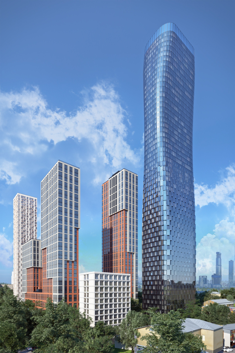
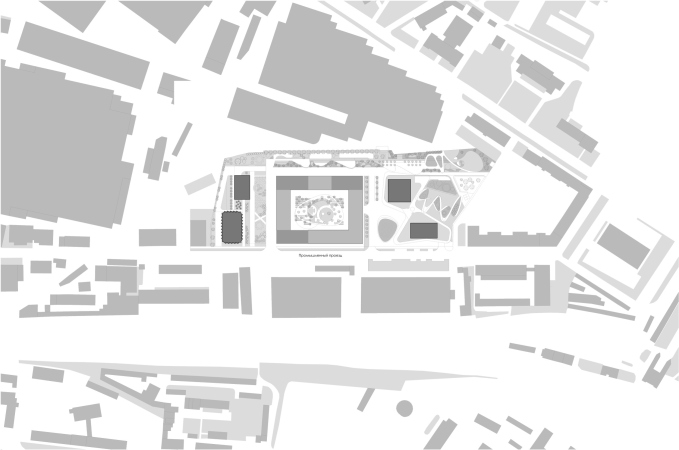
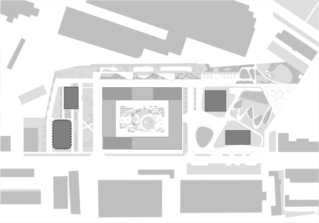
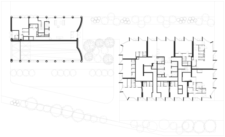
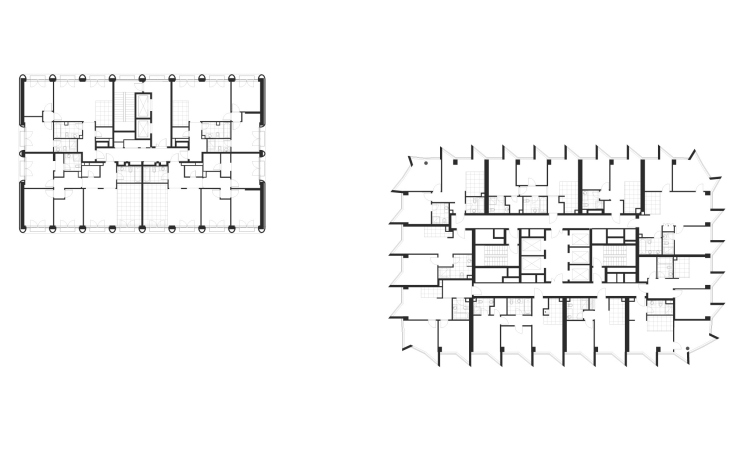
The first phase of the complex consists of a New-York-type city block of white and red-brick buildings of varying height – designed by SPEECH, two towers resting on a stylobate of a curvilinear bionic shape – designed by ADM Architects, and a boulevard running alongside the long side of the complex – designed by BuroMoscow. The towers, designed by ADM Architects as part of the first phase, are being built in the north part of the complex, while their new project, Filicity II, is being built in the southwest. This way, the two projects flank the SPEECH project from left and right, while the landscaping work applies to the complex in its entirety.
The residential complex Fili Tower
According to the leader of ADM Andrey Romanov, the architects were faced with a choice: either to design two approximately identical towers, or to create a contrastive composition – and they opted for the sharp contrast between a tall glass vertical and a compact white parallelepiped. The latter ended up being a clubhouse that looks like a low-rise construction against the background of the towers, yet interesting “from the marketing standpoint”. The architects proposed to position it as a building of a higher class, and the developer approved of the idea.
The residential complex Fili Tower
It must be said that both houses are positioned as more expensive housing than the first stage of Filicity. And this is only natural: the houses that are built last within a residential complex always have an advantage because after they are complete their residents, once they move in, will at once get full access to full-fledged urban structure.
The appearance of the 200-meter residential skyscraper is symptomatic. It looks like it marks a new vector of Moscow’s architectural policy.
In addition to the client’s wishes, our latest version of the project reflects the city’s attitude towards high-rise buildings. It consists in the fact that if we are to build skyscrapers visible from afar, they must become the face of a modern city. The city wants to see futuristic architecture, as in the leading capitals of the world: New York, Shanghai, and Tokyo. Our building is clearly visible from the Kutuzovsky Avenue, from the side of the Victory Park, and many other places, so we tried to create an image that’s moden and bright.
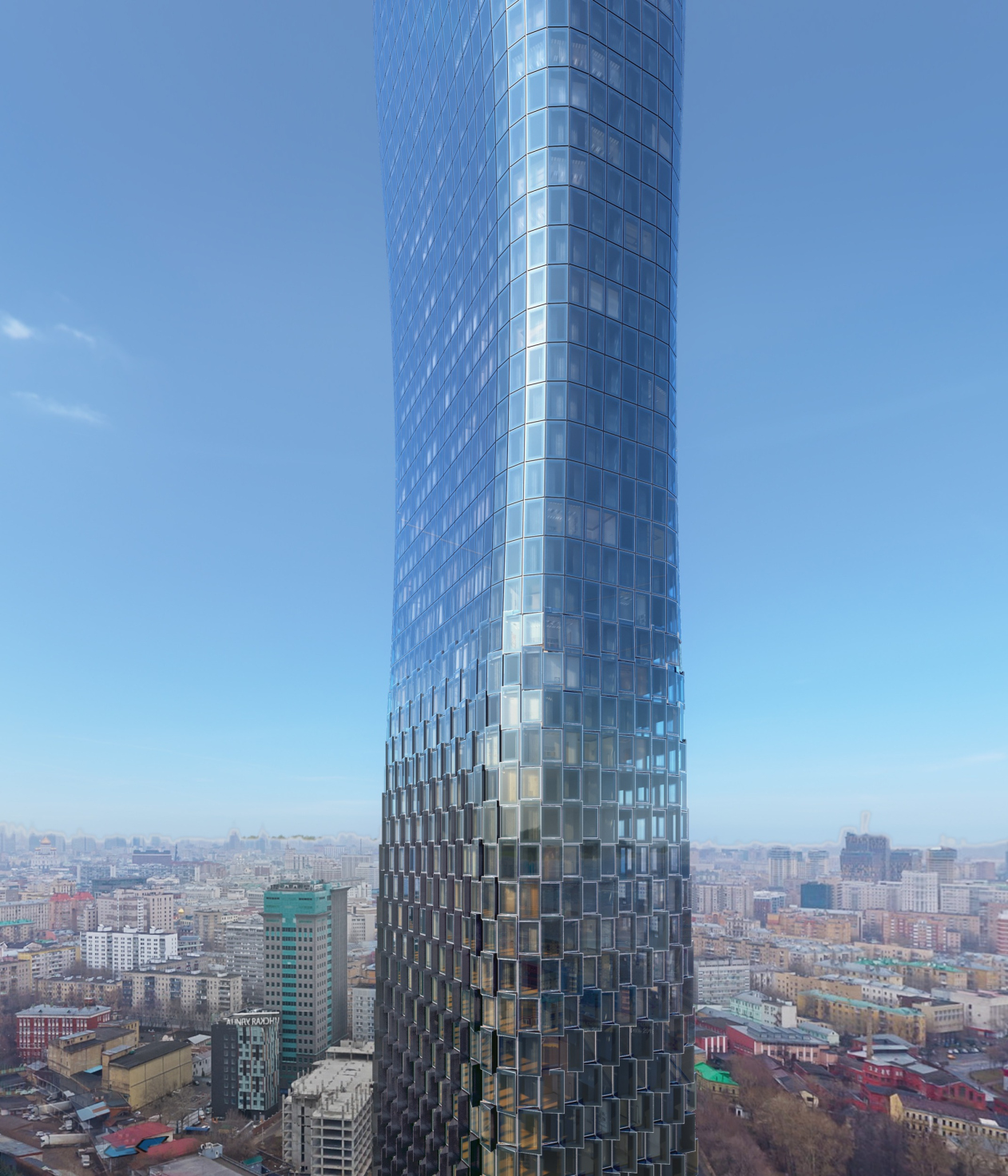
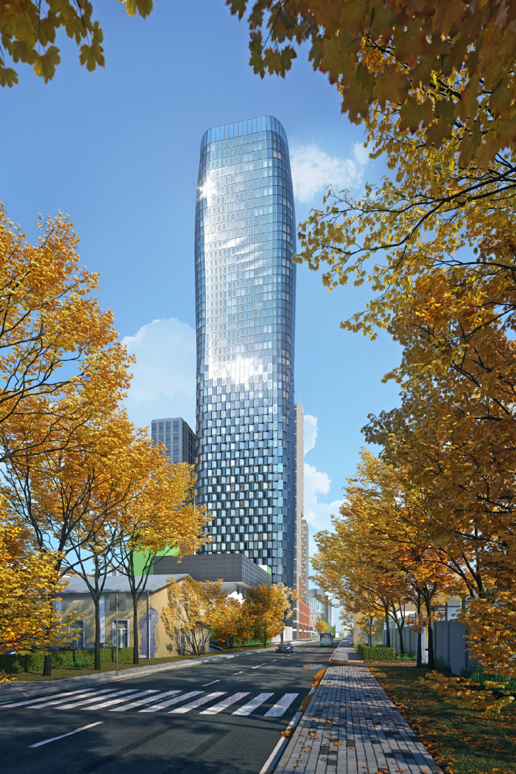
Indeed, the high-rise has a recognizable silhouette with a “waist”. On the plan, the skyscraper is a rectangle, but, as it gets higher, it gets thinner, flatter, and more rounded. However, towards the top it regains its volume to a certain degree – only to narrow in again in a curious attic. The building is crowned by five-meter glass screens that fence off the terrace on the roof with a sightseeing platform, which also masks the technical floor.
The image of the building is formed not only due to an unusual shape, but also thanks to a dramatic surface. The all-glass façade at the bottom is made up of silk-screened bay windows along the edges. The all-glass façade at the bottom is made up of silk-screened bay windows along the edges. The glass is tinted with a silver coating. The front glass of the bay window stands out further than the rest, covering the structure behind it. Both ceiling and floor of the bay window are covered with the same single-piece glass. For ventilation, special openings and a supply and exhaust ventilation system are provided. The windows have an energy-saving coating that reduces thermal conductivity and solar radiation.
The residential complex Fili Tower
The building’s surface is dynamic in its own way. Down below, where the façade can be viewed in detail, the plastique elements are active, and the bay windows are voluminous. As the building goes up, however, the surface becomes noticeably smoother – Andrey Romanov likens this effect to wind-hewn, smooth old mountains in American canyons. And it makes perfect sense, too: the winds, blowing up high, round off the surface and flatten the relief. Also, in addition to weathered mountains, a comparison comes to mind with silvery scales sparkling in the sun, or perhaps with some precious fabric, partially transparent, and in some places sparkling with crystals and tiny beads.
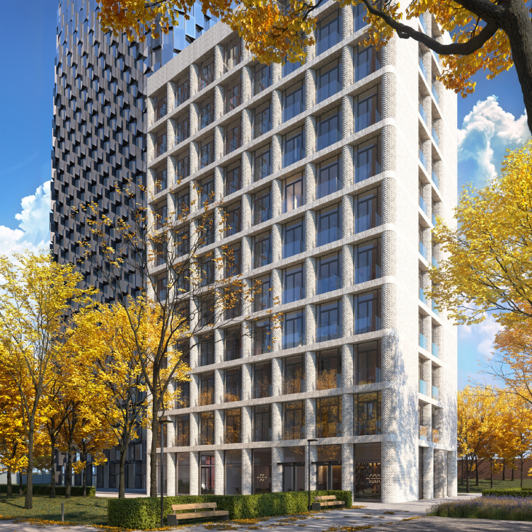
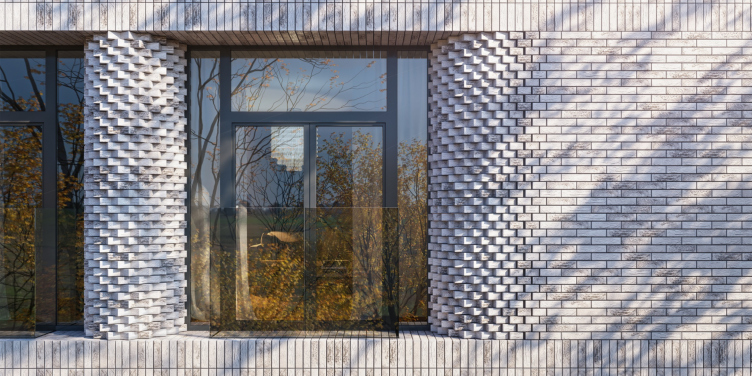
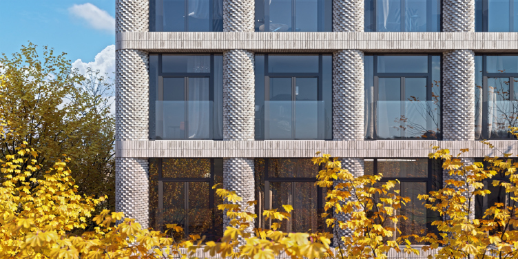
The (comparatively) small brick building, which, unlike the grandiose tower, will not be seen from anywhere, save for the nearest vantage points, is all about the expressiveness of the brickwork. The ADM Architects are well-known for their work with carefully designed brick facades of various textures – such as adorn the housing complexes “Ordynka 19” and “Vitality”. The façade of the second house of Filicity II is formed by rounded piers from light-beige solid-body hand-made brick. Interestingly, the fact that what we are seeing is solid-body bricks, and not some longitudinally cut “halves”, and certainly not tiles, is unambiguously accentuated by the shape: the massive semi-columns are made of bricks with their corners turned outwards, giving them an original “bristling” texture, which with some people may raise associations with the domes and the bell towers of the eternal city of Rome.
The residential complex Fili Tower
The “corrugated” semicircular verticals form a textured and slightly brutal stable tectonic base; they are like tree trunks in a forest. The verticals are crossed – as if bound by ribbons – by smooth stripes of the horizontals running between the floors, holding the “bristling” columns within the calm and regular grid. The windows are sunken in, in front of them, small balconies with glass barriers appear – in accordance with the same principle that the architects used in the “red” residential complex Vitality; the floor of these balconies rests on a slab protruding in front of the window. The façade turns out to be dramatic and volumetric.
The residential complex Fili Tower
In the whole residential complex Felicity, the 57-story tower is the only “glass” building. For this reason alone, it can already claim the “exceptional” status within the complex. In addition, the tower becomes a super-landmark due to its sheer height (200 meters is a lot bigger than the 150 meters, which is the height of the other centerpieces of the ensemble; it is much more imposing and more noticeable). And, finally, due to its glittering glass and silvery translucent sides, this high-rise is entering a dialogue with the skyscrapers of the Moscow City. Which brings us to the idea that in its western part Moscow is taking the development path of Manhattan. And Manhattan is characterized by contrast between the glass skyscrapers in the middle and respectable middle-height construction at the edges of the island, with an occasional direct opposition of giant buildings and respectable houses of a smaller scale. Thus, the transition from a high-rise vertical to a second, club house seems to make perfect sense, and the contrast appears to have been lived in, and tested for decades.
