По-русски

​Frontier Worlds

A search for unconventional approaches to urban housing densification, new ideas for background architecture and addressing the issues of a space with a negative aura – all of this is to be found in the new housing project designed by OSA for a land site that, among other things, contains an abandoned monument of architecture.

05 February 2019
Object
mainImg

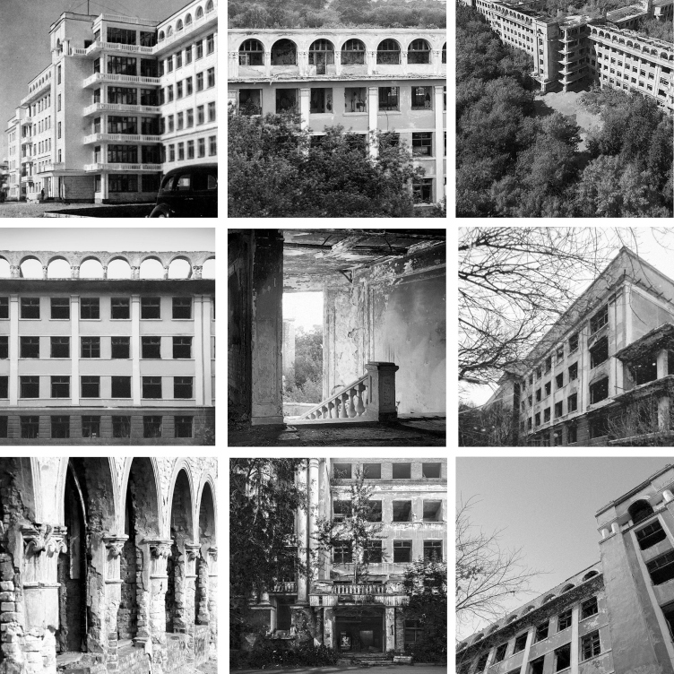
In the north suburb of the historical part of Ekaterinburg, next to the Bolshakov Park, on the 8 Marta Street, stands one of the city’s best-known derelict buildings – the emergency aid clinic that has the status of a monument of architecture of regional importance. The clinic was built in 1932; its architecture is interesting for the combination of avant-garde and neoclassical techniques. An arcade of thermal windows that crowns compound five-story buildings, columns, plasterwork, and the greenery of the nearby park make this building look more like a health resort rather than a hospital. In the 2000’s, the clinic was dispersed, and the building fell into decay. It stands open to this day, unguarded and unprotected in any other way. It has survived more than a hundred fires, and become the subject of numerous urban legends about there being a room where time stood still forever or a whole number of secret underground floors.

Green Coppice House © OSAArchitects
Green Coppice House. History © OSAArchitects


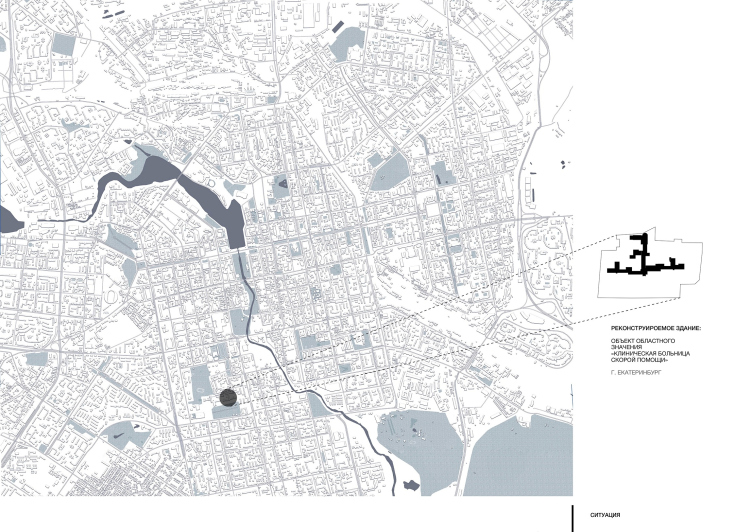
Green Coppice House. Location plan © OSAArchitects


In the nearest future, the building and the land site will be again put up for sale but this time around there are parties that are interested in buying it: developers are preparing pre-project proposals for the auction, one of them being the concept proposed by OSA.

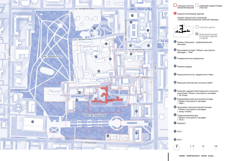
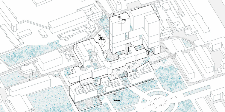
The architects were faced with a task of turning the land site with a derelict clinic into a residential complex, which was a task fraught with a number of difficulties. First, the client had a request for 75 000 square meters of housing floor space, and squeezing that amount into the confines of the land site was quite a tall order because the monument of architecture is situated in the middle of the site, sprouting numerous auxiliary buildings.

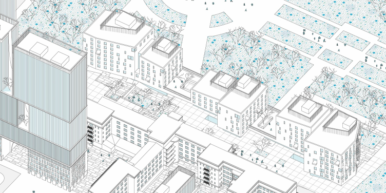
Green Coppice House. Master plan © OSAArchitects


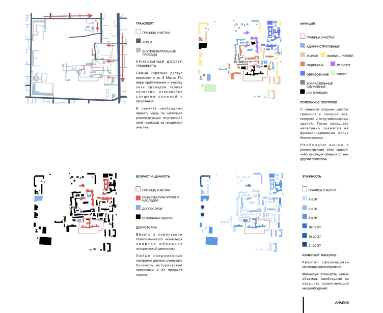
Second, the architects had a self-imposed condition of making sure that they kept the moderate scale of the architectural monument and did not obscure it with modern architecture. And, finally, this part of the city misses the infrastructure that is generally expected for a residential neighborhood – schools, kindergartens, adequate driveways, and so on. Instead, the future complex will neighbor on medical institutions, maintenance buildings, and a dull fence, which will be built by the Novotikhvinsky Monastery once it buys out a few buildings in the neighborhood. The architects confess that they are not 100% sure themselves if the city can handle such a “housing” injection in this area. However, they are still proposing an integrated and motivated solution for all of the problems outlined above.

The Monument

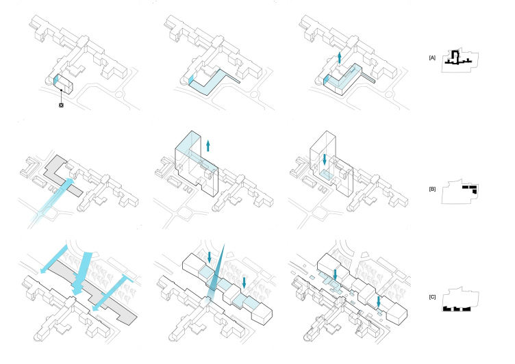
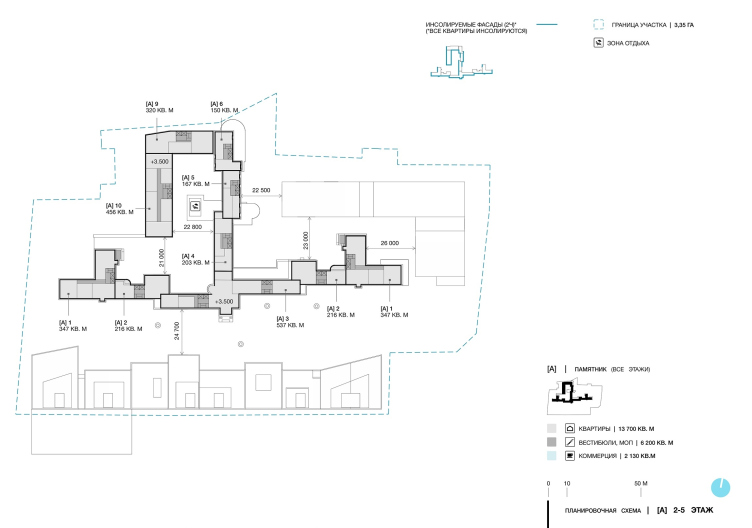
Essentially, what remained of the monument is only its façades, which are to be preserved – everything else on the inside has been destroyed. Therefore, the floor plans will be changed completely, and the architects will adapt the contours of the building for the housing function. OSA was searching for every opportunity for densification, and at some point they even planned to add a few annexes to the old building – of the same scale but with neutral “background” façades. However, because the façades were to remain intact, there was only one loophole left: in the northern part of the building, there is an annex that was built in the 1990’s, which has no architectural value, and which is clearly seen on the birds-eye view photograph. By getting rid of the annex, the architects could quite righteously “augment” the architectural monument with a new building. This would not only yield some extra floor space but will also make it possible to complete the composition of the building, giving the architects a system of cozy little yards.

Green Coppice House © OSAArchitects


Green Coppice House © OSAArchitects


The New Architecture

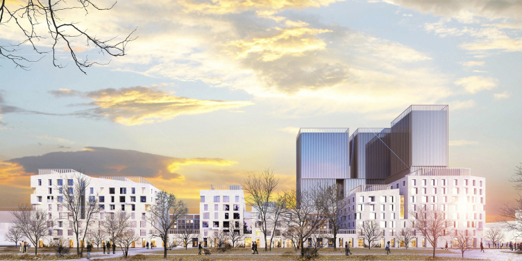
In addition to the historical building adjusted to perform a new function, the site will get two types of new residential buildings – high-rise towers and something that the architects call “urban villas”.

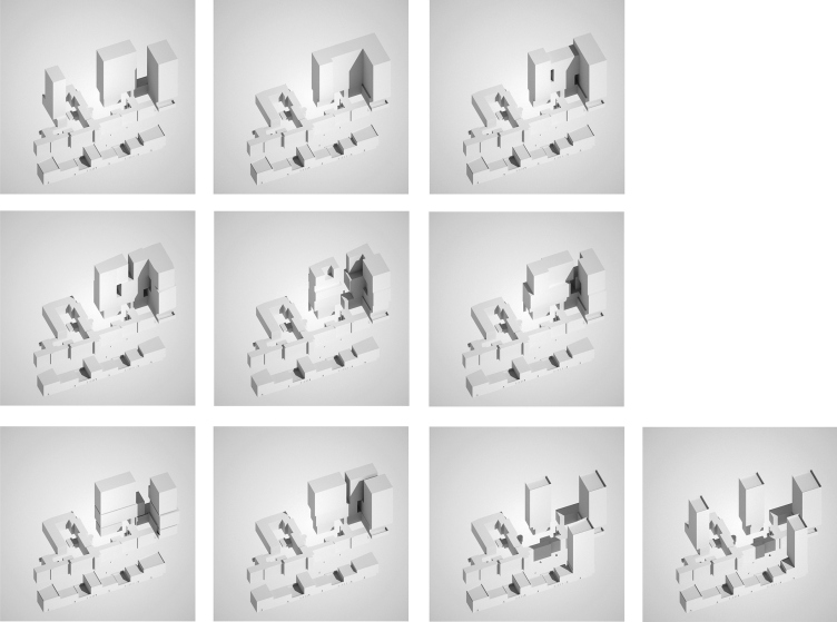
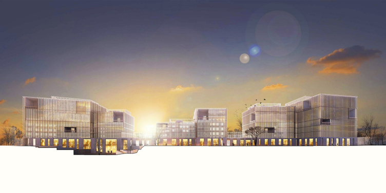
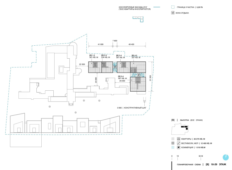
The towers take most of the load of the technical and economic performance, allowing the architects to keep the historically correct scale on the rest of the site. Because of that, the high-rises will be placed in the northwest corner, which is the furthest from the park and the closest to the roads and city’s other high-rises. Considering the volumetric and planning options, the architects came to a cluster of three adherent sections consisting of large “slab” blocks with rather large spaces preserved between them.

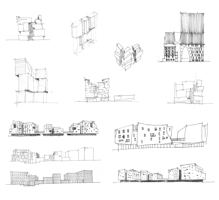
Green Coppice House. The form search © OSAArchitects


Green Coppice House © OSAArchitects


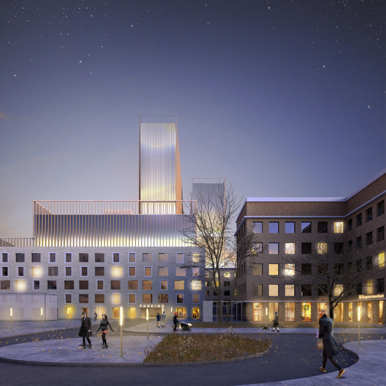
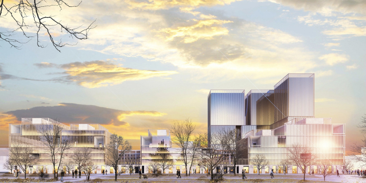
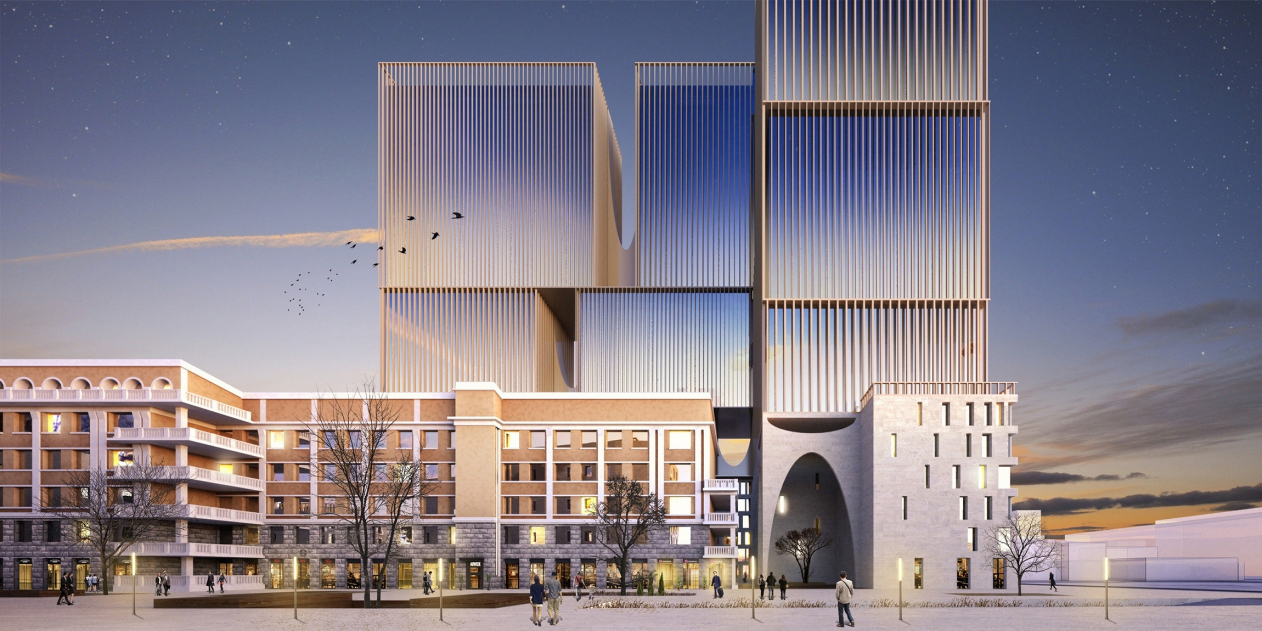
The five lower floors, whose height matches that of the buildings of the clinic, are decorated with light-colored stone. Everything above that mark strives be lightweight to the point of dissolving in the air. This effect is created by the “strings” of the lamellas that cover end-to-end glazing, as well as by slits with inverted arches that can host terraces or winter gardens. The same arches connect the new building with the historical one, echoing the dramatic rows of thermal windows, and, in addition, these arches endow the building with a fair bit of metaphorical meaning – what comes to mind is the Heaven’s Gate, portals of the gothic temples, arcs of the harp, and Giorgio de Chirico’s metaphysical insights. They keep up the aura of mystery, which is something that the clinic building definitely has, not only as a derelict place but also as a place where back in the day life would meet death. The most intriguing element of all is the arch of an impressive height that marks the point where new building joins the old one and where the entrance to the inner little yards is situated. 

Green Coppice House © OSAArchitects


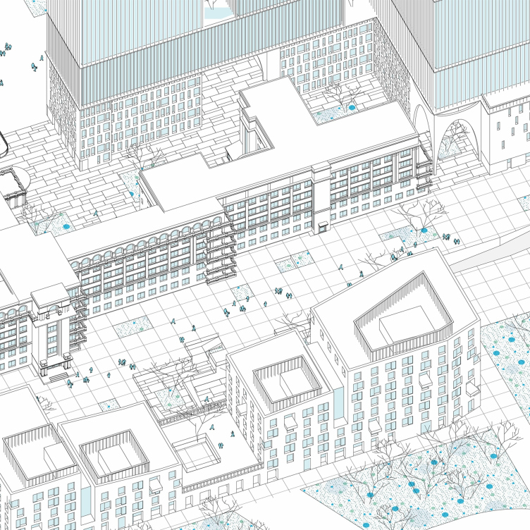
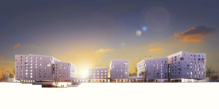
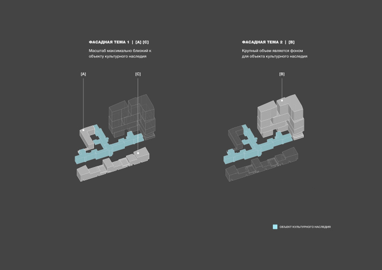
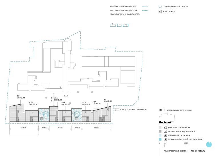
The third type of housing are the urban villas four to seven stories high, which on the one side overlook the Bolshakov Park, and on the other – the new pedestrian street and part of the historical building. For the urban villas, the architects came up with two façade design options: they can either be completely decorated with light-colored stone, which will enhance the high status of this housing segment, or they can be decorated with the same lamellas as used in the towers, which will give the buildings a likeness to the park pavilions. In both cases, the architects proceeded from the old building of the clinic as the topmost priority – the new architecture must not “steal the show”.

Green Coppice House © OSAArchitects


Green Coppice House © OSAArchitects


Green Coppice House © OSAArchitects


Green Coppice House © OSAArchitects


Green Coppice House © OSAArchitects


For the same purpose of showing the monument of architecture to the best advantage, the architects made spaces between the urban villas – the intermediate floors, which run on the level of the second floor and create yard spaces separated from the pedestrian street, are sometimes covered with a roof and sometimes aren’t, having additional entrances from the corridors on the second floors. The architects designed the “glades” with the circular square in mind – they used it as the main axis, from which the most picturesque views of the clinic building can be seen, and from which one can get to the pedestrian street.

he bottom floors of the buildings will host local businesses; one of the urban villas will host a kindergarten. 

In Between the Architecture

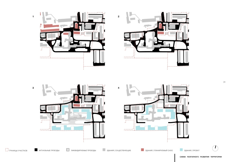
The architects are proposing a few solutions to gracefully introduce the new complex into the city life. From the north side, it will be possible to buy out the neighboring land sites, which are currently occupied by auxiliary buildings. If these buildings are to be demolished, it will be possible to make a square in front of the high-rise cluster and add a roundabout, at the same time improving the driveways because this place is the only link between the complex and the city. Also, in the north the complex borders on the Novotikhvinsky Monastery. It may be possible to make another pedestrian street there commanding a view of the temple architecture, the prospect of which was in fact discussed between OSA and the monastery, the latter still insisting on building a tall fence in order to protect itself from the bustle of the large housing complex.

Green Coppice House. The layout of developin the territory in stages © OSAArchitects


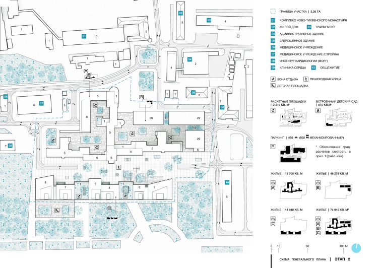
Green Coppice House. Master plan, Stage 2 © OSAArchitects


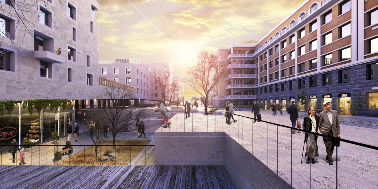
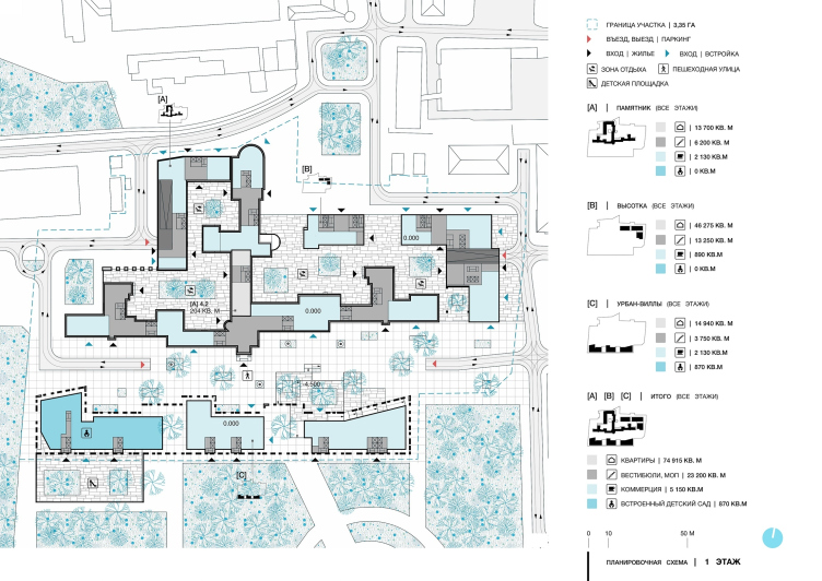
An important part of the concept is the pedestrian street that will stretch between the urban villas and the former clinic. The architects note that “the facade of the historical building was designed not for the frontal perception but for the glancing gaze of the pedestrian. The street will make it possible to better appreciate the beauty of the building from the best possible angles”.

Green Coppice House © OSAArchitects


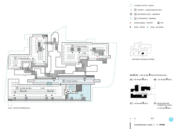
The street space is rather sophisticated, with a few levels in it: a raised promenade and a few little yards that cascade down to the underground parking garage. The street, just like the parking garage, are accessible to general public, not just to the residents of the complex.

The design of this new fragment of the city space proposed by OSA to Ekaterinburg turned out to be very dense and filled with functions, viewing angles, and meanings. This is a place of the peaceful coexistence of new and old, public and private, elite and democratic, and even underground and overland. A place that – provided the project is implemented, of course – will probably attract people with its interesting polyrhythmic structure that will become part of the new urban space, which will be a case that is rare not only for Ekaterinburg but for this whole country as well.
Green Coppice House. The floor plans. The 1st floor © OSAArchitects
Green Coppice House. Analysis © OSAArchitects
Green Coppice House © OSAArchitects
Green Coppice House. The floor plans. The -1st floor © OSAArchitects
Green Coppice House. The floor plans. Floors 2-5 © OSAArchitects
Green Coppice House. The floor plans. Floors 18-29 © OSAArchitects
Green Coppice House. The floor plans. The 2nd floor © OSAArchitects
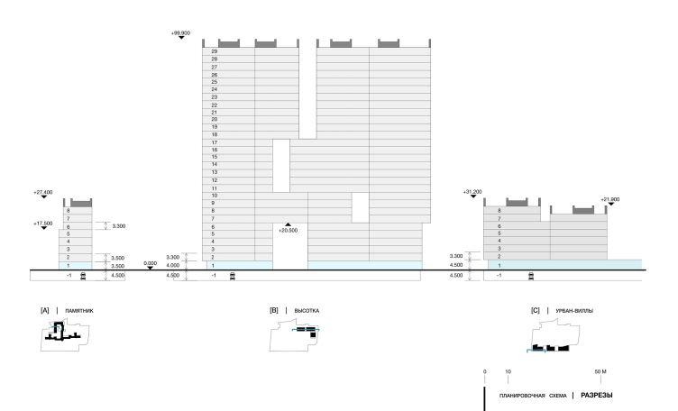
Green Coppice House. The floor plans. The section views © OSAArchitects

05 February 2019

Headlines now
The Golden Crown
The concept for a dental clinic in Yekaterinburg, developed by CNTR Studio, revolves around the idea of a “mouth full of gold”: pristine white porcelain stoneware walls are complemented by matte brass details. To avoid an overly literal interpretation, the architects focused on the building’s proportions, skillfully navigating between sunlight requirements and fire safety regulations.
Flexibility and Integration
Not long ago, we covered the project for the fourth phase of the ÁLIA residential complex, designed by APEX. Now, we’ve been shown different fence concepts they developed to enclose the complex’s private courtyards, incorporating a variety of public functions. We believe that the sheer fact that the complex’s architects were involved in such a detail as fencing speaks volumes.
A Step Forward
The HIDE residential complex represents a major milestone for ADM architects and their leaders Andrey Romanov and Ekaterina Kuznetsova in their quest for a fresh high-rise aesthetic – one that is flexible and layered, capable of bringing vibrancy to mass and silhouette while shaping form. Over recent years, this approach has become ADM’s “signature style”, with the golden HIDE tower playing a pivotal role in its evolution. Here, we delve into the project’s story, explore the details of the complex’s design, and uncover its core essence.
Gold in the Sands
A new office for a transcontinental company specializing in resource extraction and processing has opened in Dubai. Designed by T+T Architects, masters of creating spaces that are contemporary, diverse, flexible, and original, this project exemplifies their expertise. On the executive floor, a massive brass-clad partition dominates, while layered textures of compressed earth create a contextually resonant backdrop.
Layers and Levels of Flight
This project goes way back – Reserve Union won this architectural competition at the end of 2011, and the building was completed in 2018, so it’s practically “archival”. However, despite being relatively unknown, the building can hardly be considered “dated” and remains a prime example of architectural expression, particularly in the headquarters genre. And it’s especially fitting for an aviation company office. In some ways, it resembles the Aeroflot headquarters at Sheremetyevo but with its own unique identity, following the signature style of Vladimir Plotkin. In this article, we take an in-depth look at the United Aircraft Corporation (UAC) headquarters in the Moscow agglomeration town of Zhukovsky, supplemented by recent photographs from Alexey Naroditsky – a shoot that became only recently possible due to the fact that improvements were finally made in the surrounding area.
Light and Shadow
In this article, we delve into the architectural design of the “Chaika” house by DNK ag architects, which was recently completed in 2023 as part of the collection of signature designs at ZILArt. As is well-known, all the buildings in this complex follow a design code, yet each one is distinct. This particular building stands out not only for its whiteness and minimalism but also for the refined use of a limited number of techniques that, together, create what can confidently be called synergy.
Casus Novae
A master plan was developed for a large residential area with a name of “DNS City”, but now that its implementation began, the plan has been arbitrarily reformatted and replaced with something that, while similar on the surface, is actually quite different. This is not the first time such a thing happens, but it’s always frustrating. With permission from the author, we are sharing Maria Elkina’s post.
Treasure Hunting
The GAFA bureau, in collaboration with Tegola and Arkhitail, organized an expedition to the island of Kilpola in Karelia as part of Moskomarkhitektura’s “Open City” festival. There, amidst moss and rocks, the students sought answers to questions like: what is the sacred, where does it dwell, and what sustains it? Assisting the participants in this quest were landscape engineer Evgeny Levin, artist Nicholas Roerich, a moose, and the lack of cellular connection. Here’s how the story unfolded.
Depths of the Earth, Streams of Water
In the Malaya Okhta district, the Akzent building, designed by Stepan Liphart, was constructed. It follows a classic tripartite structure, yet it’s what you might call “hand-drawn”: each façade is unique in its form and details, some of which aren’t immediately noticeable. In this article, we explore the context and, together with the architect, delve into how the form was developed.
Fir Tree Dynamics
The “Airports of Region” holding is planning to build an airport in Karachay-Cherkessia, aiming to make the Arkhyz and Dombay resorts more accessible to travelers. The project that won in an invitation-only competition, submitted by Sergey Nikeshkin’s KPLN, blends natural imagery inspired by the shape of a conifer seed, open-air waiting spaces, majestic large trees, and a green roof elevated on needle-like columns. The result is both nature-inspired and WOW.
​A Brick Shell
In the process of designing a clubhouse situated among pine trees in a prestigious suburban area near Moscow, the architectural firm “A.Len” did the façade design part. The combination of different types of brick and masonry correlates with the volumetric and plastique solutions, further enhanced by the inclusion of wood-painted fragments and metal “glazing”.
Word Forms
ATRIUM architects love ambitious challenges, and for the firm’s thirtieth anniversary, they boldly play a game of words with an exhibition that dives deep into a self-created vocabulary. They immerse their projects – especially art installations – into this glossary, as if plunging into a current of their own. You feel as if you’re flowing through the veins of pure art, immersed in a universe of vertical cities, educational spaces – of which the architects are true masters – and the cultural codes of various locations. But what truly captivates is the bold statement that Vera Butko and Anton Nadtochy make, both through their work and this exhibition: architecture, above all, is art – the art of working with form and space.
Flexibility and Acuteness of Modernity
Luxurious, fluid, large “kokoshniks” and spiral barrel columns, as if made from colorful chewing gum: there seem to be no other mansion like this in Moscow, designed in the “Neo-Russian-Modern” style. And the “Teremok” on Malaya Kaluzhskaya, previously somewhat obscure, has “come alive with new colors” and gained visibility after its restoration for the office of the “architectural ecosystem” as the architects love to call themselves. It’s evident that Julius Borisov and the architects at UNK put their hearts into finding this new office and bringing it up to date. Let’s delve into the paradoxes of this mansion’s history and its plasticity. Spoiler: two versions of modernity meet here, both balancing on the razor’s edge of “what’s current”.
Yuri Vissarionov: “A modular house does not belong to the land”
It belongs to space, or to the air... It turns out that 3D printing is more effective when combined with a modular approach: the house is built in a workshop and then adapted to the site, including on uneven terrain. Yuri Vissarionov shares his latest experience in designing tourist complexes, both in central Russia and in the south. These include houseboats, homes printed from lightweight concrete using a 3D printer, and, of course, frame houses.
​Moscow’s First
“The quality of education largely depends on the quality of the educational environment”. This principle of the last decade has been realized by Sergey Skuratov in the project for the First Moscow Gymnasium on Rostovskaya Embankment in the Khamovniki district. The building seamlessly integrates into the complex urban landscape, responding both to the pedestrian flow of the city and the quiet alleyways. It skillfully takes advantage of the height differences and aligns with modern trends in educational space design. Let’s take a closer look.
Looking at the Water
The site of Villa Sonata stretches from the road to the water’s edge, offering its own shoreline, pier, and a picturesque river panorama. To reveal these sweeping views, Roman Leonidov “cut” the façade diagonally parallel to the river, thus getting two main axes for the house and, consequently, “two heads”. The internal core – two double-height spaces, a living room and a conservatory, with a “bridge” above them – makes the house both “transparent” and filled with light.
The White Wing
Well, it’s not exactly white. It’s more of a beige, white-stone structure that plays with the color of limestone – smoother surfaces are lighter, while rougher ones are darker. This wing unites various elements: it absorbs and interprets the surrounding themes. It responds to everything, yet maintains a cohesive expression – a challenging task! – while also incorporating recognizable features of its own, such as the dynamic cuts at the bottom, top, and middle.
Urban Dunes
The XSA Ramps team designed and built a three-part sports hub for a park in Rostov-on-Don, welcoming people of all ages and fitness levels. The skate plaza, pump track, and playground are all meticulously crafted with details that attract a diverse range of visitors. The technical execution of the shapes and slopes transforms this space into a kind of sculptural composition.
Proportional Growth
The project for the fourth phase of the ÁLIA residential area has been announced. The buildings are situated on an elongated plot – almost a “ray” that shoots out from the center of the area towards the river. Their layout reflects both a response to Moscow’s architectural preferences over the past 15 years, shifting “from blocks to towers”, and an interpretation of the neighboring business park designed by SOM. Additionally, the best apartments here are not located at the very top but closer to the middle, forming a glowing “waistline”.
The “Staircase” Building
In designing the “Details” residential complex in New Moscow, Rais Baishev spiced up the now-popular Moscow theme of a “courtyard” building with an idea drawn from the surrealist drawings by Maurits Escher. He envisioned the stepped silhouettes and descending slopes as a metaphysical mega-staircase, creating a key void within the courtyard that gave the project an internal “spine”. This concept is felt both in the building’s silhouette and on its façades.
Projection of the Quarter
No one doubted that the building that Vladimir Plotkin designed as part of the “Garden Quarters” would be the most modernist of all. And it turned out just that way: while adhering to the common design code, the building successfully combines brick and white stone, rhythmically responding to the neighboring building designed by Ostozhenka, yet tactfully and persistently making a few statements of its own. This includes the projection of the ideal urban development composition “14–9–6”, which can be found right next door, mathematical calculations, including those for various types of terraces (and perhaps the only reminder of the Soviet past of the Kauchuk rubber factory!), and the white “cross-stitch” pattern of the façade grid.
Domus Aurea
In this issue, we examine the “Tessinsky-1” house, designed by Sergey Skuratov and completed in 2023. Located in the middle of the Serebryanicheskaya Embankment district, at the intersection of its main streets, this house assumes a sort of “nodal” role: it not only responds to everything around it and preserves many memories of the former EMA factory within itself, but it weaves all this into a newly directed pattern, reconciling bright “gold” and dark-colored brick, largely with the help of the new, modern-yet-archaic Columba brick, which, come to think about it, is the most precious element here.
The Chimney of Nikola-Lenivets
In this issue, we are examining the “Obelisk House” designed by KATARSIS and built for the Arkhstoyanie 2023 festival. However, it was only finished later on, and this is why we are examining it now. It seems to us that after the “Obelisk House” appeared in Nikola-Lenivets, a dialogue and a few inner connections appeared between the temporary structures built here. These houses no longer look like “accidental neighbors”, more of which below.
​Periscope by the Bay
The jury awarded the second place in the competition for a public and cultural center in Petropavlovsk-Kamchatsky to the companies GORA (“Mountain”) and M4. In the consortium’s proposal, the building resembles a sperm whale with a calf swimming next to it or a periscope, whose lenses capture the most spectacular views from the surrounding landscape.
From Arcs to Dolmens
While working on the competition project for Petropavlovsk-Kamchatsky, ASADOV Architects prioritized the value of the natural and urban environment, aiming to preserve the balance of the location while minimizing the resemblance of the volume that they designed to a “traditional building”. The task was challenging, and the architects created three versions, one of which having been developed after the competition, where their main proposal took third place. However, the point of interest here is not the competition result but the continuity of creative thinking.
Hide and Seek
The ID Moskovskiy house, designed by Stepan Liphart in St. Petersburg, in the courtyards near Moskovskiy Avenue beyond the Obvodny Canal and recently completed, is notable for several reasons. Firstly, it has been realized with considerable accuracy, which is particularly significant as this is the first building where the architect was responsible not only for the facades but also for the layouts, allowing for better integration between the two. On the other hand, this building is interesting as an example of the “germination” of new architecture in the city: it draws on the best examples from the neighborhood and becomes an improved and developed sum of ideas found by the architect in the surrounding context.
The Big Twelve
Yesterday, the winners of the Moscow Mayor’s Architecture Award were announced and honored. Let’s take a look at what was awarded and, in some cases, even critique this esteemed award. After all, there is always room for improvement, right?
Above the Golden Horn
The residential complex “Philosophy” designed by T+T architects in Vladivostok, is one of the new projects in the “Golubinaya Pad” area, changing its development philosophy (pun intended) from single houses to a comprehensive approach. The buildings are organized along public streets, varying in height and format, with one house even executed in gallery typology, featuring a cantilever leaning on an art object.
Nuanced Alternative
How can you rhyme a square and space? Easily! But to do so, you need to rhyme everything you can possibly think of: weave everything together, like in a tensegrity structure, and find your own optics too. The new exhibition at GES-2 does just that, offering its visitor a new perspective on the history of art spanning 150 years, infused with the hope for endless multiplicity of worlds and art histories. Read on to see how this is achieved and how the exhibition design by Evgeny Ace contributes to it.
Blinds for Ice
An ice arena has been constructed in Domodedovo based on a project by Yuri Vissarionov Architects. To prevent the long façade, a technical requirement for winter sports facilities, from appearing monotonous, the architects proposed the use of suspended structures with multidirectional slats. This design protects the ice from direct sunlight while giving the wall texture and detail.