Archi.ru:
Last fall, your company took part in the “Eco-Shore” international architecture festival in Kazan. What made you prepare an urban landscaping project when your specialty is actually custom-designed suburban homes?
Roman Leonidov:
Participating in festivals and competitions means for us an opportunity to keep our employees’ minds busy when we have gaps in our schedule. To make sure they don’t sleep at their desks, you know. Our working schedule has changed since 2010’s. While before 2014 we had a rush of new clients from October to February, now this period has shifted to January-April, which is actually rather late. And in the late summer and early fall things are pretty slow, and we have an opportunity to do a competition project. In Kazan, we took the third place. We already did a large-scale project in that city, and we have a good knowledge of the terrain at the confluence of the Volga and Kazanka rivers. The competition brief required that we come up with an architectural solution for a problem waterfront that is cut off from the Kremlin by a railroad station. And a railroad station always means a lot of noise, poor landscaping, and so on. They are building a new highway running alongside that railway line but the waterfront still needs to be organized, and recreational areas need to be built.
What was the basic idea of the project that you submitted for “Eco-Shore”?
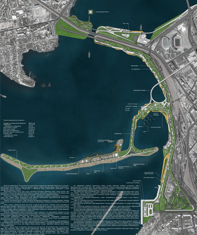
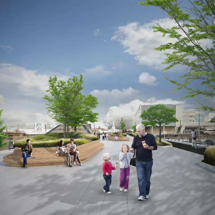
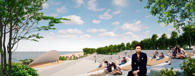
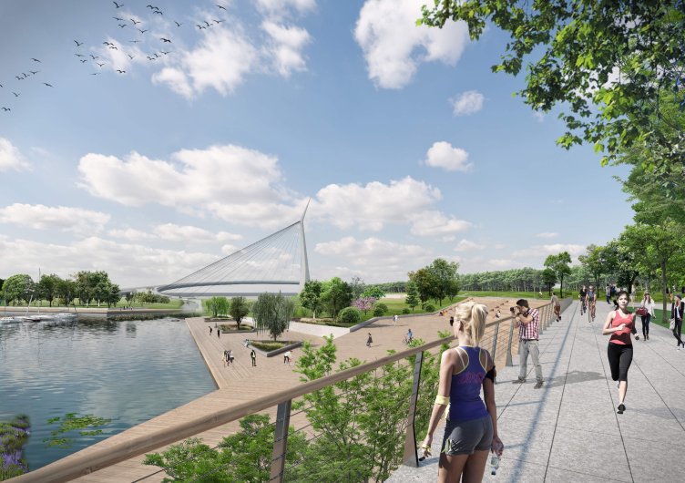
It was all about providing the access to the waterfront from the Kremlin. What we wanted to do was make a passage to it running from the Kremlin’s sightseeing platform. What we do is we make a pedestrian road, while the highway gets masked by a mound, the way it is done in Barcelona. You cannot see the highway because it runs way down below. Meaning – it is there but it doesn’t stress you out. This solution occurred to us a few hours before the submission deadline.
Waterfront project in Kazan. “Eco-Shore” festival, 3rd prize. Architects: Roman Leonidov, A.Shutegov, P.Sorokov, S.Fiantseva, Y.Galkina, A.Shpilko, S.Tsarkov, E.Kurmalieva, N.Kharlamova
Waterfront project in Kazan. “Eco-Shore” festival, 3rd prize. Architects: Roman Leonidov, A.Shutegov, P.Sorokov, S.Fiantseva, Y.Galkina, A.Shpilko, S.Tsarkov, E.Kurmalieva, N.Kharlamova
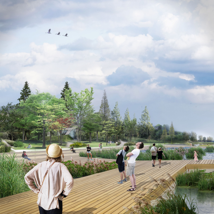
Waterfront project in Kazan. “Eco-Shore” festival, 3rd prize. Architects: Roman Leonidov, A.Shutegov, P.Sorokov, S.Fiantseva, Y.Galkina, A.Shpilko, S.Tsarkov, E.Kurmalieva, N.Kharlamova
Waterfront project in Kazan. “Eco-Shore” festival, 3rd prize. Architects: Roman Leonidov, A.Shutegov, P.Sorokov, S.Fiantseva, Y.Galkina, A.Shpilko, S.Tsarkov, E.Kurmalieva, N.Kharlamova
The current state of affairs in Kazan is as follows: the peninsula has an outlaw marina on it, which looks a mess. There is also a spontaneous bathing beach there. There was a task of breaking it into clusters, thus ensuring the de-confliction of streams of children, cyclists, people of limited mobility, yachtsmen, and others. We had little time and we could not really delve deeper into the matter. Then there is the Kremlin, which is a heritage site. To turn the waterfront into a tourist attraction, you simply need to connect it with the Kremlin by a convenient pedestrian road. And then you also need to place yet another landmark at the end of it. In our case, it is a hanging bridge that draws people’s attention. Currently, such a road already exists but it is very noisy and inconvenient. What we propose, however, is routing this pedestrian road underground. You will go down this road in any case after you see the Kremlin, unless you plan to go shopping in the city center. You only have to add a couple of bicycle and scooter rental shops – and you’ll have a good thing going.
What about the hanging bridge – is this some kind of reference to the hanging bridge in Zaryadye Park?
In a sense, yes, it is, but it is also our way of addressing the architectural context. A semicircle is something that appears here naturally – we continue the line and then take it wherever we want to take it. The bridge will command a view of the Kremlin. Since the bridge is going to be a long one, one will be able to see the Kremlin from different vantage points.
Waterfront project in Kazan. “Eco-Shore” festival, 3rd prize. Architects: Roman Leonidov, A.Shutegov, P.Sorokov, S.Fiantseva, Y.Galkina, A.Shpilko, S.Tsarkov, E.Kurmalieva, N.Kharlamova
What do you think is the reason for this landscaping boom that we’ve been recently seeing in Russian cities?
Well, it’s important for the local authorities to attract the voters. This is something that you can do quickly and this is an achievement for everyone to see: within half a year you are getting a playground, a bicycle track, and so on. Everybody wants change. What we obviously tend to overlook, however, is the fact that over the last 25 years all we’ve been doing is changing things. Take the quality of our roads, for example: there’s been a huge leap in quality as compared to what we had 25 years ago. Back then, if you drove on secondary roads, you always ran a serious risk of losing a wheel or two. Now many of our secondary roads are of almost European quality. For the authorities, this is the most effective way to show the quick change for the better.
Do you think that authorities are trying to lure people into cities because 25% of the city budget comes from the personal income tax?
No, I don’t think so. Our cities are overpopulated as it is. I think that we are in for some version of the American suburbia. Already today, I spend four days out of seven outside the city. I think that it will soon be here like in American cities: they have park and ride facilities, where a person can leave his or her car and then change to a car in which four people are riding, and only such car has the right do drive on the fast lane. And if you don’t want to leave your car – OK, fine, you can drag at five miles per hour in the right-side lane.
And how do these four people find one another? Through some sharing app like bla-bla-car? Or how?
No, not necessarily. For example, these can be four employees of one and the same company who work at the same office. Plus, you need to pay the toll charge, and if you drive from some suburb of New York to Manhattan, that will cost you around 30 dollars a day. Yes, it does sound like a lot for one person but if there are 5-6 people in the car, it’s not really expensive.
Landscaping projects oftentimes consist of small forms and wooden pavilions with a limited lifespan. What does an architect think of such “temporary” architecture? Is it OK with him that his work will be dismantled in 20 years’ time?
Any architecture is temporary, especially if we are talking about housing projects, and not about some sacral architecture (in the broad sense of the word), like a temple or a museum, that stands a chance of living a relatively long life. A lot of buildings that I designed were resold. Some of them were reconstructed, and for some, they forwarded the reconstruction commissions back to me – I expand these buildings and adjust them to serve new functions. And, no, it won’t be a problem with me if they tear them down. It’s one of my secret dreams to watch one of my buildings being destroyed.
Isn’t a house like a “baby” for an architect?
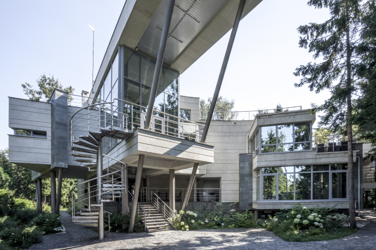
At first, yes, and then no. The house is built for 7 years, and you don’t really see the process, but they tear it down really quick, and you can see how everything is wired. A painter sees the result of his creative process at once, while for us as architects, this process stretches for years, and you can only see the structure of the house when it is broken. I would even take part in the demolition process. This is the only time when you can actually piece it together in a dynamic single picture. The longevity of the building doesn’t mean that much to me. To me, my soul work on the house stops the second I’ve done its pencil sketch. This is the moment when creativity gives way to painstaking work. Keeping the feel of the first sketch and take it through the project is a difficult thing to do. Each house has a fate of its own. Some are born within two years, and some spend a lot of time in the making, trying to break the egg shell. For example, the ZEPPELIN house was built for ten years, and now the customer is going to build a few additions to it because their family has grown.
The ZEPPELIN House. Studio of Roman Leonidov © Photo courtesy by the architect
Don’t you want your house to stand for 500 years, like the Palladio villas?
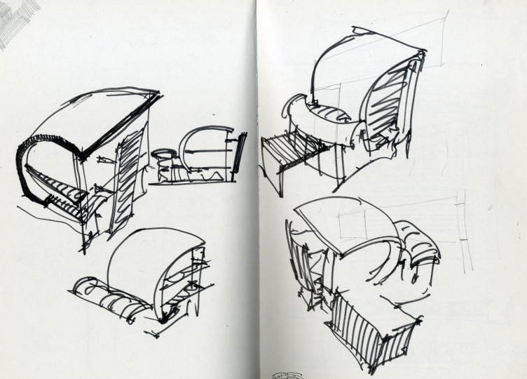
What difference will it make in comparison to the architecture that is 5000 years old? I am really impartial to this subject. I think that some of my pencil sketches will outlive some of my houses.
Sketch of a house. Roman Leonidov
In the 2000’s, there was this concept of attraction nonlinear architecture; then the environmental orientation replaced it with a more modest type. Could you please comment on this trend?
This trend is dictated by the challenging economic conditions. Today, buying a ready-made house on a land plot is less expensive than buying an empty plot. The main task of today is to convince the client to tear down what’s already in it because any reconstruction of such houses is plain hell for everyone: architect, builder, and developer. This is a path of compromise that ultimately leads you nowhere. Besides, it’s inefficient from the economic standpoint. If you tear down an old house and build a new one instead, the client saves at least two years of construction and from 15 to 20 million rubles. There is such a thing as “reconstruction coefficient”. Reconstruction is always more expensive, half again as expensive on average. On the other hand, tearing down your old house may cost from zero budget to 1.5 million rubles. If you reconstruct a house, you need to take measurements, then you need to do a fair bit of research because we always change something inside, and you don’t always know who this house was built for, from what specific materials, or maybe your measurements will show that it’s all skewed now. Then you discover that ventilation was not originally designed at all, and now you sort of want it – but the height of the intermediate floors in insufficient for that. Then you run into difficulties with the utility lines. If you expand the house, joining the foundations together is always a difficult thing to do, and sometimes even dangerous.
Consequently, this increases the period of preparing the project documents. And the costs increase not by half, but by two or three times. But the most interesting things begin when we finally hit the construction site, chip off some of the stucco from the façades and virtually any unexpected difficulty may come up you can possibly think of. And then we are in for on-the-fly corrections of the project and extra belated research. While I can build a new house within a season, and do all the decoration work within the following season, in the case of reconstruction, it will take forever. It will take three to four years at least. And over that time the children, for whom we designed the children’s rooms, will have grown up.
Still, can we say that, due to the economic situation, the overall style has shifted from an individual author’s gesture towards reserved wooden architecture?
No, this is a parallel narrative. Today, we have both. Wooden houses is some average idea, an attempt to satisfy some average requirements, addressing them in the correct and professional manner, at the same time making sure that the image of the house is clearly readable.
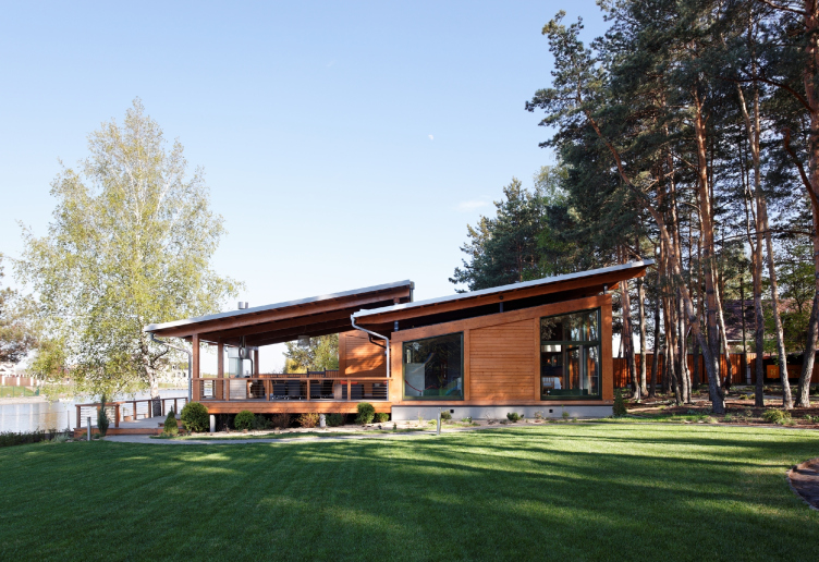
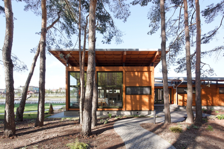
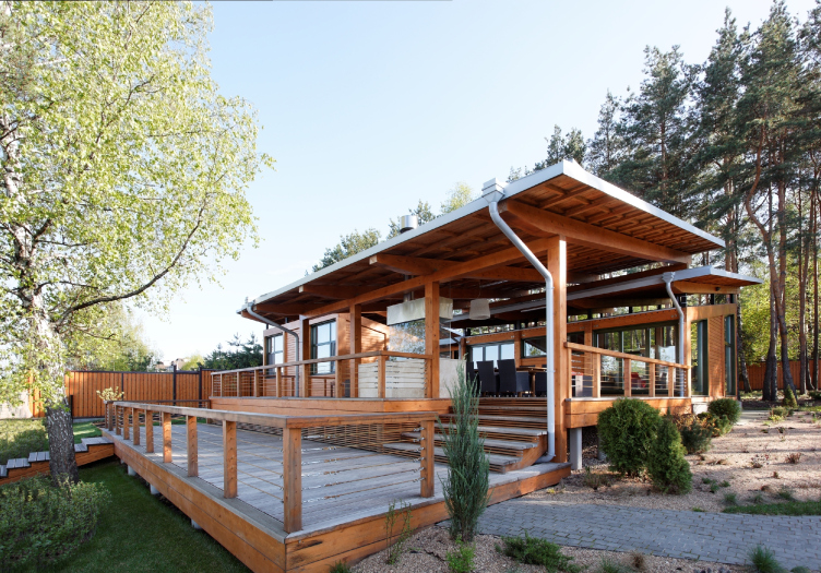
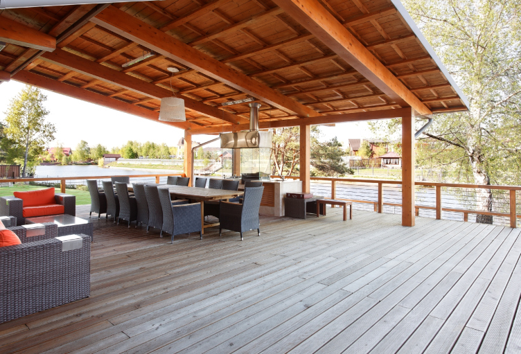
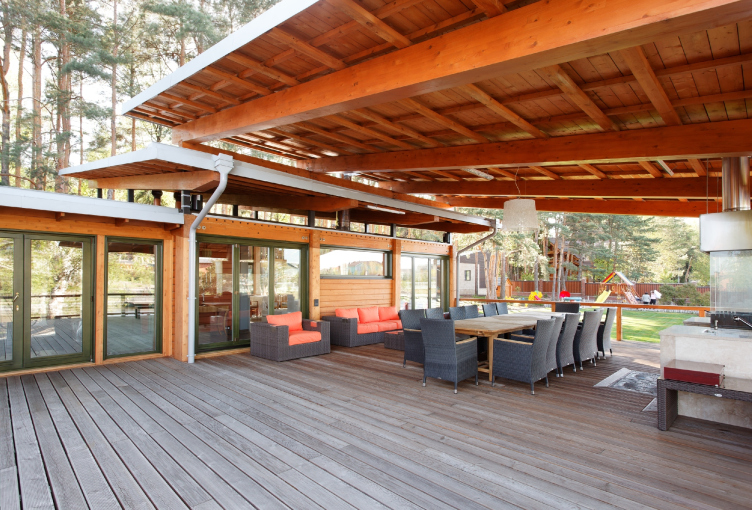
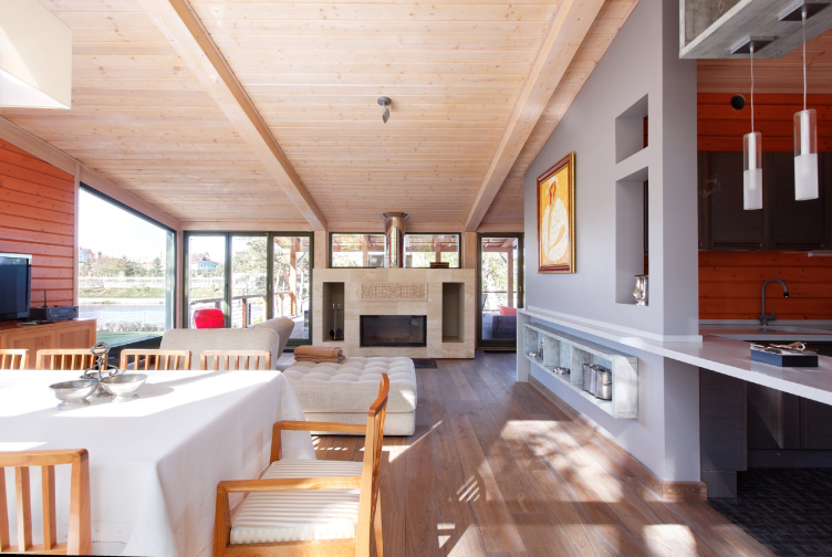
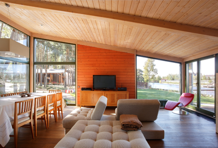
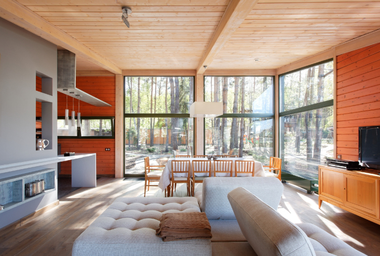
Guest house. Roman Leonidov
Guest house. Roman Leonidov
Does the image of a standard wooden house have any connection to the archetype that’s characteristic for this or that specific area? What should the architect pay most of his attention to when designing such a house?
There are two archetypes out there, actually – a birdhouse and a little house with a chimney drawn by a child. Based on this, we manipulate the details. There is an inevitable terrace with an awning but the balcony is not obligatory. Judging from the practice of living in a country house, the balcony on the second floor is hardly ever used – if only to go for a quick smoke at night. You just don’t need a balcony, even though it comes in really handy when it comes to selling houses.
Guest house. Roman Leonidov
Guest house. Roman Leonidov
Guest house. Roman Leonidov
The main factor in designing homes is the horizontal – so that you might at once get the idea of the human-proportionate scale. You also need to articulate your floors and keep in mind the tripartite composition. What makes good architecture different is the fact that it adheres to all the compositional laws that were discovered a thousand years ago. And your style has nothing to do with it. In whatever age you live, you as a human being have a body, hands and legs. It’s the same way with houses. Its legs are its basement floor. Its body is the floors, and its head is the space under the roof, or, rather, the attic and the roof taken together.
Guest house. Roman Leonidov
Guest house. Roman Leonidov
What are the distinctive features of the traditional Russian northern and southern cottages? Are they reflected in the modern townhouses?
The country houses of the Arkhangelsk region are known for their balconies with mermaids that were supposed to chase off bad luck. Above the balconies, there were so-called “skies” – vaults decorated with stars. But this is something that is difficult to carry over to modern architecture. Back in the good old days, everyone would build a house of his own, at the same time adhering to a certain tradition. Now this tradition is gone, and everybody builds everything, ruining the scenery. The configuration of the house also depended on its residents’ lifestyle. In Arkhangelsk, there were no gaps between the buildings of the manor estate, everything was covered with a roof: the home, the stockyard, and the barn, because people could be trapped in snow for weeks. And in the south, in the Stavropol region, for example, it’s very hot, so they would close the patio and the entrance to protect it from the sun and the winds blowing from the fields. In winter, people would decorate their house – the peasant would take his tools and he world carve on the wood. Today, of course, nobody does that because people come here from towns.
Guest house. Roman Leonidov
And how are things with archetypal houses in the western world?
A lot of traditions survived into the present because of rigorous country-specific requirements. In the South, it is the traditional brick-and-stone architecture without any small details, and in the North, let’s say, in Norway, grass roofs are very popular. But then again, this technique has been around since the IX century.
What are the hot trends of today’s author architecture?
There is a generation of young architects growing because the older generation is more attracted by the big architecture. But still, the number of author houses is still smaller than I would like it to be. People still cannot tell between good and bad architecture, and they rarely go to an architect when they plan to build a country home. Because today you can simply find ready projects online – but most people don't do even that.
Because of the economic situation, the sizes of country houses are shrinking – are we getting closer to the European standards?
The market segment of large-scale country houses has always been narrow but it has survived. Rather, you could say that out went such excesses as a huge house with thousands of square meters of floor space on a tiny strip of land, or huge land 150 kilometers away from Moscow that are really inconvenient to drive to.
Can you say that the generation shift among the customers brought about more modernism than classics in the author houses?
No, just as before, it’s about 50-50 percent of both. There will always be conservators and innovators.

