Archi.ru
– Let’s begin with the background history of this land site – the Badaevsky Brewery was officially scheduled for redevelopment as early as in the 2000’s; the investment contracts would come and go, and various competitions were organized. What is it that is so challenging about this territory?
Dmitry Glushchenko,
chief engineer of the project:
– The main difficulty is a great number of encumbrances, chief among them being the numerous cultural heritage monuments that were found there. The land site is rather densely overbuilt. And the main challenge that the investor has been facing all these years was finding the right concept that would stand up to the status of the place and the target financial model at the same time. In 2016, the current owner – Capital Group – got down to a comprehensive survey of the site. There was a competition, and they ultimately settled for the proposal by Herzog & de Meuron.
We entered the project in the beginning of 2017, when the participation of Herzog & de Meuron was approved, and Capital Group was looking for the Russian general designer, which would be also experienced in efficiently working together with foreign architects, and would be able to make their concept implementable.
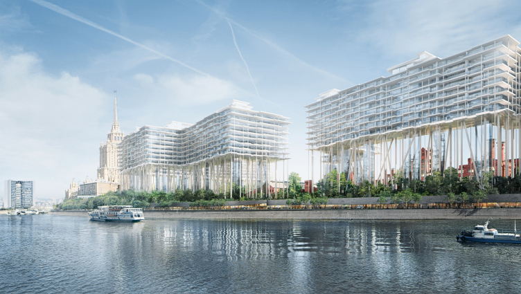
What was shown at the end of March at the presentation is essentially the result of our collaboration with HdM and CG during the entire 2017. We were present at the form shaping process of the new construction on that site, and we saw the whole “chronology of thought” of the Swiss architects. There were, if I am not mistaken, over forty project versions to choose from. All of them were ultimately declined because they did not fulfill their main task, namely, that of preserving the perception of the brewery building from the waterfront of the Moskva River.
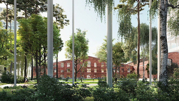
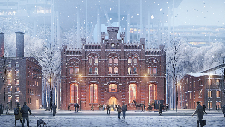
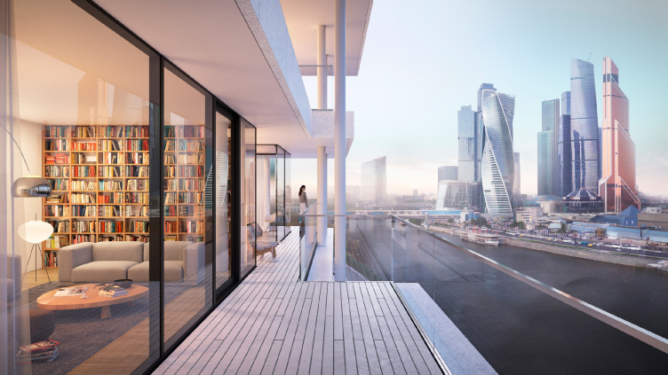
The project of developing the territory of the Badaevsky Brewery. Image © Herzog & de Meuron
The project of developing the territory of the Badaevsky Brewery. Image © Herzog & de Meuron
– Still, however, the new construction will also be quite noticeable?
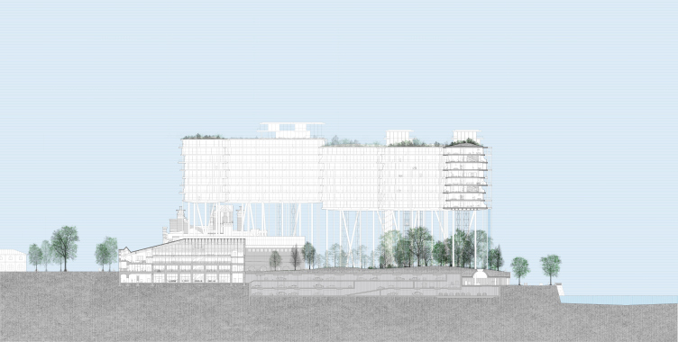
D.G.: Yes, it will be noticeable, and how can it be otherwise? The pinpoint integration technique would not work here because it destroys the integral perception of the complex when viewed from the waterfront. And I understand why there is so much public concern about this project. Because nobody ever did anything of the sort in Moscow. We have but two examples of “buildings on legs” in this city: on the Begovaya and on the Prospect Mira. Supports of this kind are not to be found anywhere else.
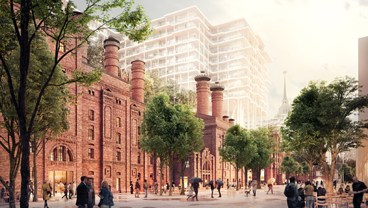
The project of developing the territory of the Badaevsky Brewery © Herzog & de Meuron
– And you also had to respond somehow to the criticism about the “sustainability” of these columns...
Mikhail Bobrovnichiy,
head of the construction department:
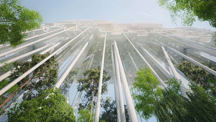
– Everybody’s saying that these columns are dangerously thin but in reality this is not the case. Originally, we and our Swiss colleagues, the designers of Schnetzer Puskas, were considering columns of an even smaller diameter – 400–600 mm. Thing is that for Europeans this has long since become a commonplace solution when you take a steel pipe, fill it with concrete and put yet another steel core inside of it. Essentially, this column is as good as completely made of steel. Yes, it does look slender and brittle but its conditional flexibility is well within the range of the effective construction rules and regulations, and the amount of steel in it is a lot greater than it would be in a plain steel pipe filled with concrete. Accordingly, the inner tension in such a column is all but neglectable. There is no threat of balance loss due to the construction load. And you don’t have to be a rocket scientist to calculate all the physical properties of this column – the theory of strength of materials has been around for centuries, and it’s also been a few centuries since Leonhard Euler came up with his theory of elasticity of compressed rods, which provides a means of calculating the load-carrying and deflection characteristics of beams. Roughly speaking, the tension inside the column is about 19 mPa, while steel is known to withstand up to three hundred.
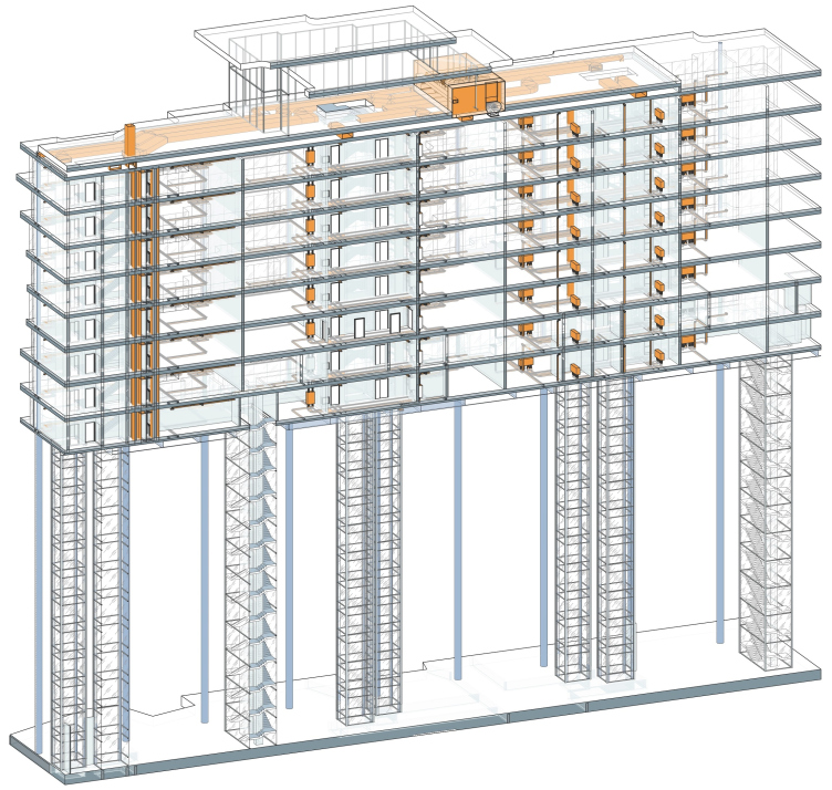
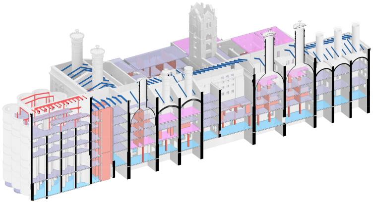
Utility systems. The project of developing the territory of the Badaevsky Brewery © APEX design bureau
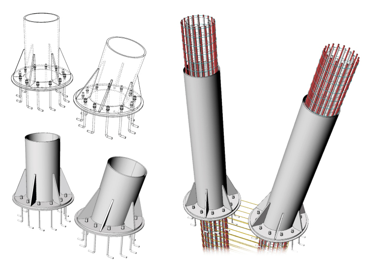
A more challenging question was how to make these columns cost-effective because Russia does not manufacture such steel cores. In addition, you can only carry a 15-meter-long load down the streets in Moscow, and our columns are 35 meters long, which means that you have to make them consisting of several segments, and joining such cores lengthwise is a enough of a challenge in itself. This is more of technological question, not technical. For this reason, the main problem for us and Schnetzer Puskas was finding a way of manufacturing these columns in Moscow from the materials that we had at our disposal – making them at the same time budget-friendly, instead of having to bring these cores over from the other end of the world. And we solved this question by proposing to replace these cores with highly durable steel reinforcement. The Swiss and us conducted independent calculations which proved that this option was quite feasible.
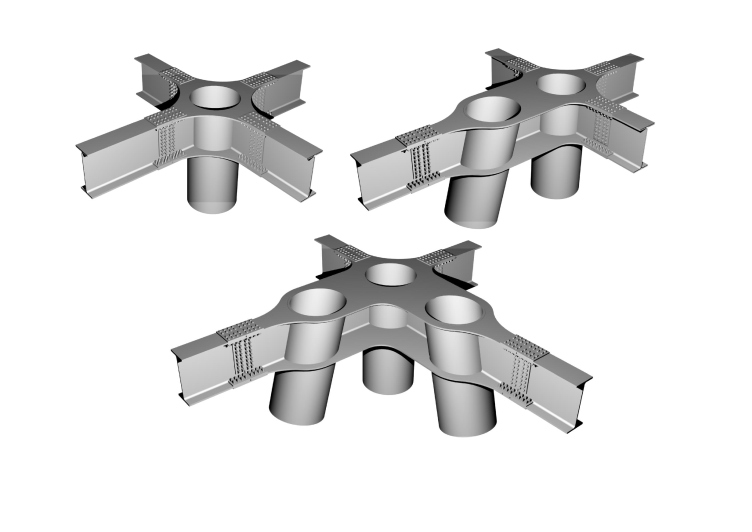
Column anchorages. The project of developing the territory of the Badaevsky Brewery © APEX design bureau
Yet another important challenge was to ensure the horizontal stability of the construction, ruling out the possibility of oscillations of any kind. Herzog & de Meuron claim that the supports that their housing complex rests upon is a forest, a thicket, but the slanted columns that look as if they were haphazardly scattered around the plan, are in fact not only an architectural element but a constructional one as well. HdM were able to put an interesting spin on that in their concept, and we, together with Schnetzer Puskas, happily used that in order to give some extra horizontal rigidity to the construction, and now the wind oscillations of the construction are way less than what is allowed by the regulations.
Column anchorages. The project of developing the territory of the Badaevsky Brewery © APEX design bureau
The skeptics must be aware of the fact that we ensured a large margin of safety, and that we could have made these pillars still thinner and even more “dangerous”-looking. The solution that we opted for is even more dependable, and it does not really affect the cost that much. The only thing that happened was that the architects specifically asked us to make sure that the section of the supports stays as small as possible: they did not want the “wow” effect to go. We also could have made less expensive columns – more concrete, less steel, and make them 1200 mm thick instead of 800 mm, but then the wow-effect would be gone. In addition, some of the columns are actually hollow – because engineering lines run through them, and they are suspended from the framework. Behind every successful architectural project, there are quite commonplace everyday challenges, really.
D.G.: I would like to clarify here that the structure of working on this project is wired in such a way that, on the one side, you have Herzog & de Meuron, and, on the other side, an independent construction consultant – the Basel-based construction bureau Schnetzer Puskas, which, together with Herzog & de Meuron, has been successfully implementing projects around the globe – for example, the Elbe Philharmonic Hall or the stadium in Bordeaux, where they used columns similar to those which will be used in Badaevsky. The work on the project is organized in such a way that be both do calculations independently from each other, meaning – the two teams of designers work concurrently, in accordance with two different sets of rules and regulations, them according to Eurocodes, us according to the Russian norms. Every three weeks the teams check their results against each other’s, make sure they are in synch, and come up with the ultimate joint solutions. This is why all of our moves are double checked by two independent teams of experts in the field of construction technologies.
– How did this cooperation model come about?
M.B.: Herzog & de Meuron were not sure that they would find in Moscow the designers that would be experienced and professional enough, and they decided to play it safe very early on. First, the architects and designers in Basel would exchange their information quicker, and we would get it with a lag, and, when in the initial stage, we would sometimes go slightly different ways. Then we established direct communication with Schnetzer Puskas, very professional and open-minded team of designers, and pretty soon we had a great thing going.
– As far as I know, you work not only with Herzog & de Meuron but also with many other foreign partners. Is such model only applied in this particular project?
D.G.: Usually, when we work with foreign architects, we do all the design work ourselves, but, aside from HdM, there is only one more exception from this rule – it is our project with Renzo Piano, GES-2. What happened there was exactly the same situation when at the stage of concept development and preparation of the working documents the maestro invited his long-standing partners – construction consultants – Milan Ingegneria.
– And at which stage is the Badaevsky project now?
D.G.: Currently, we are developing the working documents, and the restoration project. You must keep in mind that this land site has two cultural monuments on it, which are in for full-scale restoration and very careful integration into the new infrastructure.
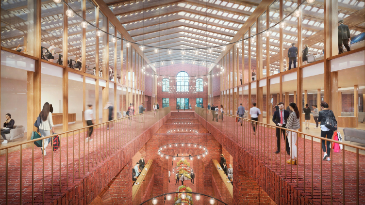
The project of developing the territory of the Badaevsky Brewery. Image © Herzog & de Meuron
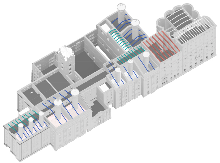
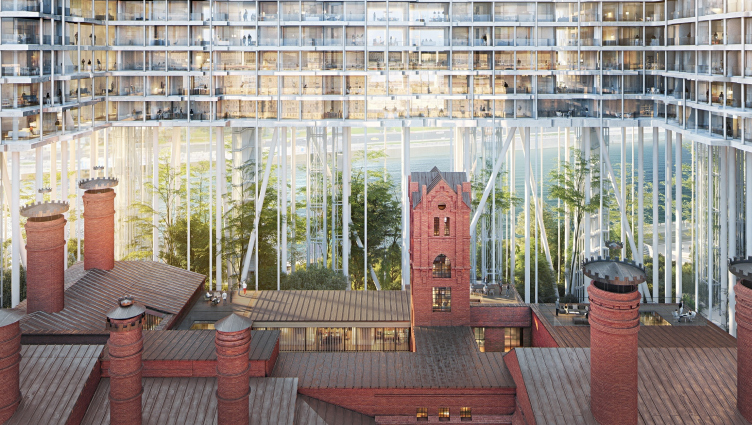
If we are to take a look at the prints that date back a century, we will see that the brewery was essentially an ensemble of three buildings. During the soviet time, the central building was partially destroyed, and a seven-floor administration building was built in its place – today, the two side buildings stand next to it like two orphans, completely lost against its background. This central building, it will be torn down altogether, and in its stead they will build, based on the records from the Moscow’s archives, the building which was there a hundred years ago. This way, the ensemble of the brewery is restored in its historical entirety.
– What will be there in the restored building and in the surviving historical ones?
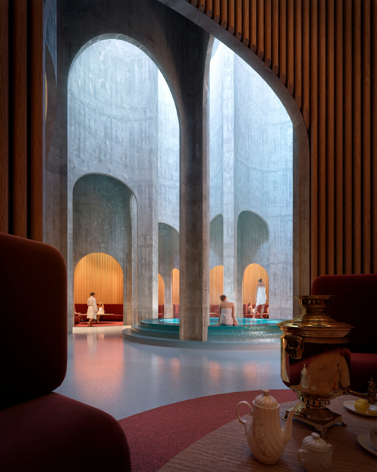
D.G.: It will be chiefly the public functions because this area is lacking in infrastructure. Specifically, now this city block has three restaurants and a gym in it – and that’s it! Later on, the historical buildings will open a food market. As for the brewery building as such, the production of beer will be resumed in it, so, the original spirit of the place is coming back.
The project of developing the territory of the Badaevsky Brewery. Image © Herzog & de Meuron
The project of developing the territory of the Badaevsky Brewery. Image © Herzog & de Meuron
The project of developing the territory of the Badaevsky Brewery. Image © Herzog & de Meuron
The project of developing the territory of the Badaevsky Brewery. Image © Herzog & de Meuron
Construction profile of the historical building. The project of developing the territory of the Badaevsky Brewery © APEX design bureau
– Will there be a public territory in the complex on the side of the waterfront?
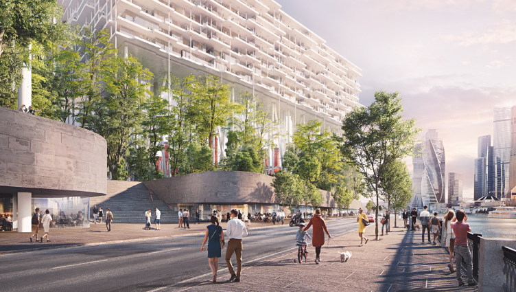
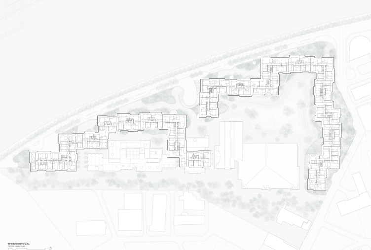
D.F.: Yes, there is a considerable height difference on the side of the Tarasa Shevchenko embankment, and we will create a promenade there that will help to integrate this waterfront into the city life and connect it to the other embankments of the Moskva River because currently it is virtually a dead-end street – neither cars nor pedestrians are there. A new restaurant and a retail zone will be formed there, and, in addition, the waterfront will also include a few direct entrances to the residential part which is being designed now – the so called residential “band”. These entrances will be organized in the recessions between the retail blocks, which will help to avoid the necessity to fence off all those “residents-only” zones. The residents will enter their houses directly from the waterfront, whilst the territory on the side of the brewery will remain public.
– Due to the fact that the residential part is placed on top, it turns out that there is no division into “public” and “private” on the ground level; these zones are divided vertically.
D.G.: Yes, exactly so! And this division helps both parts of the complex – the buildings of the brewery and the residential “band” – to exist without getting in each other’s way as much as possible. What is also worth mentioning is the the engineering solution because a lot of people have fears that the façades will freeze through in the wintertime, icicles will fall down on people’s heads, etc.
The heat conduct calculations were made by the experts of our company in two ways and in accordance with two standards – our domestic energy efficiency norms, and on the basis of the energy model of the building, which included analyzing several types of façade glazing, by analogy with calculations necessary for LEED or BREEAM certificates.
– Are you actually planning to get one?
D.G.: Only one cultural legacy monument will be certified, this being one of the two historic buildings. It’s important to mention that this will be the first precedent in the territory of the CIS when a cultural heritage site will be BREEAM-certified (BREEAM Refurbishment). As for the “residential band”, the investor opted out of certifying it; it was more of a practical exercise. An energy model of it was created, and, depending on the façade type, we analyzed just how much energy would be spent each year to heat this house, to cool it, and, generally, to get all the communications working. On the basis of these calculations, an optimum balanced was achieved between the façade costs and the engineering costs. Based on the results of our calculations, we chose the specific façade solutions.
– How will the parking lot be designed?
M.B.: Designing the parking spaces was quite a tall order here because the geologic composition of this site is very unusual. Besides, we had to consider the traffic flows, design the loading bays for the retail area, provide for the waste disposal, and make sure we have enough parking spots for the residents and guests of the complex, and for the emergency services.
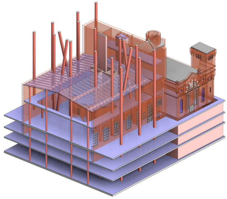
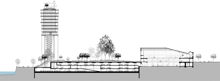
We were also faced with a lot of challenges of a purely constructional nature. If you take the columns which support the residential “band”, for example, we had to run them through the parking garage down to the foundation and join them with extra rigidity at the underground levels. During the period of digging the main construction pit, what we do is we fence off the foundations of the security facilities and add a wall rooted in the ground, but the extra challenge consists in the fact that for the future logistics and the traffic flows, it’s not enough to just build a wall around the foundations – you will also have to ensure the connection (at the following stages) between the parking and the cultural legacy buildings. And in a number of places it will be a more difficult thing to do than building the columns. In actuality, all of these things are hidden away, very few people know about them, but the difficulties are really numerous: make sure you don’t destroy the cultural legacy buildings, link them in terms of transport, and connect them with emergency exits. This task is far from trivial.
Model of integrating the columns and the cultural legacy monuments. The project of developing the territory of the Badaevsky Brewery © APEX design bureau
Construction profile of the historical building. The project of developing the territory of the Badaevsky Brewery © APEX design bureau
The project of developing the territory of the Badaevsky Brewery. Master plan © APEX design bureau © Herzog & de Meuron
In addition, you will rarely see parking garages with 14-meter reinforced concrete spans, and here it is precisely the case, and for this reason we will be getting rather large zones with intermediate floors of reinforced concrete. Speaking of other peculiarities of the project, I think it is worth mentioning, for example, the fact that the intermediate floors in the resident zone coffered. This way, we cut down the weight of the intermediate floors by about 30%, and, consequently, the columns experience less stress.
The 10-meter spans are also not something that you meet in residential construction every day, and it turns out that on a hundred square meters you will not see any vertical structures. If the columns stood at smaller intervals, it would look pretty much like a thicket, which would limit the number of possibilities for future layout planning. A lot of composite materials are used, stiff reinforcements, double-T beans, and [-shaped cross-sections for making the floor slabs sturdier, because there are cantilevered structures in the building, some of which 4-6 meters wide. The building has in it a lot of unique details that pass unnoticed against the background of large high-profile columns. Our project is being widely discussed but nobody is mentioning the fact, for example, that all the staircases and elevator nuclei are clad in glass, and there are no elevator shafts as such.
– What you did not mention, however, is the fact that everyone is worried about the fire safety of this project. How will people be evacuated in the case of emergency? There are neither staircases nor elevators. What was your response to such skepticism?
D.G.: If we are to take a look at the emergency evacuation plan of this building we will see that it is exactly the same as it is in the building “without legs”. There are staircases and elevator units there, there are also N2-type staircases, and there are elevators for the fire fighters. All of this is functioning in full accordance with the official rules. There are fire safety zones on each floor, in each hall, meaning – as far as the fire safety is concerned, we fulfilled the requirements to a letter.
The air conduits and the fire safety systems are not routed from the bottom to the top of the roof of the building, unlike what is usually the case with residential buildings. We designed a special system of smoke disposal from the “band”, and a special smoke disposal system with air discharges and intakes in the bottom part which allowed us to reduce the square footage of the staircase and elevator units, and let more “air” into the building.
This also considerably increases the dependability because, in fact, for each of the zones an individual design and engineering center exists: one for the residential part, one for the underground part, one for the historical monuments. In addition to the fact that we are optimizing the space, we make sure that these systems are independent from each other as much as possible. This way, we guarantee that in the case of emergency (well, suppose it does happen) in the underground parking garage, for example, there won’t be a power failure in the residential “band” or the other way around. Yet another great thing about it all was the fact that nobody hurried as up – almost.
– Let’s touch upon the chronology of the project. Herzog & de Meuron won the competition in 2016. You joined the project in the early 2017. When is the construction due to begin?
D.G.: Of course, we would like to begin it as soon as possible but everyone realizes that the level of responsibility that lies on every member of the project, including the client, is very high. This is a rare case when the client appreciates the fact that if you take up such a high-profile project, you are really expected to build “as it was drawn”. And it is this specific factor that stops us from naming the exact day when the construction will begin and when it will be finished. Everybody wants to deliver a high-quality product, and it must be a powerful architectural and engineering statement; something that will take the Moscow development business community to a whole new level.
It took us a year to develop a detailed concept – architectural, town-planning, technological, engineering, and constructional. Currently, we are working on the project documentation. You mustn’t forget that that the “adjustment” project is subject to getting a mandatory approval from the Cultural Legacy Department.
– And who is doing the restoration part?
D.G.: The restoration team is great friends of ours. APEX has the license of the Ministry of Culture of the Russian Federation, and we’ve got our own experts in this field but for this project we invited a subcontractor, the restoration firm “Faros” headed by Boris Savin. He is really quite at home with this material. Mosgornasledie is helping us with the archive materials, as well as with the task of defining the circle of allowable solutions. I think that the whole 2018 will be taken up by the design process and getting all the necessary approvals for the documentation, and the next year we will get down to developing the working documents. The construction will only start when as much as half of the working documents have been completed. Because this is not the kind of land site where you can build from scratch or do several spots concurrently. The quality requirements are extremely high.
The project of developing the territory of the Badaevsky Brewery. Section view © Herzog & de Meuron
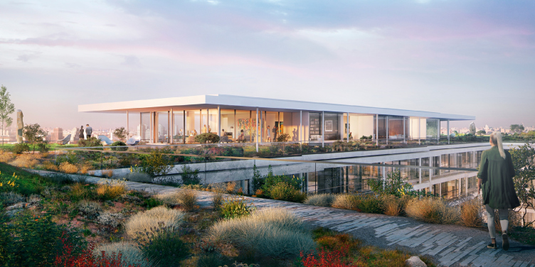
The project of developing the territory of the Badaevsky Brewery. Image © Herzog & de Meuron
The project of developing the territory of the Badaevsky Brewery. Image © Herzog & de Meuron
The project of developing the territory of the Badaevsky Brewery. Image © Herzog & de Meuron
The project of developing the territory of the Badaevsky Brewery. Image © Herzog & de Meuron
The project of developing the territory of the Badaevsky Brewery. Image © Herzog & de Meuron


