По-русски

​On Wings Spread Wide

Designed by Roman Leonidov in the Moscow area, the Wing-house demonstrates a new type of Russian manor house built in the style of organic architecture. The Wing-house observes three rules: the client’s comfort, harmony with nature, and perfect plastique. We met with Roman Leonidov and spoke to him about manifesto buildings and the architects’ subconscious.

17 January 2018
Object
mainImg

How did this name of “Wing-house” come about, anyway? Roman Leonidov explains that the image of the house sprung from its owner’s personality. He is a prominent figure in the beauty industry, known for his flights of fancy – hence, the “wing” motif. “My client is a very charismatic personality. I was afraid that he would dominate, and, as it turned out, he feared the same thing from my side. And this is why we stayed at a level of mutual respect but we never became soulmates the way I usually do with ninety percent of my clients”.

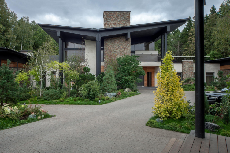
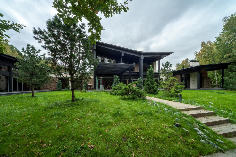
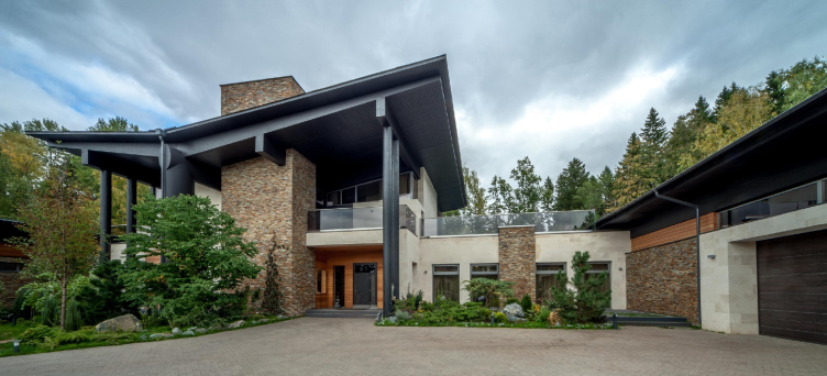
In addition, the architect wanted to experiment with the back pitch of the roof. The snow load does not scare away anybody these days because it is calculated for any type of roofing. As for the rainfall water, it just goes down the drain. This is how the “bird” form of the roof of the main house came about. It is duplicated in the design of the roofs of the flanks. As for the structure of the “main wing”, one of the elements under the roof is concrete because it carries most of the weight. The other parts of the structure are wood. The roofs of the wings expose bent glued wooden beams: they put an interesting spin on the wing motif.

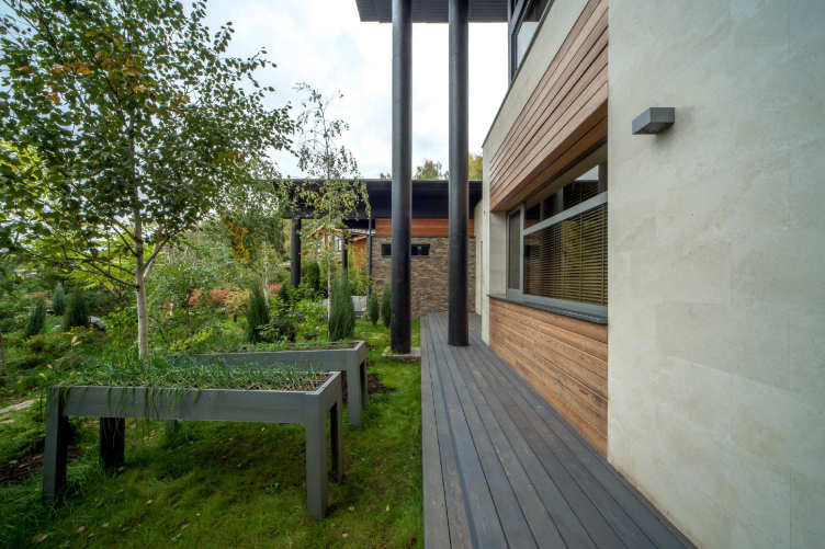
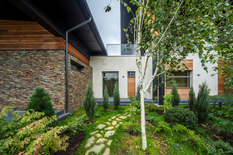
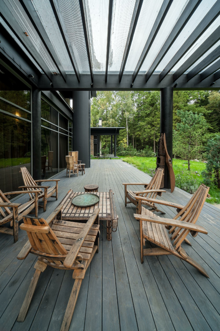
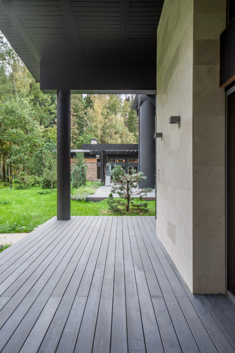
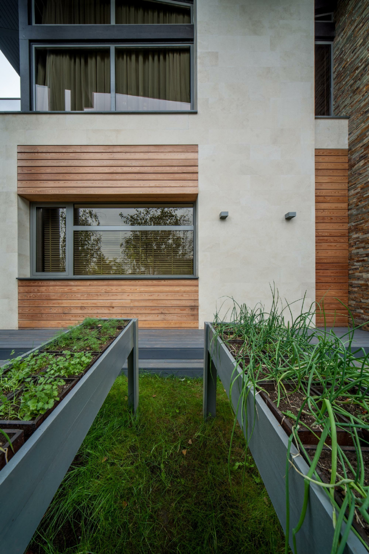
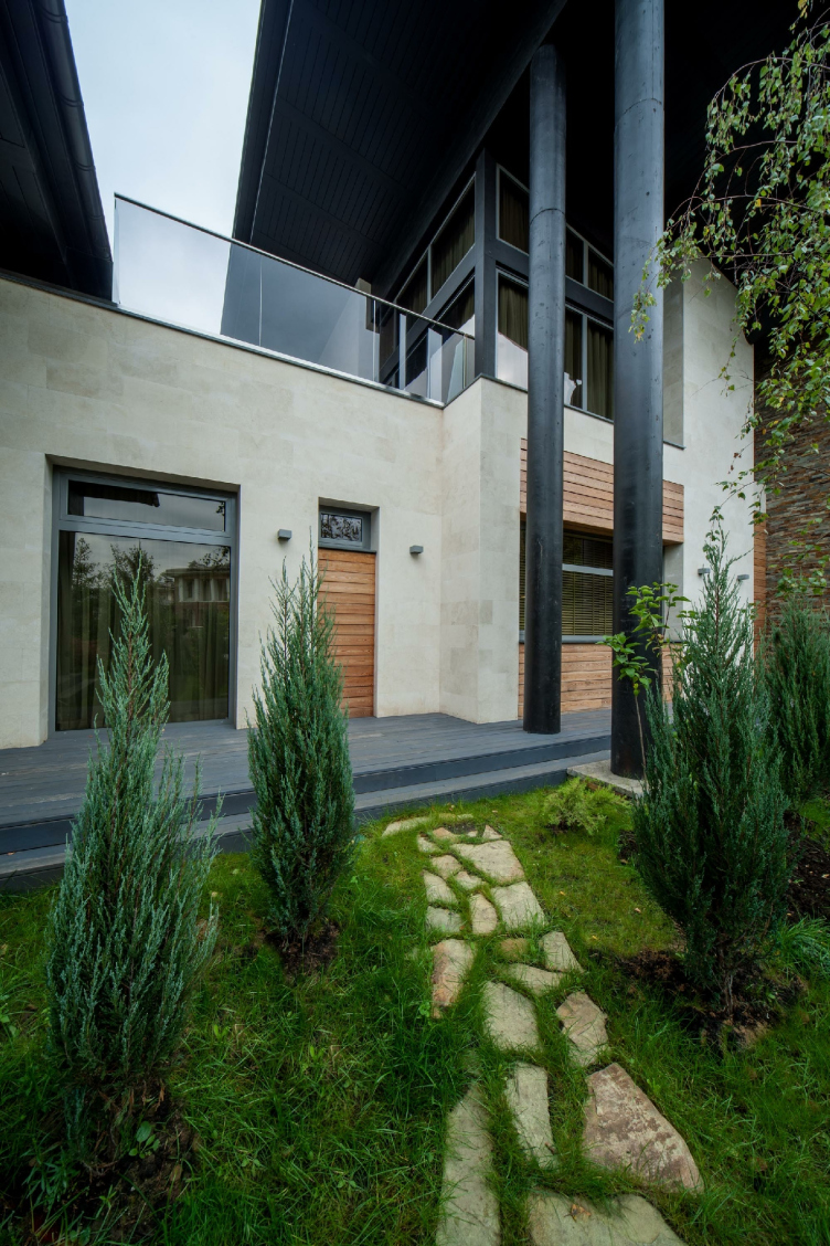
Wing-house in the Moscow area. Architect: Roman Leonidov © Studio of Roman Leonidov


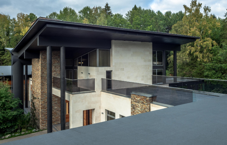
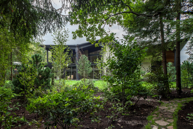
Wing-house in the Moscow area. Architect: Roman Leonidov © Studio of Roman Leonidov


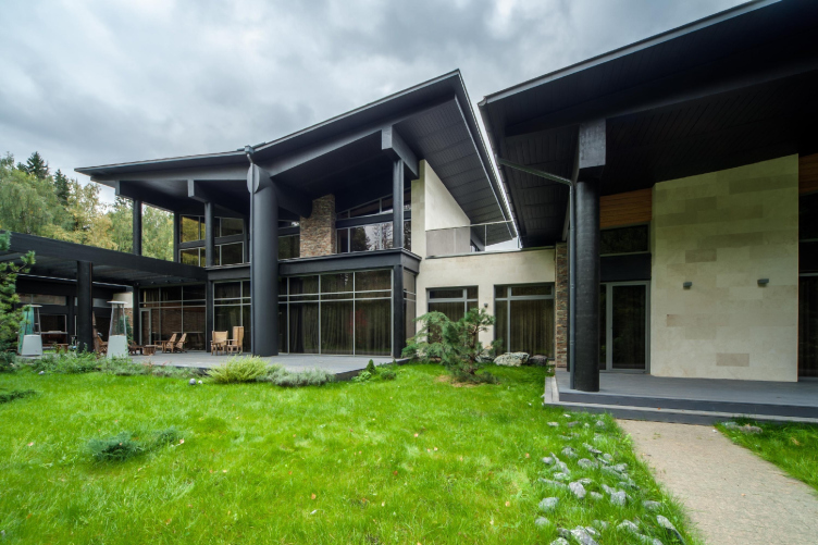
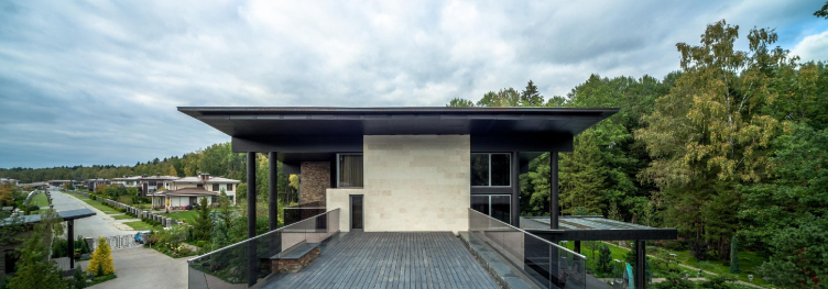
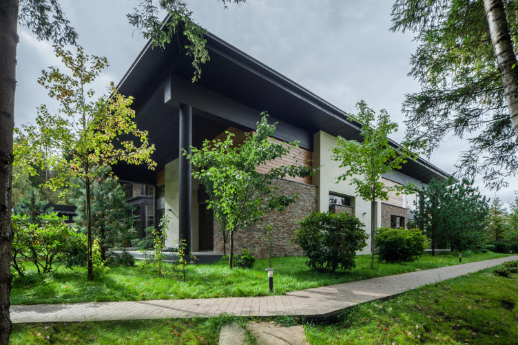
Wing-house in the Moscow area. Architect: Roman Leonidov © Studio of Roman Leonidov


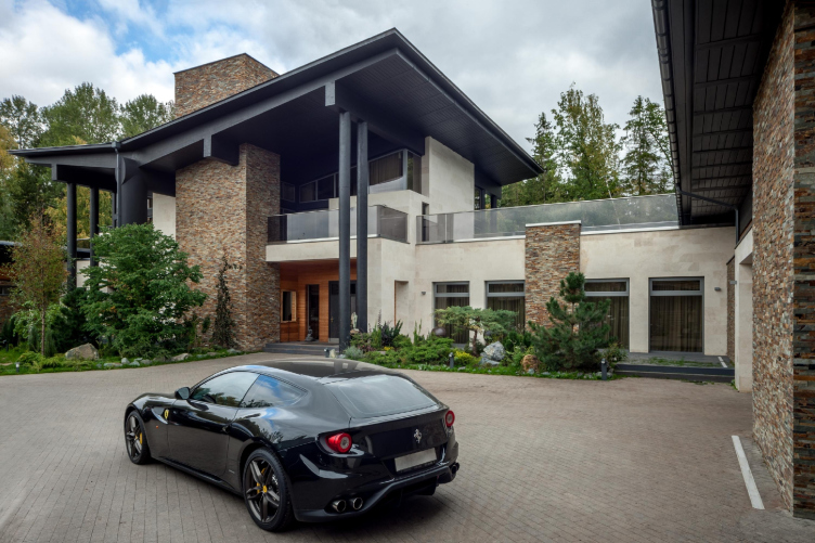
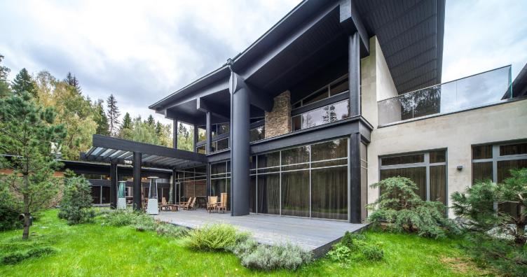
Wing-house in the Moscow area. Architect: Roman Leonidov © Studio of Roman Leonidov


A modern Russian manor estate with a court of honor

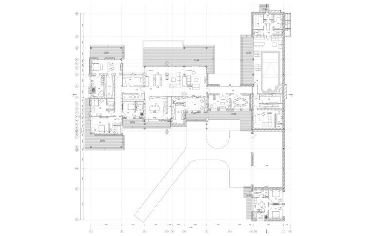
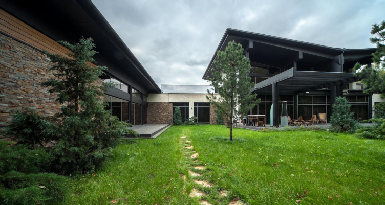
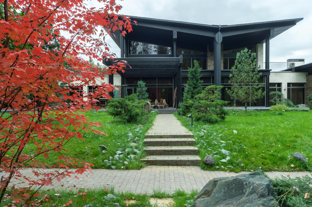
The client wanted a home that would be rather open and representative-looking, yet the same time providing an opportunity for seclusion. Due to the fact that the land plot borders on a forest, there was no problem of shutting out from the neighbors but there was still a task of creating an intimate atmosphere in the yard so that a person who would find himself in there would not feel anybody’s presence. For this reason, the composition of the house includes the central tall part (the main house) and side wings of smaller height, which form the court of honor in front of the main façade. On entering it, one can only see the forest and the land plot. The fence (which is there nonetheless) is hidden deep inside the forest, and there is no feeling of being in a confined space. As for the “court of honor” term, it did not come about by chance. In the functional program of the building, typical of today, Roman Leonidov sees a new type of the Russian manor estate. This includes a rather extended public block: a living room, a kitchen, a dining room, and a health-and-fitness part consisting of a swimming pool, a sauna, and a gym. Fully glazed, the swimming pool grants access to nature, specifically to an open-air terrace with lounge chairs (to this same court of honor, to be exact). This is a whole spa complex, the kind you would meet at a luxury resort. The client wanted this part for his personal use, and for welcoming his guests and business partners.

Plan of the first fllor. Wing-house in the Moscow area. Architect: Roman Leonidov © Studio of Roman Leonidov


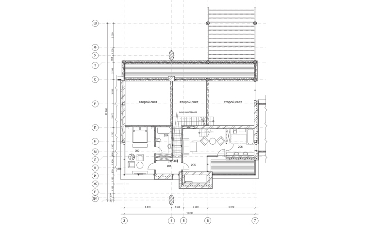
Plan of the second floor. Wing-house in the Moscow area. Architect: Roman Leonidov © Studio of Roman Leonidov


Just the way it should be at a manor house, this house has “stalls” in it, i.e. garages for the family’s cars, because if you live in the country one car per family is definitely not enough. The garage also houses the harvesting equipment and the owner’s collection of cars. Totally, this comes together to form a whole car park. The manor estate is a whopping hectare, so the landscape is handled by a gardener, or rather, the local jack-of-all-trades.

Wing-house in the Moscow area. Architect: Roman Leonidov © Studio of Roman Leonidov


Wing-house in the Moscow area. Architect: Roman Leonidov © Studio of Roman Leonidov


Wing-house in the Moscow area. Architect: Roman Leonidov © Studio of Roman Leonidov


The main house includes a double-height living room, a dining room, and a master’s bedroom on the second floor. One of the wings includes rooms for the residents and guests; beneath them, there is a spa complex. The other wing includes the “stalls” of the garages, and the gardener’s flat above them. What is interesting is the fact that the overpass leading from the main house to the wing on the second floor is essentially an open-air terrace for everyone to see, from which one can also enjoy the surrounding scenery. The terrace makes the image of the house more open (the usable roof, since it is flat, must be filled with life) but its role of a belvedere is rather representational: as was already said, the court of honor, protected from the outside world, enjoys more popularity here.

Wing-house in the Moscow area. Architect: Roman Leonidov © Studio of Roman Leonidov


Wing-house in the Moscow area. Architect: Roman Leonidov © Studio of Roman Leonidov


“At first the I and the client were shocked but then we realized that this thing would be bold and good-looking”

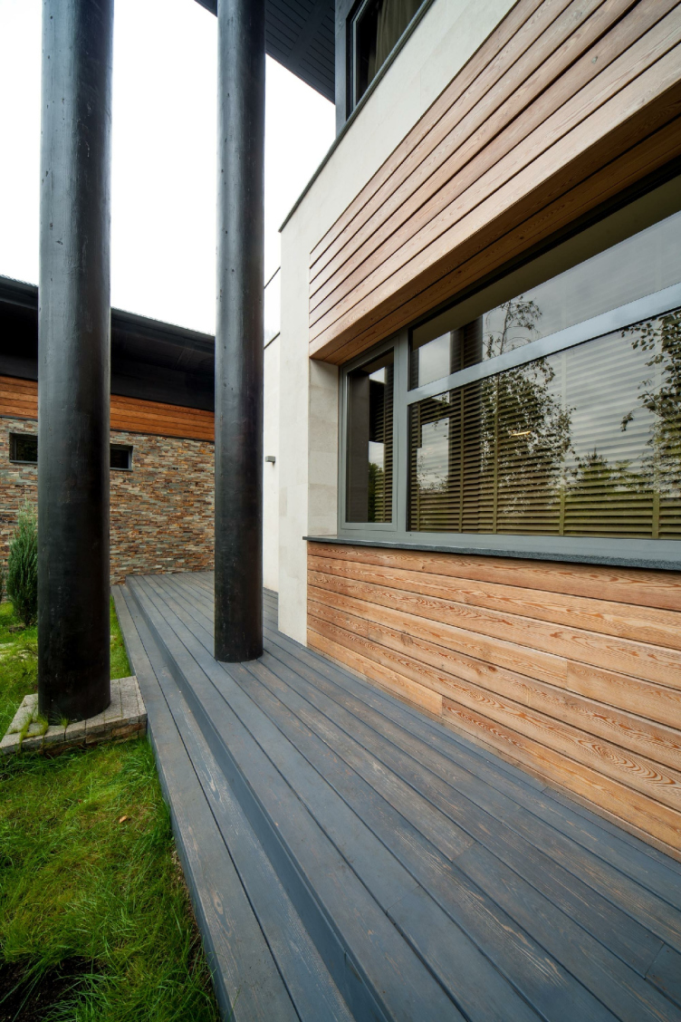
The fashionable black color is in fact a result of a construction mistake. Roman Leonidov: “The paint that we ordered arrived, and it was alright against the waybill. The construction workers started doing the paint job, and then they call us and go: it’s sort of darkish, was it meant to be that way? I instantly come round and see that the wood is now pitch-black! I try to take a shave off the surface, and I realize that this is impossible – you cannot even chip it away. At first I and the customer were shocked but then we realized that this thing would be bold and good-looking. All the more so because he is an emotionally open person, capable of making unexpected decisions! I myself would never have dared to make the plunge but now I see that this was a success”.

Wing-house in the Moscow area. Architect: Roman Leonidov © Studio of Roman Leonidov


Wing-house in the Moscow area. Architect: Roman Leonidov © Studio of Roman Leonidov


Wing-house in the Moscow area. Architect: Roman Leonidov © Studio of Roman Leonidov


Wing-house in the Moscow area. Architect: Roman Leonidov © Studio of Roman Leonidov


Wing-house in the Moscow area. Architect: Roman Leonidov © Studio of Roman Leonidov


“I like Fallingwater in terms of composition, but functionally it’s an atrocity”.

Roman Leonidov says that some of his creations were inspired by organic architecture. When asked whether he drew inspiration from Frank Lloyd Wright, he gave an unexpected answer – and our conversation went to a whole new level. “An architect cannot NOT be inspired by Wright. We all are infected by this his “Fallingwater” or “Waterfall villa”. I love it in terms of composition, but functionally it’s an atrocity, a thing in itself. It leaves no room for life. Whatever life there is in it, it only gets in the way of architecture. I am trying to be a modernist like Corbusier or Wright but I can’t seem to be doing very well. Eclecticism is what’s hot right now. At a first glance, modernism seems to have more integrity about it. But, in fact, we do the same decoration stuff that the authors of the late ХIХ century did. It lacks the philosophical prime mover that would push the whole thing forward from inside. It’s just not there. And this is generally the issue with modern architecture. It lacks the integral philosophical construct that would shape up the contents and the form of the architecture. But the tasks that we have to handle are still as important: you need to make the house fit in nicely with its surroundings, ensure the client’s comfort, and achieve the perfect plastique”.

Wing-house in the Moscow area. Architect: Roman Leonidov © Studio of Roman Leonidov


Wing-house in the Moscow area. Architect: Roman Leonidov © Studio of Roman Leonidov


Wing-house in the Moscow area. Architect: Roman Leonidov © Studio of Roman Leonidov


Wing-house in the Moscow area. Architect: Roman Leonidov © Studio of Roman Leonidov


Wing-house in the Moscow area. Architect: Roman Leonidov © Studio of Roman Leonidov


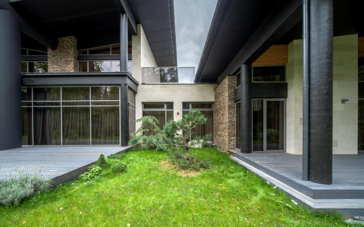
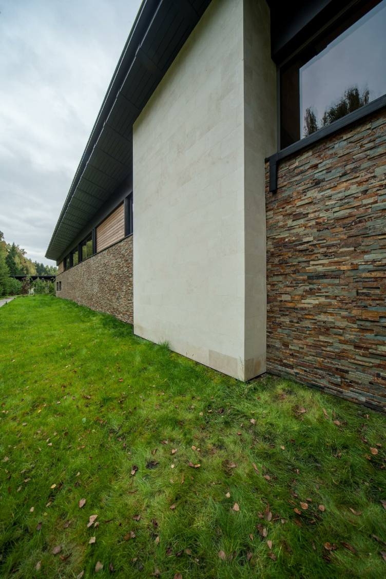
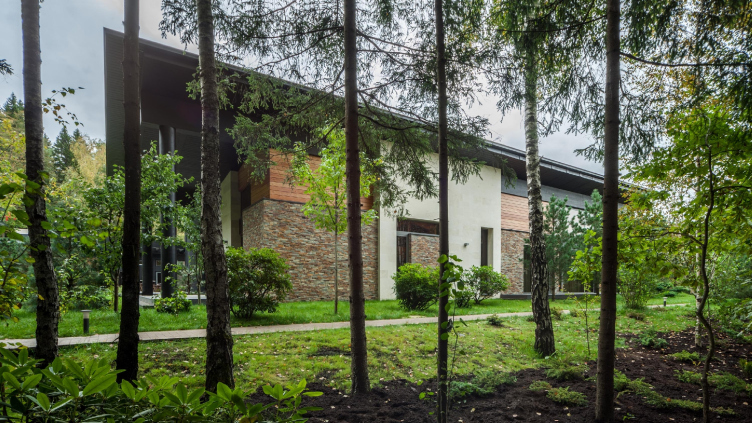
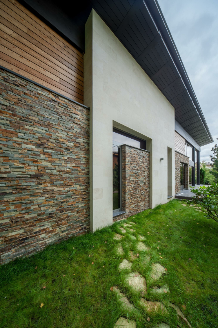
The Wing-house successfully solves all these three tasks. As for the comfort aspect, we already covered it. The house also fits nicely with its surroundings thanks to its materials. There are many of them: concrete and wood, stone and brick, glass and stucco. “Yes, it may seem like there are too many different materials used in our house. Had we used fewer materials, it would be more integral and its form would read better – Roman Leonidov says. But what people are after is something that has texture about it, something palpable”. In this case, the architect was very considerate of the human psychology. Wood, brick and stone are used in the bearing structures. The decoration is ruled by plaster and basswood. The vertical towers are covered with sandstone: “not for any functional reason, just for the beauty of it”.

The composition, as was already said, consists of three parts. Where a vertical accent was needed, the stone-covered “Wright” towers appeared – a memory of the “Villa above the waterfall”. (“The vertical wall here is, regretfully, not a fireplace. It’s just that we needed a vertical here”). These towers bump into other elements, one of them piercing the “wing” roof, for example. This technique makes the architectural form particularly dramatic. The tension between the plastique tasks and the function is always there.

Wing-house in the Moscow area. Architect: Roman Leonidov © Studio of Roman Leonidov


Wing-house in the Moscow area. Architect: Roman Leonidov © Studio of Roman Leonidov


Wing-house in the Moscow area. Architect: Roman Leonidov © Studio of Roman Leonidov


As is known, “manifesto” houses are rarely lived in. While Fallingwater, according to Roman Leonidov’s confession, is functionally atrocious, in spite of all its artistic beauty (or maybe thanks to it), and Philipp Johnson’s Glass House is also a manifesto that he never lived in, the next question I asked Roman Leonidov was – why does it always happen this way? And it turned out that “the architect’s artistic concept is one thing, and his subconscious is another”. And when I asked if it was worth trying to hear what the subconscious tells you, the answer was as follows: “This is far from easy. It’s great when somebody is around who can help you find your inner freedom. But when the person you have to fight is yourself, it’s pretty tough sometimes. My task was to make sure that my pencil sketch shows through in the end result”. In the Wing-house project, Roman Leonidov was able to do it. What he ultimately got is a house that is integral in its image and comfortable to live in. The artistic concept and the function made peace with each other and are now keeping a good balance.

17 January 2018

Headlines now
The Golden Crown
The concept for a dental clinic in Yekaterinburg, developed by CNTR Studio, revolves around the idea of a “mouth full of gold”: pristine white porcelain stoneware walls are complemented by matte brass details. To avoid an overly literal interpretation, the architects focused on the building’s proportions, skillfully navigating between sunlight requirements and fire safety regulations.
Flexibility and Integration
Not long ago, we covered the project for the fourth phase of the ÁLIA residential complex, designed by APEX. Now, we’ve been shown different fence concepts they developed to enclose the complex’s private courtyards, incorporating a variety of public functions. We believe that the sheer fact that the complex’s architects were involved in such a detail as fencing speaks volumes.
A Step Forward
The HIDE residential complex represents a major milestone for ADM architects and their leaders Andrey Romanov and Ekaterina Kuznetsova in their quest for a fresh high-rise aesthetic – one that is flexible and layered, capable of bringing vibrancy to mass and silhouette while shaping form. Over recent years, this approach has become ADM’s “signature style”, with the golden HIDE tower playing a pivotal role in its evolution. Here, we delve into the project’s story, explore the details of the complex’s design, and uncover its core essence.
Gold in the Sands
A new office for a transcontinental company specializing in resource extraction and processing has opened in Dubai. Designed by T+T Architects, masters of creating spaces that are contemporary, diverse, flexible, and original, this project exemplifies their expertise. On the executive floor, a massive brass-clad partition dominates, while layered textures of compressed earth create a contextually resonant backdrop.
Layers and Levels of Flight
This project goes way back – Reserve Union won this architectural competition at the end of 2011, and the building was completed in 2018, so it’s practically “archival”. However, despite being relatively unknown, the building can hardly be considered “dated” and remains a prime example of architectural expression, particularly in the headquarters genre. And it’s especially fitting for an aviation company office. In some ways, it resembles the Aeroflot headquarters at Sheremetyevo but with its own unique identity, following the signature style of Vladimir Plotkin. In this article, we take an in-depth look at the United Aircraft Corporation (UAC) headquarters in the Moscow agglomeration town of Zhukovsky, supplemented by recent photographs from Alexey Naroditsky – a shoot that became only recently possible due to the fact that improvements were finally made in the surrounding area.
Light and Shadow
In this article, we delve into the architectural design of the “Chaika” house by DNK ag architects, which was recently completed in 2023 as part of the collection of signature designs at ZILArt. As is well-known, all the buildings in this complex follow a design code, yet each one is distinct. This particular building stands out not only for its whiteness and minimalism but also for the refined use of a limited number of techniques that, together, create what can confidently be called synergy.
Casus Novae
A master plan was developed for a large residential area with a name of “DNS City”, but now that its implementation began, the plan has been arbitrarily reformatted and replaced with something that, while similar on the surface, is actually quite different. This is not the first time such a thing happens, but it’s always frustrating. With permission from the author, we are sharing Maria Elkina’s post.
Treasure Hunting
The GAFA bureau, in collaboration with Tegola and Arkhitail, organized an expedition to the island of Kilpola in Karelia as part of Moskomarkhitektura’s “Open City” festival. There, amidst moss and rocks, the students sought answers to questions like: what is the sacred, where does it dwell, and what sustains it? Assisting the participants in this quest were landscape engineer Evgeny Levin, artist Nicholas Roerich, a moose, and the lack of cellular connection. Here’s how the story unfolded.
Depths of the Earth, Streams of Water
In the Malaya Okhta district, the Akzent building, designed by Stepan Liphart, was constructed. It follows a classic tripartite structure, yet it’s what you might call “hand-drawn”: each façade is unique in its form and details, some of which aren’t immediately noticeable. In this article, we explore the context and, together with the architect, delve into how the form was developed.
Fir Tree Dynamics
The “Airports of Region” holding is planning to build an airport in Karachay-Cherkessia, aiming to make the Arkhyz and Dombay resorts more accessible to travelers. The project that won in an invitation-only competition, submitted by Sergey Nikeshkin’s KPLN, blends natural imagery inspired by the shape of a conifer seed, open-air waiting spaces, majestic large trees, and a green roof elevated on needle-like columns. The result is both nature-inspired and WOW.
​A Brick Shell
In the process of designing a clubhouse situated among pine trees in a prestigious suburban area near Moscow, the architectural firm “A.Len” did the façade design part. The combination of different types of brick and masonry correlates with the volumetric and plastique solutions, further enhanced by the inclusion of wood-painted fragments and metal “glazing”.
Word Forms
ATRIUM architects love ambitious challenges, and for the firm’s thirtieth anniversary, they boldly play a game of words with an exhibition that dives deep into a self-created vocabulary. They immerse their projects – especially art installations – into this glossary, as if plunging into a current of their own. You feel as if you’re flowing through the veins of pure art, immersed in a universe of vertical cities, educational spaces – of which the architects are true masters – and the cultural codes of various locations. But what truly captivates is the bold statement that Vera Butko and Anton Nadtochy make, both through their work and this exhibition: architecture, above all, is art – the art of working with form and space.
Flexibility and Acuteness of Modernity
Luxurious, fluid, large “kokoshniks” and spiral barrel columns, as if made from colorful chewing gum: there seem to be no other mansion like this in Moscow, designed in the “Neo-Russian-Modern” style. And the “Teremok” on Malaya Kaluzhskaya, previously somewhat obscure, has “come alive with new colors” and gained visibility after its restoration for the office of the “architectural ecosystem” as the architects love to call themselves. It’s evident that Julius Borisov and the architects at UNK put their hearts into finding this new office and bringing it up to date. Let’s delve into the paradoxes of this mansion’s history and its plasticity. Spoiler: two versions of modernity meet here, both balancing on the razor’s edge of “what’s current”.
Yuri Vissarionov: “A modular house does not belong to the land”
It belongs to space, or to the air... It turns out that 3D printing is more effective when combined with a modular approach: the house is built in a workshop and then adapted to the site, including on uneven terrain. Yuri Vissarionov shares his latest experience in designing tourist complexes, both in central Russia and in the south. These include houseboats, homes printed from lightweight concrete using a 3D printer, and, of course, frame houses.
​Moscow’s First
“The quality of education largely depends on the quality of the educational environment”. This principle of the last decade has been realized by Sergey Skuratov in the project for the First Moscow Gymnasium on Rostovskaya Embankment in the Khamovniki district. The building seamlessly integrates into the complex urban landscape, responding both to the pedestrian flow of the city and the quiet alleyways. It skillfully takes advantage of the height differences and aligns with modern trends in educational space design. Let’s take a closer look.
Looking at the Water
The site of Villa Sonata stretches from the road to the water’s edge, offering its own shoreline, pier, and a picturesque river panorama. To reveal these sweeping views, Roman Leonidov “cut” the façade diagonally parallel to the river, thus getting two main axes for the house and, consequently, “two heads”. The internal core – two double-height spaces, a living room and a conservatory, with a “bridge” above them – makes the house both “transparent” and filled with light.
The White Wing
Well, it’s not exactly white. It’s more of a beige, white-stone structure that plays with the color of limestone – smoother surfaces are lighter, while rougher ones are darker. This wing unites various elements: it absorbs and interprets the surrounding themes. It responds to everything, yet maintains a cohesive expression – a challenging task! – while also incorporating recognizable features of its own, such as the dynamic cuts at the bottom, top, and middle.
Urban Dunes
The XSA Ramps team designed and built a three-part sports hub for a park in Rostov-on-Don, welcoming people of all ages and fitness levels. The skate plaza, pump track, and playground are all meticulously crafted with details that attract a diverse range of visitors. The technical execution of the shapes and slopes transforms this space into a kind of sculptural composition.
Proportional Growth
The project for the fourth phase of the ÁLIA residential area has been announced. The buildings are situated on an elongated plot – almost a “ray” that shoots out from the center of the area towards the river. Their layout reflects both a response to Moscow’s architectural preferences over the past 15 years, shifting “from blocks to towers”, and an interpretation of the neighboring business park designed by SOM. Additionally, the best apartments here are not located at the very top but closer to the middle, forming a glowing “waistline”.
The “Staircase” Building
In designing the “Details” residential complex in New Moscow, Rais Baishev spiced up the now-popular Moscow theme of a “courtyard” building with an idea drawn from the surrealist drawings by Maurits Escher. He envisioned the stepped silhouettes and descending slopes as a metaphysical mega-staircase, creating a key void within the courtyard that gave the project an internal “spine”. This concept is felt both in the building’s silhouette and on its façades.
Projection of the Quarter
No one doubted that the building that Vladimir Plotkin designed as part of the “Garden Quarters” would be the most modernist of all. And it turned out just that way: while adhering to the common design code, the building successfully combines brick and white stone, rhythmically responding to the neighboring building designed by Ostozhenka, yet tactfully and persistently making a few statements of its own. This includes the projection of the ideal urban development composition “14–9–6”, which can be found right next door, mathematical calculations, including those for various types of terraces (and perhaps the only reminder of the Soviet past of the Kauchuk rubber factory!), and the white “cross-stitch” pattern of the façade grid.
Domus Aurea
In this issue, we examine the “Tessinsky-1” house, designed by Sergey Skuratov and completed in 2023. Located in the middle of the Serebryanicheskaya Embankment district, at the intersection of its main streets, this house assumes a sort of “nodal” role: it not only responds to everything around it and preserves many memories of the former EMA factory within itself, but it weaves all this into a newly directed pattern, reconciling bright “gold” and dark-colored brick, largely with the help of the new, modern-yet-archaic Columba brick, which, come to think about it, is the most precious element here.
The Chimney of Nikola-Lenivets
In this issue, we are examining the “Obelisk House” designed by KATARSIS and built for the Arkhstoyanie 2023 festival. However, it was only finished later on, and this is why we are examining it now. It seems to us that after the “Obelisk House” appeared in Nikola-Lenivets, a dialogue and a few inner connections appeared between the temporary structures built here. These houses no longer look like “accidental neighbors”, more of which below.
​Periscope by the Bay
The jury awarded the second place in the competition for a public and cultural center in Petropavlovsk-Kamchatsky to the companies GORA (“Mountain”) and M4. In the consortium’s proposal, the building resembles a sperm whale with a calf swimming next to it or a periscope, whose lenses capture the most spectacular views from the surrounding landscape.
From Arcs to Dolmens
While working on the competition project for Petropavlovsk-Kamchatsky, ASADOV Architects prioritized the value of the natural and urban environment, aiming to preserve the balance of the location while minimizing the resemblance of the volume that they designed to a “traditional building”. The task was challenging, and the architects created three versions, one of which having been developed after the competition, where their main proposal took third place. However, the point of interest here is not the competition result but the continuity of creative thinking.
Hide and Seek
The ID Moskovskiy house, designed by Stepan Liphart in St. Petersburg, in the courtyards near Moskovskiy Avenue beyond the Obvodny Canal and recently completed, is notable for several reasons. Firstly, it has been realized with considerable accuracy, which is particularly significant as this is the first building where the architect was responsible not only for the facades but also for the layouts, allowing for better integration between the two. On the other hand, this building is interesting as an example of the “germination” of new architecture in the city: it draws on the best examples from the neighborhood and becomes an improved and developed sum of ideas found by the architect in the surrounding context.
The Big Twelve
Yesterday, the winners of the Moscow Mayor’s Architecture Award were announced and honored. Let’s take a look at what was awarded and, in some cases, even critique this esteemed award. After all, there is always room for improvement, right?
Above the Golden Horn
The residential complex “Philosophy” designed by T+T architects in Vladivostok, is one of the new projects in the “Golubinaya Pad” area, changing its development philosophy (pun intended) from single houses to a comprehensive approach. The buildings are organized along public streets, varying in height and format, with one house even executed in gallery typology, featuring a cantilever leaning on an art object.
Nuanced Alternative
How can you rhyme a square and space? Easily! But to do so, you need to rhyme everything you can possibly think of: weave everything together, like in a tensegrity structure, and find your own optics too. The new exhibition at GES-2 does just that, offering its visitor a new perspective on the history of art spanning 150 years, infused with the hope for endless multiplicity of worlds and art histories. Read on to see how this is achieved and how the exhibition design by Evgeny Ace contributes to it.
Blinds for Ice
An ice arena has been constructed in Domodedovo based on a project by Yuri Vissarionov Architects. To prevent the long façade, a technical requirement for winter sports facilities, from appearing monotonous, the architects proposed the use of suspended structures with multidirectional slats. This design protects the ice from direct sunlight while giving the wall texture and detail.