По-русски

OSA: “We are excited to work with human habitat”

The Ekaterinburg-based firm “OSA” presents itself as a freethinking community of creative personalities with equal rights to self-realization.

19 September 2017
Interview
mainImg
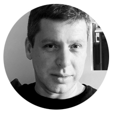
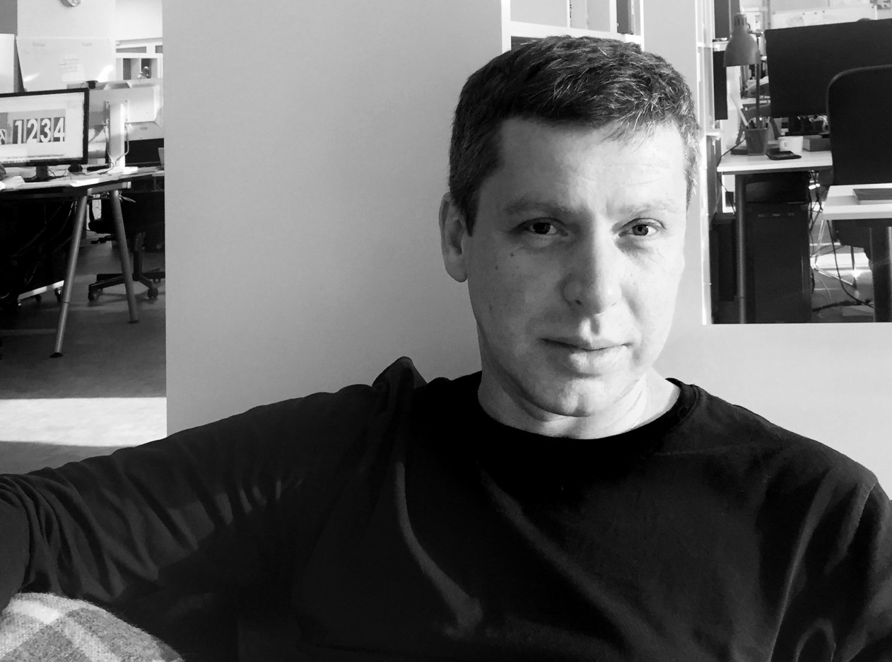
We met one of its co-founders, Stanislav Belykh, and interviewed him about the ratio of the standardized and the individual in modern housing construction, the urge of architecture to submit humans, and the necessary skill to see things through the eyes of the end consumer of your product.

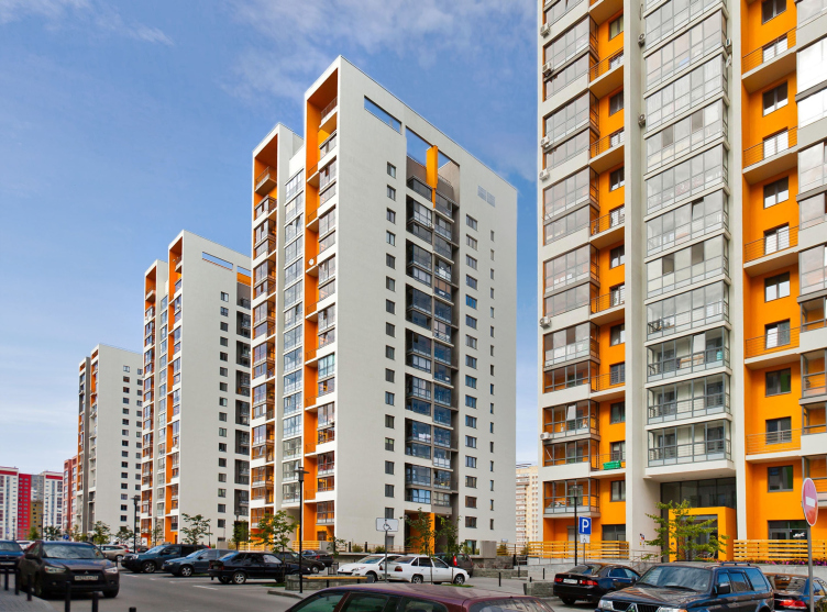
Buildings in the city of Tumen © OSA


Archi.ru:

– An inevitable question: why is your company called “OSA”? Is this connected in any way with the strong constructivist line in the architecture of Ekaterinburg?

Stanislav Belykh:

– I may surprise you but the name was the first thing that we came up with – we like it because it was so sharp, so resonant, and so stinging (“osa” is the Russian for “wasp”) – and it was only the next day that we remembered that back in the 1920’s there was the so-called “Obyedinenie Sovremennykh Arkhitektorov” (“Union of Modern Architects”) in this city. It was, of course, rather cheeky of us to just go ahead and borrow this acronym for our name, but our moral justification is that we wanted to follow in their footsteps and created the “Obyedinenie Samostoyatelnykh Arkhitektorov” (“Union of Independent Architects”), each of whom has the right to go their own way proving by his results that his way is the right way to go. Placing your bets on just one talent, even if it’s a great one, means subjecting the firm to a certain risk, and we wanted to create a strong and stable company. But, of course, all the members must share some common values – not stylistic, stylistic unity is not a rule – but at least some shape-making fundamentals.
zooming


Inside perspective © photograph by Maxim Loskutov


– And what does the structure of your bureau look like in this case? Is there any kind of inside hierarchy?

– Today we have 30 members in our company. The steady core consists of 5 partners. But it is already clear that about 5 or 6 employees are capable of going upwards once they accumulate the necessary knowledge and show their competence and skills. We don’t have a goal of creating and maintaining a caste of two, five or six chosen ones – it’s not about the numbers, it’s about the quality. You need a certain amount of time to go by for the person to “grow” into his profession and start using the design algorithms on the subconscious level – then he will become a part of the orchestra.

We started with designing small entrance groups, and now we design huge residential areas and large-scale housing projects virtually all over Russia. We deliberately try to stay away from going into some narrow specialization, and when we interview new people for the job we specifically stress that an architect must be a jack of all trades – only in this case he will be able to appreciate all the complexity and diversity of human life that he has to organize. At first this task seemed to us totally insurmountable but, at the example of the guys who came to work with our firm (we call them associate partners) we found that this task is quite achievable. After about five years of such active practice the architects can achieve the necessary level of versatility and successfully react to any challenges.

– Still, how close to you are the ideas of constructivism and functionalism? Do you see yourself as successors to a tradition?

– Only partially. You cannot call us “neo-constructivists” – we try to understand and feel different styles of architecture. What we try to borrow from our predecessors is the sense of purpose in our decision making and constant search for something new. When you work on something for a really long time you inevitably get tired and accumulate negative emotions, and it’s really important to keep up the positive attitude, not to lose this expectation of something new and beautiful with which we come into architecture when we’re young. The constructivists, by the way, were populists in the good sense of this word: they felt the social commission and they responded to it. In those maximalist years it was an easy thing to do. Today, when our society shows both the desire for law and order and at the same time appetite for destruction, search for something new and attention to tradition, this task is much more complex and much more interesting. We always try to intuitively find the style that our client needs. And, saying “client”, I don’t necessarily mean “developer” but the end buyer of the apartment or the end renter of the office. In many ways, we have to be actors – we have to imagine ourselves as a grandmother, a child, an elderly man, a young man who has just bought his first car, or a young family that has to pay off the mortgage. When you run all this through yourself, you start creating the environment seeing the world through the eyes of different social roles, and your chances for success are skyrocketing.

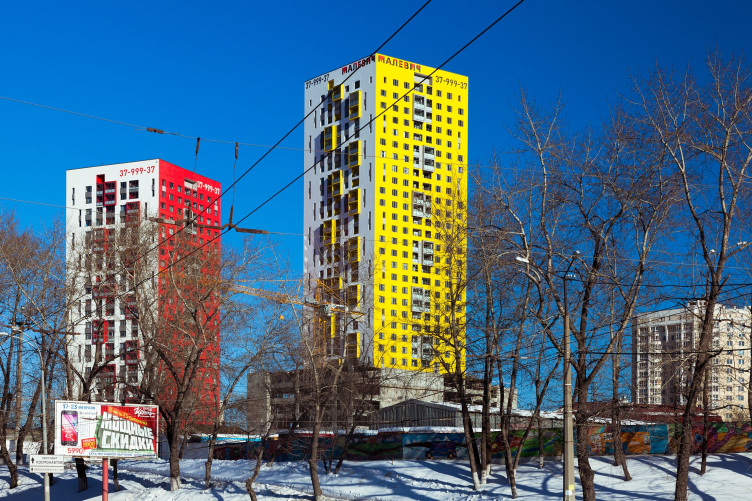
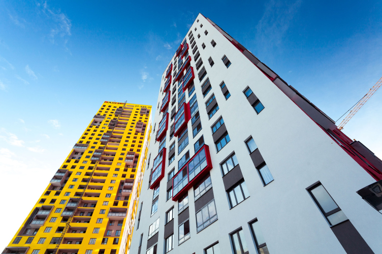
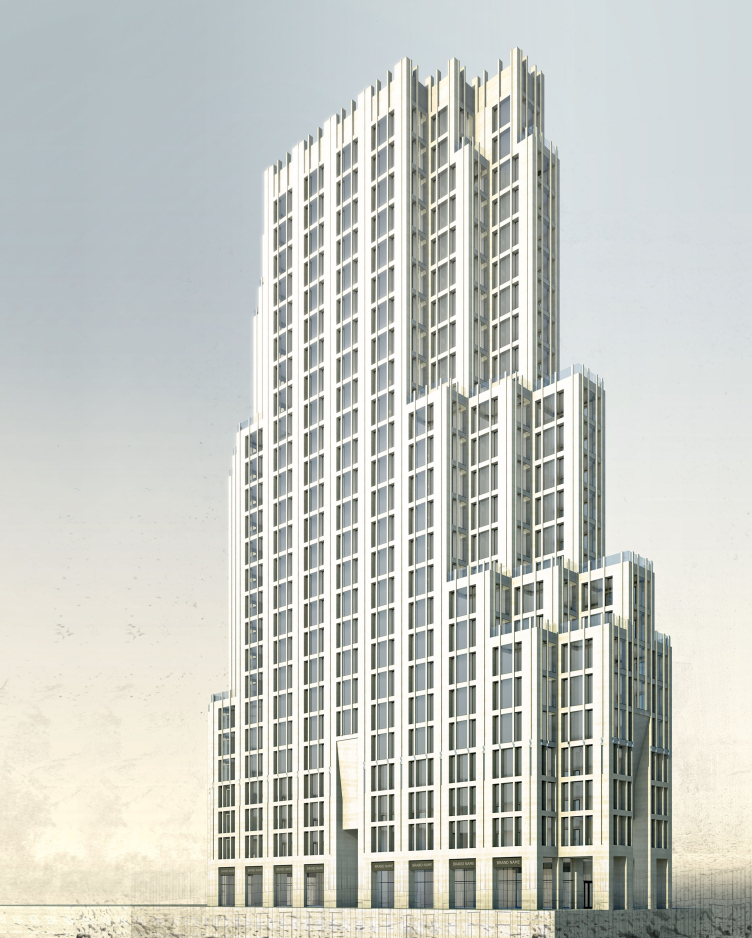
We do have conditionally “constructivist” projects, like “Malevich” housing complex where we took the modular idea to the level of aesthetic principle, totally stripping the architecture of any frills. This is a pretty scary thing to do for an architect. And there is also this apartment-hotel at Gorkogo, 79, and this housing project at Pervomaiskaya, 60, in our home city of Ekaterinburg, in which we resorted to quite a different pristine style and tried to feel how powerfully architecture can influence humans on every level. This is not, of course, the Stalin Empire style with its proverbial turrets but still a kind of architecture that makes humans unconditionally surrender to it. Today this style is not popular at all but it has some sort of historical integrity to it. Architecture possessed first power for thousands of years and it still didn’t lose it. Yes the ideas of constructivism and the social approach are more in trend today but we still wanted to remember that feeling and feel this limits of such influence. This is like an alternating shower if you like.

"Malevich" housing complex. OSA. Photograph © Maxim Loskutov


"Malevich" housing complex © OSA


Pervomaiskaya, 1 © OSA


Business-class apart-hotel "Everest" © OSA


– OK, and how important it is for you that identity of the city? To what extent are you a Ekaterinburg firm? 

– Of course, studying in a city with a rich cultural later and a strong school of the 1980’s helped us a lot. But today a significant part of our work is about analytics, accumulating information and analyzing the international expertise, and I do not want to say that we have “outgrown” this city, because this would be an ungrateful thing to say. It’s just that our interests have become broader; it’s interesting for us to have a taste of different cities, in Russia and abroad. We are already actively working in Tumen, there are projects for Novosibirsk, Sredneuralsk, Vologda, Perm, Moscow’s Odintsovo, but we are still hungry for more. Yes, this is a slightly consumerist approach: we love eating and we love the taste of new dishes.

– What can you generally say about the town planning situation in Ekaterinburg?

– The situation is difficult, as it’s difficult all over Russia. As sad as it may sound but we – and I am deliberately using “we” – so far cannot offer our society and our cities town planning, compositional and aesthetic solutions that we might be proud of. And as paradoxic as it may sound, this degradation was triggered by the ultimate freedom that the architects got. We as architects were told “go ahead and do as you please” and it turned out that we really had little to say.

– To what extent will the program of organizing the territories developed by “Strelka” together with Housing Mortgage Finance Agency for 40 Russian cities (in which, by the way, you are taking part) help to improve the situation?

– It surely can make a positive difference, in spite of the fact that Strelka’s very ideology – as rude as this may sound – is ultimately slightly offensive to Russia: it turns out that a huge 150-million country cannot create megalopolises that are capable of so much as developing and landscaping their own land. And it turns out that the 25 years of freedom failed to form people who are ready to make decisions and take responsibility for them. We all sit around and wait hoping that some Strelka will come along or some foreign experts will teach us what to do with our cities.

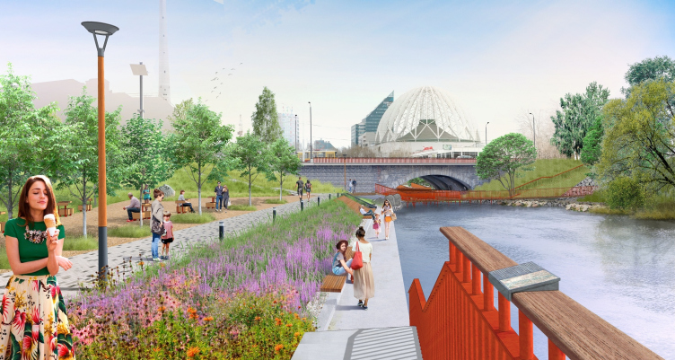
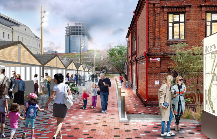
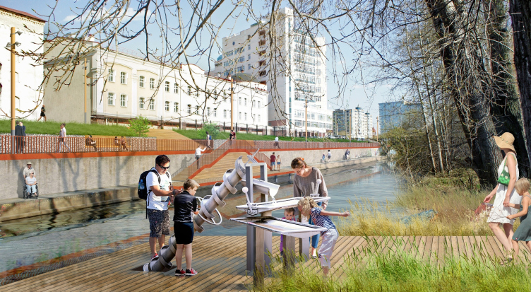
To do Strelka justice, I must say that it really makes an effort to get as much feedback as possible from the local people, let them have their say. For example, our project of the waterfront of the Iset River underwent significant changes based upon public discussion. Never mind the fact that all these comments and suggestions often sound unprofessional, are hard to implement and are contrary to the good of the majority. The important mechanism – that is a habitual thing in Europe and the rest of the world – is still having a hard time getting implemented here but it’s great that they’ve started listening to people, and, possibly, at the next stages they will be more active, and they will get across their ideas more effectively.

Project of organizing the waterfront of the Iset River from the Malysheva Street to Kuybysheva Street © Strelka+OSA


Project of organizing the waterfront of the Iset River from the Malysheva Street to Kuybysheva Street © Strelka+OSA


Project of organizing the waterfront of the Iset River from the Malysheva Street to Kuybysheva Street © Strelka+OSA


– The solutions that Strelka comes up with are basically the same for any geographical location. Is there a danger that the cities, and specifically Ekaterinburg, will lose its identity, even in spite of the fact that numerous local firms take part in developing the projects?

– I do not see any danger in implementing what you might call “Strelka aesthetics”, this is just the trend of the times. This project of organizingg waterfronts that we are taking part in, as a matter of fact, was discussed as early back as in the 1970’s. Already at that time there was a desire to build the city’s main green artery from the Verkhneisetsky to the Nizhneisetsky creeks. In the soviet time they tried to solve this problem by applying town-planning fundamentals, i.e. building classic embankments and surrounding houses, which was to take a long time and was expensive. And now it turned out that at the first stage it is enough to simply bring people here and provide them with comfortable recreation at the riverside – and this doesn’t incur any huge expenses. As for the prospect of losing the city’s identity, I don't think this is something to be afraid of because the local character is sure to show through anyway. Curiously, in the soviet time even the images of Lenin were slightly different from one republic to another under the influence of the local traditions, and Strelka’s projects will not lose the local character either, even in spite of the fact that all the architects will work along the same aesthetic lines. 

– Your desire to try your hand at different projects is quite understandable but still what typology is interesting to you most of all? 

– Most of all we like working with housing projects – not even with housing projects as such but with the human habitat, if you like. And if this doesn’t necessarily have to be architecture but any abstract meditation on where and how we as humans feel comfortable... At the end of the day it all comes down to the material implementation anyway but the philosophical rationale is still very important for us.

And today this theme has stepped into the foreground. For example we are really interested in the problem of standardization of housing – including the corporate type. Large developers are trying to understand how to structure their product better, how to make it more typological and ultimately more affordable. And from our side we have an opportunity to sit down with ourselves and just think – people of today, people that buy the housing – what are they like? How do we reconcile the requirements of tomorrow with the necessary standardization? By the way, this subject always comes up during the major cultural turnarounds. Slowly, step-by-step we are trying to convince the developers that we work with in the necessity of applying the city-block approach and in the necessity of developing a line of what we could call “housing cells”. The housing market is extremely conservative in Russia.

– And how exactly are you going to reconcile the standardization process and a very clear demand of the modern people for individuality?

– As a matter of fact there is no contradiction here. Talking to our clients we came to a slightly and expected conclusion: by “individuality” creative people mean the freedom of self-expression, but for most people, come right down to it, this word means “security” or minimum influence of the world outside of their lives. If you feel secure if your needs are met, you feel strong and you perceive yourself as an individual. This is what matters.

19 September 2017

Headlines now
The Golden Crown
The concept for a dental clinic in Yekaterinburg, developed by CNTR Studio, revolves around the idea of a “mouth full of gold”: pristine white porcelain stoneware walls are complemented by matte brass details. To avoid an overly literal interpretation, the architects focused on the building’s proportions, skillfully navigating between sunlight requirements and fire safety regulations.
Flexibility and Integration
Not long ago, we covered the project for the fourth phase of the ÁLIA residential complex, designed by APEX. Now, we’ve been shown different fence concepts they developed to enclose the complex’s private courtyards, incorporating a variety of public functions. We believe that the sheer fact that the complex’s architects were involved in such a detail as fencing speaks volumes.
A Step Forward
The HIDE residential complex represents a major milestone for ADM architects and their leaders Andrey Romanov and Ekaterina Kuznetsova in their quest for a fresh high-rise aesthetic – one that is flexible and layered, capable of bringing vibrancy to mass and silhouette while shaping form. Over recent years, this approach has become ADM’s “signature style”, with the golden HIDE tower playing a pivotal role in its evolution. Here, we delve into the project’s story, explore the details of the complex’s design, and uncover its core essence.
Gold in the Sands
A new office for a transcontinental company specializing in resource extraction and processing has opened in Dubai. Designed by T+T Architects, masters of creating spaces that are contemporary, diverse, flexible, and original, this project exemplifies their expertise. On the executive floor, a massive brass-clad partition dominates, while layered textures of compressed earth create a contextually resonant backdrop.
Layers and Levels of Flight
This project goes way back – Reserve Union won this architectural competition at the end of 2011, and the building was completed in 2018, so it’s practically “archival”. However, despite being relatively unknown, the building can hardly be considered “dated” and remains a prime example of architectural expression, particularly in the headquarters genre. And it’s especially fitting for an aviation company office. In some ways, it resembles the Aeroflot headquarters at Sheremetyevo but with its own unique identity, following the signature style of Vladimir Plotkin. In this article, we take an in-depth look at the United Aircraft Corporation (UAC) headquarters in the Moscow agglomeration town of Zhukovsky, supplemented by recent photographs from Alexey Naroditsky – a shoot that became only recently possible due to the fact that improvements were finally made in the surrounding area.
Light and Shadow
In this article, we delve into the architectural design of the “Chaika” house by DNK ag architects, which was recently completed in 2023 as part of the collection of signature designs at ZILArt. As is well-known, all the buildings in this complex follow a design code, yet each one is distinct. This particular building stands out not only for its whiteness and minimalism but also for the refined use of a limited number of techniques that, together, create what can confidently be called synergy.
Casus Novae
A master plan was developed for a large residential area with a name of “DNS City”, but now that its implementation began, the plan has been arbitrarily reformatted and replaced with something that, while similar on the surface, is actually quite different. This is not the first time such a thing happens, but it’s always frustrating. With permission from the author, we are sharing Maria Elkina’s post.
Treasure Hunting
The GAFA bureau, in collaboration with Tegola and Arkhitail, organized an expedition to the island of Kilpola in Karelia as part of Moskomarkhitektura’s “Open City” festival. There, amidst moss and rocks, the students sought answers to questions like: what is the sacred, where does it dwell, and what sustains it? Assisting the participants in this quest were landscape engineer Evgeny Levin, artist Nicholas Roerich, a moose, and the lack of cellular connection. Here’s how the story unfolded.
Depths of the Earth, Streams of Water
In the Malaya Okhta district, the Akzent building, designed by Stepan Liphart, was constructed. It follows a classic tripartite structure, yet it’s what you might call “hand-drawn”: each façade is unique in its form and details, some of which aren’t immediately noticeable. In this article, we explore the context and, together with the architect, delve into how the form was developed.
Fir Tree Dynamics
The “Airports of Region” holding is planning to build an airport in Karachay-Cherkessia, aiming to make the Arkhyz and Dombay resorts more accessible to travelers. The project that won in an invitation-only competition, submitted by Sergey Nikeshkin’s KPLN, blends natural imagery inspired by the shape of a conifer seed, open-air waiting spaces, majestic large trees, and a green roof elevated on needle-like columns. The result is both nature-inspired and WOW.
​A Brick Shell
In the process of designing a clubhouse situated among pine trees in a prestigious suburban area near Moscow, the architectural firm “A.Len” did the façade design part. The combination of different types of brick and masonry correlates with the volumetric and plastique solutions, further enhanced by the inclusion of wood-painted fragments and metal “glazing”.
Word Forms
ATRIUM architects love ambitious challenges, and for the firm’s thirtieth anniversary, they boldly play a game of words with an exhibition that dives deep into a self-created vocabulary. They immerse their projects – especially art installations – into this glossary, as if plunging into a current of their own. You feel as if you’re flowing through the veins of pure art, immersed in a universe of vertical cities, educational spaces – of which the architects are true masters – and the cultural codes of various locations. But what truly captivates is the bold statement that Vera Butko and Anton Nadtochy make, both through their work and this exhibition: architecture, above all, is art – the art of working with form and space.
Flexibility and Acuteness of Modernity
Luxurious, fluid, large “kokoshniks” and spiral barrel columns, as if made from colorful chewing gum: there seem to be no other mansion like this in Moscow, designed in the “Neo-Russian-Modern” style. And the “Teremok” on Malaya Kaluzhskaya, previously somewhat obscure, has “come alive with new colors” and gained visibility after its restoration for the office of the “architectural ecosystem” as the architects love to call themselves. It’s evident that Julius Borisov and the architects at UNK put their hearts into finding this new office and bringing it up to date. Let’s delve into the paradoxes of this mansion’s history and its plasticity. Spoiler: two versions of modernity meet here, both balancing on the razor’s edge of “what’s current”.
Yuri Vissarionov: “A modular house does not belong to the land”
It belongs to space, or to the air... It turns out that 3D printing is more effective when combined with a modular approach: the house is built in a workshop and then adapted to the site, including on uneven terrain. Yuri Vissarionov shares his latest experience in designing tourist complexes, both in central Russia and in the south. These include houseboats, homes printed from lightweight concrete using a 3D printer, and, of course, frame houses.
​Moscow’s First
“The quality of education largely depends on the quality of the educational environment”. This principle of the last decade has been realized by Sergey Skuratov in the project for the First Moscow Gymnasium on Rostovskaya Embankment in the Khamovniki district. The building seamlessly integrates into the complex urban landscape, responding both to the pedestrian flow of the city and the quiet alleyways. It skillfully takes advantage of the height differences and aligns with modern trends in educational space design. Let’s take a closer look.
Looking at the Water
The site of Villa Sonata stretches from the road to the water’s edge, offering its own shoreline, pier, and a picturesque river panorama. To reveal these sweeping views, Roman Leonidov “cut” the façade diagonally parallel to the river, thus getting two main axes for the house and, consequently, “two heads”. The internal core – two double-height spaces, a living room and a conservatory, with a “bridge” above them – makes the house both “transparent” and filled with light.
The White Wing
Well, it’s not exactly white. It’s more of a beige, white-stone structure that plays with the color of limestone – smoother surfaces are lighter, while rougher ones are darker. This wing unites various elements: it absorbs and interprets the surrounding themes. It responds to everything, yet maintains a cohesive expression – a challenging task! – while also incorporating recognizable features of its own, such as the dynamic cuts at the bottom, top, and middle.
Urban Dunes
The XSA Ramps team designed and built a three-part sports hub for a park in Rostov-on-Don, welcoming people of all ages and fitness levels. The skate plaza, pump track, and playground are all meticulously crafted with details that attract a diverse range of visitors. The technical execution of the shapes and slopes transforms this space into a kind of sculptural composition.
Proportional Growth
The project for the fourth phase of the ÁLIA residential area has been announced. The buildings are situated on an elongated plot – almost a “ray” that shoots out from the center of the area towards the river. Their layout reflects both a response to Moscow’s architectural preferences over the past 15 years, shifting “from blocks to towers”, and an interpretation of the neighboring business park designed by SOM. Additionally, the best apartments here are not located at the very top but closer to the middle, forming a glowing “waistline”.
The “Staircase” Building
In designing the “Details” residential complex in New Moscow, Rais Baishev spiced up the now-popular Moscow theme of a “courtyard” building with an idea drawn from the surrealist drawings by Maurits Escher. He envisioned the stepped silhouettes and descending slopes as a metaphysical mega-staircase, creating a key void within the courtyard that gave the project an internal “spine”. This concept is felt both in the building’s silhouette and on its façades.
Projection of the Quarter
No one doubted that the building that Vladimir Plotkin designed as part of the “Garden Quarters” would be the most modernist of all. And it turned out just that way: while adhering to the common design code, the building successfully combines brick and white stone, rhythmically responding to the neighboring building designed by Ostozhenka, yet tactfully and persistently making a few statements of its own. This includes the projection of the ideal urban development composition “14–9–6”, which can be found right next door, mathematical calculations, including those for various types of terraces (and perhaps the only reminder of the Soviet past of the Kauchuk rubber factory!), and the white “cross-stitch” pattern of the façade grid.
Domus Aurea
In this issue, we examine the “Tessinsky-1” house, designed by Sergey Skuratov and completed in 2023. Located in the middle of the Serebryanicheskaya Embankment district, at the intersection of its main streets, this house assumes a sort of “nodal” role: it not only responds to everything around it and preserves many memories of the former EMA factory within itself, but it weaves all this into a newly directed pattern, reconciling bright “gold” and dark-colored brick, largely with the help of the new, modern-yet-archaic Columba brick, which, come to think about it, is the most precious element here.
The Chimney of Nikola-Lenivets
In this issue, we are examining the “Obelisk House” designed by KATARSIS and built for the Arkhstoyanie 2023 festival. However, it was only finished later on, and this is why we are examining it now. It seems to us that after the “Obelisk House” appeared in Nikola-Lenivets, a dialogue and a few inner connections appeared between the temporary structures built here. These houses no longer look like “accidental neighbors”, more of which below.
​Periscope by the Bay
The jury awarded the second place in the competition for a public and cultural center in Petropavlovsk-Kamchatsky to the companies GORA (“Mountain”) and M4. In the consortium’s proposal, the building resembles a sperm whale with a calf swimming next to it or a periscope, whose lenses capture the most spectacular views from the surrounding landscape.
From Arcs to Dolmens
While working on the competition project for Petropavlovsk-Kamchatsky, ASADOV Architects prioritized the value of the natural and urban environment, aiming to preserve the balance of the location while minimizing the resemblance of the volume that they designed to a “traditional building”. The task was challenging, and the architects created three versions, one of which having been developed after the competition, where their main proposal took third place. However, the point of interest here is not the competition result but the continuity of creative thinking.
Hide and Seek
The ID Moskovskiy house, designed by Stepan Liphart in St. Petersburg, in the courtyards near Moskovskiy Avenue beyond the Obvodny Canal and recently completed, is notable for several reasons. Firstly, it has been realized with considerable accuracy, which is particularly significant as this is the first building where the architect was responsible not only for the facades but also for the layouts, allowing for better integration between the two. On the other hand, this building is interesting as an example of the “germination” of new architecture in the city: it draws on the best examples from the neighborhood and becomes an improved and developed sum of ideas found by the architect in the surrounding context.
The Big Twelve
Yesterday, the winners of the Moscow Mayor’s Architecture Award were announced and honored. Let’s take a look at what was awarded and, in some cases, even critique this esteemed award. After all, there is always room for improvement, right?
Above the Golden Horn
The residential complex “Philosophy” designed by T+T architects in Vladivostok, is one of the new projects in the “Golubinaya Pad” area, changing its development philosophy (pun intended) from single houses to a comprehensive approach. The buildings are organized along public streets, varying in height and format, with one house even executed in gallery typology, featuring a cantilever leaning on an art object.
Nuanced Alternative
How can you rhyme a square and space? Easily! But to do so, you need to rhyme everything you can possibly think of: weave everything together, like in a tensegrity structure, and find your own optics too. The new exhibition at GES-2 does just that, offering its visitor a new perspective on the history of art spanning 150 years, infused with the hope for endless multiplicity of worlds and art histories. Read on to see how this is achieved and how the exhibition design by Evgeny Ace contributes to it.
Blinds for Ice
An ice arena has been constructed in Domodedovo based on a project by Yuri Vissarionov Architects. To prevent the long façade, a technical requirement for winter sports facilities, from appearing monotonous, the architects proposed the use of suspended structures with multidirectional slats. This design protects the ice from direct sunlight while giving the wall texture and detail.