Keeping the identity
The cities keep on growing and encroaching on their suburbs. In those of them, where the real estate enjoys steady demand, active expansion is on the rise. Dozens of small, yet by no means trivial, towns with a history and a character of their own are absorbed by a wave of standard prefabricated commercial housing construction. These towns keep disappearing and turning into new residential areas, their once-resonant names becoming part of the brand names of new housing complexes – elite and standard ones alike.
For Studio 44, a company that is known for its formidable experience in working with historical heritage sites, as well as for approaching the tasks of introducing new buildings and reconstructing old ones with particular care and responsibility, the commission to develop a planning project of a large residential area at the entrance to the town of Pushkin gave the company an opportunity for demonstrating alternative approaches to commercial and residential construction on the territory of a city with a prominent architectural and town-planning character. The architects at once defined for themselves the main vector of their creative search – applying the characteristic features of the city for creating new construction that would harmoniously complement the existing buildings.
Residential area in Pushkin. Housing complex 4 © Studio 44
Birds-eye view of the land site. Residential area in Pushkin © Studio 44
Nikita Yavein phrased the original task in the following way: “To research the planning, housing and park structure that defines Tsarskoye Selo and its genesis. And then to use the results of this research to create modern architecture based on the architectural tradition of the city, in which it will appear. Not the artificial kind, but the kind of architecture that continues the city’s tradition, at the same time developing and transforming it with regard to the requirements of the modern world”.
Pushkin – Tsarskoye Selo
The town of Pushkin is a veritable treasure. It is one of those towns that, very much like a beautiful necklace, appeared around Saint Petersburg springing from the Czar’s palaces and park ensembles. So, it comes as no surprise that UNESCO put this town on its list of “Historic Center of Saint Petersburg and Related Groups of Monuments.” The city was founded in 1710, and until 1918 it bore the name of “Tsarskoye Selo” (“Czar’s Village”). Currently, the people of Saint Petersburg use both names, the former when they speak about its monuments and historical legacy, the latter when it is about today’s issues. The town’s main cultural heritage site is the “Tsarskoye Selo” museum, a monument of town-planning art, and a palace-and-park ensemble of the XVIII – XIX centuries. The museum complex includes the Ekaterininsky Park with the Bolshoi Ekaterininsky Palace (founded in 1717), the Aleksandrovsky Palace (1792–1796), a park bearing the same name, and other buildings as well.
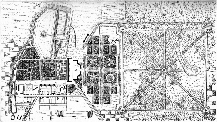
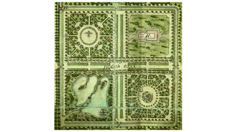
Tsarskoe Selo, the Ekaterininsky Park, plan of 1767-68 © Studio 44
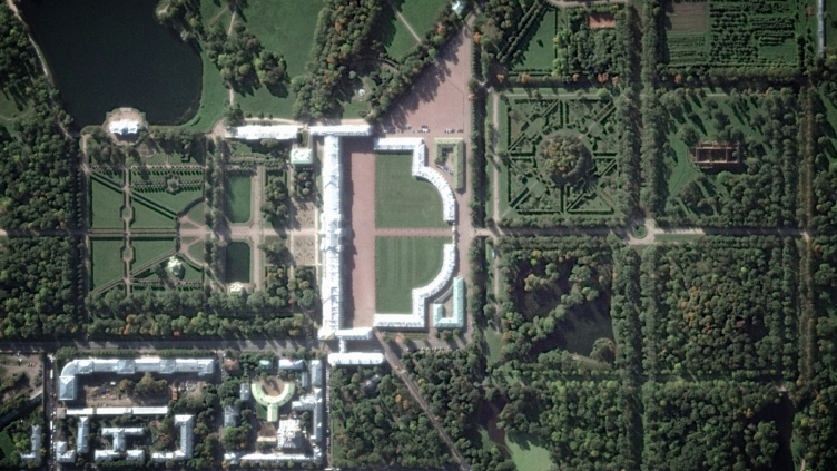
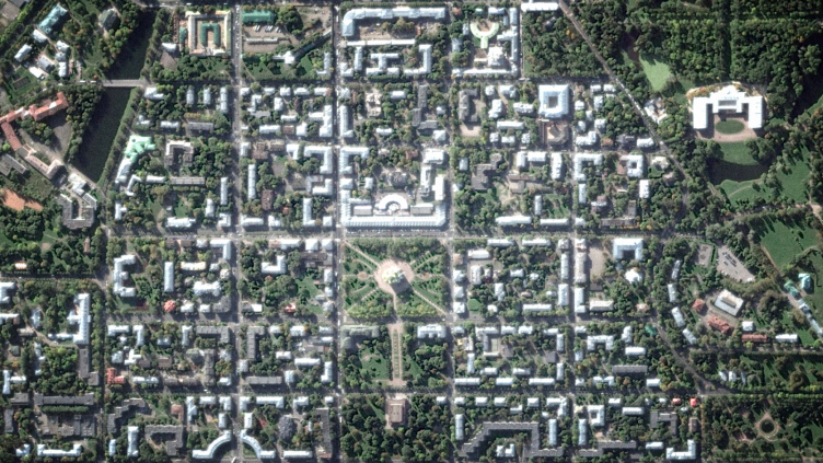
Fragment of the Ekaterininsky Park on satellite photography © Studio 44
Bosket and pavilion system
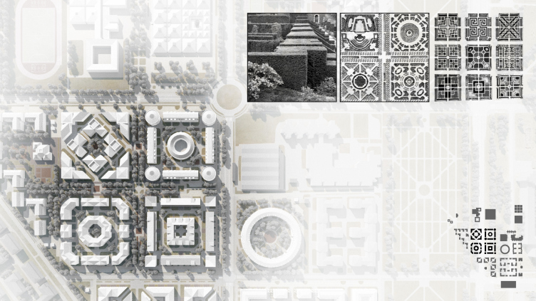
One of the features of the planning structure of Tsarskoye Selo is the fact that its residential part utilizes the same planning module as its park part: the center of the town is dissected into orthogonal blocks whose measurements (130–180 meters) repeat the large parterres, curtain walls, and boskets of the Ekaterininsky and Aleksandrovsky parks.
Fragment of the plan of the formal Ekaterininsky Park. Residential area in Pushkin © Studio 44
Housing construction in the center of Pushkin. Satellite photography © Studio 44
Studio 44 is quite familiar with the principles of regular planning and the opportunities that it presents in terms of being adapted to the tasks of today. Using the regular composition, the company designed and built, back in the 2000’s, the hotel complex “Novy Petergof”. In 2007, while they were doing the contest project of reconstructing the complex of “Apraksin Dvor” in Saint Petersburg (built back in its days on the former territory of a regular park), the architects carefully preserved and accentuated its linear structure. In addition, since 2010, Studio 44 has been doing the project of reconstructing and turning into a museum the Aleksandrovsky Palace in Pushkin.
Thus, it came as no surprise that with such formidable knowledge of the subject and a clear idea of the continuity of Tsarskoye Selo’s historical legacy and Pushkin’s new housing construction, Studio 44 chose, as the prototype and the source of inspiration for the planning project of the new residential area, the structure and the format of a formal park, with all its peculiarities and even architectural vagaries.
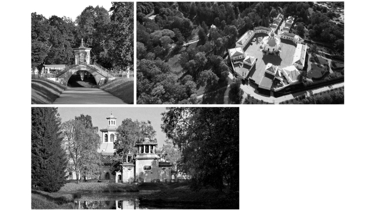
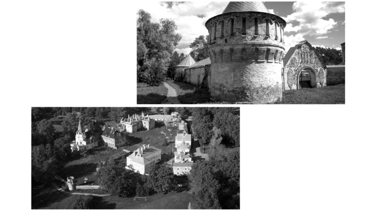
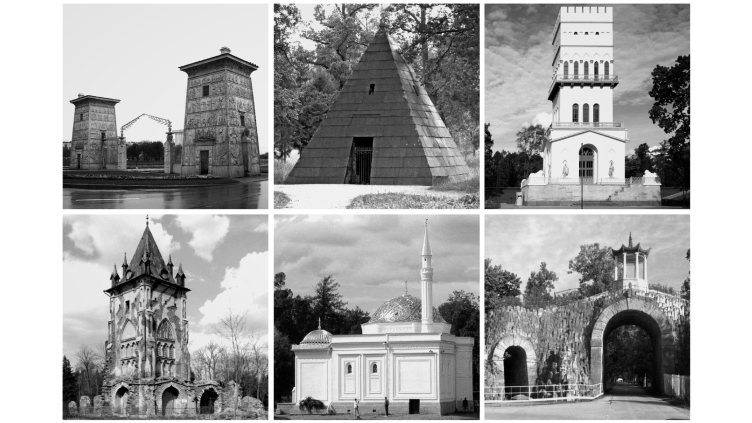
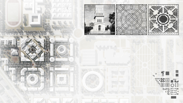
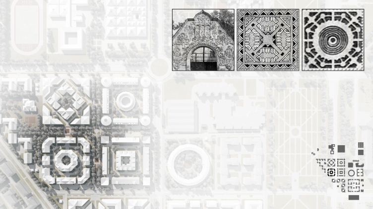
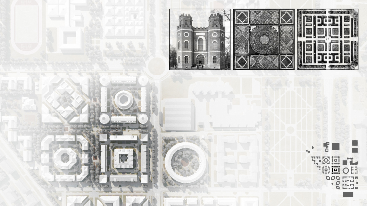
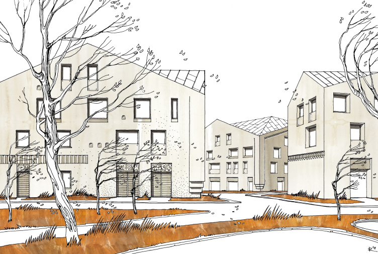
The latter are represented by the “style-ish” buildings that are characteristic of Pushkin – park pavilions and their clusters, stylized as exotic ones: Chinese, Egyptian, Turkish, neo-Gothic, a-la-Russ, and so on. The mistress of the Major Palace, Catherine the Great, would call this kind of architecture “educational” because it was meant not only to entertain the guests but also enlighten them in terms of culture and ethnography. In the Nikita Yavein project, this “educational” architecture was used as a source of form making for the new residential buildings. Of course, all of these sources were creatively revised in the recognizable manner of Studio 44.
Starting points of form-making. Ethnic "towns" and "villages" in Tsarskoe Selo © Studio 44
Residential area in Pushkin. Starting points of form-making. "Educational" architecture © Studio 44
Residential area in Pushkin. Starting points of form-making. "Educational" architecture © Studio 44
Regular diversity
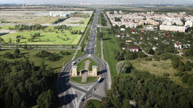
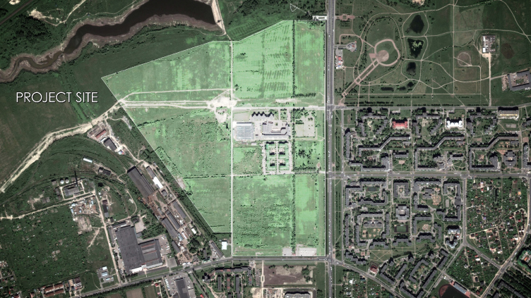
The territory allocated for the construction of the new residential area, more than 100 hectares, is situated at the entrance to the town of Pushkin. The trapeze-shaped land plot borders on the Peterburgskoe Highway in the east, the Kuzminskoe Highway in the south, and to the Kuzminka Creek in the north. Running alongside the riverbed, there is yet another land plot meant for the second stage of construction.
Satellite photography of the land site. Residential area in Pushkin © Studio 44
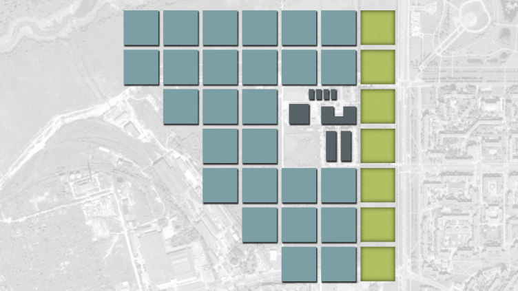
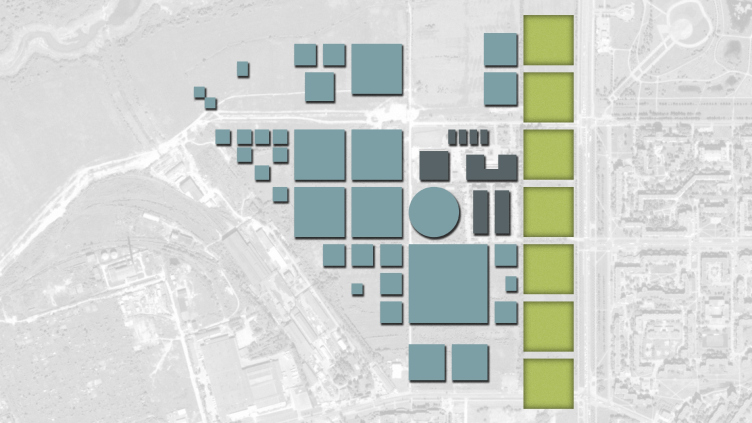
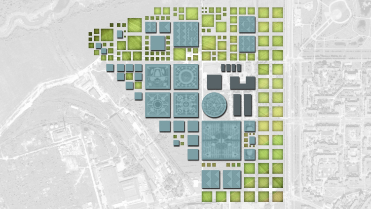
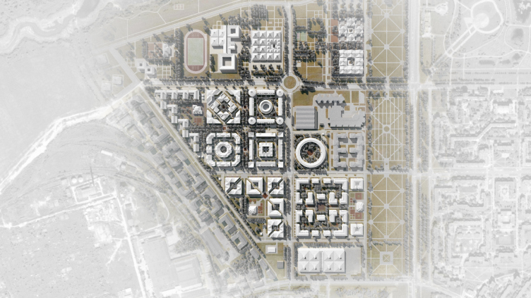
The plans of the first stage of construction have a clear-cut structure with a basic span of streets and driveways of 180x180 meters and a whole collection of variations based on this module, which carefully disguise their relationship with it.
Dissecting the plot into the basic squares. Residential area in Pushkin © Studio 44
Construction layout. Introduction of additional elements. Residential area in Pushkin © Studio 44
Construction layout. Residential area in Pushkin © Studio 44
Master plan. Introduction of additional elements. Residential area in Pushkin © Studio 44
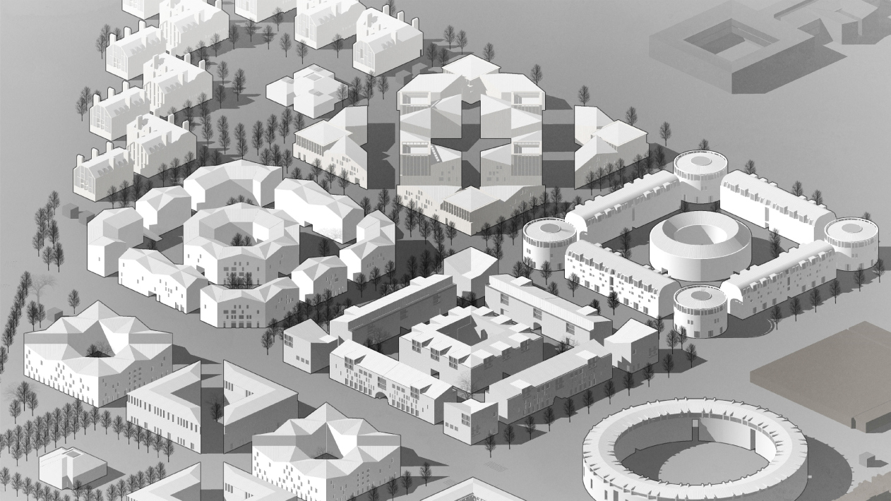
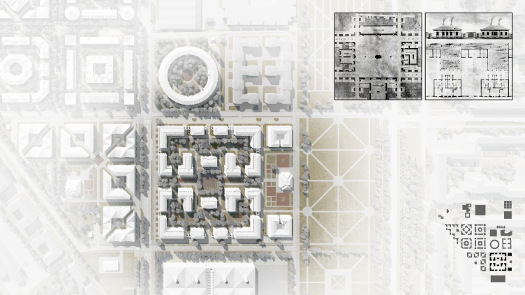
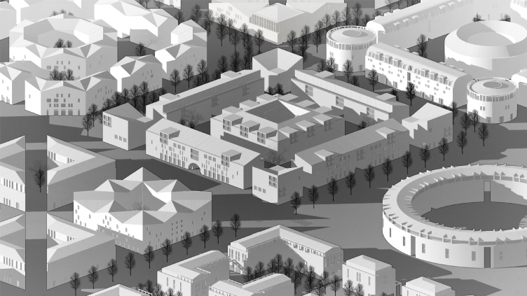
The center of the first stage is occupied by four city blocks. With a charming sincerity, these blocks take on the role of the buildings that pay homage to the parterre of the Aleksandrovsky Park. The fixed dimensions of the city blocks allow for placing yet another building in the middle of the block. This adds some difficulty to the task of the designer but at the same time this gives the composition a certain likeness to a landscape, in which curtain walls are turned into houses, while lawns and flowerbeds – into yards and playgrounds. According to Nikita Yavein, “from the multilayered pattern of the bosket, a housing structure is made. The scale, the character, and the very pattern of the new housing construction are so much at one with their context that, when one looks at the plan of this residential area superimposed on the aerial photos, it looks practically the same as the historical part of the city and its parks”.
Plan of the construction fragment with historical prototypes. Residential area in Pushkin © Studio 44
Residential area in Pushkin. Housing complex 4 © Studio 44
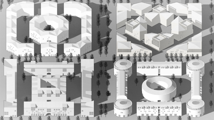
The principle of planning the central apartments is a single one – a perimeter with breaks plus a central block with a small inner yard. The easily read likeness to military fortifications is not accidental. This is a paraphrase of “poteshny” or “toy” fortresses or towns with round or square towers on the corners. For the sake of achieving a likeness to boskets, the architects indulged in the luxury of using the plans of the buildings with corners slashed at 45 degrees and diagonal sidefills of the yards – the beauty of the composition and the purity of the idea comes at a price.
These four “model” boskets are surrounded by their variations. In some instances, the module is reduced by half, forming a corner composition of four diagonally dissected houses, in some instances, it is the other way around – the module grows half again as big turning into a semblance of Kvarnegi’s ideal quarter, with a square in the middle, surrounded by a labyrinth of L and T-shaped buildings.
Plan of the construction fragment with historical prototypes. Residential area in Pushkin © Studio 44
Plan of the construction fragment with historical prototypes. Residential area in Pushkin © Studio 44
On the opposite side of the land site, along the slanted sure of the trapeze, there is a ledge-like row of English-style block-based cottages.
Plan of the construction fragment with historical prototypes. Residential area in Pushkin © Studio 44
Visualization of housing construction in Pushkin © Studio 44
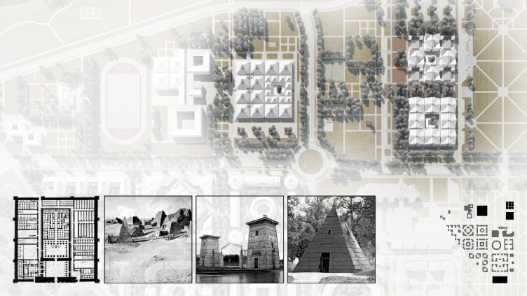
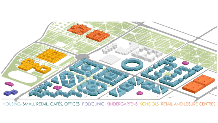
The square module is also applied to designing the public buildings; standing along the northern border of the area, there is a school, a few kindergartens, a medical center, a fitness center, and a cultural center; next to the south border, there is a marketplace.
Plan of the construction fragment with historical prototypes. Residential area in Pushkin © Studio 44
Visualization of housing construction in Pushkin © Studio 44
Their volumetric solution can be traced back to yet another decorative motif which was popular in the XVIII century – the Egyptian theme, which, of course, came in the form of the most obvious image of a pyramid. As coverage, the architects use roofs with four sloping surfaces and volumetric structures with most diverse pyramidal elements.
Plan of the construction fragment with historical prototypes. Residential area in Pushkin © Studio 44
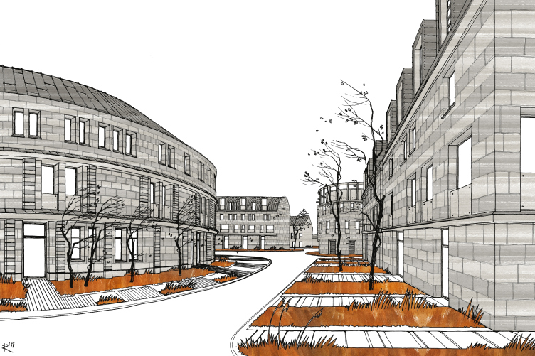
Next to the boskets, the architects have placed yet another unusual “arch object” – a multi section residential building that forms a ring. In this specific instance, prototypes are hard to trace. It could be the legendary “bottle” from Saint Petersburg’s “New Holland” or some amusement park figures. In any case, this would hardly be the Moscow’s famous “ring” houses built for the 1980 Olympics. Against the overall background of the master plan, this prominently “non-square” thing looks pretty provocative – as if the designers initially announced the rules of the game, and then broke them deliberately and with great pleasure – but only once. The main construction rules have been defined and they stay the same.
Axonometry of the construction fragment. Residential area in Pushkin © Studio 44
Norms and rules
The territory planning project makes clear provisions for the structure and main functional zones of the new residential area, layout of the driveways, locations, the measurements of the blocks, and their specific configuration, referring us back to the “amusement” and “educational” prototypes, as well as other parameters, which in the future will define the quality of the environment, and will be observed by the designers who will develop individual blocks. Under the standard construction density, the height of the buildings is strictly limited. The main bulk of the housing construction, which occupies 32% of the territory, is formed by four-story houses with elevators (plus a mansard floor) with pitched roofs. The height of the buildings is 18 meters.
Under the buildings and some of the yards, there is a single-level underground parking garage, which provides a sufficient number of car stalls that slightly exceeds the number of the apartments. The large ceiling height – about three meters – allows small trucks to drive in for unloading, thus freeing the yards from the unloading operations and the long presence of the truck transport.
Fragment of residential area in Pushkin © Studio 44
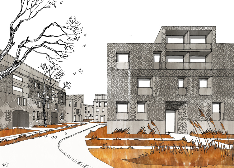
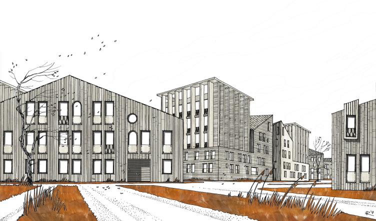
The architecture is only roughcast, which leaves the future designers a lot of space for creative work, both in terms of stylizations, and in the choice of decoration materials. Nikita Yavein comments on this point in the following way: “The image of each block is defined individually. The decoration can be based on most diverse materials, the important thing being that they correspond to the chosen style. We would like to see here a stone-white town in the Russian style, a red-brick English city block, a reserved northern Scandinavian / Saint Petersburg Art Nouveau, multicolored Mediterranean houses, and gray-and-white constructivism. In our planning project we set the general guidelines, the parameters, and the character of the construction, as well as a range of options for their realization. The specific architectural solutions will be defined by the designers of individual buildings and complexes which will constitute this residential area”.
Visualization of housing construction in Pushkin © Studio 44
Parks and recreation zones
In the north of the territory, along the bank of the Kuzminka River, and in the east, along the Peterburgskoe Highway, the architects placed green recreation zones. And, although their design significantly differs from one zone to another, demonstrating different landscaping traditions, they form a single recreational system with bicycle and walking trails, recreation areas, and sports fields. The river part is designed in a landscape style, or, rather, in its modern interpretation, which implies preserving the picturesque clusters of trees and lawns gradually bleeding into the beach zone. Along the highway, runs a grand esplanade two hundred meters wide, at the beginning of which, i.e. at the entrance to the town of Pushkin from the side of Saint Petersburg, there will be built a church. For the time being, the planning of this zone is done by the architects of Studio 44 in full accordance with the rules of a formal parterre park, with boskets and geometric tracing of the trails, like a paraphrase of the historical prototypes situated nearby. In the future, after this territory is transferred to the property of the municipality, the question of planning and decorating the park running along the highway will be considered by the city council.
Visualization of housing construction in Pushkin © Studio 44
“Light-minded” manifesto
Analyzing the project of planning the residential area in the town of Pushkin, one cannot rid of a feeling that this is an academic research or perhaps an experimental concept in the spirit of an “ideal town”. The geometry laid as the basis of the construction looks too correct and thought-out too well, and the houses installed in it are too fancy. One cannot help but feel some sort of architectural irony in all of this, which is inevitable when a modern master who is quite at home with historical samples, and at the same time has a recognizable professional lexicon of his own, creates a paraphrase project, or, if you will, stylization to the architectural monuments of the days past.
One cannot help wondering just how relevant and sustainable this system created by the architects is. What was good and relevant in the plans of formal parks in the XVIII century – will these techniques help answer the demands of the modern housing market?
In any other case answering these questions would have been difficult – but not with Studio 44. This team has a tremendous experience of working with historical legacy, filling the forms of the past with new energy and functions, and breathing new life into them.
When asked about the irony and idealism of this project, Nikita Yavein said: “Tsarskoye Selo is basically a getaway place. And I think that this place requires such slightly ironic and literary approach. It presents a whole range of solutions which we deliberately endowed with some fairy tale quality, and some “light-mindedness” in the best meaning of this word. The very local environment dictates the project solutions that take into account the history and the legends of this place. The whole planning project is full of such allusions and direct associations. And in this sense, the project of this residential area in the town of Pushkin can be perceived as our manifesto showing the ideology and methodology of our design. It in a pure unalloyed form, it shows the connection between the prototype, the source of inspiration and the original project that we created”.

