По-русски

​The Rzhevsky Gate

For the competition for the best design of the new station or the Third Interchange Contour, Blank Architects came up with three proposals. Two of them were shortlisted, and one, containing the concept of the “Rzhevskaya” metro station, took the first place. Here we are to take a look at the winning project.

Written by:
Lilya Aronova
Translated by:
Anton Mizonov

07 August 2017
Object
mainImg

“Rzhevskaya” metro station that got its name from the nearby railroad station, will soon open on the Rizhskaya Square, between the railway station and the “Rizhskaya” metro station, with which it will be connected by an underpass. This place is historical and symbolic in a certain sense: a long time ago, this place, also known as Krestovskaya Zastava, was one of Moscow’s city entrances. Now, instead of the Kamer-Kollezhsky Val, the square is traversed by the Third Transport Ring but the difference between its inner and outer sides is still clearly visible: on the one side, there is the old Moscow as we know it: Marina Roshcha, Sushchevsky Val, and Gilyarovskogo Street; on the other side, there are railroad tracks, industrial buildings, and the outbound highway of the Mira Avenue that eventually turns into the Yaroslavl Highway. Long gone are the red-brick water towers that stood here until the 1930’s, designed by the architect Maxim Geppner with an exquisite bridge between them, but even today the entrance to the “inner city” section of the Mira Avenue is framed by the towers of Stalin buildings on either side of the street. Thus, the “city gate” concept chosen by Blank Architects makes perfect sense both geographically and historically.

"Rzhevskaya" metro station © Blank Architects
zooming
"Rzhevskaya" metro station © Blank Architects


The material implementation of this concept took the form of one of the most ancient architectural archetypes, unique and perfect in its simplicity – an arch. Even The Arch: in reference to the project by Blank Architects, one indeed wants to write this word with a capital “A”. A welcoming symbol of entrance and invitation, this element is many times repeated in the interiors of the platforms and lobbies, gives a rhythmic feeling to the space and closes a lion’s share of the interior design. Its section view clearly shows that the architects chose for the arch a rather sophisticated curvilinear shape. “On the one hand, we wanted to make it tall and dramatic – explains one of the authors of the project, Tatyana Leontyeva – On the other hand, we had to make it all fit in with the existing construction elements: the height of the passage between the platforms cannot exceed 2.5 meters”. Because of this, the arches are turned to the platforms with their monumental portals – the higher one to the central, the lower one to the lateral platforms – and between them there is a smooth curve, the dramatic expressiveness of which the people can only appreciate from the outside where the same shape is encased in a glass box of the overland pavilion like a museum exhibit or a city sculpture which in fact it is.

"Rzhevskaya" metro station © Blank Architects


Designing things sixty meters underground, just like the very genre of transportation architecture, was something that Blank Architects handled for the first time. And this became a serious challenge and an interesting experience for them. “This is what we love competitions for – says the partner of the firm and one of the authors of the project Magda Kmita – They give you an opportunity to try your hand in entirely new architectural formats – we already designed hotels, schools, museums, and now we got our hands on a metro station”. The architects approached the task with all due seriousness – they read a lot of special literature, rode the Moscow metro and visited nearly its every station, and also did quite a bit of research on the world expertise. From the technology standpoint, the architects were able to master and come to grips with some things, some of the challenges – for example, the above-mentioned height restriction of the passage between the platforms – inspired unconventional solutions, and some were to remain bothersome limitations. For example, the authors of the project still lament the fact that, because of the operational complexities, they were unable to apply at least some minimal decoration to the walls and ceilings of the escalator groups, although in terms of a passenger’s average staying time this zone has a huge potential. As far as the general interior design is concerned, it was decided very early on to make it minimalist, without any unnecessary decorations. If we are to speak about some sources of inspiration in this case, Magda Kmita’s favorite station of Moscow metro is Kropotkinskaya – with its monumental “ancient Egypt” colonnade, while Tatyana Leontyeva add “Sokol” and “Airport” to her hit parade. “What these stations have in common is very simple design without any excessive and unnecessary decorative techniques but with a repetition and amplification of one single architectural element, beautifully backlit and setting the rhythm – she explains – And this was the effect that we looked to achieve in our project”.

zooming
"Rzhevskaya" metro station © Blank Architects


The main theme of the project is echoed by the intertwined motif of a travel that was inspired by the railway station standing on the square. As for the walls standing along the tracks, the architects plan to paint them with landscapes, but of a somewhat blurred quality – the way that they look from a window of a speeding train car. The traveling theme is supported by the lines on the lobby floors, reminding one of railroad tracks and also serving as a navigation instrument. A convenient navigation system is something that the Moscow metro still lacks – claim the authors of “Rzhevskaya”. In their project, they paid special attention to this issue, alongside the conventional things – such as LED screens, signs, and info points – a large role being given to intuitive navigation. For this reason, for example, the exits from the main platform are designed differently. The western one, through which one exits into the city, meaning, towards the railway station, is marked by a large wall-size interactive multimedia screen that shows the train schedule. As for the opposite exit, it all shines a yellow light – this is a transfer to the “Rizhskaya” metro station with its “amber” pylons (in addition, “Rizhskaya” is situated on the “orange” line of the Moscow metro).

zooming
"Rzhevskaya" metro station © Blank Architects


With all the program laconism of the decor, special role is given to the lighting design, including the functional aspect. Again, the architects place their bet on a person’s intuitive reactions: for example, the authors of the project propose to vary the intensity of light in the arches as the train enters the station. Thanks to this, a person, while still on the escalator, will understand that he had better hurry up – the way that we have already learn to get our bearings from the swelling sound of the oncoming train, only now it will be more reliable because it will be clear from which direction the train is approaching. And as for the passengers moving up the escalator, they will gradually find themselves in an ever-lighter environment: this technique will mark that we are moving outdoors, towards the light. In the underground lobbies, the direction of the passenger flows will be prompted by the turning angle of the arches, through which the passengers exit the station, in respect to the direction of movement of those who enter: thanks to this, the flows will be clearly separated.

"Rzhevskaya" metro station. Axonometric drawing © Blank Architects


Having a broad experience of designing shopping centers, Blank Architects know how to attract people to their projects and arouse their interest in order to make them stay longer. Of course, a metro station has a different purpose, not to say a diametrically opposite one – here what you need to do is optimize the traffic as much as you can. Nevertheless, the authors of the project did everything to make the few minutes that a person is going to spend at the “Rzhevskaya” metro station not only comfortable but emotionally satisfying. Examining the blurred landscapes behind the “arch” windows, tracing the junctions of the railroad lines on the floor, and following the change of the digits on the media screen, even the ever-busy morning passenger will be able to get distracted from his worries for a little while. According to Magda Kmita, it was important for the architect to create an environment where even a person that uses this station every day could always discover something new do that his metro ride would become a little trip for him.

zooming
"Rzhevskaya" metro station © Blank Architects


"Rzhevskaya" metro station © Blank Architects


The basis of the color set of the station is the exquisite combination of gray marble of the walls and stainless steel adorning the arches, with the warm shade of “rose ash” in the granite covering of the floor. According to the specifications, the decoration materials were to be of Russian origin. Initially, this presented a minor challenge but eventually the architects were able to use this condition to their advantage – they got acquainted with new companies and studied new possibilities of the stone in order to ultimately choose the sturdy and vandal-proof materials that are an absolute must in the conditions of the busy traffic of the metro station.

zooming
"Rzhevskaya" metro station © Blank Architects


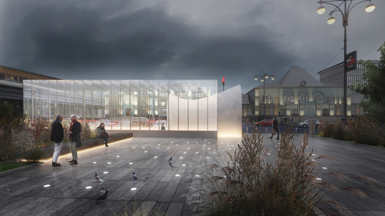
The overland pavilion of the station which is situated on the territory of a small park squeezed between two automobile roads is inscribed in a small rectangle three by six meters. “We decided to make the walls completely transparent – explains Magda Kmita – We have so much different architecture around – the Rizhsky railway station, the rotunda of the “Rizhskaya” metro station, and the Stalin buildings on the Mira Avenue – hat we decided not to add another landmark. This is why we sort of “dissolved” the pavilion in space, only highlighting our arch”. The authors of the project would want to make the little park, currently all but unused, busier – in their project they propose a landscaping plan that provides for new benches, street lights, and greenery added along the park’s perimeter. Although it must be said that neither the technical specifications nor the budget of the future station provide for any improvement of the adjacent territory but Blank Architects always try to see the project as a whole, not limiting themselves to the dry specifications.
 
***

Recently it was announced that the project of “Rzhevskaya” metro station by Blank Architects, just as the project proposal for “Sheremetyevskaya”, made the shortlist or World Architecture Festival 2017 (for readers of Russian). We are still waiting for the results but what is more important is the fact that the implementation of the project is actually coming soon: if everything goes to plan, the first trains will pass through the “Rzhevskaya” metro station as early as in the beginning of 2020.

07 August 2017

Written by:

Lilya Aronova
Translated by:
Anton Mizonov
Headlines now
The Chinese Symphony
The construction of the Chinese center “Huaming Park” has been a long story that came to fruition relatively recently. The building is adjacent to a traditional Chinese garden, but it is very modern, laconic and technological, and the simple-in-form, yet spectacular, white lamellae promise to someday be incorporated as a media facade. This complex is also truly multifunctional: it contains different types of living spaces, offices, a large fitness center, conference halls and restaurants – all wrapped in one volume. You can comfortably hold international forums in it, having everything you may possibly need at your fingertips, and going outside only to take a walk. In this article, we are examining this complex in detail.
Ensemble of Individualities
Construction of the first phase of the INDY Towers multifunctional complex on Kuusinen Street, designed by Ostozhenka, has started. The project opens new angles of similarity between the column and the skyscraper, and we examine the nuances and parallels.
Black and Red
Kazakov Grand Loft received its name for a reason: responding to the client’s brief and proceeding from the historical industrial architecture of its immediate surroundings, Valery Kanyashin and Ostozhenka architects proposed a new version of a modern house designed in the fashionable “loft” style. What makes this building different is the fact that the bricks here are dark gray, and the facades of the romantic “fortress” towers blossom with magnificent glazing of the windows in the upper part. The main highlight of the complex, however, is the multiple open air terraces situated on different levels.
Icy Hospitality
Mezonproject has won the national architectural and town planning competition for designing a hotel and a water recreation center in the city of Irkutsk. The architects chose hummocks of Baikal ice as a visual image.
The Mastery of Counterpoint
In the sculpture of Classical Greece, counterpoint was first invented: the ability to position the human body as if it were about to take a step, imbuing it with a hint of the energy of future movement, and with hidden dynamics. For architecture, especially in the 20th century and now, this is also one of the main techniques, and the ATRIUM architects implement it diligently, consistently – and always slightly differently. The new residential complex “Richard” is a good example of such exploration, based on the understanding of contrasts in the urban environment, which was fused into the semblance of a living being.
Countryside Avant-Garde
The project of the museum of Aleksey Gastev, the ideologist of scientific organization of work, located in his hometown of Suzdal, is inscribed in multiple contexts: the contest of a small town, the context of avant-garde design, the context of “lean production”, and the context of the creative quest of Nikolai Lyzlov’s minimalist architecture – and it seems to us that this project even reveals a distant memory of the fact that Aleksey Gastev learned his craft in France.
On the Hills
In the project by Studio 44, the “distributed” IT campus of Nizhny Novgorod is based on well-balanced contracts. Sometimes it is hovering, sometimes undulating, sometimes towering over a rock. For every task, the architects found appropriate form and logic: the hotels are based on a square module, the academic buildings are based on a “flying” one, and so on. Modernist prototypes, specifically, Convent Sainte-Marie de La Tourette, stand next to references to the antique Forum and the tower of a medieval university – as well as next to contextual allusions that help inscribe the buildings of the future campus into the landscape of the city hills with their dominants, high slopes, breathtaking river views, the historical city center, and the Nizhny Novgorod University.
The Magic Carpet
The anniversary exhibition of Totan Kuzembaev’s drawings named “Event Horizons” shows both very old drawings made by the architect in the formative 1980’s, and now extracted from the Museum of Architecture, as well as quite a few pictures from the “Weightlessness” series that Totan Kuzembaev drew specifically for this exhibition in 2023. It seemed to us that the architect represented reality from the point of view of someone levitating in space, and sometimes even upside down, like a magic carpet with multiple layers.
​A Copper Step
Block 5, designed by ASADOV architects as part of the “Ostrov” (“Island”) housing complex, is at the same time grand-scale, conspicuous thanks to its central location – and contextual. It does not “outshout” the solutions used in the neighboring buildings, but rather gives a very balanced implementation of the design code: combining brick and metal in light and dark shades and large copper surfaces, orthogonal geometry on the outside and flexible lines in the courtyard.
The Light for the Island
For the first time around, we are examining a lighting project designed for a housing complex; but then again, the authors of the nighttime lighting of the Ostrov housing complex, UNK lighting, proudly admit that this project is not just the largest in their portfolio, but also the largest in this country. They describe their approach as a European one, its chief principles being smoothness of transitions, comfort to the eye, and the concentration of most of the light at the “bottom” level – meaning, it “works” first of all for pedestrians.
Spots of Light
A new housing complex in Tyumen designed by Aukett Swanke is a very eye-pleasing example of mid-rise construction: using simple means of architectural expression, such as stucco, pitched roofs, and height changes, the architects achieve a “human-friendly” environment, which becomes a significant addition to the nearby park and forest.
Ledges and Swirls
The housing complex “Novaya Zarya” (“New Dawn”) designed by ASADOV Architects will become one of the examples of integrated land development in Vladivostok. The residential area will be characterized by various typologies of its housing sections, and a multitude of functions – in addition to the social infrastructure, the complex will include pedestrian promenades, shopping malls, office buildings, and recreational facilities. The complex is “inscribed” in a relief with a whopping 40-meter height difference, and overlooks the Amur Bay.
Agglomeration on an Island
Recently, an approval came for the master plan of the Yuzhno-Sakhalinsk agglomeration, which was developed by a consortium headed by the Genplan Institute of Moscow. The document provides for the creation of 12 clusters, the totality of which will give the region a qualitative leap in development and make the island more self-sufficient, more accessible, and less dependent on the mainland. We are inviting you to examine the details.
Ivan Grekov: “A client that wants to make a building that is “about architecture” is...
In this article, we are talking to Ivan Grekov, the leader of the architectural company KAMEN (translates as “stone”), the author of many high-profile projects that have been built in Moscow in the recent years, about the history of his company, about different approaches to form making, about different meanings of volume and facade, and about “layers” in working with the environment – at the example of two projects by Osnova Group. These are the MIRAPOLIS complex on the Mira Avenue in Rostokino, whose construction began at the end of last year, and the multifunctional complex in the 2nd Silikatny Proezd on the Zvenigorodsky Highway; recently, it received all the required approvals.
Grasping and Formulating
The special project “Tezisy” (“Abstracts”), showcased at Arch Moscow exhibition in Moscow’s Gostiny Dvor, brought together eight young “rock stars of architecture”, the headliner being Vladislav Kirpichev, founder of the EDAS school. In this article, we share our impressions of the installations and the perspectives of the new generation of architects.
The White Tulip
Currently, there are two relevant projects for the Great Cathedral Mosque in Kazan, which was transferred to a land site in Admiralteiskaya Sloboda in February. One of them, designed by TsLP, was recently showcased at Arch Moscow. In this article, we are covering another project, which was proposed during the same period for the same land site. Its author is Aleksey Ginzburg, the winner of the 2022 competition, but now the project is completely different. Today, it is a sculptural “flower” dome symbolizing a white tulip.
ATRIUM’s Metaverse
The architectural company ATRIUM opened a gallery of its own in a metaverse. Inside, one can examine the company’s approach and main achievements, as well as get some emotional experience. The gallery is already hosting cyberspace business meetings and corporate events.
​From Darkness to Light
Responding to a lengthy list of limitations and a lengthy – by the standards of a small building – list of functions, Vladimir Plotkin turned the project of the Novodevichy Monastery into a light, yet dynamic statement of modern interpretation of historical context, or, perhaps, even interpretation of light and darkness.
Modernism in Avant-Garde
The contest proposal that Studio 44 made for the Krasnoyarsk Opera and Ballet Theater is bright in all senses, and in many ways even provocative – just like a modern theater performance should be. Being in context with modern culture, it even shocks you in some respects. At first, you are amazed at the red color that is present all around, and then you gradually make sense of the picturesque congregation of volumes that share a multitude of functions. And it’s only later that you realize that this conglomerate conceals a modernist building, most of which the architects save intact.
The Black Mountain
The project of reconstructing the Krasnoyarsk Opera and Ballet theater developed by Wowhaus, which won the competition, proposed a total demolition and new construction, as well as considerable expansion (up to 8 floors) – and transformable multifunctional spaces. The new project, however, does retain the recognizable elements and the image of the old theater. As for the main spectator hall, it is turned – figuratively speaking, of course – into a semblance of a black volcano.
Garage-Garage
Recently, Moscow saw the presentation of a project by Yuri Grigoryan, devoted to turning the truck garage on Novoryazanskaya Street, designed by Konstantin Melnikov, into the Museum of Moscow Transport. The project involves restoring the monument of architecture, adding a new underground floor and a new entrance, as well as a whole park. The implementation is already underway.
Houses by the Lakeside
Approvals came for the project of a housing complex that DNK ag designed in Kazan. The complex is low-rise; its sections are designed as separate volumes united by a common podium. Everything is very much like DNK: delicate and sometimes even lyrical, especially where the yard meets the lakeshore.
Exemplary Adaptation
In Novosibirsk, the construction of a school has been completed, whose project is standing every chance to set a new standard for the nation’s educational institutions. SVESMI Architects and Brusnika company started by developing the brief that would answer the modern teaching practices, and then they proposed the optimum plan, versatile classrooms, and reserved, yet expressive, image in the spirit of this Amsterdam alliance.
Terra Incognita
An 800-room hotel complex, designed by Ginzburg Architects, offers the seaside city of Anapa a fragment of well-organized urban environment that keeps up the cultural spirit of the place. The architects break away from traditional white facades, turning to the antique and even archaic periods of the history of this land, and drawing inspiration in the color of red clay and simple, yet lightweight, shapes.
In Plumage Colors
Working on the facades of a mid-rise residential area in Odintsovsky district, GENPRO architects “adjusted” a number of features of the volumetric composition, which they received without the right to make any changes to, by purely “decorative” means, such as ornamental brickwork, including glazed bricks and the rhythm of the windows. Interestingly, the starting point in the search for the color code was the plumage of birds that are found in the Moscow region.
Julius Borisov: “The “Island” housing complex is a unique project – we took it on with...
One of the largest housing projects of today’s Moscow – the “Ostrov” (“Island”) housing complex built by Donstroy – is now being actively built in the Mnevniky Floodplain. They are planning to build about 1.5M square meters of housing on an area of almost 40 hectares. We are beginning to examine this project– first of all, we are talking to Julius Borisov, the head of the architectural company UNK, which works with most of the residential blocks in this grand-scale project, as well as with the landscaping part; the company even proposed a single design code for the entire territory.
A Balanced Solution
The residential complex “Balance” on Moscow’s Ryazansky Prospekt is one of the large-scale, and relatively economical (again, by Moscow standards) housing projects. Its first phase has already been built and landscaped; the work on the others is in progress. Nevertheless, it has an integral internal logic, which is based on the balance of functions, height, and even image and space composition. The proposed solutions are recognizable and laconic, so that each of them was reduced by the authors to a graphic “logo”. To see everything, you have to flip through the pages and look through to the end.
Horror Vacui
In the city of Omsk, ASADOV architects took on a very challenging task: they are developing a concept of a public and residential complex, which involves reconstructing the city’s first thermal power station standing right next to Omsk’s first fortress. This territory has already seen a lot of projects designed for it, and the residential function of this land site has been the subject of heated debate. In this article, we are examining the project in question, aimed at developing a mid-scale city fabric suited for the historical center. We also examine the above-mentioned debate. Seriously, will this project save this place or will it bring it to ruin?
A Multi-Faced Grotto
This building, seemingly small, unremarkable, semi-ruined, and not even very ancient – the Grotto in the Bauman Garden – was restored by the “People’s Architect” architectural company with all the care applicable to a heritage monument. They preserved the romantic appeal of the ruins, added multimedia content, and explored the cascading fountain, which, as it turned out, was completely preserved. Brace yourself for a long story!