По-русски

​The Rzhevsky Gate

For the competition for the best design of the new station or the Third Interchange Contour, Blank Architects came up with three proposals. Two of them were shortlisted, and one, containing the concept of the “Rzhevskaya” metro station, took the first place. Here we are to take a look at the winning project.

07 August 2017
Object
mainImg

“Rzhevskaya” metro station that got its name from the nearby railroad station, will soon open on the Rizhskaya Square, between the railway station and the “Rizhskaya” metro station, with which it will be connected by an underpass. This place is historical and symbolic in a certain sense: a long time ago, this place, also known as Krestovskaya Zastava, was one of Moscow’s city entrances. Now, instead of the Kamer-Kollezhsky Val, the square is traversed by the Third Transport Ring but the difference between its inner and outer sides is still clearly visible: on the one side, there is the old Moscow as we know it: Marina Roshcha, Sushchevsky Val, and Gilyarovskogo Street; on the other side, there are railroad tracks, industrial buildings, and the outbound highway of the Mira Avenue that eventually turns into the Yaroslavl Highway. Long gone are the red-brick water towers that stood here until the 1930’s, designed by the architect Maxim Geppner with an exquisite bridge between them, but even today the entrance to the “inner city” section of the Mira Avenue is framed by the towers of Stalin buildings on either side of the street. Thus, the “city gate” concept chosen by Blank Architects makes perfect sense both geographically and historically.

"Rzhevskaya" metro station © Blank Architects
zooming
"Rzhevskaya" metro station © Blank Architects


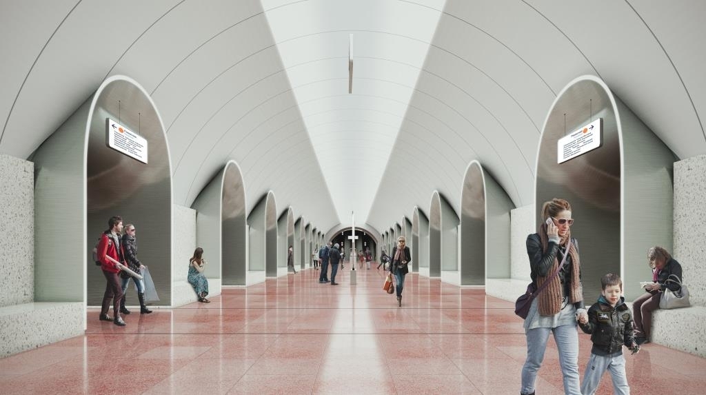
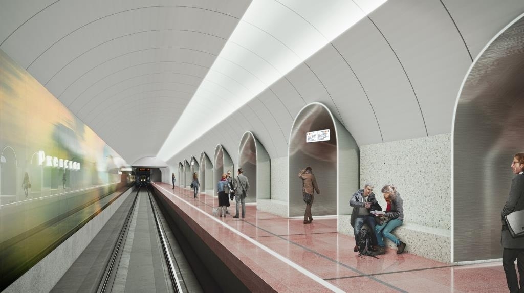
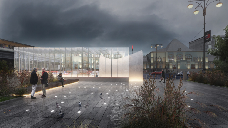
The material implementation of this concept took the form of one of the most ancient architectural archetypes, unique and perfect in its simplicity – an arch. Even The Arch: in reference to the project by Blank Architects, one indeed wants to write this word with a capital “A”. A welcoming symbol of entrance and invitation, this element is many times repeated in the interiors of the platforms and lobbies, gives a rhythmic feeling to the space and closes a lion’s share of the interior design. Its section view clearly shows that the architects chose for the arch a rather sophisticated curvilinear shape. “On the one hand, we wanted to make it tall and dramatic – explains one of the authors of the project, Tatyana Leontyeva – On the other hand, we had to make it all fit in with the existing construction elements: the height of the passage between the platforms cannot exceed 2.5 meters”. Because of this, the arches are turned to the platforms with their monumental portals – the higher one to the central, the lower one to the lateral platforms – and between them there is a smooth curve, the dramatic expressiveness of which the people can only appreciate from the outside where the same shape is encased in a glass box of the overland pavilion like a museum exhibit or a city sculpture which in fact it is.

"Rzhevskaya" metro station © Blank Architects


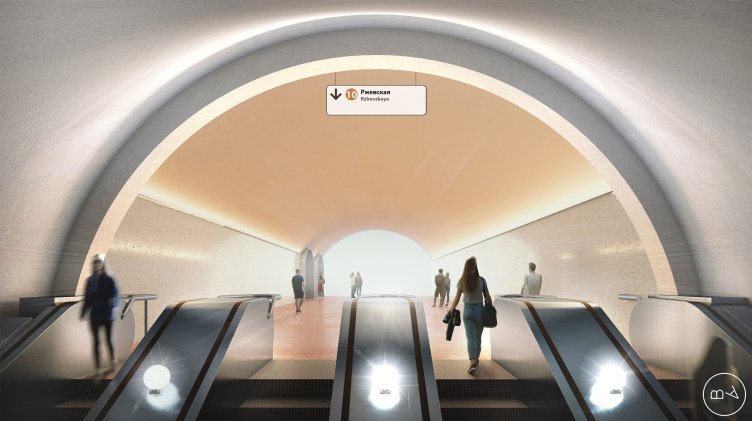
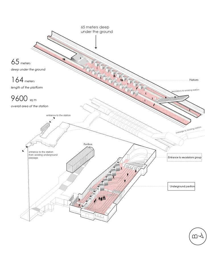
Designing things sixty meters underground, just like the very genre of transportation architecture, was something that Blank Architects handled for the first time. And this became a serious challenge and an interesting experience for them. “This is what we love competitions for – says the partner of the firm and one of the authors of the project Magda Kmita – They give you an opportunity to try your hand in entirely new architectural formats – we already designed hotels, schools, museums, and now we got our hands on a metro station”. The architects approached the task with all due seriousness – they read a lot of special literature, rode the Moscow metro and visited nearly its every station, and also did quite a bit of research on the world expertise. From the technology standpoint, the architects were able to master and come to grips with some things, some of the challenges – for example, the above-mentioned height restriction of the passage between the platforms – inspired unconventional solutions, and some were to remain bothersome limitations. For example, the authors of the project still lament the fact that, because of the operational complexities, they were unable to apply at least some minimal decoration to the walls and ceilings of the escalator groups, although in terms of a passenger’s average staying time this zone has a huge potential. As far as the general interior design is concerned, it was decided very early on to make it minimalist, without any unnecessary decorations. If we are to speak about some sources of inspiration in this case, Magda Kmita’s favorite station of Moscow metro is Kropotkinskaya – with its monumental “ancient Egypt” colonnade, while Tatyana Leontyeva add “Sokol” and “Airport” to her hit parade. “What these stations have in common is very simple design without any excessive and unnecessary decorative techniques but with a repetition and amplification of one single architectural element, beautifully backlit and setting the rhythm – she explains – And this was the effect that we looked to achieve in our project”.

zooming
"Rzhevskaya" metro station © Blank Architects


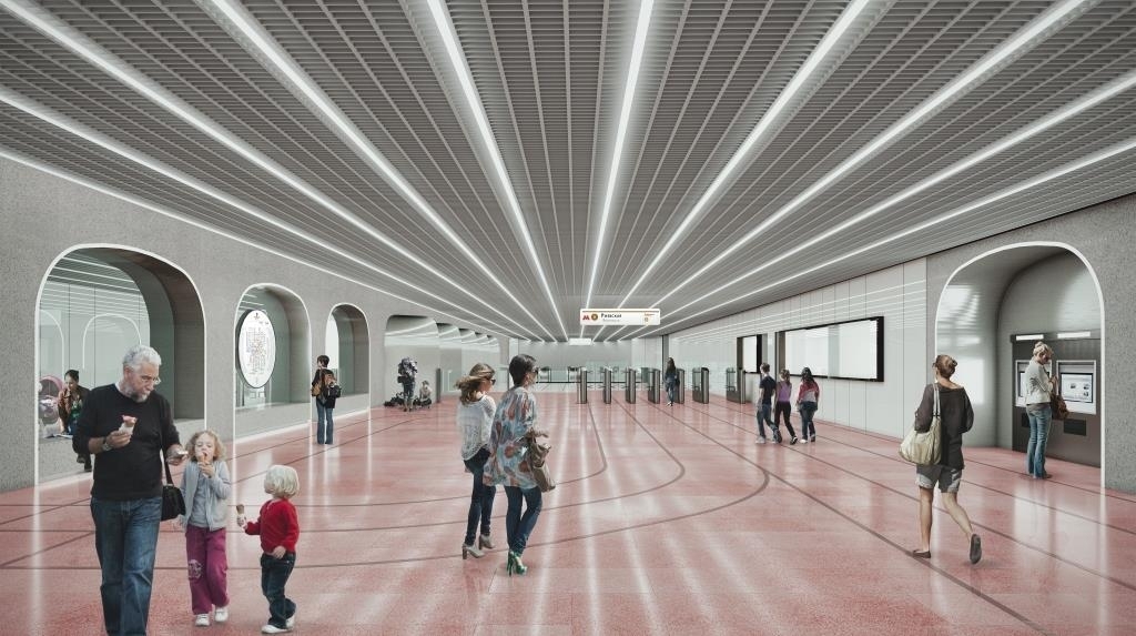
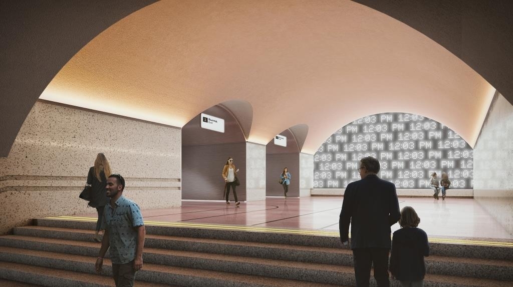
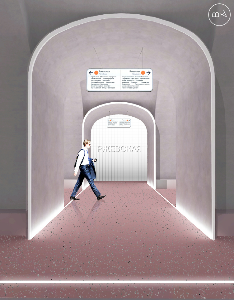
The main theme of the project is echoed by the intertwined motif of a travel that was inspired by the railway station standing on the square. As for the walls standing along the tracks, the architects plan to paint them with landscapes, but of a somewhat blurred quality – the way that they look from a window of a speeding train car. The traveling theme is supported by the lines on the lobby floors, reminding one of railroad tracks and also serving as a navigation instrument. A convenient navigation system is something that the Moscow metro still lacks – claim the authors of “Rzhevskaya”. In their project, they paid special attention to this issue, alongside the conventional things – such as LED screens, signs, and info points – a large role being given to intuitive navigation. For this reason, for example, the exits from the main platform are designed differently. The western one, through which one exits into the city, meaning, towards the railway station, is marked by a large wall-size interactive multimedia screen that shows the train schedule. As for the opposite exit, it all shines a yellow light – this is a transfer to the “Rizhskaya” metro station with its “amber” pylons (in addition, “Rizhskaya” is situated on the “orange” line of the Moscow metro).

zooming
"Rzhevskaya" metro station © Blank Architects


With all the program laconism of the decor, special role is given to the lighting design, including the functional aspect. Again, the architects place their bet on a person’s intuitive reactions: for example, the authors of the project propose to vary the intensity of light in the arches as the train enters the station. Thanks to this, a person, while still on the escalator, will understand that he had better hurry up – the way that we have already learn to get our bearings from the swelling sound of the oncoming train, only now it will be more reliable because it will be clear from which direction the train is approaching. And as for the passengers moving up the escalator, they will gradually find themselves in an ever-lighter environment: this technique will mark that we are moving outdoors, towards the light. In the underground lobbies, the direction of the passenger flows will be prompted by the turning angle of the arches, through which the passengers exit the station, in respect to the direction of movement of those who enter: thanks to this, the flows will be clearly separated.

"Rzhevskaya" metro station. Axonometric drawing © Blank Architects


Having a broad experience of designing shopping centers, Blank Architects know how to attract people to their projects and arouse their interest in order to make them stay longer. Of course, a metro station has a different purpose, not to say a diametrically opposite one – here what you need to do is optimize the traffic as much as you can. Nevertheless, the authors of the project did everything to make the few minutes that a person is going to spend at the “Rzhevskaya” metro station not only comfortable but emotionally satisfying. Examining the blurred landscapes behind the “arch” windows, tracing the junctions of the railroad lines on the floor, and following the change of the digits on the media screen, even the ever-busy morning passenger will be able to get distracted from his worries for a little while. According to Magda Kmita, it was important for the architect to create an environment where even a person that uses this station every day could always discover something new do that his metro ride would become a little trip for him.

zooming
"Rzhevskaya" metro station © Blank Architects


"Rzhevskaya" metro station © Blank Architects


The basis of the color set of the station is the exquisite combination of gray marble of the walls and stainless steel adorning the arches, with the warm shade of “rose ash” in the granite covering of the floor. According to the specifications, the decoration materials were to be of Russian origin. Initially, this presented a minor challenge but eventually the architects were able to use this condition to their advantage – they got acquainted with new companies and studied new possibilities of the stone in order to ultimately choose the sturdy and vandal-proof materials that are an absolute must in the conditions of the busy traffic of the metro station.

zooming
"Rzhevskaya" metro station © Blank Architects


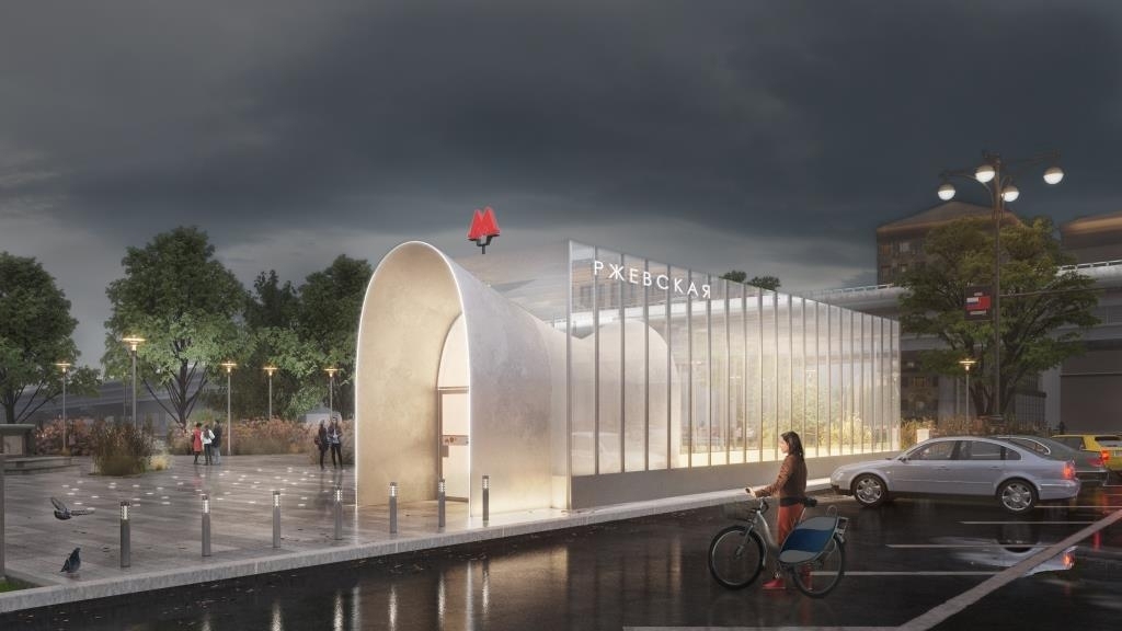
The overland pavilion of the station which is situated on the territory of a small park squeezed between two automobile roads is inscribed in a small rectangle three by six meters. “We decided to make the walls completely transparent – explains Magda Kmita – We have so much different architecture around – the Rizhsky railway station, the rotunda of the “Rizhskaya” metro station, and the Stalin buildings on the Mira Avenue – hat we decided not to add another landmark. This is why we sort of “dissolved” the pavilion in space, only highlighting our arch”. The authors of the project would want to make the little park, currently all but unused, busier – in their project they propose a landscaping plan that provides for new benches, street lights, and greenery added along the park’s perimeter. Although it must be said that neither the technical specifications nor the budget of the future station provide for any improvement of the adjacent territory but Blank Architects always try to see the project as a whole, not limiting themselves to the dry specifications.
 
***

Recently it was announced that the project of “Rzhevskaya” metro station by Blank Architects, just as the project proposal for “Sheremetyevskaya”, made the shortlist or World Architecture Festival 2017 (for readers of Russian). We are still waiting for the results but what is more important is the fact that the implementation of the project is actually coming soon: if everything goes to plan, the first trains will pass through the “Rzhevskaya” metro station as early as in the beginning of 2020.

07 August 2017

Headlines now
A Step Forward
The HIDE residential complex represents a major milestone for ADM architects and their leaders Andrey Romanov and Ekaterina Kuznetsova in their quest for a fresh high-rise aesthetic – one that is flexible and layered, capable of bringing vibrancy to mass and silhouette while shaping form. Over recent years, this approach has become ADM’s “signature style”, with the golden HIDE tower playing a pivotal role in its evolution. Here, we delve into the project’s story, explore the details of the complex’s design, and uncover its core essence.
Gold in the Sands
A new office for a transcontinental company specializing in resource extraction and processing has opened in Dubai. Designed by T+T Architects, masters of creating spaces that are contemporary, diverse, flexible, and original, this project exemplifies their expertise. On the executive floor, a massive brass-clad partition dominates, while layered textures of compressed earth create a contextually resonant backdrop.
Layers and Levels of Flight
This project goes way back – Reserve Union won this architectural competition at the end of 2011, and the building was completed in 2018, so it’s practically “archival”. However, despite being relatively unknown, the building can hardly be considered “dated” and remains a prime example of architectural expression, particularly in the headquarters genre. And it’s especially fitting for an aviation company office. In some ways, it resembles the Aeroflot headquarters at Sheremetyevo but with its own unique identity, following the signature style of Vladimir Plotkin. In this article, we take an in-depth look at the United Aircraft Corporation (UAC) headquarters in the Moscow agglomeration town of Zhukovsky, supplemented by recent photographs from Alexey Naroditsky – a shoot that became only recently possible due to the fact that improvements were finally made in the surrounding area.
Light and Shadow
In this article, we delve into the architectural design of the “Chaika” house by DNK ag architects, which was recently completed in 2023 as part of the collection of signature designs at ZILArt. As is well-known, all the buildings in this complex follow a design code, yet each one is distinct. This particular building stands out not only for its whiteness and minimalism but also for the refined use of a limited number of techniques that, together, create what can confidently be called synergy.
Casus Novae
A master plan was developed for a large residential area with a name of “DNS City”, but now that its implementation began, the plan has been arbitrarily reformatted and replaced with something that, while similar on the surface, is actually quite different. This is not the first time such a thing happens, but it’s always frustrating. With permission from the author, we are sharing Maria Elkina’s post.
Treasure Hunting
The GAFA bureau, in collaboration with Tegola and Arkhitail, organized an expedition to the island of Kilpola in Karelia as part of Moskomarkhitektura’s “Open City” festival. There, amidst moss and rocks, the students sought answers to questions like: what is the sacred, where does it dwell, and what sustains it? Assisting the participants in this quest were landscape engineer Evgeny Levin, artist Nicholas Roerich, a moose, and the lack of cellular connection. Here’s how the story unfolded.
Depths of the Earth, Streams of Water
In the Malaya Okhta district, the Akzent building, designed by Stepan Liphart, was constructed. It follows a classic tripartite structure, yet it’s what you might call “hand-drawn”: each façade is unique in its form and details, some of which aren’t immediately noticeable. In this article, we explore the context and, together with the architect, delve into how the form was developed.
Fir Tree Dynamics
The “Airports of Region” holding is planning to build an airport in Karachay-Cherkessia, aiming to make the Arkhyz and Dombay resorts more accessible to travelers. The project that won in an invitation-only competition, submitted by Sergey Nikeshkin’s KPLN, blends natural imagery inspired by the shape of a conifer seed, open-air waiting spaces, majestic large trees, and a green roof elevated on needle-like columns. The result is both nature-inspired and WOW.
​A Brick Shell
In the process of designing a clubhouse situated among pine trees in a prestigious suburban area near Moscow, the architectural firm “A.Len” did the façade design part. The combination of different types of brick and masonry correlates with the volumetric and plastique solutions, further enhanced by the inclusion of wood-painted fragments and metal “glazing”.
Word Forms
ATRIUM architects love ambitious challenges, and for the firm’s thirtieth anniversary, they boldly play a game of words with an exhibition that dives deep into a self-created vocabulary. They immerse their projects – especially art installations – into this glossary, as if plunging into a current of their own. You feel as if you’re flowing through the veins of pure art, immersed in a universe of vertical cities, educational spaces – of which the architects are true masters – and the cultural codes of various locations. But what truly captivates is the bold statement that Vera Butko and Anton Nadtochy make, both through their work and this exhibition: architecture, above all, is art – the art of working with form and space.
Flexibility and Acuteness of Modernity
Luxurious, fluid, large “kokoshniks” and spiral barrel columns, as if made from colorful chewing gum: there seem to be no other mansion like this in Moscow, designed in the “Neo-Russian-Modern” style. And the “Teremok” on Malaya Kaluzhskaya, previously somewhat obscure, has “come alive with new colors” and gained visibility after its restoration for the office of the “architectural ecosystem” as the architects love to call themselves. It’s evident that Julius Borisov and the architects at UNK put their hearts into finding this new office and bringing it up to date. Let’s delve into the paradoxes of this mansion’s history and its plasticity. Spoiler: two versions of modernity meet here, both balancing on the razor’s edge of “what’s current”.
Yuri Vissarionov: “A modular house does not belong to the land”
It belongs to space, or to the air... It turns out that 3D printing is more effective when combined with a modular approach: the house is built in a workshop and then adapted to the site, including on uneven terrain. Yuri Vissarionov shares his latest experience in designing tourist complexes, both in central Russia and in the south. These include houseboats, homes printed from lightweight concrete using a 3D printer, and, of course, frame houses.
​Moscow’s First
“The quality of education largely depends on the quality of the educational environment”. This principle of the last decade has been realized by Sergey Skuratov in the project for the First Moscow Gymnasium on Rostovskaya Embankment in the Khamovniki district. The building seamlessly integrates into the complex urban landscape, responding both to the pedestrian flow of the city and the quiet alleyways. It skillfully takes advantage of the height differences and aligns with modern trends in educational space design. Let’s take a closer look.
Looking at the Water
The site of Villa Sonata stretches from the road to the water’s edge, offering its own shoreline, pier, and a picturesque river panorama. To reveal these sweeping views, Roman Leonidov “cut” the façade diagonally parallel to the river, thus getting two main axes for the house and, consequently, “two heads”. The internal core – two double-height spaces, a living room and a conservatory, with a “bridge” above them – makes the house both “transparent” and filled with light.
The White Wing
Well, it’s not exactly white. It’s more of a beige, white-stone structure that plays with the color of limestone – smoother surfaces are lighter, while rougher ones are darker. This wing unites various elements: it absorbs and interprets the surrounding themes. It responds to everything, yet maintains a cohesive expression – a challenging task! – while also incorporating recognizable features of its own, such as the dynamic cuts at the bottom, top, and middle.
Urban Dunes
The XSA Ramps team designed and built a three-part sports hub for a park in Rostov-on-Don, welcoming people of all ages and fitness levels. The skate plaza, pump track, and playground are all meticulously crafted with details that attract a diverse range of visitors. The technical execution of the shapes and slopes transforms this space into a kind of sculptural composition.
Proportional Growth
The project for the fourth phase of the ÁLIA residential area has been announced. The buildings are situated on an elongated plot – almost a “ray” that shoots out from the center of the area towards the river. Their layout reflects both a response to Moscow’s architectural preferences over the past 15 years, shifting “from blocks to towers”, and an interpretation of the neighboring business park designed by SOM. Additionally, the best apartments here are not located at the very top but closer to the middle, forming a glowing “waistline”.
The “Staircase” Building
In designing the “Details” residential complex in New Moscow, Rais Baishev spiced up the now-popular Moscow theme of a “courtyard” building with an idea drawn from the surrealist drawings by Maurits Escher. He envisioned the stepped silhouettes and descending slopes as a metaphysical mega-staircase, creating a key void within the courtyard that gave the project an internal “spine”. This concept is felt both in the building’s silhouette and on its façades.
Projection of the Quarter
No one doubted that the building that Vladimir Plotkin designed as part of the “Garden Quarters” would be the most modernist of all. And it turned out just that way: while adhering to the common design code, the building successfully combines brick and white stone, rhythmically responding to the neighboring building designed by Ostozhenka, yet tactfully and persistently making a few statements of its own. This includes the projection of the ideal urban development composition “14–9–6”, which can be found right next door, mathematical calculations, including those for various types of terraces (and perhaps the only reminder of the Soviet past of the Kauchuk rubber factory!), and the white “cross-stitch” pattern of the façade grid.
Domus Aurea
In this issue, we examine the “Tessinsky-1” house, designed by Sergey Skuratov and completed in 2023. Located in the middle of the Serebryanicheskaya Embankment district, at the intersection of its main streets, this house assumes a sort of “nodal” role: it not only responds to everything around it and preserves many memories of the former EMA factory within itself, but it weaves all this into a newly directed pattern, reconciling bright “gold” and dark-colored brick, largely with the help of the new, modern-yet-archaic Columba brick, which, come to think about it, is the most precious element here.
The Chimney of Nikola-Lenivets
In this issue, we are examining the “Obelisk House” designed by KATARSIS and built for the Arkhstoyanie 2023 festival. However, it was only finished later on, and this is why we are examining it now. It seems to us that after the “Obelisk House” appeared in Nikola-Lenivets, a dialogue and a few inner connections appeared between the temporary structures built here. These houses no longer look like “accidental neighbors”, more of which below.
​Periscope by the Bay
The jury awarded the second place in the competition for a public and cultural center in Petropavlovsk-Kamchatsky to the companies GORA (“Mountain”) and M4. In the consortium’s proposal, the building resembles a sperm whale with a calf swimming next to it or a periscope, whose lenses capture the most spectacular views from the surrounding landscape.
From Arcs to Dolmens
While working on the competition project for Petropavlovsk-Kamchatsky, ASADOV Architects prioritized the value of the natural and urban environment, aiming to preserve the balance of the location while minimizing the resemblance of the volume that they designed to a “traditional building”. The task was challenging, and the architects created three versions, one of which having been developed after the competition, where their main proposal took third place. However, the point of interest here is not the competition result but the continuity of creative thinking.
Hide and Seek
The ID Moskovskiy house, designed by Stepan Liphart in St. Petersburg, in the courtyards near Moskovskiy Avenue beyond the Obvodny Canal and recently completed, is notable for several reasons. Firstly, it has been realized with considerable accuracy, which is particularly significant as this is the first building where the architect was responsible not only for the facades but also for the layouts, allowing for better integration between the two. On the other hand, this building is interesting as an example of the “germination” of new architecture in the city: it draws on the best examples from the neighborhood and becomes an improved and developed sum of ideas found by the architect in the surrounding context.
The Big Twelve
Yesterday, the winners of the Moscow Mayor’s Architecture Award were announced and honored. Let’s take a look at what was awarded and, in some cases, even critique this esteemed award. After all, there is always room for improvement, right?
Above the Golden Horn
The residential complex “Philosophy” designed by T+T architects in Vladivostok, is one of the new projects in the “Golubinaya Pad” area, changing its development philosophy (pun intended) from single houses to a comprehensive approach. The buildings are organized along public streets, varying in height and format, with one house even executed in gallery typology, featuring a cantilever leaning on an art object.
Nuanced Alternative
How can you rhyme a square and space? Easily! But to do so, you need to rhyme everything you can possibly think of: weave everything together, like in a tensegrity structure, and find your own optics too. The new exhibition at GES-2 does just that, offering its visitor a new perspective on the history of art spanning 150 years, infused with the hope for endless multiplicity of worlds and art histories. Read on to see how this is achieved and how the exhibition design by Evgeny Ace contributes to it.
Blinds for Ice
An ice arena has been constructed in Domodedovo based on a project by Yuri Vissarionov Architects. To prevent the long façade, a technical requirement for winter sports facilities, from appearing monotonous, the architects proposed the use of suspended structures with multidirectional slats. This design protects the ice from direct sunlight while giving the wall texture and detail.
Frozen Magma
A competition for the creation of a public and cultural center was held in Petropavlovsk-Kamchatsky. Three architectural companies made it to the final, and we consider it important to share about the work of each. Let’s start with the winner – the consortium led by Wowhaus.
Campus within a Day
In this article, we talk about what the participants of Genplan Institute of Moscow’s hackathon were doing at the MosComArchitecture booth at the “ArchMoscow” exhibition. We also discuss who won the prize and why, and what can be done with the territory of a small university on the outskirts of Moscow.