– What kind of company is Blank Architects?
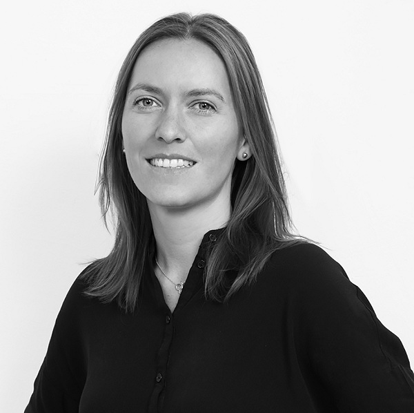
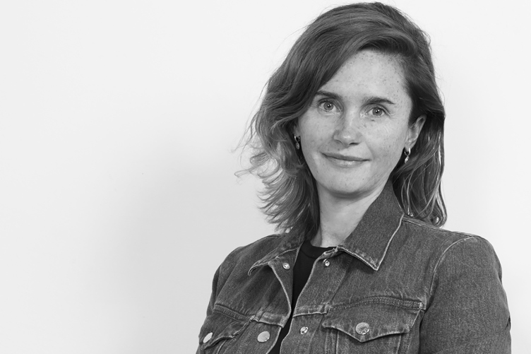
Magda Cichon, partner of Blank Architects © Blank Architects
Magda Cichon
– The founders of Blank Architects are five partners: Lukasz Kaczmarczyk, Magda Kmita, Szymon Matkowski, Piotr Fafara, and me. We all studied architecture in different countries across Europe. I’ve been living in Moscow since 2002. We all met here in Russia. This really was a simple coincidence – we didn’t have any special plan for that. However, we found common ground, and launched this company. We all are the cofounders, and we manage this company as partners. All the goals and decisions of this company proceed from our collective vision of the situation.
– Was it difficult coming to Russia and starting your own company?
Magda Cichon: Not for us, and I’ll tell you why – we were young. You know, there’s an analogy that comes to mind about a child who is learning to walk without even thinking that he’s ever going to fall. We were mesmerized by the opportunities that opened up before us. In Europe, where most of my fellow students went to work, the competition was really tough, and they had a very hard time establishing themselves there. And here it was sort of like “open occident”, if you will. (Turning to Lukasz) How old were you when you started managing construction sites?
Lukasz Kaczmarczyk: Twenty-four.
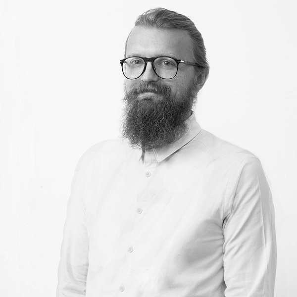
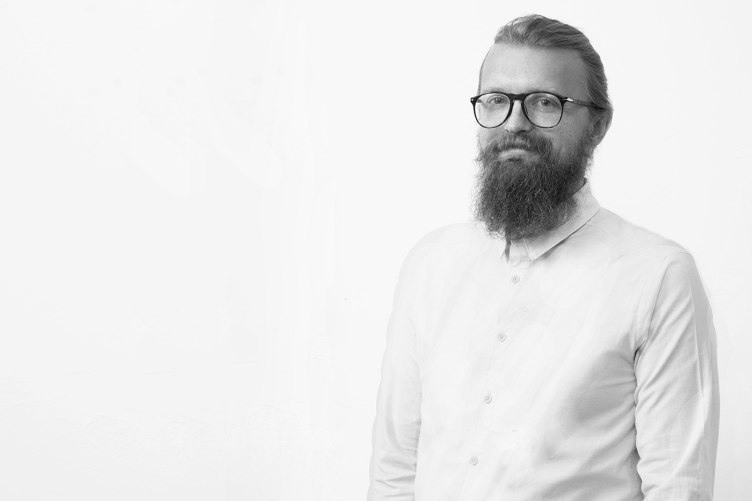
Lukasz Kaczmarczyk, partner of Blank Architects © Blank Architects
Magda Cichon: At twenty-four, he was already a chief architect of the project. We were so young, and we already had the powers that in the west you could not even dream of.
Team work
– And how do you go about organizing internal communications within your company?
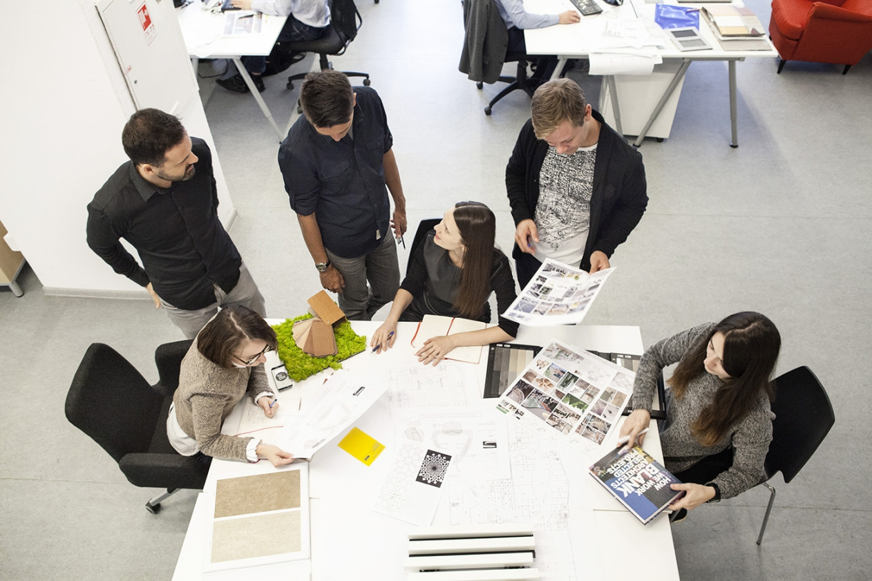
Magda Cichon: Currently, there are 45 architects working for our company plus the administrative assistants. We work based on a principle of weekly meetings – design-boards, as we call them – where we discuss our projects. These meetings usually include about 10 people. You know, when you work on something for a long enough time, you develop a tunnel vision. And those who are not directly involved in the project can see it from a different angle – they ask questions that never occurred to you because you’re in it every day. In our company, design work is not about some person’s ambition – it’s all about the team work. To us, our projects are a constant dialogue.
– How do you select your employees?
Magda Cichon: We select new people with great care and attention. One of the partners pre-interviews the candidate; then, regardless of the vacation that the candidate seeks to fill – be that Chief Architect of the Project or Assistant Architect – I interview him or her. Then we have a few rigorous tests that the candidate has to pass. One vacancy usually draws about 40 CV’s. We invite about five people for an interview, and then we ultimately choose one. Then we have a lengthy trial term. But some of our employees have been with us for more than a decade, so, it’s basically humanly possible to pass it (laughs). We are very demanding. We evaluate how people can think creatively and logically; it’s important for us to know if they can think out of the box.
Lukasz Kaczmarczyk: We try to maintain such an atmosphere where everything sort of comes about in the course of discussion. We do not demand that the orders from above be fulfilled to a letter. Even an assistant architect can influence a project. Some companies call this a “democratic approach”. People that come to us for an interview are sometimes very surprised by that. What you more often see here in Russia is a “hierarchical approach”: there is the main architect, whose company usually bears his name, and all the other employees are just his followers. As for us, we put the word “architects” in the plural form, and we do have many architects.
Magda Cichon: The architect can be still very young. If he can indeed think out of the box and if he’s really passionate about what he’s doing, then our company has a great future in store for him: at 26 or 27 he can already become a chief project architect, even though we are swarmed by lots of architects with a forty-years’ experience and a big portfolio but we just don’t want to take them on because we see that they are “give-me-the-instructions-for-what-to-do” type.
Lukasz Kaczmarczyk: But we have zero tolerance for any sorts of excuses.
Magda Cichon: No excuses apart from architecture. Better not design at all than design poorly.
Blank Architects at work © Blank Architects
– Do you think these shortcomings could have something to do with the specifics of the Russian architectural education?
Magda Cichon: Our employees don’t learn and grow by memorizing rules and regulations books. I always ask people at my interviews about what they should do first. And a lot of them answer that they will first look into the rules and regulations. But rules and regulations aren’t everything! First of all, you need to envision how the building will function, and how people will use it. The way I see it, this makes all the difference.
Midlife crisis
– How did your company change over time?
Magda Cichon: Until 2008, whatever project would come in, we would take it without thinking twice about it. This was some sort of a business machine. But in 2008 the crisis hit, and we lost almost all of our contracts. We had more partners who, thinking that the company went belly up, left the bureau. And us five, left alone, got together and started to think what we wanted to do next.
Lukasz Kaczmarczyk: Oh, and, by the way, one of the important moments of those days was the fact that we changed our vision. We realized that we must be in full control of the development of our every architectural project.
Magda Cichon: Back then, there were a lot of western architectural companies that would pop up just to draw the concept and then shove it to some local companies to do the rest of the job. And we are pretty sensible people – we saw what happened to that original concept in the process of implementation, and we understood why. I am still into this quest of finding potential snags in every project – from the stage of the architectural proposal to the completion of the construction. In Russia, it is very important to be completely involved with the whole process if you want to see your project built the way you intended it to be. We came to this in 2008; now the situation is slightly different but back then an architect was just an architect, period. What is called “general designer” in the west, in Russia has always been “chief engineer of the project”. But here is the thing – in the west it is not the engineer that’s in charge of the project, but the architect. And we had to prove to our customers that it’s a great idea that the architect should be in charge. Because the architect sees everything!
– Did the last crisis influence the work of your company in any way?
Magda Cichon: Some of our competition has closed down, and we have been able at least to keep up the pre-crisis volume of commissions, and we are growing stronger. But the year of 2015 saw three of our partners turning forty. And we again sat down with ourselves to think about just what we were doing and where we were going. We thought for about a year. As a result, we came up with a new image of Blank Architects, and decided that our goal is to go international and design all over the world.
Blueprint Competition © Blank Architects
– Do you have any specific strategy for that?
Magda Cichon: The only effective way to do that is take part in the competitions. We created a special department headed by Lukasz. His work is to monitor the situation, pick the competitions that are worth taking part in, and prepare the projects. Yes, we try to take part in international competitions. And we take part in Russian competitions as well. It doesn’t matter what country you come from – what matters is whether or not you create great architecture.
– And what makes great architecture in your opinion?
Lukasz Kaczmarczyk: Even if you take us five, each has his or her own answer to that question, but, yes, we were still able to come to one common denominator. We believe that great architecture is responsible architecture. What we do first is study the links and ties between the future building and its environment. And this refers not only to measurements, proportions, and materials, but also (and, maybe, above all) to the surroundings. What really matters is how the building will interact with the place that it will appear at.
Magda Cichon: I can tell you what “bad architecture” means to me. “Bad architecture” is something that we try to uproot from the mind of everyone who comes to work with us, regardless of how old they are. In Russia, the technical specifications can be presented in a gigantic book, where the client will describe what he wants in minute detail. And the first project proposal will follow these specifications to a letter. But this devaluates the profession of an architect! He must think over the project together with his client!
Lukasz Kaczmarczyk: This means being responsible towards our investors, our neighbors, and the people who will be using this building, not to mention the environmental concerns.
Magda Cichon: We want to improve the quality of life in the city. When a client comes to us with specifications, we study them carefully and then say: “Yes, we do understand what you want. However, let us make a few suggestions on what can be changed here and how”. We think out of the box of the construction site. There were a few projects when we were ultimately able to convince our client to invest his money into the building’s surroundings, for example, make a park in order to give the project some extra identity but, above all, create a comfortable living environment for the people who will live in this house, and for other city people as well.
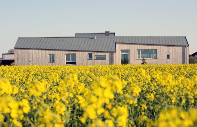
A private residence © Piotr Krajewski
Architecture as Volvo
– Your company chiefly designs retail buildings, doesn’t it?
Magda Cichon: We have many different projects. We design sports facilities, for example, we collaborate with SPEECH on the project of the “Dinamo” stadium.
Lukasz Kaczmarczyk: This is really interesting because the “Dinamo” stadium will most likely become the world’s only stadium with a whole retail floor. This is by no means a standard practice because stadiums are rarely situated downtown.
Magda Cichon: We also design offices, hotels, and housing projects. We are interested in complex and sophisticated projects. We do have a lot of projects that have to do with the retail function – because this is what we started with. This circle is pretty specific because it has a close circle of clients, project managers, and architects. And we are part of this circle: the more you design, the more experienced you get. But we always try to look at designing retail premises with a fresh eye. These retail projects are very interesting because you have to understand the whole logic of the building, how everything works there, how to place individual elements in the building in order to get the best results. Retail is always changing, and significantly, too.
Lukasz Kaczmarczyk: Now the task is still more complex. If you take a look at the top-quality projects of retail buildings, you will notice that most of the time they are not just retail but mixed-function type. They outgrow the format of mere shopping centers and become life-hubs open to the city people. This trend has not yet fully manifested itself in Russia, and we are currently researching it.
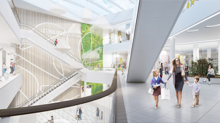
"Pushkinsky" shopping mall © Blank Architects
– Which of the projects that you are working on now seems to you the most interesting?
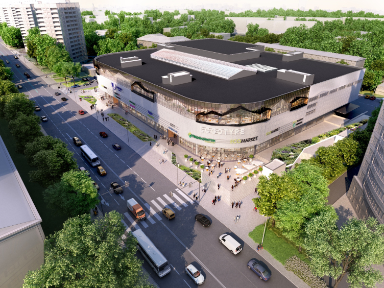
Lukasz Kaczmarczyk: Probably, “Fifth Avenue” shopping mall, even though it is seemingly pretty simple. You could say that this is renovation of the building built in the late 1990’s.
Magda Cichon: I would describe this project as “rebranding retail”. We take the old building and strip it all down to its foundation and framework. The building has stood there for years, and a certain pattern for using this building has been formed with the local people. We bring the existing elements in accordance with the new context that we want to create. We are thinking about the new functions that we will add. If you want to make a community center or a life hub, it must have a certain atmosphere of its own in order to be open and attractive to people.
Lukasz Kaczmarczyk: Currently, we are working on organizing a farmers market on the third floor. This is rather unusual because in Europe the farmers markets are usually found on the lower levels – this is a historical tradition. And there is also a lot of other little details that can turn this building into a community hub. Little things, really, but they make all the difference!
"Fifth Avenue" shopping mall © Blank Architects
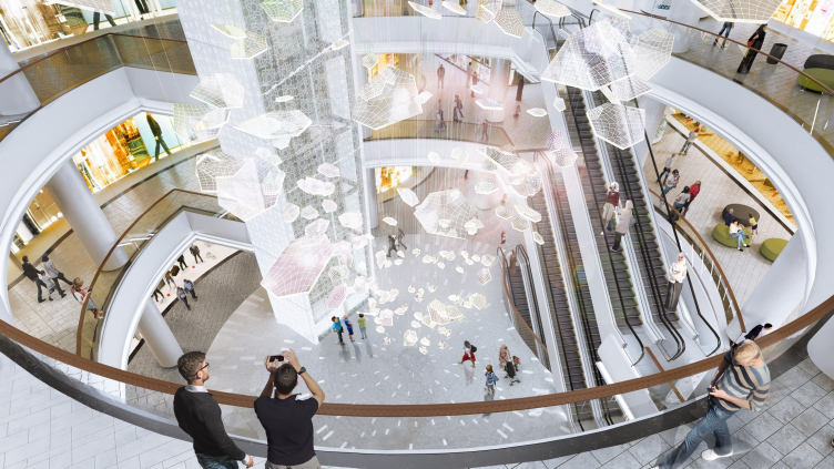
Grozny Mall © Blank Architects
– Does your company have any ambitions of designing a building that would become an “architectural icon”?
Magda Cichon: I want to create opportunities for the people to enjoy life. I don’t think that if they see a giant arch and make a selfie against its background, it will make a whole lot of positive difference to their lives. Yes, the city does need spectacular buildings but there must be a healthy balance. This is like it is with cars. Somebody buys a good car, let’s say, a Volvo, and there are those who drive a Ferrari, even though it’s not really practical: it’s got a low suspension, it’s not really safe, and, where are you going to go at such speed, anyway? But then again, everyone notices one in the city traffic, and, yes, it’s a cool way to show off.
Lukasz Kaczmarczyk: It really depends on what you mean by “iconic building”. To me, this is the Melnikov house. If this is an iconic building, then, yes, we do want to design one. But If you are talking about some monster-size towers meant to demonstrate the power of the crude oil giants – no, I’m not sure that this is our idea of success.
“A Moscow Team”
– Which project is your favorite?
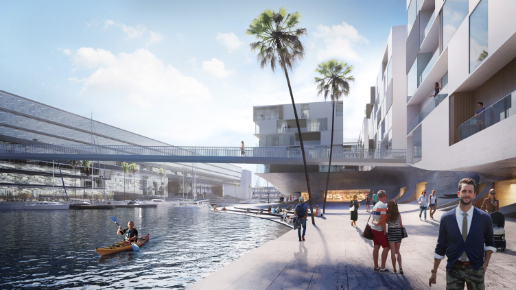
Magda Cichon: We’ve done hundreds of projects, and each one is our favorite in its own way. I like very much the London project with which we participated in a RIBA competition a few years ago. The task was to design a master plan for a large area in London in Vauxhall. The judging panel only accepted one A1 sketch-board for consideration. And it had to explain the entire narrative, so, it was quite a challenge. We were among the three finalists. Hundreds of companies from all over the world took part in that competition. The finalists were a British company, a French company that is London-based, and us. Everybody was really surprised that a Russian company was shortlisted.
Lukasz Kaczmarczyk: It came so unexpected that even the London Evening Standard wrote about that. Nobody else was mentioned in that article – only a “Moscow team”.
Magda Cichon: It came quite unexpected for them because this was a historical place, and we were able to understand it. We read a lot of books on how London developed. We did quite a bit of research on that place. And then we got an idea of how to reform it, introduce landscape areas, functional zones, and create scenarios for how this territory would function in different seasons – because there are a lot of other public territories around. As the members of the judging panel later told us, they were surprised that we were able to see through the eyes of the people that were born and grew up there. We were even if able to create a connection to Big Ben and the Tate. To me, it meant a great success.
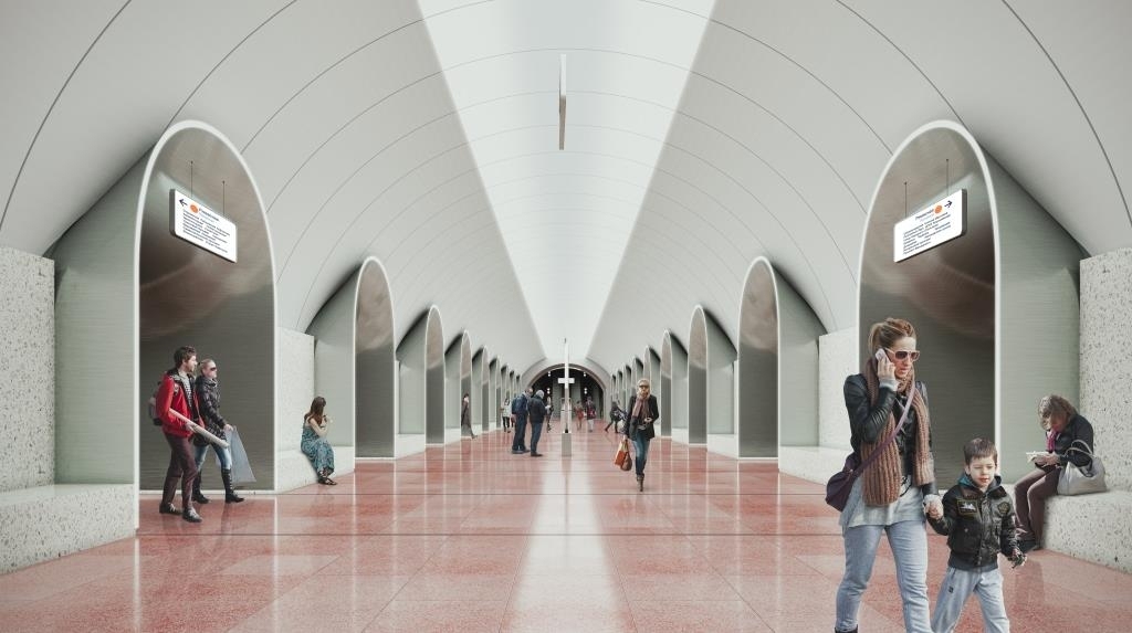
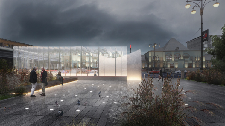
"Rzhevskaya" metro station © Blank Architects
– And what makes your “Moscow team” different from any of the “truly Russian” companies?
Lukasz Kaczmarczyk: We just came here and started working – we did not know anything about how one must go about doing things here – and we did everything our own way. Everybody else around was also curious because this was something amazing. We did things nobody had done before us. For example, we started working with the Fire Safety Research Institute that issues the fire safety regulations. That is, we first made sure we had a full understanding of these regulations, and then we tried to adapt them, change them to be the way we wanted them to be. And this was an adventure of sorts – because we had to walk the same trail as everybody else. Because we were foreigners and we had our way of thinking about things!
Magda Cichon: I do not know how I could compare us to Russian architectural companies because I never worked in one. Sometimes we do collaborations. But I guess that we attach more importance to what a person says or does than to how old they are and what position they occupy.
Lukasz Kaczmarczyk: And I also think that we’re just stubborn. They can tell us a thousand times that it’s impossible to build a house or do something else the way we want it. But in the long run we will still find a way to prove that it is possible. We get really furious when someone tells us that something is “not possible”, and we know for a fact that it is (laughs). Sometimes we just bang our heads against the wall but more often than not that wall crumbles and we come through.
"Rzhevskaya" metro station © Blank Architects
