По-русски

Nikita Yavein: "The more professional architectural companies there are on the market, the better".

In this article, we discuss the state of things on the architectural market, the professional education, the young colleagues, and the benefits of competition; speak about the transformation of “Zodchestvo” festival, and about the future plans of “Studio 44”, a company that has already been around for 25 years.

28 December 2016
Interview
mainImg
Archi.ru
– What can you say about the past year? At the international festival “Arch Moscow” you were elected as the “architect of the year”, while the British publishing company Thames&Hudson is preparing a book on “Studio 44”. How important are these achievements for you and your company?

Nikita Yavein:
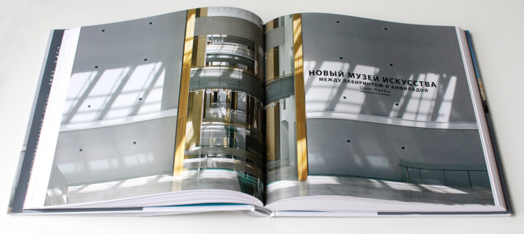
– Thames&Hudson published an album about the building of Joint Staff that we restored. This book turned out to be rather popular. They’ve already sold about two and a half thousand copies, and the publishing company decided to capitalize on that success by publishing our monograph.

Oleg Yavein. Hermitage XXI century. New Museum in the Joint Staff. London: Thames & Hudson Ltd., 2014. Photo: Julia Tarabarina, Archi.ru


As far as my “architect of the year” status is concerned, I feel very much like Donald Trump in this voting. This status, just as the fact that in 2016 it was me who got it, can be viewed in different ways. To begin with, “architect of the year” means in fact “Moscow architect of the year”. Traditionally, the candidates are elected from a pool of Moscow architects based on our industry-specific understanding of what good architecture is. And in this situation it is a very peculiar fact that some group of Moscow architects elected a Saint-Petersburg architect considering my work to be of sufficient value and importance. I think this had also something to do with the fact that we are actively involved in exhibiting at architectural festivals. First of all, I am speaking about “Zodchestvo” where we won the main prizes several times. Currently, the festival is going through a new stage of its development, not to say “a serious crisis”, and its very nature is changing. A while ago it was going through an interesting, however controversial, period of searching for and trying new formats. But now it is becoming more and more obvious that it is losing its national status. Although in a slightly archaic format, it still showcased different regions. Now the share of the regional architecture is growing smaller and smaller. And this despite the fact that today the regions are coming alive and becoming active in terms of architecture. However, today’s “Zodchestvo” is turning into yet another Moscow-focused event, yet another platform for discussing Moscow problems and the problems that pop up in the regions due to the fact that Moscow architects are actively exploring them. Yes, “Zodchestvo” became more upbeat and less formal. There is definitely an upside to it but to me this festival has become less interesting.

But then again, this status of “architect of the year” is still important to me, among other things, because of the fact that I will need to do an exhibition, and I've been thinking about it for a long time. “Studio 44” has recently turned 25. I’ve been in the profession for nearly 40 years. We have more than once discussed the possibility of organizing the exhibition with different museums but we never seemed to find the time to go through with it. Thing is, you are always on the run, solving this and that, getting approvals for your projects, and things like that. But now we simply don’t have any other options. This will be the first exhibition that we will organize ourselves, and we want to make it a movable one. We will be able to stage it at different places and develop it. To me, it will be a great opportunity to reassess the path that I have traveled.

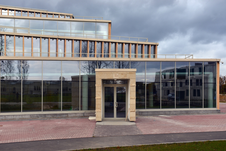
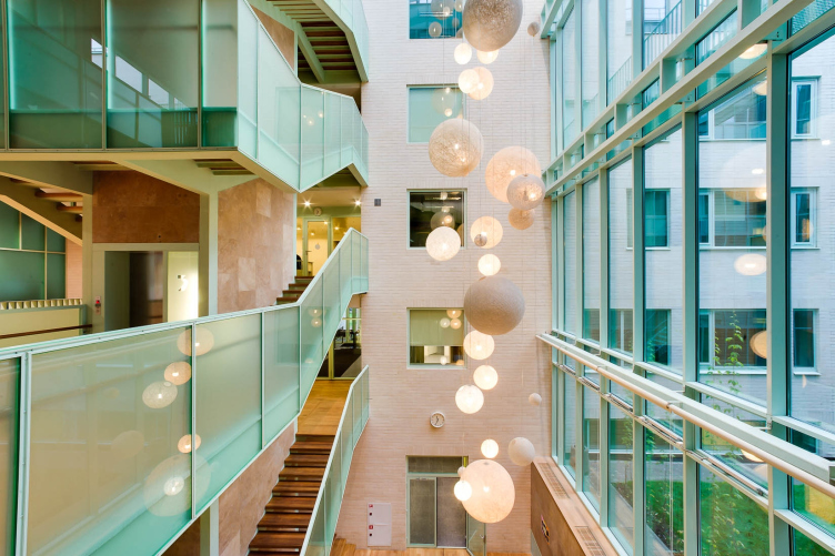
The students' cafe of the Higher Management School of Saint Petersburg State University. Structure. Construction, 2014. Photograph © Margarita Yavein, Tatiana Strekalova


– And how do you assess these 25 years – was it a straight line of development or a long and winding road?

– I think that largely this was a straight path, in spite of the fact that, viewed from aside, it could indeed look like a long and winding one. However, the entire search that I did fell in with a very clear-cut development vector. Looking back, I am sometimes surprised myself at how stubborn I was at trying to stick to it, no matter what. I think this runs in our family. According to the Confucian tradition, the son must achieve the dreams that his father was not able to achieve. And this is what I persevere in doing, creating an architectural studio that now you can arguably call an architectural school. The experience of working in “Studio 44” goes a long way to shape up an architect. I see this at the example of those boys who ready launched architectural companies of their own. And even if they don't realize it themselves, the influence of “Studio 44” is felt both in the behavioral and organizational patterns of their companies.

zooming
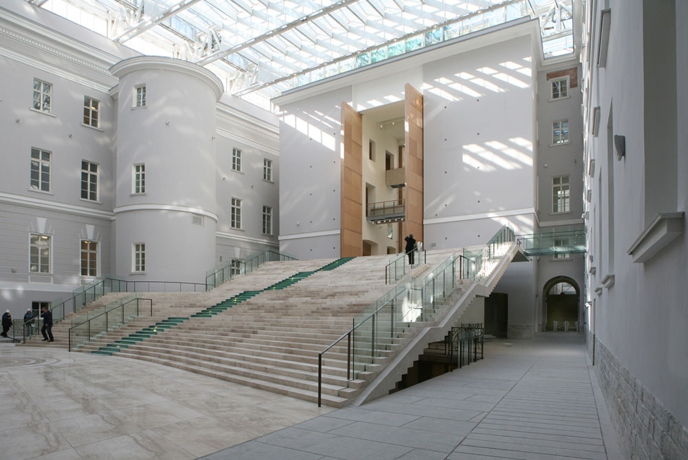
The State Hermitage Museum, the New Major Enfilade in the east wing of the Joint Staff, Saint-Petersburg © Studio 44


– How do you build your relationship with the young architects? Moscow recently hosted an exhibition and a conference devoted to architectural education, its further problems, and its further lines of development.

– This is a disaster, to put it mildly. What we are seeing is a terrible education crisis. When I was graduating, each course had at least ten people whom you might call full-fledged professional architects. Today, I cannot find in the Academy more than four-six people whom you might call simply professionally adequate.

– And how can this crisis be solved? It turns out that the educating functions are being taken over by the architectural companies in which the emerging professionals begin to work. If these companies want to have qualified employees, they must take in as part-timers the graduate students and teach them the tricks of the trade, mustn’t they?

– We have long since been using this method. I do the teaching, and this allows me to see the potential that my students have. Practically all the young leaders in our company have been with us since they were third-year students. Our company does have the resources for educating and developing the emerging professionals. Our three studios each have a specific ideology of their own. A young architect will get an opportunity to try himself at different formats, learn the profession, and find his or her niche in the workflow. A lot of those architects who have been through our school, stayed with our company; two or three persons left to start companies of their own. And I am quite cool with that. The more professional architectural companies there are on the market, the better.

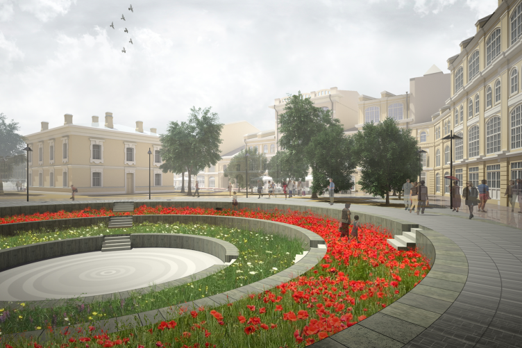
Boris Eifman Dance Academy
 

– So aren’t you afraid of competition at all? 

– You need to realize that those who leaves to start an independent practice, are mostly involved in interior design projects or designing small private residences at the most, but sometimes they do get to do larger projects. Today’s competition is really of a cutthroat kind, and the customer wants to absolutely sure he is getting his money’s worth, and this is what clinches the matter for us. Under such circumstances, only if he works for a large architectural company, will a young architect get a chance of being a part of a serious grand-scale project that he would never otherwise get his hands on, not until he’s fifty years old. But In this case you still need to give your young employees some extra motivation. For example, a partnership project when the chief architect takes on the responsibility for the work of his studio inside the company or for some grand-scale project. For example, Anton Yar-Skryabin, practically singlehanded, did with three or four colleagues of his, within a span of two weeks, a project for an Irkutsk competition, and they won it in flying colors. Or take Ivan Kozhin, for example – he is a great artist and designer, and we are shortly doing a small Moscow project. Vera Burmistrova is also great – I could go on and on.

The Major Gostiny Dvor © Studio 44


– How successful do you think you are in keeping an architect’s individuality under such system of professional growth that operates within a company known for its vivid and well-established image? Do you sometimes get a feeling that the Russian architecture lacks original and unconventional professional statements?

– As the recent WAF festival showed, there lack of individuality is a global issue, not just a Russian one. The exhibition clearly showed that all the architectural proposals and concepts could be easily divided into 8-10 types. Like gravel sorted out, they seem to fit perfectly into this or that cell. And the success of a project is just a matter of which of these cells is hot today. And, the way I see it, despite all the variety of the showcased projects, they were all pretty monotonous.

In our situation, things are still more complicated. Today, the main index of your professional competence is your professionalism and the class of the solutions that you propose. And it is within the framework of this class that you are to develop your individual style. And if your individual style comes down to the fact that your design skills are poor, and you try to replace them with beautiful 3D visualizations, what kind of professionalism can we talk about here? And this is to be seen everywhere, especially at contests and competitions.

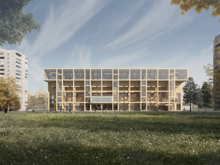
Sports and recreation complex of the judo school. Project, 2016 © Studio 44


– As a result of this, the cite architects that work in Russia’s major cities are the professionals who started back in the nineties. New young architects so emerge but at a pace not nearly as fast as we would like to see.

- Speaking of this, I would decide the entire market into two large groups: the big architecture, and the market of interior design projects. The latter is a lot easier to explore and find work at. And, hypothetically, you could use it as a springboard for getting into the market of big architecture. But the work in the main part of this field – half of it or maybe even two thirds – is done by design bureaus that are affiliated with construction companies. It is them that form the faces of our cities. The remaining part is done by the well-established companies that have a reputation and implementation expertise. Oftentimes, the customer will not choose an architect based on his victories in competitions, articles in magazines, or participation in exhibitions. And this explains the issues that we have with promoting our young talent. One customer talks to another customer, and he examines which approvals his architect was or was not able to get, how his project was implemented, and so on. They will check twenty five times before they ever turn to a different company or a different name. This is a totally members-only club, in which the companies compete, not in terms of whose project is better or more original, but in terms who will be more efficient in getting the municipal approvals for construction. Unfortunately, such a situation is conductive of neither appearing new interesting teams nor creating new interesting projects.

– And what is the situation with “Studio 44”? What have you been able to achieve, and what are your plans for 2017? 

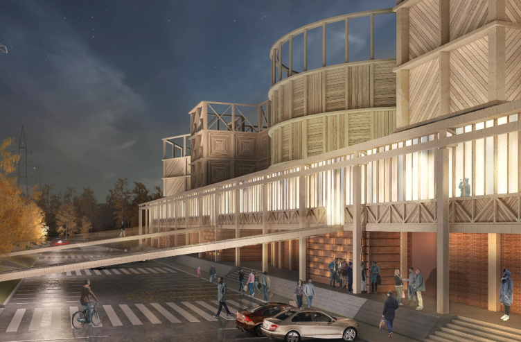
– We landed a number of very serious contracts. Whether or not all of these projects will be implemented is hard to say yet. We’ll see. But among these there are huge housing projects in which I would like to try and implement a few groundbreaking approaches. We are actively involved in working with the regions – Tomsk, Sochi, and other cities. The Tomsk project, as I hope, will become a real breakthrough, first of all, in terms of its construction technologies. We have a goal of redeeming wood as a full-fledged building material again.
Concept of Science and Technology Museum in Tomsk © Studio 44

28 December 2016

Headlines now
The Golden Crown
The concept for a dental clinic in Yekaterinburg, developed by CNTR Studio, revolves around the idea of a “mouth full of gold”: pristine white porcelain stoneware walls are complemented by matte brass details. To avoid an overly literal interpretation, the architects focused on the building’s proportions, skillfully navigating between sunlight requirements and fire safety regulations.
Flexibility and Integration
Not long ago, we covered the project for the fourth phase of the ÁLIA residential complex, designed by APEX. Now, we’ve been shown different fence concepts they developed to enclose the complex’s private courtyards, incorporating a variety of public functions. We believe that the sheer fact that the complex’s architects were involved in such a detail as fencing speaks volumes.
A Step Forward
The HIDE residential complex represents a major milestone for ADM architects and their leaders Andrey Romanov and Ekaterina Kuznetsova in their quest for a fresh high-rise aesthetic – one that is flexible and layered, capable of bringing vibrancy to mass and silhouette while shaping form. Over recent years, this approach has become ADM’s “signature style”, with the golden HIDE tower playing a pivotal role in its evolution. Here, we delve into the project’s story, explore the details of the complex’s design, and uncover its core essence.
Gold in the Sands
A new office for a transcontinental company specializing in resource extraction and processing has opened in Dubai. Designed by T+T Architects, masters of creating spaces that are contemporary, diverse, flexible, and original, this project exemplifies their expertise. On the executive floor, a massive brass-clad partition dominates, while layered textures of compressed earth create a contextually resonant backdrop.
Layers and Levels of Flight
This project goes way back – Reserve Union won this architectural competition at the end of 2011, and the building was completed in 2018, so it’s practically “archival”. However, despite being relatively unknown, the building can hardly be considered “dated” and remains a prime example of architectural expression, particularly in the headquarters genre. And it’s especially fitting for an aviation company office. In some ways, it resembles the Aeroflot headquarters at Sheremetyevo but with its own unique identity, following the signature style of Vladimir Plotkin. In this article, we take an in-depth look at the United Aircraft Corporation (UAC) headquarters in the Moscow agglomeration town of Zhukovsky, supplemented by recent photographs from Alexey Naroditsky – a shoot that became only recently possible due to the fact that improvements were finally made in the surrounding area.
Light and Shadow
In this article, we delve into the architectural design of the “Chaika” house by DNK ag architects, which was recently completed in 2023 as part of the collection of signature designs at ZILArt. As is well-known, all the buildings in this complex follow a design code, yet each one is distinct. This particular building stands out not only for its whiteness and minimalism but also for the refined use of a limited number of techniques that, together, create what can confidently be called synergy.
Casus Novae
A master plan was developed for a large residential area with a name of “DNS City”, but now that its implementation began, the plan has been arbitrarily reformatted and replaced with something that, while similar on the surface, is actually quite different. This is not the first time such a thing happens, but it’s always frustrating. With permission from the author, we are sharing Maria Elkina’s post.
Treasure Hunting
The GAFA bureau, in collaboration with Tegola and Arkhitail, organized an expedition to the island of Kilpola in Karelia as part of Moskomarkhitektura’s “Open City” festival. There, amidst moss and rocks, the students sought answers to questions like: what is the sacred, where does it dwell, and what sustains it? Assisting the participants in this quest were landscape engineer Evgeny Levin, artist Nicholas Roerich, a moose, and the lack of cellular connection. Here’s how the story unfolded.
Depths of the Earth, Streams of Water
In the Malaya Okhta district, the Akzent building, designed by Stepan Liphart, was constructed. It follows a classic tripartite structure, yet it’s what you might call “hand-drawn”: each façade is unique in its form and details, some of which aren’t immediately noticeable. In this article, we explore the context and, together with the architect, delve into how the form was developed.
Fir Tree Dynamics
The “Airports of Region” holding is planning to build an airport in Karachay-Cherkessia, aiming to make the Arkhyz and Dombay resorts more accessible to travelers. The project that won in an invitation-only competition, submitted by Sergey Nikeshkin’s KPLN, blends natural imagery inspired by the shape of a conifer seed, open-air waiting spaces, majestic large trees, and a green roof elevated on needle-like columns. The result is both nature-inspired and WOW.
​A Brick Shell
In the process of designing a clubhouse situated among pine trees in a prestigious suburban area near Moscow, the architectural firm “A.Len” did the façade design part. The combination of different types of brick and masonry correlates with the volumetric and plastique solutions, further enhanced by the inclusion of wood-painted fragments and metal “glazing”.
Word Forms
ATRIUM architects love ambitious challenges, and for the firm’s thirtieth anniversary, they boldly play a game of words with an exhibition that dives deep into a self-created vocabulary. They immerse their projects – especially art installations – into this glossary, as if plunging into a current of their own. You feel as if you’re flowing through the veins of pure art, immersed in a universe of vertical cities, educational spaces – of which the architects are true masters – and the cultural codes of various locations. But what truly captivates is the bold statement that Vera Butko and Anton Nadtochy make, both through their work and this exhibition: architecture, above all, is art – the art of working with form and space.
Flexibility and Acuteness of Modernity
Luxurious, fluid, large “kokoshniks” and spiral barrel columns, as if made from colorful chewing gum: there seem to be no other mansion like this in Moscow, designed in the “Neo-Russian-Modern” style. And the “Teremok” on Malaya Kaluzhskaya, previously somewhat obscure, has “come alive with new colors” and gained visibility after its restoration for the office of the “architectural ecosystem” as the architects love to call themselves. It’s evident that Julius Borisov and the architects at UNK put their hearts into finding this new office and bringing it up to date. Let’s delve into the paradoxes of this mansion’s history and its plasticity. Spoiler: two versions of modernity meet here, both balancing on the razor’s edge of “what’s current”.
Yuri Vissarionov: “A modular house does not belong to the land”
It belongs to space, or to the air... It turns out that 3D printing is more effective when combined with a modular approach: the house is built in a workshop and then adapted to the site, including on uneven terrain. Yuri Vissarionov shares his latest experience in designing tourist complexes, both in central Russia and in the south. These include houseboats, homes printed from lightweight concrete using a 3D printer, and, of course, frame houses.
​Moscow’s First
“The quality of education largely depends on the quality of the educational environment”. This principle of the last decade has been realized by Sergey Skuratov in the project for the First Moscow Gymnasium on Rostovskaya Embankment in the Khamovniki district. The building seamlessly integrates into the complex urban landscape, responding both to the pedestrian flow of the city and the quiet alleyways. It skillfully takes advantage of the height differences and aligns with modern trends in educational space design. Let’s take a closer look.
Looking at the Water
The site of Villa Sonata stretches from the road to the water’s edge, offering its own shoreline, pier, and a picturesque river panorama. To reveal these sweeping views, Roman Leonidov “cut” the façade diagonally parallel to the river, thus getting two main axes for the house and, consequently, “two heads”. The internal core – two double-height spaces, a living room and a conservatory, with a “bridge” above them – makes the house both “transparent” and filled with light.
The White Wing
Well, it’s not exactly white. It’s more of a beige, white-stone structure that plays with the color of limestone – smoother surfaces are lighter, while rougher ones are darker. This wing unites various elements: it absorbs and interprets the surrounding themes. It responds to everything, yet maintains a cohesive expression – a challenging task! – while also incorporating recognizable features of its own, such as the dynamic cuts at the bottom, top, and middle.
Urban Dunes
The XSA Ramps team designed and built a three-part sports hub for a park in Rostov-on-Don, welcoming people of all ages and fitness levels. The skate plaza, pump track, and playground are all meticulously crafted with details that attract a diverse range of visitors. The technical execution of the shapes and slopes transforms this space into a kind of sculptural composition.
Proportional Growth
The project for the fourth phase of the ÁLIA residential area has been announced. The buildings are situated on an elongated plot – almost a “ray” that shoots out from the center of the area towards the river. Their layout reflects both a response to Moscow’s architectural preferences over the past 15 years, shifting “from blocks to towers”, and an interpretation of the neighboring business park designed by SOM. Additionally, the best apartments here are not located at the very top but closer to the middle, forming a glowing “waistline”.
The “Staircase” Building
In designing the “Details” residential complex in New Moscow, Rais Baishev spiced up the now-popular Moscow theme of a “courtyard” building with an idea drawn from the surrealist drawings by Maurits Escher. He envisioned the stepped silhouettes and descending slopes as a metaphysical mega-staircase, creating a key void within the courtyard that gave the project an internal “spine”. This concept is felt both in the building’s silhouette and on its façades.
Projection of the Quarter
No one doubted that the building that Vladimir Plotkin designed as part of the “Garden Quarters” would be the most modernist of all. And it turned out just that way: while adhering to the common design code, the building successfully combines brick and white stone, rhythmically responding to the neighboring building designed by Ostozhenka, yet tactfully and persistently making a few statements of its own. This includes the projection of the ideal urban development composition “14–9–6”, which can be found right next door, mathematical calculations, including those for various types of terraces (and perhaps the only reminder of the Soviet past of the Kauchuk rubber factory!), and the white “cross-stitch” pattern of the façade grid.
Domus Aurea
In this issue, we examine the “Tessinsky-1” house, designed by Sergey Skuratov and completed in 2023. Located in the middle of the Serebryanicheskaya Embankment district, at the intersection of its main streets, this house assumes a sort of “nodal” role: it not only responds to everything around it and preserves many memories of the former EMA factory within itself, but it weaves all this into a newly directed pattern, reconciling bright “gold” and dark-colored brick, largely with the help of the new, modern-yet-archaic Columba brick, which, come to think about it, is the most precious element here.
The Chimney of Nikola-Lenivets
In this issue, we are examining the “Obelisk House” designed by KATARSIS and built for the Arkhstoyanie 2023 festival. However, it was only finished later on, and this is why we are examining it now. It seems to us that after the “Obelisk House” appeared in Nikola-Lenivets, a dialogue and a few inner connections appeared between the temporary structures built here. These houses no longer look like “accidental neighbors”, more of which below.
​Periscope by the Bay
The jury awarded the second place in the competition for a public and cultural center in Petropavlovsk-Kamchatsky to the companies GORA (“Mountain”) and M4. In the consortium’s proposal, the building resembles a sperm whale with a calf swimming next to it or a periscope, whose lenses capture the most spectacular views from the surrounding landscape.
From Arcs to Dolmens
While working on the competition project for Petropavlovsk-Kamchatsky, ASADOV Architects prioritized the value of the natural and urban environment, aiming to preserve the balance of the location while minimizing the resemblance of the volume that they designed to a “traditional building”. The task was challenging, and the architects created three versions, one of which having been developed after the competition, where their main proposal took third place. However, the point of interest here is not the competition result but the continuity of creative thinking.
Hide and Seek
The ID Moskovskiy house, designed by Stepan Liphart in St. Petersburg, in the courtyards near Moskovskiy Avenue beyond the Obvodny Canal and recently completed, is notable for several reasons. Firstly, it has been realized with considerable accuracy, which is particularly significant as this is the first building where the architect was responsible not only for the facades but also for the layouts, allowing for better integration between the two. On the other hand, this building is interesting as an example of the “germination” of new architecture in the city: it draws on the best examples from the neighborhood and becomes an improved and developed sum of ideas found by the architect in the surrounding context.
The Big Twelve
Yesterday, the winners of the Moscow Mayor’s Architecture Award were announced and honored. Let’s take a look at what was awarded and, in some cases, even critique this esteemed award. After all, there is always room for improvement, right?
Above the Golden Horn
The residential complex “Philosophy” designed by T+T architects in Vladivostok, is one of the new projects in the “Golubinaya Pad” area, changing its development philosophy (pun intended) from single houses to a comprehensive approach. The buildings are organized along public streets, varying in height and format, with one house even executed in gallery typology, featuring a cantilever leaning on an art object.
Nuanced Alternative
How can you rhyme a square and space? Easily! But to do so, you need to rhyme everything you can possibly think of: weave everything together, like in a tensegrity structure, and find your own optics too. The new exhibition at GES-2 does just that, offering its visitor a new perspective on the history of art spanning 150 years, infused with the hope for endless multiplicity of worlds and art histories. Read on to see how this is achieved and how the exhibition design by Evgeny Ace contributes to it.
Blinds for Ice
An ice arena has been constructed in Domodedovo based on a project by Yuri Vissarionov Architects. To prevent the long façade, a technical requirement for winter sports facilities, from appearing monotonous, the architects proposed the use of suspended structures with multidirectional slats. This design protects the ice from direct sunlight while giving the wall texture and detail.