
Archi.ru:
- Anatoly, "Lenta" was quite a milestone in you career. When you started working on it, virtually nobody here heard about shopping centers of such kind. Meanwhile, this genre is very specific: essentially, a hypermarket is as much of a machine as a housing project - only it is designed for retail operations.
Anatoly Stolyarchuk:
- Yes, for us it was also a new thing to do. Some of us had seen hypermarkets when they went abroad but for most of our citizens the very notion of a food store came down to a bakery or a corner grocery store. In 2001, when the customer approached us with a proposal to design "Lentas", there was but one shopping center of such kind in Saint Petersburg - it was situated on the Energetikov Avenue, in a former factory building that was redesigned to fit the purpose in the late 1990's.
A "Lenta" is a retail store and a warehouse at the same time, a place where everything is about logistics, where all the dimensions are calculated down to the last inch, where the joint efforts of the developers, the marketing experts, psychologists and designers are channeled to one end: to make the customer lose all touch with reality and leave here what money they have.


"Lenta" shopping center on the Bukharest Street. Construction, 2003 © Anatoly Stolyarchuk architects


"Lenta" shopping center on the Bukharest Street. Construction, 2003 © Anatoly Stolyarchuk architects


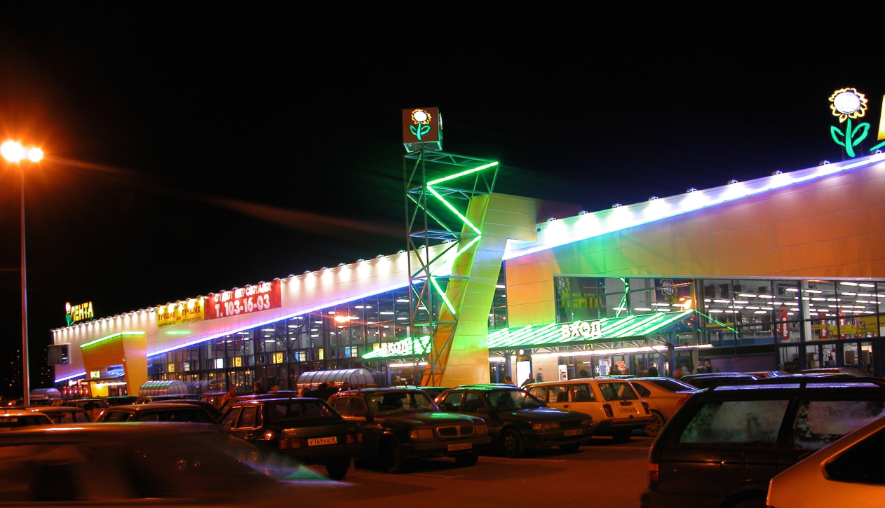
"Lenta" shopping center on the Pulkovo Highway. Construction, 2002 © Anatoly Stolyarchuk architects
- Unlike Moscow's GUM, TSUM, and other "posh" shopping centers, supermarkets need to be as utilitarian as possible. At the same time, they must look colorful, attractive, and possess a "fair-like" quality. Does this "fork" leave any room for true architecture? How did you address these issues?
- As I already said, all the technological content of the supermarket is calculated down to an inch. We took into consideration everything - the warehouse issues, loading and unloading of the goods, showcasing them, as well as providing a possibility for the supermarket to produce its own trademark foodstuffs, and so on. The distance between the shelves depends on the size of the forklift that cruises between them virtually 24/7. We consulted Saint Petersburg, Moscow, and German technologists and logistics experts. We had to learn lots of things along the way.
All these technologies had to be clad in some "construction dress". At the same time, nobody was going to spend any money on what you would call "architecture". Luckily, however, that time was not completely devoid of any romantics. Based on this feeling, we were able to convince our customer in the necessity of some extra expenses to be made. We placed our bets on the expressiveness of the entrance groups that were meant to attract customers. We also tried to make the routes of people's flows as interesting as possible. These, of course, were also technologically calculated but, by using lighting, decoration elements, and smart advertising, we were able to achieve some extra effects. All of our "Lenta" supermarkets have different entrance groups. I don't think something like this could be possible today.


"Lenta" shopping center on the Dalnevostochny Avenue. Construction, 2009 © Anatoly Stolyarchuk architects
- Can such buildings respect their architectural context?
- Hypermarkets are giant volumes with a floor space of some 12000-14000 square meters that consequently require large 3-4 hectare land sites. You also need a 400-500 stall parking lot, and, furthermore, a huge loading bay for the trucks to unload the product. In any city, such places are few and far between, and, yes, it's a lot easier to find them outside of town. Hence, luckily, the issue of context is just not on.
The first location address of our "Lenta" is at the Savushkin Street. Sixteen years ago it was a total wasteland. Then it was the Pulkovskoe Highway that at that moment was surrounded by a swampy field with croaking frogs. Today, as you very well know, every square inch of that land is owned by someone. On the Kim Avenue that is on the Vasilyevsky Island, this is just the territory of a river freight port. On the Obvodny Channel, it is the territory of the hoisting equipment plant.


"Lenta" shopping center on the Savushkina Street. Facade. Construction, 2001 © Anatoly Stolyarchuk architects


"Lenta" shopping center on the Kim Avenue. Facade. Construction, 2007 © Anatoly Stolyarchuk architects


"Lenta" shopping center on the Kim Avenue. Facade. Construction, 2007 © Anatoly Stolyarchuk architects
- Still, however, at the Obvodny Channel, your "Lenta" has porticos, doesn't it?
- In the case of the Obvodny Channel project, the portico solution has in fact nothing to do with the intention to imitate the historical Saint Petersburg. For any building with such a function any adornment is strictly forbidden. And this is just not our style, even if we design something in the historical center of the city.
What we do pay attention to, however, is what the rest of the world is doing. Back in the day, I was really impressed by Michael Graves: I liked his popular postmodernist works in which he successfully tried to "fit a square peg into a round hole". I also wanted to do this sort of thing.


"Lenta" shopping center on the Embankment of the Obvodnoy Channel. Construction, 2005 © Anatoly Stolyarchuk architects


"Lenta" shopping center on the Embankment of the Obvodnoy Channel. Construction, 2005 © Anatoly Stolyarchuk architects


"Lenta" shopping center on the Embankment of the Obvodnoy Channel. Construction, 2005 © Anatoly Stolyarchuk architects
I must mention that our customer did not really like this idea - he thought it was too much on the hefty side. However, the project was still implemented, and, after the store opened, the customer called me to say thank you because he saw that these porticos were a great tool to attract people (he deliberately took a vantage point on the opposite bank of the Obvodny Channel). What I was after, though, was "doing architecture". Yes, we impose our ideas on our customers, and there's nothing wrong with that. When we are successful in it, beautiful pieces of architecture appear.
- On the one hand, hypermarkets are convenient but what they also bring about is faceless unification of architecture. And this is partially why we are so attracted (especially when we travel abroad) by small shops where you can chat with the person behind the counter, get some advice, maybe taste something - in a word, places that have identity and some human touch about them. And such cute little stores are having a very hard time now trying to compete with hypermarkets.
- One does not substitute or exclude the other. As you very well know, Lenta is not just a food supermarket and not just a department store: it has cafes, a drugstore, ATM's, and lots of other things. When you can, for relatively reasonable money, fill your cart with purchases, push it toward your car, unload it and just leave it there - this is convenient, which is one of the reasons why such shopping centers are thriving. Furthermore, even such rank-and-file projects can be made interesting - where there is a will there is a way! The only problem is that I am seeing less and less of the former.
We designed eleven "Lentas", two "Metricas", and two "Castoramas". Every year, two "Lentas" would be launched: we went from an empty land site to the opening of the store, each of them being an individual project. However, they simplified our last project to an impossible degree and then just let us know that they "did not require our services any longer". You don't need an architect to build a modern hypermarket. And this is not because times are tough. This year, "Lenta" is planning to open forty new stores across the nation.
- One might think that allotting money for the architect would also be possible?
- There's no practical point in it anyway.


"Lenta" shopping center on the Savushkina Street. Facade. Construction, 2001 © Anatoly Stolyarchuk architects


"Lenta" shopping center on the Pulkovo Highway. Construction, 2002 © Anatoly Stolyarchuk architects


"Lenta" shopping center on the Dalnevostochny Avenue. Facade. Construction, 2009 © Anatoly Stolyarchuk architects


"Lenta" shopping center on the Dalnevostochny Avenue. Facade. Construction, 2009 © Anatoly Stolyarchuk architects


"Lenta" shopping center on the Dalnevostochny Avenue. Facade. Construction, 2009 © Anatoly Stolyarchuk architects


"Lenta" shopping center on the Tallinn Highway. Construction, 2006 © Anatoly Stolyarchuk architects


"Lenta" shopping center on the Tallinn Highway. Construction, 2006 © Anatoly Stolyarchuk architects


"Lenta" shopping center on the Tallinn Highway. Construction, 2006 © Anatoly Stolyarchuk architects


"Lenta" shopping center on the Tallinn Highway. Construction, 2006 © Anatoly Stolyarchuk architects


"Lenta" shopping center on the Tallinn Highway. Construction, 2006 © Anatoly Stolyarchuk architects


"Lenta" shopping center on the Vyborg Highway. Construction, 2004 © Anatoly Stolyarchuk architects


"Lenta" shopping center on the Vyborg Highway. Construction, 2004 © Anatoly Stolyarchuk architects


"Lenta" shopping center on the Moscow Highway. Construction, 2008 © Anatoly Stolyarchuk architects


"Lenta" shopping center on the Vyborg Highway. Plan of the 1st floor. Construction, 2004 © Anatoly Stolyarchuk architects


"Lenta" shopping center on the Vyborg Highway. Plan of the 2nd floor. Construction, 2004 © Anatoly Stolyarchuk architects


"Lenta" shopping center on the Vyborg Highway. Section view. Construction, 2004 © Anatoly Stolyarchuk architects


"Lenta" shopping center on the Vyborg Highway. Facade. Construction, 2004 © Anatoly Stolyarchuk architects


"Lenta" shopping center on the Vyborg Highway. Master Plan. Construction, 2004 © Anatoly Stolyarchuk architects


