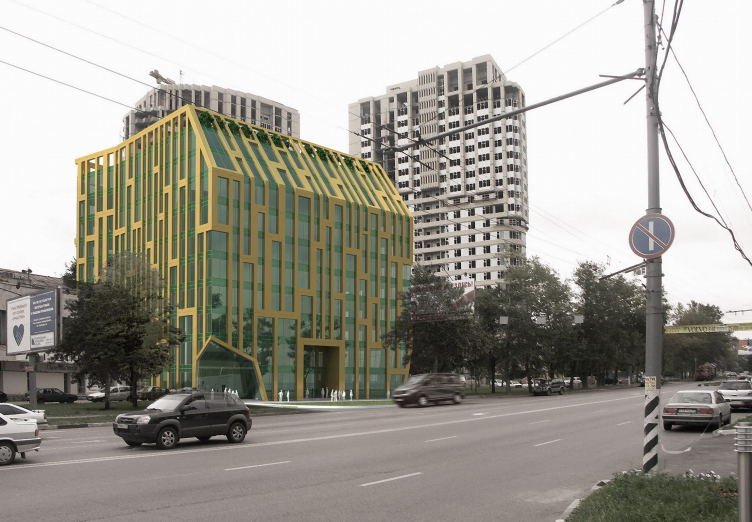
For the office building there is a small site in the city block nearby the crossing of Nahimovsky avenue and Vavilova street. Diagonally through the crossing there is Cheremushkinsky market on the place of which Alexander Asadov designed a large house with media-facade. In the rest, surrounding building development is of late Stalin period and of early Hruschev period, includes mostly 5- and 7-storey houses generally of faded-pink, and in some places yellowish color. Here and there modern houses-towers are wedged into this hasteless, low and green area. Nearest neighbors of the ABD’s office building are the two 24-storeyed towers. In such surrounding a small office building will be like in a forest, it is smaller than its nearest neighbours.
How to make it more noticeable? A formal experiment is needed here.
At first sight the house designed by architects from ABD, seems to be wrapped in a large angular net.
Most of external walls, from floor to ceiling are glass; interfloor overlappings emerge on facades as strips of green color. Visually from glass and strips there appears the "basis" of building, its basic material – half-transparent coldish mass. It is easy to notice, that its colour is directly opposite to grayish pink prevailing in this area, but this is one of ABD's favorite – austere, practical and fresh, close to nature.
Over this half-transparent mass there is put framework of light yellow, similar to the Stalin stone in its color. It consists of thin vertical and wider horizontal strips. Their arrangement is irregular, gaps are big and small, and in some places "thick" lines are forming zigzags. Stripes are more compact in the center of walls and are rarer on corners. But the main thing is that the trellis work is put atop, each line notably stands out of the glass surface.
So, the building is like a coldish, "natural" mass, seized by edges of a trellis-net. “Hanging gardens” are put to maintain the effect and make up for the lack of yard. It is designed so that the trees would “sprout" through the net inclined at the top part of the main facade. All the 11-storeys of the building will turn n a kind of "rest" for trees which become a final chord of the facades’ coloring.
Volume of the building, almost cubic, looks as if it was cut from different sides – somewhere above and below. One corner was cut off on slanting, in the other below there is cut out a glass "cave". Well, here this effect helps to gain maximum of volume and square meters. However, on the other hand, it supports the effect of net, transforming it from the "stone" into "metal", and even into jeweler-like, golden. In that case, trellis turns into precious "frame" of glass-emerald "jewelry".
The plot of this building can be understood in two ways. Obviously, the glass-green idea is close to modern office architecture which is supposed to be glass and ecological. The net is context. Modern architecture "breaks off" the common non-transparent surface, or the strong net "holds" natural mass. But it is apparent, the architects pushed together the two themes here – functions and context, and made their interplay the basic idea of this building.


