Office premises of Nord Star Development © Sergey Estrin Architectural Studio
For its new office, the developer company rented the two top floors of Nordstar Tower complex on the Begovaya Street in Moscow. Fully glazed, these two floors boast breathtakingly beautiful views if contemporary Moscow, and it makes perfect sense that it was their sightseeing properties that the architects based themselves upon while designing the new office. In this, there was perfect unity between the architects and their commissioners - the latter also requested that the "cornerstone" of the new design should be the megalopolis panoramas that this place commands. Other requests to the future office were, in fact, rather few - the design was to have in it natural wood, and one of the necessary elements of its furniture was to be the niches meant for exhibiting the art objects, if which the C.E.O.'s of Nord Star Development are devoted collectors.
Office premises of Nord Star Development © Sergey Estrin Architectural Studio
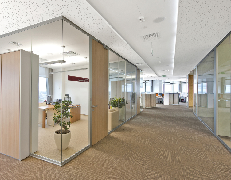
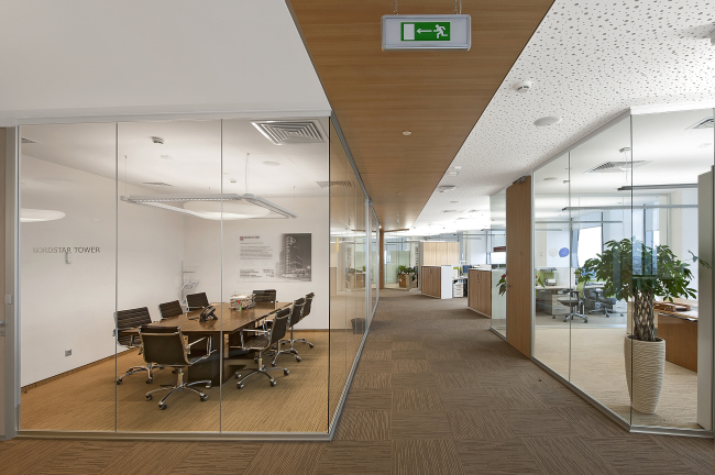
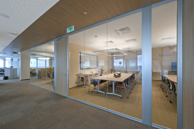
The desire to make views of Moscow and integral part of the indoor design conditioned its overall layout. The main working area is in fact a transparent open-space, into which the architects insert here and there the "cubes" of meeting rooms and the divisional managers' offices. In order to render these volumes less "palpable" in the office structure, the architects execute most of their walls from glass, giving the role of conditional partitions between the workplaces and the corridors to the low-height lockers that also do not get in the way of the daylight getting in. To enhance the "light" feeling of the office, the ceilings are also painted white, and to eliminate "hospital" associations, they are not covered with flat panels but are decorated with perforated patterns of various density. At some places, for coating the ceiling the wooden panels are also used - the broad bands composed from them mark, in the overall structure of the office, the corridors that are meant predominantly for the visitors. The corridors dominated by the offices are not so evidently marked - this simple technique helps unobtrusively separate the people flows without breaking the stylistic unity of the design concept.
Office premises of Nord Star Development © Sergey Estrin Architectural Studio
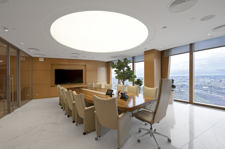
The interesting know-how that was used in the design of the meeting rooms was the use of double-sided lockers that are installed directly into the transparent walls and are used both for storing the employees' things and the accessories necessary for conducting meetings and negotiations. The lockers, as well as the solid-wood doors, give the glass volumes more of an individuality - otherwise, the latter would have run the risk of looking like the proverbial "fish bowls". Basically, the same purpose is served by the green plants placed in the transparent corners - these plants give a little bit of human touch to these generally pristine premises.

Office premises of Nord Star Development © Sergey Estrin Architectural Studio
"We tried to give this office a laconic and business-like air - because outside the window, there is a huge city bustling and bubbling 24/7" - Sergey Estrin explains. Accordingly, the color solution was chosen: the natural tone of the wood showcases to the best advantage not only the light-colored ceiling but also the floor cover that the architects chose - the beige and light-brown carpet tile Desso.
Office premises of Nord Star Development © Sergey Estrin Architectural Studio
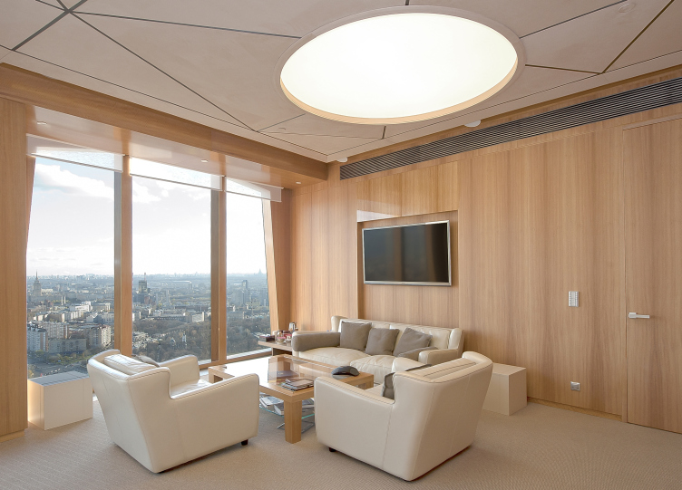
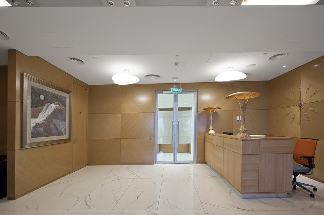
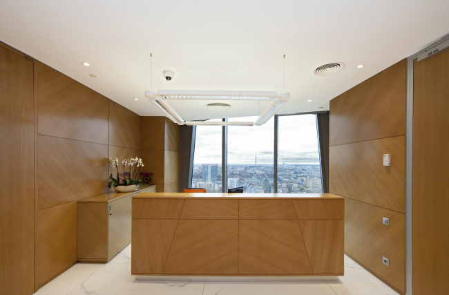
A few areas in this interior are executed exclusively of wood. In particular, the "visiting card" of the office - its entrance area with the reception desk, as well as the reception area before the C.E.O.'s offices. In both cases, panels if one and the same light copper hue are used, only the entrance area is dominated by straight lines and rectangular panels, while the latter territory gets a more dynamic look at the expense of its diagonal lines. The latter are the logical consequence of the development of the architecture of the complex itself: the windows of the tower have dramatic slants. As Sergey Estrin confesses, the laconic and at the same time imposing volume of the high-rise left its mark on the design of the company's main timepiece - the large clock that meet the visitors at the entrance: instead of the single clock-face, there are metallic notches scattered all over the wall.
Office premises of Nord Star Development © Sergey Estrin Architectural Studio
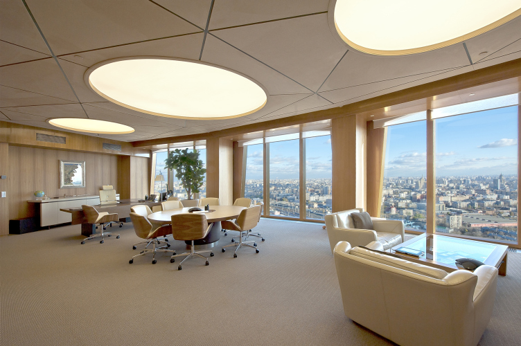
The design of the VIP zone uses colors that are still more reserved. For example, the ceiling gets a milky hue here - the architects were able to achieve this effect by coating it with nubuck. Three round large-diameter lights give the opportunity to highlight, out of the entire grand-scale study, the workspace proper, the meeting table, and the area meant for conducting meetings that are less official. The lights not only dissect the premises into dedicated zones but also visually enlarges the height of the ceilings, stressing the importance of each of the zones. Apart from that, they create the image of the office that is clearly viewable and recognizable from the outside - three bright circles on the top floor of Nordstar Tower turn the building into a beacon standing out in the sea of city lights.

Office premises of Nord Star Development © Sergey Estrin Architectural Studio

Office premises of Nord Star Development © Sergey Estrin Architectural Studio
Offices of Nord Star Development © Sergey Estrin Architects


