Archi.ru:
Igor, in December it will be two years since you and your team moved into the new office. How are you faring along professionally in your new home? What has your studio been up to?
Igor Schwartzman:
We are pretty much into our main activity - meaning, we are developing various projects at various stages and of various degrees of complexity, supervising them down the point of final implementation. And, while two years ago we would often lament the fact that we were forced to busy ourselves with conceptual contests - i.e., we had little of "real" work, now, luckily, the tables have turned: we have a lot of field work to do and now all of our departments are loaded to capacity.
- Did these project arise over the last two years or are you finishing what was launched still before the crisis?
- Both ways. There are projects that were launched 3-4 years ago and even earlier - now we are breathing new life into them and getting them into shape, and this gives us a great feeling that our efforts did not ultimately go to waste. And there are also commissions that are brand-new, ones that we got through tenders or directly from the investors. In other words, we are living an eventful professional life: we take part in tenders, supervise the implementation of our already developed projects, and search for the perfect marriage between our vision of this or that object and the customer's requirements. You know that our company never was into doing sketches alone - we do everything for the project to be implemented from beginning to end.
- As far as I know, right now you have a whole number of projects being implemented. For one, the residential complex "Literator" ("Man of Letters" - translator's note) that is currently in construction.
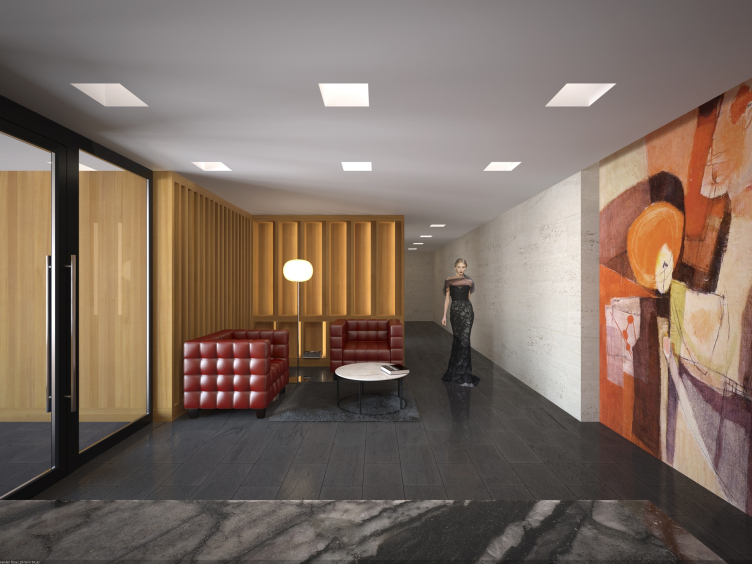
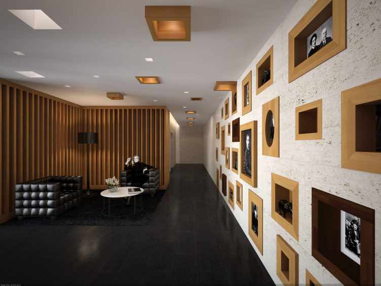
- Yes, right now we are doing the author supervision there and I think that next year this complex will be put into operation. Recently we also developed for it the project of interiors and public areas. Initially, we made them rather laconic, spinning it all around the contrast and unity of the quality wood and stone in the contemporary style that is characteristic for us but then we altered our project because the customer wanted interiors that would be a little "warmer" and "closer to the literature theme". I must confess that groping for the compromise was not that easy: the last thing we wanted to do was use the direct associations, this would have been cheap, really. First of all, we refrained form the idea of associating each building of the complex with this or that writer, or maybe a fiction hero, or anything of the sort. We also introduced a different type of lights, shrank the vertical fracturing of the wooden wall that frames the lounge zone, and enriched the plastics of the he stone surface with differently-sized niches framed with natural wood. And it is these niches that you can, if necessary, introduce your "literature" into - pictures of writers, maybe statuettes, books, and the like. Generally, however, the style of this complex remained emphatically up-to-date - for us it was a crucial point.
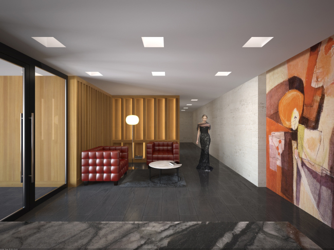
Interiors of the public areas of "Literator" residential complex. The original version. Chief architect of the project: A.Medvedev. © "Sergey Kisselev and Partners".

Interiors of the public areas of "Literator" residential complex. The implemented version. Chief architect of the project: A.Medvedev. © "Sergey Kisselev and Partners".
- Speaking of 3D-modeling, how often are you able to "infect" your customer with your certainty of the righteousness of the solutions that you offer?
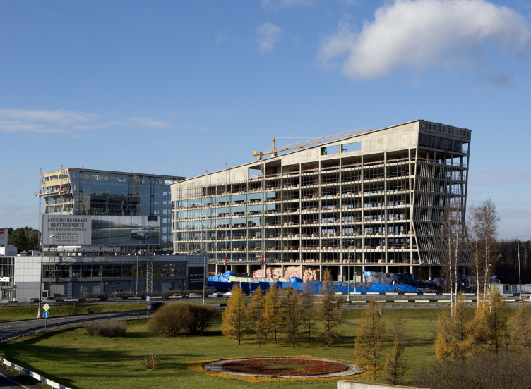
- In this sense, a great example can be set by a recent object of ours that is presently being completed - the administrative and business center of the 1st kilometer of the Rublevo-Uspenskoe Highway. The main author of the project that was developed back in 2007 was Sergey Kisselev, and it was him that came up with the main "image" idea - the building looks as if it was wrapped up into a broad band. For us, it was really important to keep both the original compositional design and the plastique of the facades of this complex. Over the recent years, our customer has many times tried to talk us into straightening out the side walls and the roofs of the buildings but we have been able to prove it to him that the trivial parallelepipeds would have looked dull and inappropriate here, and we are really grateful to him for his being inclined to listen to the architects' opinion. Yes, we gave up a few "pre-crisis" luxuries - but we still were able to keep the dramatic look of the building.
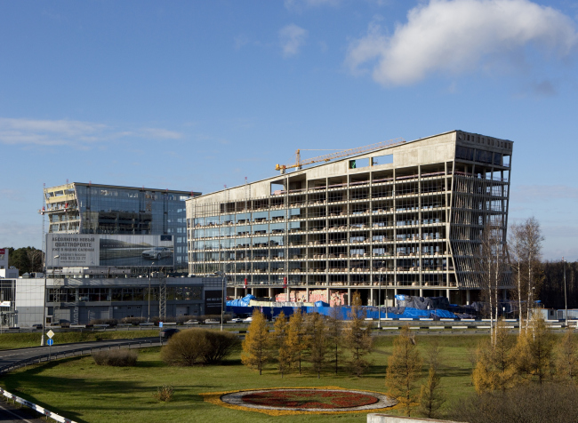
Administration and business center on the 1st kilometer of the Rublevo-Uspenskoe Highway. Chief architect of the project: V.Barmin, A.Khomyakova.© "Sergey Kisselev and Partners".
- Yet another "long-living" project is the reconstruction of Block 109 in the neighborhood of Textilschiki, where Sergey Kisselev, according to his figurative expression, was able to "whistle a tune".
- This is a project that got from "Pioneer" company the name of "Volzhskaya-Life". It underwent several changes during its implementation, even though we still were able to keep the original idea of there being this "structural grid" whose segments are filled with tiles of different colors. Two buildings got extra floors; in one of the buildings, the function of the lower floors changed. Besides, the complex got yet another building, this new volume in fact heading the array of six already complete buildings.
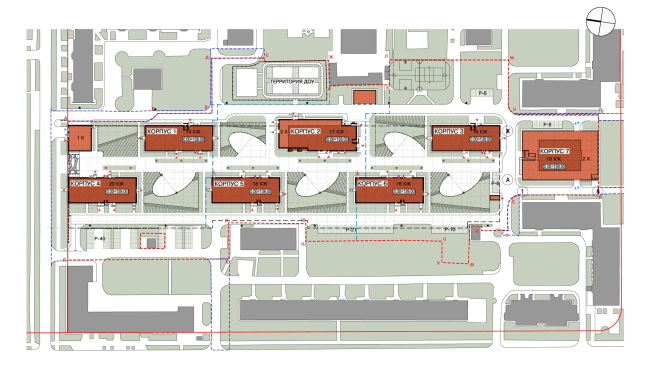
Residential neighborhood in Tekstilschiki. Chief architect of the project: V.Shvetsov. © "Sergey Kisselev and Partners"
So here was the dilemma: either to design a new tower in this same style or visually adjust to it the housing of the entire block. A lot of options were developed, some of them appealed to us, some - to our customer, and the final word was said by Moskomarkhitektura that recommended the more reserved out of the compromised options that we proposed. This building is also dominated by the grid but, with the consideration of its situation and its dimensions, its cells are made larger, the vertical fractures are accentuated, and the facades are painted two different colors, which create the impression of some animal's hide turned inside out.
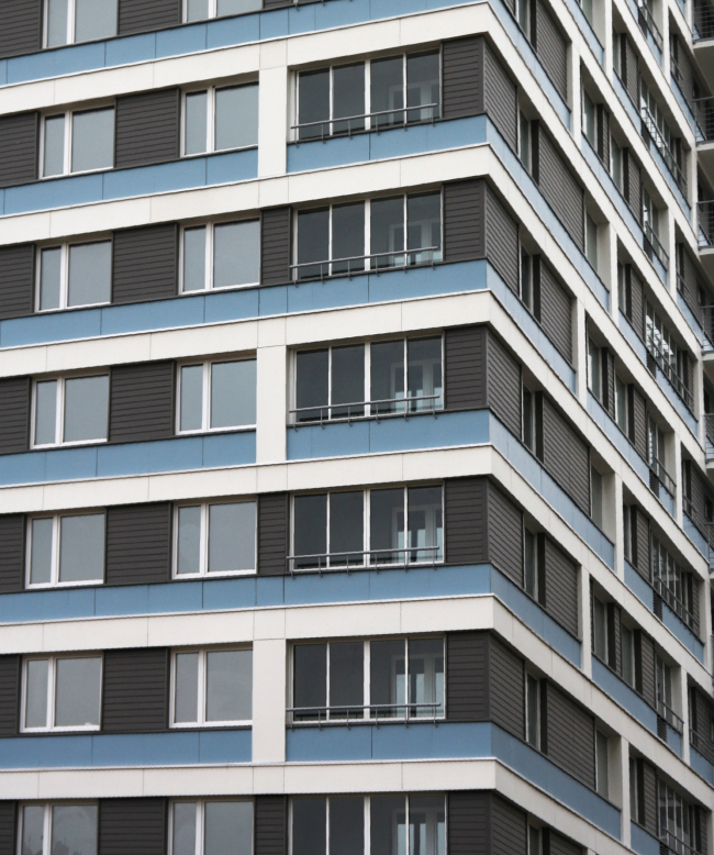
Residential neighborhood in Tekstilschiki. A fragment of a complete house. Chief architect of the project: V.Shvetsov. © "Sergey Kisselev and Partners.
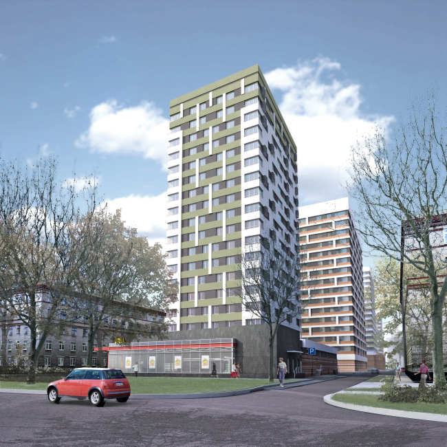
Residential neighborhood in Tekstilschiki. Buildind 7. Chief architect of the project: V.Shvetsov. © "Sergey Kisselev and Partners.
- The architects of your studio generally like working with colors, preferring the bright shades and striking color combinations - like the "Avant-garde" building that got much critical acclaim.
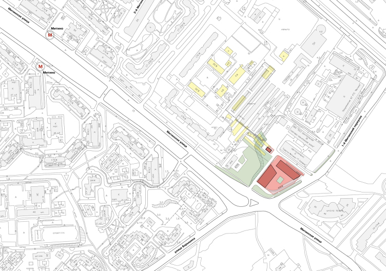
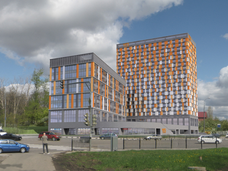
- Bright colors are not and end in itself - it is only one of the means of creating a great environment to live in. And we by no means always try to make the facades of our buildings as bright and as cheerful as possible. In a sense, this theme shows through in our new project that we developed for "Pioneer" company - the multi-purpose center on the Mitinskaya Street, 16. These are two volumes - the 10-story business center with a highly developed public area and a 23-story apart-hotel, both standing on a single stylobate that houses retail stores, a fitness center, and a parking garage - the very typology of the object of commercial property being revolutionary for the center of Moscow. We developed quite a few options while still at pre-design stage, in terms of both planning and functional solutions for the facades.
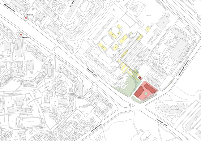
Multi-purpose complex at Mitinskaya 16. Master plan. Chief architect of the project: A. Khomyakova.© "Sergey Kisselev and Partners"
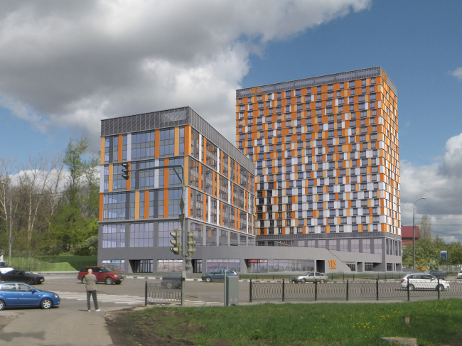
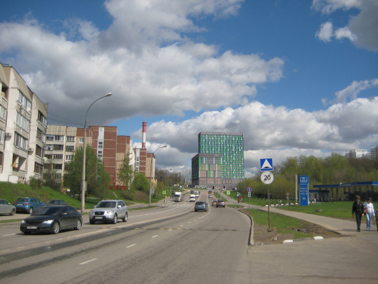
Multi-purpose complex at Mitinskaya 16. Chief architect of the project: A. Khomyakova.© "Sergey Kisselev and Partners"
And this was exactly the case when we found it appropriate to make the colors of the facade a little more reserved and even cold but at the same time a little bold and contrasting with its surroundings. The customer, however, opted in favor of a different coloristic solution that, according to him, better matched the surrounding houses and were closer to the "corporate" colors of the future chain hotel. And, even though our figurative idea - a more "penetrable" office facade and a more "pixelated" hotel one - was still there, we do not find the arguments in favor of this color really convincing.

Multi-purpose complex at Mitinskaya 16. The original version. Chief architect of the project: A. Khomyakova.© "Sergey Kisselev and Partners"
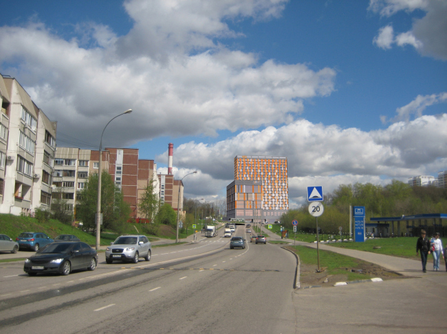
Multi-purpose complex at Mitinskaya 16. The approved version. Chief architect of the project: A. Khomyakova.© "Sergey Kisselev and Partners"
- So it turns out that the very structure of the commissions that you work with is changing, and you get less of elite houses to build, switching over to the economy class? How do you feel about it - is it interesting for you?
- Now it is common to call such projects "comfort class", and, in my opinion, such expression sounds a lot better than "economy class", let alone the proverbial "affordable housing". In Moscow, "affordable housing" is nothing but a cliche that in effect means pre-fabricated panel residential property that is devoid of any identity or individuality. Somebody aptly said that what the city needs is not "affordable" but "appropriate" housing, and the comfort class is something that allows us to achieve the optimum price/quality ratio, together with expressiveness and individuality. And, yes, we are interested in this genre - this is like making a silk prude out of a sow's ear - the costs are affordable, and every contestant thinks that he is smarter than the rest. So, yes, we gladly address such challenges.
- It is common knowledge that oftentimes the developers' good intentions run out exactly at the moment when the project is almost completed and ready to be actually implemented. We cannot but mention your "Marfino" housing project that was "laid by", while the developer built instead a whole neighborhood of pre-fabricated residential houses.
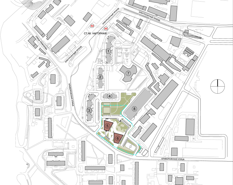
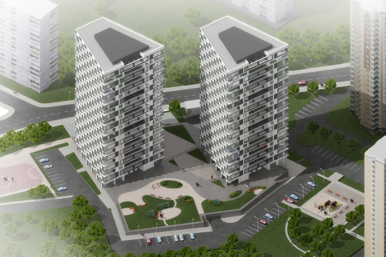
- Yes, "Marfino" is a rather sad example that is frustrating for us. But, you know, time will dot the i's and cross the t's: the developer ultimately realized that placing your bets on the pre-fabricated housing is a losing game by default. A few years after this "Marfino" project, "Vedis Group" turned to us again. Right now they are doing a residential block at the Elektrolitny Driveway in Moscow and they realize that they will not be able to make it look interesting with the pre-fabricated series alone - so they commissioned us two houses that, different in their number of floors, shape, and finish, will become "flagships" of this renovated neighborhood. These are monolith buildings that have a pronounced trapeze shape on the plan. And such solution was chosen not because we wanted to make the volume more "sculptural" but, in fact, for a number of reasons: the existing town-planning situation, the insolation, the mandatory requirements for the apartments, and the like. As far as the image of the facades is concerned, it came around as a result of choosing out of a whole number of options - but the choice was quite logical and natural: in my opinion, what we see here is the perfect marriage between the tactful presence within the given circumstances and the healthy ambition. It was something that Sergey Kisselev described as two A's: appropriateness and aptitude. And here, by the way, we deliberately refrained from using bright garish colors, placing our bet on the sure-fire expressiveness of the black-and-white combination.
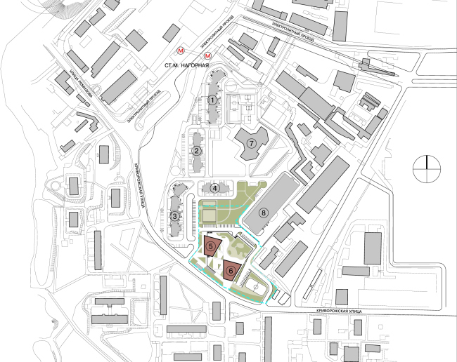
Residential complex at the Elektrolitny Driveway. Master plan. Chief architect of the project: A.Nikiforov. © ООО "Sergey Kiselev and partners"
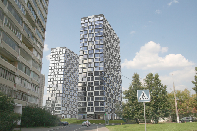
Residential complex at the Elektrolitny Driveway. General view. Chief architect of the project: A.Nikiforov. © ООО "Sergey Kiselev and partners"
- How were you able to get all the approvals for a housing project of a medium price category with almost no balconies or stanzas?
- There are the public stanzas of the smokeproof stairway, on which we propose to place the conditioning packs, plus we just had to include a few apartment stanzas under the pressure from our marketologists. This theme, of course, includes the common stereotypes: apartment that has a balcony, much more a stanza, is more expensive - for an average Russian person, these things are an indispensable part of their home life, and you cannot really change that. I will not speak for everyone but the prevailing majority of the population seek to adjoin these areas to the thermal envelope - meaning, augmenting the total area of their apartment by doing this. So why not address this at the very start, all the more so because at the two fire escape staircases this is permitted by the regulations, while the "cold elements" are sold at the same price all the same? Generally, these two things - balconies and air conditioners - are nearly the main problem of today's Russian construction industry; the field on which the aesthetic reasons and the interests of the future inhabitants are engaged in a non-trivial controversy. For example, in the Textilschiki houses we provided the the places for installing the conditioning packs - the special bays in the stanzas. Then what? The "street smart" pushes the tenants to hang the packs directly on the facades - the reason that they will use the "paid-for area" for something else, while the air outside the facade comes for free anyway.

Residential complex at the Elektrolitny Driveway. Bird's hight view. Chief architect of the project: A.Nikiforov. © ООО "Sergey Kiselev and partners"
- "Sergey Kisselev and Partners" was among the finalists of the contest for the concept of the residential complex at the Rublevskoe Highway. Do you take part in other high-profile contest of our time?
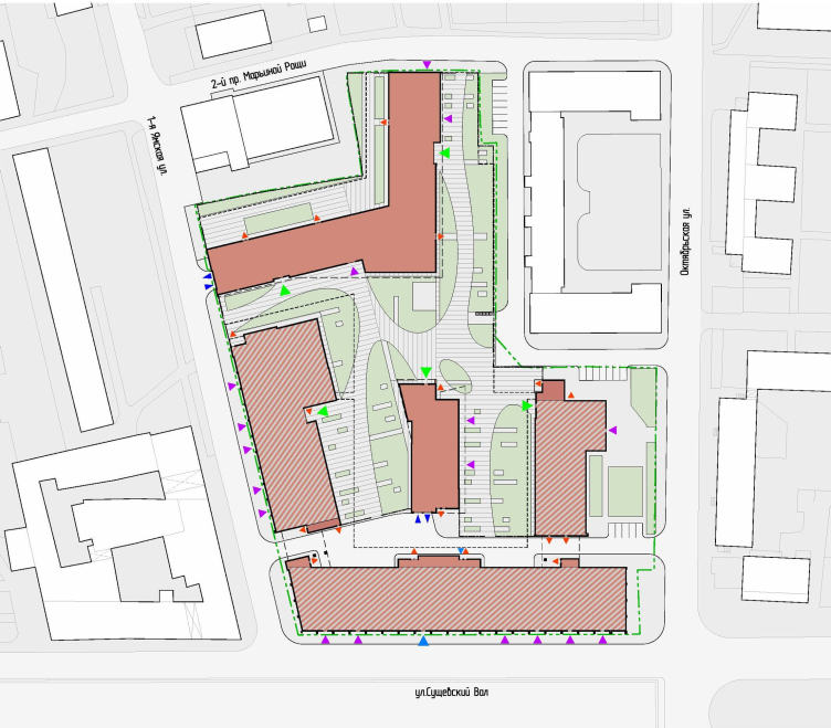
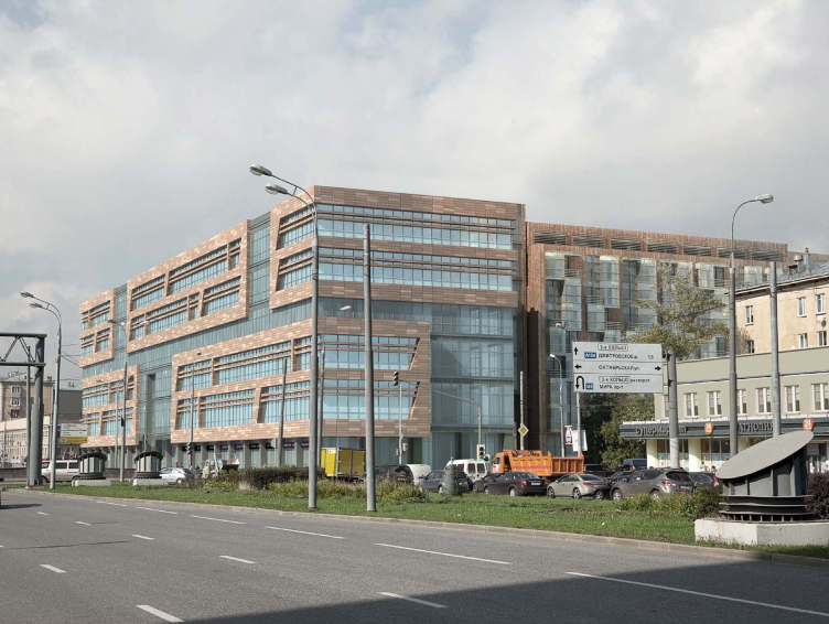
- Not in all of them, of course, but, generally, yes, we do. We pick the contests whose subjects are close to us in spirit and professionally as well. For example, we took part in the first round of the contest for the project of the international financial center in Rublevo-Arkhangelskoe - we are quite familiar with this place because it was here that we designed on two venues for our previous investor. We submitted the application for the participation in the contest for the park in Zaryadye. And now we are waiting for the results of the reconstruction project for the territory of "Serp i Molot" Plant. Earlier we took part in the contest for the shopping mall on the Tverskoy Zastavy Square. We also do not refrain from less "high profile" contests. For example, recently we finished a contest project for the reconstruction of the former industrial park at the Suschevsky Val Street - we did not win it but such type of contests is already specific work and it means another coin falling into the bank of our expertise.

Contest project at the Suschevsky val Street. Chief architect of the project: V.Labutin.© "Sergey Kiselev and Partners".

Contest project at the Suschevsky val Street. Chief architect of the project: V.Labutin.© "Sergey Kiselev and Partners".
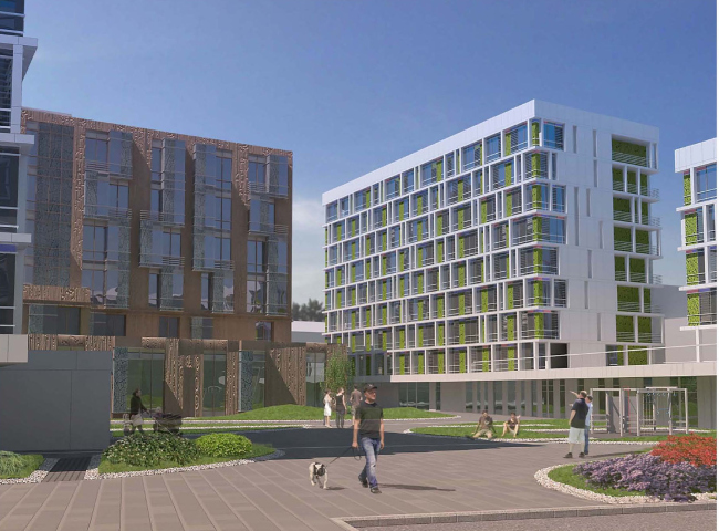
Contest project at the Suschevsky val Street. Chief architect of the project: V.Labutin.© "Sergey Kiselev and Partners".
- Reconstructing industrial territories was always one of the strong points of your studio. Even our recent review of Moscow's projects of developing the former industrial parks mentions "Sergey Kisselev and Partners" more often than any other company.
- This is indeed one of our favorite areas of applying our professional efforts. Even now we are working on a few projects of multi-functional complexes that will be build in the places of former production facilities, and these projects cover the integrated landscaping of the territory and creation of the public and recreational areas. It is still too early to uncover all the details, we will be able to speak about this project later on when we have the opportunity to estimate the end result. We also carry on our cooperation with "Red Rose" - right now we are simultaneously doing three objects in the format of "little houses" as part of the concept of landscaping the land - that was developed by our company back in 2003 and now we made a few adjustments to it with regard to the realities of the present day.


