По-русски

Vladimir Plotkin: these days, any contest is a guessing game

The main architect of "Reserve" Studio speaks about his new projects, international contests, and the contemporary Moscow.

25 April 2013
Interview
mainImg
Architect:
Vladimir Plotkin

Archi.ru: Vladimir, your studio has recently taken part in two high–profile international contests - one for the concept of developing the Berezhkovskaya Embankment, and the other one for the new building of the Polytechnic Museum. What is your general impression of these two competitions?


Vladimir Plotkin: I am a little bit disappointed with the results of both of them. And not exactly with the results but with the very fact of us having participated in these contests! Both of our projects seemed quite successful to us - that is, until we saw the proposals of our colleagues. And now it is quite obvious to me that in both cases we made a mistake submitting our works in the first place.
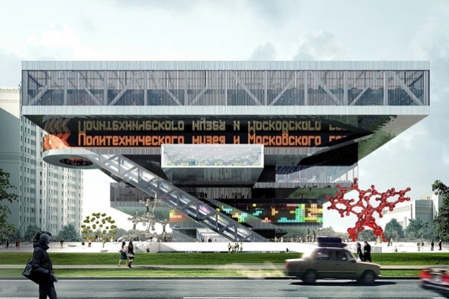
 

New building of the Polytechnic Museum. The contest project of "Mecanoo International B.V." and "RESERVE" Studio


Archi.ru: Frankly speaking, it is my personal opinion that the Berezhkovskaya Embankment was among the most impressive ones.


Vladimir Plotkin: As the outcome of this contest showed, what the commissioner wanted was not the detailed concept but only a few possible options, the vectors of development strategy - this early on, the commissioner simply did not want to commit himself with any specific plans having to do with the zoning and/or improvement of the territory. We came up with our concept pretty quickly, and generally it seems to me a successful in terms of the local, and not strategic, development of that place. What we should have done further on, though, was to concentrate on the overall analysis of the situation on the whole, and not developing a detailed and elaborate solution.


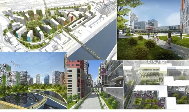
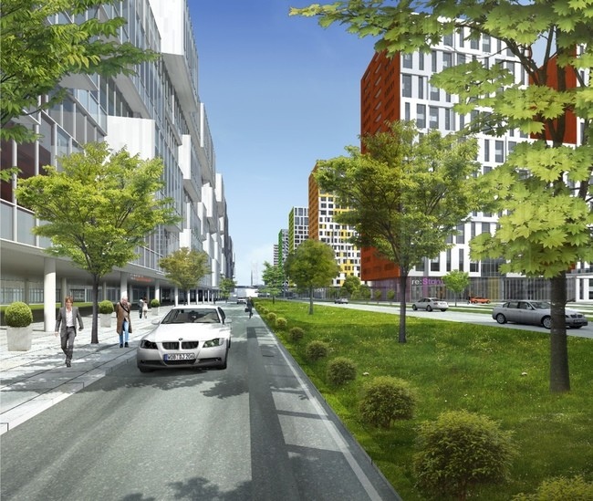
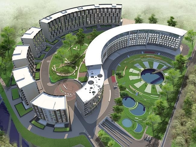
Concept for developing the former industrial park on the Berezhkovskaya Embankment by "RESERVE" Studio


Archi.ru: Well, ultimately it was a consulting contest that did not have any strict rules or criteria by definition. And, by the way, the commissioner is going to use the proposals of all the participants in the creation of the eventual project. How reasonable do you think is the idea of the architectural consortium for this place?


Vladimir Plotkin: Better ask me how reasonable seems to me the very idea of developing this land! Look at the map: this is a sack! It has a driving entrance but it has no decent driving exit. It is cut off from the most active part of the city by the railroad tracks, and from the normal communication with the embankment - by the territory of the power plant. In fact, there is only one tiny opportunity to "squeeze through" from the embankment side, and that is closer to the Third Ring Road. Under such initial circumstances, any large-scale construction will bring about yet another city-scale problem. The proximity of the thruways does not automatically mean their accessibility! And, even though all the participants of the contest tried to address this issue in their projects, you cannot change the situation by the pedestrian overpasses alone. What you need here is the comprehensive solution of the problem that means creating the new city matter and connecting it with the already existing - for example, we could re-route the railroad tracks or at least cover them with a platform. Even gradual development of this land presents in my opinion considerable risks for the investor because it can prove financially devastating.


Concept for developing the former industrial park on the Berezhkovskaya Embankment by "RESERVE" Studio


Archi.ru: To what extent, in your opinion, is today's Moscow generally ready for comprehensive solutions of its town-planning issues?


Vladimir Plotkin: With its financial turnover?! Technically, everything is possible! But what you need in the first place is the human will that will set in motion the sluggish machine of decision-making and the implementation of those decisions. And here I am referring not to the Moscow government alone but in the first place to the federal one. Of course, I do very well realize that even if such a decision is ultimately made the situation will not change overnight. Still, we cannot do without surgical intervention in this case. The palliative "pinpoint" treatment of the city problems is not enough - only if within the boundaries of its historical center.


Archi.ru: And what can the architects do in the absence of such will? Is there any help from the architectural contests that have recently become so frequent? Do they help the architects get the grasp of the state of things and communicate this information to those who make the appropriate decisions?


Vladimir Plotkin: The architects' conceptual town-planning initiatives never did stop. Thank God, the very contest situation has taken a significant turn for the better. The contests are widely advertised and the city authorities themselves delegate the experts for their competent organization and the analysis of their results. This certainly inspires optimism, if this is not yet another "playing democracy". At least, nowadays almost every professional architectural contest gets a professional program of its own, and there are now qualified experts capable of doing this - I am referring to "Strelka" Institute in the first place. And one must note here that these programs are developed on a really professional level (they might even be too detailed) - I think this is some sort of a reaction to the critical shortage of such programs of the previous years when the commissioners announced tenders on a ragged piece of tracing paper or as some blurry jpeg image without any specifications whatsoever. Back then, the evaluation criteria were something that nobody even talked about - at best, your projects were examined by the evaluation board that predominantly consisted of marketing consultants and realtors with an odd neighborhood-level architect among them. And there were lots of such contests! Last summer I was reading a lecture to the students of "MARCH" architectural school and I wanted to show to the students the specific projects that we did within the framework of various contests over the last two years. Frankly speaking, I thought that I would hardly collect more than 12-15 concepts but it turns out that they were 24! That is, exactly one contest a month!


Archi.ru: How many of them won the contests? How many of them were actually implemented?


Vladimir Plotkin: Our western colleagues consider winning one contest out of ten to be a pretty successful rate. We won four but only one project was actually implemented. Plus it looks like some work is starting in connection with the residential complex at the Bukhvostova Street in Moscow. So, our efficiency factor is not really high. There was a number of situations when we actually won the contest but still the construction started by a different project. The saddest cases I think were the Moscow City triangle contest and the Savvinskaya Embankment tender. In these contests, none of the submitted projects did win, and eventually the architects were invited from the side. Why? For whatever reasons? These questions are doomed to be left unanswered because no clear rules of the game were ever there in the first pace. But then again, this refers not only to the contests and tenders alone...
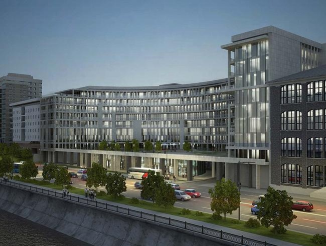
 

The project of a residential complex on the Savvinskaya Embankment


Archi.ru: And what do you think is the reason for that?


Vladimir Plotkin: To a large extent, I think, this has to do with the consequences of the global economic crisis that undermined and changed for the worse the very structure of the development market in Russia. Because up until 2008 those companies were successful in construction that were originally created as the developer companies - over the 10-15 years of their work, such companies had the time to gain some experience, learn to make clear-cut specifications, and they did care about the quality of their work, plus-minus. In other words, they were real professionals. But then they went bankrupt, their employees joined other teams, and the construction market got new players - large banks that do have the financial resources but do not have the slightest idea of what it is that they want, hence the, let's say the "eclectic" organization of the construction processes. In fact, this leads to the fact that any contest turns into a guessing game where you have to guess the commissioner's tastes, and you are lucky if you only have to guess one person's tastes because more often than not you have to deal with a group of "creative consultants" each of whom has his or her own vision of beauty and the right typology.


So, every time, starting new work, the architect is forced to do an equation in a thousand unknowns. Specifically, you never know what kind of restrictions weigh down this or that particular land site. As a result, the designing process turns into a losing game of endless adjusting your project to the "unexpected" restrictions and fine-tuning it to the fickle requirements of the commissioner - creating, under such conditions, something that will reflect and change the city matter for the better, as well as charging this something with your teams creative and personal imprint, is quite a tall order, to be frank.


Archi.ru: Vladimir, you still seem to me one of the few Russian architects that over the years has been able to do exactly that.


Vladimir Plotkin: Our buildings are always a compromise, and, sadly, often a bitter one. This is why when I design a new building I always hope that this time I will make amends for sure but later on, when the building gets finished, I realize yet again just how naive my aspirations were... And I want so much to speak in the language of architecture not about conventionalities but about motion, about context, about the allusions that this or that place suggests. It is these things that make your building different, but under the conditions that we have here almost all of this remains a dream - you cannot even always build a well-proportioned thing, really.
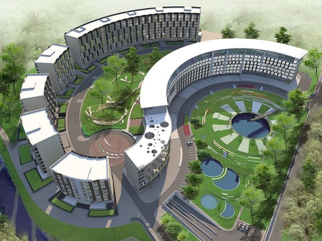
 

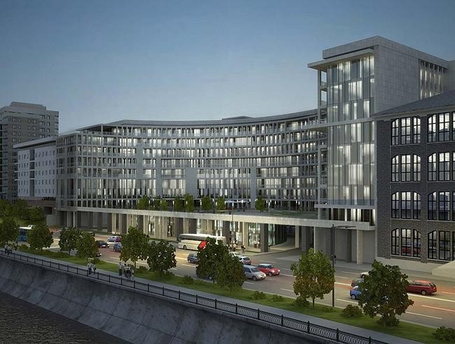
Residential complex with an underground parking garage in the settlement of Zarechye


Archi.ru: What "Reserve" projects are being implemented right now?


Vladimir Plotkin: First of all, a few old projects have finally entered the implementation stage. This year, the Zarechye project will be completed, the one that was developed back in the day when no one even heard of the neighboring Science Town of Skolkovo. The building on the Valovaya Street is now being completed - it is a house with a history; it had a huge number of versions which I am planning to publish one day to get an impressive volume of projects. The residential complex "Tricolor" is also under construction now, even though things are slower there than I would have wanted, just as the Ivanovskoe project. The headquarters building of the United Aircraft Company in the settlement of Zhukovsky is being completed. Just recently they started the construction of a residential complex at Khodynskoe Pole for Capital Group. As far as the already mentioned residential complex at the Bukhvostova Street is concerned, we have entered into the design development phase but there are still a lot of unresolved issues there - both legal and territorial. Still unclear is the destiny of the residential area in the Patroclus Bay - as the commissioner recently put it, he "might use some of our ideas in the future". I really fear that ultimately they will make some pathetic caricature of our draft offer - but, regretfully, I am powerless to prevent that.
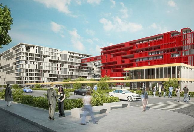

Конкурсный проект жилого комплекса на 1-й улице Бухвостова в Москве
Contest project of a residential complex on the 1st Bukhvostova Street, Moscow
Archi.ru: Why do you think today there is less demand for the "well-proportioned things" than for such "pathetic caricatures"?


Vladimir Plotkin: Only today? That's an eternal question! Books and books have been written on the metaphysics of society's esthetic perception of architecture. Of course, you can try and console yourself with the classic saying that there are just as many types of beauty as there are ways to happiness for everyone. This does not mean, however, that there are no palpable and measurable reasons, including the architects' conformism (and here I do not exclude myself either), that make the architects take the line of the least resistance instead of being one step ahead of the philistine ideas of what is beautiful. A fair part of the blame lies on the so-called "consultants": they calculate and analyze just what their target group is willing to pay for and what styles are in at the moment, and the developers blindly follow their recommendations. But here is the question: what shall we leave to the generations to come? Yes, the question is vexed but still: what buildings shall we be able to show as the example of today's architecture in 20 or 30 year' time? The painted and seemingly expensive-looking atrocities that are now considered to be fine pieces of architecture? If we are to call a spade a spade, then it is nothing more nor less than the typical example of dumbing-down of the population: right before our eyes, there grows a generation that is used to the fact that the whole city media consists of such mock-ups, and it does not offend their eyes. And when I see this situation I realize that our point of honor is to stand up for at least those proverbial proportions, at least the materials, at least the right geometry.

zooming
zooming
zooming
zooming
zooming
zooming


Architect:
Vladimir Plotkin

25 April 2013

Headlines now
The Golden Crown
The concept for a dental clinic in Yekaterinburg, developed by CNTR Studio, revolves around the idea of a “mouth full of gold”: pristine white porcelain stoneware walls are complemented by matte brass details. To avoid an overly literal interpretation, the architects focused on the building’s proportions, skillfully navigating between sunlight requirements and fire safety regulations.
Flexibility and Integration
Not long ago, we covered the project for the fourth phase of the ÁLIA residential complex, designed by APEX. Now, we’ve been shown different fence concepts they developed to enclose the complex’s private courtyards, incorporating a variety of public functions. We believe that the sheer fact that the complex’s architects were involved in such a detail as fencing speaks volumes.
A Step Forward
The HIDE residential complex represents a major milestone for ADM architects and their leaders Andrey Romanov and Ekaterina Kuznetsova in their quest for a fresh high-rise aesthetic – one that is flexible and layered, capable of bringing vibrancy to mass and silhouette while shaping form. Over recent years, this approach has become ADM’s “signature style”, with the golden HIDE tower playing a pivotal role in its evolution. Here, we delve into the project’s story, explore the details of the complex’s design, and uncover its core essence.
Gold in the Sands
A new office for a transcontinental company specializing in resource extraction and processing has opened in Dubai. Designed by T+T Architects, masters of creating spaces that are contemporary, diverse, flexible, and original, this project exemplifies their expertise. On the executive floor, a massive brass-clad partition dominates, while layered textures of compressed earth create a contextually resonant backdrop.
Layers and Levels of Flight
This project goes way back – Reserve Union won this architectural competition at the end of 2011, and the building was completed in 2018, so it’s practically “archival”. However, despite being relatively unknown, the building can hardly be considered “dated” and remains a prime example of architectural expression, particularly in the headquarters genre. And it’s especially fitting for an aviation company office. In some ways, it resembles the Aeroflot headquarters at Sheremetyevo but with its own unique identity, following the signature style of Vladimir Plotkin. In this article, we take an in-depth look at the United Aircraft Corporation (UAC) headquarters in the Moscow agglomeration town of Zhukovsky, supplemented by recent photographs from Alexey Naroditsky – a shoot that became only recently possible due to the fact that improvements were finally made in the surrounding area.
Light and Shadow
In this article, we delve into the architectural design of the “Chaika” house by DNK ag architects, which was recently completed in 2023 as part of the collection of signature designs at ZILArt. As is well-known, all the buildings in this complex follow a design code, yet each one is distinct. This particular building stands out not only for its whiteness and minimalism but also for the refined use of a limited number of techniques that, together, create what can confidently be called synergy.
Casus Novae
A master plan was developed for a large residential area with a name of “DNS City”, but now that its implementation began, the plan has been arbitrarily reformatted and replaced with something that, while similar on the surface, is actually quite different. This is not the first time such a thing happens, but it’s always frustrating. With permission from the author, we are sharing Maria Elkina’s post.
Treasure Hunting
The GAFA bureau, in collaboration with Tegola and Arkhitail, organized an expedition to the island of Kilpola in Karelia as part of Moskomarkhitektura’s “Open City” festival. There, amidst moss and rocks, the students sought answers to questions like: what is the sacred, where does it dwell, and what sustains it? Assisting the participants in this quest were landscape engineer Evgeny Levin, artist Nicholas Roerich, a moose, and the lack of cellular connection. Here’s how the story unfolded.
Depths of the Earth, Streams of Water
In the Malaya Okhta district, the Akzent building, designed by Stepan Liphart, was constructed. It follows a classic tripartite structure, yet it’s what you might call “hand-drawn”: each façade is unique in its form and details, some of which aren’t immediately noticeable. In this article, we explore the context and, together with the architect, delve into how the form was developed.
Fir Tree Dynamics
The “Airports of Region” holding is planning to build an airport in Karachay-Cherkessia, aiming to make the Arkhyz and Dombay resorts more accessible to travelers. The project that won in an invitation-only competition, submitted by Sergey Nikeshkin’s KPLN, blends natural imagery inspired by the shape of a conifer seed, open-air waiting spaces, majestic large trees, and a green roof elevated on needle-like columns. The result is both nature-inspired and WOW.
​A Brick Shell
In the process of designing a clubhouse situated among pine trees in a prestigious suburban area near Moscow, the architectural firm “A.Len” did the façade design part. The combination of different types of brick and masonry correlates with the volumetric and plastique solutions, further enhanced by the inclusion of wood-painted fragments and metal “glazing”.
Word Forms
ATRIUM architects love ambitious challenges, and for the firm’s thirtieth anniversary, they boldly play a game of words with an exhibition that dives deep into a self-created vocabulary. They immerse their projects – especially art installations – into this glossary, as if plunging into a current of their own. You feel as if you’re flowing through the veins of pure art, immersed in a universe of vertical cities, educational spaces – of which the architects are true masters – and the cultural codes of various locations. But what truly captivates is the bold statement that Vera Butko and Anton Nadtochy make, both through their work and this exhibition: architecture, above all, is art – the art of working with form and space.
Flexibility and Acuteness of Modernity
Luxurious, fluid, large “kokoshniks” and spiral barrel columns, as if made from colorful chewing gum: there seem to be no other mansion like this in Moscow, designed in the “Neo-Russian-Modern” style. And the “Teremok” on Malaya Kaluzhskaya, previously somewhat obscure, has “come alive with new colors” and gained visibility after its restoration for the office of the “architectural ecosystem” as the architects love to call themselves. It’s evident that Julius Borisov and the architects at UNK put their hearts into finding this new office and bringing it up to date. Let’s delve into the paradoxes of this mansion’s history and its plasticity. Spoiler: two versions of modernity meet here, both balancing on the razor’s edge of “what’s current”.
Yuri Vissarionov: “A modular house does not belong to the land”
It belongs to space, or to the air... It turns out that 3D printing is more effective when combined with a modular approach: the house is built in a workshop and then adapted to the site, including on uneven terrain. Yuri Vissarionov shares his latest experience in designing tourist complexes, both in central Russia and in the south. These include houseboats, homes printed from lightweight concrete using a 3D printer, and, of course, frame houses.
​Moscow’s First
“The quality of education largely depends on the quality of the educational environment”. This principle of the last decade has been realized by Sergey Skuratov in the project for the First Moscow Gymnasium on Rostovskaya Embankment in the Khamovniki district. The building seamlessly integrates into the complex urban landscape, responding both to the pedestrian flow of the city and the quiet alleyways. It skillfully takes advantage of the height differences and aligns with modern trends in educational space design. Let’s take a closer look.
Looking at the Water
The site of Villa Sonata stretches from the road to the water’s edge, offering its own shoreline, pier, and a picturesque river panorama. To reveal these sweeping views, Roman Leonidov “cut” the façade diagonally parallel to the river, thus getting two main axes for the house and, consequently, “two heads”. The internal core – two double-height spaces, a living room and a conservatory, with a “bridge” above them – makes the house both “transparent” and filled with light.
The White Wing
Well, it’s not exactly white. It’s more of a beige, white-stone structure that plays with the color of limestone – smoother surfaces are lighter, while rougher ones are darker. This wing unites various elements: it absorbs and interprets the surrounding themes. It responds to everything, yet maintains a cohesive expression – a challenging task! – while also incorporating recognizable features of its own, such as the dynamic cuts at the bottom, top, and middle.
Urban Dunes
The XSA Ramps team designed and built a three-part sports hub for a park in Rostov-on-Don, welcoming people of all ages and fitness levels. The skate plaza, pump track, and playground are all meticulously crafted with details that attract a diverse range of visitors. The technical execution of the shapes and slopes transforms this space into a kind of sculptural composition.
Proportional Growth
The project for the fourth phase of the ÁLIA residential area has been announced. The buildings are situated on an elongated plot – almost a “ray” that shoots out from the center of the area towards the river. Their layout reflects both a response to Moscow’s architectural preferences over the past 15 years, shifting “from blocks to towers”, and an interpretation of the neighboring business park designed by SOM. Additionally, the best apartments here are not located at the very top but closer to the middle, forming a glowing “waistline”.
The “Staircase” Building
In designing the “Details” residential complex in New Moscow, Rais Baishev spiced up the now-popular Moscow theme of a “courtyard” building with an idea drawn from the surrealist drawings by Maurits Escher. He envisioned the stepped silhouettes and descending slopes as a metaphysical mega-staircase, creating a key void within the courtyard that gave the project an internal “spine”. This concept is felt both in the building’s silhouette and on its façades.
Projection of the Quarter
No one doubted that the building that Vladimir Plotkin designed as part of the “Garden Quarters” would be the most modernist of all. And it turned out just that way: while adhering to the common design code, the building successfully combines brick and white stone, rhythmically responding to the neighboring building designed by Ostozhenka, yet tactfully and persistently making a few statements of its own. This includes the projection of the ideal urban development composition “14–9–6”, which can be found right next door, mathematical calculations, including those for various types of terraces (and perhaps the only reminder of the Soviet past of the Kauchuk rubber factory!), and the white “cross-stitch” pattern of the façade grid.
Domus Aurea
In this issue, we examine the “Tessinsky-1” house, designed by Sergey Skuratov and completed in 2023. Located in the middle of the Serebryanicheskaya Embankment district, at the intersection of its main streets, this house assumes a sort of “nodal” role: it not only responds to everything around it and preserves many memories of the former EMA factory within itself, but it weaves all this into a newly directed pattern, reconciling bright “gold” and dark-colored brick, largely with the help of the new, modern-yet-archaic Columba brick, which, come to think about it, is the most precious element here.
The Chimney of Nikola-Lenivets
In this issue, we are examining the “Obelisk House” designed by KATARSIS and built for the Arkhstoyanie 2023 festival. However, it was only finished later on, and this is why we are examining it now. It seems to us that after the “Obelisk House” appeared in Nikola-Lenivets, a dialogue and a few inner connections appeared between the temporary structures built here. These houses no longer look like “accidental neighbors”, more of which below.
​Periscope by the Bay
The jury awarded the second place in the competition for a public and cultural center in Petropavlovsk-Kamchatsky to the companies GORA (“Mountain”) and M4. In the consortium’s proposal, the building resembles a sperm whale with a calf swimming next to it or a periscope, whose lenses capture the most spectacular views from the surrounding landscape.
From Arcs to Dolmens
While working on the competition project for Petropavlovsk-Kamchatsky, ASADOV Architects prioritized the value of the natural and urban environment, aiming to preserve the balance of the location while minimizing the resemblance of the volume that they designed to a “traditional building”. The task was challenging, and the architects created three versions, one of which having been developed after the competition, where their main proposal took third place. However, the point of interest here is not the competition result but the continuity of creative thinking.
Hide and Seek
The ID Moskovskiy house, designed by Stepan Liphart in St. Petersburg, in the courtyards near Moskovskiy Avenue beyond the Obvodny Canal and recently completed, is notable for several reasons. Firstly, it has been realized with considerable accuracy, which is particularly significant as this is the first building where the architect was responsible not only for the facades but also for the layouts, allowing for better integration between the two. On the other hand, this building is interesting as an example of the “germination” of new architecture in the city: it draws on the best examples from the neighborhood and becomes an improved and developed sum of ideas found by the architect in the surrounding context.
The Big Twelve
Yesterday, the winners of the Moscow Mayor’s Architecture Award were announced and honored. Let’s take a look at what was awarded and, in some cases, even critique this esteemed award. After all, there is always room for improvement, right?
Above the Golden Horn
The residential complex “Philosophy” designed by T+T architects in Vladivostok, is one of the new projects in the “Golubinaya Pad” area, changing its development philosophy (pun intended) from single houses to a comprehensive approach. The buildings are organized along public streets, varying in height and format, with one house even executed in gallery typology, featuring a cantilever leaning on an art object.
Nuanced Alternative
How can you rhyme a square and space? Easily! But to do so, you need to rhyme everything you can possibly think of: weave everything together, like in a tensegrity structure, and find your own optics too. The new exhibition at GES-2 does just that, offering its visitor a new perspective on the history of art spanning 150 years, infused with the hope for endless multiplicity of worlds and art histories. Read on to see how this is achieved and how the exhibition design by Evgeny Ace contributes to it.
Blinds for Ice
An ice arena has been constructed in Domodedovo based on a project by Yuri Vissarionov Architects. To prevent the long façade, a technical requirement for winter sports facilities, from appearing monotonous, the architects proposed the use of suspended structures with multidirectional slats. This design protects the ice from direct sunlight while giving the wall texture and detail.