По-русски

Lizard's Tale

In spite of all the restrictions that were raining on them from all sides, Vera Butko and Anton Nadtochy were able to build a kindergarten that looks like a toy fairy tale palace. How were they able to do that? Let us find out!

14 February 2013
Object
mainImg

The project of a kindergarten that we are going to cover in this article won the first prize in the contest for "the best design project of a pre-school educational institution of variative shapes", organized by the Research Institute for the Development of Professional Education and with the support of Moscow department of education. The winner was to be awarded, among other things, with an opportunity to make a presentation at a conference dedicated to innovative design of kindergartens. The conference took place on the 15th of February at the Information and Analysis Center of the City Education Department.


The architects got the commission of designing the kindergarten that is situated amidst residential buildings on the 2nd Parkovaya Street in the district of Izmailovo practically at the construction pit stage. Its construction had started by the project of a different architectural office - this project even got all the necessary official approvals but at the same time it was not finished yet: it missed the facades and even the layout of the building was on the "raw" side, though, because officially approved, mandatory to execution.


Strictly speaking, what was required of "Atrium" was just to "finish" the facades and the interiors - but the architects thought it below them to approach the task formally and worked their way through everything, including the technical plan. What was ultimately left of the original project was the set of dimensions, even though the architects had to coordinate the numerous changes not with the investor ("Donstroy") but with a "less personified commissioner", this last being the representatives of the district authorities - due to the fact that the kindergarten has the municipal status and number. In a word, in spite of the time constraints, the minimum budget (the construction period coincided exactly with the lowest point of the economic crisis) and the difficulties connected with getting all the necessary approvals, the architects were ultimately able to make a difference - now the building looked undoubtedly "Atrium" style.
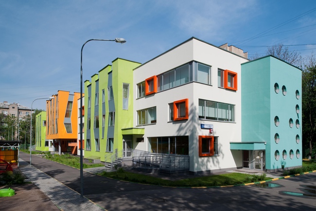
 

Kindergarten at the 2nd Parkovaya Street

Working with the volume that was generally defined by the existing plan, the architects used to the best effect its outstanding blocks, the alternating of which prompted the central theme of the project - the theme of playing games. Each fragment of the building can be viewed as part of an exciting game of blocks, the game elements being there in the structure of the building as well as in the details. This impression is enhanced at the expense of the fact that the cubical blocks are placed with a shift to one another, as if put there by a child's unsteady hand.
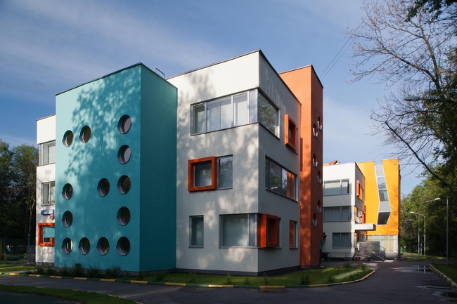
Kindergarten at the 2nd Parkovaya Street

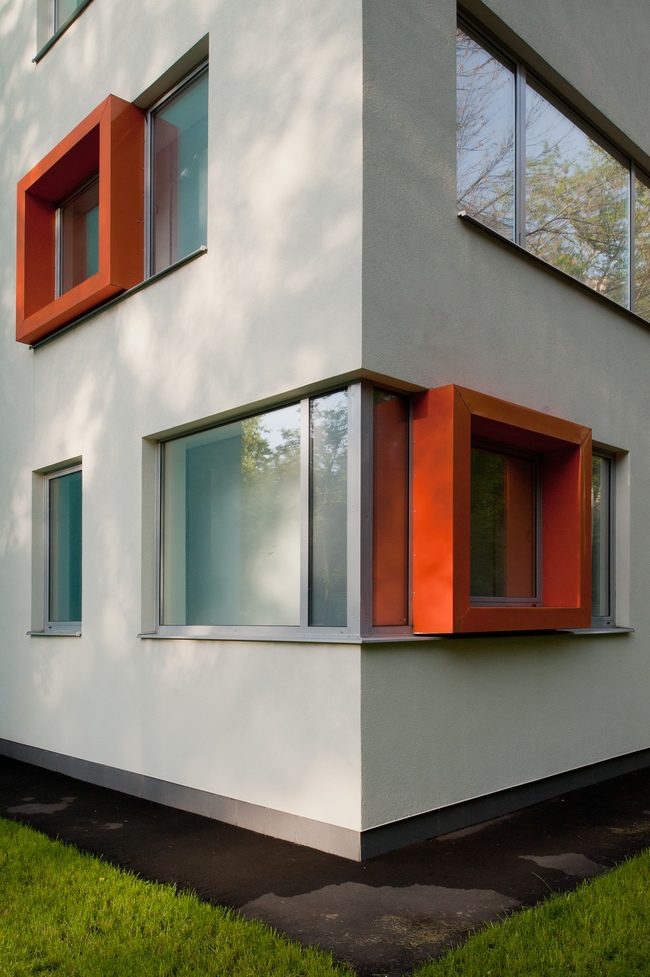
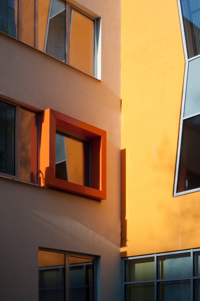
At the same time the structure of the building is easily discernible - from a white rectangle, multicolored volumes protrude: the turquoise and red ones with bull's eye windows are staircases, the chartreuse and the orange ones, pierced with zigzagged verticals of "mystery forest" are the volumes of the auditorium, the gym, and the large swimming pool on the first floor. Behind the white walls, there are children's bedrooms and game rooms but these do not fall short of their neighbors - here and there, like curious children, square red frames pop out of them. Thus the architects implement one of their favorite principles: they designate the functions of the premises on the facade, building the house in accordance with the fundamentals of classic modernism - from inside to outside. And, as a side effect of such decorative functionalism, they are getting a multicolored and height-varying "fairy tale country" with its towers of staircases, and its magic forest that is drawn on the facades and that grows over the roof with the teeth of the parapet that look like the pinions of the Kremlin wall on a child's watercolor drawing. The play of the volumes, the colors, and the heights... Everything is reasoned and everything is cheerful-looking.
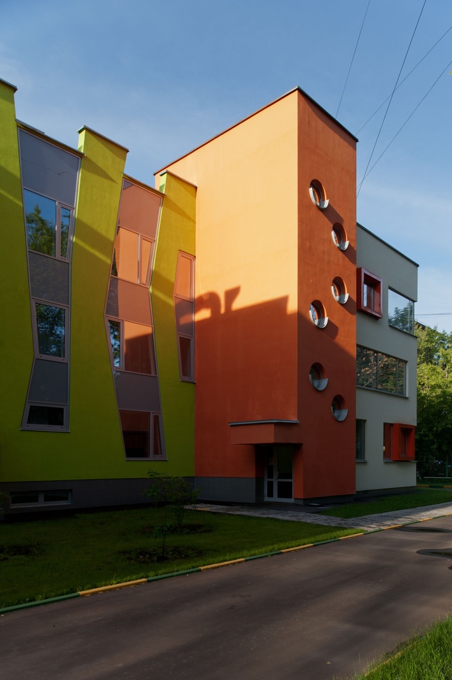
 

Kindergarten at the 2nd Parkovaya Street
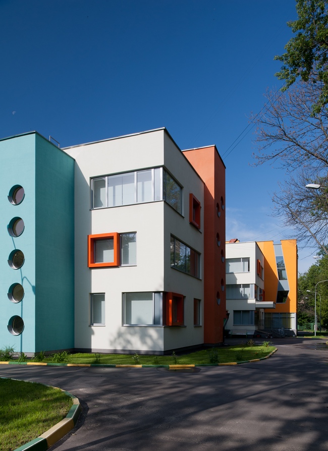
The main image centerpiece of the project was to be formed of the mystery "crayoned forest". Initially it was also planned to make these zigzags three-dimensional, casting a complex form of fiber concrete - it was at that time that "Donstroy" launched a production line of its own for molding fiber concrete panels. "The original idea was to make all the surfaces not only multicolored but of different textures as well, make them from different materials. The commissioner, however, opted out of using the fiber concrete and it all ultimately came down to the good old stucco. It was only the configuration of the windows and the colors that survived" - Vera Butko shares.
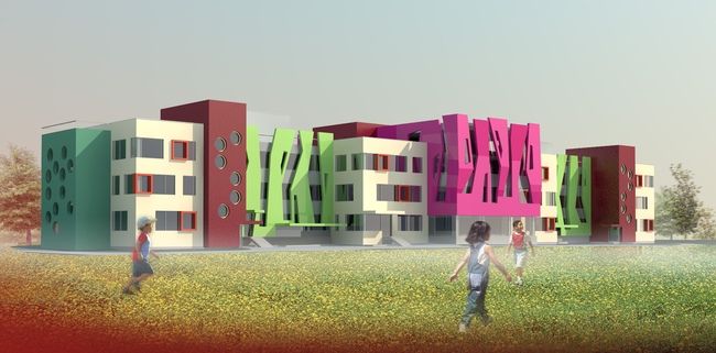
 

Kindergarten at the 2nd Parkovaya Street. Design offer.
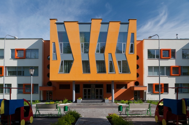
Kindergarten at the 2nd Parkovaya Street
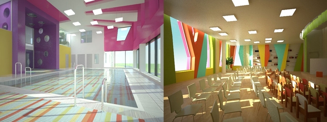
Kindergarten at the 2nd Parkovaya Street. Interior design.

The interiors became the biggest disappointment of the project. The "Atrium" architects worked them down to the last nail, so as every detail would be in its place. However, the never did get access to the author supervision, different people were responsible for the procurement of the materials and furniture, and as a result nothing went to plan. In the project the interiors are drawn as the direct continuation of the facades. They have in them the same round windows and tree-like zigzags on the walls of the auditorium. The original idea was "what you see is what you get" - if you have a "forest" on the outside, you will have a "forest" inside, only better and more colorful. Either the facades were "growing" into the interior or the color was "growing" from the inside out, spilling over onto the walls.
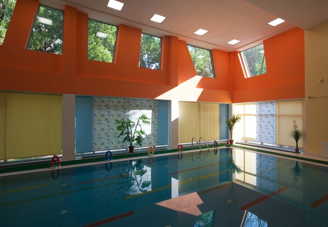
 

Kindergarten at the 2nd Parkovaya Street: swimming pool
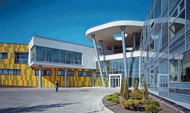
Kozhukhovo Orphanage

Color per se plays a very special part in this project. The bright and cheerful palette unmistakably defines the function of the building. "We fought to protect our color solution for quite a while, - the architects share - we kept getting reproaches and warnings that ostensibly because of the brightness of color the children will grow psychically unbalanced. Funny that we kept getting these accusations from the construction workers themselves, and not from teachers or children psychologists". Shortly after the completion of the construction (in October last year) there were reports that Moscow's mayor Sergey Sobyanin praised the building during one of his inspection visits over the North-West Administrative District: "a great project... positive both from the construction and architectural standpoint" - said the mayor and even recommended its "repeated usage".


The bureau's portfolio includes several school buildings, including the orphanage in Kozhukhovo area, a sunny-yellow building of a sophisticated "whirling" shape. After that, just as the Kuzhukhovo orphanage, also at Donstroy's commission, the architects designed an educational complex in the district of Schukino, consisting of a junior school and two kindergartens.
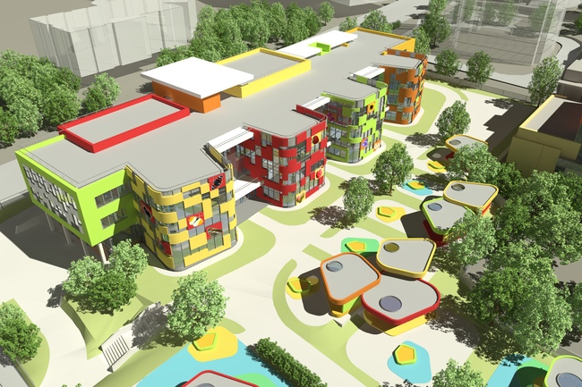
 

Kindergartens at Schukino district. Elevation facing yard

One can notice the similarity between the Kozhukhovo orphanage and the Schukino educational complex: for example, in the first case the slanting "wisps" of silver-colored pillars supported the perforated "pancake" of the main awning that united, like a joint, the entire building, while in the second case this motif is transferred onto the "mushroom" awnings of the children's playgrounds.
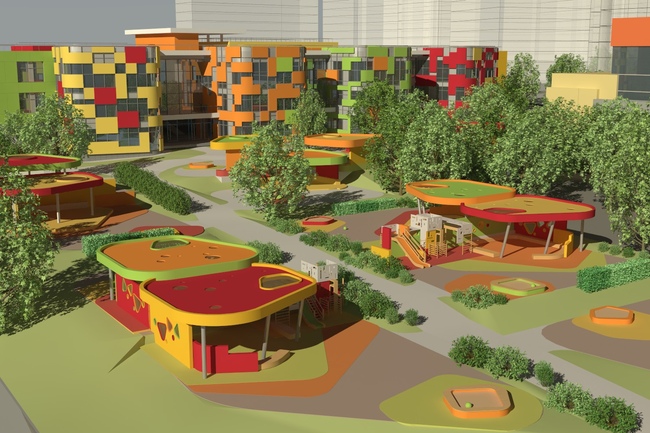
Kindergartens at Schukino district. Yard

Out of the rectangular body of the buildings and into the yard, there grow four rounded "fingers" of the group blocks with "webbings" of deep recessed balconies between them. The color is active, the drawing is asymmetric and it sometimes looks like an arrested game of tetris or maybe like a multitude of chaotic large pixels on the television screen.
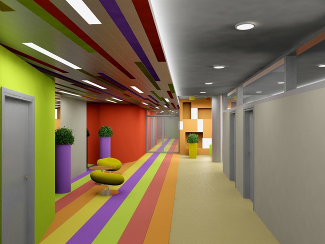
 

Kindergartens at Schukino district. Interiors
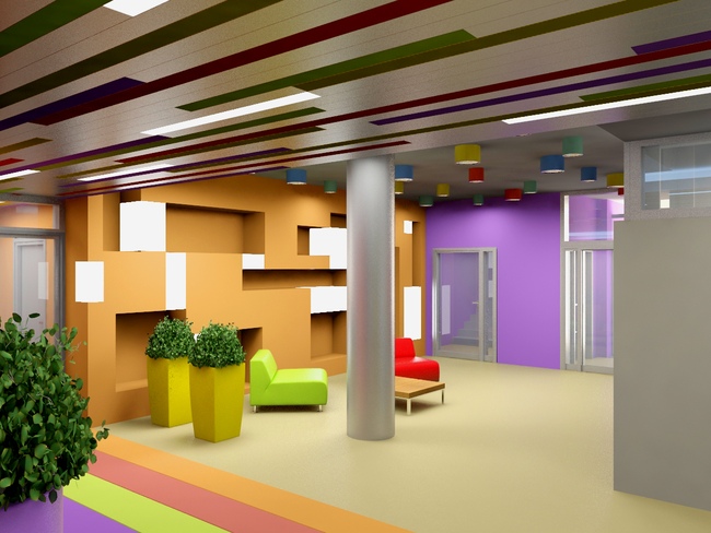
Kindergartens at Schukino district. Interiors
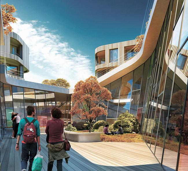
Lower level of the yard

In a word, the theme of schools and kindergartens has become one of the favorites with Vera Butko and Anton Nadtochy. So it is not surprising that in the contest for designing the residential blocks in Skolkovo's Technopark (District D2) they got a block with a kindergarten in it - in that particular case it was designed by the European standards and under a lot of space constraints, and was thus called "children's club", but the colorful beams from this building that was literally inserted inside a hill lightened up the entire block with its playful flares of rainbow colors, breaking through the multicolored glass of the "light funnel" in the center.
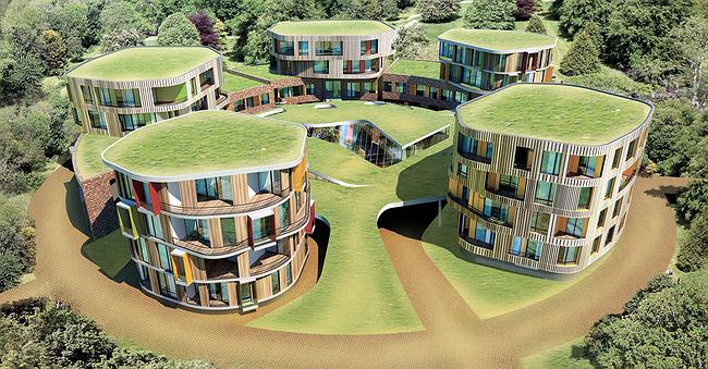
 

Overview of the block

One should mention here that multicolored schools and kindergartens have become quite common of late - now even Moscow municipal architectural bureaus have adopted the typical solution of a multicolored kindergarten building.


So what makes the projects by Vera Butko and Anton Nadtochy so different? I would say that it is some plastic and even theme "abundance" that is there about them. Their color is inseparable from their shape, it grows into it, and then both shape and color grow into the interior. Or, conversely, it grows from the interior onto the facades. The building strives to become a living being, not just another set of "lively" colors that are so numerous around but a house that pays it for real, according to the serious rules of the game. One can always feel it when the grown-ups really had no time to really put their mind to it: they have construction rules and laws to obey, meetings to attend, and phone calls to answer - but the children just want to play games! And the grown-ups make believe that they are playing a game, talking at the same time to their boss or their client on the phone, thinking that they could get away with some sort of palliative.


Vera Butko and Anton Nadtochy play it for real and they don't make believe. And this is precisely why they come up with all of their crazy ideas - and this is really important. Because if you have but one technique or idea, losing it in the construction process is lethal. But if you have many ideas - no, your losses do not become less painful - but here is what ends up happening: the building stays true to itself and keeps its face (and faith!) no matter what. Because it has something that it can give up - like a lizard loses its tail - keeping in mind that perhaps next time you will be able to implement more. Maybe, a lot more.

zooming
zooming


14 February 2013

Headlines now
The Golden Crown
The concept for a dental clinic in Yekaterinburg, developed by CNTR Studio, revolves around the idea of a “mouth full of gold”: pristine white porcelain stoneware walls are complemented by matte brass details. To avoid an overly literal interpretation, the architects focused on the building’s proportions, skillfully navigating between sunlight requirements and fire safety regulations.
Flexibility and Integration
Not long ago, we covered the project for the fourth phase of the ÁLIA residential complex, designed by APEX. Now, we’ve been shown different fence concepts they developed to enclose the complex’s private courtyards, incorporating a variety of public functions. We believe that the sheer fact that the complex’s architects were involved in such a detail as fencing speaks volumes.
A Step Forward
The HIDE residential complex represents a major milestone for ADM architects and their leaders Andrey Romanov and Ekaterina Kuznetsova in their quest for a fresh high-rise aesthetic – one that is flexible and layered, capable of bringing vibrancy to mass and silhouette while shaping form. Over recent years, this approach has become ADM’s “signature style”, with the golden HIDE tower playing a pivotal role in its evolution. Here, we delve into the project’s story, explore the details of the complex’s design, and uncover its core essence.
Gold in the Sands
A new office for a transcontinental company specializing in resource extraction and processing has opened in Dubai. Designed by T+T Architects, masters of creating spaces that are contemporary, diverse, flexible, and original, this project exemplifies their expertise. On the executive floor, a massive brass-clad partition dominates, while layered textures of compressed earth create a contextually resonant backdrop.
Layers and Levels of Flight
This project goes way back – Reserve Union won this architectural competition at the end of 2011, and the building was completed in 2018, so it’s practically “archival”. However, despite being relatively unknown, the building can hardly be considered “dated” and remains a prime example of architectural expression, particularly in the headquarters genre. And it’s especially fitting for an aviation company office. In some ways, it resembles the Aeroflot headquarters at Sheremetyevo but with its own unique identity, following the signature style of Vladimir Plotkin. In this article, we take an in-depth look at the United Aircraft Corporation (UAC) headquarters in the Moscow agglomeration town of Zhukovsky, supplemented by recent photographs from Alexey Naroditsky – a shoot that became only recently possible due to the fact that improvements were finally made in the surrounding area.
Light and Shadow
In this article, we delve into the architectural design of the “Chaika” house by DNK ag architects, which was recently completed in 2023 as part of the collection of signature designs at ZILArt. As is well-known, all the buildings in this complex follow a design code, yet each one is distinct. This particular building stands out not only for its whiteness and minimalism but also for the refined use of a limited number of techniques that, together, create what can confidently be called synergy.
Casus Novae
A master plan was developed for a large residential area with a name of “DNS City”, but now that its implementation began, the plan has been arbitrarily reformatted and replaced with something that, while similar on the surface, is actually quite different. This is not the first time such a thing happens, but it’s always frustrating. With permission from the author, we are sharing Maria Elkina’s post.
Treasure Hunting
The GAFA bureau, in collaboration with Tegola and Arkhitail, organized an expedition to the island of Kilpola in Karelia as part of Moskomarkhitektura’s “Open City” festival. There, amidst moss and rocks, the students sought answers to questions like: what is the sacred, where does it dwell, and what sustains it? Assisting the participants in this quest were landscape engineer Evgeny Levin, artist Nicholas Roerich, a moose, and the lack of cellular connection. Here’s how the story unfolded.
Depths of the Earth, Streams of Water
In the Malaya Okhta district, the Akzent building, designed by Stepan Liphart, was constructed. It follows a classic tripartite structure, yet it’s what you might call “hand-drawn”: each façade is unique in its form and details, some of which aren’t immediately noticeable. In this article, we explore the context and, together with the architect, delve into how the form was developed.
Fir Tree Dynamics
The “Airports of Region” holding is planning to build an airport in Karachay-Cherkessia, aiming to make the Arkhyz and Dombay resorts more accessible to travelers. The project that won in an invitation-only competition, submitted by Sergey Nikeshkin’s KPLN, blends natural imagery inspired by the shape of a conifer seed, open-air waiting spaces, majestic large trees, and a green roof elevated on needle-like columns. The result is both nature-inspired and WOW.
​A Brick Shell
In the process of designing a clubhouse situated among pine trees in a prestigious suburban area near Moscow, the architectural firm “A.Len” did the façade design part. The combination of different types of brick and masonry correlates with the volumetric and plastique solutions, further enhanced by the inclusion of wood-painted fragments and metal “glazing”.
Word Forms
ATRIUM architects love ambitious challenges, and for the firm’s thirtieth anniversary, they boldly play a game of words with an exhibition that dives deep into a self-created vocabulary. They immerse their projects – especially art installations – into this glossary, as if plunging into a current of their own. You feel as if you’re flowing through the veins of pure art, immersed in a universe of vertical cities, educational spaces – of which the architects are true masters – and the cultural codes of various locations. But what truly captivates is the bold statement that Vera Butko and Anton Nadtochy make, both through their work and this exhibition: architecture, above all, is art – the art of working with form and space.
Flexibility and Acuteness of Modernity
Luxurious, fluid, large “kokoshniks” and spiral barrel columns, as if made from colorful chewing gum: there seem to be no other mansion like this in Moscow, designed in the “Neo-Russian-Modern” style. And the “Teremok” on Malaya Kaluzhskaya, previously somewhat obscure, has “come alive with new colors” and gained visibility after its restoration for the office of the “architectural ecosystem” as the architects love to call themselves. It’s evident that Julius Borisov and the architects at UNK put their hearts into finding this new office and bringing it up to date. Let’s delve into the paradoxes of this mansion’s history and its plasticity. Spoiler: two versions of modernity meet here, both balancing on the razor’s edge of “what’s current”.
Yuri Vissarionov: “A modular house does not belong to the land”
It belongs to space, or to the air... It turns out that 3D printing is more effective when combined with a modular approach: the house is built in a workshop and then adapted to the site, including on uneven terrain. Yuri Vissarionov shares his latest experience in designing tourist complexes, both in central Russia and in the south. These include houseboats, homes printed from lightweight concrete using a 3D printer, and, of course, frame houses.
​Moscow’s First
“The quality of education largely depends on the quality of the educational environment”. This principle of the last decade has been realized by Sergey Skuratov in the project for the First Moscow Gymnasium on Rostovskaya Embankment in the Khamovniki district. The building seamlessly integrates into the complex urban landscape, responding both to the pedestrian flow of the city and the quiet alleyways. It skillfully takes advantage of the height differences and aligns with modern trends in educational space design. Let’s take a closer look.
Looking at the Water
The site of Villa Sonata stretches from the road to the water’s edge, offering its own shoreline, pier, and a picturesque river panorama. To reveal these sweeping views, Roman Leonidov “cut” the façade diagonally parallel to the river, thus getting two main axes for the house and, consequently, “two heads”. The internal core – two double-height spaces, a living room and a conservatory, with a “bridge” above them – makes the house both “transparent” and filled with light.
The White Wing
Well, it’s not exactly white. It’s more of a beige, white-stone structure that plays with the color of limestone – smoother surfaces are lighter, while rougher ones are darker. This wing unites various elements: it absorbs and interprets the surrounding themes. It responds to everything, yet maintains a cohesive expression – a challenging task! – while also incorporating recognizable features of its own, such as the dynamic cuts at the bottom, top, and middle.
Urban Dunes
The XSA Ramps team designed and built a three-part sports hub for a park in Rostov-on-Don, welcoming people of all ages and fitness levels. The skate plaza, pump track, and playground are all meticulously crafted with details that attract a diverse range of visitors. The technical execution of the shapes and slopes transforms this space into a kind of sculptural composition.
Proportional Growth
The project for the fourth phase of the ÁLIA residential area has been announced. The buildings are situated on an elongated plot – almost a “ray” that shoots out from the center of the area towards the river. Their layout reflects both a response to Moscow’s architectural preferences over the past 15 years, shifting “from blocks to towers”, and an interpretation of the neighboring business park designed by SOM. Additionally, the best apartments here are not located at the very top but closer to the middle, forming a glowing “waistline”.
The “Staircase” Building
In designing the “Details” residential complex in New Moscow, Rais Baishev spiced up the now-popular Moscow theme of a “courtyard” building with an idea drawn from the surrealist drawings by Maurits Escher. He envisioned the stepped silhouettes and descending slopes as a metaphysical mega-staircase, creating a key void within the courtyard that gave the project an internal “spine”. This concept is felt both in the building’s silhouette and on its façades.
Projection of the Quarter
No one doubted that the building that Vladimir Plotkin designed as part of the “Garden Quarters” would be the most modernist of all. And it turned out just that way: while adhering to the common design code, the building successfully combines brick and white stone, rhythmically responding to the neighboring building designed by Ostozhenka, yet tactfully and persistently making a few statements of its own. This includes the projection of the ideal urban development composition “14–9–6”, which can be found right next door, mathematical calculations, including those for various types of terraces (and perhaps the only reminder of the Soviet past of the Kauchuk rubber factory!), and the white “cross-stitch” pattern of the façade grid.
Domus Aurea
In this issue, we examine the “Tessinsky-1” house, designed by Sergey Skuratov and completed in 2023. Located in the middle of the Serebryanicheskaya Embankment district, at the intersection of its main streets, this house assumes a sort of “nodal” role: it not only responds to everything around it and preserves many memories of the former EMA factory within itself, but it weaves all this into a newly directed pattern, reconciling bright “gold” and dark-colored brick, largely with the help of the new, modern-yet-archaic Columba brick, which, come to think about it, is the most precious element here.
The Chimney of Nikola-Lenivets
In this issue, we are examining the “Obelisk House” designed by KATARSIS and built for the Arkhstoyanie 2023 festival. However, it was only finished later on, and this is why we are examining it now. It seems to us that after the “Obelisk House” appeared in Nikola-Lenivets, a dialogue and a few inner connections appeared between the temporary structures built here. These houses no longer look like “accidental neighbors”, more of which below.
​Periscope by the Bay
The jury awarded the second place in the competition for a public and cultural center in Petropavlovsk-Kamchatsky to the companies GORA (“Mountain”) and M4. In the consortium’s proposal, the building resembles a sperm whale with a calf swimming next to it or a periscope, whose lenses capture the most spectacular views from the surrounding landscape.
From Arcs to Dolmens
While working on the competition project for Petropavlovsk-Kamchatsky, ASADOV Architects prioritized the value of the natural and urban environment, aiming to preserve the balance of the location while minimizing the resemblance of the volume that they designed to a “traditional building”. The task was challenging, and the architects created three versions, one of which having been developed after the competition, where their main proposal took third place. However, the point of interest here is not the competition result but the continuity of creative thinking.
Hide and Seek
The ID Moskovskiy house, designed by Stepan Liphart in St. Petersburg, in the courtyards near Moskovskiy Avenue beyond the Obvodny Canal and recently completed, is notable for several reasons. Firstly, it has been realized with considerable accuracy, which is particularly significant as this is the first building where the architect was responsible not only for the facades but also for the layouts, allowing for better integration between the two. On the other hand, this building is interesting as an example of the “germination” of new architecture in the city: it draws on the best examples from the neighborhood and becomes an improved and developed sum of ideas found by the architect in the surrounding context.
The Big Twelve
Yesterday, the winners of the Moscow Mayor’s Architecture Award were announced and honored. Let’s take a look at what was awarded and, in some cases, even critique this esteemed award. After all, there is always room for improvement, right?
Above the Golden Horn
The residential complex “Philosophy” designed by T+T architects in Vladivostok, is one of the new projects in the “Golubinaya Pad” area, changing its development philosophy (pun intended) from single houses to a comprehensive approach. The buildings are organized along public streets, varying in height and format, with one house even executed in gallery typology, featuring a cantilever leaning on an art object.
Nuanced Alternative
How can you rhyme a square and space? Easily! But to do so, you need to rhyme everything you can possibly think of: weave everything together, like in a tensegrity structure, and find your own optics too. The new exhibition at GES-2 does just that, offering its visitor a new perspective on the history of art spanning 150 years, infused with the hope for endless multiplicity of worlds and art histories. Read on to see how this is achieved and how the exhibition design by Evgeny Ace contributes to it.
Blinds for Ice
An ice arena has been constructed in Domodedovo based on a project by Yuri Vissarionov Architects. To prevent the long façade, a technical requirement for winter sports facilities, from appearing monotonous, the architects proposed the use of suspended structures with multidirectional slats. This design protects the ice from direct sunlight while giving the wall texture and detail.