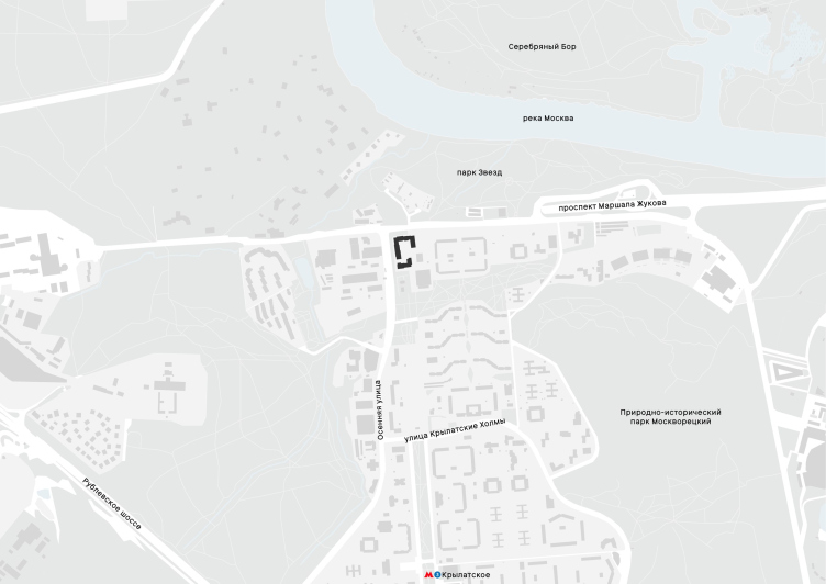
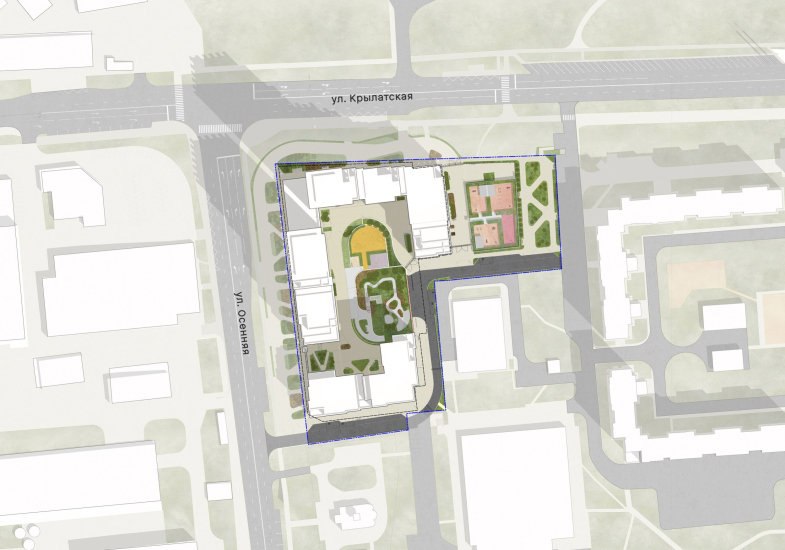
Location plan. “Krylatskaya 33” residential complex, a project
Copyright: © Ostozhenka Architects
Running directly from south to north, Osenny Boulevard was laid out in the 1980s, stretching like an arrow for two kilometers from Rublevskoe Highway. The challenge lay in the rugged terrain: the elevation drop from the Moskva River slope to the highway is 40 meters, with another 20 meters down to the river. This area was once known as Krylatskaya Mountain, home to a fortified settlement in the 12th-14th centuries. As a result, the boulevard of the 1980s turned out to be stepped, with elevation changes and staircases. Yet, it still serves as a spatial axis, shooting through the landscape above Serebryany Bor and pointing toward Troitse-Lykovo.
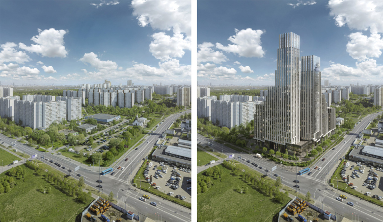
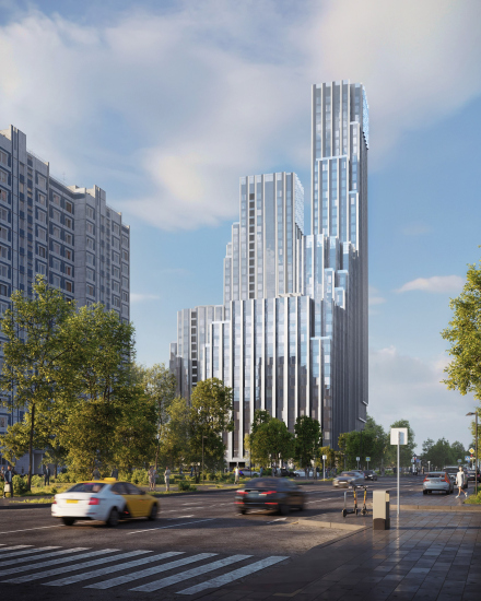
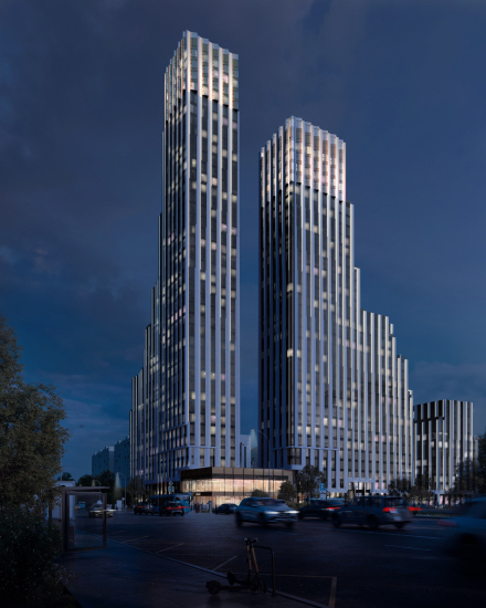
This is precisely the axis, upon which “Krylatskaya 33” residential complex, designed by Ostozhenka, is strung. Destined to become the area’s main vertical landmark, it “leads” the entire flock of local micro-districts, its towers coming to a halt at the intersection above the Moskva River.
“Krylatskaya 33” residential complex, a project
Copyright: © Ostozhenka Architects
The vacant corner plot emerged because, in the 1970s, this spot was planned as the intersection of the future Marshal Zhukov Avenue and a metro line. The avenue was eventually routed through a tunnel along the river, the metro was built farther east, and for years, the rectangular lot at the crossroads remained nothing but an open parking area.
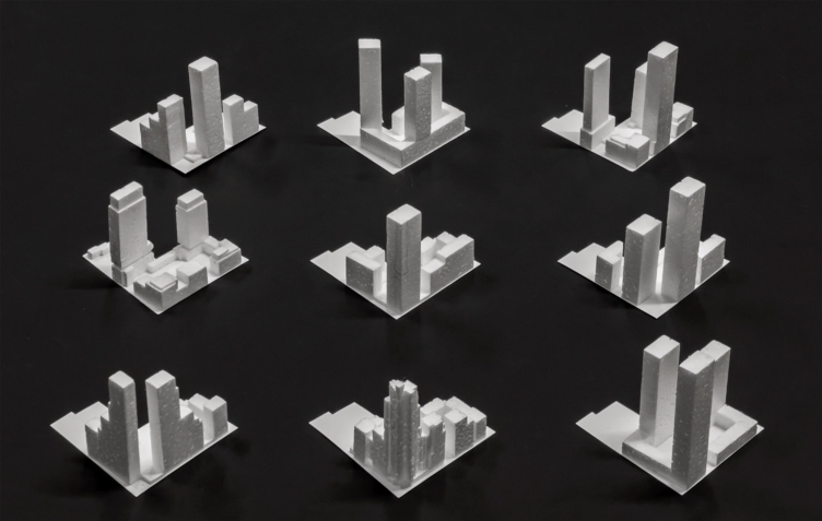
The form did not emerge immediately – the architects tried quite a few variations at first.
“Krylatskaya 33” residential complex, a project
Copyright: © Ostozhenka Architects
In the end, they settled on a version that is hard to call orthodox within the context of contemporary Moscow trends. I would guess that ten years ago, this site might have seen a sectional block rising 100 meters (well, maybe 70 meters) high. Five years ago, the preference might have been for a composition of three or four towers with roughly square floor plans.
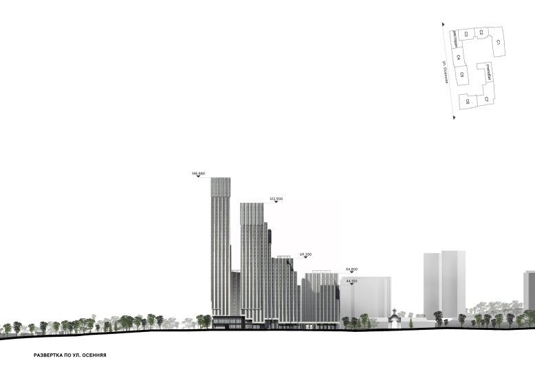
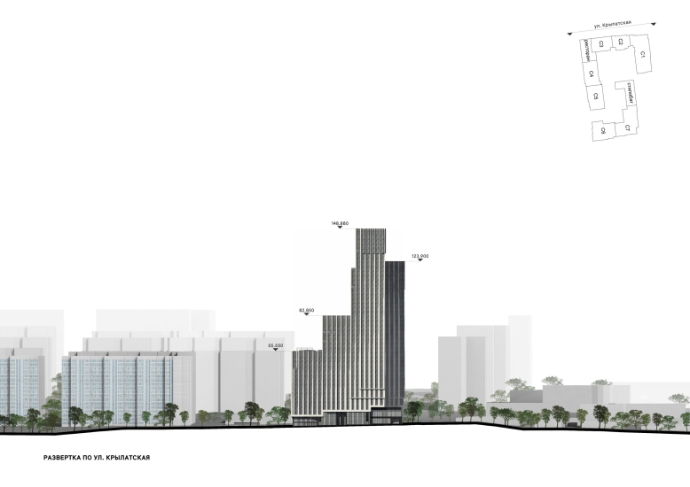
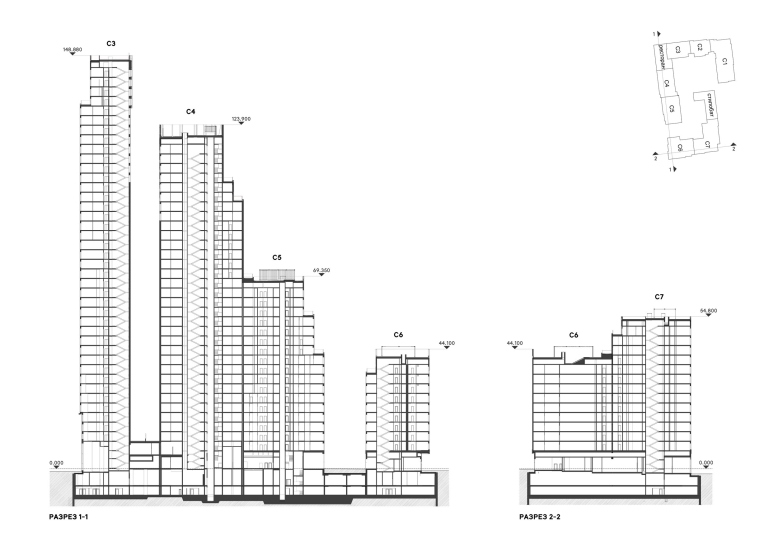
In this instance, however, we see a blend of several familiar large-scale housing typologies. The block is nearly enclosed in plan, yet at the same time is spatially open. Toward the residential buildings and the recently built church, the volumes gradually descend to “shoulders” that align with the 1980s high-rises – ranging from 43 to 55.5 meters in height.
One might imagine the complex as a parallelepiped sliced diagonally from the upper northwest corner to the southeast. Indeed, if you trace a line along the rooftops, you get something akin to what the architects vividly described as a “skirt” or the trailing hem of a lady’s gown in a late Gothic miniature.
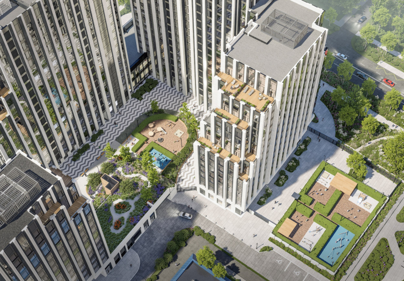
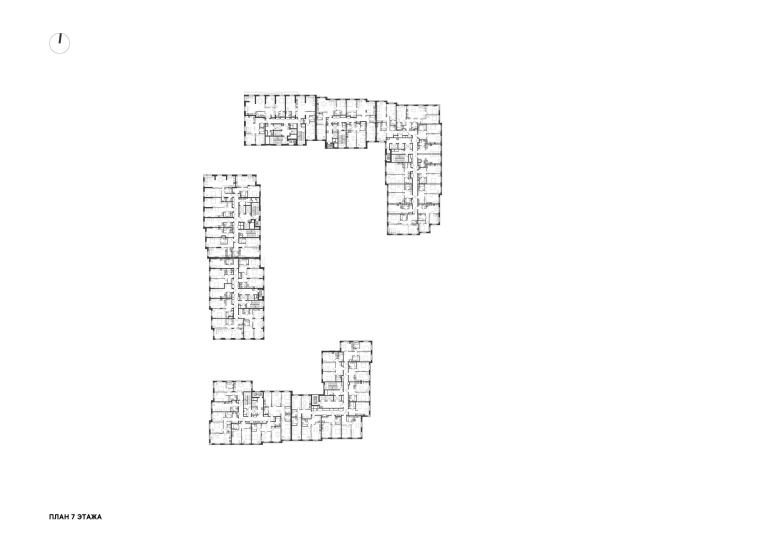
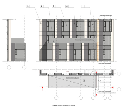
This, however, is not the case at all, as the structure is actually stepped. Each level features terraces for the adjacent apartments, arranged not chaotically, yet not uniformly either. Some steps are large, others quite small; the terraces vary in size as well – some of them are end terraces, some occupy corners.
There is no measured rhythm here, nor is there an expansive, sweeping openness. The stepped volume resembles a geological formation: it develops incrementally, as if icy cliffs or a colony of crystals were “extruding themselves” from the earth. Following certain rules, rising from below, strictly vertical – yet with an array of picturesque nuances.
It was essential for us to create a dominant feature – a vertical accent – at the corner of two streets. This is a logical urban planning technique: to anchor the intersection, marking its presence.
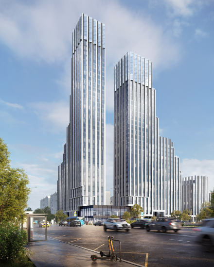
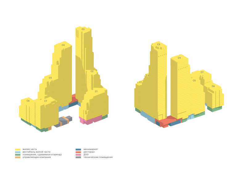
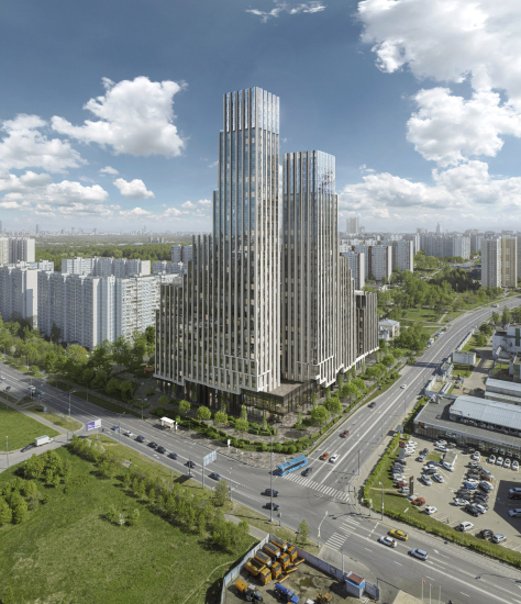
An important design decision – one that emerged in the process of refining the final form – was to split the corner dominant into two towers. They are placed close enough to create a unified vertical silhouette, yet they do not merge into a single monumental obelisk-like volume. Instead, a kind of dialogue arises between the masses, and a narrative unfolds. As a result, the key accent is not on the towers themselves but on the space between them: as if two planes have drawn near but never fully converged. This gap carries the most energy – it creates certain magnetism, making the spatial pause, rather than the mass, the true protagonist of the composition.
Looking at the final version of the project now, I see that we have gained much more – above all, a building outline that seems to grow organically from its surroundings. Its form is artistically unpredictable, as if crystals have formed where salt once dripped. Or as if a natural process of weathering and erosion has shaped a kind of mountain, where the more resilient layers remain while the softer ones have been carved away, leaving behind terraces.
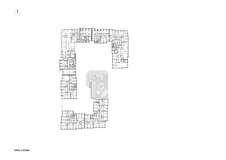
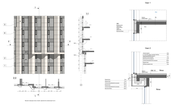
The floor plans, much like the silhouettes, vary within reason. Or, to put it another way, they are “sculpted” along with the overall form, individually drawn. A section can wrap around a corner by the width of a single room, seamlessly connecting to another “counterpart” section. There’s plenty to discover here – the architects themselves speak of their efforts to embed the apartments within the massing. In fact, this is precisely what contemporary architects working on large-scale residential projects primarily focus on: shaping a silhouette through a composition of layouts. The façade panels extend outward as cantilevers, forming staggered ledges – shallow but asymmetrical. The floor plan meanders in a stepped, serpentine fashion, though still within a rectangular footprint.
The upper floors of the towers – the result of further sculptural explorations – have been transformed by the architects into “heads” featuring a glass “accordion” of facades – essentially, a row of right-angled triangles without hypotenuses. This solution, without affecting the structural framework, allows for excellent natural lighting, effectively “catching” the light. Standing in such a projection, one might indeed feel as if they are floating above the city.
The glass “teeth” of the towers’ upper sections are oriented opposite to the pylons’ bevels on the main structure, ensuring that the “heads” stand out due to the differing light exposure on their surfaces. At night, this contrast will be further accentuated by the glow from within.
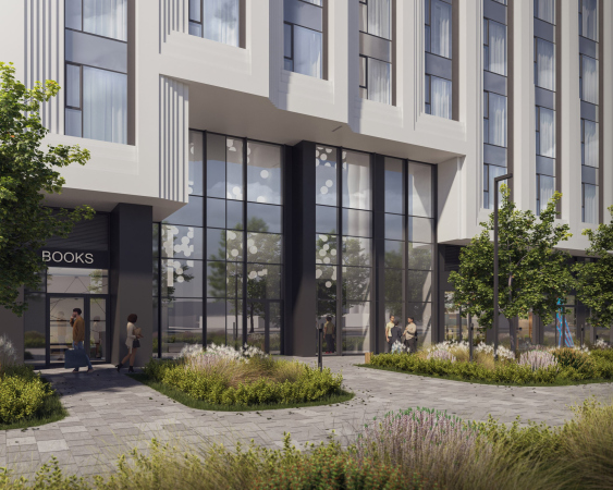
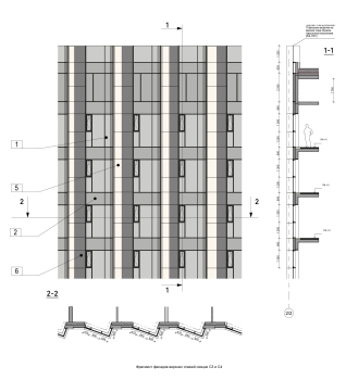
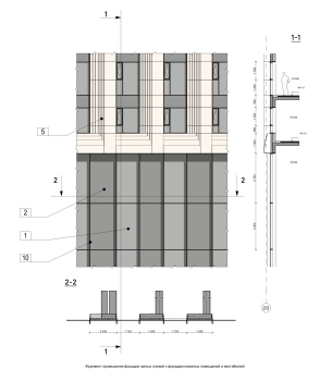
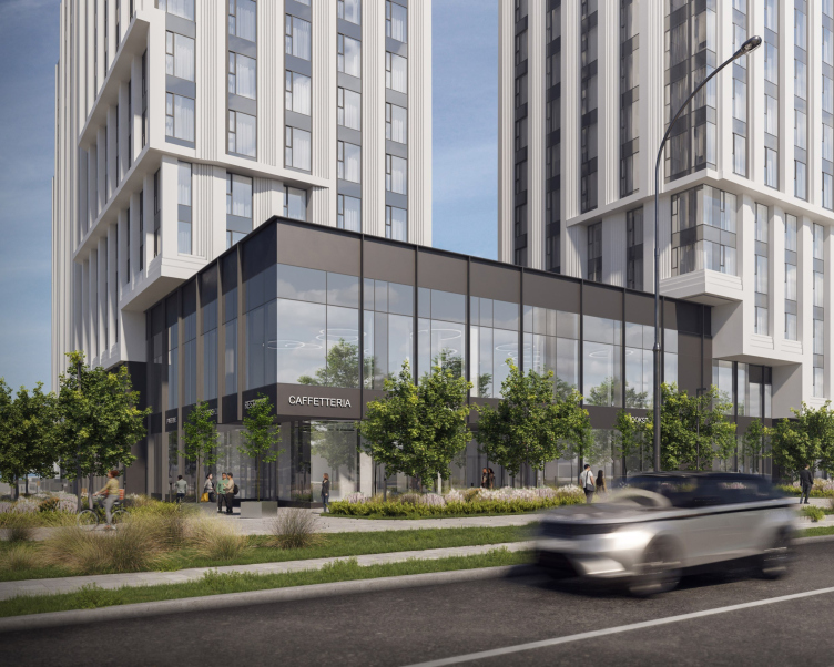
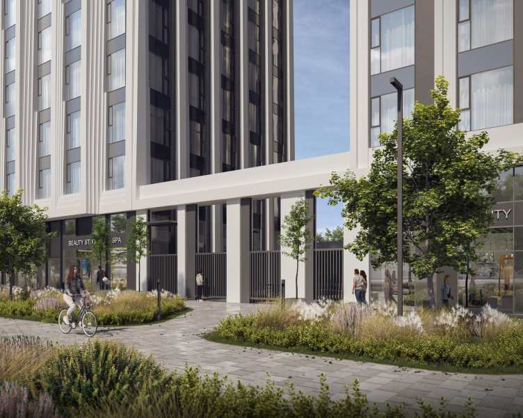
While the “heads” are glass, the pylons of the main body are nearly white. The façade material has not yet been finally determined, but the plan is to use glass fiber-reinforced concrete, resembling stone. The pylons feature large, stepped edges – looking a bit like scarp rock formation – with a tapering effect that makes the piers appear slimmer from bottom to top. The “light-stone” facades extend significantly over the podium level, where they are visually anchored by a stepped horizontal band. This echoes the building’s upper contour in a more “material” cut, allowing the pedestrians to better perceive the thickness of the structure.
The effect of recessing the lower tiers is particularly striking in the two-story corner volume, which connects the two towers like a hinge. The second floor will house a restaurant, accessed via an open staircase from the entrance lobby. Yet from the outside, this will continue to look like a single unified volume – simple, multidimensional in form, and slightly recessed. One might say that, with modernist modesty, it steps back from the building line – or, conversely, that it reveals the building’s “inner substance” beneath and between the façade layers, inviting pedestrians to engage with it directly.
“Krylatskaya 33” residential complex, a project
Copyright: © Ostozhenka Architects
The lobby in the lower tier of the complex is also spacious, covering a total area of 300 square meters, earning it the proud title of a grand lobby. The ceiling heights range from 5.5 to 7 meters. The architects created preliminary interior sketches – solely to understand the atmosphere this space would evoke. For now, until the final décor is determined, the impression is one of restrained grandeur.
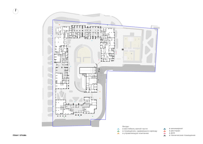
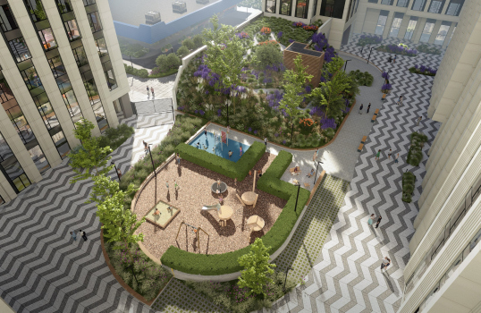
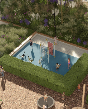
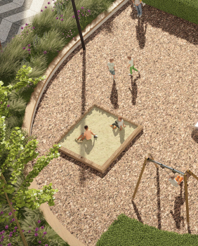
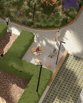
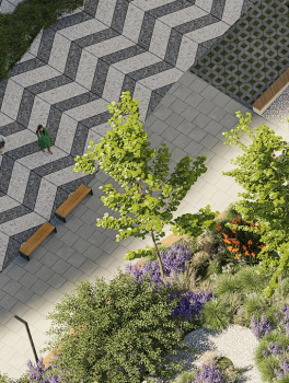
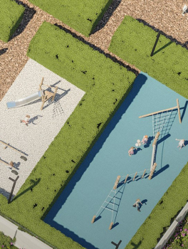
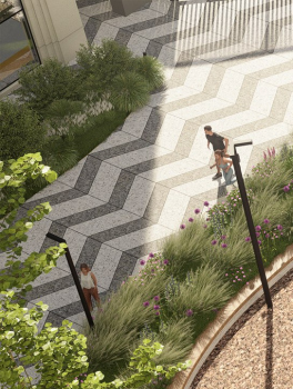
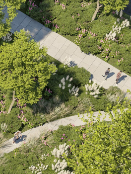
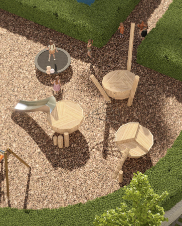
Beneath the complex, there are two levels of underground parking, with piles and walls planned to be constructed to a depth of up to 40 meters. The private courtyard is located on the parking roof, with the landscaping project also developed by Ostozhenka. A key feature here is the zoning. Firstly, the courtyard is planned at a level below Osennyaya Street’s sidewalk, separated from it by a colonnade and a staircase leading downward.
“Krylatskaya 33” residential complex, a project
Copyright: © Ostozhenka Architects
Secondly, on the opposite side of the courtyard, where the southern section turns eastward, it continues into a single-story technical block, which, among other functions, houses an enclosed waste collection chamber – a feature still relatively rare in Moscow. On the roof of this technical block, facing the courtyard, the architects have proposed a lush alpine rock garden. The eastern section of the complex incorporates a kindergarten.
The design work for “Krylatskaya 33” was carried out between 2022 and 2024 at the commission of the developer Capital Group. However, the project’s client has since changed, and construction and sales are now being handled by SZ “Siyanie”.
We started with the massing, sculpting the contours of the complex based on the site’s position in the city – and, I must say, it took considerable effort to maintain the form throughout the design and planning process. It required numerous refinements, as well as structural and engineering solutions. Though the project was never overburdened with technical and economic parameters from the start – one of its great strengths – this allowed us to preserve space and a sense of openness, giving us the freedom to work with proportions within the original maximum height of 150 meters. We didn’t even feel the need to increase the tower heights when height restrictions were lifted in Moscow.
The very concept of a hybrid typology, combining perimeter blocks and towers in the middle, is in some ways convenient, as it allows for a variety approaches. One volume is oriented along Krylatskaya Street, the other along Osennyaya Street – one has apartments with an optimal north-south orientation, while the other consists of east-west sections, which are typically more challenging to work with. Ultimately, section three, the tallest one, turned out to be quite slender, with just three apartments per floor.
The very concept of a hybrid typology, combining perimeter blocks and towers in the middle, is in some ways convenient, as it allows for a variety approaches. One volume is oriented along Krylatskaya Street, the other along Osennyaya Street – one has apartments with an optimal north-south orientation, while the other consists of east-west sections, which are typically more challenging to work with. Ultimately, section three, the tallest one, turned out to be quite slender, with just three apartments per floor.
Indeed, “Krylatskaya 33” is set to become one of the very first new residential complexes in this area, and at the very least, the first large-scale one built to the standards that have taken hold in Moscow over the past 5-10 years: a car-free courtyard, a podium level with diverse functional spaces… The terraces and panoramic windows alone are a great advantage in such a natural setting. This environment, to a large extent, serves as the basis for positioning the project as “eco-friendly”. Also contributing to this status are the enclosed waste collection area, the supply and exhaust ventilation system, and the VRF air conditioning systems.
Back to the imagery, though! What does this complex actually look like? As mentioned earlier, in typological terms, it is a “hybrid”, merging elements of a perimeter block, sectional housing, and towers. The subtle allusions to Art Deco – most notably in the stepped edges of the pylons – on the one hand, dissolve into the glass-and-metal background, and on the other, are softened by the sheer scale of the entire development.
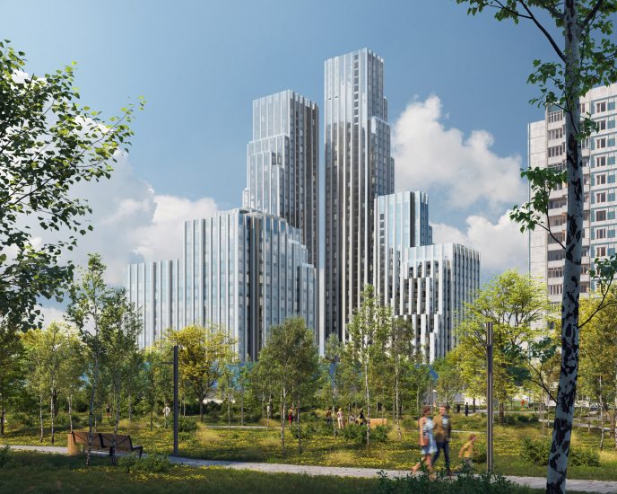
A bold, fence-like grid structures the glass mass, as if holding it within a kind of “basket”, whose silhouette, in my view, explores the theme of the “deconstruction of a high-rise”. From certain perspectives – especially if one imagines drifting down the Moskva River, perhaps on a paddleboard – the new complex will appear as a stepped pyramid. You turn a corner, and you realize the “pyramid” isn’t whole; not only is there a break in it, but it is also composed of two distinct planes. It’s as if, here on the river slope, at Moscow’s “beginning”, we are shown a kind of “spoiler”: a white-and-glass outline of the city’s iconic high-rises, lined along the Garden Ring and further down the river on Vorobyovy Gory (“Sparrow Hills”). But this silhouette is noticeably more restrained, more minimalist, in the spirit of modernist architecture – the language in which Krylatskoye’s "old" panel housing was built.
The architects of Ostozhenka are known for their contextual approach and deep sensitivity to the city. But to conjure the ghost of a skyscraper from the fabric of micro-district aesthetics – that requires a rare level of immersion in context.


