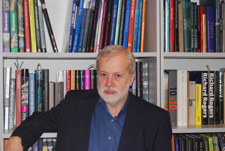
Anatoliy Stolyarchuk: "I've got no interests outside of architecture".
An interview with the Saint Petersburg architect and the leader of his studio Anatoliy Stolyarchuk.
Interviewed by: Irina Bembel Translated by: Anton Mizonov
02 December 2015
Interview
Firm:
Archi.ru: - How did you start your career in architecture?
Anatoliy Stolyarchuk:
It all started with me coming to Saint Petersburg which was called Leningrad back then. I was born in a small Ukrainian town of Kamenets-Podolsk, and I went to a regular school there. And when I came to Leningrad I realized that I wanted to be an architect. When I was taking my entrance exams at the Academy of Arts I only had behind me an amateur painting club and private drawing lessons, so I in fact was a "tabula rasa" - but because of this I imbibed everything like a sponge. I had great teachers: besides Sergey Speransky whose studio I attended during my second year, these were such well-known architects as Alexander Macheret, Valerian Volonsevich, and Nathan Tregubov. There was a wonderful aura about the Academy that gave me strength for years to come.
- If I ask you to name the milestones of your professional career, what would it be?
After serving in the military, I spent fourteen and a half years in our famous LENPROJECT in Studio 2 that was then lead by Login Shreter (it was later on headed by Jean Verzhbiisky and Nikolai Apostol), and by the end of my time there I became the deputy chief. In 1989 I was invited to head a studio in LenZNIep where I then worked for nine years. This studio was once headed by Sergey Speransky; over that time my colleagues were Victoria Struzman, Mark Serebrovsky, and others. To me, it was a bar raised pretty high.
It was Perestroika at that time; there were no large projects to do, yet still I was able to get a very important experience of interested residential construction. In collaboration with Valery Kaplunov, we designed a residential compound near Nizhny Novgorod for the military people and their families who came back from German Democratic Republic. Then, this time unassisted, our studio designed a similar compound in the city of Tver. Back in those days, integrated design - with schools and kindergartens, not to mention other objects of social and cultural infrastructure - was quite a rarity. Because they would first build the serial standard residential buildings and then they would try to "pull up" the infrastructure to them in a way that was painfully inefficient. In our case, we from the very start provided for a fabulous school with a swimming pool, a kindergarten, a community center - and all of this was ultimately implemented! In 1998, I opened my own architectural company and I've been running it up to the present day.
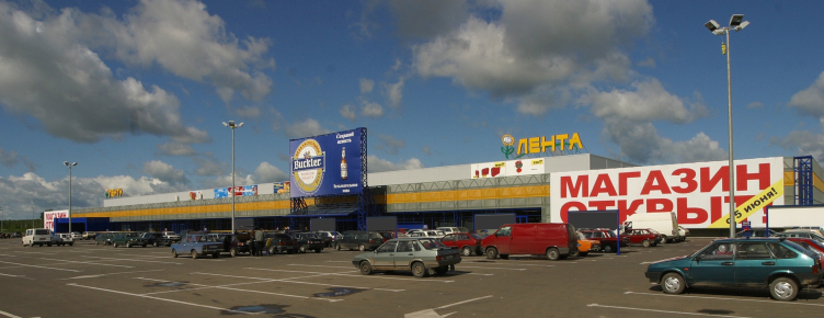
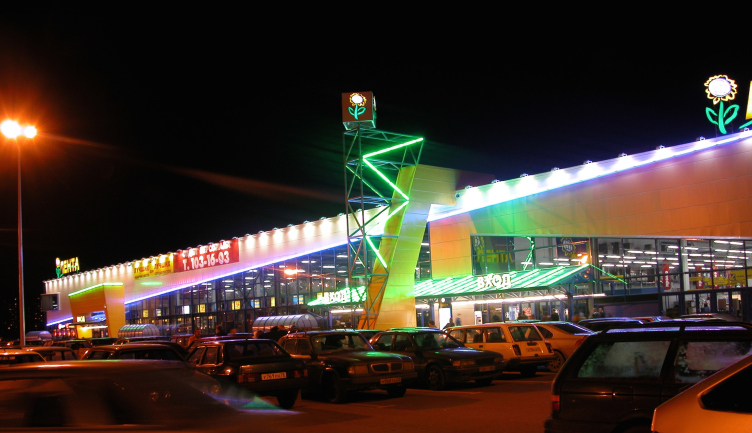
- One of your trademark projects is the chain of "Lenta" hypermarkets...
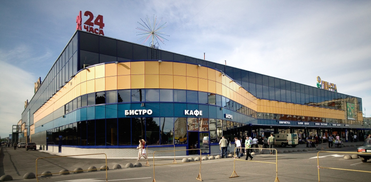
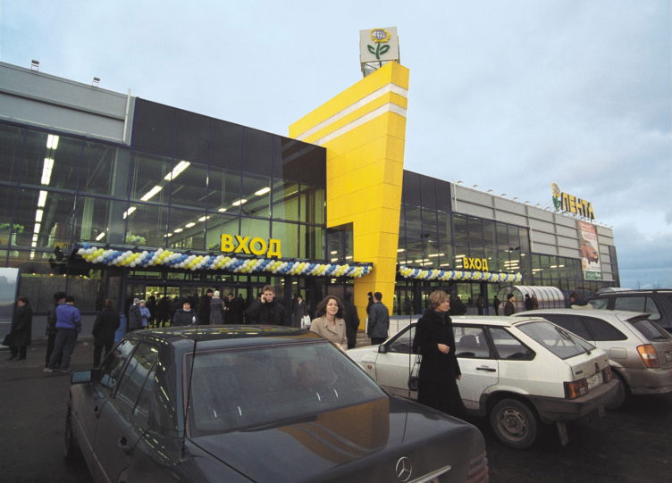
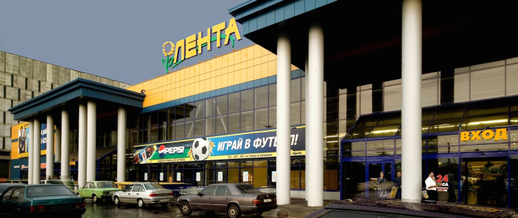
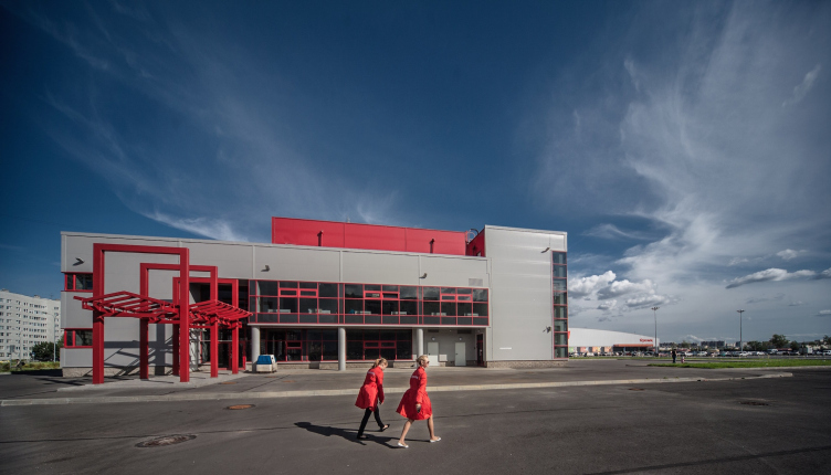
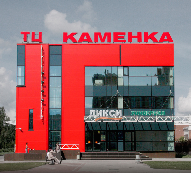
Yes, we developed ten projects, out of which nine have been implemented. For the Russia of the early 2000's, the chain hypermarkets were quite a novelty. We considered our task as taking those all-functional premises, pre-calculated down to the last inch, and giving them recognizable and customer-friendly features - first of all, by virtue of organizing their entrance groups. We had quite a hard time trying to convince our customer that this was really necessary but he ultimately was satisfied because our design solutions were really the ones that sold. We worked quite a lot in the genre of hypermarkets (besides "Lenta", these are "Norma", "Metrika", and "Castorama" chains) but we also built a lot of residential and public buildings.
- Which of them do you consider to be your milestones?
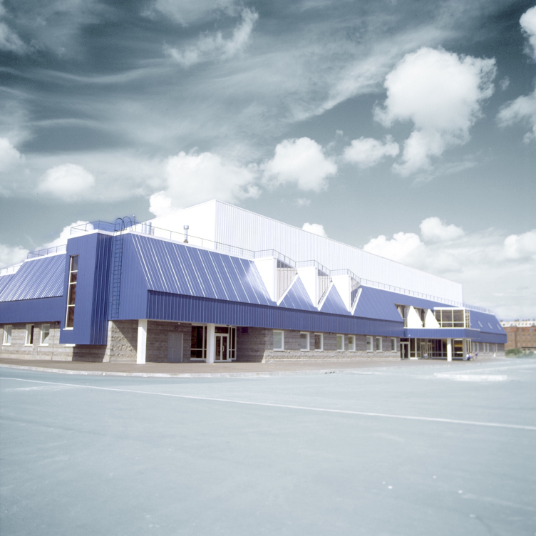
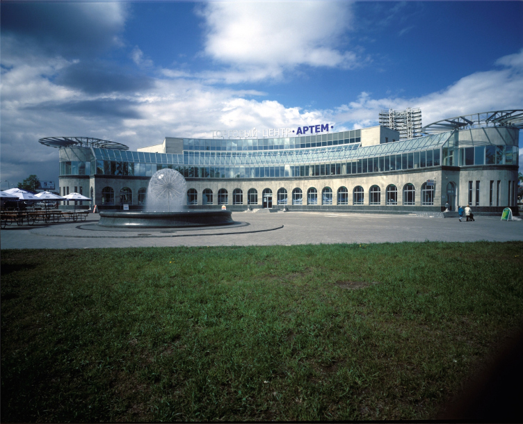
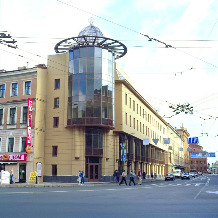
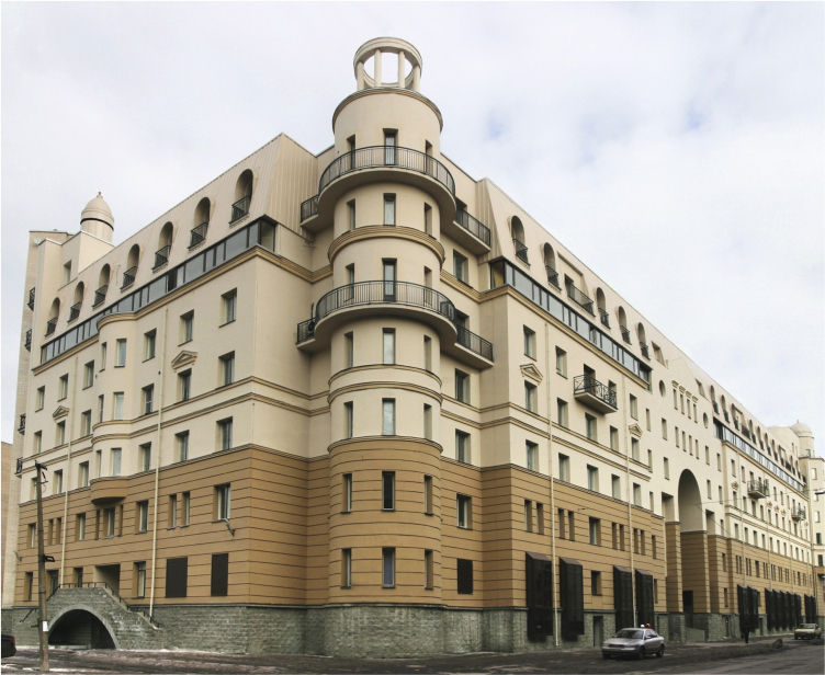
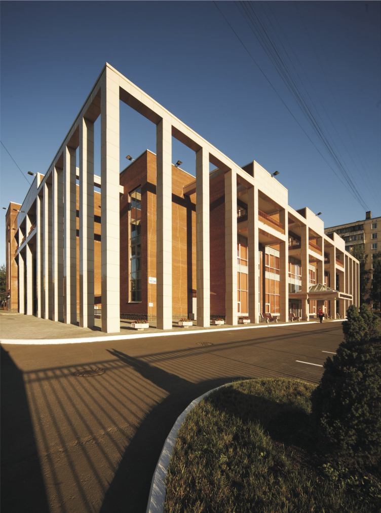
Besides "Lenta" hypermarkets, these are the building of the skating rink on the Butlerova Street, the house that we designed on the Professora Popova Street, the Olympic Trade Center ("Artem" shopping mall) next to Sportivnaya metro station, an office center at the crossing of Nevsky and Suvorovsky prospects, PEAK Shopping and Entertainment Center, and the chapel on the Sennaya Square...
- These all are very different buildings. What are your professional principles?
I profess honest and functional architecture. Second - architecture must be humane. I don't think an architect has the right to thrust either to his customer or to the end consumers his personal subjective ambitions; what he must do is immerse as much as possible into the material that he's got to work with and solve his task taking it to the limit.
- At the same time, your buildings look nothing like functionalism...
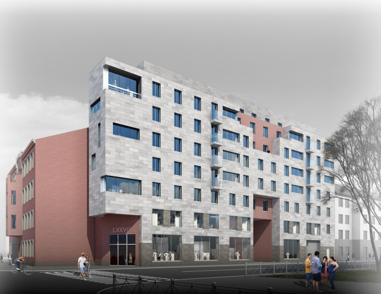
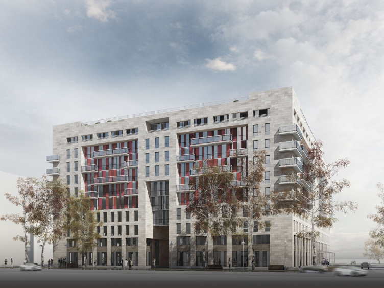
Those compromises in favor of decoration or historicism that I allowed of were the steps that I had to take under the circumstances. A characteristic example of that is the house on the Professora Popova Street. Back then, in the early nineties, we were still afraid of making ostentatiously modern injections into the city's historic structure. I took that path later on, for example, in the project that I did for the Mira Street, and I do not on the least regret it, even though the customer was always pushing us to stylize things - which even led to a conflict.
Now, I don't want to say that I am opposed to working "in styles" at all - I just want to say that one must be competent to do that. This city has very few convincing stylizations in it - simply because there are few people that are competent to do that; most of the time what we see is rough unabashed kitsch.
- What motivates you in your work?
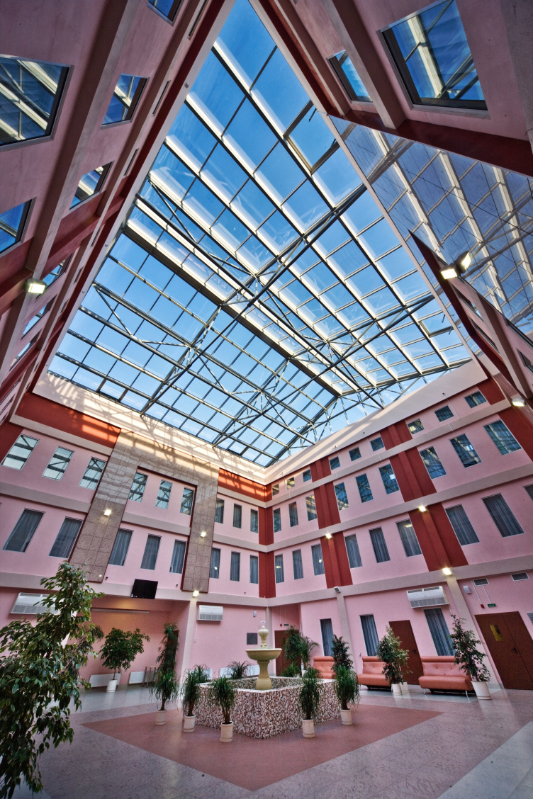
The opportunity to build something that had real value, something that's socially important. In recent years, we've done two projects of youth entertainment centers, as well as a rehab centers for disabled persons and disabled children. Being implemented, such projects bring me immense satisfaction.
- You have for years been teaching at Repin Academy of Fine Arts. What does your teaching activity mean and how important is it to you?
I've been teaching at the Academy since 1999, and the more I do the more I value the time that I spend within its walls. I also work as Vladimir Popov's assistant: not only do I teach but I also learn things - from my colleagues and from my students as well. The Academy is the place where some of the finest practicing architects of Saint Petersburg work, and this circle of communication really means a lot to me.
Remembering my student days I try to give my students what I fell short of getting back in my time. Our professors would not analyze our work as often as they should have, and sessions with Sergey Speransky were an event that we all looked forward to. Communicating to my students pushes me to stay in shape in order to be able to always answer their questions, and to be in the loop of what's going on in the profession. I consider my work as a mission, I try to help the young in any way that I can, and be not so much a strict teacher as a mentor and an older friend. There's no other architectural educational institution that teaches the things that the students can learn at the Academy with its century-old traditions. Here we treat our each and every student as a unique personality.
- Presently, you head the Union of Architectural Studios of Saint Petersburg, an organization that many regard as the elite of the Architects Union of Russia. Please share a little bit about this social activity of yours.
It's not in my character being a boss. Once I started working in my own studio I sighed with relief because I no longer had to supervise a staff of some eighty people. In this organization, I am not meant to be a "boss" - within the limits of my power I handle organizational issue and this is how I make myself useful for the professional community. I think that our 15th anniversary biennale that we organized in April was quite a success. Quite recently, in Moscow, there was an exhibition named PROEstate in which our young architects took part. Among the organizers, there was the Guild of Managing Developers and the Union of Architectural Studios. The main prize - a professional visit to Germany - was won by the alumni of our Academy which was of course great news for us. This is all about integration into the European management system that the professionals need so much these days.
- What are your interests outside of architecture?
With all due modesty, I will say that I've got no interests outside of architecture.
- What could you wish to yourself?
I could wish to myself to be in what I would call "creative demand". I really want to make a positive difference, want to implement the experience that I have accumulated while I still feel I have the power to do that.
Scheduled Evolution
ASADOV Architects unveiled the EvyCenter pavilion, a microcultural hub for fostering personal growth, organizing workshops, and doing gymnastics. Additionally, this pavilion serves as a prototype for a scalable country house, drawing inspiration from the “Loskutok” project, and constructed from CLT panels in a factory. This marks the beginning of a developer project initiated by the architectural firm (sic!), which is seeking partners to expand both small Evy settlements and even larger Evy cities, which are, according to Andrey Asadov, aimed at fostering the “evolutionary” development of the people who will inhabit them.
The Golden Crown
The concept for a dental clinic in Yekaterinburg, developed by CNTR Studio, revolves around the idea of a “mouth full of gold”: pristine white porcelain stoneware walls are complemented by matte brass details. To avoid an overly literal interpretation, the architects focused on the building’s proportions, skillfully navigating between sunlight requirements and fire safety regulations.
Flexibility and Integration
Not long ago, we covered the project for the fourth phase of the ÁLIA residential complex, designed by APEX. Now, we’ve been shown different fence concepts they developed to enclose the complex’s private courtyards, incorporating a variety of public functions. We believe that the sheer fact that the complex’s architects were involved in such a detail as fencing speaks volumes.
A Step Forward
The HIDE residential complex represents a major milestone for ADM architects and their leaders Andrey Romanov and Ekaterina Kuznetsova in their quest for a fresh high-rise aesthetic – one that is flexible and layered, capable of bringing vibrancy to mass and silhouette while shaping form. Over recent years, this approach has become ADM’s “signature style”, with the golden HIDE tower playing a pivotal role in its evolution. Here, we delve into the project’s story, explore the details of the complex’s design, and uncover its core essence.
Gold in the Sands
A new office for a transcontinental company specializing in resource extraction and processing has opened in Dubai. Designed by T+T Architects, masters of creating spaces that are contemporary, diverse, flexible, and original, this project exemplifies their expertise. On the executive floor, a massive brass-clad partition dominates, while layered textures of compressed earth create a contextually resonant backdrop.
Layers and Levels of Flight
This project goes way back – Reserve Union won this architectural competition at the end of 2011, and the building was completed in 2018, so it’s practically “archival”. However, despite being relatively unknown, the building can hardly be considered “dated” and remains a prime example of architectural expression, particularly in the headquarters genre. And it’s especially fitting for an aviation company office. In some ways, it resembles the Aeroflot headquarters at Sheremetyevo but with its own unique identity, following the signature style of Vladimir Plotkin. In this article, we take an in-depth look at the United Aircraft Corporation (UAC) headquarters in the Moscow agglomeration town of Zhukovsky, supplemented by recent photographs from Alexey Naroditsky – a shoot that became only recently possible due to the fact that improvements were finally made in the surrounding area.
Light and Shadow
In this article, we delve into the architectural design of the “Chaika” house by DNK ag architects, which was recently completed in 2023 as part of the collection of signature designs at ZILArt. As is well-known, all the buildings in this complex follow a design code, yet each one is distinct. This particular building stands out not only for its whiteness and minimalism but also for the refined use of a limited number of techniques that, together, create what can confidently be called synergy.
Casus Novae
A master plan was developed for a large residential area with a name of “DNS City”, but now that its implementation began, the plan has been arbitrarily reformatted and replaced with something that, while similar on the surface, is actually quite different. This is not the first time such a thing happens, but it’s always frustrating. With permission from the author, we are sharing Maria Elkina’s post.
Treasure Hunting
The GAFA bureau, in collaboration with Tegola and Arkhitail, organized an expedition to the island of Kilpola in Karelia as part of Moskomarkhitektura’s “Open City” festival. There, amidst moss and rocks, the students sought answers to questions like: what is the sacred, where does it dwell, and what sustains it? Assisting the participants in this quest were landscape engineer Evgeny Levin, artist Nicholas Roerich, a moose, and the lack of cellular connection. Here’s how the story unfolded.
Depths of the Earth, Streams of Water
In the Malaya Okhta district, the Akzent building, designed by Stepan Liphart, was constructed. It follows a classic tripartite structure, yet it’s what you might call “hand-drawn”: each façade is unique in its form and details, some of which aren’t immediately noticeable. In this article, we explore the context and, together with the architect, delve into how the form was developed.
Fir Tree Dynamics
The “Airports of Region” holding is planning to build an airport in Karachay-Cherkessia, aiming to make the Arkhyz and Dombay resorts more accessible to travelers. The project that won in an invitation-only competition, submitted by Sergey Nikeshkin’s KPLN, blends natural imagery inspired by the shape of a conifer seed, open-air waiting spaces, majestic large trees, and a green roof elevated on needle-like columns. The result is both nature-inspired and WOW.
A Brick Shell
In the process of designing a clubhouse situated among pine trees in a prestigious suburban area near Moscow, the architectural firm “A.Len” did the façade design part. The combination of different types of brick and masonry correlates with the volumetric and plastique solutions, further enhanced by the inclusion of wood-painted fragments and metal “glazing”.
Word Forms
ATRIUM architects love ambitious challenges, and for the firm’s thirtieth anniversary, they boldly play a game of words with an exhibition that dives deep into a self-created vocabulary. They immerse their projects – especially art installations – into this glossary, as if plunging into a current of their own. You feel as if you’re flowing through the veins of pure art, immersed in a universe of vertical cities, educational spaces – of which the architects are true masters – and the cultural codes of various locations. But what truly captivates is the bold statement that Vera Butko and Anton Nadtochy make, both through their work and this exhibition: architecture, above all, is art – the art of working with form and space.
Flexibility and Acuteness of Modernity
Luxurious, fluid, large “kokoshniks” and spiral barrel columns, as if made from colorful chewing gum: there seem to be no other mansion like this in Moscow, designed in the “Neo-Russian-Modern” style. And the “Teremok” on Malaya Kaluzhskaya, previously somewhat obscure, has “come alive with new colors” and gained visibility after its restoration for the office of the “architectural ecosystem” as the architects love to call themselves. It’s evident that Julius Borisov and the architects at UNK put their hearts into finding this new office and bringing it up to date. Let’s delve into the paradoxes of this mansion’s history and its plasticity. Spoiler: two versions of modernity meet here, both balancing on the razor’s edge of “what’s current”.
Yuri Vissarionov: “A modular house does not belong to the land”
It belongs to space, or to the air... It turns out that 3D printing is more effective when combined with a modular approach: the house is built in a workshop and then adapted to the site, including on uneven terrain. Yuri Vissarionov shares his latest experience in designing tourist complexes, both in central Russia and in the south. These include houseboats, homes printed from lightweight concrete using a 3D printer, and, of course, frame houses.
Moscow’s First
“The quality of education largely depends on the quality of the educational environment”. This principle of the last decade has been realized by Sergey Skuratov in the project for the First Moscow Gymnasium on Rostovskaya Embankment in the Khamovniki district. The building seamlessly integrates into the complex urban landscape, responding both to the pedestrian flow of the city and the quiet alleyways. It skillfully takes advantage of the height differences and aligns with modern trends in educational space design. Let’s take a closer look.
Looking at the Water
The site of Villa Sonata stretches from the road to the water’s edge, offering its own shoreline, pier, and a picturesque river panorama. To reveal these sweeping views, Roman Leonidov “cut” the façade diagonally parallel to the river, thus getting two main axes for the house and, consequently, “two heads”. The internal core – two double-height spaces, a living room and a conservatory, with a “bridge” above them – makes the house both “transparent” and filled with light.
The White Wing
Well, it’s not exactly white. It’s more of a beige, white-stone structure that plays with the color of limestone – smoother surfaces are lighter, while rougher ones are darker. This wing unites various elements: it absorbs and interprets the surrounding themes. It responds to everything, yet maintains a cohesive expression – a challenging task! – while also incorporating recognizable features of its own, such as the dynamic cuts at the bottom, top, and middle.
Urban Dunes
The XSA Ramps team designed and built a three-part sports hub for a park in Rostov-on-Don, welcoming people of all ages and fitness levels. The skate plaza, pump track, and playground are all meticulously crafted with details that attract a diverse range of visitors. The technical execution of the shapes and slopes transforms this space into a kind of sculptural composition.
Proportional Growth
The project for the fourth phase of the ÁLIA residential area has been announced. The buildings are situated on an elongated plot – almost a “ray” that shoots out from the center of the area towards the river. Their layout reflects both a response to Moscow’s architectural preferences over the past 15 years, shifting “from blocks to towers”, and an interpretation of the neighboring business park designed by SOM. Additionally, the best apartments here are not located at the very top but closer to the middle, forming a glowing “waistline”.
The “Staircase” Building
In designing the “Details” residential complex in New Moscow, Rais Baishev spiced up the now-popular Moscow theme of a “courtyard” building with an idea drawn from the surrealist drawings by Maurits Escher. He envisioned the stepped silhouettes and descending slopes as a metaphysical mega-staircase, creating a key void within the courtyard that gave the project an internal “spine”. This concept is felt both in the building’s silhouette and on its façades.
Projection of the Quarter
No one doubted that the building that Vladimir Plotkin designed as part of the “Garden Quarters” would be the most modernist of all. And it turned out just that way: while adhering to the common design code, the building successfully combines brick and white stone, rhythmically responding to the neighboring building designed by Ostozhenka, yet tactfully and persistently making a few statements of its own. This includes the projection of the ideal urban development composition “14–9–6”, which can be found right next door, mathematical calculations, including those for various types of terraces (and perhaps the only reminder of the Soviet past of the Kauchuk rubber factory!), and the white “cross-stitch” pattern of the façade grid.
Domus Aurea
In this issue, we examine the “Tessinsky-1” house, designed by Sergey Skuratov and completed in 2023. Located in the middle of the Serebryanicheskaya Embankment district, at the intersection of its main streets, this house assumes a sort of “nodal” role: it not only responds to everything around it and preserves many memories of the former EMA factory within itself, but it weaves all this into a newly directed pattern, reconciling bright “gold” and dark-colored brick, largely with the help of the new, modern-yet-archaic Columba brick, which, come to think about it, is the most precious element here.
The Chimney of Nikola-Lenivets
In this issue, we are examining the “Obelisk House” designed by KATARSIS and built for the Arkhstoyanie 2023 festival. However, it was only finished later on, and this is why we are examining it now. It seems to us that after the “Obelisk House” appeared in Nikola-Lenivets, a dialogue and a few inner connections appeared between the temporary structures built here. These houses no longer look like “accidental neighbors”, more of which below.
Periscope by the Bay
The jury awarded the second place in the competition for a public and cultural center in Petropavlovsk-Kamchatsky to the companies GORA (“Mountain”) and M4. In the consortium’s proposal, the building resembles a sperm whale with a calf swimming next to it or a periscope, whose lenses capture the most spectacular views from the surrounding landscape.
From Arcs to Dolmens
While working on the competition project for Petropavlovsk-Kamchatsky, ASADOV Architects prioritized the value of the natural and urban environment, aiming to preserve the balance of the location while minimizing the resemblance of the volume that they designed to a “traditional building”. The task was challenging, and the architects created three versions, one of which having been developed after the competition, where their main proposal took third place. However, the point of interest here is not the competition result but the continuity of creative thinking.
Hide and Seek
The ID Moskovskiy house, designed by Stepan Liphart in St. Petersburg, in the courtyards near Moskovskiy Avenue beyond the Obvodny Canal and recently completed, is notable for several reasons. Firstly, it has been realized with considerable accuracy, which is particularly significant as this is the first building where the architect was responsible not only for the facades but also for the layouts, allowing for better integration between the two. On the other hand, this building is interesting as an example of the “germination” of new architecture in the city: it draws on the best examples from the neighborhood and becomes an improved and developed sum of ideas found by the architect in the surrounding context.
The Big Twelve
Yesterday, the winners of the Moscow Mayor’s Architecture Award were announced and honored. Let’s take a look at what was awarded and, in some cases, even critique this esteemed award. After all, there is always room for improvement, right?
Above the Golden Horn
The residential complex “Philosophy” designed by T+T architects in Vladivostok, is one of the new projects in the “Golubinaya Pad” area, changing its development philosophy (pun intended) from single houses to a comprehensive approach. The buildings are organized along public streets, varying in height and format, with one house even executed in gallery typology, featuring a cantilever leaning on an art object.
Nuanced Alternative
How can you rhyme a square and space? Easily! But to do so, you need to rhyme everything you can possibly think of: weave everything together, like in a tensegrity structure, and find your own optics too. The new exhibition at GES-2 does just that, offering its visitor a new perspective on the history of art spanning 150 years, infused with the hope for endless multiplicity of worlds and art histories. Read on to see how this is achieved and how the exhibition design by Evgeny Ace contributes to it.