По-русски

Swallow

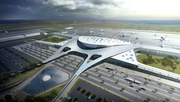
The warm waves of the Black Sea, the mountain slopes, the mysterious Crimean grottos, and a swallow perched between two runways - all this is Simferopol International Airport in the contest project by Asadov Bureau.

15 September 2015
Object
mainImg

The results of the international contest for the project of the new terminal of Simferopol Airport were announced late in June this year. Out of the nine contest proposals submitted by architectural companies from Germany, Great Britain, Russia, and other countries, the judging panel chose a project by the Korean bureau Samoo Architects & Engineers; it is planned that the project will be implemented already in 2018. The contest proposal by UNK Project for Simferopol Airport has already been covered by our website. The project prepared by Andrew Asadov architectural studio was also developed as part of this architectural contest and within the same framework of specifications: the new terminal must become Crimea's new face and new "visiting card"; the organizers laid special stress on the powerful conceptual part of the project and its recognizable features connected with the peculiarities of its location. 

Presently, Simferopol Airport whose large-scale renovation is already in progress - two of its terminals and the international sector have been reconstructed - Simferopol Airport is devoid of a recognizable image and is even a bit on the boring side. The new terminal is going to be built between two runways. Only a few kilometers away from this place one of the main transport junctions is located with exits to Yalta and Sevastopol; nearby, the peninsula's two main arteries run - Eupatoria and Moscow highways. Besides the new terminal, a hotel, a business center, and other elements of infrastructure will be built. 

Simferopol International Airport © Asadov Architectural Bureau
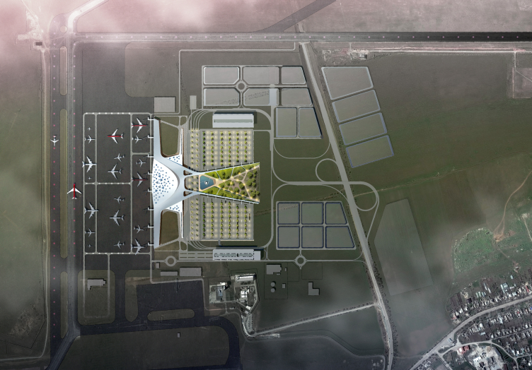
Simferopol International Airport. Location plan © Asadov Architectural Bureau


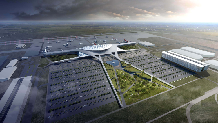
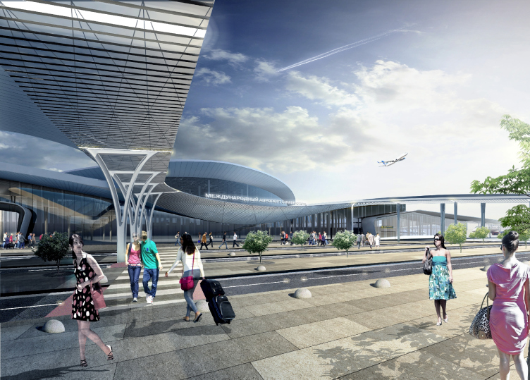
The architects of Asadov Studio paid special attention to the artistic part of the project. Thinking out the functional structure and the highly technological content, they proposed an image that is read practically at once - the image of flight, a bird, a swallow that looks as if it landed for a minute between the two long arrows of runways. The swallow appears here as one of the symbols of the Crimea, reminding of the famous "Swallow's Nest", the postcard-kind castle of Baron Steingel standing on the rock overhanging above the sea. 

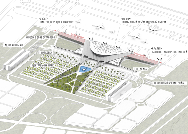
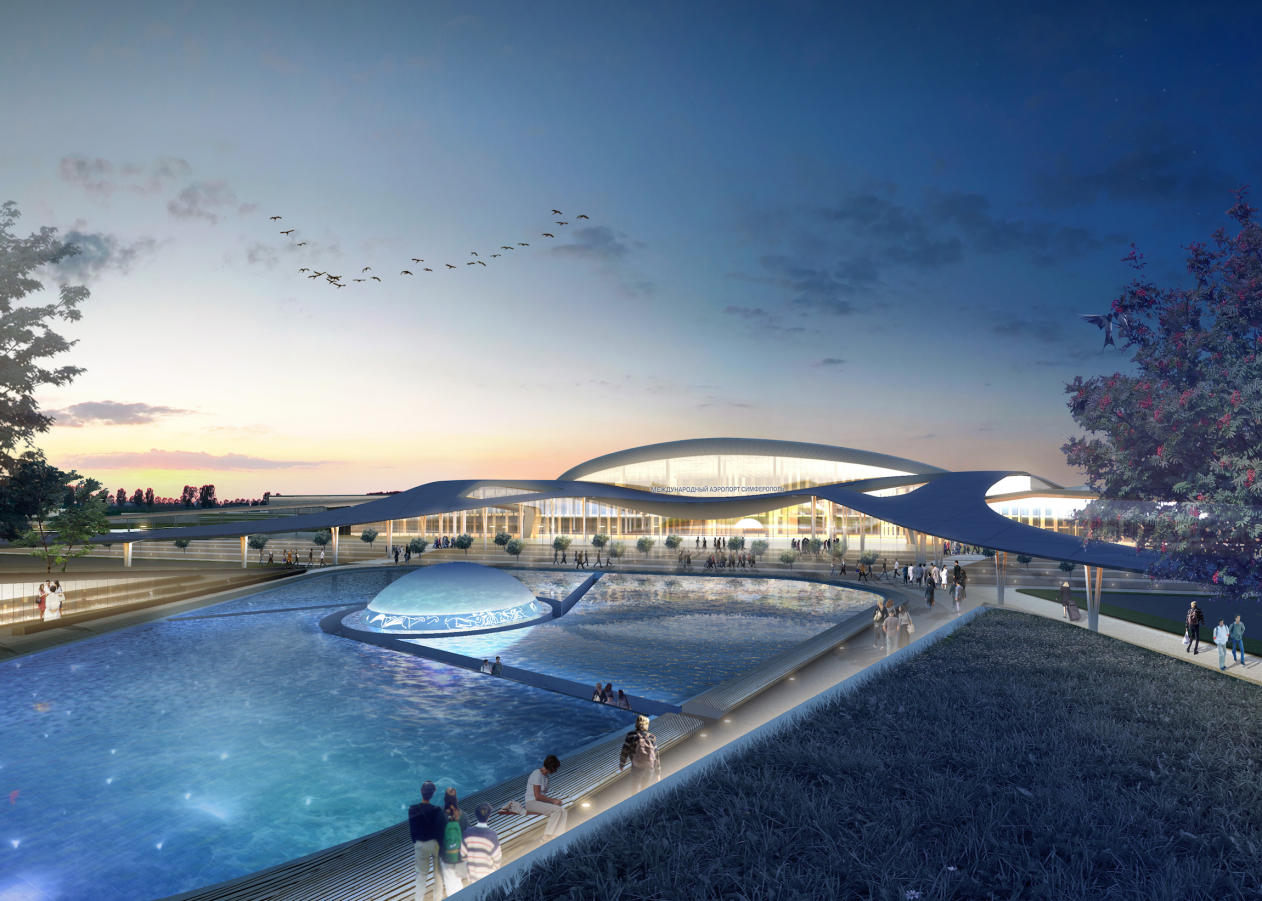
The outlines of the bird can be clearly traced from above when the airplane comes in for a landing. The main similarity is the long split swallow's tail pointed in the direction of the parking lots. The tail includes roofed pedestrian galleries that lead from the parking lots and public transportation stops to the central entrance. In The triangular hollow of the "tail", there is a park - not every airport can boast a park of its own, and this one even has a large man-made decorative creek in it located closer to the terminal building. And this is not just a landscaping element. In the middle of the water surface, the authors placed the huge gem of the kind that adorns the Crimea's coat of arms. And, according to the architects' proposal, the mother-of-pearl surface of the gem will bear the Skif ornaments combined with the history of the peninsula. 

Simferopol International Airport © Asadov Architectural Bureau


Simferopol International Airport © Asadov Architectural Bureau


Simferopol International Airport. Functional layout © Asadov Architectural Bureau


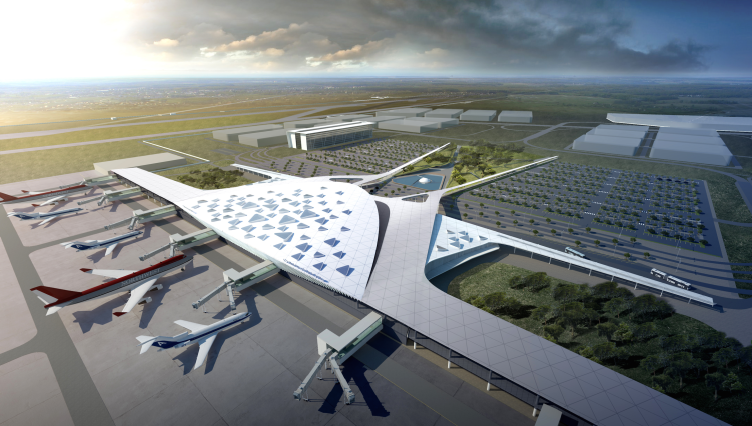
The bird's wings are symbolized by the elongated narrow galleries running away from the center. And as for the role of the swallow's body and head, as if turned into the direction of the city, it is played by the roof that covers the main terminal building. Robust and rounded, it is strewn with the specs of lights in the shape of large and small triangles raised above the metallic surface. 

Simferopol International Airport © Asadov Architectural Bureau


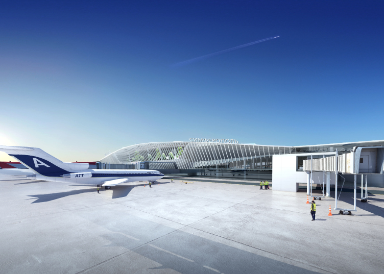
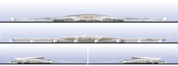
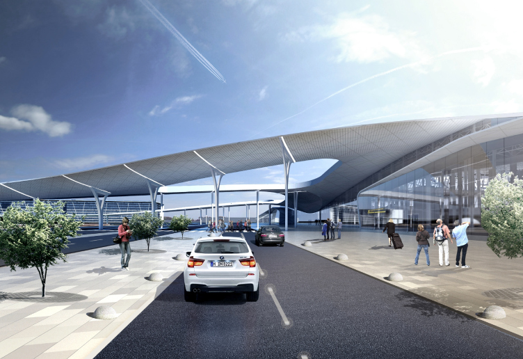
If viewed from the airplane side, the glass facade of the building is arranged basically along a straight line. Only in the central part it can be seen that the volume stands forward a bit. The roof's awning starts its ascent from this point - from the sloping surface of the wall clad in white vertical lamellae - and billows above the central volume in some steep sea wave or maybe a gentle mountain slope. The light and laconic facade next to the airfield gives way to the dynamic and shifty image on the side of the central entrance. From here, the swallow's "head" raised above the building looks like a sail filled with wind. The thin edge of the roof and panoramic glancing only enhance the resemblance. The galleries running away from the entrance group zone, together with the "hills" of arrivals and departures sections, form something like a quiet bay amidst rocky shores. The smooth curves of the building echo the silhouettes of the Crimea's peaks. 

Simferopol International Airport © Asadov Architectural Bureau


Simferopol International Airport © Asadov Architectural Bureau


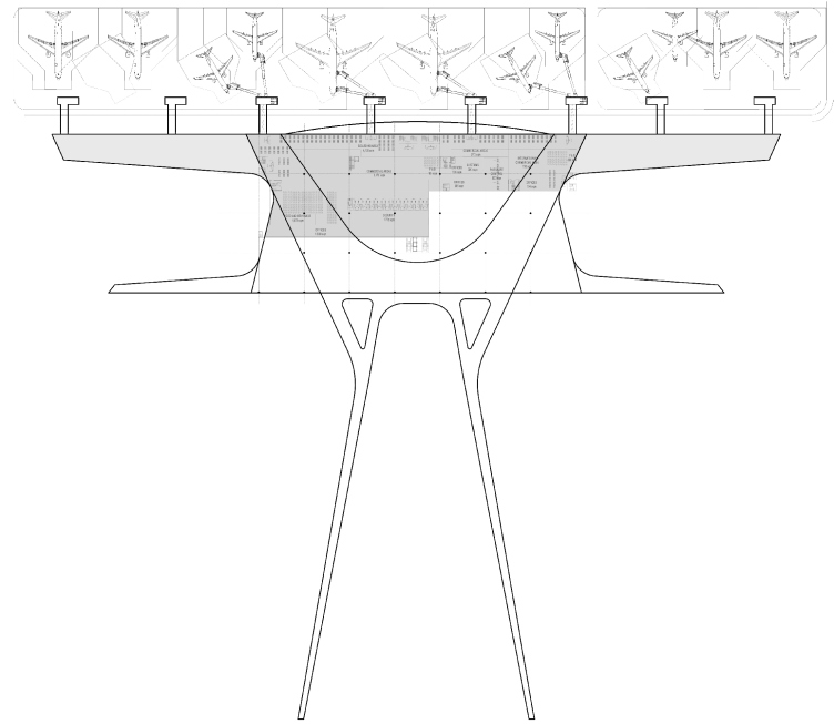
Simferopol International Airport. Facades © Asadov Architectural Bureau


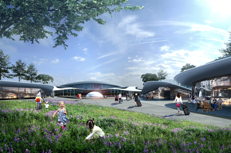
The architects explain that the building of the terminal develops the best traits of the southern architecture. For example, one of the prototypes of the pedestrian galleries is the famous arcade of Simferopol railway terminal designed by the famous soviet architect Aleksey Dushkin. In front of the building - also in accordance with traditional - the architects place a spacious square. The chain of wave-shaped awnings flowing into one another from the building entrance to the square and further on to the park forms a continuous gallery for the passengers and people who come to meet or see them off. 

Simferopol International Airport © Asadov Architectural Bureau


Simferopol International Airport © Asadov Architectural Bureau


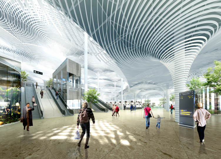
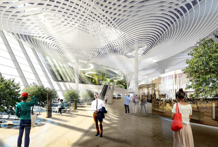
Turning the airport into a "swallow" building on the outside, the architects proposed a contextual story within. The high vaults of the airport halls remind of the Crimea's grottos and caves, although unlike in the caves, there is a lot of light here that streams in through the numerous sun tubes, and the spots of sunlight come together on the floor to form an intricate ever-changing ornament. The complex configuration of the vaults is formed by a light ring-shaped structure that belts the slender columns placed at equal intervals all over the hall. Up closer toward the ceiling, the rings grow wider and because of that the whole structure looks like a crown of some fantasy giant tree. As for the hall, it turns into a semblance of a forest. The "trees" emit a soft light. Besides this artificial "forest" - the interior of the waiting lounge - the architects proposed to give the airport a real tropical conservatory - something that is pretty common for airports nowadays - with a panoramic view of the runways. 

Simferopol International Airport © Asadov Architectural Bureau


Simferopol International Airport © Asadov Architectural Bureau


The caves and the forest, the creek with its symbolic gem, the metal swallow in the airport's silhouette - all of this put together, welcoming the passengers and seeing them off must form a recognizable image of the Crimean peninsula, a place that means so much to many of us. Possibly, too much. 
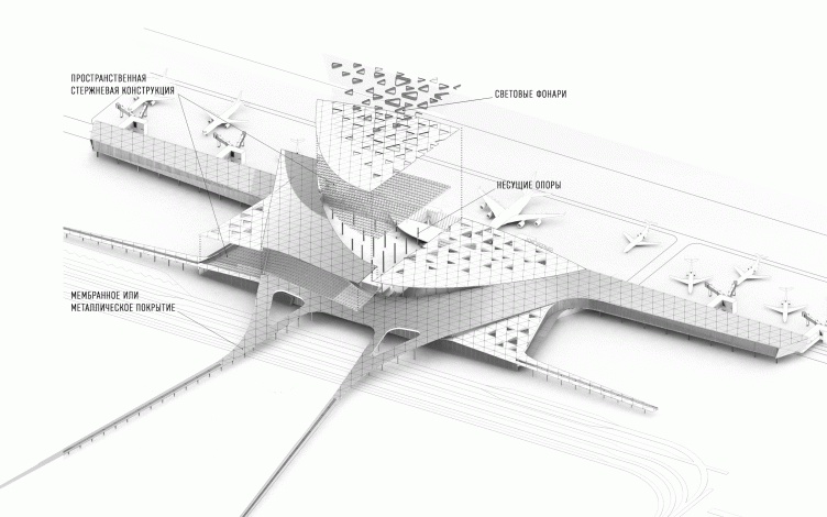
Simferopol International Airport. Structure © Asadov Architectural Bureau
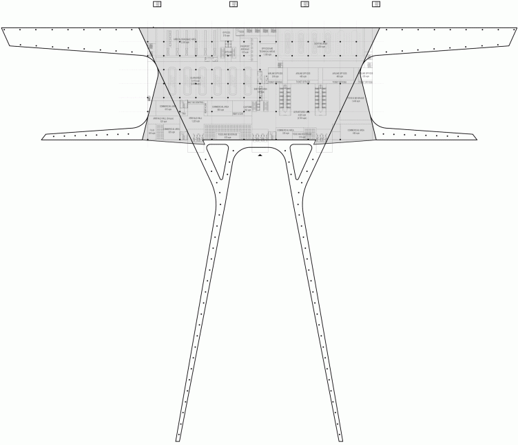
Simferopol International Airport. Plan © Asadov Architectural Bureau

15 September 2015

Headlines now
Four Different Surveys
The “Explore the City” competition, organized this year by the Genplan Institute of Moscow, stands out as a pretty unconventional one for the architectural field but aligns perfectly well with the character of urban planning work. The winning project analyzed contemporary residential complexes, combining urban planning insights with a realtor’s perspective to propose a hybrid approach. Other entries explored public centers, motivations for car ownership, and housing vacancy rates. A fifth participant withdrew. Here’s a closer look at the four completed works.
Scheduled Evolution
ASADOV Architects unveiled the EvyCenter pavilion, a microcultural hub for fostering personal growth, organizing workshops, and doing gymnastics. Additionally, this pavilion serves as a prototype for a scalable country house, drawing inspiration from the “Loskutok” project, and constructed from CLT panels in a factory. This marks the beginning of a developer project initiated by the architectural firm (sic!), which is seeking partners to expand both small Evy settlements and even larger Evy cities, which are, according to Andrey Asadov, aimed at fostering the “evolutionary” development of the people who will inhabit them.
The Golden Crown
The concept for a dental clinic in Yekaterinburg, developed by CNTR Studio, revolves around the idea of a “mouth full of gold”: pristine white porcelain stoneware walls are complemented by matte brass details. To avoid an overly literal interpretation, the architects focused on the building’s proportions, skillfully navigating between sunlight requirements and fire safety regulations.
Flexibility and Integration
Not long ago, we covered the project for the fourth phase of the ÁLIA residential complex, designed by APEX. Now, we’ve been shown different fence concepts they developed to enclose the complex’s private courtyards, incorporating a variety of public functions. We believe that the sheer fact that the complex’s architects were involved in such a detail as fencing speaks volumes.
A Step Forward
The HIDE residential complex represents a major milestone for ADM architects and their leaders Andrey Romanov and Ekaterina Kuznetsova in their quest for a fresh high-rise aesthetic – one that is flexible and layered, capable of bringing vibrancy to mass and silhouette while shaping form. Over recent years, this approach has become ADM’s “signature style”, with the golden HIDE tower playing a pivotal role in its evolution. Here, we delve into the project’s story, explore the details of the complex’s design, and uncover its core essence.
Gold in the Sands
A new office for a transcontinental company specializing in resource extraction and processing has opened in Dubai. Designed by T+T Architects, masters of creating spaces that are contemporary, diverse, flexible, and original, this project exemplifies their expertise. On the executive floor, a massive brass-clad partition dominates, while layered textures of compressed earth create a contextually resonant backdrop.
Layers and Levels of Flight
This project goes way back – Reserve Union won this architectural competition at the end of 2011, and the building was completed in 2018, so it’s practically “archival”. However, despite being relatively unknown, the building can hardly be considered “dated” and remains a prime example of architectural expression, particularly in the headquarters genre. And it’s especially fitting for an aviation company office. In some ways, it resembles the Aeroflot headquarters at Sheremetyevo but with its own unique identity, following the signature style of Vladimir Plotkin. In this article, we take an in-depth look at the United Aircraft Corporation (UAC) headquarters in the Moscow agglomeration town of Zhukovsky, supplemented by recent photographs from Alexey Naroditsky – a shoot that became only recently possible due to the fact that improvements were finally made in the surrounding area.
Light and Shadow
In this article, we delve into the architectural design of the “Chaika” house by DNK ag architects, which was recently completed in 2023 as part of the collection of signature designs at ZILArt. As is well-known, all the buildings in this complex follow a design code, yet each one is distinct. This particular building stands out not only for its whiteness and minimalism but also for the refined use of a limited number of techniques that, together, create what can confidently be called synergy.
Casus Novae
A master plan was developed for a large residential area with a name of “DNS City”, but now that its implementation began, the plan has been arbitrarily reformatted and replaced with something that, while similar on the surface, is actually quite different. This is not the first time such a thing happens, but it’s always frustrating. With permission from the author, we are sharing Maria Elkina’s post.
Treasure Hunting
The GAFA bureau, in collaboration with Tegola and Arkhitail, organized an expedition to the island of Kilpola in Karelia as part of Moskomarkhitektura’s “Open City” festival. There, amidst moss and rocks, the students sought answers to questions like: what is the sacred, where does it dwell, and what sustains it? Assisting the participants in this quest were landscape engineer Evgeny Levin, artist Nicholas Roerich, a moose, and the lack of cellular connection. Here’s how the story unfolded.
Depths of the Earth, Streams of Water
In the Malaya Okhta district, the Akzent building, designed by Stepan Liphart, was constructed. It follows a classic tripartite structure, yet it’s what you might call “hand-drawn”: each façade is unique in its form and details, some of which aren’t immediately noticeable. In this article, we explore the context and, together with the architect, delve into how the form was developed.
Fir Tree Dynamics
The “Airports of Region” holding is planning to build an airport in Karachay-Cherkessia, aiming to make the Arkhyz and Dombay resorts more accessible to travelers. The project that won in an invitation-only competition, submitted by Sergey Nikeshkin’s KPLN, blends natural imagery inspired by the shape of a conifer seed, open-air waiting spaces, majestic large trees, and a green roof elevated on needle-like columns. The result is both nature-inspired and WOW.
​A Brick Shell
In the process of designing a clubhouse situated among pine trees in a prestigious suburban area near Moscow, the architectural firm “A.Len” did the façade design part. The combination of different types of brick and masonry correlates with the volumetric and plastique solutions, further enhanced by the inclusion of wood-painted fragments and metal “glazing”.
Word Forms
ATRIUM architects love ambitious challenges, and for the firm’s thirtieth anniversary, they boldly play a game of words with an exhibition that dives deep into a self-created vocabulary. They immerse their projects – especially art installations – into this glossary, as if plunging into a current of their own. You feel as if you’re flowing through the veins of pure art, immersed in a universe of vertical cities, educational spaces – of which the architects are true masters – and the cultural codes of various locations. But what truly captivates is the bold statement that Vera Butko and Anton Nadtochy make, both through their work and this exhibition: architecture, above all, is art – the art of working with form and space.
Flexibility and Acuteness of Modernity
Luxurious, fluid, large “kokoshniks” and spiral barrel columns, as if made from colorful chewing gum: there seem to be no other mansion like this in Moscow, designed in the “Neo-Russian-Modern” style. And the “Teremok” on Malaya Kaluzhskaya, previously somewhat obscure, has “come alive with new colors” and gained visibility after its restoration for the office of the “architectural ecosystem” as the architects love to call themselves. It’s evident that Julius Borisov and the architects at UNK put their hearts into finding this new office and bringing it up to date. Let’s delve into the paradoxes of this mansion’s history and its plasticity. Spoiler: two versions of modernity meet here, both balancing on the razor’s edge of “what’s current”.
Yuri Vissarionov: “A modular house does not belong to the land”
It belongs to space, or to the air... It turns out that 3D printing is more effective when combined with a modular approach: the house is built in a workshop and then adapted to the site, including on uneven terrain. Yuri Vissarionov shares his latest experience in designing tourist complexes, both in central Russia and in the south. These include houseboats, homes printed from lightweight concrete using a 3D printer, and, of course, frame houses.
​Moscow’s First
“The quality of education largely depends on the quality of the educational environment”. This principle of the last decade has been realized by Sergey Skuratov in the project for the First Moscow Gymnasium on Rostovskaya Embankment in the Khamovniki district. The building seamlessly integrates into the complex urban landscape, responding both to the pedestrian flow of the city and the quiet alleyways. It skillfully takes advantage of the height differences and aligns with modern trends in educational space design. Let’s take a closer look.
Looking at the Water
The site of Villa Sonata stretches from the road to the water’s edge, offering its own shoreline, pier, and a picturesque river panorama. To reveal these sweeping views, Roman Leonidov “cut” the façade diagonally parallel to the river, thus getting two main axes for the house and, consequently, “two heads”. The internal core – two double-height spaces, a living room and a conservatory, with a “bridge” above them – makes the house both “transparent” and filled with light.
The White Wing
Well, it’s not exactly white. It’s more of a beige, white-stone structure that plays with the color of limestone – smoother surfaces are lighter, while rougher ones are darker. This wing unites various elements: it absorbs and interprets the surrounding themes. It responds to everything, yet maintains a cohesive expression – a challenging task! – while also incorporating recognizable features of its own, such as the dynamic cuts at the bottom, top, and middle.
Urban Dunes
The XSA Ramps team designed and built a three-part sports hub for a park in Rostov-on-Don, welcoming people of all ages and fitness levels. The skate plaza, pump track, and playground are all meticulously crafted with details that attract a diverse range of visitors. The technical execution of the shapes and slopes transforms this space into a kind of sculptural composition.
Proportional Growth
The project for the fourth phase of the ÁLIA residential area has been announced. The buildings are situated on an elongated plot – almost a “ray” that shoots out from the center of the area towards the river. Their layout reflects both a response to Moscow’s architectural preferences over the past 15 years, shifting “from blocks to towers”, and an interpretation of the neighboring business park designed by SOM. Additionally, the best apartments here are not located at the very top but closer to the middle, forming a glowing “waistline”.
The “Staircase” Building
In designing the “Details” residential complex in New Moscow, Rais Baishev spiced up the now-popular Moscow theme of a “courtyard” building with an idea drawn from the surrealist drawings by Maurits Escher. He envisioned the stepped silhouettes and descending slopes as a metaphysical mega-staircase, creating a key void within the courtyard that gave the project an internal “spine”. This concept is felt both in the building’s silhouette and on its façades.
Projection of the Quarter
No one doubted that the building that Vladimir Plotkin designed as part of the “Garden Quarters” would be the most modernist of all. And it turned out just that way: while adhering to the common design code, the building successfully combines brick and white stone, rhythmically responding to the neighboring building designed by Ostozhenka, yet tactfully and persistently making a few statements of its own. This includes the projection of the ideal urban development composition “14–9–6”, which can be found right next door, mathematical calculations, including those for various types of terraces (and perhaps the only reminder of the Soviet past of the Kauchuk rubber factory!), and the white “cross-stitch” pattern of the façade grid.
Domus Aurea
In this issue, we examine the “Tessinsky-1” house, designed by Sergey Skuratov and completed in 2023. Located in the middle of the Serebryanicheskaya Embankment district, at the intersection of its main streets, this house assumes a sort of “nodal” role: it not only responds to everything around it and preserves many memories of the former EMA factory within itself, but it weaves all this into a newly directed pattern, reconciling bright “gold” and dark-colored brick, largely with the help of the new, modern-yet-archaic Columba brick, which, come to think about it, is the most precious element here.
The Chimney of Nikola-Lenivets
In this issue, we are examining the “Obelisk House” designed by KATARSIS and built for the Arkhstoyanie 2023 festival. However, it was only finished later on, and this is why we are examining it now. It seems to us that after the “Obelisk House” appeared in Nikola-Lenivets, a dialogue and a few inner connections appeared between the temporary structures built here. These houses no longer look like “accidental neighbors”, more of which below.
​Periscope by the Bay
The jury awarded the second place in the competition for a public and cultural center in Petropavlovsk-Kamchatsky to the companies GORA (“Mountain”) and M4. In the consortium’s proposal, the building resembles a sperm whale with a calf swimming next to it or a periscope, whose lenses capture the most spectacular views from the surrounding landscape.
From Arcs to Dolmens
While working on the competition project for Petropavlovsk-Kamchatsky, ASADOV Architects prioritized the value of the natural and urban environment, aiming to preserve the balance of the location while minimizing the resemblance of the volume that they designed to a “traditional building”. The task was challenging, and the architects created three versions, one of which having been developed after the competition, where their main proposal took third place. However, the point of interest here is not the competition result but the continuity of creative thinking.
Hide and Seek
The ID Moskovskiy house, designed by Stepan Liphart in St. Petersburg, in the courtyards near Moskovskiy Avenue beyond the Obvodny Canal and recently completed, is notable for several reasons. Firstly, it has been realized with considerable accuracy, which is particularly significant as this is the first building where the architect was responsible not only for the facades but also for the layouts, allowing for better integration between the two. On the other hand, this building is interesting as an example of the “germination” of new architecture in the city: it draws on the best examples from the neighborhood and becomes an improved and developed sum of ideas found by the architect in the surrounding context.
The Big Twelve
Yesterday, the winners of the Moscow Mayor’s Architecture Award were announced and honored. Let’s take a look at what was awarded and, in some cases, even critique this esteemed award. After all, there is always room for improvement, right?
Above the Golden Horn
The residential complex “Philosophy” designed by T+T architects in Vladivostok, is one of the new projects in the “Golubinaya Pad” area, changing its development philosophy (pun intended) from single houses to a comprehensive approach. The buildings are organized along public streets, varying in height and format, with one house even executed in gallery typology, featuring a cantilever leaning on an art object.