По-русски

Grown from the Context

The building at 5 Pobedy Street revises the ideas of Stalin architecture of this area in a better material quality. The architects did not neglect the deeper roots, though, either.

26 February 2015
Object
mainImg
Architect:
Evgeny Gerasimov
Object:
Apartment building on the Pobedy Street in Saint Petersburg
Russia, St. Petersburg, Pobedy Street, 5

Project Team:
Leader of the project: E.Gerasimov. Chief architect of the project: T.Yaroshchuk. Head of the workgroup: T.Oskolkova. Architects: O.Burdakova, I Khukhka

2011 / 2014

Developer: LEGENDA Intelligent Development

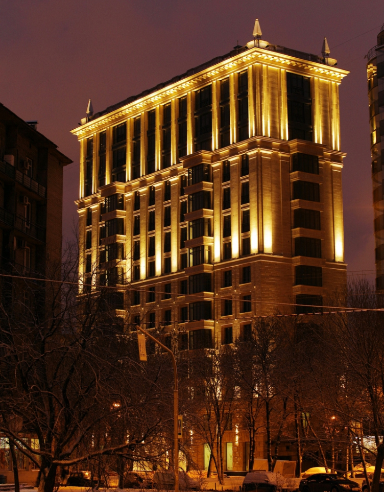
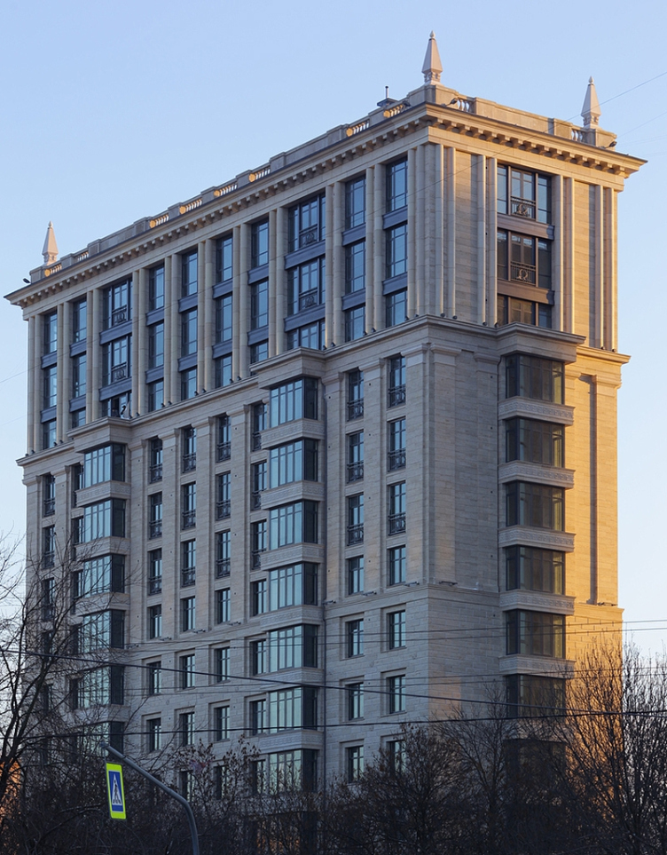
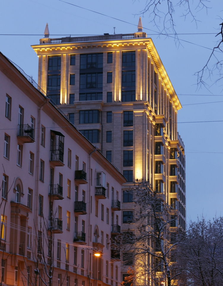
We already wrote about the project of a house at Pobedy 5, not far away from the Moskovsky Avenue and the Strugatsky Square, in the area where the Stalin houses alternate with the Brezhnev "slabs" and the post-soviet/post-modernist buildings. Eugene Gerasimov Bureau has been able to inscribe into this multicolored, but still rather comfortable from the town-planning standpoint, context a new premium-class residential house composing its facade of three themes: northern modernism/neoclassic at the bottom, Stalin-era style in the middle, and the top floors hinting, though tentatively, at the glass and long columns of the nineties. It looks as though the house springs up from the ground "chronologically": one could think of it as a piece of some Saint Petersburg classic, several times overbuilt during the XX century. The developer of the project is LEGENDA Intelligent Development.

The construction is now complete, the building was put into operation in December; on the 17th of February; a guided press tour of the house was conducted. The architect Eugene Gerasimov and the C.E.O of LEGENDA Intelligent Development Vasily Selivanov showed the new house to the industry media reporters, letting them appreciate live and first-hand the textured materiality of the new building.

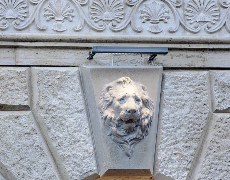
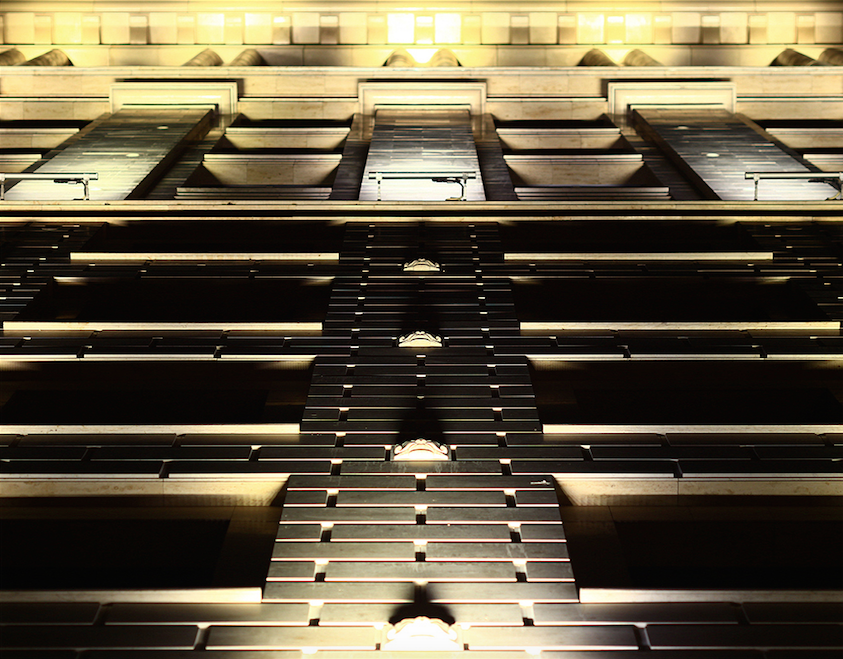
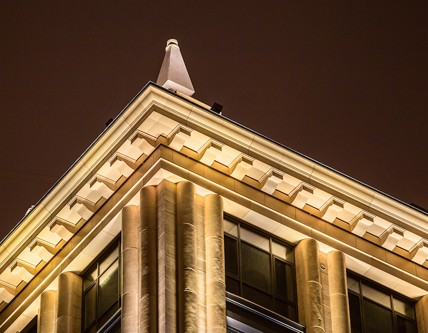
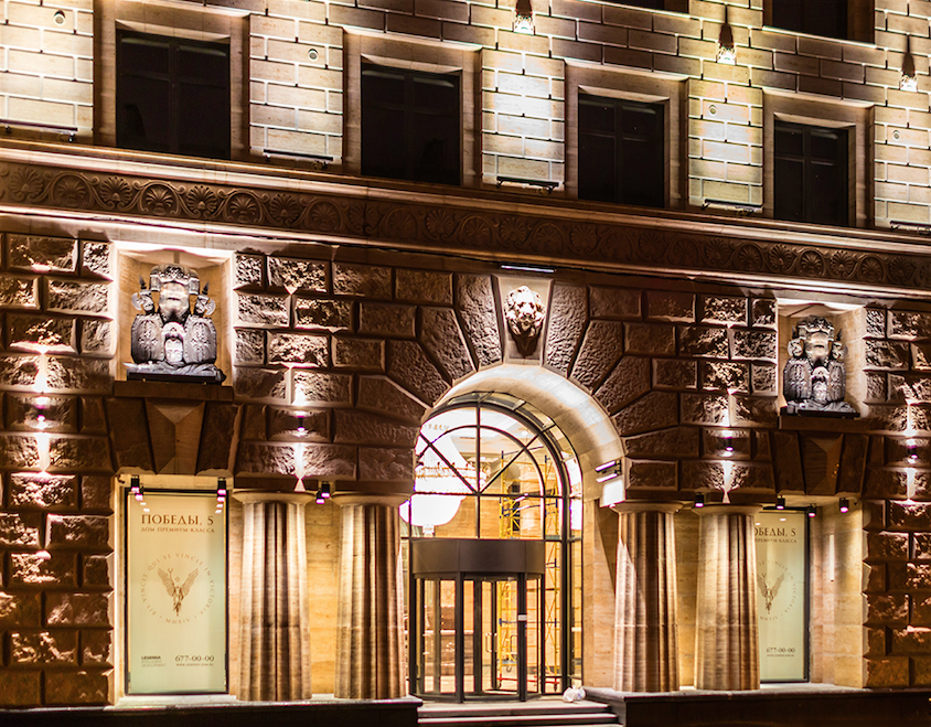
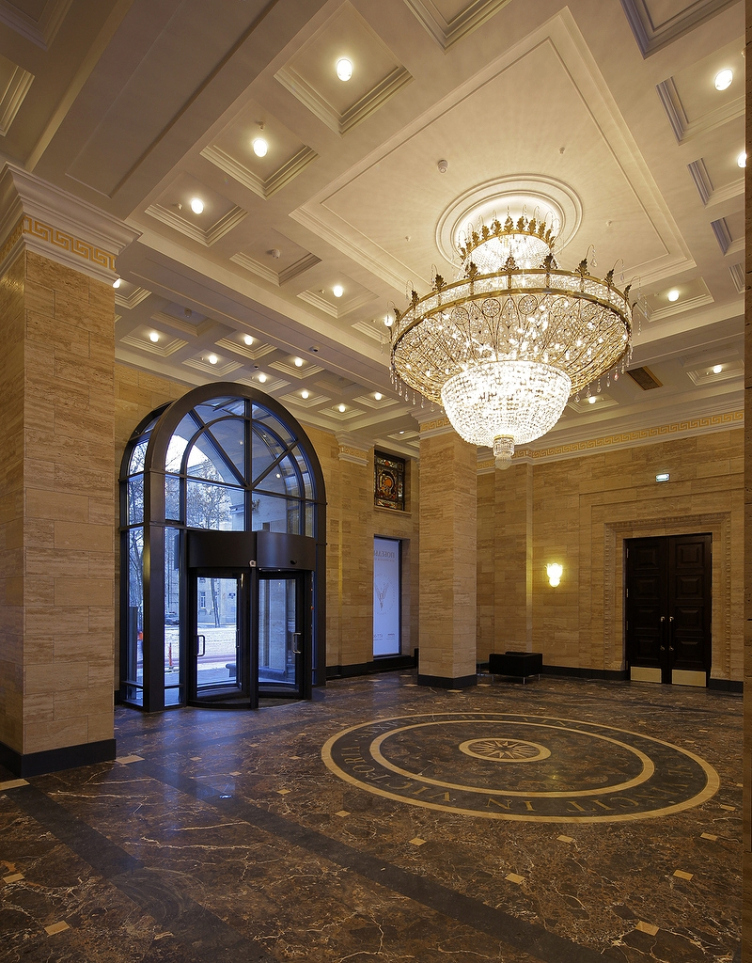
The travertine columns of the squatting Dorian order before the entrance, with their real, broad, arc-shaped flutes, almost like the ones in Italy's Paestum. The rugged rock-face basement tier, according to all the rules of superposition, lightened upwards. The inevitable lion faces at the keystones as one's gaze goes up, the facades sporting quadrifoil flowers that remind us about another work by this bureau - the building in the Kovensky Alley (this has inserts in the shape of fleure de lys). The same, only more polished travertine in the hall, wood, ornament, a Latin inscription in bronze letters on the floor, and a grand antique chandelier. The Stalin architecture even used cheaper materials. This is what art-deco of Saint Petersburg would have looked like had it not been for the revolution (or should we say now coup d'état?) of 1917 - the building looks as if it were catching up on two qualities at once: that of classicism plastique and the natural stone material. 

zooming
The building at 5, Pobedy Street. "Eugene Gerasimov and Partners", 2014. Photo courtesy of LEGENDA Intelligent Development
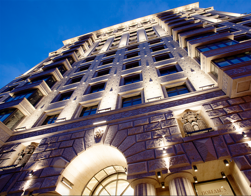
View of the basement floor from the Pobedy Street. The building at 5, Pobedy Street. "Eugene Gerasimov and Partners"


zooming
The building at 5, Pobedy Street. "Eugene Gerasimov and Partners", 2014. Photo courtesy of LEGENDA Intelligent Development


Multiapartment building at 5, Pobedy Street. "Eugene Gerasimov and Partners"


The building at 5, Pobedy Street. "Eugene Gerasimov and Partners", 2014. Photo courtesy of LEGENDA Intelligent Development


zooming
The building at 5, Pobedy Street. "Eugene Gerasimov and Partners", 2014. Photo courtesy of LEGENDA Intelligent Development
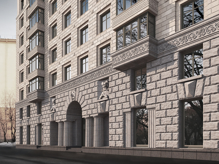

Still, though, it absorbed a lot from its surroundings: one only has to take a walk along the neighboring Moscow Avenue in order to see a similar superposition of rock-face structures that the architects of the 1930's borrowed from Michelozzo, and the relief inserts that look like the pinnacles above the cornices. This building can be quite possibly understood through its Stalin-architecture surroundings and then it turns out that the tall, three-story high top draughts echo the array of the imposing-looking columns of the House of Soviets built by the architect Noah Trotsky at the Moscow Square. This is something that the architects have been doing for more than three hundred years: founding their leads and starting points in the surrounding buildings, recreating the more recognizable elements and thus inscribing their creation into the array of its neighbors. This new house embodies the ideas of the Stalin architecture of the Moscow district in a new and up-to-date quality, honing and polishing them but at the same time staying true to its roots. This is also what the authors of the building were sharing about during the guided tour. 
***

Back in the 1930's, it was planned that the Moscow district would be raised to the status of the new, "soviet", center of the city - the authors explained to the participants of the tour - but the experiment was left unfinished, even not all of the streets got names of their own. Meanwhile, this quiet district that follows, in its own unique way, the principles of "new urbanism" has now become one of the most attractive ones thanks to its good residential stock, highly developed social and transport infrastructure and comparative proximity to the city's historical center - which became the reason for the appearance of a premium-class house here. 

Vasily Selivanov shared that the history of the house began back in 2011 when the company bought Plot #5, one of the last free ones on the red lines of the front part of the Moskovsky district; shortly, Eugene Gerasimov bureau started the design work. "Of course, we had a basic understanding that the house was to be generally designed in the neoclassic style - the so-called "Stalin Empire". From the very start, Eugene Gerasimov and we agreed that this must be honest, high-quality and "well-bred" architecture. And our house is the rare exception when the building exactly answers the original idea and the first sketches" - Selivanov stressed. 

The customer's demands matched the architect's vision. "It so happened that we somehow both saw this house in our mind's eye - Eugene Gerasimov says - It was obvious for us that the Moskovsky District that many people associate by default with the Stalin architecture is one of the best places for revising its style. The challenge, and, on the other hand, the creative task was the fact that we were supposed to build a thirteen-story Stalin house". 

The building at 5, Pobedy Street. "Eugene Gerasimov and Partners", 2014. Photo courtesy of LEGENDA Intelligent Development

The building at 5, Pobedy Street. "Eugene Gerasimov and Partners", 2014. Photo courtesy of LEGENDA Intelligent Development
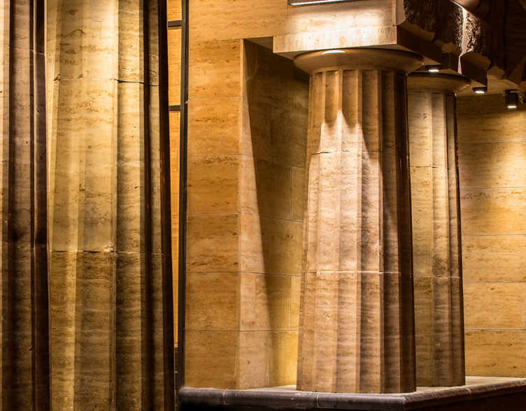

For Eugene Gerasimov, this was his first experience of working with Legenda Development but it is not the first time that he does a project in a historical style. "Based on the "order" system, the traditional architecture, as opposed to its modernist counterpart, makes up a large part of our creative activity. To me as the leader of the company and to the architects that work with me, it is exciting to do the research in both directions: in the field of the modern form-making and in the field of revising our historical legacy" - the architect explains. 

When he was speaking about the peculiarities of the house, Vasily Selivanov mentioned the planning and designing freedom necessary for the elite housing segment achieved by the absence of bearing walls inside the apartments: all the weight is supported by the reinforcement plates. But then again, the "apartment geography" allows for escaping the necessity of re-planning - the project provides for as many as 16 different types and subtypes of planning solutions. 

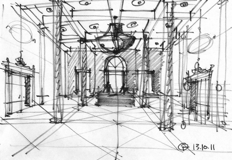
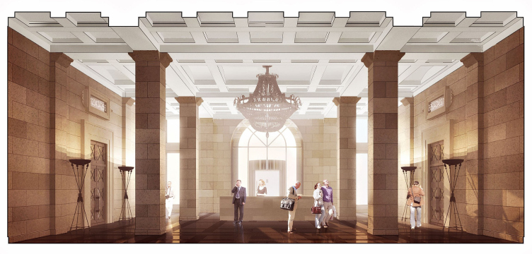
The authors of the house were particularly attentive to detail, both inside and outside. According to Vasily Selivanov, the chandelier of the entrance hall is a "true part of history" - it was recovered from the building of that had been taken down to make room for the construction of the second stage of the Mariinsky Theater. At that time, the architects worked with the sketches of the interiors of the house, and, especially for this chandelier, they designed a double-height entrance lobby. 

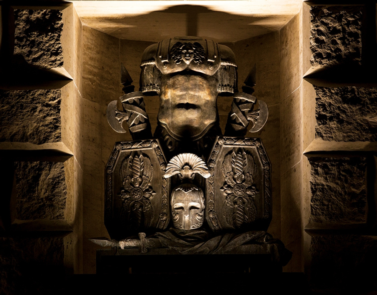
When he was speaking about the results of the two-year work, Eugene Gerasimov paid special attention to their commitment to excellence. We do say that architecture can be different but commitment to excellence is something that we all today are in desperate need of, while the questions of style can be considered secondary. Anything has a right to be there as long as we, while working with any style, are committed to excellence. Here you can feel it first-hand: here is the reception desk, here are the mail boxes, here are the doors, here is the chandelier, here are the pieces of stained glass done by the graduates of the Academy of Arts, here is a sculpture by a graduate of Vlad Manachinsky Academy. And these things are not imitation by any means: they are the real wood, stone, and brass. Look at the zoccolo that was first made on a machine and then finished by hand - each of the stones is unique". 

The building at 5, Pobedy Street. "Eugene Gerasimov and Partners", 2014. Photo courtesy of LEGENDA Intelligent Development
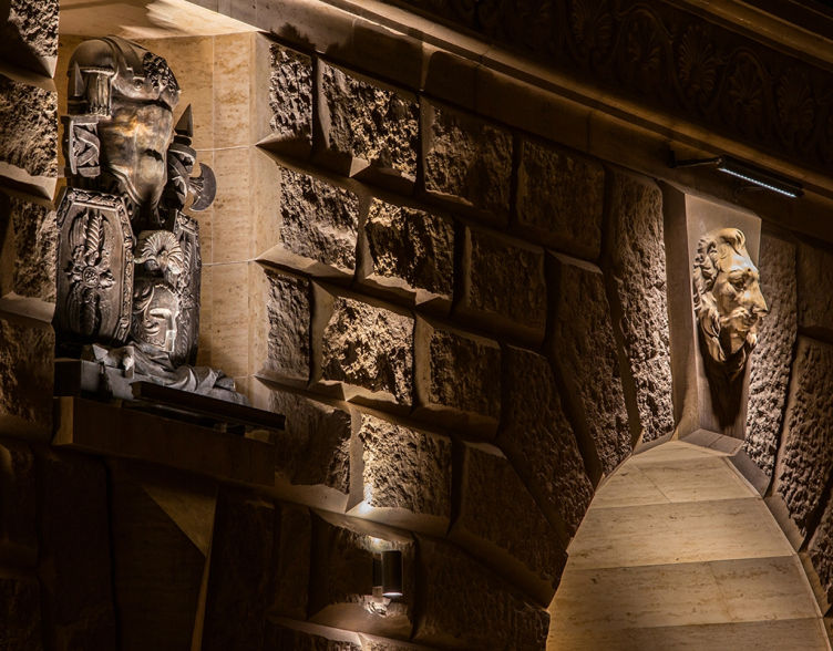

Even the name of the house fits in with its overall "high-profile" style. The developers deliberately opted out of coming up with an extra name for this particular project, as is the custom at today's real estate market. "The address that is already there, speaks for itself; just the address - 5, Pobedy Street - is enough; everything is determined by it. There are THE addresses in this city, and we hope that this one will also become an address with a capital "A"" - Selivanov says. "The house at the Pobedy ("Victory") street in its antique transcription, the heraldic of the Ancient Rome, and the synthesis of arts that we see here - the color, the sculptures, even the fonts of the letters - everything falls into place here" - adds Eugene Gerasimov. 
The building at 5, Pobedy Street. "Eugene Gerasimov and Partners", 2014. Photo courtesy of LEGENDA Intelligent Development
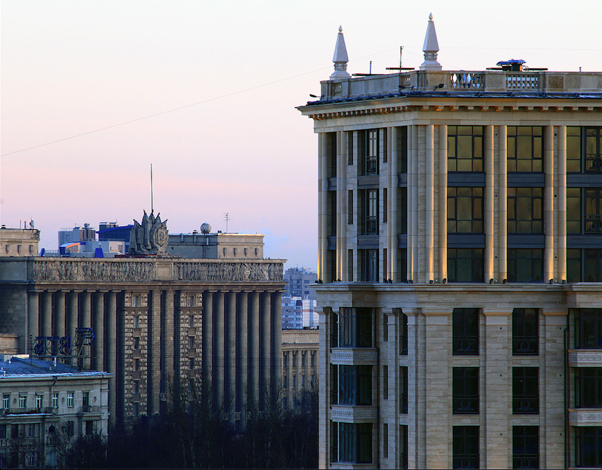
Lobby with the reception desk. The building at 5, Pobedy Street. "Eugene Gerasimov and Partners"
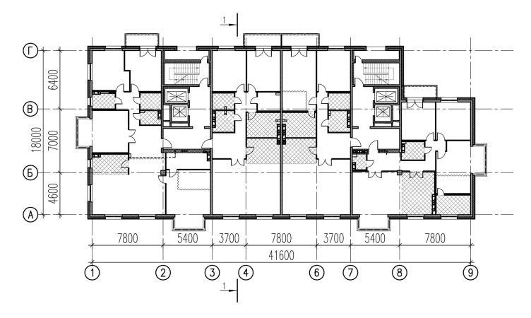
Plan of the typical floor. The building at 5, Pobedy Street. "Eugene Gerasimov and Partners"
Sketch of the entrance lobby. The building at 5, Pobedy Street. "Eugene Gerasimov and Partners"
The building at 5, Pobedy Street. "Eugene Gerasimov and Partners", 2014. Photo courtesy of LEGENDA Intelligent Development
zooming
The building at 5, Pobedy Street. "Eugene Gerasimov and Partners", 2014. Photo courtesy of LEGENDA Intelligent Development
zooming
The building at 5, Pobedy Street. "Eugene Gerasimov and Partners", 2014. Photo courtesy of LEGENDA Intelligent Development

Architect:
Evgeny Gerasimov
Object:
Apartment building on the Pobedy Street in Saint Petersburg
Russia, St. Petersburg, Pobedy Street, 5

Project Team:
Leader of the project: E.Gerasimov. Chief architect of the project: T.Yaroshchuk. Head of the workgroup: T.Oskolkova. Architects: O.Burdakova, I Khukhka

2011 / 2014

Developer: LEGENDA Intelligent Development
26 February 2015

Headlines now
The Golden Crown
The concept for a dental clinic in Yekaterinburg, developed by CNTR Studio, revolves around the idea of a “mouth full of gold”: pristine white porcelain stoneware walls are complemented by matte brass details. To avoid an overly literal interpretation, the architects focused on the building’s proportions, skillfully navigating between sunlight requirements and fire safety regulations.
Flexibility and Integration
Not long ago, we covered the project for the fourth phase of the ÁLIA residential complex, designed by APEX. Now, we’ve been shown different fence concepts they developed to enclose the complex’s private courtyards, incorporating a variety of public functions. We believe that the sheer fact that the complex’s architects were involved in such a detail as fencing speaks volumes.
A Step Forward
The HIDE residential complex represents a major milestone for ADM architects and their leaders Andrey Romanov and Ekaterina Kuznetsova in their quest for a fresh high-rise aesthetic – one that is flexible and layered, capable of bringing vibrancy to mass and silhouette while shaping form. Over recent years, this approach has become ADM’s “signature style”, with the golden HIDE tower playing a pivotal role in its evolution. Here, we delve into the project’s story, explore the details of the complex’s design, and uncover its core essence.
Gold in the Sands
A new office for a transcontinental company specializing in resource extraction and processing has opened in Dubai. Designed by T+T Architects, masters of creating spaces that are contemporary, diverse, flexible, and original, this project exemplifies their expertise. On the executive floor, a massive brass-clad partition dominates, while layered textures of compressed earth create a contextually resonant backdrop.
Layers and Levels of Flight
This project goes way back – Reserve Union won this architectural competition at the end of 2011, and the building was completed in 2018, so it’s practically “archival”. However, despite being relatively unknown, the building can hardly be considered “dated” and remains a prime example of architectural expression, particularly in the headquarters genre. And it’s especially fitting for an aviation company office. In some ways, it resembles the Aeroflot headquarters at Sheremetyevo but with its own unique identity, following the signature style of Vladimir Plotkin. In this article, we take an in-depth look at the United Aircraft Corporation (UAC) headquarters in the Moscow agglomeration town of Zhukovsky, supplemented by recent photographs from Alexey Naroditsky – a shoot that became only recently possible due to the fact that improvements were finally made in the surrounding area.
Light and Shadow
In this article, we delve into the architectural design of the “Chaika” house by DNK ag architects, which was recently completed in 2023 as part of the collection of signature designs at ZILArt. As is well-known, all the buildings in this complex follow a design code, yet each one is distinct. This particular building stands out not only for its whiteness and minimalism but also for the refined use of a limited number of techniques that, together, create what can confidently be called synergy.
Casus Novae
A master plan was developed for a large residential area with a name of “DNS City”, but now that its implementation began, the plan has been arbitrarily reformatted and replaced with something that, while similar on the surface, is actually quite different. This is not the first time such a thing happens, but it’s always frustrating. With permission from the author, we are sharing Maria Elkina’s post.
Treasure Hunting
The GAFA bureau, in collaboration with Tegola and Arkhitail, organized an expedition to the island of Kilpola in Karelia as part of Moskomarkhitektura’s “Open City” festival. There, amidst moss and rocks, the students sought answers to questions like: what is the sacred, where does it dwell, and what sustains it? Assisting the participants in this quest were landscape engineer Evgeny Levin, artist Nicholas Roerich, a moose, and the lack of cellular connection. Here’s how the story unfolded.
Depths of the Earth, Streams of Water
In the Malaya Okhta district, the Akzent building, designed by Stepan Liphart, was constructed. It follows a classic tripartite structure, yet it’s what you might call “hand-drawn”: each façade is unique in its form and details, some of which aren’t immediately noticeable. In this article, we explore the context and, together with the architect, delve into how the form was developed.
Fir Tree Dynamics
The “Airports of Region” holding is planning to build an airport in Karachay-Cherkessia, aiming to make the Arkhyz and Dombay resorts more accessible to travelers. The project that won in an invitation-only competition, submitted by Sergey Nikeshkin’s KPLN, blends natural imagery inspired by the shape of a conifer seed, open-air waiting spaces, majestic large trees, and a green roof elevated on needle-like columns. The result is both nature-inspired and WOW.
​A Brick Shell
In the process of designing a clubhouse situated among pine trees in a prestigious suburban area near Moscow, the architectural firm “A.Len” did the façade design part. The combination of different types of brick and masonry correlates with the volumetric and plastique solutions, further enhanced by the inclusion of wood-painted fragments and metal “glazing”.
Word Forms
ATRIUM architects love ambitious challenges, and for the firm’s thirtieth anniversary, they boldly play a game of words with an exhibition that dives deep into a self-created vocabulary. They immerse their projects – especially art installations – into this glossary, as if plunging into a current of their own. You feel as if you’re flowing through the veins of pure art, immersed in a universe of vertical cities, educational spaces – of which the architects are true masters – and the cultural codes of various locations. But what truly captivates is the bold statement that Vera Butko and Anton Nadtochy make, both through their work and this exhibition: architecture, above all, is art – the art of working with form and space.
Flexibility and Acuteness of Modernity
Luxurious, fluid, large “kokoshniks” and spiral barrel columns, as if made from colorful chewing gum: there seem to be no other mansion like this in Moscow, designed in the “Neo-Russian-Modern” style. And the “Teremok” on Malaya Kaluzhskaya, previously somewhat obscure, has “come alive with new colors” and gained visibility after its restoration for the office of the “architectural ecosystem” as the architects love to call themselves. It’s evident that Julius Borisov and the architects at UNK put their hearts into finding this new office and bringing it up to date. Let’s delve into the paradoxes of this mansion’s history and its plasticity. Spoiler: two versions of modernity meet here, both balancing on the razor’s edge of “what’s current”.
Yuri Vissarionov: “A modular house does not belong to the land”
It belongs to space, or to the air... It turns out that 3D printing is more effective when combined with a modular approach: the house is built in a workshop and then adapted to the site, including on uneven terrain. Yuri Vissarionov shares his latest experience in designing tourist complexes, both in central Russia and in the south. These include houseboats, homes printed from lightweight concrete using a 3D printer, and, of course, frame houses.
​Moscow’s First
“The quality of education largely depends on the quality of the educational environment”. This principle of the last decade has been realized by Sergey Skuratov in the project for the First Moscow Gymnasium on Rostovskaya Embankment in the Khamovniki district. The building seamlessly integrates into the complex urban landscape, responding both to the pedestrian flow of the city and the quiet alleyways. It skillfully takes advantage of the height differences and aligns with modern trends in educational space design. Let’s take a closer look.
Looking at the Water
The site of Villa Sonata stretches from the road to the water’s edge, offering its own shoreline, pier, and a picturesque river panorama. To reveal these sweeping views, Roman Leonidov “cut” the façade diagonally parallel to the river, thus getting two main axes for the house and, consequently, “two heads”. The internal core – two double-height spaces, a living room and a conservatory, with a “bridge” above them – makes the house both “transparent” and filled with light.
The White Wing
Well, it’s not exactly white. It’s more of a beige, white-stone structure that plays with the color of limestone – smoother surfaces are lighter, while rougher ones are darker. This wing unites various elements: it absorbs and interprets the surrounding themes. It responds to everything, yet maintains a cohesive expression – a challenging task! – while also incorporating recognizable features of its own, such as the dynamic cuts at the bottom, top, and middle.
Urban Dunes
The XSA Ramps team designed and built a three-part sports hub for a park in Rostov-on-Don, welcoming people of all ages and fitness levels. The skate plaza, pump track, and playground are all meticulously crafted with details that attract a diverse range of visitors. The technical execution of the shapes and slopes transforms this space into a kind of sculptural composition.
Proportional Growth
The project for the fourth phase of the ÁLIA residential area has been announced. The buildings are situated on an elongated plot – almost a “ray” that shoots out from the center of the area towards the river. Their layout reflects both a response to Moscow’s architectural preferences over the past 15 years, shifting “from blocks to towers”, and an interpretation of the neighboring business park designed by SOM. Additionally, the best apartments here are not located at the very top but closer to the middle, forming a glowing “waistline”.
The “Staircase” Building
In designing the “Details” residential complex in New Moscow, Rais Baishev spiced up the now-popular Moscow theme of a “courtyard” building with an idea drawn from the surrealist drawings by Maurits Escher. He envisioned the stepped silhouettes and descending slopes as a metaphysical mega-staircase, creating a key void within the courtyard that gave the project an internal “spine”. This concept is felt both in the building’s silhouette and on its façades.
Projection of the Quarter
No one doubted that the building that Vladimir Plotkin designed as part of the “Garden Quarters” would be the most modernist of all. And it turned out just that way: while adhering to the common design code, the building successfully combines brick and white stone, rhythmically responding to the neighboring building designed by Ostozhenka, yet tactfully and persistently making a few statements of its own. This includes the projection of the ideal urban development composition “14–9–6”, which can be found right next door, mathematical calculations, including those for various types of terraces (and perhaps the only reminder of the Soviet past of the Kauchuk rubber factory!), and the white “cross-stitch” pattern of the façade grid.
Domus Aurea
In this issue, we examine the “Tessinsky-1” house, designed by Sergey Skuratov and completed in 2023. Located in the middle of the Serebryanicheskaya Embankment district, at the intersection of its main streets, this house assumes a sort of “nodal” role: it not only responds to everything around it and preserves many memories of the former EMA factory within itself, but it weaves all this into a newly directed pattern, reconciling bright “gold” and dark-colored brick, largely with the help of the new, modern-yet-archaic Columba brick, which, come to think about it, is the most precious element here.
The Chimney of Nikola-Lenivets
In this issue, we are examining the “Obelisk House” designed by KATARSIS and built for the Arkhstoyanie 2023 festival. However, it was only finished later on, and this is why we are examining it now. It seems to us that after the “Obelisk House” appeared in Nikola-Lenivets, a dialogue and a few inner connections appeared between the temporary structures built here. These houses no longer look like “accidental neighbors”, more of which below.
​Periscope by the Bay
The jury awarded the second place in the competition for a public and cultural center in Petropavlovsk-Kamchatsky to the companies GORA (“Mountain”) and M4. In the consortium’s proposal, the building resembles a sperm whale with a calf swimming next to it or a periscope, whose lenses capture the most spectacular views from the surrounding landscape.
From Arcs to Dolmens
While working on the competition project for Petropavlovsk-Kamchatsky, ASADOV Architects prioritized the value of the natural and urban environment, aiming to preserve the balance of the location while minimizing the resemblance of the volume that they designed to a “traditional building”. The task was challenging, and the architects created three versions, one of which having been developed after the competition, where their main proposal took third place. However, the point of interest here is not the competition result but the continuity of creative thinking.
Hide and Seek
The ID Moskovskiy house, designed by Stepan Liphart in St. Petersburg, in the courtyards near Moskovskiy Avenue beyond the Obvodny Canal and recently completed, is notable for several reasons. Firstly, it has been realized with considerable accuracy, which is particularly significant as this is the first building where the architect was responsible not only for the facades but also for the layouts, allowing for better integration between the two. On the other hand, this building is interesting as an example of the “germination” of new architecture in the city: it draws on the best examples from the neighborhood and becomes an improved and developed sum of ideas found by the architect in the surrounding context.
The Big Twelve
Yesterday, the winners of the Moscow Mayor’s Architecture Award were announced and honored. Let’s take a look at what was awarded and, in some cases, even critique this esteemed award. After all, there is always room for improvement, right?
Above the Golden Horn
The residential complex “Philosophy” designed by T+T architects in Vladivostok, is one of the new projects in the “Golubinaya Pad” area, changing its development philosophy (pun intended) from single houses to a comprehensive approach. The buildings are organized along public streets, varying in height and format, with one house even executed in gallery typology, featuring a cantilever leaning on an art object.
Nuanced Alternative
How can you rhyme a square and space? Easily! But to do so, you need to rhyme everything you can possibly think of: weave everything together, like in a tensegrity structure, and find your own optics too. The new exhibition at GES-2 does just that, offering its visitor a new perspective on the history of art spanning 150 years, infused with the hope for endless multiplicity of worlds and art histories. Read on to see how this is achieved and how the exhibition design by Evgeny Ace contributes to it.
Blinds for Ice
An ice arena has been constructed in Domodedovo based on a project by Yuri Vissarionov Architects. To prevent the long façade, a technical requirement for winter sports facilities, from appearing monotonous, the architects proposed the use of suspended structures with multidirectional slats. This design protects the ice from direct sunlight while giving the wall texture and detail.