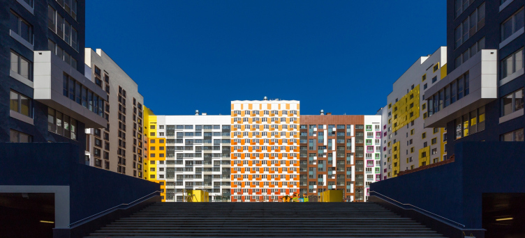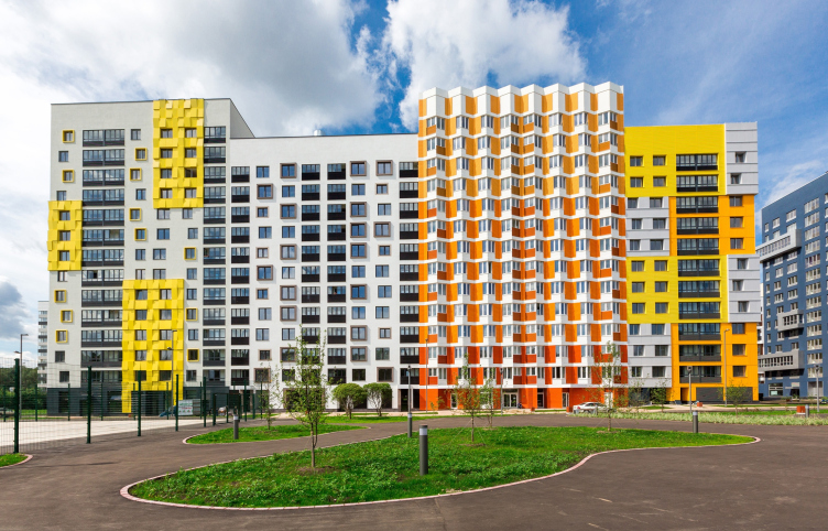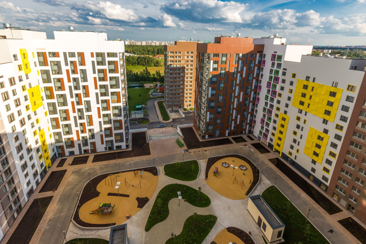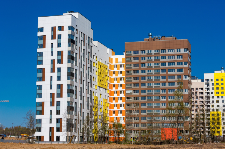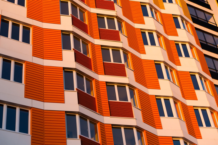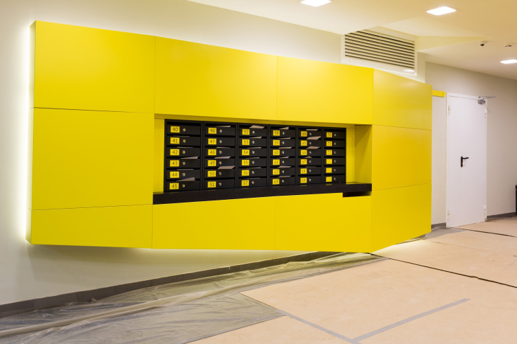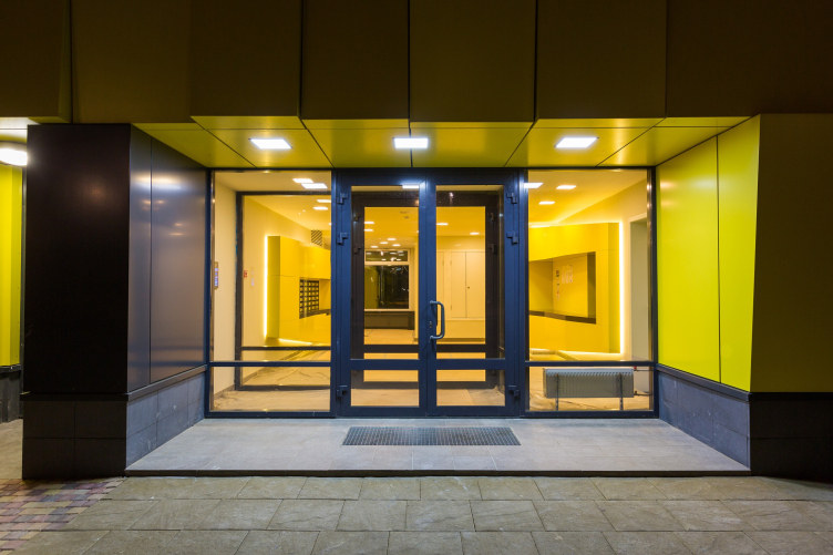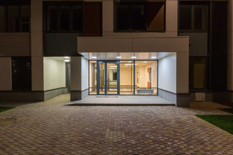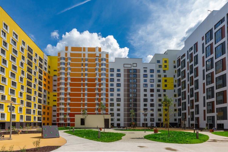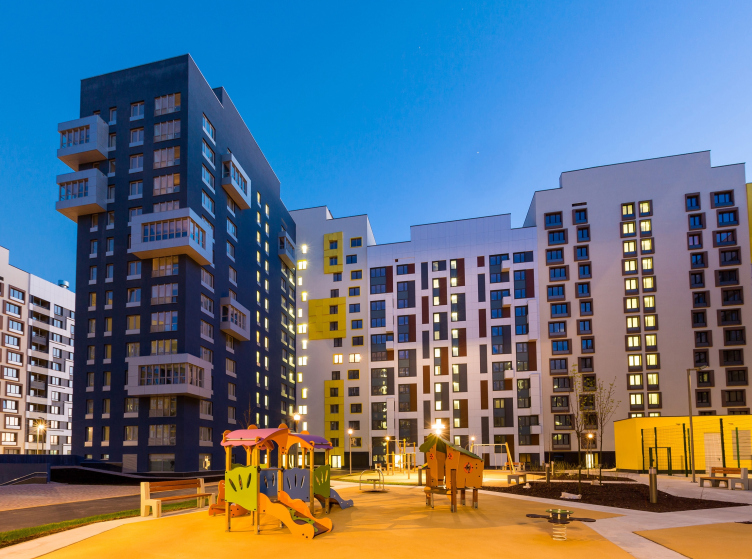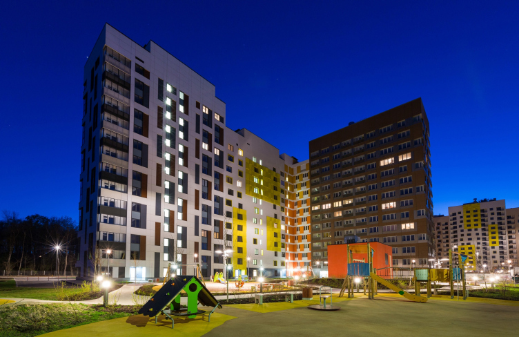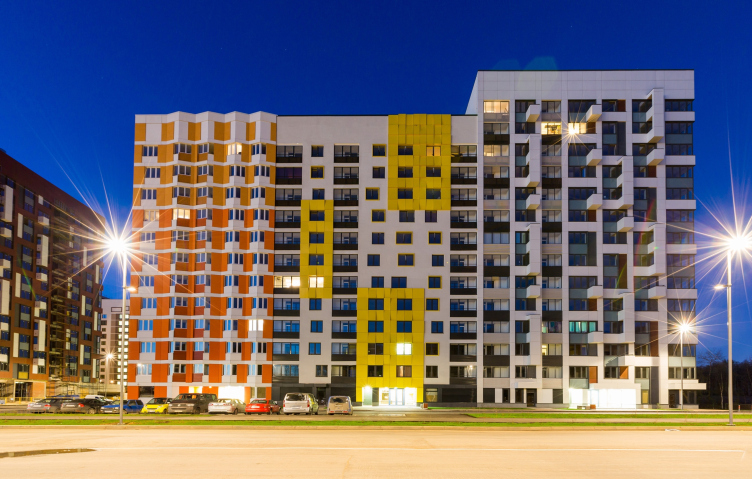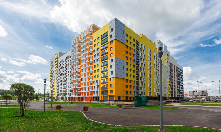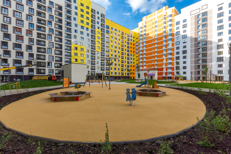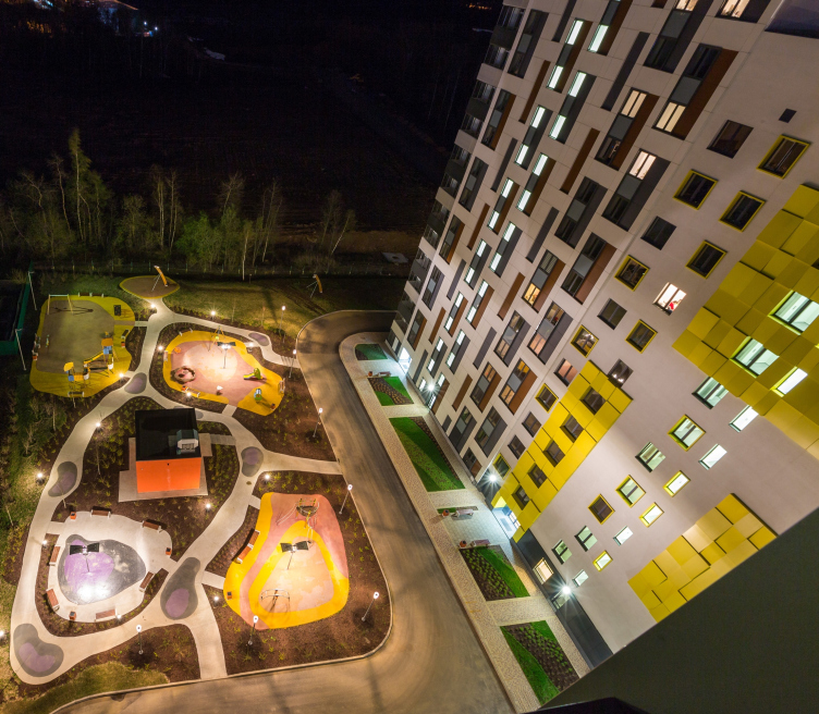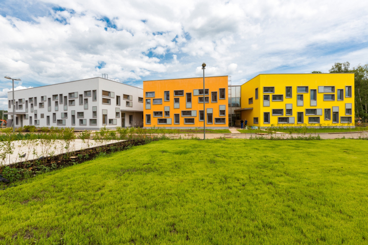
Building 16. The second stage of "Microcity in the Forest" Complex, 2014 © Rose Group, photo by Anton Ukhanov
The project and the concept of the “Microcity “in the Forest” was already covered at our website. This comfort class housing estate is being built on Pyatnitskoye Shosse, four miles away from Moscow by Rose Group Company, on the draft of SPEECH bureau. This is an emblematic project both for Rose Group developer as well as for the architects. Rose Group Company, known for their elite housing development in Ostozhenka district, took up this project in 2011 in comfort-class segment, completely new for the company. It was also a challenge for the architects to make a humanized urban web: with quarter planning, shut yards, closed up from the cars, shops and cafes, not only on the ground floor, but especially on the boulevard. The boulevard will be built in the third building stage and is to become the center of social life, complementing the residential function with the commercial, cultural and recreational ones – which are all necessary for a valid urban environment.
The layout drawing of the “Microcity in the Forest” currently covers 100 hectares. It is designed for 35 000 people, two schools and three kindergartens. The construction is planned to be carried out in eight stages (the decision about the implementation of several projects will be made later, in accordance with the current general situation on the market – explains Rose Group). At this point, three multi-sectional houses of the first construction stage, one kindergarten and a school are ready and second stage houses are being built. This was all demonstrated to the journalists at the end of August.
It was raining heavily and Sergey Choban said as he came to the press-conference: “We were afraid that it could be too bright because in summer we would usually see the facades in the sun. But now I see that these colors can cheer you up in bad weather”.
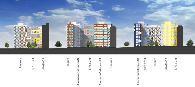
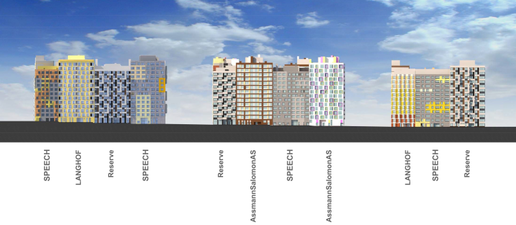
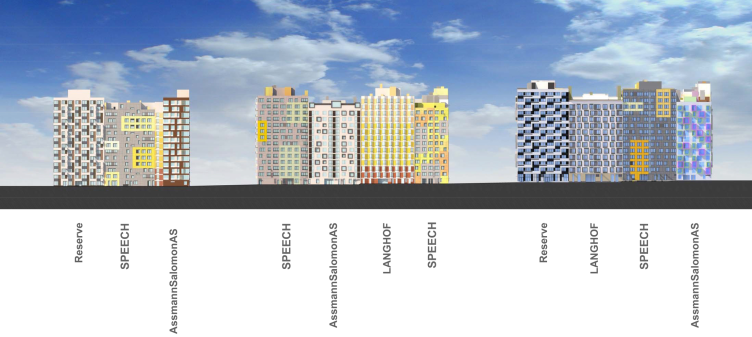
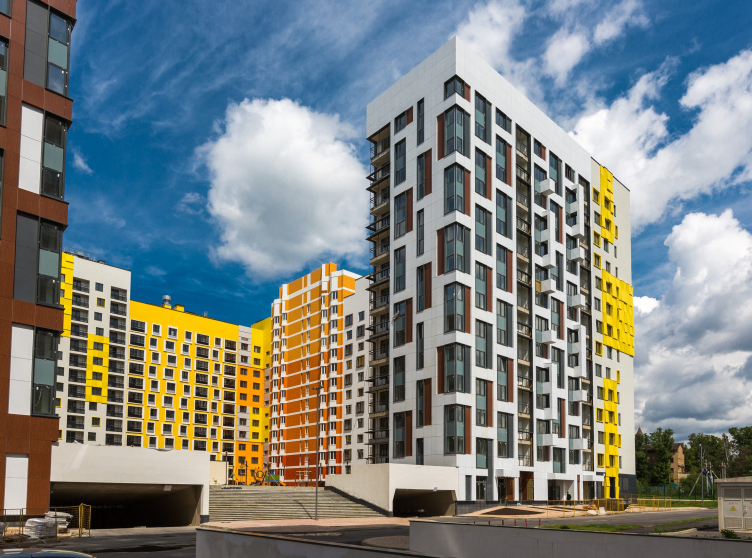
The textured yellow spots of the aluminum panels, bent at different angles, really did seem especially attractive that day. They look like thick strokes of oil paint made by a palette knife on a white canvas; like impasto blemishes of the sun left on the façade, so that they would not get washed away by the frequent Moscow rain. The first stage facades, as is known, are designed by two Russian architectural bureaus: SPEECH and “Reserve”, and two German ones: AssmannSalomon AS and LANGHOF. The “sunny” spots were suggested by SPEECH, and they echo to the relief creases of the orange facades, designed by LANGHOF. The idea of contrasting zigzags and the relief, irregular hatching of the white balconies belong to “Reserve”. By the way, not all colors are sunny here: the grey-brown tones from AssmannSalomon and its blue propylaea houses guarding the entrance to the sixteenth building look unexpectedly serious. (by the way, “Reserve” inverted the color solution while working on the similar propylaea sections of the seventeenth building – so the volumes turned out to be paired negatives).

Building 17. The first stage of "Microcity in the Forest" Complex, 2014 © Rose Group, photo by Anton Ukhanov

Building 17. The first stage of "Microcity in the Forest" Complex, 2014 © Rose Group, photo by Anton Ukhanov

Building 18. The first stage of "Microcity in the Forest" Complex, 2014 © Rose Group, photo by Anton Ukhanov

Building 18. The first stage of "Microcity in the Forest" Complex, 2014 © Rose Group, photo by Anton Ukhanov
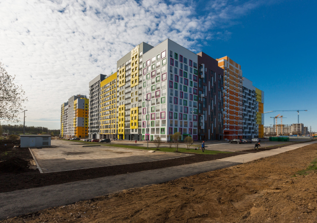
Building 16. The first stage of "Microcity in the Forest" Complex, 2014 © Rose Group, photo by Anton Ukhanov
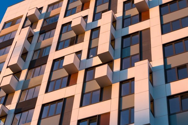
Building 18. The first stage of "Microcity in the Forest" Complex, 2014 © Rose Group, photo by Anton Ukhanov
Each member of the project made two to four variants. But what is most interesting – the invitees didn’t design separate volumes of houses (as done in SPEECH’s “Gruenewald” project and Sergey Skuratov’s “Garden Quarters”). They worked on designing the facades of separate sections, which were then put together by the leading bureau – SPEECH – with accents on corner and final sections. In addition to every façade option, the authors designed the incoming groups and apartments that are sold with fine finish, painted walls, doors and finished wet units. All details, including the numbers on the apartments, are thought over and match the design if the whole section. So the clearly readable external individuality of every block soaks inside the volume, letting the dwellers easily identify their own part of the house, and, of course, the integrity of the design on the whole.

The second stage of the residential construction of "Microcity in the Forest" Complex, 2014 © Rose Group, photo by Anton Ukhanov

The second stage of the residential construction of "Microcity in the Forest" Complex, 2014 © Rose Group, photo by Anton Ukhanov

The second stage of the residential construction of "Microcity in the Forest" Complex, 2014 © Rose Group, photo by Anton Ukhanov

The second stage of the residential construction of "Microcity in the Forest" Complex, 2014 © Rose Group, photo by Anton Ukhanov
Besides, the sections are intentionally made of different height. Twelve- and fourteen-storey volumes irregularly alternate every second or third house – thus emphasizing the impression of a variety of houses standing in line. The gradation of the top line is intensified by the flanges of the technical floors, moved to the surface of the facades. The top line goes fancifully up and down, and then suddenly calms down and stretches along the horizon, echoing the variety of the facades.
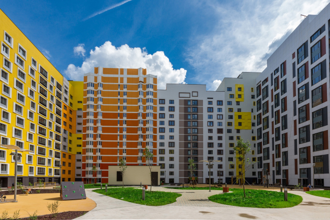
Building 17. The second stage of the residential construction of "Microcity in the Forest" Complex, 2014 © Rose Group, photo by Anton Ukhanov

The second stage of the residential construction of "Microcity in the Forest" Complex, 2014 © Rose Group, photo by Anton Ukhanov

The second stage of the residential construction of "Microcity in the Forest" Complex, 2014 © Rose Group, photo by Anton Ukhanov

The second stage of the residential construction of "Microcity in the Forest" Complex, 2014 © Rose Group, photo by Anton Ukhanov
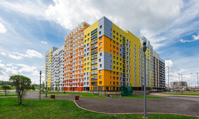
Building 17. The second stage of the residential construction of "Microcity in the Forest" Complex, 2014 © Rose Group, photo by Anton Ukhanov
In a word, the goal of the architects was to enrich the impression, in which they have definitely succeeded. It is fun to walk around counting the variants of combinations, noticing the ones that you have seen before or, on the contrary, the new ones. The developed technique is planned to be applied to the other construction stages as well. At least the facades of the second stage are already designed by the same Russian contestants – SPEECH and “Reserve”, and the new invitees – the German bureau Ortner&Ortner and the eccentric Briton William Alsop, who suggested to decorate the windows with styled colored flowers to pick up the theme of colored frames from the first construction stage, introduced by AsmannSalomon. One can see a certain polarization in the second stage: all the “brightness” is now gone to Alsop with the other three contestants suggesting a mixture of modernism and relative conservatism. It underlines the image of a town, made up of different buildings that turned up beside one another only by accident.

Facades. The second stage of the residential construction of "Microcity in the Forest" Complex, 2014 © SPEECH

Facades. The second stage of the residential construction of "Microcity in the Forest" Complex, 2014 © SPEECH

Facades. The second stage of the residential construction of "Microcity in the Forest" Complex, 2014 © SPEECH
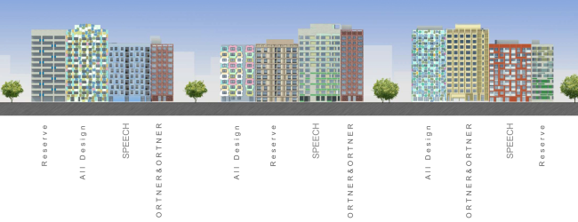
Facades. The second stage of the residential construction of "Microcity in the Forest" Complex, 2014 © SPEECH
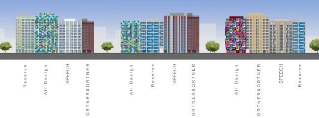
Facades. The second stage of the residential construction of "Microcity in the Forest" Complex, 2014 © SPEECH
The dance of lines and colors is not the only special feature of this project. Nearly the most important peculiarity is the gridiron planning, proposed by the designers. Now that Sergey Kuznetsov – architect in chief for the last two years – insists on prioritizing the gridiron development over the micro-district open one, only a lazy or a short-sighted author would not call his project a block. In 2007, when it all only started the priorities were not that clear yet – although one must admit, that not only SPEECH was among the devotees of gridiron planning at that time: for instance, Bart Goldhorn promoted the same idea in his project A101 – and still the project of a large-scale gridiron development must be recognized as a certain manifesto.
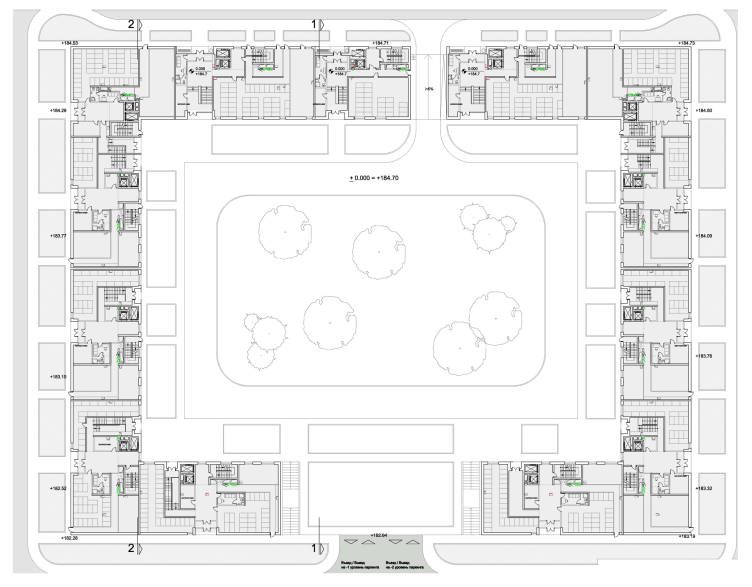
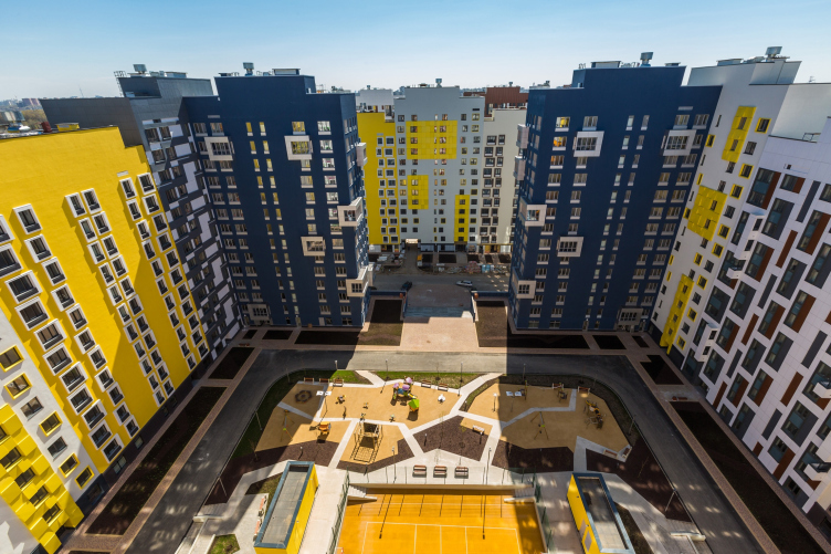
Most of the houses on the master plan, except for the dozen towers of the boulevard – surround the large yards with their dense perimeter. The perimeter breaks as if unwillingly, giving away one, less frequently two sections. The defined rhythm of the large blocks is inscribed into a fairly flexible, but still stubbornly orthogonal scale.
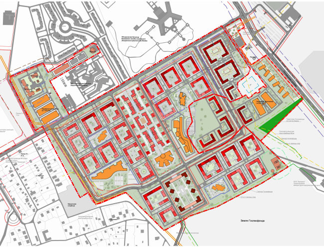
Master plan. The second stage of the residential construction of "Microcity in the Forest" Complex, 2014 © Rose Group, photo by Anton Ukhanov
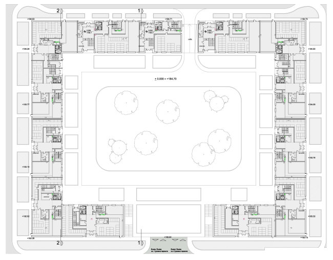
Plan of the underground floor. The second stage of the residential construction of "Microcity in the Forest" Complex, 2014 © © Rose Group, photo by Anton Ukhanov
We will remind you at this point that the first stage buildings – two blocks and an L-shaped house, about two times smaller and drawn back from the border of the lot – are the highest and the largest ones and stand closest to the highway. The sizes of the houses will be a bit smaller, only 10% maybe. Two full block-houses – buildings 16 and 17 – open in the middle, from the eastern side. The drop of the relief here forms wide front stairs, leading into the yard and framed with two propylaea sections and the openings into the underground parking. On the opposite, on the western side, there is an arch for letting a fire truck in (only for that purpose, since the yards are pedestrian). All the entrances and arches are concentrated round the central axis lining up like enfilade. It is expected that children will be able to play outside safely without their parents there.
The concept of the landscape improvement was developed by the Berlin St. Raum A bureau under the direction of Stefan Jackel and the Moscow “Ilya Mochalov and the Partners”. They also made up the operating documentation for the first stage and are now working on the second one.

Building 16. The first stage of the residential construction of "Microcity in the Forest" Complex, 2014 © Rose Group, photo by Anton Ukhanov

Building 17. The first stage of the residential construction of "Microcity in the Forest" Complex, 2014 © Rose Group, photo by Anton Ukhanov
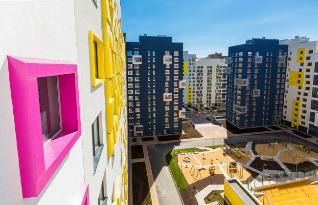
Building 16. The first stage of the residential construction of "Microcity in the Forest" Complex, 2014 © Rose Group, photo by Anton Ukhanov

Building 17. The first stage of the residential construction of "Microcity in the Forest" Complex, 2014 © Rose Group, photo by Anton Ukhanov

The first stage of the residential construction of "Microcity in the Forest" Complex, 2014 © Rose Group, photo by Anton Ukhanov
The resulting yards have turned out to be equally far from the Stalinist architecture and the historical development of the 18-19 and even 20th centuries with a much smaller scale (Stalin’s houses on the avenues had 9-11 floors, yards from 86 000 to 160 000 square feet; guest houses on Liteyniy avenue had 4-5 floors, yards from 3000 to 8600 square feet; in Haussmann Paris or in the center of Rome there are even small yards of around 2000 square feet in the same 4-6-floor houses; in the “Microcity “in the Forest” we can see houses with 12-14 floors and with yards of 60 000 square feet).
As a result it turns out to be something in the middle: far from the historical city scale (as an example – the project “Dwelling Hybrid” by MVRDV, typologically a townhouse), but also significantly suppressing the “Hong Kong like” growing height up to thirty-forty floors, so typical in Moscow and Podmoskovye. The district came out to be just in the middle between these two poles.
The new blocks – neither big, nor small, but still perceptibly rather large volumes – became the main modulus in the project. The district will be made up of such houses, placed in groups and divided by very wide passages. Their volumes are solid, thick blocks. The various facades on the outside serve as a decoration that conceals the sizes, draws the viewer’s attention to it and even argues with the rigid regularity of the block structure. One can easily notice that all the facades are made asymmetrical – as if they are trying to swing the volumes, trying it out with large and small zigzags and the irregularly arranged spots and flanges. The vertically cut facades slightly remind the old medieval towns, divided into miniature sections and built up with versicolored – although similar – houses, where the vertical lines of the narrow facades emphasizes the stepped pediments. The centers of all Hanseatic cities (in Denmark, Netherlands and Poland) are built up that way. But in this case their image is not copied. It is sooner shown through a kaleidoscope: not a single pair of similar forms – though the idea is fairly transparent. It may be also considered that there is more similarity with the center of Istanbul, built up with the same vertical late modernistic facades. However, every resemblance stays no more than a hint, a fantasy of the viewer – an idea, rather than an image. Hence the clearest association with theatrical decorations for Anderson’s tale, staged in some experimental theatre disdaining the fairylike Christmas literalism.
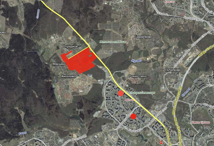
Sharing about the dwelling complex the architect Sergey Kryuchkov confesses that “in the forest” must not be taken literally. The name misleads you, making you think that the city must be located somewhere in taiga. In fact it is not so. The surrounding territory is well lived-in: Mitino micro-district starts not far on the eastern side near Pyatnitskoye Shosse; to the west is the Otradnoye settlement – another dwelling complex is also being built there; but the nearest to the microcity is the clinic. The actual forest starts only two miles away – after Sinichka river surrounded by sanatoriums. The name has a different meaning: aiming to make the economy-class nevertheless comfortable the developers gave away about two quarters, keeping a fragment of forest parks inside the territory (the planting is managed by a Russian company Imperial Gardens).

Aerial photography. The first stage of the residential construction of "Microcity in the Forest" Complex, 2014 © SPEECH
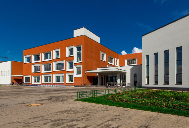
It is notable that the forest is not the only peculiarity of the district: there is a number of important details meant to improve the quality of life and attract the dwellers. They were widely discussed at the press-conference. Besides, Rose Group underlines that it is essential that the new complex lives and functions – that it doesn’t become an investment purchase or a concrete lockbox (which is also new). A kindergarten is built according to projects of SPEECH: very vivid, composed of several colorful volumes with many perpendicular windows. The red-brick school with perspective frames round the windows and even on doors reminds the Tretyakov Gallery reconstruction project f the same authors. The kindergarten and school are markedly asymmetrical, in contrast to the square plans of the blocks, and their frons are uniform – unlike those of the residential buildings.
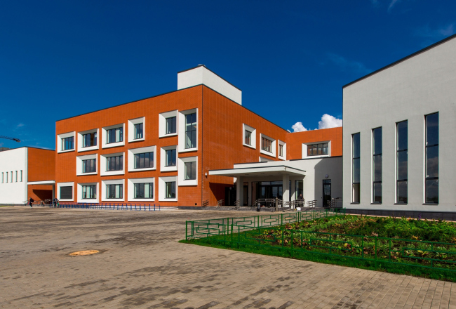
School. The first stage of the residential construction of "Microcity in the Forest" Complex, 2014 © Rose Group, photo by Anton Ukhanov

Kindergarten. The first stage of the residential construction of "Microcity in the Forest" Complex, 2014 © Rose Group, photo by Anton Ukhanov
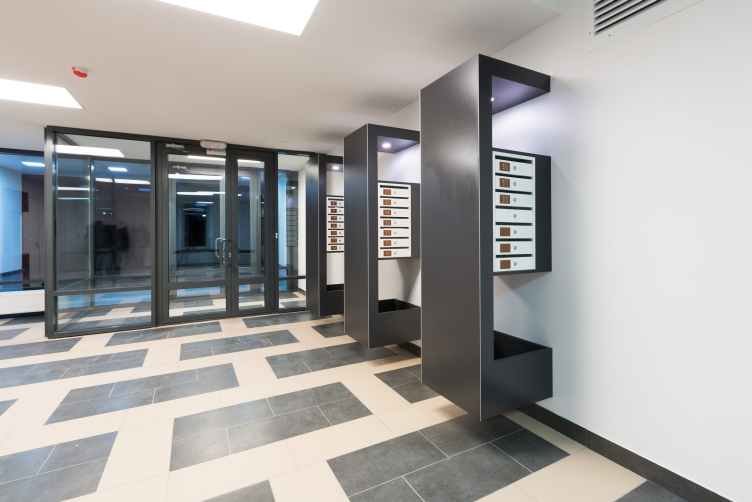
As the spokesmen of Rose Group and SPEECH said at the press-conference – there are no particular technical and service innovations, but many things were first used in comfort class, that are traditionally more elite. For example, all apartments are sold together with a place in the underground parking lot (the parking places on the ground floor are for guests and are located outside of the perimeter – the yards are pedestrian). The optical fiber channel laid in the houses can support telephone, door phone and the internet at the same time (and besides: the dwellers can choose between three competing providers). If desired, this connection allows to organize a full-fledged “smart house” system. The cars entering the parking are identified by a remote card reading system. Children will have similar cards at school. Door phones are located inside transparent tambours in front of the vestibules – so that the guests will not have to freeze while waiting outside. The ground floor is equipped with storages for baby carriages and bicycles. School will cost 10 000 rubles a month (which is a rather low price for private school – the average payment is 35 000 rubles – that was achieved in the agreement between the developers and the school operator). The school is only four minutes on foot away from the first stage houses. The dwellers, however, do not accept all novelties. For instance, many people are not happy about the lack of rubbish chutes: good thing that it does not smell in the stair well, but it is sometimes so convenient to throw garbage away just on your floor… Whether there will be some other improvement is not clear yet. The dwellers have not yet decided if they are ready to pay for it. If they turn out not to – the improvement will not go beyond grass on the lawns without any gardening luxuries.
Many of the enumerated small details, both architectural and domestic ones, respond to the very definition of comfort-class. You can feel how some critical elements are being step-by-step implanted, although it takes hard work and compromising. Starting from the compulsory parking place (that can later be sold) and the trimming of the apartments (that could be more easily remade) – to the whole image of the microcity aiming to refine the brutal Moscow views. Everything is close in this place: cottages, townhouses, sanatoriums, micro-districts, the big shopping mall and also the forest and the field. The “Microcity in “the Forest” fits in perfectly – and at the same time is completely different – joyous and clean. Well, typical middle class.


