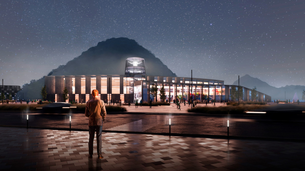
Therefore, ASADOV Architects, working last year on the competition project for a cultural and community center on the central square of Petropavlovsk-Kamchatsky, focused primarily on the appropriateness of the building within the natural context of the nearby Nikolskaya Sopka.
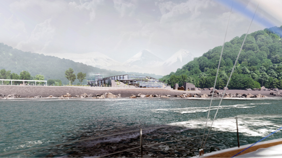
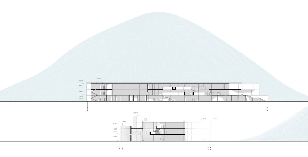
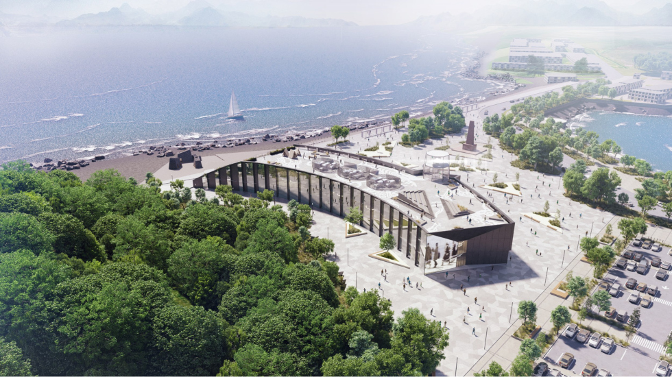
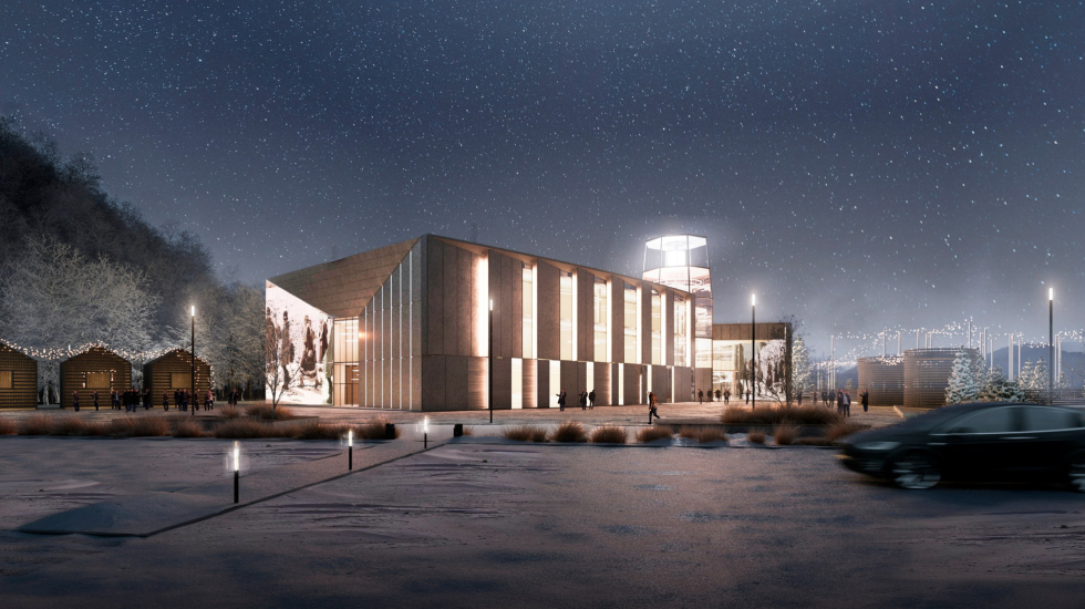
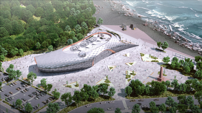
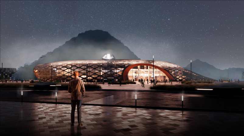
The place is basically a natural reserve. The hill is very beautiful and sculptural – looking at the pictures, one might think it’s a huge mountain. But in reality, the hill is small, and even a three-story building in front of it will be noticeable. The site is very delicate; if you place a “suitcase” there, the hill will disappear. So, we tried in every way to “dismantle” the building to avoid competing with the hill. Not completely, of course; harsh “deconstruction” would be inappropriate in this case – but we wanted to move away from traditional architecture and create “not quite a building”, but something that looks like it broke off from the hill. We divided the volume into two arcs: one, of lesser height, forms Lenin Square, and the other curves along the base of the hill. This creates a foreground and background: the wings recede into the depth and do not compete with the natural backdrop.
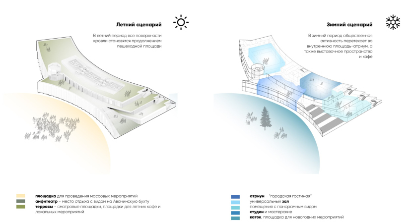
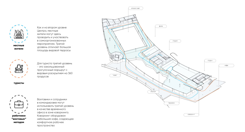
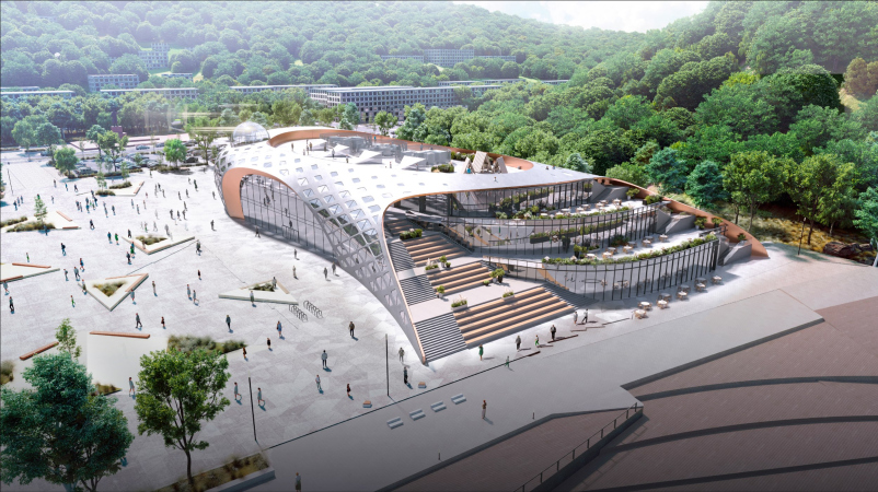
On the roof, we proposed terraces on the bay side and a staircase with an amphitheater to “animate” the building, turning it into a public space that is essentially a continuation of Lenin Square. There is a specific natural and landscape context here: first, the city is located on hills, and people are used to stairs; second, the climate is harsh, often windy and cold, but when the sun comes out, people flock to the square to “catch” it and warm up. We observed how this happens in Lenin Square now, and our terraces and stairs are largely designed to provide additional space for such outings.
In short, we believe the view from the bay side, where the building descends in steps, is the most successful.
A public and cultural center in Petropavlovsk-Kamchatsky
Copyright: © ASADOV Architects
A public and cultural center in Petropavlovsk-Kamchatsky
Copyright: © ASADOV Architects
Interestingly, the amphitheater staircase, with its sharp nose pointing toward the embankment, extends beyond the permitted construction area – but the architects interpreted it as “not a building volume, but part of the square’s landscaping design. There is certain logic in this decision, and it underscores Alexander Asadov’s stated goal of “blending with the space” and becoming part of the environment.
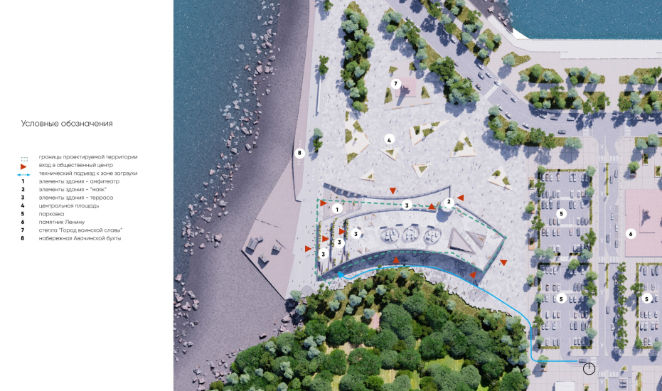
Indeed, Lenin Square, in front of the western part of which the building is designed, is one of the most remarkable centers of the city. Officially, it is indeed its central point, but it is located on a spit separating the bay from Kultuchnoye Lake. Nevertheless, the location remains the city center. Here, not only the Government House, but also the Drama and Comedy Theater is situated, in front of which the city festival “Kamchatka Arbat” is held. Therefore, the space between the hill and the cultural center was conceived by the architects as a pedestrian street – especially since it became clear during the competition, according to the revised brief, that it would have to be car-free – connecting the new building with the square in front of the theater and adapted, among other things, for conducting festivals.
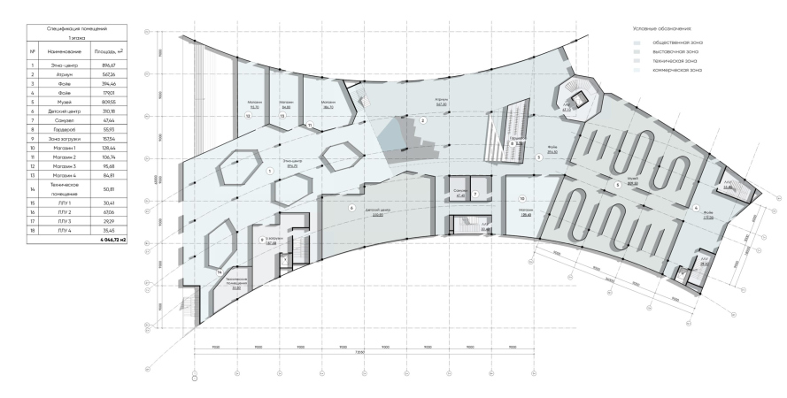
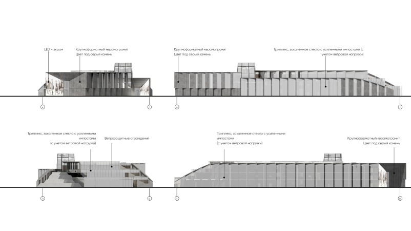
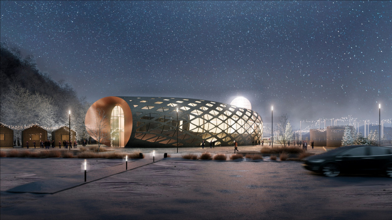
As we can see, the two arcs, one small and one large, converge to form a plan resembling the handwritten letter X. At the point of their intersection on the city side, a “lighthouse” tower emerges, inside which a spiral staircase was planned. From this side, the center looks like a noticeable urban building. It could also serve as a beacon at night, being composed of large triangular bay windows: one opaque plate and one glass plate. During the day, the glass would reflect everything around. The alternating planes and the discrete rotation of the facade arc – more “escaping” from the viewer than presenting itself – also partially work to visually dissolve the volume. At the same time, the end facing the Government House features a narrow vertical window in a broad perspective frame, with one slope serving as a media screen.
A public and cultural center in Petropavlovsk-Kamchatsky
Copyright: © ASADOV Architects
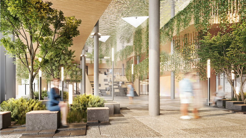
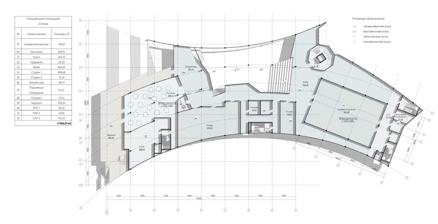
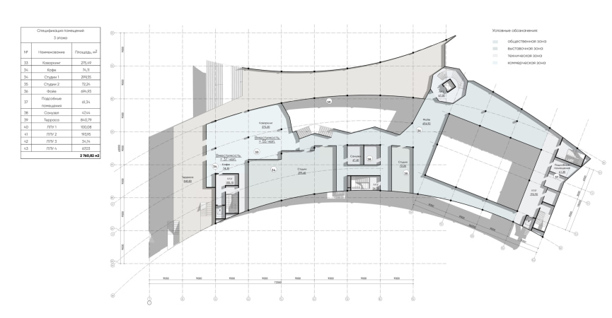
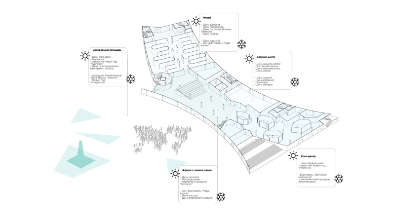
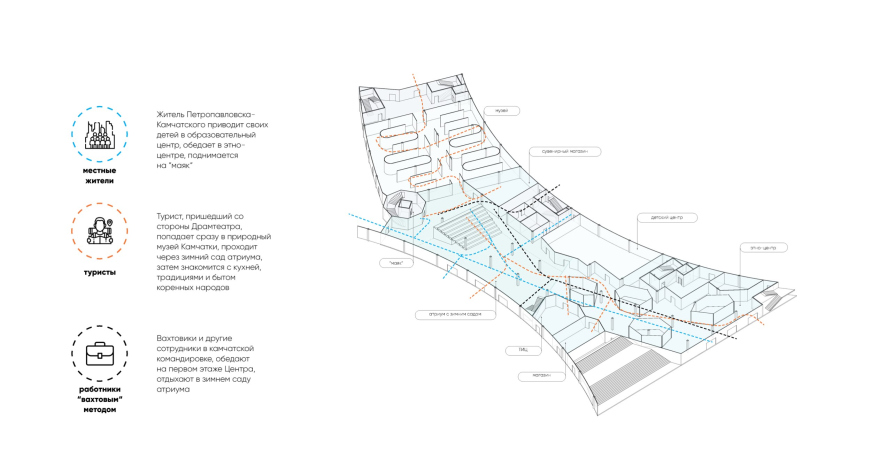
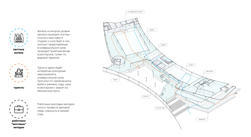
The core of the internal space in the project is a triple-height atrium adjacent to the arc of the façade from the side of Lenin Square. Here, the architects propose a fully-fledged winter garden, highly relevant in the harsh climate, with a visually expanding mirrored ceiling and a large amphitheater, the back of which houses the cloakroom. It echoes the external open amphitheater, mirroring it internally.
The atrium connects two wings – the museum wing on the city side and the restaurant wing on the “sea” side. However, on the first level under the “restaurant” wing, the architects are placing an ethnic culture center. The functional program also includes a children’s leisure center, a food court with seafood dishes, and a multifunctional hall that can serve as the minor theater stage during festivals.
Different functions in the project have entrances from different sides.
For the final presentation, ASADOV Architects showcased the most “traditional” option, the one, where, in their own words, it was not entirely possible to move away from the traditional “building” concept.
Thus, aside from the final version, a second, more streamlined form emerged, resembling, according to Alexander Asadov, a giant fish.
But that’s not everything. The “momentum” from the creative search during the competition was enough for the architects to create another sketch after the completion – simply to understand what image of the cultural center at the foot of the protected hill they really found appropriate if they had it their own way.
“The restrained image of the final version was dictated by the remoteness of the location and self-censorship in the selection of materials”, says Alexander Asadov. “But if we turned the flat vertical pylons into volumetric ones and pushed them forward from the glass toward the square, it would create a “Stonehenge” – a wild, ancient building, stepping back a thousand years”.
Well, maybe this would have been the right thing to do.


