По-русски

For Mental Reboot

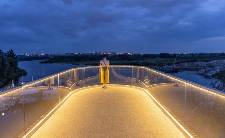
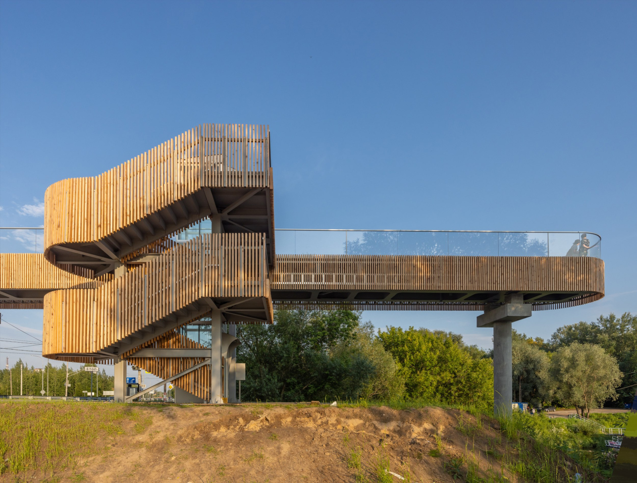
At the architectural competition held in 2023 in Novosibirsk, the project by GORA Architects – a pedestrian bridge leading to the town of Bor – was awarded the “Golden Capital” prize. In this country, more than a hundred pedestrian bridges are constructed each year. What makes the Bor bridge different?

19 October 2023
Contest Results
mainImg
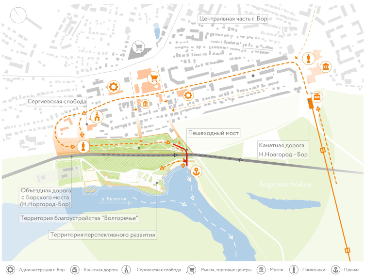
The project’s author, architect Stas Gorshunov, explains: the pedestrian bridge is an extension of the route from the city center to the water – to the Vezloma River, which flows into the Volga here.

The pedestrian bridge in the Bor Volga Valley
Copyright: Photo © Alexander Ivasenko / provided by GORA

The pedestrian bridge in the Bor Volga Valley
Copyright: Photo © Alexander Ivasenko / provided by GORA
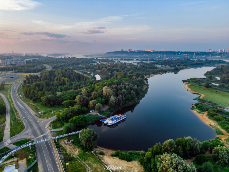

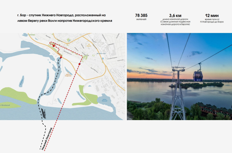
Bor is situated on the left bank of the Volga but is separated from it by flood meadows: passenger ships travel to Bor through the Vezloma channels, and a ferry was in operation for cars. The new pedestrian bridge leads to the pier, and the observation platform at its end faces Vezloma, overlooking the Bor floodplain. The route from the city to the pier is seasonal, and after the construction of a cable car and an alternative to the Bor bridge (of federal importance), reaching Nizhny Novgorod across the Volga is not a problem at all. However, the flood meadows are a traditionally beloved recreation spot for the residents of Bor. Seven years ago, this area was suddenly cut off from the city by a bypass road, which was justified by the needs of motorists, although not everyone found these justifications convincing.

The pedestrian bridge in the Bor Volga Valley. Fragment of the presentation
Copyright: © GORA


The pedestrian bridge in the Bor Volga Valley
Copyright: Photo © Alexander Ivasenko / provided by GORA


On the bypass road, a traffic light was installed at the zebra crossing, but then the idea of an overhead pedestrian bridge emerged. Initially, there was a proposal to create something similar to Nizhny Novgorod – a clumsy plastic pedestrian “pipeline”. However, during one of the discussions, the governor had doubts, which eventually led to the concept of a tailored project. If one considers only these facts and observes a bit more how pedestrians currently, without using the bridge, walk towards the traffic light, it is easy to assume that Gorshunov’s project is just a piece of pleasant art, and a pure simulacrum.

  • zooming
    The pedestrian bridge in the Bor Volga Valley
    Copyright: Photo © Alexander Ivasenko / provided by GORA
  • zooming
    The pedestrian bridge in the Bor Volga Valley
    Copyright: Photo © Alexander Ivasenko / provided by GORA

Such assumptions quickly dissipate when one recalls how vehemently local communists criticized the very idea of a pedestrian bridge. In response to the criticism, a whole chain of arguments was built: the “Volga Valley” will be improved, increasing the city’s tourist attractiveness and eventually merging into a certain tourist cluster. Whether the cluster will materialize is unknown; in the coastal zone, re-enactors are already active, depicting scenes from Ancient Rome, and a wake-surf park operates on Yurasovskoye Lake in the summer. There were statements about building an oceanarium in Bor, which were met with mixed reactions and subsequently refined with the addition of “an oceanarium with a hotel and a rehabilitation center for children with cerebral palsy”. Another initiative is to open a yacht club with winter storage and a pier for boats on the banks of the Vezloma. So, currently, the pedestrian bridge is a symbol of change in the Bor Volga Valley.

The pedestrian bridge in the Bor Volga Valley
Copyright: Photo © Alexander Ivasenko / provided by GORA

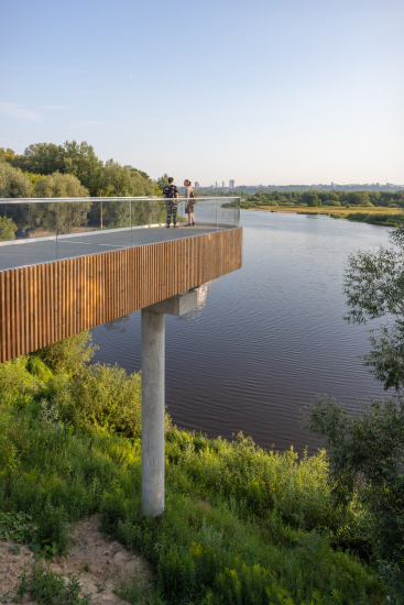
This symbol is indeed beautiful. The bridge itself is a new landmark for the city, modern and aesthetically flawless, following in the footsteps of the “Mossy Mountains”, the previous project that GORA Architects did in Bor.

The pedestrian bridge in the Bor Volga Valley
Copyright: Photo © Alexander Ivasenko / provided by GORA

The pedestrian bridge in the Bor Volga Valley
Copyright: Photo © Alexander Ivasenko / provided by GORA
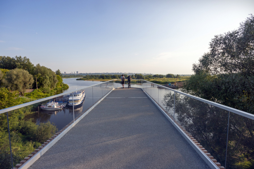

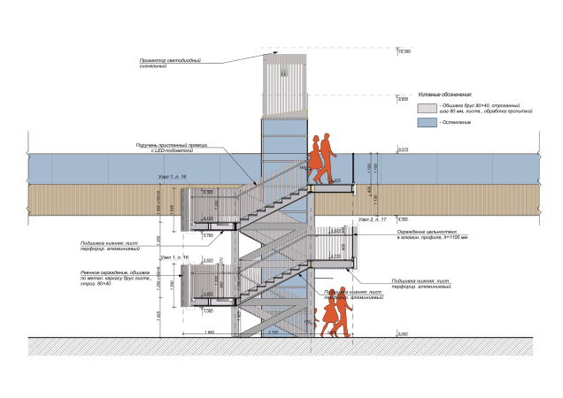
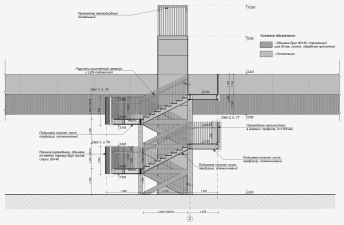
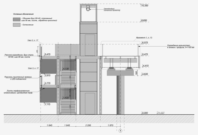
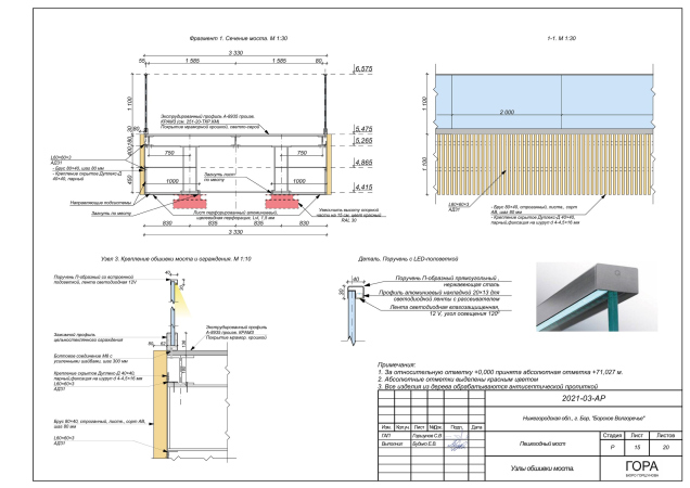
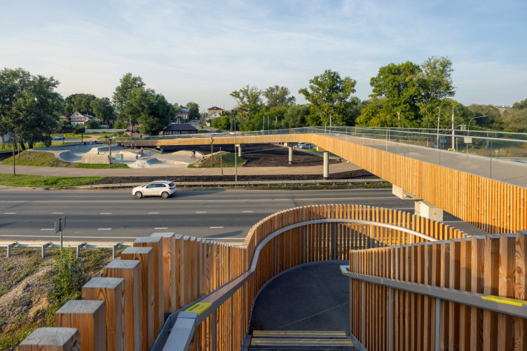
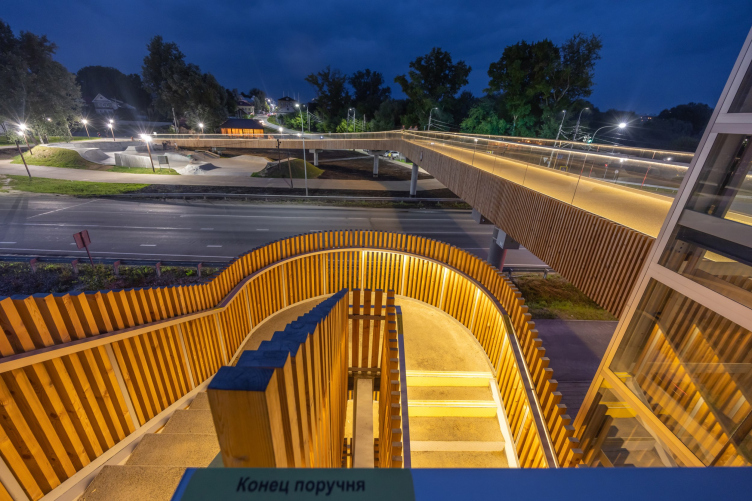
The bridge is referred to as an aluminum one; its structures are made of metal, while the finish consists of larch and glass. The glass fragments are crucial for the city, primarily known for its glass factory.

  • zooming
    The pedestrian bridge in the Bor Volga Valley. The construction process
    Copyright: Photo © Stanislav Gorshunov / provided by GORA
  • zooming
    The pedestrian bridge in the Bor Volga Valley
    Copyright: Photo © Stanislav Gorshunov / provided by GORA


The use of wood in the design is not accidental. The initial version of the project envisioned the construction of a wooden bridge.

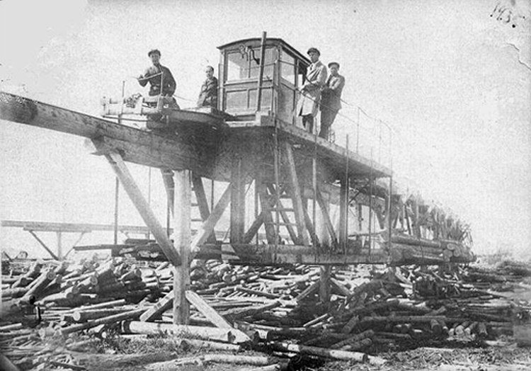
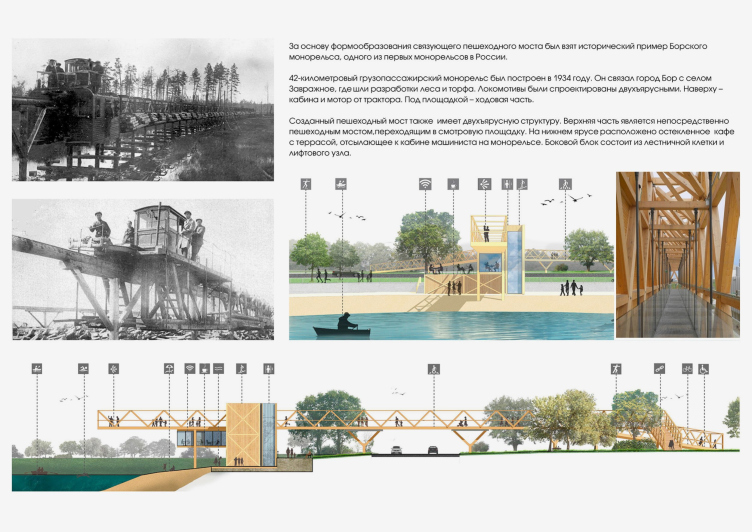
Local history inspired the architects as well: in the mid-1930s, the first industrial monorail road in the country was launched in Bor. The wooden viaduct traversed a terrain with significant elevation changes, transporting timber and peat to Bor. The road operated for six years until the forest area was completely exhausted.

zooming
Monorail of 1935 in Borsky Volga Valley
Copyright: Archival photo: submitted by AB GORA


The project’s explanatory note says that the locomotives on the monorail road were double-decker: the top part housed the cabin and motor from a tractor, while the lower part contained the running gear. Similarly, the wooden bridge could reproduce the monorail’s image, with a cafe as an addition on the lower platform under the observation deck.

The original project of the wooden bridge. The pedestrian bridge in the Bor Volga Valley
Copyright: © GORA


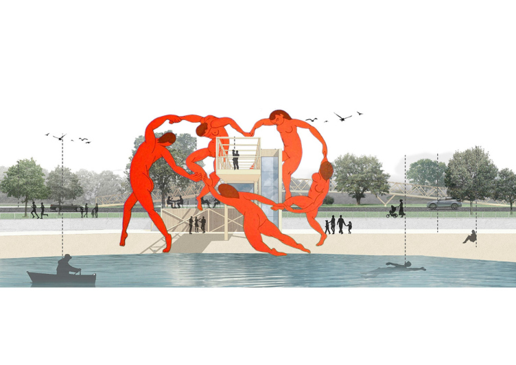
However, it was not by chance that, in defense of his project during the final stage of the architectural competition “Golden Capital”, Gorshunov enriched his presentation with a slide with red figures reminiscent of Matisse’s “Dance” around the bridge.

The pedestrian bridge in the Bor Volga Valley
Copyright: © GORA


I thought it was a hint at high art, and that Stas decided to make a bold statement. However, it turned out to be a visualization of the bustling atmosphere around the bridge project, as various interested parties emerged.

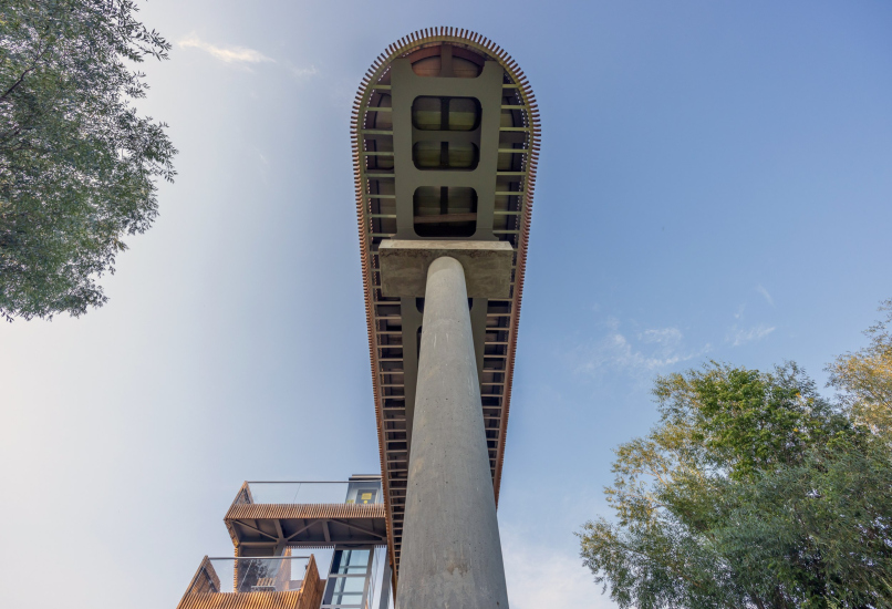
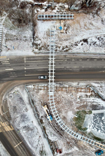
Discussions about durability, fire safety, and other security concerns had a radical impact on the project. They wanted something more than allusions to the history of logging, something about a bright future, especially since talks were already underway about “Nizhny Novgorod high-tech” – the first aluminum automobile bridge in Russia over the Linda River, not far from Bor. As a result, the wooden pedestrian bridge was redrawn into an aluminum one.

  • zooming
    The aluminum structures are particularly visible when viewed from below the observation deck cantilever. The pedestrian bridge in the Bor Volga Valley
    Copyright: Photo © Alexander Ivasenko / provided by GORA
  • zooming
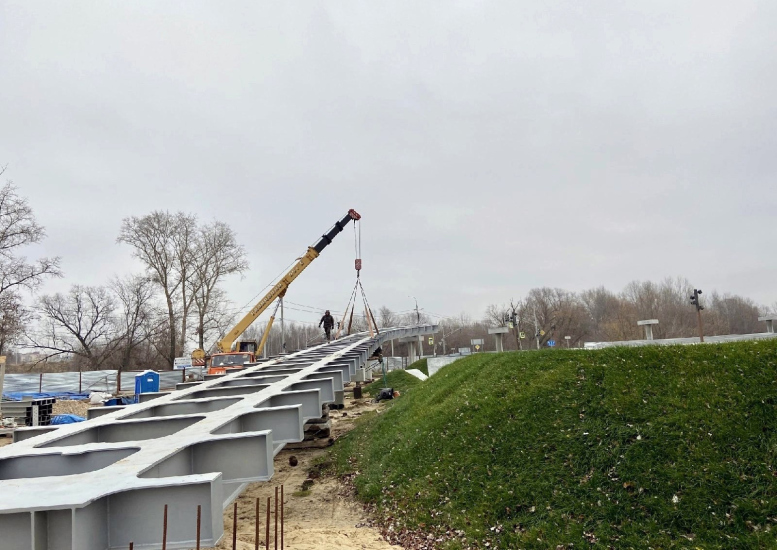
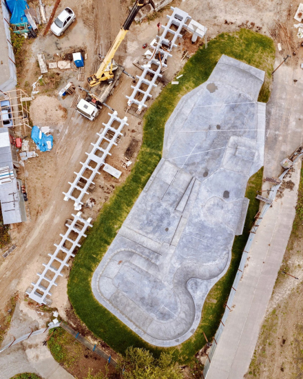
    The aluminum structure was moved by crane to be installed over the road. The pedestrian bridge in the Bor Volga Valley. The construction process
    Copyright: Photo © Stanislav Gorshunov / provided by GORA


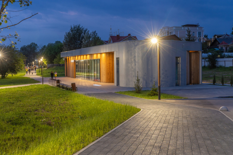
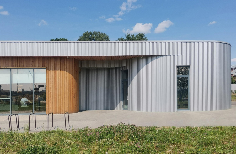
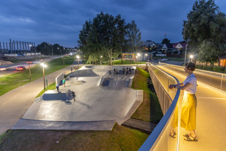
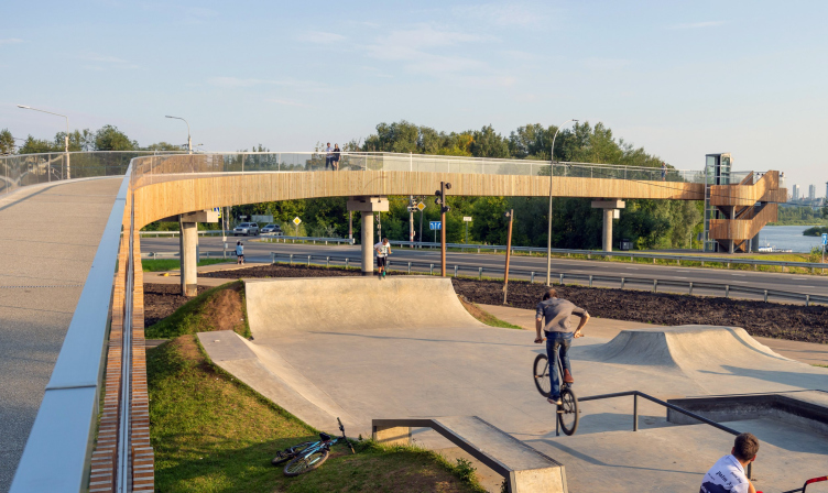
The use of wood in the bridge’s design extends vertically to the “Volgorechye” café – it is not suspended under the bridge but is situated at the beginning of the ascent to the bridge, next to the skate park. The entire area is landscaped according to a unified project, reaching to George the Victorious Square: pathways, small structures, and platforms. The promenade area will also extend in the other direction beyond the bridge, reaching to the cable car.

The pedestrian bridge in the Bor Volga Valley
Copyright: Photo © Alexander Ivasenko / provided by GORA

The pedestrian bridge in the Bor Volga Valley
Copyright: Photo © Alexander Ivasenko / provided by GORA

The bridge received high praise not only from the “Golden Capital” judging panel in Novosibirsk but also from the residents of Nizhny Novgorod, who openly envy their satellite city. Of course, one should not expect that the lift for people with limited mobility is operational or that there is no litter or waste around. However, the quality of execution on the bridge and in its vicinity is exemplary.

The pedestrian bridge in the Bor Volga Valley
Copyright: Photo © Alexander Ivasenko / provided by GORA

“In its vicinity” is a very important specification here. Locals refer to Bor as a large village, and to some extent they have a point – public life here is fragmented into private interests, and common goals are rarely united. Although occasionally they do unite – such as in building the Stalin Museum (currently in construction). As for the Mukhinskoe Lake – the main myth and foundation of the city – it has been improved almost to the point of complete loss of all living things. The metal structure – a fragment of the 1896 pavilion, part of which is preserved on the Nizhny Novgorod Spit – was also attached to the case, despite knowing the history of this iron thing. Yurasovskoye Lake (where they opened a beach and the wake-surf park) is now surrounded by roads, and this summer Rospotrebnadzor declared it unsuitable for swimming. The historical wooden building of the “Mossy Mountains” station was restored beyond recognition, and turned into a beer shop. In Volgorechye, opposite the new café – across the road – where the ruins of some small production still stand, a giant windowless and seemingly doorless structure has emerged. No one has a clue who even issued permission for building such a thing here. However, there are also questions about the improvement of Volgorechye: who will take responsibility for the withered saplings passed off as greenery?

As the significance of the bridge for the city of Bor is challenging to measure at the moment, and not everyone believes in signs, I suggest evaluating it as an art object. It has everything: precision of proportions and a divergence of lines. Warmth and aloofness. Traditional material and innovation. It is appropriate, comfortable, and, moreover, self-sufficient. Original-looking, yet at the same time devoid of unnecessary ornamentation. In addition to the ability to move up and down, along, and even across, it accentuates the feeling of suspension and hovering. And if this bridge symbolizes anything, then it is an attempt to discern the perspective: whether Nizhny Novgorod is across the river or other horizons. This thing has been installed in Volgorechye for mental reboot.

The pedestrian bridge in the Bor Volga Valley
Copyright: Photo © Alexander Ivasenko / provided by GORA

  • zooming
    1 / 4
    The pedestrian bridge in the Bor Volga Valley
    Copyright: © GORA
  • zooming
    2 / 4
    The pedestrian bridge in the Bor Volga Valley
    Copyright: © GORA
  • zooming
    3 / 4
    The pedestrian bridge in the Bor Volga Valley
    Copyright: © GORA
  • zooming
    4 / 4
    The pedestrian bridge in the Bor Volga Valley
    Copyright: © GORA


19 October 2023

Headlines now
The Golden Crown
The concept for a dental clinic in Yekaterinburg, developed by CNTR Studio, revolves around the idea of a “mouth full of gold”: pristine white porcelain stoneware walls are complemented by matte brass details. To avoid an overly literal interpretation, the architects focused on the building’s proportions, skillfully navigating between sunlight requirements and fire safety regulations.
Flexibility and Integration
Not long ago, we covered the project for the fourth phase of the ÁLIA residential complex, designed by APEX. Now, we’ve been shown different fence concepts they developed to enclose the complex’s private courtyards, incorporating a variety of public functions. We believe that the sheer fact that the complex’s architects were involved in such a detail as fencing speaks volumes.
A Step Forward
The HIDE residential complex represents a major milestone for ADM architects and their leaders Andrey Romanov and Ekaterina Kuznetsova in their quest for a fresh high-rise aesthetic – one that is flexible and layered, capable of bringing vibrancy to mass and silhouette while shaping form. Over recent years, this approach has become ADM’s “signature style”, with the golden HIDE tower playing a pivotal role in its evolution. Here, we delve into the project’s story, explore the details of the complex’s design, and uncover its core essence.
Gold in the Sands
A new office for a transcontinental company specializing in resource extraction and processing has opened in Dubai. Designed by T+T Architects, masters of creating spaces that are contemporary, diverse, flexible, and original, this project exemplifies their expertise. On the executive floor, a massive brass-clad partition dominates, while layered textures of compressed earth create a contextually resonant backdrop.
Layers and Levels of Flight
This project goes way back – Reserve Union won this architectural competition at the end of 2011, and the building was completed in 2018, so it’s practically “archival”. However, despite being relatively unknown, the building can hardly be considered “dated” and remains a prime example of architectural expression, particularly in the headquarters genre. And it’s especially fitting for an aviation company office. In some ways, it resembles the Aeroflot headquarters at Sheremetyevo but with its own unique identity, following the signature style of Vladimir Plotkin. In this article, we take an in-depth look at the United Aircraft Corporation (UAC) headquarters in the Moscow agglomeration town of Zhukovsky, supplemented by recent photographs from Alexey Naroditsky – a shoot that became only recently possible due to the fact that improvements were finally made in the surrounding area.
Light and Shadow
In this article, we delve into the architectural design of the “Chaika” house by DNK ag architects, which was recently completed in 2023 as part of the collection of signature designs at ZILArt. As is well-known, all the buildings in this complex follow a design code, yet each one is distinct. This particular building stands out not only for its whiteness and minimalism but also for the refined use of a limited number of techniques that, together, create what can confidently be called synergy.
Casus Novae
A master plan was developed for a large residential area with a name of “DNS City”, but now that its implementation began, the plan has been arbitrarily reformatted and replaced with something that, while similar on the surface, is actually quite different. This is not the first time such a thing happens, but it’s always frustrating. With permission from the author, we are sharing Maria Elkina’s post.
Treasure Hunting
The GAFA bureau, in collaboration with Tegola and Arkhitail, organized an expedition to the island of Kilpola in Karelia as part of Moskomarkhitektura’s “Open City” festival. There, amidst moss and rocks, the students sought answers to questions like: what is the sacred, where does it dwell, and what sustains it? Assisting the participants in this quest were landscape engineer Evgeny Levin, artist Nicholas Roerich, a moose, and the lack of cellular connection. Here’s how the story unfolded.
Depths of the Earth, Streams of Water
In the Malaya Okhta district, the Akzent building, designed by Stepan Liphart, was constructed. It follows a classic tripartite structure, yet it’s what you might call “hand-drawn”: each façade is unique in its form and details, some of which aren’t immediately noticeable. In this article, we explore the context and, together with the architect, delve into how the form was developed.
Fir Tree Dynamics
The “Airports of Region” holding is planning to build an airport in Karachay-Cherkessia, aiming to make the Arkhyz and Dombay resorts more accessible to travelers. The project that won in an invitation-only competition, submitted by Sergey Nikeshkin’s KPLN, blends natural imagery inspired by the shape of a conifer seed, open-air waiting spaces, majestic large trees, and a green roof elevated on needle-like columns. The result is both nature-inspired and WOW.
​A Brick Shell
In the process of designing a clubhouse situated among pine trees in a prestigious suburban area near Moscow, the architectural firm “A.Len” did the façade design part. The combination of different types of brick and masonry correlates with the volumetric and plastique solutions, further enhanced by the inclusion of wood-painted fragments and metal “glazing”.
Word Forms
ATRIUM architects love ambitious challenges, and for the firm’s thirtieth anniversary, they boldly play a game of words with an exhibition that dives deep into a self-created vocabulary. They immerse their projects – especially art installations – into this glossary, as if plunging into a current of their own. You feel as if you’re flowing through the veins of pure art, immersed in a universe of vertical cities, educational spaces – of which the architects are true masters – and the cultural codes of various locations. But what truly captivates is the bold statement that Vera Butko and Anton Nadtochy make, both through their work and this exhibition: architecture, above all, is art – the art of working with form and space.
Flexibility and Acuteness of Modernity
Luxurious, fluid, large “kokoshniks” and spiral barrel columns, as if made from colorful chewing gum: there seem to be no other mansion like this in Moscow, designed in the “Neo-Russian-Modern” style. And the “Teremok” on Malaya Kaluzhskaya, previously somewhat obscure, has “come alive with new colors” and gained visibility after its restoration for the office of the “architectural ecosystem” as the architects love to call themselves. It’s evident that Julius Borisov and the architects at UNK put their hearts into finding this new office and bringing it up to date. Let’s delve into the paradoxes of this mansion’s history and its plasticity. Spoiler: two versions of modernity meet here, both balancing on the razor’s edge of “what’s current”.
Yuri Vissarionov: “A modular house does not belong to the land”
It belongs to space, or to the air... It turns out that 3D printing is more effective when combined with a modular approach: the house is built in a workshop and then adapted to the site, including on uneven terrain. Yuri Vissarionov shares his latest experience in designing tourist complexes, both in central Russia and in the south. These include houseboats, homes printed from lightweight concrete using a 3D printer, and, of course, frame houses.
​Moscow’s First
“The quality of education largely depends on the quality of the educational environment”. This principle of the last decade has been realized by Sergey Skuratov in the project for the First Moscow Gymnasium on Rostovskaya Embankment in the Khamovniki district. The building seamlessly integrates into the complex urban landscape, responding both to the pedestrian flow of the city and the quiet alleyways. It skillfully takes advantage of the height differences and aligns with modern trends in educational space design. Let’s take a closer look.
Looking at the Water
The site of Villa Sonata stretches from the road to the water’s edge, offering its own shoreline, pier, and a picturesque river panorama. To reveal these sweeping views, Roman Leonidov “cut” the façade diagonally parallel to the river, thus getting two main axes for the house and, consequently, “two heads”. The internal core – two double-height spaces, a living room and a conservatory, with a “bridge” above them – makes the house both “transparent” and filled with light.
The White Wing
Well, it’s not exactly white. It’s more of a beige, white-stone structure that plays with the color of limestone – smoother surfaces are lighter, while rougher ones are darker. This wing unites various elements: it absorbs and interprets the surrounding themes. It responds to everything, yet maintains a cohesive expression – a challenging task! – while also incorporating recognizable features of its own, such as the dynamic cuts at the bottom, top, and middle.
Urban Dunes
The XSA Ramps team designed and built a three-part sports hub for a park in Rostov-on-Don, welcoming people of all ages and fitness levels. The skate plaza, pump track, and playground are all meticulously crafted with details that attract a diverse range of visitors. The technical execution of the shapes and slopes transforms this space into a kind of sculptural composition.
Proportional Growth
The project for the fourth phase of the ÁLIA residential area has been announced. The buildings are situated on an elongated plot – almost a “ray” that shoots out from the center of the area towards the river. Their layout reflects both a response to Moscow’s architectural preferences over the past 15 years, shifting “from blocks to towers”, and an interpretation of the neighboring business park designed by SOM. Additionally, the best apartments here are not located at the very top but closer to the middle, forming a glowing “waistline”.
The “Staircase” Building
In designing the “Details” residential complex in New Moscow, Rais Baishev spiced up the now-popular Moscow theme of a “courtyard” building with an idea drawn from the surrealist drawings by Maurits Escher. He envisioned the stepped silhouettes and descending slopes as a metaphysical mega-staircase, creating a key void within the courtyard that gave the project an internal “spine”. This concept is felt both in the building’s silhouette and on its façades.
Projection of the Quarter
No one doubted that the building that Vladimir Plotkin designed as part of the “Garden Quarters” would be the most modernist of all. And it turned out just that way: while adhering to the common design code, the building successfully combines brick and white stone, rhythmically responding to the neighboring building designed by Ostozhenka, yet tactfully and persistently making a few statements of its own. This includes the projection of the ideal urban development composition “14–9–6”, which can be found right next door, mathematical calculations, including those for various types of terraces (and perhaps the only reminder of the Soviet past of the Kauchuk rubber factory!), and the white “cross-stitch” pattern of the façade grid.
Domus Aurea
In this issue, we examine the “Tessinsky-1” house, designed by Sergey Skuratov and completed in 2023. Located in the middle of the Serebryanicheskaya Embankment district, at the intersection of its main streets, this house assumes a sort of “nodal” role: it not only responds to everything around it and preserves many memories of the former EMA factory within itself, but it weaves all this into a newly directed pattern, reconciling bright “gold” and dark-colored brick, largely with the help of the new, modern-yet-archaic Columba brick, which, come to think about it, is the most precious element here.
The Chimney of Nikola-Lenivets
In this issue, we are examining the “Obelisk House” designed by KATARSIS and built for the Arkhstoyanie 2023 festival. However, it was only finished later on, and this is why we are examining it now. It seems to us that after the “Obelisk House” appeared in Nikola-Lenivets, a dialogue and a few inner connections appeared between the temporary structures built here. These houses no longer look like “accidental neighbors”, more of which below.
​Periscope by the Bay
The jury awarded the second place in the competition for a public and cultural center in Petropavlovsk-Kamchatsky to the companies GORA (“Mountain”) and M4. In the consortium’s proposal, the building resembles a sperm whale with a calf swimming next to it or a periscope, whose lenses capture the most spectacular views from the surrounding landscape.
From Arcs to Dolmens
While working on the competition project for Petropavlovsk-Kamchatsky, ASADOV Architects prioritized the value of the natural and urban environment, aiming to preserve the balance of the location while minimizing the resemblance of the volume that they designed to a “traditional building”. The task was challenging, and the architects created three versions, one of which having been developed after the competition, where their main proposal took third place. However, the point of interest here is not the competition result but the continuity of creative thinking.
Hide and Seek
The ID Moskovskiy house, designed by Stepan Liphart in St. Petersburg, in the courtyards near Moskovskiy Avenue beyond the Obvodny Canal and recently completed, is notable for several reasons. Firstly, it has been realized with considerable accuracy, which is particularly significant as this is the first building where the architect was responsible not only for the facades but also for the layouts, allowing for better integration between the two. On the other hand, this building is interesting as an example of the “germination” of new architecture in the city: it draws on the best examples from the neighborhood and becomes an improved and developed sum of ideas found by the architect in the surrounding context.
The Big Twelve
Yesterday, the winners of the Moscow Mayor’s Architecture Award were announced and honored. Let’s take a look at what was awarded and, in some cases, even critique this esteemed award. After all, there is always room for improvement, right?
Above the Golden Horn
The residential complex “Philosophy” designed by T+T architects in Vladivostok, is one of the new projects in the “Golubinaya Pad” area, changing its development philosophy (pun intended) from single houses to a comprehensive approach. The buildings are organized along public streets, varying in height and format, with one house even executed in gallery typology, featuring a cantilever leaning on an art object.
Nuanced Alternative
How can you rhyme a square and space? Easily! But to do so, you need to rhyme everything you can possibly think of: weave everything together, like in a tensegrity structure, and find your own optics too. The new exhibition at GES-2 does just that, offering its visitor a new perspective on the history of art spanning 150 years, infused with the hope for endless multiplicity of worlds and art histories. Read on to see how this is achieved and how the exhibition design by Evgeny Ace contributes to it.
Blinds for Ice
An ice arena has been constructed in Domodedovo based on a project by Yuri Vissarionov Architects. To prevent the long façade, a technical requirement for winter sports facilities, from appearing monotonous, the architects proposed the use of suspended structures with multidirectional slats. This design protects the ice from direct sunlight while giving the wall texture and detail.