По-русски

Off We Go!

The new terminal of the Tomsk airport is being designed by ASADOV bureau. The architects keep on developing its identity, building the imagery upon the inventions of Nikolai Kamov, whose name the airport bears. The result is laconic, light, and, as always, levitating.

16 December 2022
Object
mainImg
Object:
Tomsk Airport
Russia, Tomsk
The Tomsk airport is situated a couple of dozen kilometers away from the city, near the settlement of Bogashevo. The construction of the international terminal was planned still in 2004, when the city celebrated its 400th anniversary, but at that point the city only managed to modernize the building of the old terminal and the adjacent plaza. International flights began flying from Tomsk in 2013, and since then passenger traffic has been steadily growing: almost 800 thousand people live in the Tomsk urban agglomeration alone, and the airport serves other cities as well. In 2019, large-scale work finally began: reconstruction of the runway, repair of access roads and construction of a new terminal by the project of Asadov bureau. The expected area of the facility is 7000 square meters; after the construction is finished, the total area of both Tomsk terminals will be 17,300 square meters.

The terminal’s client is the Novaport company, Russia’s largest chain of regional airports, working with which ASADOV bureau designed and built facilities in Perm and Kemerovo.

A regional airport is the typology, in which nowadays it is fashionable to “crank up” the identity to very high levels, and all this in spite of the fact that the terminals are oftentimes located in a windswept field or in an industrial area – but then again, the absence of immediate context leaves more freedom for flashy accents. It is a place where it is appropriate to tell the guests and remind the residents about the things that the city has to offer.

In Tomsk, the architects proceeded from the name of the airport: in 2018, it was named after Nikolai Kamov – the aircraft designer, founder of the Soviet helicopter industry, who coined the word “vertolet” that is now used in the modern Russian language instead of the English “helicopter”. Under the leadership of Nikolai Kamov and Mikhail Mil, the production of the world-famous helicopters “Ka” and “Mi” began. Nikolai Kamov studied in Tomsk; he entered the Institute of Technology at the age of 16. One cannot say that the engineer’s ideas are reflected in the building in any literal way – and at the same time it is obvious that they were the source of inspiration.

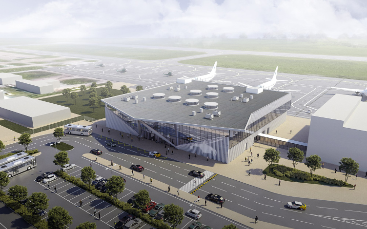
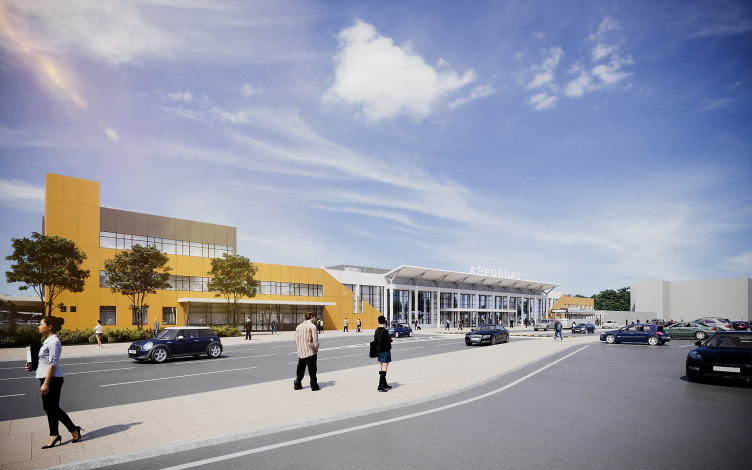
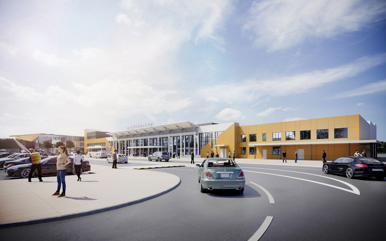
The new terminal is situated on the left of the old one and has a plan that is very close to a perfect square – the volume is technology-determined and was set well in advance, so ASADOV bureau worked on breathing architecture into this parallelepiped.

Tomsk airport named after Nikolai Kamov
Copyright: © ASADOV Architects


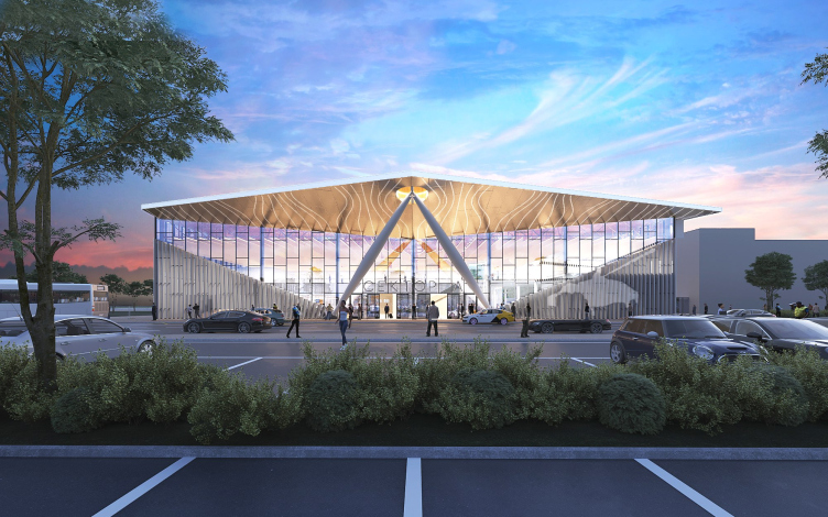
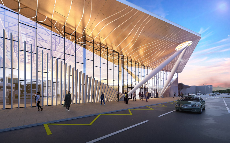
At this point, we can recall that the main feature of Nikolai Kamov’s helicopters was a twin-screw coaxial scheme, in which a pair of rotors installed in parallel rotates in opposite directions on a single geometric axis. It seems that in the solution of the main facade one can see some vague allusions to this invention – not literal, of course, but still quite readable: the wings, the air streams, the axles and blades definitely play an important part in the airport’s imagery.

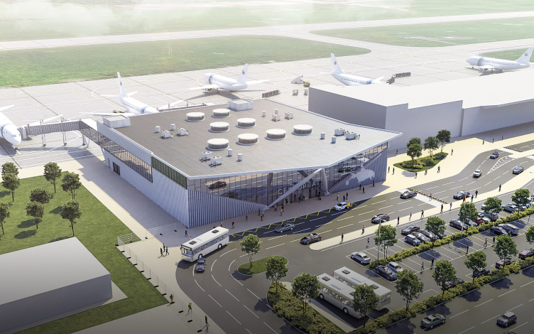
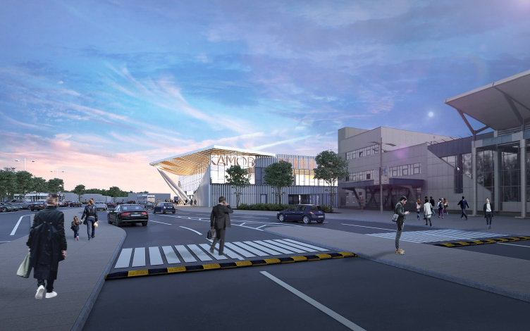
In one brisk motion, pointed from the bottom upwards and from the edges towards the center, two large spindle-like columns converge in the center before the main entrance. The entire facade is determined by their symmetrical impulse: it looks as though the incoming passengers are welcomed by a giant “emerging” aircraft that unfolds the golden “wing” of the marquee reflected in the glass of the facade. At the same time, a row of lamellas below is smoothly bent – the way grass would underneath rotating blades; the analogy is further strengthened by the images of helicopters on the metallic surfaces. The resulting image is something in the middle between a hang glider and a rotorcraft.

Tomsk airport named after Nikolai Kamov
Copyright: © ASADOV Architects


Tomsk airport named after Nikolai Kamov
Copyright: © ASADOV Architects


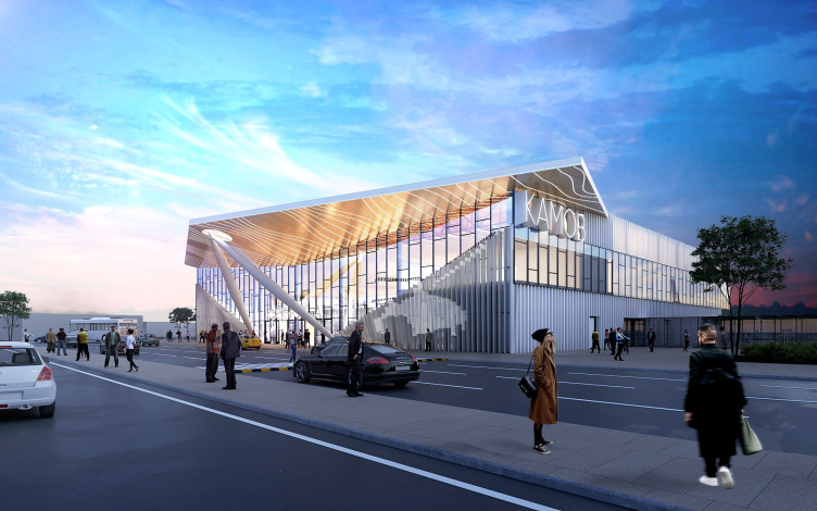
On the side, the similarity between the marquee and a hang glider is particularly strong; the lines are simple and laconic, and the “forward and upward” impulse makes one think not just about the theme of flight, quite justified in this case, but also some retro-note, remindful of the Worker and Kolkhoz Woman monument, and even of the reserved and light style of the Soviet terminals. 

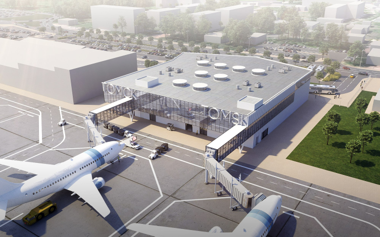
Let us also take a look at the characters of the “Kamov” name – its slender font looks very much like the one that was used in the airport during the Soviet time. A font just as slender is used to write the city name of Tomsk from the side of the runways and boarding bridges.

Tomsk airport named after Nikolai Kamov
Copyright: © ASADOV Architects


Tomsk airport named after Nikolai Kamov
Copyright: © ASADOV Architects


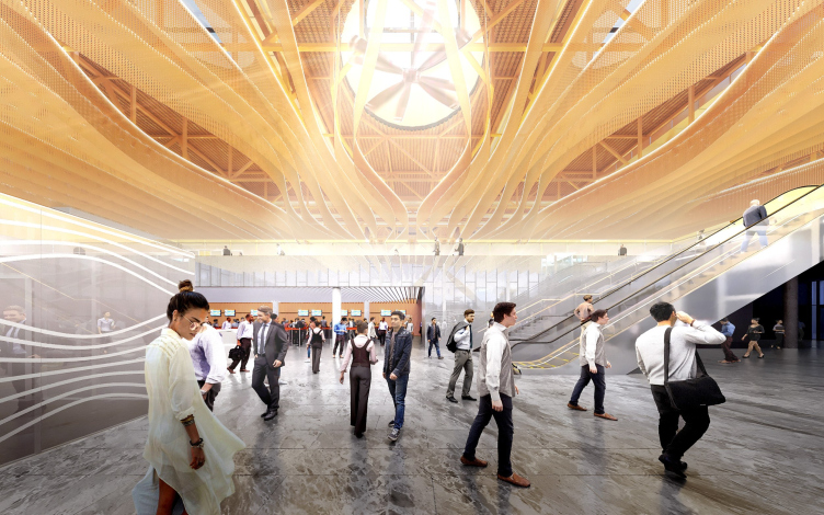
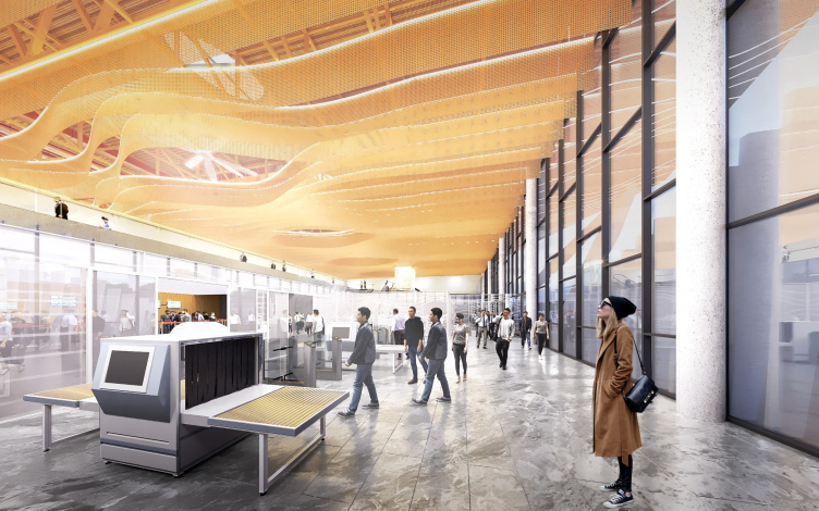
Currently, it is yet unknown what the interiors of the terminal will ultimately look like, but within the project the principle of the connection between the outside and inside solutions was fully implemented. Behind the golden marquee in the glowing waves on the inside, there is a ceiling of the same color with circular skylights, in which the bladed fans are installed. These put one in the mind of art house cinema, but even more about helicopters. The smooth waves of the noise-canceling suspended from the ceiling visualize the streams of air “moved by the blades”, and, absorbing the noise, at the same time mask the bearing structures – and by these economical means form a “living” and nonlinear surface, positive-looking and glowing with yellow warmth. This is cost-effective, cozy, positive, and, thanks to the yellow color, even jolly-looking. Let’s live and see how the interior solution will be implemented.

Tomsk airport named after Nikolai Kamov
Copyright: © ASADOV Architects


Tomsk airport named after Nikolai Kamov
Copyright: © ASADOV Architects


The skylights on the roof also continue the theme of modernist roots and unassuming Soviet expressiveness: their cylinders are shifted upwards, and, when viewed from above, they look like buttons on a dashboard – so that the “fifth facade” of the terminal (which sometimes is indeed visible from the airplane cabin!) is also carefully thought out. At the same time, the similarity between the “button” skylights and the large colored “mushrooms” of Pulkovo-1 seems rather obvious.

Tomsk airport named after Nikolai Kamov
Copyright: © ASADOV Architects


Tomsk airport named after Nikolai Kamov
Copyright: © ASADOV Architects


The new terminal is connected to the old one with a covered passage. The ASADOV architects proposed the option of re-cladding the facades of the terminal: it is also dominated by light gray and warm yellow, and the old terminal also has a wing-like marquee, so that the buildings should turn into a single complex.

Tomsk airport named after Nikolai Kamov
Copyright: © ASADOV Architects


Tomsk airport named after Nikolai Kamov
Copyright: © ASADOV Architects

Object:
Tomsk Airport
Russia, Tomsk

16 December 2022

Headlines now
The Golden Crown
The concept for a dental clinic in Yekaterinburg, developed by CNTR Studio, revolves around the idea of a “mouth full of gold”: pristine white porcelain stoneware walls are complemented by matte brass details. To avoid an overly literal interpretation, the architects focused on the building’s proportions, skillfully navigating between sunlight requirements and fire safety regulations.
Flexibility and Integration
Not long ago, we covered the project for the fourth phase of the ÁLIA residential complex, designed by APEX. Now, we’ve been shown different fence concepts they developed to enclose the complex’s private courtyards, incorporating a variety of public functions. We believe that the sheer fact that the complex’s architects were involved in such a detail as fencing speaks volumes.
A Step Forward
The HIDE residential complex represents a major milestone for ADM architects and their leaders Andrey Romanov and Ekaterina Kuznetsova in their quest for a fresh high-rise aesthetic – one that is flexible and layered, capable of bringing vibrancy to mass and silhouette while shaping form. Over recent years, this approach has become ADM’s “signature style”, with the golden HIDE tower playing a pivotal role in its evolution. Here, we delve into the project’s story, explore the details of the complex’s design, and uncover its core essence.
Gold in the Sands
A new office for a transcontinental company specializing in resource extraction and processing has opened in Dubai. Designed by T+T Architects, masters of creating spaces that are contemporary, diverse, flexible, and original, this project exemplifies their expertise. On the executive floor, a massive brass-clad partition dominates, while layered textures of compressed earth create a contextually resonant backdrop.
Layers and Levels of Flight
This project goes way back – Reserve Union won this architectural competition at the end of 2011, and the building was completed in 2018, so it’s practically “archival”. However, despite being relatively unknown, the building can hardly be considered “dated” and remains a prime example of architectural expression, particularly in the headquarters genre. And it’s especially fitting for an aviation company office. In some ways, it resembles the Aeroflot headquarters at Sheremetyevo but with its own unique identity, following the signature style of Vladimir Plotkin. In this article, we take an in-depth look at the United Aircraft Corporation (UAC) headquarters in the Moscow agglomeration town of Zhukovsky, supplemented by recent photographs from Alexey Naroditsky – a shoot that became only recently possible due to the fact that improvements were finally made in the surrounding area.
Light and Shadow
In this article, we delve into the architectural design of the “Chaika” house by DNK ag architects, which was recently completed in 2023 as part of the collection of signature designs at ZILArt. As is well-known, all the buildings in this complex follow a design code, yet each one is distinct. This particular building stands out not only for its whiteness and minimalism but also for the refined use of a limited number of techniques that, together, create what can confidently be called synergy.
Casus Novae
A master plan was developed for a large residential area with a name of “DNS City”, but now that its implementation began, the plan has been arbitrarily reformatted and replaced with something that, while similar on the surface, is actually quite different. This is not the first time such a thing happens, but it’s always frustrating. With permission from the author, we are sharing Maria Elkina’s post.
Treasure Hunting
The GAFA bureau, in collaboration with Tegola and Arkhitail, organized an expedition to the island of Kilpola in Karelia as part of Moskomarkhitektura’s “Open City” festival. There, amidst moss and rocks, the students sought answers to questions like: what is the sacred, where does it dwell, and what sustains it? Assisting the participants in this quest were landscape engineer Evgeny Levin, artist Nicholas Roerich, a moose, and the lack of cellular connection. Here’s how the story unfolded.
Depths of the Earth, Streams of Water
In the Malaya Okhta district, the Akzent building, designed by Stepan Liphart, was constructed. It follows a classic tripartite structure, yet it’s what you might call “hand-drawn”: each façade is unique in its form and details, some of which aren’t immediately noticeable. In this article, we explore the context and, together with the architect, delve into how the form was developed.
Fir Tree Dynamics
The “Airports of Region” holding is planning to build an airport in Karachay-Cherkessia, aiming to make the Arkhyz and Dombay resorts more accessible to travelers. The project that won in an invitation-only competition, submitted by Sergey Nikeshkin’s KPLN, blends natural imagery inspired by the shape of a conifer seed, open-air waiting spaces, majestic large trees, and a green roof elevated on needle-like columns. The result is both nature-inspired and WOW.
​A Brick Shell
In the process of designing a clubhouse situated among pine trees in a prestigious suburban area near Moscow, the architectural firm “A.Len” did the façade design part. The combination of different types of brick and masonry correlates with the volumetric and plastique solutions, further enhanced by the inclusion of wood-painted fragments and metal “glazing”.
Word Forms
ATRIUM architects love ambitious challenges, and for the firm’s thirtieth anniversary, they boldly play a game of words with an exhibition that dives deep into a self-created vocabulary. They immerse their projects – especially art installations – into this glossary, as if plunging into a current of their own. You feel as if you’re flowing through the veins of pure art, immersed in a universe of vertical cities, educational spaces – of which the architects are true masters – and the cultural codes of various locations. But what truly captivates is the bold statement that Vera Butko and Anton Nadtochy make, both through their work and this exhibition: architecture, above all, is art – the art of working with form and space.
Flexibility and Acuteness of Modernity
Luxurious, fluid, large “kokoshniks” and spiral barrel columns, as if made from colorful chewing gum: there seem to be no other mansion like this in Moscow, designed in the “Neo-Russian-Modern” style. And the “Teremok” on Malaya Kaluzhskaya, previously somewhat obscure, has “come alive with new colors” and gained visibility after its restoration for the office of the “architectural ecosystem” as the architects love to call themselves. It’s evident that Julius Borisov and the architects at UNK put their hearts into finding this new office and bringing it up to date. Let’s delve into the paradoxes of this mansion’s history and its plasticity. Spoiler: two versions of modernity meet here, both balancing on the razor’s edge of “what’s current”.
Yuri Vissarionov: “A modular house does not belong to the land”
It belongs to space, or to the air... It turns out that 3D printing is more effective when combined with a modular approach: the house is built in a workshop and then adapted to the site, including on uneven terrain. Yuri Vissarionov shares his latest experience in designing tourist complexes, both in central Russia and in the south. These include houseboats, homes printed from lightweight concrete using a 3D printer, and, of course, frame houses.
​Moscow’s First
“The quality of education largely depends on the quality of the educational environment”. This principle of the last decade has been realized by Sergey Skuratov in the project for the First Moscow Gymnasium on Rostovskaya Embankment in the Khamovniki district. The building seamlessly integrates into the complex urban landscape, responding both to the pedestrian flow of the city and the quiet alleyways. It skillfully takes advantage of the height differences and aligns with modern trends in educational space design. Let’s take a closer look.
Looking at the Water
The site of Villa Sonata stretches from the road to the water’s edge, offering its own shoreline, pier, and a picturesque river panorama. To reveal these sweeping views, Roman Leonidov “cut” the façade diagonally parallel to the river, thus getting two main axes for the house and, consequently, “two heads”. The internal core – two double-height spaces, a living room and a conservatory, with a “bridge” above them – makes the house both “transparent” and filled with light.
The White Wing
Well, it’s not exactly white. It’s more of a beige, white-stone structure that plays with the color of limestone – smoother surfaces are lighter, while rougher ones are darker. This wing unites various elements: it absorbs and interprets the surrounding themes. It responds to everything, yet maintains a cohesive expression – a challenging task! – while also incorporating recognizable features of its own, such as the dynamic cuts at the bottom, top, and middle.
Urban Dunes
The XSA Ramps team designed and built a three-part sports hub for a park in Rostov-on-Don, welcoming people of all ages and fitness levels. The skate plaza, pump track, and playground are all meticulously crafted with details that attract a diverse range of visitors. The technical execution of the shapes and slopes transforms this space into a kind of sculptural composition.
Proportional Growth
The project for the fourth phase of the ÁLIA residential area has been announced. The buildings are situated on an elongated plot – almost a “ray” that shoots out from the center of the area towards the river. Their layout reflects both a response to Moscow’s architectural preferences over the past 15 years, shifting “from blocks to towers”, and an interpretation of the neighboring business park designed by SOM. Additionally, the best apartments here are not located at the very top but closer to the middle, forming a glowing “waistline”.
The “Staircase” Building
In designing the “Details” residential complex in New Moscow, Rais Baishev spiced up the now-popular Moscow theme of a “courtyard” building with an idea drawn from the surrealist drawings by Maurits Escher. He envisioned the stepped silhouettes and descending slopes as a metaphysical mega-staircase, creating a key void within the courtyard that gave the project an internal “spine”. This concept is felt both in the building’s silhouette and on its façades.
Projection of the Quarter
No one doubted that the building that Vladimir Plotkin designed as part of the “Garden Quarters” would be the most modernist of all. And it turned out just that way: while adhering to the common design code, the building successfully combines brick and white stone, rhythmically responding to the neighboring building designed by Ostozhenka, yet tactfully and persistently making a few statements of its own. This includes the projection of the ideal urban development composition “14–9–6”, which can be found right next door, mathematical calculations, including those for various types of terraces (and perhaps the only reminder of the Soviet past of the Kauchuk rubber factory!), and the white “cross-stitch” pattern of the façade grid.
Domus Aurea
In this issue, we examine the “Tessinsky-1” house, designed by Sergey Skuratov and completed in 2023. Located in the middle of the Serebryanicheskaya Embankment district, at the intersection of its main streets, this house assumes a sort of “nodal” role: it not only responds to everything around it and preserves many memories of the former EMA factory within itself, but it weaves all this into a newly directed pattern, reconciling bright “gold” and dark-colored brick, largely with the help of the new, modern-yet-archaic Columba brick, which, come to think about it, is the most precious element here.
The Chimney of Nikola-Lenivets
In this issue, we are examining the “Obelisk House” designed by KATARSIS and built for the Arkhstoyanie 2023 festival. However, it was only finished later on, and this is why we are examining it now. It seems to us that after the “Obelisk House” appeared in Nikola-Lenivets, a dialogue and a few inner connections appeared between the temporary structures built here. These houses no longer look like “accidental neighbors”, more of which below.
​Periscope by the Bay
The jury awarded the second place in the competition for a public and cultural center in Petropavlovsk-Kamchatsky to the companies GORA (“Mountain”) and M4. In the consortium’s proposal, the building resembles a sperm whale with a calf swimming next to it or a periscope, whose lenses capture the most spectacular views from the surrounding landscape.
From Arcs to Dolmens
While working on the competition project for Petropavlovsk-Kamchatsky, ASADOV Architects prioritized the value of the natural and urban environment, aiming to preserve the balance of the location while minimizing the resemblance of the volume that they designed to a “traditional building”. The task was challenging, and the architects created three versions, one of which having been developed after the competition, where their main proposal took third place. However, the point of interest here is not the competition result but the continuity of creative thinking.
Hide and Seek
The ID Moskovskiy house, designed by Stepan Liphart in St. Petersburg, in the courtyards near Moskovskiy Avenue beyond the Obvodny Canal and recently completed, is notable for several reasons. Firstly, it has been realized with considerable accuracy, which is particularly significant as this is the first building where the architect was responsible not only for the facades but also for the layouts, allowing for better integration between the two. On the other hand, this building is interesting as an example of the “germination” of new architecture in the city: it draws on the best examples from the neighborhood and becomes an improved and developed sum of ideas found by the architect in the surrounding context.
The Big Twelve
Yesterday, the winners of the Moscow Mayor’s Architecture Award were announced and honored. Let’s take a look at what was awarded and, in some cases, even critique this esteemed award. After all, there is always room for improvement, right?
Above the Golden Horn
The residential complex “Philosophy” designed by T+T architects in Vladivostok, is one of the new projects in the “Golubinaya Pad” area, changing its development philosophy (pun intended) from single houses to a comprehensive approach. The buildings are organized along public streets, varying in height and format, with one house even executed in gallery typology, featuring a cantilever leaning on an art object.
Nuanced Alternative
How can you rhyme a square and space? Easily! But to do so, you need to rhyme everything you can possibly think of: weave everything together, like in a tensegrity structure, and find your own optics too. The new exhibition at GES-2 does just that, offering its visitor a new perspective on the history of art spanning 150 years, infused with the hope for endless multiplicity of worlds and art histories. Read on to see how this is achieved and how the exhibition design by Evgeny Ace contributes to it.
Blinds for Ice
An ice arena has been constructed in Domodedovo based on a project by Yuri Vissarionov Architects. To prevent the long façade, a technical requirement for winter sports facilities, from appearing monotonous, the architects proposed the use of suspended structures with multidirectional slats. This design protects the ice from direct sunlight while giving the wall texture and detail.