По-русски

The Book Sanctuary

Reconstructed and renovated by Studio 44, the building of Vladimir Mayakovsky Public Library received modern technical content, at the same time becoming closer to its authentic image from the times when it was part of the compound of the Trinity-Sergius Lavra.

20 April 2022
Object
mainImg
Even before the reconstruction, Vladimir Mayakovsky Public Library, aka Mayakovka, was probably the most popular library of St. Petersburg: situated a little bit away from the bustling Nevsky Prospect, in a pretty building, with a quite representative selection of books, and a unique atmosphere  – serious, but not too serious, unlike the one at the Russian National Library. After the renovation, the library changed even more for the better: it became more convenient for the coworkers, visitors, and for books too, it took on a certain kind of shine, became ready to host events and form communities, yet at the same time it kept its charm – once you enter the building at Fontanka, 44, you find yourself inside the “good old” Mayakovka – only with a telelift and a smart locker room. In this issue, we are covering what the architects and restoration experts did to achieve such a result.

Restoration and modernization of the Mayakovsky Public Library
Copyright: Photograph © Margarita Yavein / provided by Studio 44


The Labyrinth 

In 2018, the library, through the efforts of its director Zoya Chalova, finally got into the targeted reconstruction program: by this time, repairs had not been carried out for about 40 years, the engineering systems were worn out, and the complicated logistics system made it difficult not only to access books, but also for different departments to interact with one another. The competition for the development of the project was won by Studio 44. 

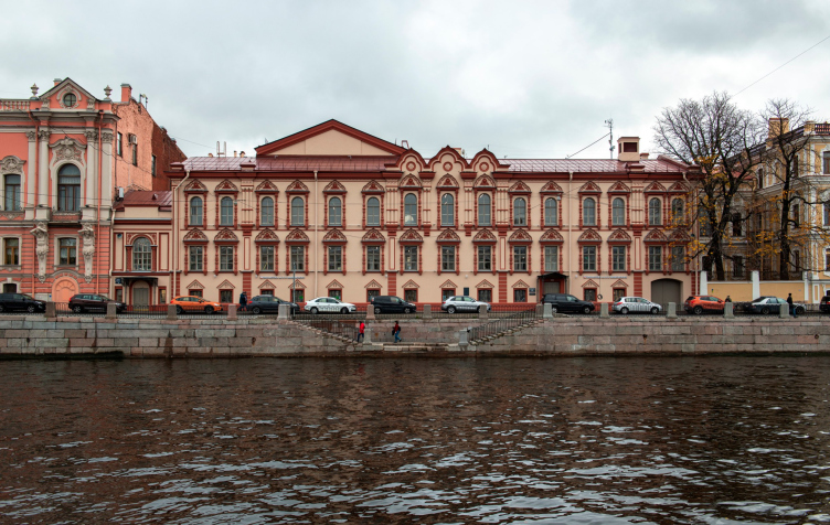
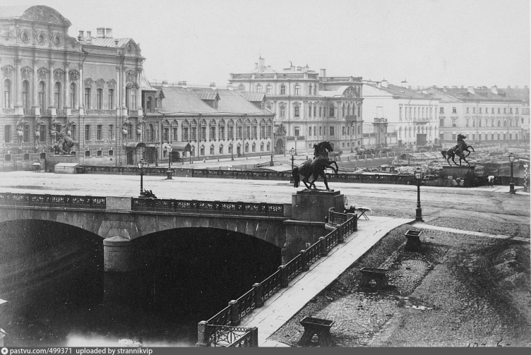
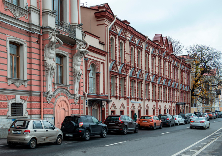
To give you a better idea of the complexity of the task that the architects were faced with, we must first of all say that the library is situated literally two steps away from the “Horse Tamers” sculptures on the Anichkov Bridge, next to the Beloselsky-Belozersky Palace – in the buildings that formerly belonged to the compound of the Trinity-Sergius monastery, the land site for which was allotted by Peter the Great himself back in 1714. For two hundred years, the monastery abbots who came from Moscow to imperial St. Petersburg stayed in the courtyard.

In the Soviet time, the complex changed its function and was transformed to fit the needs of the library, but it was done in a way a bit too pragmatic and straightforward – today, however, the authors of the new restoration and renovation project were required, on the one side, to keep the current functions of the buildings and at the same time reveal the beauty of their architecture, somewhat spoiled by the alterations made in the 1969’s, and, on the other side, to adjust the complex to meet the needs of a modern library, literally “jamming” innovative solutions – both architectural and organizational – in the interiors of the old buildings. In addition, it must be noted that the compound did not arise at once back in the day – in actuality, it is a group of buildings of different functions and years of construction, very much like a volumetric jigsaw puzzle on the inside. Spoiler: the difference in years of construction is something that the architects also emphasized.

Restoration and modernization of the Mayakovsky Public Library
Copyright: Photograph © Margarita Yavein / provided by Studio 44


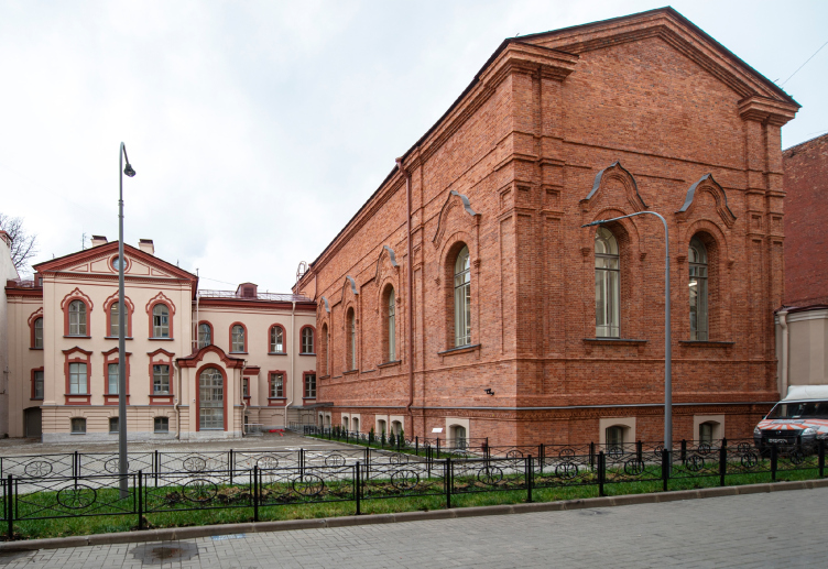
The three main buildings of the former courtyard are the cell building stretched along the Fontanka embankment, the Church of Sergius of Radonezh next to the Beloselsky-Belozersky Palace and the volume of the late Trinity Church located deeper inside the site.

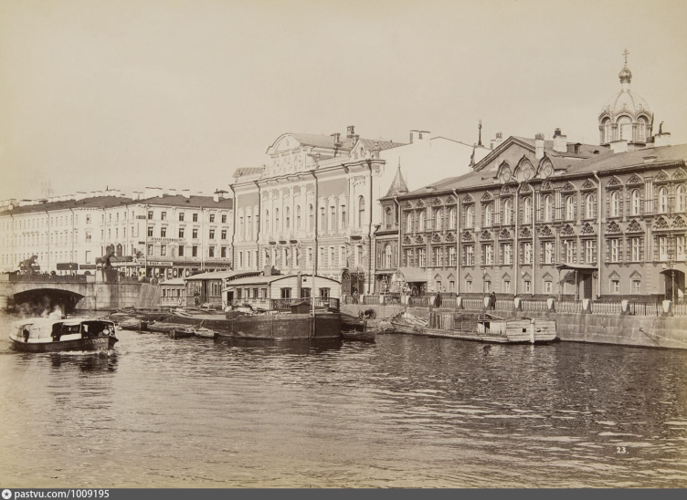
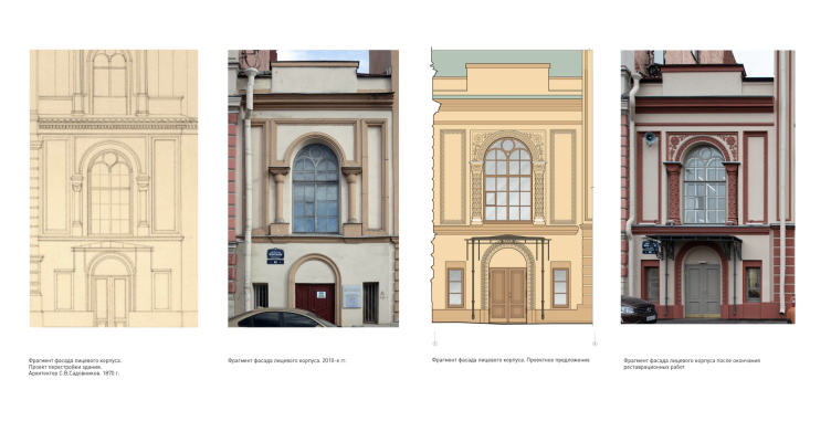
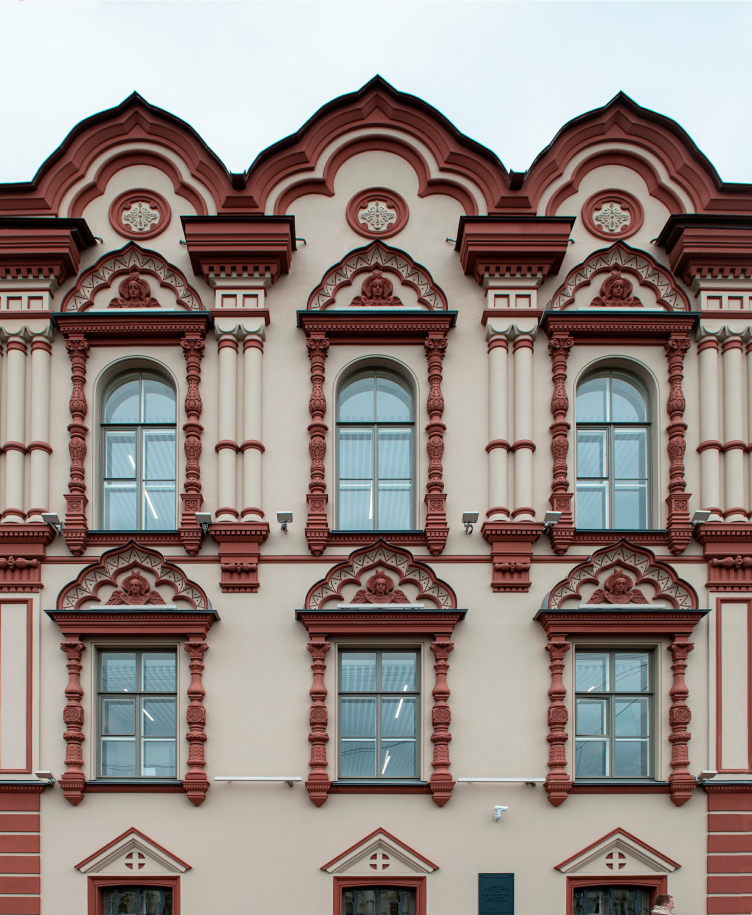
The cells and the Church of Sergius of Radonezh mostly refer to the mid-18th century, but this predominantly applies to the material of the walls, floors, and general outline of the plan. As for the facades, they were repeatedly changed, buildups were constructed over the main volumes, new entrances, staircases, windows, and rooms appeared. Two capital rebuilds refer to the middle of the 19th century. Architect Alexey Gornostaev decorated the front facade in the Russian style: window frames appeared in the form of figured columns with cornices and cherubs in tympanums, while the courtyard facades retained the Baroque decoration (1856-1857). Architect Sergey Sadovnikov added a third floor to the cell building and added the Trinity Church (1870).

Подворье Троице-Сергиевой лавры, 1860-е
Copyright: Photograph by A. Lorens ©


The courtyard of the Trinity-Sergius Lavra, photo of the 1880s – 1890s


Most of the changes to the monastery compound took place – for obvious reasons – in the 1930’s: at that time, the domes were dismantled, the facade and interior decoration was destroyed, which included an oak-carved iconostasis designed by Joseph Charlemagne and icons painted by Alexei Venetsianov. In the 1940’s, the library moved to the building, but it was only later, in 1968, that the building was reconstructed to fit its needs: the single-volume spaces of both churches were divided into three stories, some of the bearing structures were replaced, extra staircases were added, and the basement floor was deepened.

The decoration of the facades was returned only in 1995, but for some reason, specifically on the Fontanka, i.e. in the grand-facade part, it was done in a simplified format.

zooming
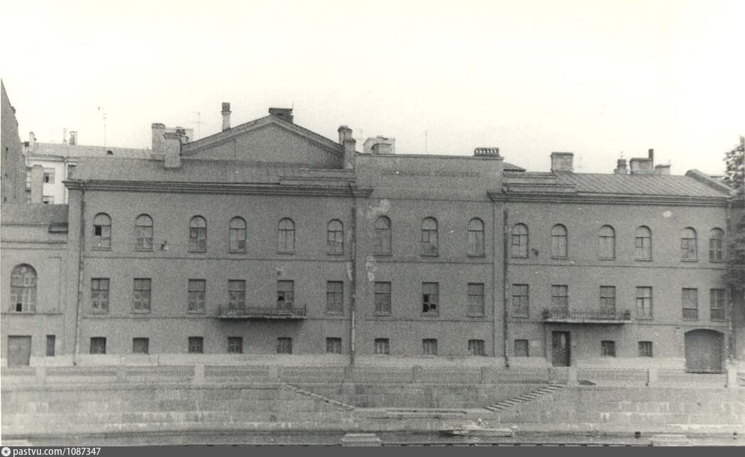
Photograph 1973


Restoration and modernization of the Mayakovsky Public Library
Copyright: © Studio 44


The library building is a cultural heritage site. Despite the fact that it keeps its function, the task of adjusting it to modern realities was nothing short of rocket science: considering all the applicable restrictions, the architects were to “fine-tune” the old premises for the new regulations, making them inclusive and convenient for all the users, at the same time keeping and highlighting the historical value of the building.

Throughout the entire course of reconstruction, we worked closely with both builders and architects. First of all, the historic building was not originally intended for a library, and the main task was to make the project modern, versatile, and comfortable for the employees and visitors. Constant dialogue with contractors helped to achieve excellent results; all our wishes were carefully listened to and taken into account. The architects of Studio 44 offered us eight options for the project, and it seems to us that we have chosen the best one.


The Starting Point

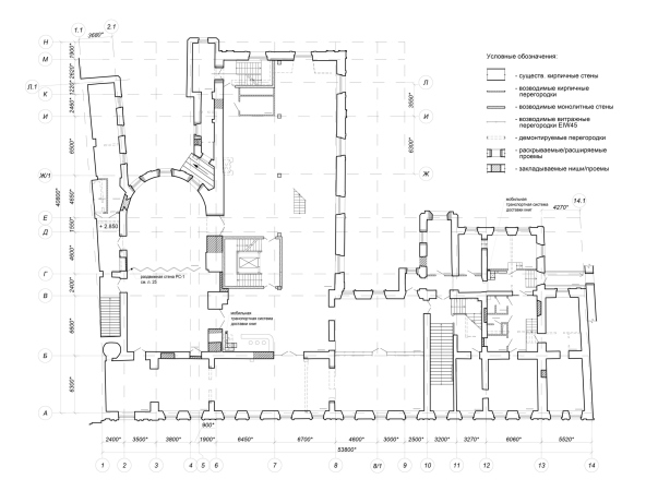
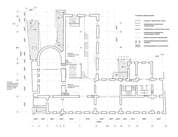
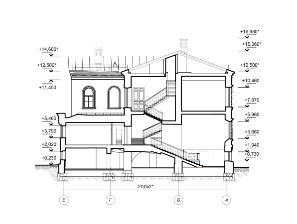
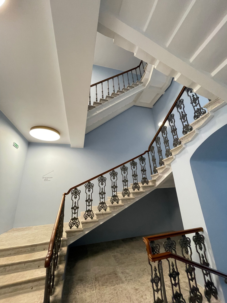
The project started developing from purely pragmatic tasks: in order to ensure two emergency exits from any given point of the building, it was required a staircase-and-elevator nucleus. There was only one place for it – the vault that curiously did not have a protected status. Having established the “nucleus”, the architects could get down to other rooms.

  • zooming
    1 / 7
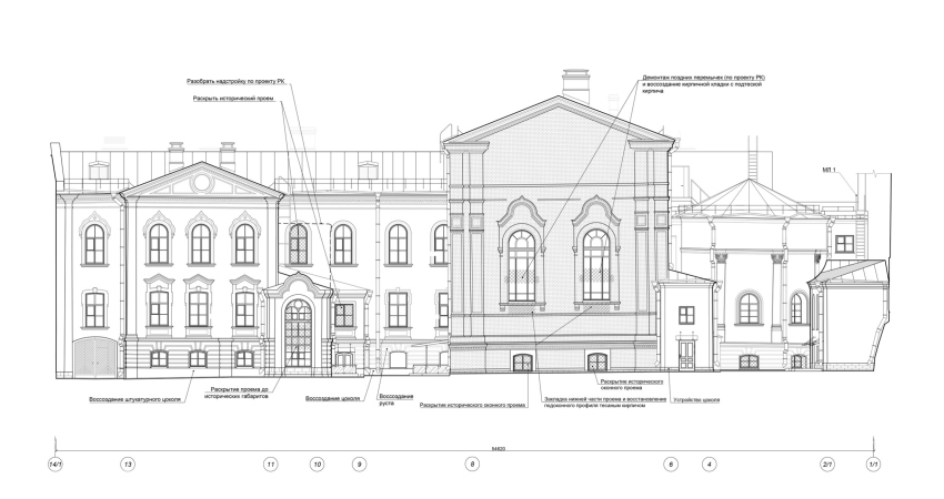
    Restoration and modernization of the Mayakovsky Public Library. The yard facade
    Copyright: © Studio 44
  • zooming
    2 / 7
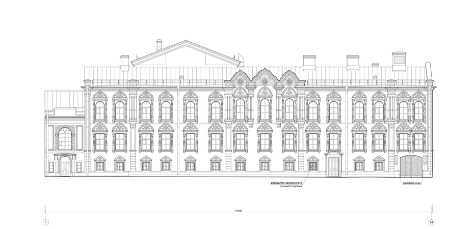
    Restoration and modernization of the Mayakovsky Public Library. The main facade
    Copyright: © Studio 44
  • zooming
    3 / 7
    Restoration and modernization of the Mayakovsky Public Library. Plan of the 1st floor
    Copyright: © Studio 44
  • zooming
    4 / 7
    Restoration and modernization of the Mayakovsky Public Library. Plan of the 2nd floor
    Copyright: © Studio 44
  • zooming
    5 / 7
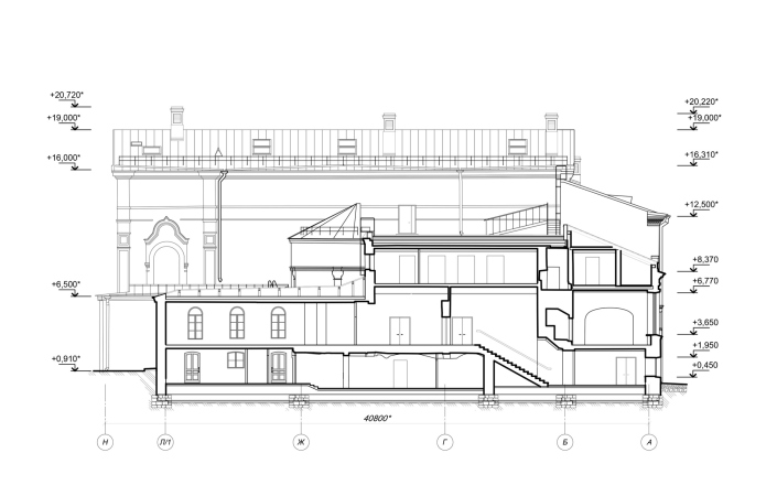
    Restoration and modernization of the Mayakovsky Public Library. Section view 4-4
    Copyright: © Studio 44
  • zooming
    6 / 7
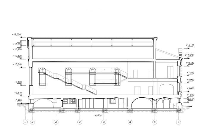
    Restoration and modernization of the Mayakovsky Public Library. Section view 6-6
    Copyright: © Studio 44
  • zooming
    7 / 7
    Restoration and modernization of the Mayakovsky Public Library. Section view 7-7
    Copyright: © Studio 44


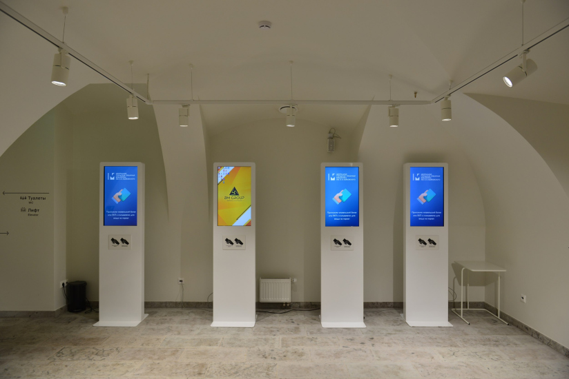
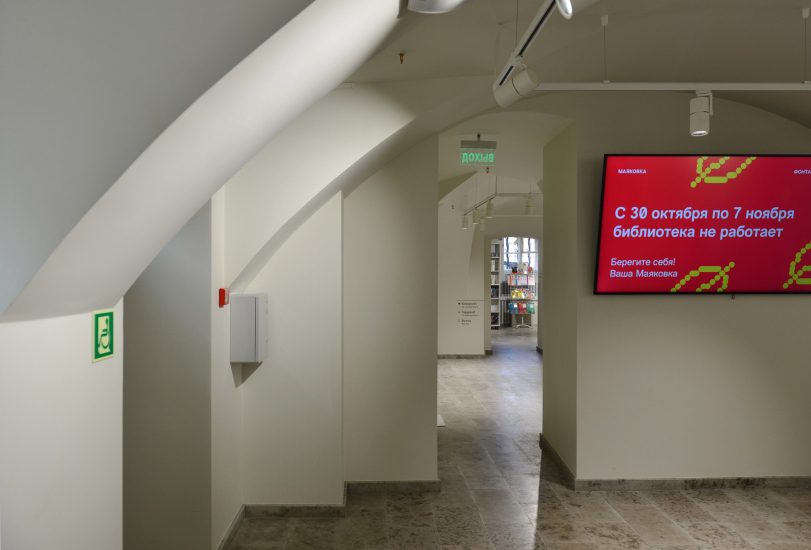
The second most difficult problem was connected with the utility lines: in order to find room for all of them, the architects had to sink the basement floor by 30cm, and the proximity of the Fontanka River was making the whole thing even more exciting. Eventually, however, everything did work out: the load from the existing walls was carried over to a new foundation of reinforced concrete, the historical masonry was repaired and reinforced, and the utility lines were hidden under the plaster floor slabs. The condition of the masonry of the basement floor did not allow the architects to leave it exposed, demonstrating to the visitors the authentic masonry of the 18th century – the walls in the interiors of the lower tier are covered with stucco, which, on the other hand, brings out the plastique of the vaults, and also looks dramatic in its own way. In addition, after the later additions in the basement floor were removed, the outlines of the 18th-century historical plan and volumetric design of the embankment building became clearly visible.

  • zooming
    Restoration and modernization of the Mayakovsky Public Library
    Copyright: Photograph © Margarita Yavein / provided by Studio 44
  • zooming
    Restoration and modernization of the Mayakovsky Public Library
    Copyright: Photograph © Margarita Yavein / provided by Studio 44


Today, under the vaults of the basement, there is a reader reception area, a “smart” cloakroom, restrooms and an information sector. There are also boxes at the main entrance where books can be picked up or left at any time of the day, after submitting an application. At the level of the basement, the flow of visitors is split in two: from here you can get to the multifunctional hall for 300 people, which occupies the volume of the former church of St. Sergius of Radonezh, or you can take the main staircase to get to the main halls of the open storage.

Restoration and modernization of the Mayakovsky Public Library
Copyright: Photograph © Margarita Yavein / provided by Studio 44


The Temple of Books

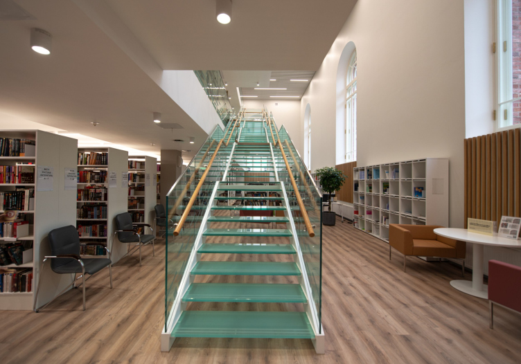
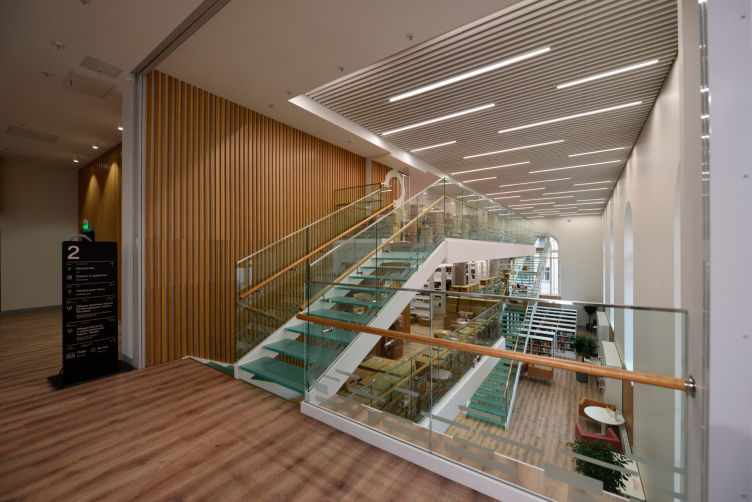
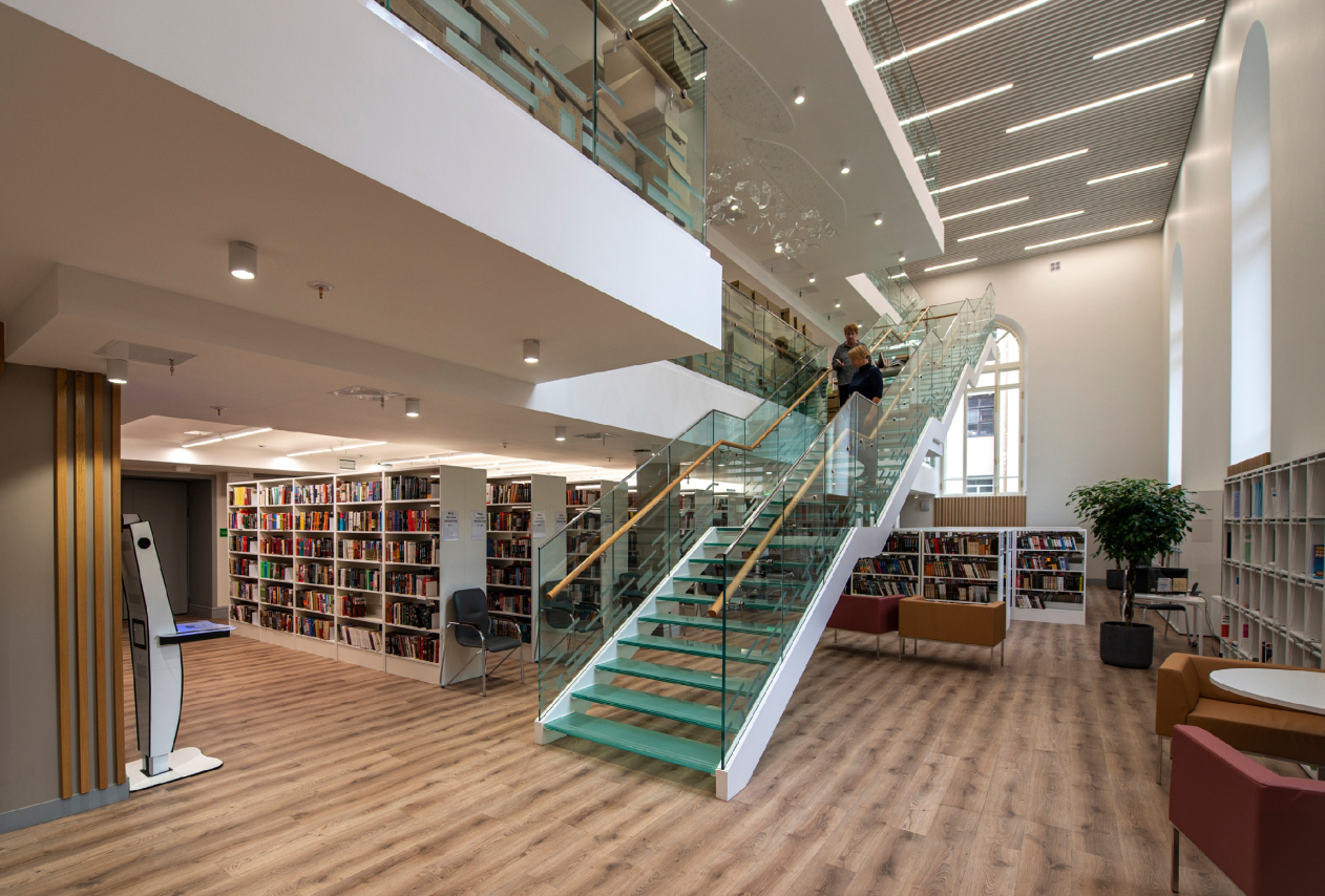
The newsroom is situated in the former Trinity Church, the tallest and the most spacious room of the complex, and here the main challenge was presented by the intermediate floors of the Soviet period that divided the church volume into several floors, cutting into the windows without thinking twice about it. These were replaced by a system of “loft” levels, connected along the longitudinal axis with semitransparent staircases.

Restoration and modernization of the Mayakovsky Public Library
Copyright: Photograph © Margarita Yavein / provided by Studio 44


The green glass – particularly, the green glass of the steps – makes the interior seem fresh and modern, becoming a certain kind of “hi-tech” axis of the revised space. It makes a good neighbor of the old brick walls, yet it does not let you forget about the 21st century, including thanks to the tactful character of the modern elements added by the architects. It is not by chance that the loft divides the northern part of the hall, that stops against the wall less lit; the southern part is opened up as much as possible, filling up the entire hall with natural light, which is really abundant on this side – we hope we don’t have to explain to anyone how important the sunshine is in St. Petersburg. And the staircases end up at the border between the two spaces, standing with their sides to the sun, making the most of the light to expose the aesthetic quality of the glass that they are made of. 

We will note here that the staircases with steps and barriers of greenish glass and wooden railings are a signature technique of Studio 44 and Nikita Yavein: things that come to mind are the glass “beam” of the staircase in the amphitheater of the Joint Staff (2002-2014), the Higher Management School of the St. Petersburg State University (2007-2015), the Dance Academy (2008-2013), the Nevsky 38 business center (2000-2004), and many other projects. This is like the author’s signature.

Restoration and modernization of the Mayakovsky Public Library
Copyright: Photograph © Margarita Yavein / provided by Studio 44


The air-like quality of the renovated space is highlighted by chandeliers composed of pieces of glass, asymmetrically “hanging in the air” on the ceilings of the upper tiers.

The open storage now contains more books than it used to, while the closed stock shrank a little: now it is hosted in the mansard premises, where it was necessary to replace the wooden roof truss system with a metal one and install a climate control system.

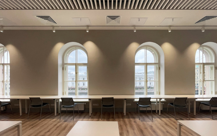
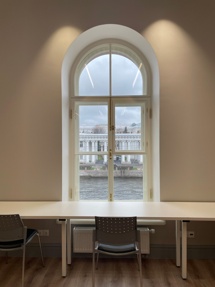
The staircases lead not only to the bookshelves but also to the coworking zone with long tables standing near the windows overlooking the Fontanka. This space takes a little bit of getting used to: when you find yourself here for the first time, you can get mixed up and be surprised at the fact that after you enter at the first floor, you suddenly exit at the third; next time it will be easier to get your bearings.

Restoration and modernization of the Mayakovsky Public Library
Copyright: Photograph © Margarita Yavein / provided by Studio 44


Restoration and modernization of the Mayakovsky Public Library
Copyright: Photograph © Margarita Yavein / provided by Studio 44


Deus ex Machina 

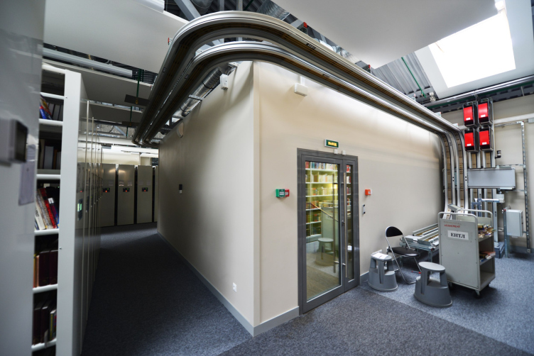
The special pride of the renewed library is the telelift system that speeds up the process of delivering the books from storage: a monorail, along which a “trolley” with the book moves, connects all the floors. The construction is partially concealed behind the suspended ceiling; it was necessary to calculate the place for it, as well as for the supply and exhaust ventilation system, literally with millimeter precision, since the walls were weakened during historical alterations. It is expected that in the future the telelift will be extended to the neighboring building, a pseudo-baroque mansion of Duchess Carlova, which is situated nearby, south of the former compound, at Fontanka 46, and also belongs to the library.

Restoration and modernization of the Mayakovsky Public Library
Copyright: Photograph © Margarita Yavein / provided by Studio 44


Restoration

As for the restoration work itself, it gave the building a cared-for look, at the same time helping to visually divide volumes built at different times. The cement details of the facade decor of the Soviet time were replaced by plaster casts, executed by archive photographs and drafts. The authentic masonry of the Trinity Church was repaired and reinforced; the windows, which used to be clogged up, were opened once again.

Restoration and modernization of the Mayakovsky Public Library
Copyright: Photograph © Margarita Yavein / provided by Studio 44


Restoration and modernization of the Mayakovsky Public Library
Copyright: Photograph © Margarita Yavein / provided by Studio 44


Restoration and modernization of the Mayakovsky Public Library
Copyright: Photograph © Margarita Yavein / provided by Studio 44


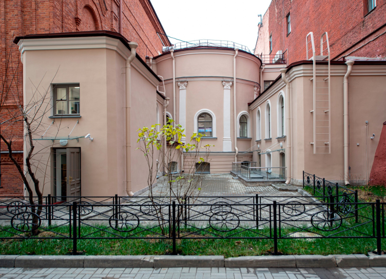
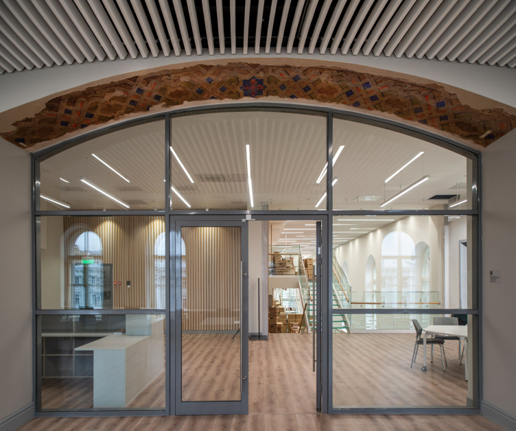
It was not without a few unexpected discoveries: on one of the arches, a surviving painting was discovered. The old tiles on the staircase were restored and complemented by a modern analogue – the architects deliberately highlighted the latter with a brighter color. The small-sized volume on the side of the Beloselsky-Belozersky Palace, where an extra entrance and maintenance rooms are situated, hosted a “museum corner” showcasing artifacts found in the process of restoration – a fragment of the gate leaf, the grating of the window opening and the stamp of the window grating with the date from 1748.

Restoration and modernization of the Mayakovsky Public Library
Copyright: Photograph © Margarita Yavein / provided by Studio 44


The third place

Remarkably, after the reconstruction the Mayakovsky Public Library considerably broadened its range of services but stopped short of becoming a tourist attraction where you can do just about anything but read books. Quite the opposite: everything here is meant to help you focus – there is plenty of light and air, softened colors, complete absence of unwanted sounds, and inspiring architecture both inside and outside. And, of course, the books – always within an arm’s reach.
Restoration and modernization of the Mayakovsky Public Library
Copyright: Photograph © Alyona Goreglyad / provided by Studio 44


20 April 2022

Headlines now
The Golden Crown
The concept for a dental clinic in Yekaterinburg, developed by CNTR Studio, revolves around the idea of a “mouth full of gold”: pristine white porcelain stoneware walls are complemented by matte brass details. To avoid an overly literal interpretation, the architects focused on the building’s proportions, skillfully navigating between sunlight requirements and fire safety regulations.
Flexibility and Integration
Not long ago, we covered the project for the fourth phase of the ÁLIA residential complex, designed by APEX. Now, we’ve been shown different fence concepts they developed to enclose the complex’s private courtyards, incorporating a variety of public functions. We believe that the sheer fact that the complex’s architects were involved in such a detail as fencing speaks volumes.
A Step Forward
The HIDE residential complex represents a major milestone for ADM architects and their leaders Andrey Romanov and Ekaterina Kuznetsova in their quest for a fresh high-rise aesthetic – one that is flexible and layered, capable of bringing vibrancy to mass and silhouette while shaping form. Over recent years, this approach has become ADM’s “signature style”, with the golden HIDE tower playing a pivotal role in its evolution. Here, we delve into the project’s story, explore the details of the complex’s design, and uncover its core essence.
Gold in the Sands
A new office for a transcontinental company specializing in resource extraction and processing has opened in Dubai. Designed by T+T Architects, masters of creating spaces that are contemporary, diverse, flexible, and original, this project exemplifies their expertise. On the executive floor, a massive brass-clad partition dominates, while layered textures of compressed earth create a contextually resonant backdrop.
Layers and Levels of Flight
This project goes way back – Reserve Union won this architectural competition at the end of 2011, and the building was completed in 2018, so it’s practically “archival”. However, despite being relatively unknown, the building can hardly be considered “dated” and remains a prime example of architectural expression, particularly in the headquarters genre. And it’s especially fitting for an aviation company office. In some ways, it resembles the Aeroflot headquarters at Sheremetyevo but with its own unique identity, following the signature style of Vladimir Plotkin. In this article, we take an in-depth look at the United Aircraft Corporation (UAC) headquarters in the Moscow agglomeration town of Zhukovsky, supplemented by recent photographs from Alexey Naroditsky – a shoot that became only recently possible due to the fact that improvements were finally made in the surrounding area.
Light and Shadow
In this article, we delve into the architectural design of the “Chaika” house by DNK ag architects, which was recently completed in 2023 as part of the collection of signature designs at ZILArt. As is well-known, all the buildings in this complex follow a design code, yet each one is distinct. This particular building stands out not only for its whiteness and minimalism but also for the refined use of a limited number of techniques that, together, create what can confidently be called synergy.
Casus Novae
A master plan was developed for a large residential area with a name of “DNS City”, but now that its implementation began, the plan has been arbitrarily reformatted and replaced with something that, while similar on the surface, is actually quite different. This is not the first time such a thing happens, but it’s always frustrating. With permission from the author, we are sharing Maria Elkina’s post.
Treasure Hunting
The GAFA bureau, in collaboration with Tegola and Arkhitail, organized an expedition to the island of Kilpola in Karelia as part of Moskomarkhitektura’s “Open City” festival. There, amidst moss and rocks, the students sought answers to questions like: what is the sacred, where does it dwell, and what sustains it? Assisting the participants in this quest were landscape engineer Evgeny Levin, artist Nicholas Roerich, a moose, and the lack of cellular connection. Here’s how the story unfolded.
Depths of the Earth, Streams of Water
In the Malaya Okhta district, the Akzent building, designed by Stepan Liphart, was constructed. It follows a classic tripartite structure, yet it’s what you might call “hand-drawn”: each façade is unique in its form and details, some of which aren’t immediately noticeable. In this article, we explore the context and, together with the architect, delve into how the form was developed.
Fir Tree Dynamics
The “Airports of Region” holding is planning to build an airport in Karachay-Cherkessia, aiming to make the Arkhyz and Dombay resorts more accessible to travelers. The project that won in an invitation-only competition, submitted by Sergey Nikeshkin’s KPLN, blends natural imagery inspired by the shape of a conifer seed, open-air waiting spaces, majestic large trees, and a green roof elevated on needle-like columns. The result is both nature-inspired and WOW.
​A Brick Shell
In the process of designing a clubhouse situated among pine trees in a prestigious suburban area near Moscow, the architectural firm “A.Len” did the façade design part. The combination of different types of brick and masonry correlates with the volumetric and plastique solutions, further enhanced by the inclusion of wood-painted fragments and metal “glazing”.
Word Forms
ATRIUM architects love ambitious challenges, and for the firm’s thirtieth anniversary, they boldly play a game of words with an exhibition that dives deep into a self-created vocabulary. They immerse their projects – especially art installations – into this glossary, as if plunging into a current of their own. You feel as if you’re flowing through the veins of pure art, immersed in a universe of vertical cities, educational spaces – of which the architects are true masters – and the cultural codes of various locations. But what truly captivates is the bold statement that Vera Butko and Anton Nadtochy make, both through their work and this exhibition: architecture, above all, is art – the art of working with form and space.
Flexibility and Acuteness of Modernity
Luxurious, fluid, large “kokoshniks” and spiral barrel columns, as if made from colorful chewing gum: there seem to be no other mansion like this in Moscow, designed in the “Neo-Russian-Modern” style. And the “Teremok” on Malaya Kaluzhskaya, previously somewhat obscure, has “come alive with new colors” and gained visibility after its restoration for the office of the “architectural ecosystem” as the architects love to call themselves. It’s evident that Julius Borisov and the architects at UNK put their hearts into finding this new office and bringing it up to date. Let’s delve into the paradoxes of this mansion’s history and its plasticity. Spoiler: two versions of modernity meet here, both balancing on the razor’s edge of “what’s current”.
Yuri Vissarionov: “A modular house does not belong to the land”
It belongs to space, or to the air... It turns out that 3D printing is more effective when combined with a modular approach: the house is built in a workshop and then adapted to the site, including on uneven terrain. Yuri Vissarionov shares his latest experience in designing tourist complexes, both in central Russia and in the south. These include houseboats, homes printed from lightweight concrete using a 3D printer, and, of course, frame houses.
​Moscow’s First
“The quality of education largely depends on the quality of the educational environment”. This principle of the last decade has been realized by Sergey Skuratov in the project for the First Moscow Gymnasium on Rostovskaya Embankment in the Khamovniki district. The building seamlessly integrates into the complex urban landscape, responding both to the pedestrian flow of the city and the quiet alleyways. It skillfully takes advantage of the height differences and aligns with modern trends in educational space design. Let’s take a closer look.
Looking at the Water
The site of Villa Sonata stretches from the road to the water’s edge, offering its own shoreline, pier, and a picturesque river panorama. To reveal these sweeping views, Roman Leonidov “cut” the façade diagonally parallel to the river, thus getting two main axes for the house and, consequently, “two heads”. The internal core – two double-height spaces, a living room and a conservatory, with a “bridge” above them – makes the house both “transparent” and filled with light.
The White Wing
Well, it’s not exactly white. It’s more of a beige, white-stone structure that plays with the color of limestone – smoother surfaces are lighter, while rougher ones are darker. This wing unites various elements: it absorbs and interprets the surrounding themes. It responds to everything, yet maintains a cohesive expression – a challenging task! – while also incorporating recognizable features of its own, such as the dynamic cuts at the bottom, top, and middle.
Urban Dunes
The XSA Ramps team designed and built a three-part sports hub for a park in Rostov-on-Don, welcoming people of all ages and fitness levels. The skate plaza, pump track, and playground are all meticulously crafted with details that attract a diverse range of visitors. The technical execution of the shapes and slopes transforms this space into a kind of sculptural composition.
Proportional Growth
The project for the fourth phase of the ÁLIA residential area has been announced. The buildings are situated on an elongated plot – almost a “ray” that shoots out from the center of the area towards the river. Their layout reflects both a response to Moscow’s architectural preferences over the past 15 years, shifting “from blocks to towers”, and an interpretation of the neighboring business park designed by SOM. Additionally, the best apartments here are not located at the very top but closer to the middle, forming a glowing “waistline”.
The “Staircase” Building
In designing the “Details” residential complex in New Moscow, Rais Baishev spiced up the now-popular Moscow theme of a “courtyard” building with an idea drawn from the surrealist drawings by Maurits Escher. He envisioned the stepped silhouettes and descending slopes as a metaphysical mega-staircase, creating a key void within the courtyard that gave the project an internal “spine”. This concept is felt both in the building’s silhouette and on its façades.
Projection of the Quarter
No one doubted that the building that Vladimir Plotkin designed as part of the “Garden Quarters” would be the most modernist of all. And it turned out just that way: while adhering to the common design code, the building successfully combines brick and white stone, rhythmically responding to the neighboring building designed by Ostozhenka, yet tactfully and persistently making a few statements of its own. This includes the projection of the ideal urban development composition “14–9–6”, which can be found right next door, mathematical calculations, including those for various types of terraces (and perhaps the only reminder of the Soviet past of the Kauchuk rubber factory!), and the white “cross-stitch” pattern of the façade grid.
Domus Aurea
In this issue, we examine the “Tessinsky-1” house, designed by Sergey Skuratov and completed in 2023. Located in the middle of the Serebryanicheskaya Embankment district, at the intersection of its main streets, this house assumes a sort of “nodal” role: it not only responds to everything around it and preserves many memories of the former EMA factory within itself, but it weaves all this into a newly directed pattern, reconciling bright “gold” and dark-colored brick, largely with the help of the new, modern-yet-archaic Columba brick, which, come to think about it, is the most precious element here.
The Chimney of Nikola-Lenivets
In this issue, we are examining the “Obelisk House” designed by KATARSIS and built for the Arkhstoyanie 2023 festival. However, it was only finished later on, and this is why we are examining it now. It seems to us that after the “Obelisk House” appeared in Nikola-Lenivets, a dialogue and a few inner connections appeared between the temporary structures built here. These houses no longer look like “accidental neighbors”, more of which below.
​Periscope by the Bay
The jury awarded the second place in the competition for a public and cultural center in Petropavlovsk-Kamchatsky to the companies GORA (“Mountain”) and M4. In the consortium’s proposal, the building resembles a sperm whale with a calf swimming next to it or a periscope, whose lenses capture the most spectacular views from the surrounding landscape.
From Arcs to Dolmens
While working on the competition project for Petropavlovsk-Kamchatsky, ASADOV Architects prioritized the value of the natural and urban environment, aiming to preserve the balance of the location while minimizing the resemblance of the volume that they designed to a “traditional building”. The task was challenging, and the architects created three versions, one of which having been developed after the competition, where their main proposal took third place. However, the point of interest here is not the competition result but the continuity of creative thinking.
Hide and Seek
The ID Moskovskiy house, designed by Stepan Liphart in St. Petersburg, in the courtyards near Moskovskiy Avenue beyond the Obvodny Canal and recently completed, is notable for several reasons. Firstly, it has been realized with considerable accuracy, which is particularly significant as this is the first building where the architect was responsible not only for the facades but also for the layouts, allowing for better integration between the two. On the other hand, this building is interesting as an example of the “germination” of new architecture in the city: it draws on the best examples from the neighborhood and becomes an improved and developed sum of ideas found by the architect in the surrounding context.
The Big Twelve
Yesterday, the winners of the Moscow Mayor’s Architecture Award were announced and honored. Let’s take a look at what was awarded and, in some cases, even critique this esteemed award. After all, there is always room for improvement, right?
Above the Golden Horn
The residential complex “Philosophy” designed by T+T architects in Vladivostok, is one of the new projects in the “Golubinaya Pad” area, changing its development philosophy (pun intended) from single houses to a comprehensive approach. The buildings are organized along public streets, varying in height and format, with one house even executed in gallery typology, featuring a cantilever leaning on an art object.
Nuanced Alternative
How can you rhyme a square and space? Easily! But to do so, you need to rhyme everything you can possibly think of: weave everything together, like in a tensegrity structure, and find your own optics too. The new exhibition at GES-2 does just that, offering its visitor a new perspective on the history of art spanning 150 years, infused with the hope for endless multiplicity of worlds and art histories. Read on to see how this is achieved and how the exhibition design by Evgeny Ace contributes to it.
Blinds for Ice
An ice arena has been constructed in Domodedovo based on a project by Yuri Vissarionov Architects. To prevent the long façade, a technical requirement for winter sports facilities, from appearing monotonous, the architects proposed the use of suspended structures with multidirectional slats. This design protects the ice from direct sunlight while giving the wall texture and detail.