The space between the Expocentr, the Moscow City, the Krasnopresnenskaya Embankment, and the Krasnaya Presnya Park arguably bears a cult status: Sergey Skuratov shares that back in the day lots of his friends would come here to play tennis on the weekends. Luckily, the new owners of the land site decided to retain this function and they asked the architect to design here a modern tennis court and a... premium-class high-rise residential complex.
The plan of the development company Capital Group made perfect sense: this location is central as it is, while the nearby complex of “Moscow City” is definitely in need of fully-fledged housing. At their first presentation, the architects showcased 20 versions of the future high-rise – a result of their survey about what could be basically built on this spot in terms of shape-making. “What we wanted to do was distance our building as much as possible from the Moscow City – Sergey Skuratov reminisces – First of all, we wanted to build it in a completely different style. Second, we wanted to chiefly orient it to the park and embankment. And, third, checking all the vantage points for insolation conditions, we found a certain angle, at which the building must be turned in respect to the business center of Moscow City. It turned out that this angle is very similar to the one at which the Third Transport Ring crosses the Moskva River. Thus, what we ultimately get in the center is a large and almost equilateral triangle”.
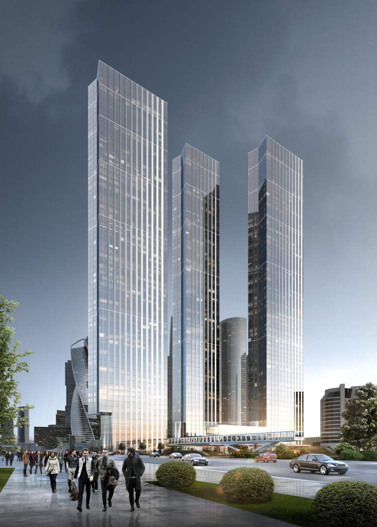
Housing complex with an underground parking garage on the Krasnopresnenskaya Embankment © Sergey Skuratov Architects
Visual analysis © Sergey Skuratov Architects
Vantage points diagram. Housing complex with an underground parking garage on the Krasnopresnenskaya Embankment © Sergey Skuratov Architects
The list of versions produced at that point, with a height limit of 200 meters, included such exotic things as “frames”, “staircases”, and “hedgehogs”. The version that Skuratov proposed to take as the main one was essentially a slab with super-high-tech façades – textured, voluminous and “rippled”, with a sophisticated system of internal connections. All this diversity scared the client just as much as it impressed him. It scared the client because the first impression that one got looking at the project was that a thing like that would never get all the appropriate approvals, let alone be built. However, it also impressed the client with the profundity of the architect’s approach, the magnitude of his ideas, and a storm of creative thinking.
Versions and theme search. Housing complex with an underground parking garage on the Krasnopresnenskaya Embankment © Sergey Skuratov Architects
Housing complex with an underground parking garage on the Krasnopresnenskaya Embankment. Sketches © Sergey Skuratov Architects
Versions and theme search. Housing complex with an underground parking garage on the Krasnopresnenskaya Embankment © Sergey Skuratov Architects
Versions and theme search. Housing complex with an underground parking garage on the Krasnopresnenskaya Embankment © Sergey Skuratov Architects
Housing complex with an underground parking garage on the Krasnopresnenskaya Embankment. Versions. Silhouette scheme © Sergey Skuratov Architects
The shape search continued, and a single slab was replaced by three ones – still more slender and elegant because the architects were able to “stretch” their height from 200 to 267 meters: the resulting “thickness” of one such building was 21 meters which is really little by skyscraper standards.
Housing complex with an underground parking garage on the Krasnopresnenskaya Embankment © Sergey Skuratov Architects
“Superslim” towers are generally a fashionable trend of today: currently, such things are being built on Manhattan. This seemingly unnatural “thinness” is in fact their main distinctive feature: as if man challenges nature by living in a building that looks as if it is about to collapse. This is like balancing on the edge of an abyss – an exquisite pleasure of the rich and powerful. One of such skyscrapers is being designed in New York by Russia’s Meganom Architects for Five Points Development.
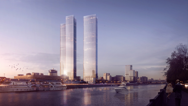
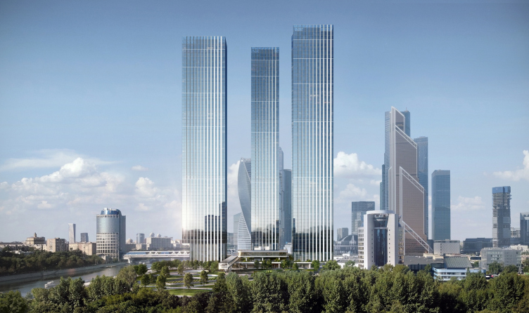
But then again, it must be noted that in Skuratov’s version this slimness is far from extreme and is rather on the comfortable side. Placed on a green podium that ties in together all the public spaces of the complex, the towers overlook the park, while their narrow side façades overlook the river. The towers do not argue among themselves and, and do not obscure one another. Their mutual positions could even look deceptively trivial, if they had not been precisely calculated from the viewing, compositional, and insolation standpoints. “The first tower stands on the axis of the first line of Moscow City, the second – on the axis of the street that separates the first line and the “Afimall”, and the farthest tower stands on the “Afimall” axis” – Sergey explains.
Housing complex with an underground parking garage on the Krasnopresnenskaya Embankment. Compositional axes of "Moscow City" © Sergey Skuratov Architects
The positioning of the towers partially defined the direction of the façades’ dynamics: as is always the case with Skuratov, the matters that he handles are a lot more subtle and deeper than they appear to be. As one moves his gaze upwards or in the direction of the water, the high-tech glass surfaces (which have the valves of the positive pressure ventilation installed in them, as well as sunlight and heat protection elements) grow thinner and virtually dissolve in the air. The effect looks particularly realistic thanks to the use of special lightened glass (“My skyscrapers will be the lightest thing around!” – the architect claims). As one moves inside, however, the façades take on an ever-increasing “material” quality thanks to the aluminum lamellae that boldly stand out and cover the ventilation grills.
Housing complex with an underground parking garage on the Krasnopresnenskaya Embankment. Lamellae © Sergey Skuratov Architects
Housing complex with an underground parking garage on the Krasnopresnenskaya Embankment. Lamellae © Sergey Skuratov Architects
Housing complex with an underground parking garage on the Krasnopresnenskaya Embankment. Lamellae © Sergey Skuratov Architects
The plastique of the façade volumes demonstrates yet another interesting feature – the M-shaped cutaways of the sidewalls that are turned to the river. And, while the cantilevered cutaway of the tower closest to the water was made there deliberately in order to avoid blocking the view of the Moscow City to those strolling down the waterfront, the other “cutaways” have no functional reason. Skuratov himself meditates on the image of the “compressed” façade that takes on the pressure of the void created by the Moskva River. Some might see here allusions to the Kremlin wall as a hint at the “Moscow” character of these objects – and this will also be not too far from the truth.
Housing complex with an underground parking garage on the Krasnopresnenskaya Embankment © Sergey Skuratov Architects
Housing complex with an underground parking garage on the Krasnopresnenskaya Embankment © Sergey Skuratov Architects
Housing complex with an underground parking garage on the Krasnopresnenskaya Embankment © Sergey Skuratov Architects
It is rather obvious that this project developed from a variating and saturated one to a slim and probably the only possible solution coming down to taking away the excess. The nearest context of the towers consists of the group of the Moscow City skyscrapers, so one could not possibly be mistaken here – Sergey Skuratov shares that for a long time he was dubious about whether this place needed skyscrapers at all... However, one way or another, the proximity of a “skyscraper forest” poses some serious requirements to the newly born “tree”: you need to live up to your position, be as good as, or, preferably, better than the rest. This is why the architect chose to use the lightened glass, steel, modern building materials, and at the same time light and simple form.
But then again, one can hardly call these towers “simple” – just like any other 200-meter-high building, they are very complex from the engineering standpoint because of their sheer height, slimness, and the necessity to fight the wind resistance – these issues are handled in the architectural firm by Mikhail Kelman. In addition, a unique heating and ventilation system was developed: it utilizes narrow slits that are there on the apartments before the façades and allows for individual settings for each apartment – this system was developed by Alexander Kolubkov.
The complexity of the task was also conditioned by the building’s mixed function: in addition to the fact that the towers rest on a five-level underground parking garage and the podium includes a two-level public retail space, the towers themselves combine a residential and an office function. One of them, the farthest away from the river, is completely residential, in another the offices occupy the bottom part, and in the third one they occupy the upper part – all the offices are equipped with individual entrances, lobbies and elevators, including high-speed ones.
Housing complex with an underground parking garage on the Krasnopresnenskaya Embankment. The functions distribution diagram © Sergey Skuratov Architects
The second, just as important, constituent part of the project’s genius loci is defined by the proximity of the park and the memories of the old tennis courts that are inherited, as we remember, by the complex’s semi-underground tennis part with a highly developed space narrative. The courts occupy the east part of the territory – the triangle next to the edge of the Krasnopresnensky Park, separated from the towers by a driveway; construction was prohibited here but placing a flat tennis court infrastructure covered by a green roof was OK. One of the courts – the open-air one – occupies the lawn located from the side of the transparent entrance pavilion. It opens up the access to a large community center with a fitness club, a swimming pool, a supermarket, a cafe, a restaurant, and a five-level underground parking garage. Raising the height of the land site by a little over 4 meters, the green roof of the pavilion becomes a platform for an amphitheater with a picturesque waterfront view.
Housing complex with an underground parking garage on the Krasnopresnenskaya Embankment. Underground tennis courts. Perspective 2 © Sergey Skuratov Architects
Housing complex with an underground parking garage on the Krasnopresnenskaya Embankment. Underground tennis courts. Plan of the basement floor at the 0.000 mark © Sergey Skuratov Architects
Housing complex with an underground parking garage on the Krasnopresnenskaya Embankment. Underground tennis courts. Structure 1 © Sergey Skuratov Architects
Housing complex with an underground parking garage on the Krasnopresnenskaya Embankment. Underground tennis courts. Section views © Sergey Skuratov Architects
Housing complex with an underground parking garage on the Krasnopresnenskaya Embankment. Underground tennis courts. Constructions 3,4 © Sergey Skuratov Architects
Most of the courts, however, are hidden underground – 7 gyms are separated from one another with soundproof glass partitions and are grouped around a central space that yawns as a triangular cutaway in the green “roof”. Through it, almost the entire inside space of the courts is viewable. And from the courts, in turn, the greenery and the hill are seen. In the summertime the upper stained glasses of the partitions can be opened in order to let in not only the sunlight but also the air. Sergey Skuratov is arguably a pioneer in designing such tennis courts, sunken 16 meters underground.
Housing complex with an underground parking garage on the Krasnopresnenskaya Embankment. Underground tennis courts. Perspective 1 © Sergey Skuratov Architects
Housing complex with an underground parking garage on the Krasnopresnenskaya Embankment © Sergey Skuratov Architects
Housing complex with an underground parking garage on the Krasnopresnenskaya Embankment. Underground tennis courts. Perspective 9 © Sergey Skuratov Architects
Housing complex with an underground parking garage on the Krasnopresnenskaya Embankment. Underground tennis courts. Perspective 6 © Sergey Skuratov Architects
Housing complex with an underground parking garage on the Krasnopresnenskaya Embankment. Underground tennis courts. Perspective 9 © Sergey Skuratov Architects
Housing complex with an underground parking garage on the Krasnopresnenskaya Embankment. Underground tennis courts. Perspective 7 © Sergey Skuratov Architects
In addition to the amphitheater and the “tennis window”, the comfortable green yard on the roof of the pavilion will be adorned by a man made creek and a children’s playground. Another thing that this place will get will be a hanging restaurant suspended on cantilevered structures and commanding beautiful views.
Housing complex with an underground parking garage on the Krasnopresnenskaya Embankment © Sergey Skuratov Architects
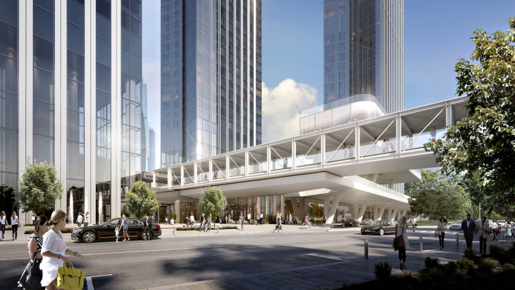
The main architectural centerpiece, however (apart from the “dissolving” towers), will be a pedestrian bridge thrown over the road between the waterfront and the Krasnogvardeisky Drive and connecting the residential buildings to a sightseeing platform hovering above the park. This “bridge to nowhere” leads in fact to the epicenter of cultural life: it is planned that it will be additionally glazed, then heated, and ultimately turned into a spacious art gallery (suffice it to say that the bridge is 4 meters wide and 100 meters long).
Housing complex with an underground parking garage on the Krasnopresnenskaya Embankment © Sergey Skuratov Architects
Housing complex with an underground parking garage on the Krasnopresnenskaya Embankment © Sergey Skuratov Architects
Housing complex with an underground parking garage on the Krasnopresnenskaya Embankment © Sergey Skuratov Architects
Housing complex with an underground parking garage on the Krasnopresnenskaya Embankment © Sergey Skuratov Architects
Housing complex with an underground parking garage on the Krasnopresnenskaya Embankment © Sergey Skuratov Architects
Housing complex with an underground parking garage on the Krasnopresnenskaya Embankment © Sergey Skuratov Architects
Housing complex with an underground parking garage on the Krasnopresnenskaya Embankment © Sergey Skuratov Architects
Housing complex with an underground parking garage on the Krasnopresnenskaya Embankment © Sergey Skuratov Architects
Housing complex with an underground parking garage on the Krasnopresnenskaya Embankment © Sergey Skuratov Architects
Housing complex with an underground parking garage on the Krasnopresnenskaya Embankment © Sergey Skuratov Architects
Construction of the complex has already begun, and is expected to be completed in 2020. Still much earlier this land site will see the sales office designed by Skuratov Architects. This will be a mini-version of one of the towers – a six-story glass volume. Inside, the building will showcase six versions of interior design and decoration that are now being developed by Antonio Citterio. He handles all the apartments and penthouses, and as for the tall 20-meter lobbies, these will be done by Sergey Skuratov and the Italian designer together. It will be interesting to check out how the stylish simplicity of the former will be contrasted by the ostentatiously bourgeois style of the latter.
Housing complex with an underground parking garage on the Krasnopresnenskaya Embankment. Interior © Sergey Skuratov Architects
Housing complex with an underground parking garage on the Krasnopresnenskaya Embankment. Interior © Sergey Skuratov Architects
Housing complex with an underground parking garage on the Krasnopresnenskaya Embankment. Interior © Sergey Skuratov Architects
But then again, what will meet the eye will be the high-rises themselves – and this, according to Sergey Skuratov, constitutes the main challenge of any skyscraper construction: the building is viewable from all sides, and all of your mistakes and miscalculations are laid bare for the world to see. This is a huge responsibility before the city, and, just like with any grand-scale projects, it will not be without problems here.
But, as everyone knows, Sergey Skuratov is not to be scared easily. He receives the serve.
Housing complex with an underground parking garage on the Krasnopresnenskaya Embankment. Technical premises © Sergey Skuratov Architects
Housing complex with an underground parking garage on the Krasnopresnenskaya Embankment. 3rd floor at the mark of 6.750 © Sergey Skuratov Architects
Housing complex with an underground parking garage on the Krasnopresnenskaya Embankment. 2nd floor at the mark 0.000 © Sergey Skuratov Architects
Housing complex with an underground parking garage on the Krasnopresnenskaya Embankment. 1st floor at the mark -7.200 © Sergey Skuratov Architects
Housing complex with an underground parking garage on the Krasnopresnenskaya Embankment. 1st floor at the mark -12.600 © Sergey Skuratov Architects
Housing complex with an underground parking garage on the Krasnopresnenskaya Embankment. -2nd floor at the mark -16.500 © Sergey Skuratov Architects
Housing complex with an underground parking garage on the Krasnopresnenskaya Embankment. -3rd floor at the mark -20.400 © Sergey Skuratov Architects
Housing complex with an underground parking garage on the Krasnopresnenskaya Embankment. -4th floor at the mark -24.300 © Sergey Skuratov Architects
Housing complex with an underground parking garage on the Krasnopresnenskaya Embankment. -5th floor at the mark -28.200 © Sergey Skuratov Architects
Housing complex with an underground parking garage on the Krasnopresnenskaya Embankment. Block "A", 58th floor (offices) 0 © Sergey Skuratov Architects
Housing complex with an underground parking garage on the Krasnopresnenskaya Embankment. Block "A", floors 4-16 © Sergey Skuratov Architects
Housing complex with an underground parking garage on the Krasnopresnenskaya Embankment. Block "B", floors 4-16 © Sergey Skuratov Architects
Housing complex with an underground parking garage on the Krasnopresnenskaya Embankment. Block "B", Floor 60 (penthouse) © Sergey Skuratov Architects
Housing complex with an underground parking garage on the Krasnopresnenskaya Embankment. Block "B", floors 15-16 (offices) © Sergey Skuratov Architects
Housing complex with an underground parking garage on the Krasnopresnenskaya Embankment. Block "B", floors 18-23 © Sergey Skuratov Architects
Housing complex with an underground parking garage on the Krasnopresnenskaya Embankment. Development drawing along the Proektiruemy Drive © Sergey Skuratov Architects
Housing complex with an underground parking garage on the Krasnopresnenskaya Embankment. Development drawing along the Krasnopresnenskaya Embankment © Sergey Skuratov Architects
Housing complex with an underground parking garage on the Krasnopresnenskaya Embankment. Section view 1-1 © Sergey Skuratov Architects
Housing complex with an underground parking garage on the Krasnopresnenskaya Embankment. Location plan © Sergey Skuratov Architects


