По-русски

Labyrinths of Creativity

The interior design of "Yandex" HQ: Atrium's good old and time-tested trademark techniques coupled with new interesting approaches to creating an unconventional workspace.

04 August 2015
Object
mainImg

It was "Atrium" architectural bureau that once defined the image of Yandex offices - easily recognizable today by their combination of flash and efficiency. It all started back in 2005 from designing the interior in an abandoned red-brick workshop on the Samokatnaya Street. Then there was the space at the Stanislavsky Street. In 2010, the company moved to the Leo Tolstoy Street, into a new facility in the business quarter "Krasnaya Roza 1875". And again it was Atrium that did the interior design, this time around for whole seven new floors: their main feature is the tree-like inside blocks with their lath-covered meeting rooms alternating with occasional "living" grass walls.

This consecutive, "Yandex"'s fifth interior designed by Atrium and implemented but recently is a new part of the office in the same business center. However, this time around, the bureau, along with a few other Moscow's established architectural companies, took part in the closed tender for designing the space for conducting external conferences. The prize - the right to design the second stage of the interiors with a total area of twelve thousand square meters - Atrium won in flying colors proving that over the years of cooperation it has learned to understand like no other company its customer's needs and, on top of that, anticipate the direction of the customer's further development. The image of the new interior turned out to be maximally natural and refreshing at the same time.

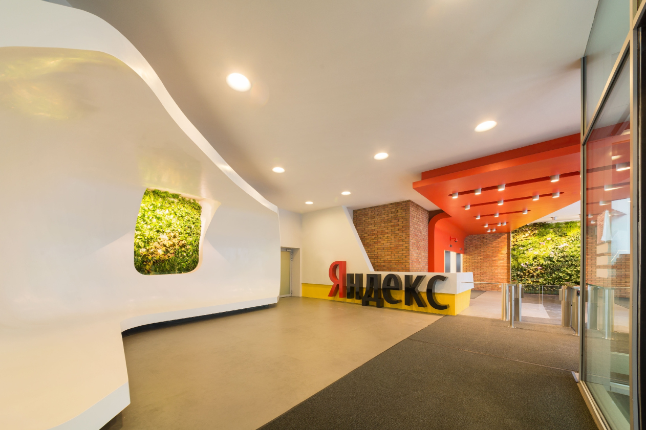
Yandex HQ on Leo Tolstoy Street (second stage). Entrance group © "Atrium" Architectural Bureau
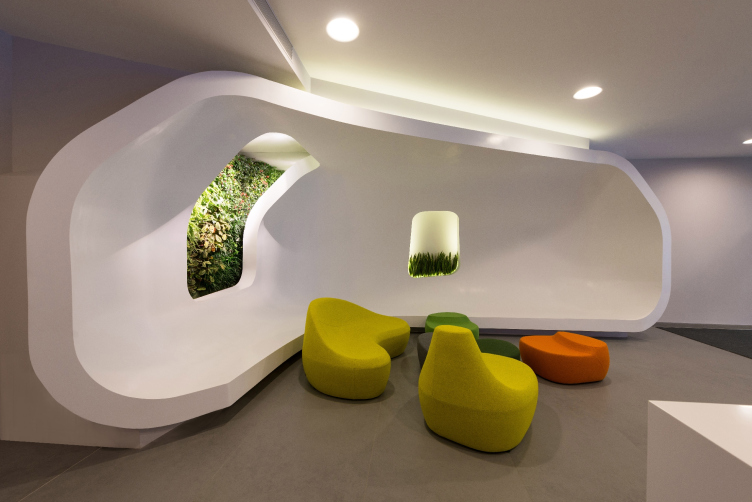
Yandex HQ on Leo Tolstoy Street (second stage). Waiting lounge © "Atrium" Architectural Bureau


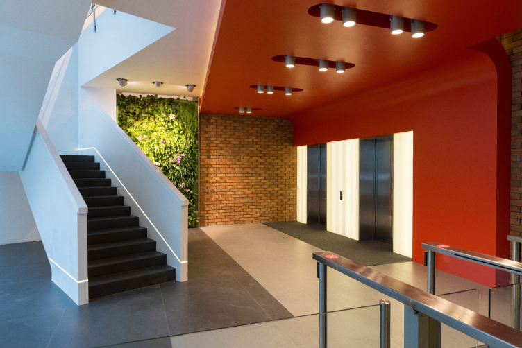
Yandex HQ on Leo Tolstoy Street (second stage). Corian clam shell stairway © "Atrium" Architectural Bureau


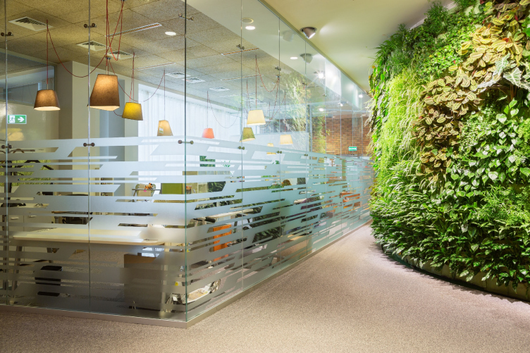
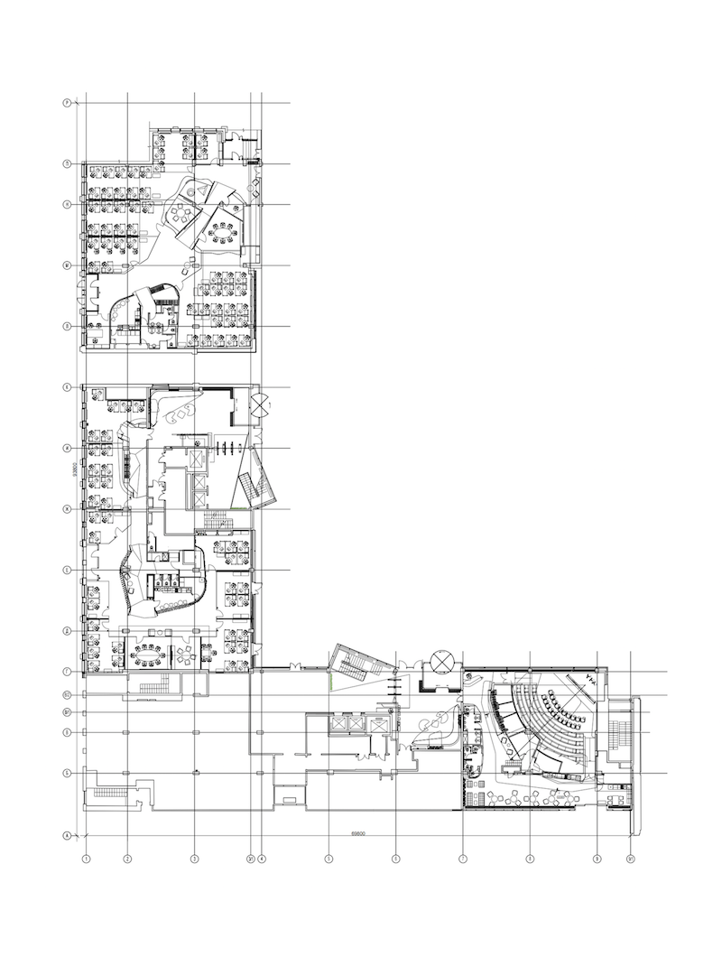
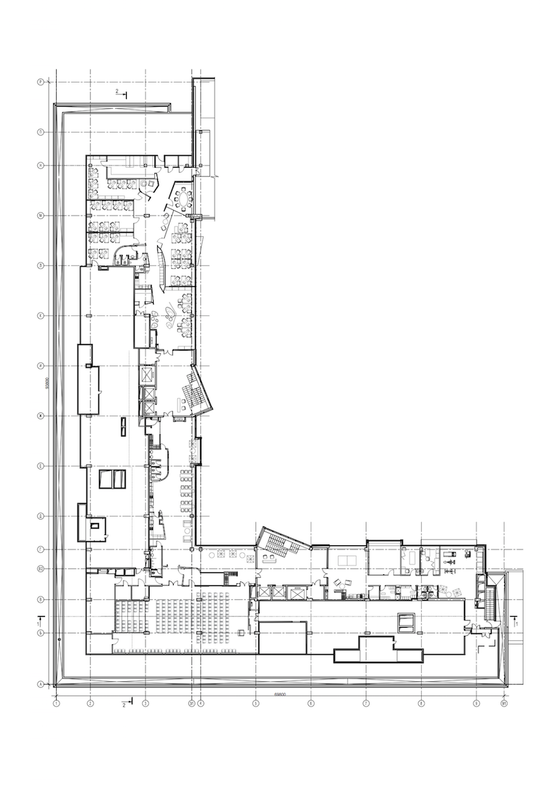
The new five floors are situated in the recessed glass building of "Morozov". The first floor has in it a spacious lobby: the guests waiting area with a corian clam shell, living plants, and the reception desk with the inevitable Yandex logo on it. Soft backlight. Bright multicolored furniture.

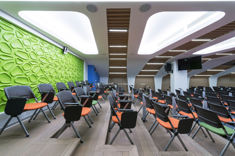
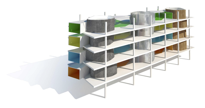
Besides the entrance group that leads to the sculptural volume of the stairway and the accompanying wall of green plants, this floor also includes the administrative block and the premises for the public events. Higher up, there are three floors that include nothing but the workspace. And above all this, the fifth and the last floor belonging to the company has in it the conference hall and the sports and entertainment center. The work tables are placed along the glazed perimeter of the offices' outer walls, while the studies, the meeting rooms, and the coffee points are gathered in the center where the ambient light is less required. The architects tested this technique of organizing the workspace in their previous "Yandex" project, and, over the years of operation, it proved its efficiency one hundred percent. 

Yandex HQ on Leo Tolstoy Street (second stage). Conference hall at the fifth floor © "Atrium" Architectural Bureau


Yandex HQ on Leo Tolstoy Street (second stage) © "Atrium" Architectural Bureau


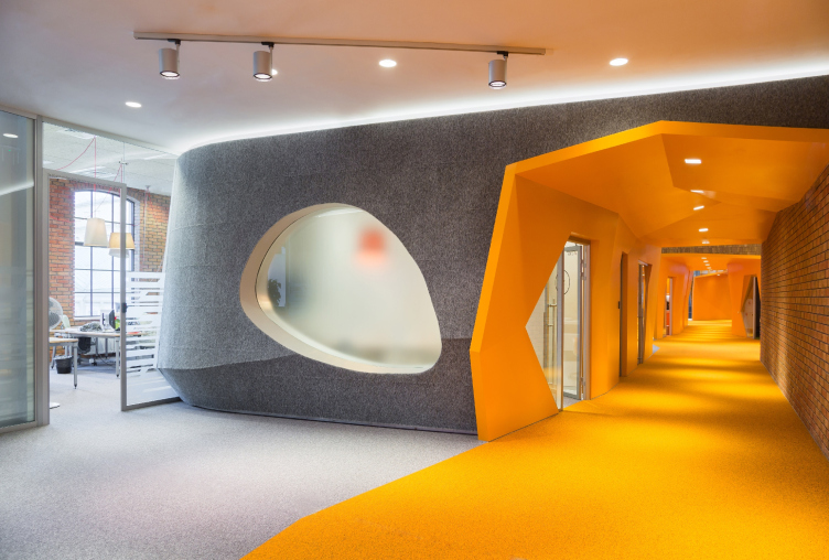
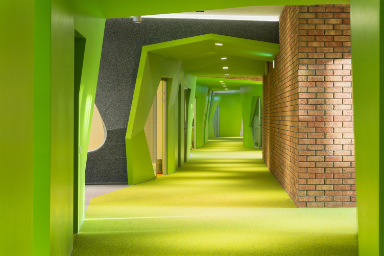
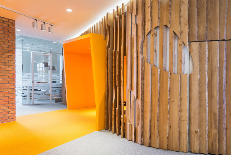
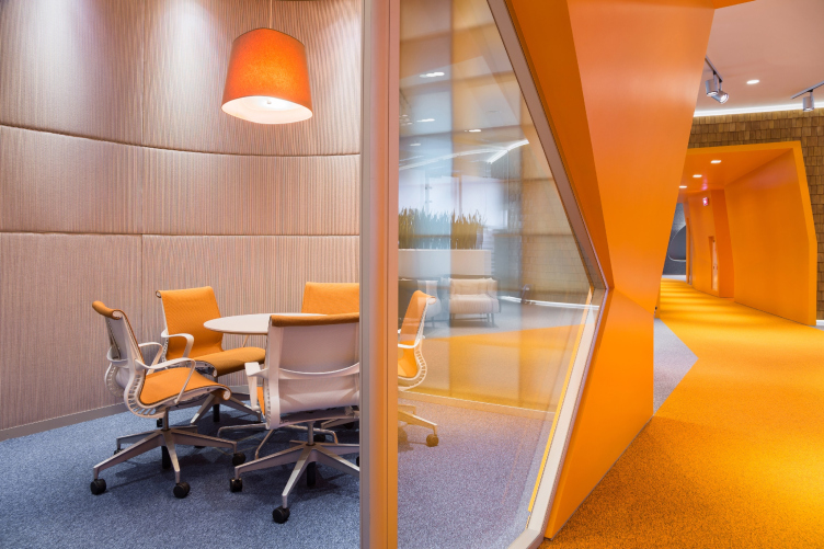
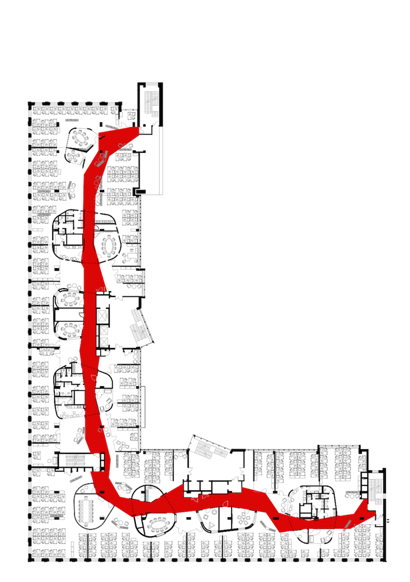
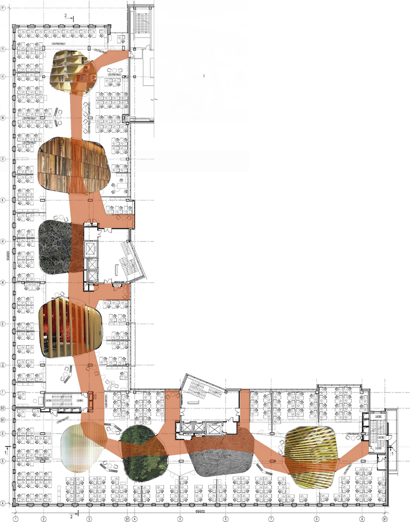
However, the main "hero", or, better yet, the main "core" of each of the work floors is the bright and agile passageway: it runs through the space at an optimal trajectory saving people from getting lost in the labyrinth of desks and chairs. It also has the capsules with meeting rooms, kitchens, and smoking rooms strung upon it. In a way, it can be likened to a corridor, only not of the usual type but intermittent and discontinuous like a corpuscle of light - because the open and the tunnels fragments alternate at rhythmic intervals. At some points, it is only the color band on the floor that saves you from losing your way - but the ensuing closed fragment with the facets of walls and ceiling makes a strong impression indeed. The complex geometry of the passages changes the efficiently planned office floor not only facilitating its navigation but also saturating its interior with human emotions - life-affirming, akin to the kind that people experience in an amusement park. What the architects ultimately got is a curious hybrid of open space and the classic "corridor-type" office - which in itself is not really a rarity but Atrium is capable of turning, time after time, the logistic nucleus of the workspace into an artistically justified and effort-efficient amusement ride. In the previous Yandex office, the passages were of a sophisticated multi-fragment shape, while here they are planned as being shorter and more efficient. 

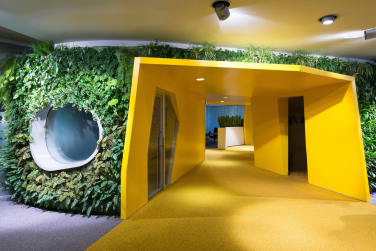
What is important is the fact that each such "corridor" is bound by its unique color, common for each specific floor. On the second floor, it is yellow, on the third - green, on the fourth - orange, and on the fifth it is dark blue. This "rainbow" navigation is supported by the bright red accent that echoes the trademark letter "Я" in the entrance lobby.

Yandex HQ on Leo Tolstoy Street (second stage) © "Atrium" Architectural Bureau


Yandex HQ on Leo Tolstoy Street (second stage) © "Atrium" Architectural Bureau


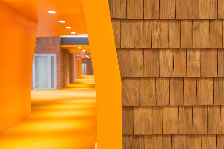
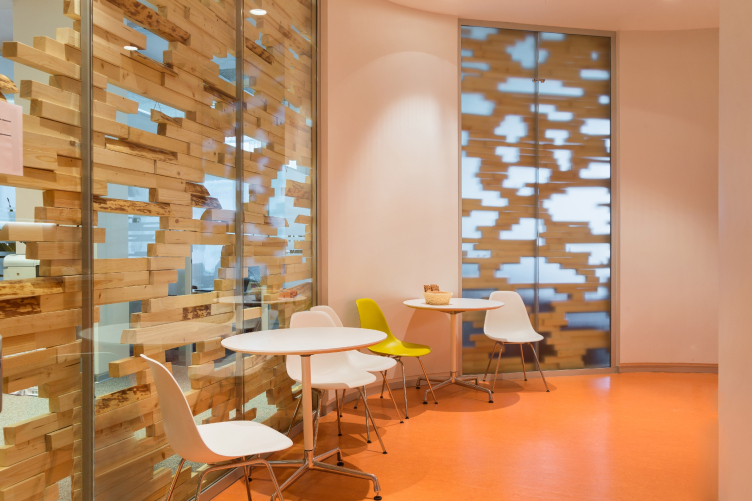
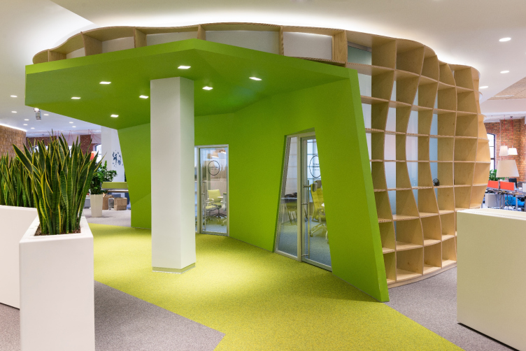
The second important difference from the earlier part of the office lies in the fact that in the former case the verticals of the almost-identical "capsule" blocks would run through the suspended ceiling, as if growing into, very much like trees, into the next floor. In the new office, the architects deliberately tear each block away from the ceiling - physically and with the help of the backlight. These blocks are very different; no two blocks on one floor are exactly alike: the eight types of finishes create images as dramatic as easily recognizable - for example, the capsules with unevenly drawn "bull's eyes" of windows wrapped into dark-gray shaggy carpet fabric. Others are surrounded by vertical carved wooden planks. Still others are covered with textured pixel-like pattern of horizontal wooden bars through which the glass lining and the inner rooms show through. One of the shell options is really functional: the capsule consists of deep shelves that the employees are free to fill in at their discretion. But the most striking impression is produced by the green hill that is covered from top to bottom with scramblers - the lounges that are inside of it look the coziest of all. It will only be fair to mention that in this project a fancy shell always conceals a space that is rational and efficient, where the very last little door is rationally justified. Besides, the diversity of the capsules, as we remember, is part of the navigation system: emotional, visual, and territorial. 

Yandex HQ on Leo Tolstoy Street (second stage). Finish in the form of a living plant wall © "Atrium" Architectural Bureau


Yandex HQ on Leo Tolstoy Street (second stage). Finish in the form of a wooden grid © "Atrium" Architectural Bureau


Yandex HQ on Leo Tolstoy Street (second stage). Finish in the form of wooden bars forming a pixel pattern © "Atrium" Architectural Bureau


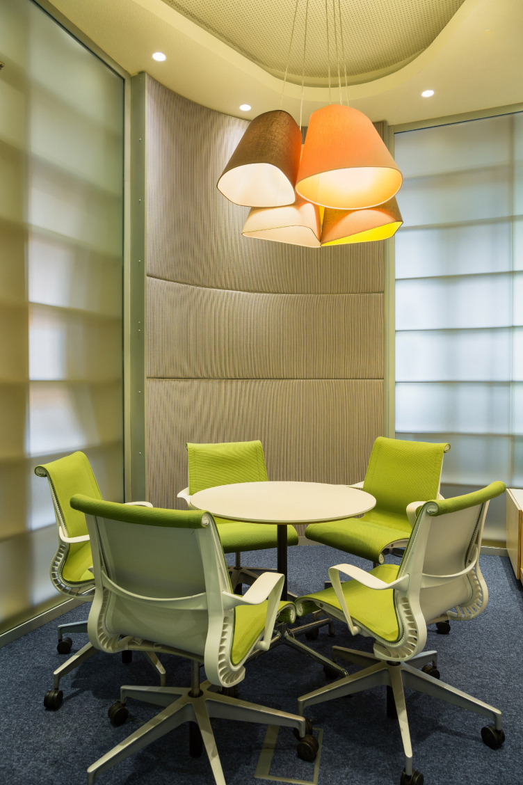
Every last little detail here shows some brilliant design idea. Probably, for this very reason, as you get inside, the last thing on your mind is that you are in the office of a huge corporation, the richest one, according to Forbes, in the Russian segment of the Internet, with thousands of employees. It has long been known that an upbeat creative workspace is one of the ground requirements of this famous IT company, and one that allows for it to attract new young talented employees with great conditions for creative work. As was already mentioned, Atrium has repeatedly been able to fulfill this mission - because its style with its combination of unexpected "sculptural-ness", diverse textures and brings colors best meets the expectations of the young creative minds. 

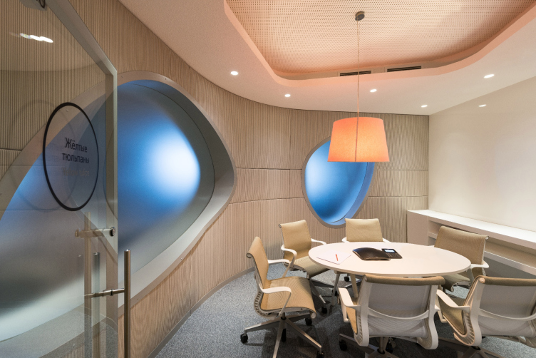
Yandex HQ on Leo Tolstoy Street (second stage). Meeting room © "Atrium" Architectural Bureau


Yandex HQ on Leo Tolstoy Street (second stage). Meeting room © "Atrium" Architectural Bureau


Yandex HQ on Leo Tolstoy Street (second stage). Entrance in the form of the Yandex trademark cursor © "Atrium" Architectural Bureau


Every detail shows that the authors did not for a minute forget whom exactly they were working for. The glass entrances to the oases of the meeting rooms are executed in the shape of the cursor of Yandex search engine. The merry-sounding plaques on the doors continue and support this simulation of a merry traffic light: on Orange Floor, the plaques read "Orange Mood" and "Orange Necktie" (two cool Russian rock-n-roll evergreens - translator's note). On Yellow Floor - "Yellow Tulips", "Yellow Pants", and "Yellow Shoes", all this being not the architects' but the customers' initiative. The company's employees actively joined the game - which was a sure sign that they "accepted" their new home. So, Atrium has hit the mark yet again. 
Yandex HQ on Leo Tolstoy Street (second stage). © "Atrium" Architectural Bureau
zooming
zooming
zooming
zooming
zooming


04 August 2015

Headlines now
The Golden Crown
The concept for a dental clinic in Yekaterinburg, developed by CNTR Studio, revolves around the idea of a “mouth full of gold”: pristine white porcelain stoneware walls are complemented by matte brass details. To avoid an overly literal interpretation, the architects focused on the building’s proportions, skillfully navigating between sunlight requirements and fire safety regulations.
Flexibility and Integration
Not long ago, we covered the project for the fourth phase of the ÁLIA residential complex, designed by APEX. Now, we’ve been shown different fence concepts they developed to enclose the complex’s private courtyards, incorporating a variety of public functions. We believe that the sheer fact that the complex’s architects were involved in such a detail as fencing speaks volumes.
A Step Forward
The HIDE residential complex represents a major milestone for ADM architects and their leaders Andrey Romanov and Ekaterina Kuznetsova in their quest for a fresh high-rise aesthetic – one that is flexible and layered, capable of bringing vibrancy to mass and silhouette while shaping form. Over recent years, this approach has become ADM’s “signature style”, with the golden HIDE tower playing a pivotal role in its evolution. Here, we delve into the project’s story, explore the details of the complex’s design, and uncover its core essence.
Gold in the Sands
A new office for a transcontinental company specializing in resource extraction and processing has opened in Dubai. Designed by T+T Architects, masters of creating spaces that are contemporary, diverse, flexible, and original, this project exemplifies their expertise. On the executive floor, a massive brass-clad partition dominates, while layered textures of compressed earth create a contextually resonant backdrop.
Layers and Levels of Flight
This project goes way back – Reserve Union won this architectural competition at the end of 2011, and the building was completed in 2018, so it’s practically “archival”. However, despite being relatively unknown, the building can hardly be considered “dated” and remains a prime example of architectural expression, particularly in the headquarters genre. And it’s especially fitting for an aviation company office. In some ways, it resembles the Aeroflot headquarters at Sheremetyevo but with its own unique identity, following the signature style of Vladimir Plotkin. In this article, we take an in-depth look at the United Aircraft Corporation (UAC) headquarters in the Moscow agglomeration town of Zhukovsky, supplemented by recent photographs from Alexey Naroditsky – a shoot that became only recently possible due to the fact that improvements were finally made in the surrounding area.
Light and Shadow
In this article, we delve into the architectural design of the “Chaika” house by DNK ag architects, which was recently completed in 2023 as part of the collection of signature designs at ZILArt. As is well-known, all the buildings in this complex follow a design code, yet each one is distinct. This particular building stands out not only for its whiteness and minimalism but also for the refined use of a limited number of techniques that, together, create what can confidently be called synergy.
Casus Novae
A master plan was developed for a large residential area with a name of “DNS City”, but now that its implementation began, the plan has been arbitrarily reformatted and replaced with something that, while similar on the surface, is actually quite different. This is not the first time such a thing happens, but it’s always frustrating. With permission from the author, we are sharing Maria Elkina’s post.
Treasure Hunting
The GAFA bureau, in collaboration with Tegola and Arkhitail, organized an expedition to the island of Kilpola in Karelia as part of Moskomarkhitektura’s “Open City” festival. There, amidst moss and rocks, the students sought answers to questions like: what is the sacred, where does it dwell, and what sustains it? Assisting the participants in this quest were landscape engineer Evgeny Levin, artist Nicholas Roerich, a moose, and the lack of cellular connection. Here’s how the story unfolded.
Depths of the Earth, Streams of Water
In the Malaya Okhta district, the Akzent building, designed by Stepan Liphart, was constructed. It follows a classic tripartite structure, yet it’s what you might call “hand-drawn”: each façade is unique in its form and details, some of which aren’t immediately noticeable. In this article, we explore the context and, together with the architect, delve into how the form was developed.
Fir Tree Dynamics
The “Airports of Region” holding is planning to build an airport in Karachay-Cherkessia, aiming to make the Arkhyz and Dombay resorts more accessible to travelers. The project that won in an invitation-only competition, submitted by Sergey Nikeshkin’s KPLN, blends natural imagery inspired by the shape of a conifer seed, open-air waiting spaces, majestic large trees, and a green roof elevated on needle-like columns. The result is both nature-inspired and WOW.
​A Brick Shell
In the process of designing a clubhouse situated among pine trees in a prestigious suburban area near Moscow, the architectural firm “A.Len” did the façade design part. The combination of different types of brick and masonry correlates with the volumetric and plastique solutions, further enhanced by the inclusion of wood-painted fragments and metal “glazing”.
Word Forms
ATRIUM architects love ambitious challenges, and for the firm’s thirtieth anniversary, they boldly play a game of words with an exhibition that dives deep into a self-created vocabulary. They immerse their projects – especially art installations – into this glossary, as if plunging into a current of their own. You feel as if you’re flowing through the veins of pure art, immersed in a universe of vertical cities, educational spaces – of which the architects are true masters – and the cultural codes of various locations. But what truly captivates is the bold statement that Vera Butko and Anton Nadtochy make, both through their work and this exhibition: architecture, above all, is art – the art of working with form and space.
Flexibility and Acuteness of Modernity
Luxurious, fluid, large “kokoshniks” and spiral barrel columns, as if made from colorful chewing gum: there seem to be no other mansion like this in Moscow, designed in the “Neo-Russian-Modern” style. And the “Teremok” on Malaya Kaluzhskaya, previously somewhat obscure, has “come alive with new colors” and gained visibility after its restoration for the office of the “architectural ecosystem” as the architects love to call themselves. It’s evident that Julius Borisov and the architects at UNK put their hearts into finding this new office and bringing it up to date. Let’s delve into the paradoxes of this mansion’s history and its plasticity. Spoiler: two versions of modernity meet here, both balancing on the razor’s edge of “what’s current”.
Yuri Vissarionov: “A modular house does not belong to the land”
It belongs to space, or to the air... It turns out that 3D printing is more effective when combined with a modular approach: the house is built in a workshop and then adapted to the site, including on uneven terrain. Yuri Vissarionov shares his latest experience in designing tourist complexes, both in central Russia and in the south. These include houseboats, homes printed from lightweight concrete using a 3D printer, and, of course, frame houses.
​Moscow’s First
“The quality of education largely depends on the quality of the educational environment”. This principle of the last decade has been realized by Sergey Skuratov in the project for the First Moscow Gymnasium on Rostovskaya Embankment in the Khamovniki district. The building seamlessly integrates into the complex urban landscape, responding both to the pedestrian flow of the city and the quiet alleyways. It skillfully takes advantage of the height differences and aligns with modern trends in educational space design. Let’s take a closer look.
Looking at the Water
The site of Villa Sonata stretches from the road to the water’s edge, offering its own shoreline, pier, and a picturesque river panorama. To reveal these sweeping views, Roman Leonidov “cut” the façade diagonally parallel to the river, thus getting two main axes for the house and, consequently, “two heads”. The internal core – two double-height spaces, a living room and a conservatory, with a “bridge” above them – makes the house both “transparent” and filled with light.
The White Wing
Well, it’s not exactly white. It’s more of a beige, white-stone structure that plays with the color of limestone – smoother surfaces are lighter, while rougher ones are darker. This wing unites various elements: it absorbs and interprets the surrounding themes. It responds to everything, yet maintains a cohesive expression – a challenging task! – while also incorporating recognizable features of its own, such as the dynamic cuts at the bottom, top, and middle.
Urban Dunes
The XSA Ramps team designed and built a three-part sports hub for a park in Rostov-on-Don, welcoming people of all ages and fitness levels. The skate plaza, pump track, and playground are all meticulously crafted with details that attract a diverse range of visitors. The technical execution of the shapes and slopes transforms this space into a kind of sculptural composition.
Proportional Growth
The project for the fourth phase of the ÁLIA residential area has been announced. The buildings are situated on an elongated plot – almost a “ray” that shoots out from the center of the area towards the river. Their layout reflects both a response to Moscow’s architectural preferences over the past 15 years, shifting “from blocks to towers”, and an interpretation of the neighboring business park designed by SOM. Additionally, the best apartments here are not located at the very top but closer to the middle, forming a glowing “waistline”.
The “Staircase” Building
In designing the “Details” residential complex in New Moscow, Rais Baishev spiced up the now-popular Moscow theme of a “courtyard” building with an idea drawn from the surrealist drawings by Maurits Escher. He envisioned the stepped silhouettes and descending slopes as a metaphysical mega-staircase, creating a key void within the courtyard that gave the project an internal “spine”. This concept is felt both in the building’s silhouette and on its façades.
Projection of the Quarter
No one doubted that the building that Vladimir Plotkin designed as part of the “Garden Quarters” would be the most modernist of all. And it turned out just that way: while adhering to the common design code, the building successfully combines brick and white stone, rhythmically responding to the neighboring building designed by Ostozhenka, yet tactfully and persistently making a few statements of its own. This includes the projection of the ideal urban development composition “14–9–6”, which can be found right next door, mathematical calculations, including those for various types of terraces (and perhaps the only reminder of the Soviet past of the Kauchuk rubber factory!), and the white “cross-stitch” pattern of the façade grid.
Domus Aurea
In this issue, we examine the “Tessinsky-1” house, designed by Sergey Skuratov and completed in 2023. Located in the middle of the Serebryanicheskaya Embankment district, at the intersection of its main streets, this house assumes a sort of “nodal” role: it not only responds to everything around it and preserves many memories of the former EMA factory within itself, but it weaves all this into a newly directed pattern, reconciling bright “gold” and dark-colored brick, largely with the help of the new, modern-yet-archaic Columba brick, which, come to think about it, is the most precious element here.
The Chimney of Nikola-Lenivets
In this issue, we are examining the “Obelisk House” designed by KATARSIS and built for the Arkhstoyanie 2023 festival. However, it was only finished later on, and this is why we are examining it now. It seems to us that after the “Obelisk House” appeared in Nikola-Lenivets, a dialogue and a few inner connections appeared between the temporary structures built here. These houses no longer look like “accidental neighbors”, more of which below.
​Periscope by the Bay
The jury awarded the second place in the competition for a public and cultural center in Petropavlovsk-Kamchatsky to the companies GORA (“Mountain”) and M4. In the consortium’s proposal, the building resembles a sperm whale with a calf swimming next to it or a periscope, whose lenses capture the most spectacular views from the surrounding landscape.
From Arcs to Dolmens
While working on the competition project for Petropavlovsk-Kamchatsky, ASADOV Architects prioritized the value of the natural and urban environment, aiming to preserve the balance of the location while minimizing the resemblance of the volume that they designed to a “traditional building”. The task was challenging, and the architects created three versions, one of which having been developed after the competition, where their main proposal took third place. However, the point of interest here is not the competition result but the continuity of creative thinking.
Hide and Seek
The ID Moskovskiy house, designed by Stepan Liphart in St. Petersburg, in the courtyards near Moskovskiy Avenue beyond the Obvodny Canal and recently completed, is notable for several reasons. Firstly, it has been realized with considerable accuracy, which is particularly significant as this is the first building where the architect was responsible not only for the facades but also for the layouts, allowing for better integration between the two. On the other hand, this building is interesting as an example of the “germination” of new architecture in the city: it draws on the best examples from the neighborhood and becomes an improved and developed sum of ideas found by the architect in the surrounding context.
The Big Twelve
Yesterday, the winners of the Moscow Mayor’s Architecture Award were announced and honored. Let’s take a look at what was awarded and, in some cases, even critique this esteemed award. After all, there is always room for improvement, right?
Above the Golden Horn
The residential complex “Philosophy” designed by T+T architects in Vladivostok, is one of the new projects in the “Golubinaya Pad” area, changing its development philosophy (pun intended) from single houses to a comprehensive approach. The buildings are organized along public streets, varying in height and format, with one house even executed in gallery typology, featuring a cantilever leaning on an art object.
Nuanced Alternative
How can you rhyme a square and space? Easily! But to do so, you need to rhyme everything you can possibly think of: weave everything together, like in a tensegrity structure, and find your own optics too. The new exhibition at GES-2 does just that, offering its visitor a new perspective on the history of art spanning 150 years, infused with the hope for endless multiplicity of worlds and art histories. Read on to see how this is achieved and how the exhibition design by Evgeny Ace contributes to it.
Blinds for Ice
An ice arena has been constructed in Domodedovo based on a project by Yuri Vissarionov Architects. To prevent the long façade, a technical requirement for winter sports facilities, from appearing monotonous, the architects proposed the use of suspended structures with multidirectional slats. This design protects the ice from direct sunlight while giving the wall texture and detail.