По-русски

Radiant Concept

Based on the visual and landscape survey that later on became a valuable part of the concept in its own right, the architects of "Ostozhenka" Bureau proposed to keep 85% of the views of the St Simon Monastery seen from the embankment, at the same time increasing the height of the residential buildings.

27 April 2015
Object
mainImg

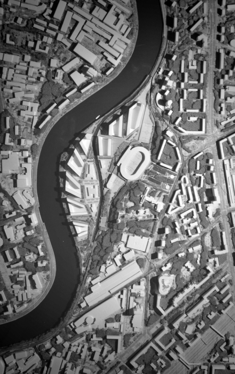
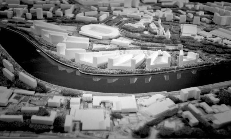
Photo fixation of the model. Top view. Concept of a multifunctional residential complex with objects of social infrastructure © Ostozhenka

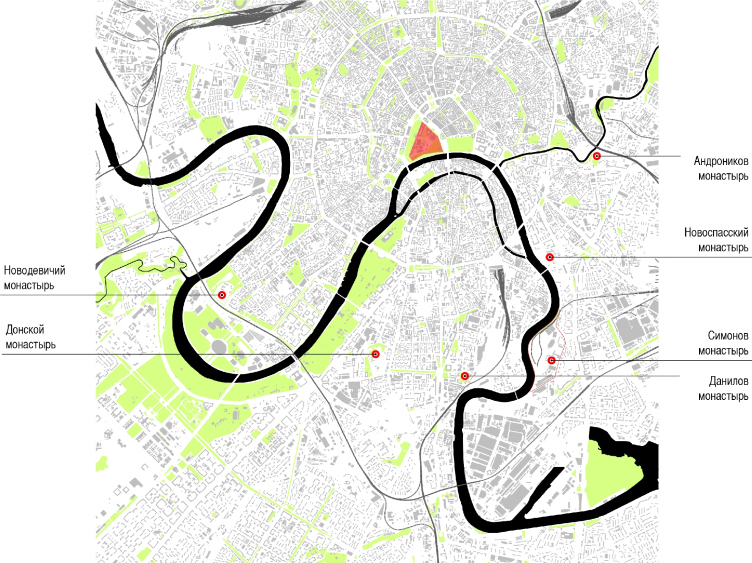
The territory in question is of quite a significant size - about 64 hectares - it stretches from south to north between the smooth bend of the Moskva River and the remains of the St Simon Monastery situated next to the "ZIL Peninsula" that is now also under reconstruction. The eery semi-industrial place keeps curious monuments of different epochs: from the Nativity of the Blessed Virgin Church dating back to the XIV century and the monastery towers of the XVII century, the most famous of which is, of course, the tour guides' favorite, the "Barrel" Tower - down to the "ZIL" Palace of Culture designed by the Vesnin brothers (yes, back in the day it was built in the place of a destroyed monastery but now it has also became an important monument of architecture, so it goes) and Shukhov oil cisterns standing closer to the river. In the late fifties, a little more to the north, a 15000-capacity football stadium was built. Now it is planned that both the stadium and the architectural monuments will be preserved and at the same time a large residential complex will be built here, one whose concept the Ostozhenka architects have been developing for a few years now. 

The southern half-ring of "fortress" monasteries. Concept of a multifunctional residential complex with objects of social infrastructure © Ostozhenka


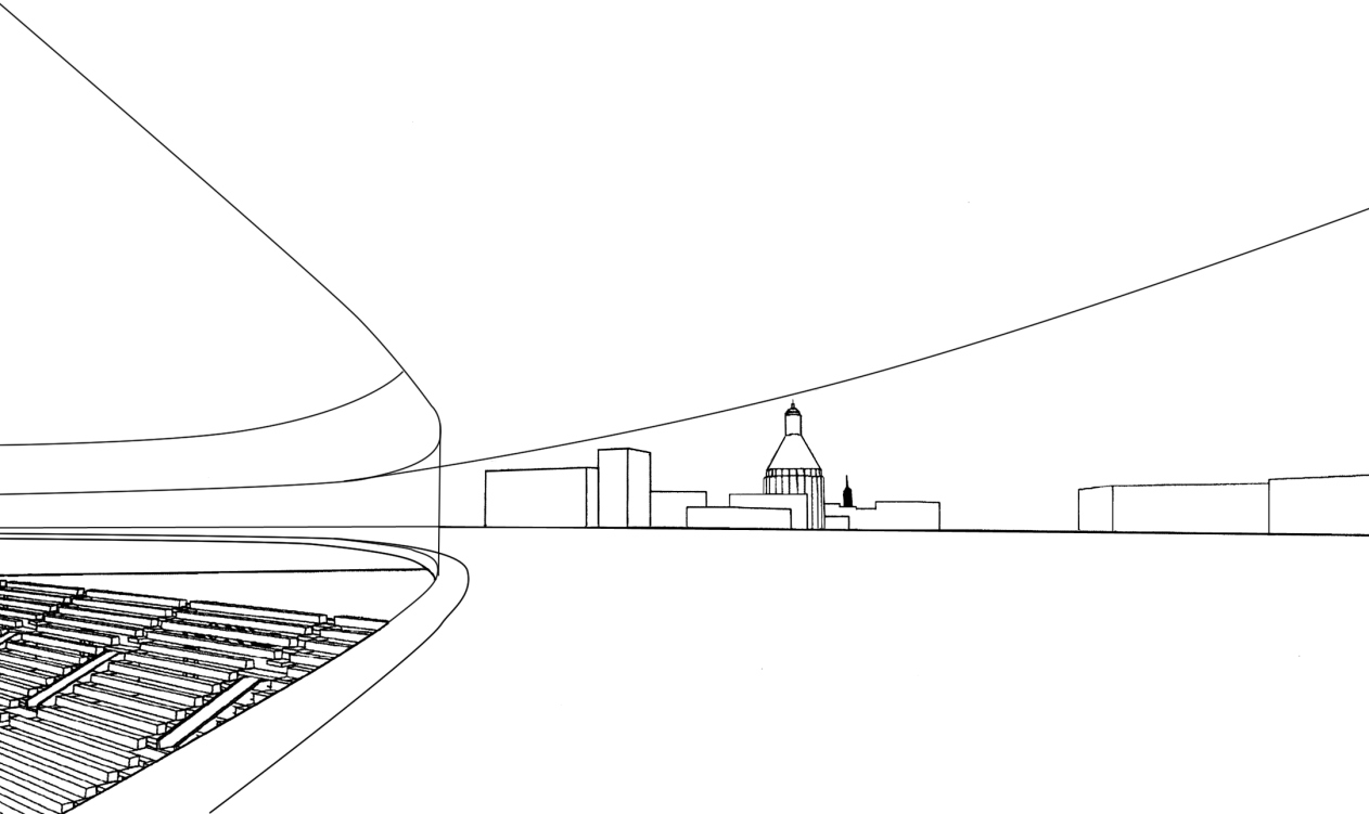
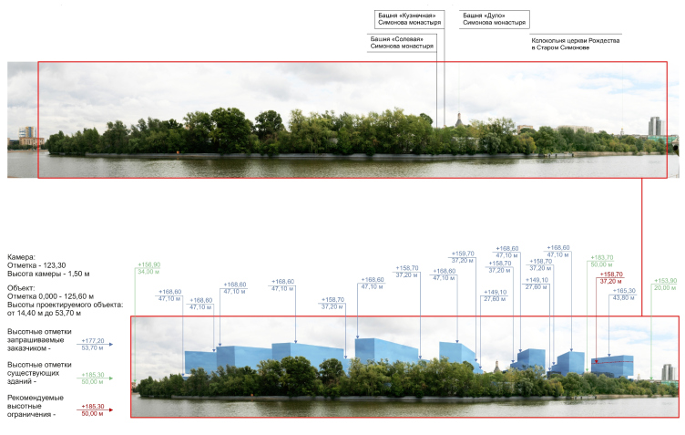
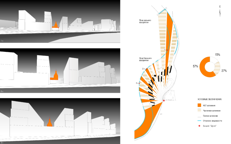
The concept required a detailed survey of the surroundings. Initially, the architects came up with the relevant to our time quarters that boasted the specified whopping three hundred thousand square meters of useful floor space. However, based on the landscape and visual survey, the licensing experts of the municipal authorities required that the height of the buildings should be cut down from thirty-three to eighteen meters so that these buildings would not block the view of the monastery and, most importantly, the "Barrel" tower together with the Nativity of the Blessed Virgin Church. The "curtailed" buildings simply would not house the required amount of useful square footage. Then the architects conducted a landscape and visual survey of their own studying a dozen panoramic views of the St Simon Monastery if viewed from the Derbenevskaya Embankment and the Novospassky Bridge, and not only from the pedestrian's vantage point (the height of the horizon being 150 cm) but also from the driver's line of vision which is significantly lower (horizon 127 cm) and came forward with an alternative version: they increased the height of the buildings still more (up to 40+ meters) but what they did was break the quarterly order and position the buildings in a radial fashion, as if they were running away from the central tower in an exquisite geometrical fashion, and not evenly but smoothly bending their direction so as to provide a maximum number of views of the architectural monuments. 

Indeed, the quarters blocked the view of the tower virtually from every conceivable angle. However, if lowered down to eighteen meters, even if we are to disregard the customer's square footage specifications, the complex was spreading over the ground in a single volume that, when viewed from a distance, looked a lot like a blind fence, above which the cone of the tower towered rather incongruously. Proposing to gather the volume in compact modernist rays, the authors achieved, on the one hand, the effect that the buildings now obscure not more than 15% of the monument views. On the other hand, when viewed from a moving car, there will appear the "picket fence effect": the tower will be seen all the time, as the architects claim. For them, this survey has long since become a part of the project in its own right. The specialists of the licensing board recognized that this solution wad a successful one.

Prerequisites of the design solution © Ostozhenka


Visual analysis of the final version of increased height. Concept of a multifunctional residential complex with objects of social infrastructure © Ostozhenka

Visual connection of St Simon Monastery with the right bank of the Moskva River © Ostozhenka


In this case, the "fan" of slabs is the key revolutionary idea. All the "power lines" run up to the tower, as if the complex were paying homage to the monuments of architecture. Yes, it used to turn away from them, block them, even "destroy" them but now it has changed its mind and pays respect to the monuments. As such, the very idea of placing the houses in a radial fashion, or even at a ninety-degree angle to the street is not entirely groundbreaking, it is one of the techniques of the classic modernism, great for increasing the airing and insolation properties. However, what is interesting in this particular case is the fact that the essentially modernist plan is used specifically to accentuate the ancient monuments. It would be interesting to develop this idea in other Moscow projects, particularly the large ones, to "crumple" the city's folds and crinkles around its historical monuments - and maybe the city would become more refined and civilized. Generally, this is amazing how Ostozhenka can endow gigantic volumes with delicate feelings, as if "teaching elephants how to dance". And - what else can you do if the elephants are the only thing that this city ever gets. 

Still, the architects did not entirely neglect the now-popular theme of the quarters - because the today's house simply must have a private courtyard of its own open only to its tenants - the "radiant" houses joined together to form large "horseshoes" opening up to the river in Ostozhenka's trademark arches, and to the tower - with the wings of double-L-shaped plans. These plans are used by the eight residential quarters standing along the river, from four to twelve floors. Together, they will house 2650 apartments of "business", "business+" and "premium" class. The total floor space of the project is 251 500 м2; according to estimates, it will be capable of housing a little under 6000 people. All the "quarter" buildings are raised on stylobates that include the shopping zones, social infrastructure, and the parking garages. The stylobates support the courtyards, private, but still not entirely closed: they command a broad view of the tower and, with a narrower perspective, toward the river.

Most of the apartments are double-sided, with large areas of glazing, which again enhances their connection to the surrounding panoramas. The turning of the radial buildings, besides the kind mentioned above, inside out, provides for the visitors both the views of the river and the St Simon Monastery. 

Photo fixation of the model. Top view. Concept of a multifunctional residential complex with objects of social infrastructure © Ostozhenka

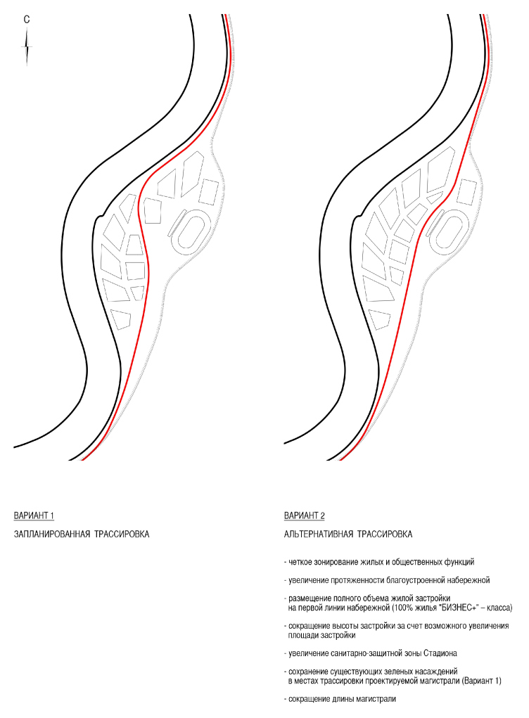
The architects of Ostozhenka also came up with a traffic diagram of their own, more convenient than the one that had been initially designed for this territory. Presently, the traffic area ends just short of the territory of the St Simon Monastery, making an abrupt turn away from the river in the direction of the Velozavodskaya Street; meanwhile, according to the municipal development plans, the carriage way of the Simonovskaya Embankment must be continued, cutting the new area lengthwise in two. This is just the right solution for Moscow that is choking on the exhaust fumes from its endless traffic jams. The architects were able to show, however, that, by straightening its line just a little bit, they could place all the residential houses by the river, without separating them in two groups with a busy highway. This last solution will ensure that it will only be the monastery and the stadium that will be left behind the highway, while the entire residential complex with its massive infrastructure will adjoin the pedestrian infrastructure - which will significantly improve the quality of life of the people who will live here and the value of its apartments. 

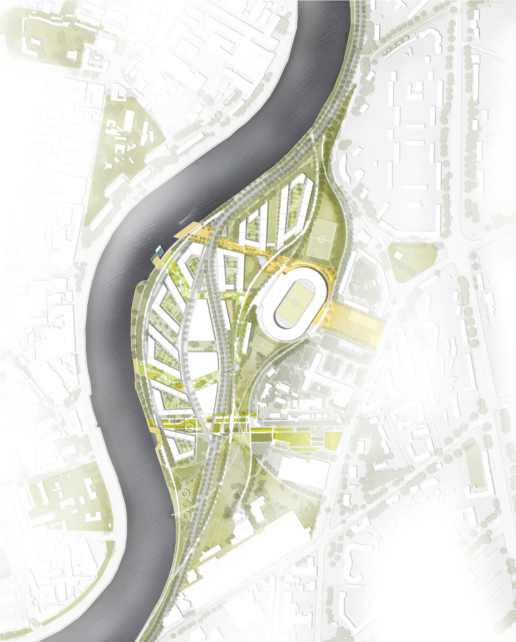
Ostozhenka's partner - the British company Gillespies that specializes specifically in landscape design - made a research of this area and developed a detailed plan of improvement on every level, from the tenants-only courtyards to the embankment promenade. As for the above-mentioned highway, Gillespies proposed to throw over it green bridges with bicycle trails. They also came up with three main walking routes: the stadium and the quay are linked by a descending "sport esplanade", from the monastery one can get here by a "historical route" (the surviving Shukhov cisterns will be turned into art objects). Meanwhile, between them meander the trails of the municipal park, the pedestrian trails uniting the entire area. There will be even a swimming pool. 

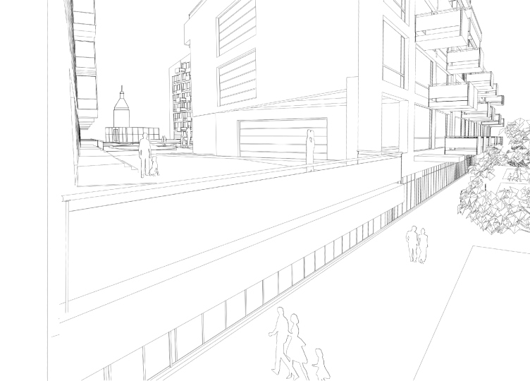
Volume and planning organization of the residential quarter. Concept of a multifunctional residential complex with objects of social infrastructure © Ostozhenka


Naturally, some might wonder: well, what about the facades? We have not yet heard a single word of them. The architects deliberately concentrated on the volume and planning solutions so as to showcase as accurately as possible the principle of handling such territories that they have come up with. "A facade is a very important category; recently, however, it has been taking more and more independence, and, just like Major Kovalev's nose in the famous novel by Gogol, it seems to exist and function quite independently now. What we ultimately got was buildings of a very complex shape, with numerous angles, facets, caves and protrusions, and we, of course, came up with a version of outward decoration but it isn't by any means obligatory. Maybe in some twenty or thirty years the facades will become changeable like the clothes that we wear" - says the leader of "Ostozhenka" Alexander Skokan. 

The nucleus of this whole project is not its plastics but a chain of carefully elaborated ideas of improving a complex territory that required transformation and preservation at the same time. As is often the case in the situation when the authors find themselves between the devil and the deep blue sea of the customer's square footage requirements and the municipal restrictions, the meanings got shifted here: the landscape and visual analysis, seemingly something secondary and peripheral, came to play the main part and became the very essence of this project; not only did it entail extra work but also changed the perception of the entire end result. And it is all the more remarkable that the outlines of the buildings took on not the chaotic "medieval" tooth-like quality but came out pretty whole and clear, forming together a clear and concise idea. 

The fan of the "rays" - viewing angles - looks like the sun, the way Mayakovsky would draw it on his posters. Well, what can you say here? The masters of avant-garde also gave to the world a lot of interesting ideas, some of them people started appreciating but recently, and some maybe will be appreciated by our descendants. A survey is an important thing to do; sooner or later down the line it will have its effect.
Volume and planning organization of the residential quarter. Concept of a multifunctional residential complex with objects of social infrastructure © Ostozhenka
Master plan of the landscape design. Concept of a multifunctional residential complex with objects of social infrastructure © Ostozhenka
Options of the designed highway. Concept of a multifunctional residential complex with objects of social infrastructure © Ostozhenka
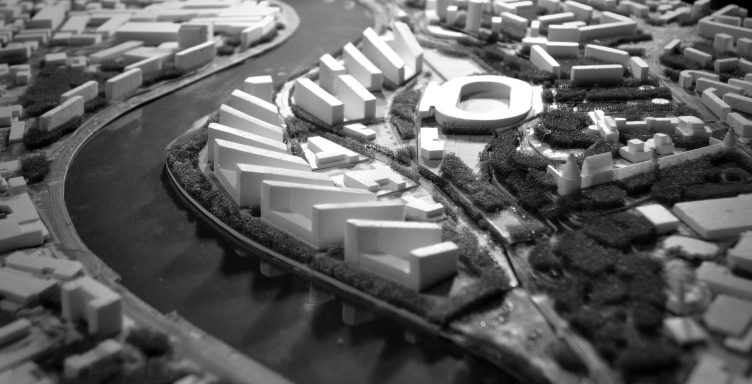
Photo fixation of the model. Top view. Concept of a multifunctional residential complex with objects of social infrastructure © Ostozhenka

27 April 2015

Headlines now
The Golden Crown
The concept for a dental clinic in Yekaterinburg, developed by CNTR Studio, revolves around the idea of a “mouth full of gold”: pristine white porcelain stoneware walls are complemented by matte brass details. To avoid an overly literal interpretation, the architects focused on the building’s proportions, skillfully navigating between sunlight requirements and fire safety regulations.
Flexibility and Integration
Not long ago, we covered the project for the fourth phase of the ÁLIA residential complex, designed by APEX. Now, we’ve been shown different fence concepts they developed to enclose the complex’s private courtyards, incorporating a variety of public functions. We believe that the sheer fact that the complex’s architects were involved in such a detail as fencing speaks volumes.
A Step Forward
The HIDE residential complex represents a major milestone for ADM architects and their leaders Andrey Romanov and Ekaterina Kuznetsova in their quest for a fresh high-rise aesthetic – one that is flexible and layered, capable of bringing vibrancy to mass and silhouette while shaping form. Over recent years, this approach has become ADM’s “signature style”, with the golden HIDE tower playing a pivotal role in its evolution. Here, we delve into the project’s story, explore the details of the complex’s design, and uncover its core essence.
Gold in the Sands
A new office for a transcontinental company specializing in resource extraction and processing has opened in Dubai. Designed by T+T Architects, masters of creating spaces that are contemporary, diverse, flexible, and original, this project exemplifies their expertise. On the executive floor, a massive brass-clad partition dominates, while layered textures of compressed earth create a contextually resonant backdrop.
Layers and Levels of Flight
This project goes way back – Reserve Union won this architectural competition at the end of 2011, and the building was completed in 2018, so it’s practically “archival”. However, despite being relatively unknown, the building can hardly be considered “dated” and remains a prime example of architectural expression, particularly in the headquarters genre. And it’s especially fitting for an aviation company office. In some ways, it resembles the Aeroflot headquarters at Sheremetyevo but with its own unique identity, following the signature style of Vladimir Plotkin. In this article, we take an in-depth look at the United Aircraft Corporation (UAC) headquarters in the Moscow agglomeration town of Zhukovsky, supplemented by recent photographs from Alexey Naroditsky – a shoot that became only recently possible due to the fact that improvements were finally made in the surrounding area.
Light and Shadow
In this article, we delve into the architectural design of the “Chaika” house by DNK ag architects, which was recently completed in 2023 as part of the collection of signature designs at ZILArt. As is well-known, all the buildings in this complex follow a design code, yet each one is distinct. This particular building stands out not only for its whiteness and minimalism but also for the refined use of a limited number of techniques that, together, create what can confidently be called synergy.
Casus Novae
A master plan was developed for a large residential area with a name of “DNS City”, but now that its implementation began, the plan has been arbitrarily reformatted and replaced with something that, while similar on the surface, is actually quite different. This is not the first time such a thing happens, but it’s always frustrating. With permission from the author, we are sharing Maria Elkina’s post.
Treasure Hunting
The GAFA bureau, in collaboration with Tegola and Arkhitail, organized an expedition to the island of Kilpola in Karelia as part of Moskomarkhitektura’s “Open City” festival. There, amidst moss and rocks, the students sought answers to questions like: what is the sacred, where does it dwell, and what sustains it? Assisting the participants in this quest were landscape engineer Evgeny Levin, artist Nicholas Roerich, a moose, and the lack of cellular connection. Here’s how the story unfolded.
Depths of the Earth, Streams of Water
In the Malaya Okhta district, the Akzent building, designed by Stepan Liphart, was constructed. It follows a classic tripartite structure, yet it’s what you might call “hand-drawn”: each façade is unique in its form and details, some of which aren’t immediately noticeable. In this article, we explore the context and, together with the architect, delve into how the form was developed.
Fir Tree Dynamics
The “Airports of Region” holding is planning to build an airport in Karachay-Cherkessia, aiming to make the Arkhyz and Dombay resorts more accessible to travelers. The project that won in an invitation-only competition, submitted by Sergey Nikeshkin’s KPLN, blends natural imagery inspired by the shape of a conifer seed, open-air waiting spaces, majestic large trees, and a green roof elevated on needle-like columns. The result is both nature-inspired and WOW.
​A Brick Shell
In the process of designing a clubhouse situated among pine trees in a prestigious suburban area near Moscow, the architectural firm “A.Len” did the façade design part. The combination of different types of brick and masonry correlates with the volumetric and plastique solutions, further enhanced by the inclusion of wood-painted fragments and metal “glazing”.
Word Forms
ATRIUM architects love ambitious challenges, and for the firm’s thirtieth anniversary, they boldly play a game of words with an exhibition that dives deep into a self-created vocabulary. They immerse their projects – especially art installations – into this glossary, as if plunging into a current of their own. You feel as if you’re flowing through the veins of pure art, immersed in a universe of vertical cities, educational spaces – of which the architects are true masters – and the cultural codes of various locations. But what truly captivates is the bold statement that Vera Butko and Anton Nadtochy make, both through their work and this exhibition: architecture, above all, is art – the art of working with form and space.
Flexibility and Acuteness of Modernity
Luxurious, fluid, large “kokoshniks” and spiral barrel columns, as if made from colorful chewing gum: there seem to be no other mansion like this in Moscow, designed in the “Neo-Russian-Modern” style. And the “Teremok” on Malaya Kaluzhskaya, previously somewhat obscure, has “come alive with new colors” and gained visibility after its restoration for the office of the “architectural ecosystem” as the architects love to call themselves. It’s evident that Julius Borisov and the architects at UNK put their hearts into finding this new office and bringing it up to date. Let’s delve into the paradoxes of this mansion’s history and its plasticity. Spoiler: two versions of modernity meet here, both balancing on the razor’s edge of “what’s current”.
Yuri Vissarionov: “A modular house does not belong to the land”
It belongs to space, or to the air... It turns out that 3D printing is more effective when combined with a modular approach: the house is built in a workshop and then adapted to the site, including on uneven terrain. Yuri Vissarionov shares his latest experience in designing tourist complexes, both in central Russia and in the south. These include houseboats, homes printed from lightweight concrete using a 3D printer, and, of course, frame houses.
​Moscow’s First
“The quality of education largely depends on the quality of the educational environment”. This principle of the last decade has been realized by Sergey Skuratov in the project for the First Moscow Gymnasium on Rostovskaya Embankment in the Khamovniki district. The building seamlessly integrates into the complex urban landscape, responding both to the pedestrian flow of the city and the quiet alleyways. It skillfully takes advantage of the height differences and aligns with modern trends in educational space design. Let’s take a closer look.
Looking at the Water
The site of Villa Sonata stretches from the road to the water’s edge, offering its own shoreline, pier, and a picturesque river panorama. To reveal these sweeping views, Roman Leonidov “cut” the façade diagonally parallel to the river, thus getting two main axes for the house and, consequently, “two heads”. The internal core – two double-height spaces, a living room and a conservatory, with a “bridge” above them – makes the house both “transparent” and filled with light.
The White Wing
Well, it’s not exactly white. It’s more of a beige, white-stone structure that plays with the color of limestone – smoother surfaces are lighter, while rougher ones are darker. This wing unites various elements: it absorbs and interprets the surrounding themes. It responds to everything, yet maintains a cohesive expression – a challenging task! – while also incorporating recognizable features of its own, such as the dynamic cuts at the bottom, top, and middle.
Urban Dunes
The XSA Ramps team designed and built a three-part sports hub for a park in Rostov-on-Don, welcoming people of all ages and fitness levels. The skate plaza, pump track, and playground are all meticulously crafted with details that attract a diverse range of visitors. The technical execution of the shapes and slopes transforms this space into a kind of sculptural composition.
Proportional Growth
The project for the fourth phase of the ÁLIA residential area has been announced. The buildings are situated on an elongated plot – almost a “ray” that shoots out from the center of the area towards the river. Their layout reflects both a response to Moscow’s architectural preferences over the past 15 years, shifting “from blocks to towers”, and an interpretation of the neighboring business park designed by SOM. Additionally, the best apartments here are not located at the very top but closer to the middle, forming a glowing “waistline”.
The “Staircase” Building
In designing the “Details” residential complex in New Moscow, Rais Baishev spiced up the now-popular Moscow theme of a “courtyard” building with an idea drawn from the surrealist drawings by Maurits Escher. He envisioned the stepped silhouettes and descending slopes as a metaphysical mega-staircase, creating a key void within the courtyard that gave the project an internal “spine”. This concept is felt both in the building’s silhouette and on its façades.
Projection of the Quarter
No one doubted that the building that Vladimir Plotkin designed as part of the “Garden Quarters” would be the most modernist of all. And it turned out just that way: while adhering to the common design code, the building successfully combines brick and white stone, rhythmically responding to the neighboring building designed by Ostozhenka, yet tactfully and persistently making a few statements of its own. This includes the projection of the ideal urban development composition “14–9–6”, which can be found right next door, mathematical calculations, including those for various types of terraces (and perhaps the only reminder of the Soviet past of the Kauchuk rubber factory!), and the white “cross-stitch” pattern of the façade grid.
Domus Aurea
In this issue, we examine the “Tessinsky-1” house, designed by Sergey Skuratov and completed in 2023. Located in the middle of the Serebryanicheskaya Embankment district, at the intersection of its main streets, this house assumes a sort of “nodal” role: it not only responds to everything around it and preserves many memories of the former EMA factory within itself, but it weaves all this into a newly directed pattern, reconciling bright “gold” and dark-colored brick, largely with the help of the new, modern-yet-archaic Columba brick, which, come to think about it, is the most precious element here.
The Chimney of Nikola-Lenivets
In this issue, we are examining the “Obelisk House” designed by KATARSIS and built for the Arkhstoyanie 2023 festival. However, it was only finished later on, and this is why we are examining it now. It seems to us that after the “Obelisk House” appeared in Nikola-Lenivets, a dialogue and a few inner connections appeared between the temporary structures built here. These houses no longer look like “accidental neighbors”, more of which below.
​Periscope by the Bay
The jury awarded the second place in the competition for a public and cultural center in Petropavlovsk-Kamchatsky to the companies GORA (“Mountain”) and M4. In the consortium’s proposal, the building resembles a sperm whale with a calf swimming next to it or a periscope, whose lenses capture the most spectacular views from the surrounding landscape.
From Arcs to Dolmens
While working on the competition project for Petropavlovsk-Kamchatsky, ASADOV Architects prioritized the value of the natural and urban environment, aiming to preserve the balance of the location while minimizing the resemblance of the volume that they designed to a “traditional building”. The task was challenging, and the architects created three versions, one of which having been developed after the competition, where their main proposal took third place. However, the point of interest here is not the competition result but the continuity of creative thinking.
Hide and Seek
The ID Moskovskiy house, designed by Stepan Liphart in St. Petersburg, in the courtyards near Moskovskiy Avenue beyond the Obvodny Canal and recently completed, is notable for several reasons. Firstly, it has been realized with considerable accuracy, which is particularly significant as this is the first building where the architect was responsible not only for the facades but also for the layouts, allowing for better integration between the two. On the other hand, this building is interesting as an example of the “germination” of new architecture in the city: it draws on the best examples from the neighborhood and becomes an improved and developed sum of ideas found by the architect in the surrounding context.
The Big Twelve
Yesterday, the winners of the Moscow Mayor’s Architecture Award were announced and honored. Let’s take a look at what was awarded and, in some cases, even critique this esteemed award. After all, there is always room for improvement, right?
Above the Golden Horn
The residential complex “Philosophy” designed by T+T architects in Vladivostok, is one of the new projects in the “Golubinaya Pad” area, changing its development philosophy (pun intended) from single houses to a comprehensive approach. The buildings are organized along public streets, varying in height and format, with one house even executed in gallery typology, featuring a cantilever leaning on an art object.
Nuanced Alternative
How can you rhyme a square and space? Easily! But to do so, you need to rhyme everything you can possibly think of: weave everything together, like in a tensegrity structure, and find your own optics too. The new exhibition at GES-2 does just that, offering its visitor a new perspective on the history of art spanning 150 years, infused with the hope for endless multiplicity of worlds and art histories. Read on to see how this is achieved and how the exhibition design by Evgeny Ace contributes to it.
Blinds for Ice
An ice arena has been constructed in Domodedovo based on a project by Yuri Vissarionov Architects. To prevent the long façade, a technical requirement for winter sports facilities, from appearing monotonous, the architects proposed the use of suspended structures with multidirectional slats. This design protects the ice from direct sunlight while giving the wall texture and detail.