 |
The architects have been working on this project off and on since 2007 and highly appreciate the experience that they have gained. In particular, they could see for themselves that if working drawings are detailed enough the concept can be actualized rather precisely even without the author supervision. It only took a couple of consultations – and the result was accurate. Besides, some important elements – for example, the wooden frames of the terraces – turned out to be thin and light – just according to the concept.
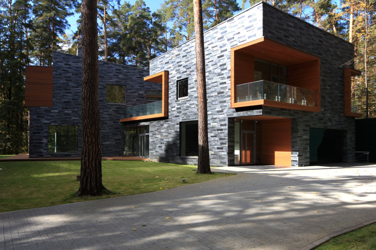
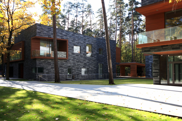
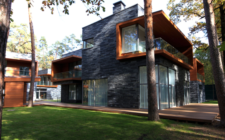
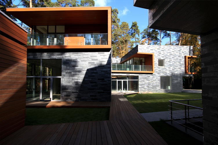
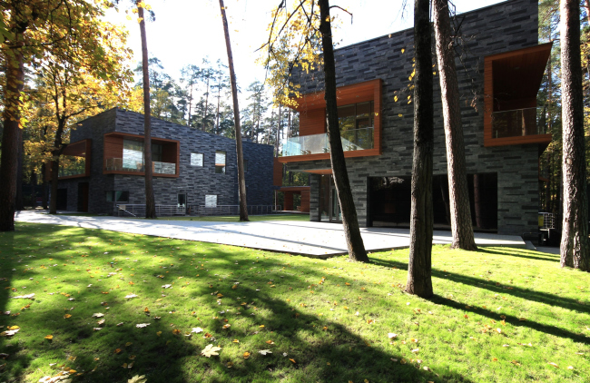
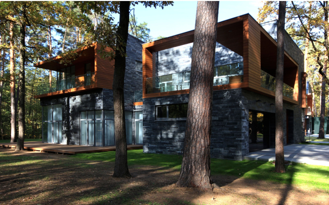
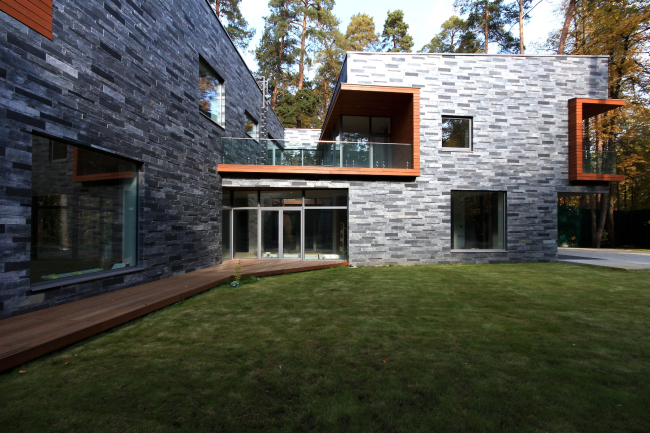
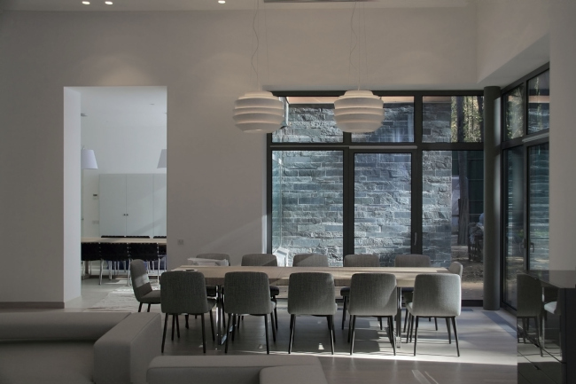
The two volumes are covered with dark scratchy slate plasterwork, with their windows facing the woodland. Being placed closely to each other they form some room between them for the yard – as a result, it is a well-laid-out, coherent ensemble, both natural and urban, a modern choice for a “garden-city”. Plus the stone texture of the facades is contractedly underlined by the blight whiteness of the interior space (the architects have also worked with the interior of one of the houses).
We talked about these houses with one the chief architects of DNK agency, Nataliya Sidorova
 |
Archi.ru:
- What is the key-point of this project?
Natalia Sidorova:
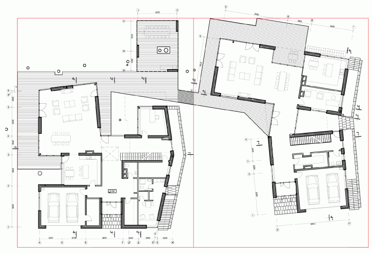
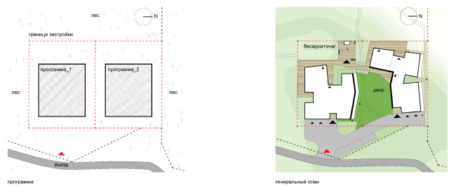
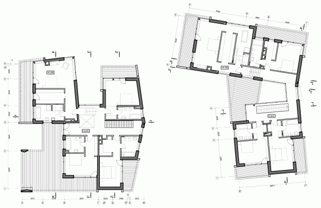
- Our task was to build two houses for two brothers on two adjacent lots surrounded by forest. The necessary function program was to almost fully cover up the land meant for building. That is why one of the main tasks was to settle the space issue coming from the almost urban development connected with preserving all the advantages of country life.
 |
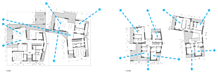
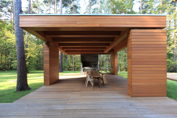
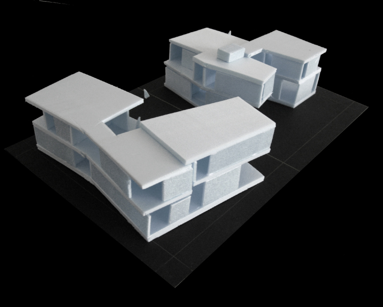
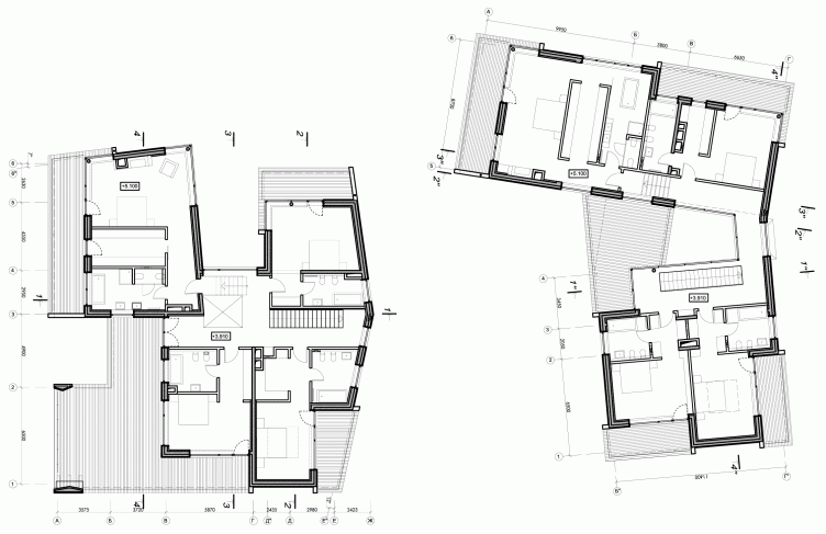
During the modeling process we’ve developed a structure of houses with non-square, seemingly accidental geometry of their layouts. This composition let us answer several questions at one stroke: the windows of all the main buildings face the forest avoiding the walls of neighboring buildings, the similarly programmed and sized houses attained individual plan features. The space between the volumes forms an inner yard with an arbor and barbecue where the whole big family can gather together at the family table.

 |

 |
 |

 |

 |

 |
 |
- Tell us about the facades.
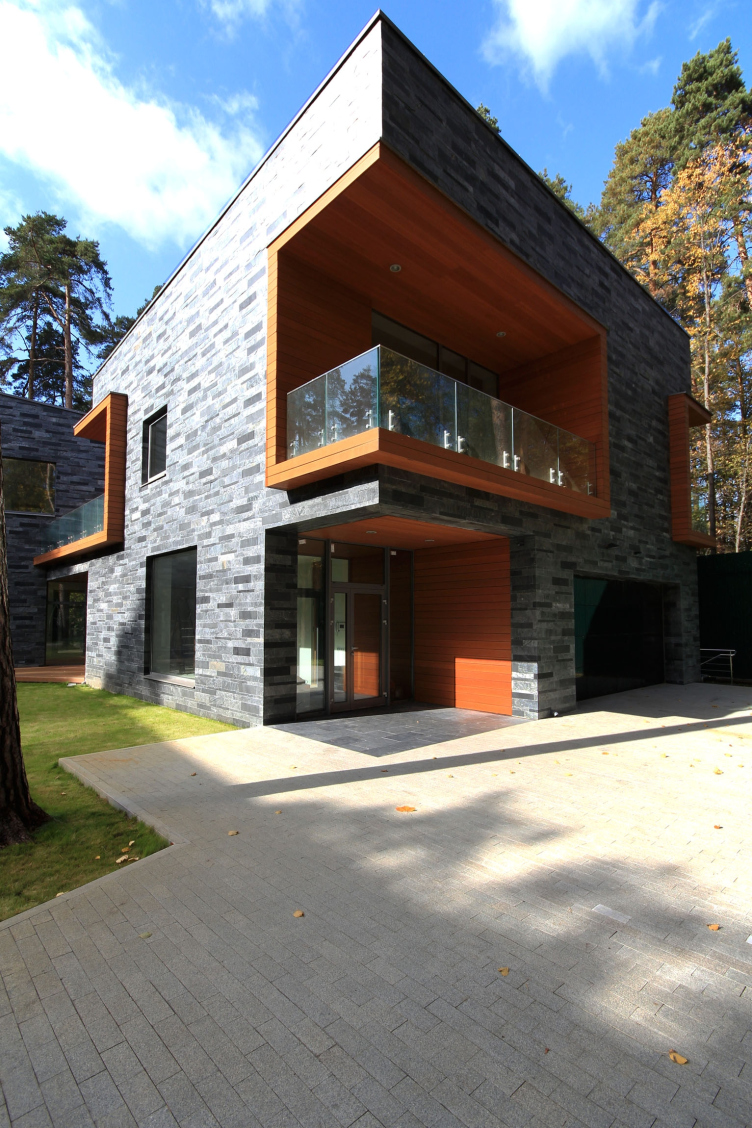
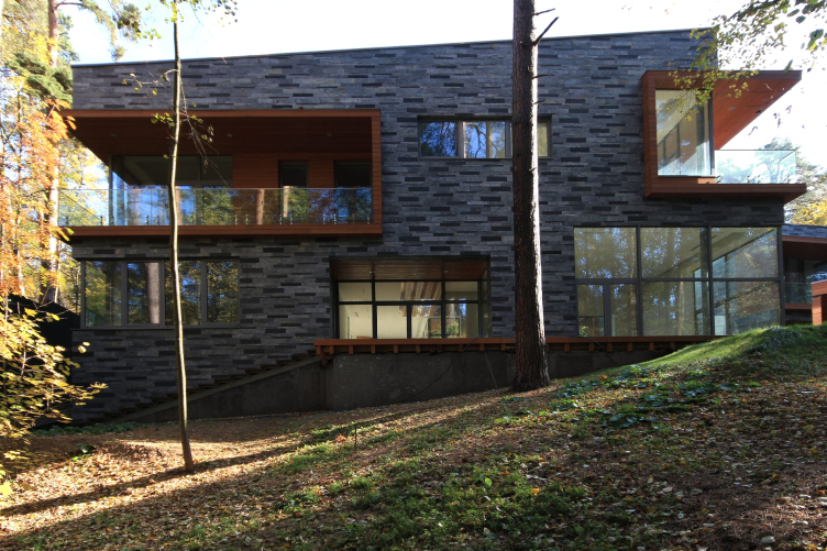
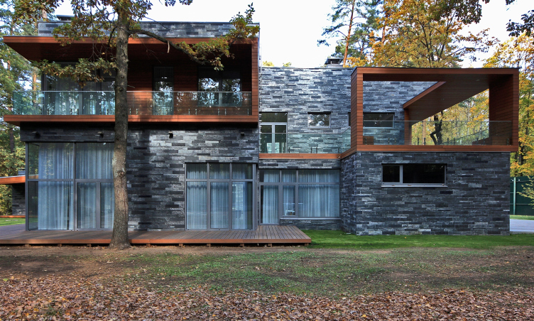
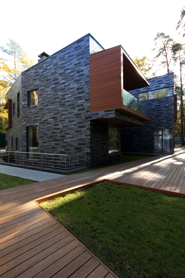
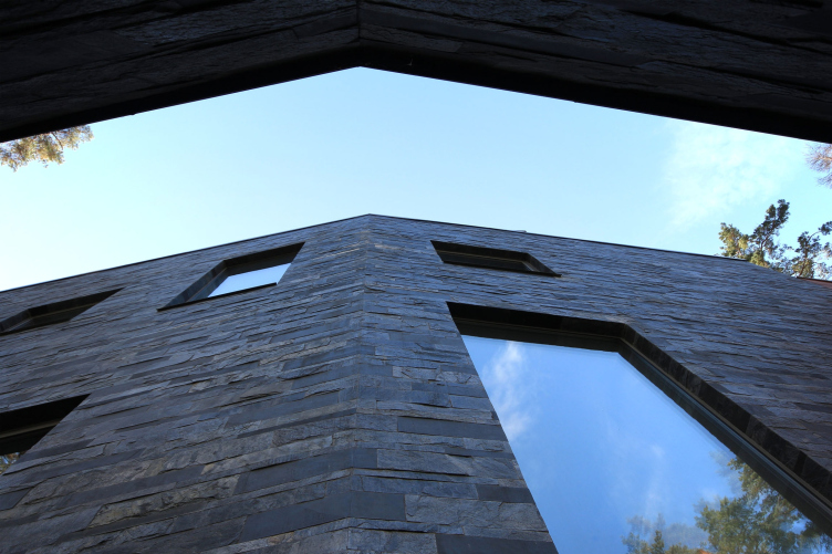
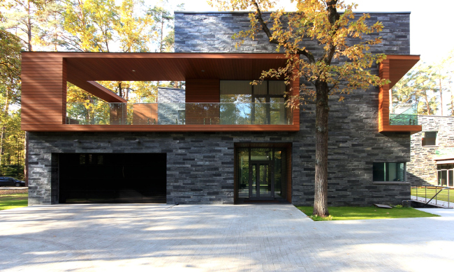
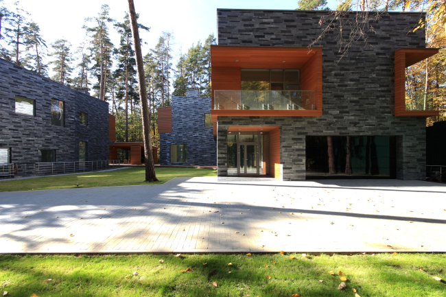
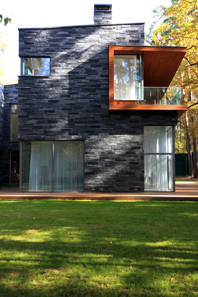
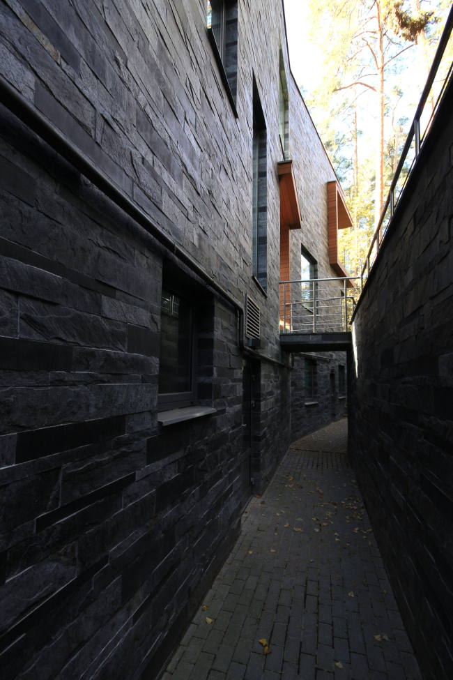
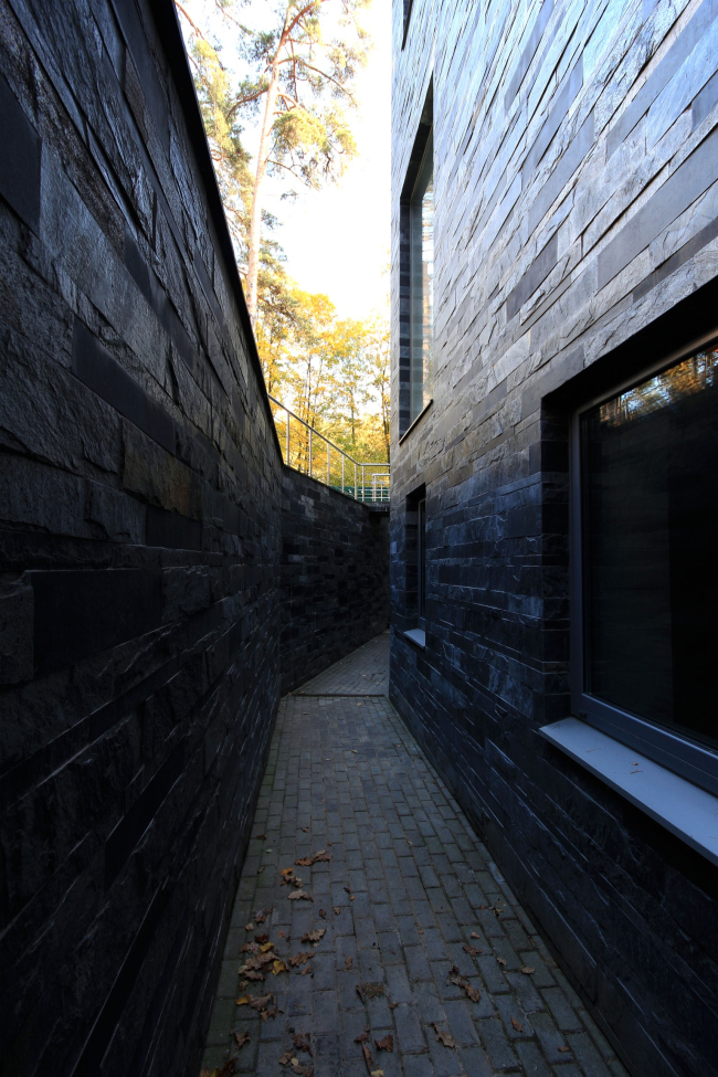
N.S.: All the facades are multicolored, like sculptures; there is no dividing them into main and subordinate ones. Thereby we have not only a spatial but also complete and extensional composition. At the same time each façade has a “personality” of its own, dictated by the planning pattern of the houses. They are finished with lines of two types of slate: the basic – silvery one and inclusions of dark grey. In the shade the colors differ in subtly, but the contrast intensifies in the sunlight: the silvery stone shines slightly due to its metallized smooth surface and the dark stone is matted and more rugged.
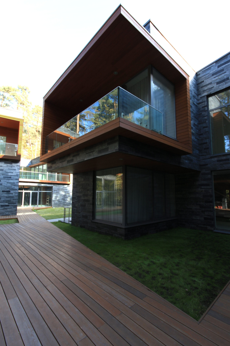
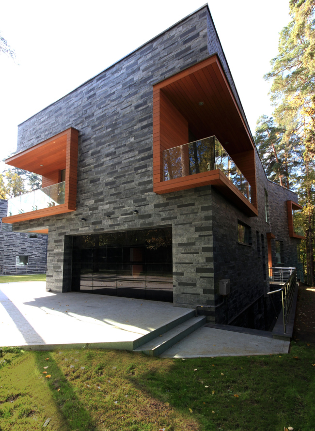
When it came to ordering the façade materials the client started doubting the dark color of the stone and said he wanted the finishing to be more traditional, light. It was essential for the whole concept and fortunately we could persuade him to choose the dark-grey slate and save the intended mood. Contrasting with the wall materials in color and its nature the balconies and terraces are finished with warm bright wood – aged larch.

 |
 |

 |

 |

 |
 |
 |
 |

 |
The "brutalist" brickwork and the non-square geometry of the walls – both on plan and on the facades – together with the irregular chamber spaces adds a lively modern and, at the same time, almost medieval character to the houses.
- Which engineering solutions that you proposed were a particular success, do you think?
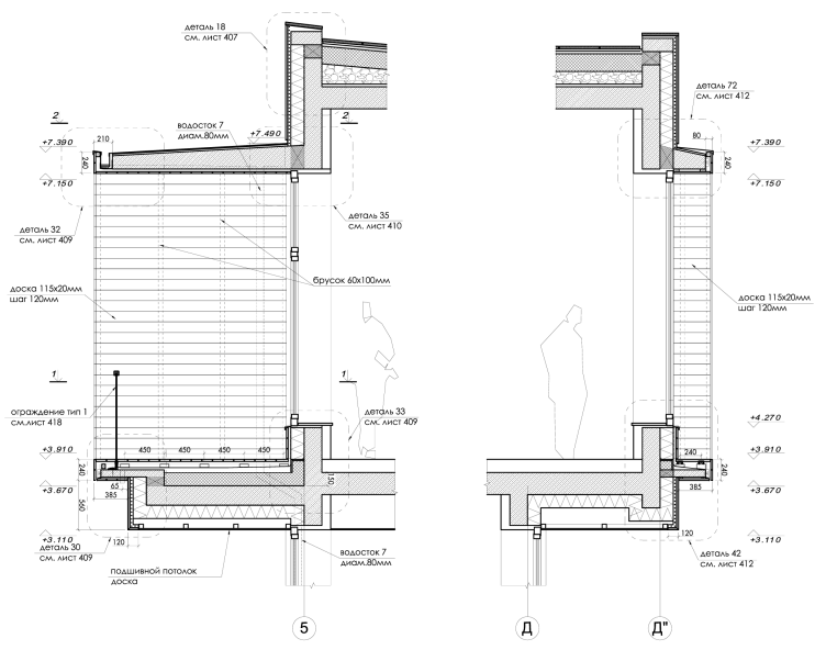
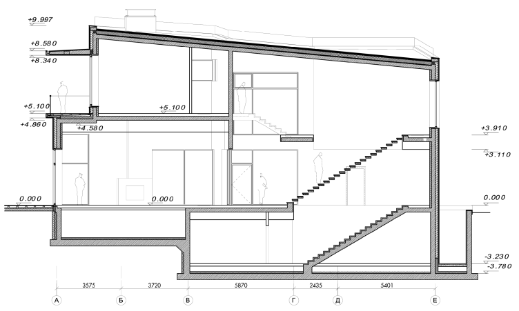
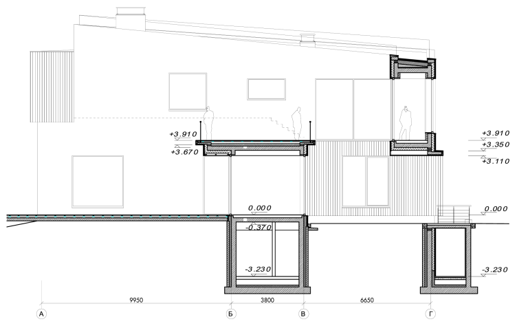
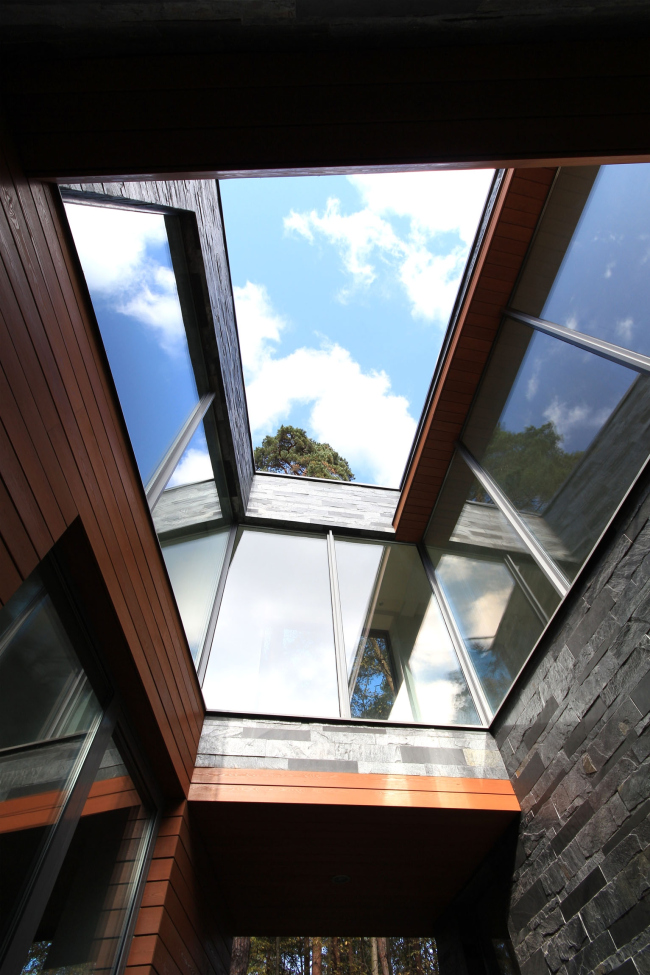
N.S.: The slightly overhung wooden framings of the niches and terraces scattered about the house have become a rather characteristic element. Plus, a shallow thickness of the frames was very important for the character of the “line”. That is why we chose a monolith construction for these console elements and fixed it to the main, also monolith, framework with a thermo-connector. It let us do without the winterizing and achieve the necessary width together with the finishing.
The construction went on with minimum author supervision. The project had been executed in detail and with the good organization and the client’s good will to make a house according to the plan, the monitoring was almost unnecessary. As a result, the houses do fully match the project. There was only a slight adaptation of the railing design during the construction.

 |
 |
Deep window-wells are made along one of the facades in each house for illuminating the basement entrance. The facades and breastwalls are made fully of slate – it creates an impression of a house grown out of a rock or, on the contrary, grown into a cultural layer of a fragment of an ancient building.
 |
 |
- Did you do all the interiors?
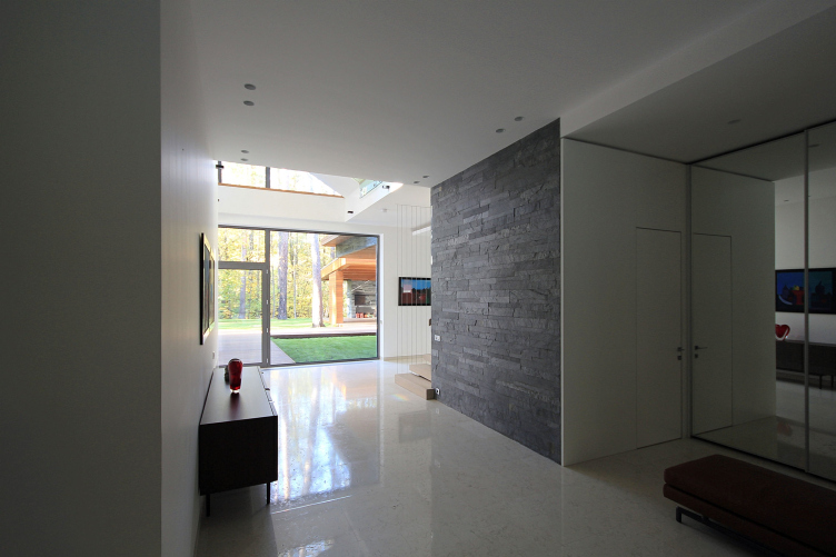
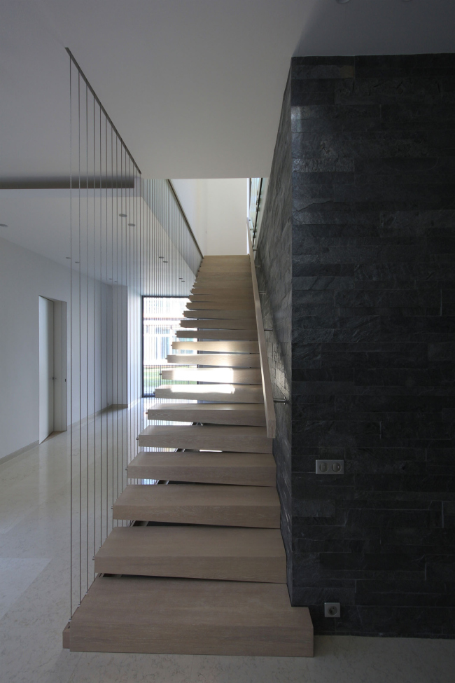
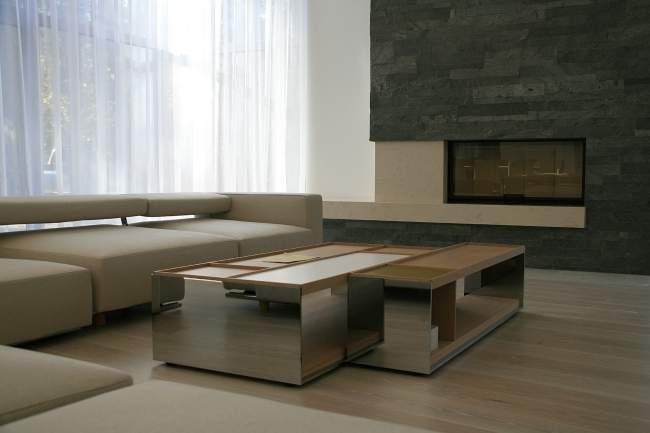
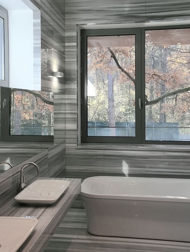
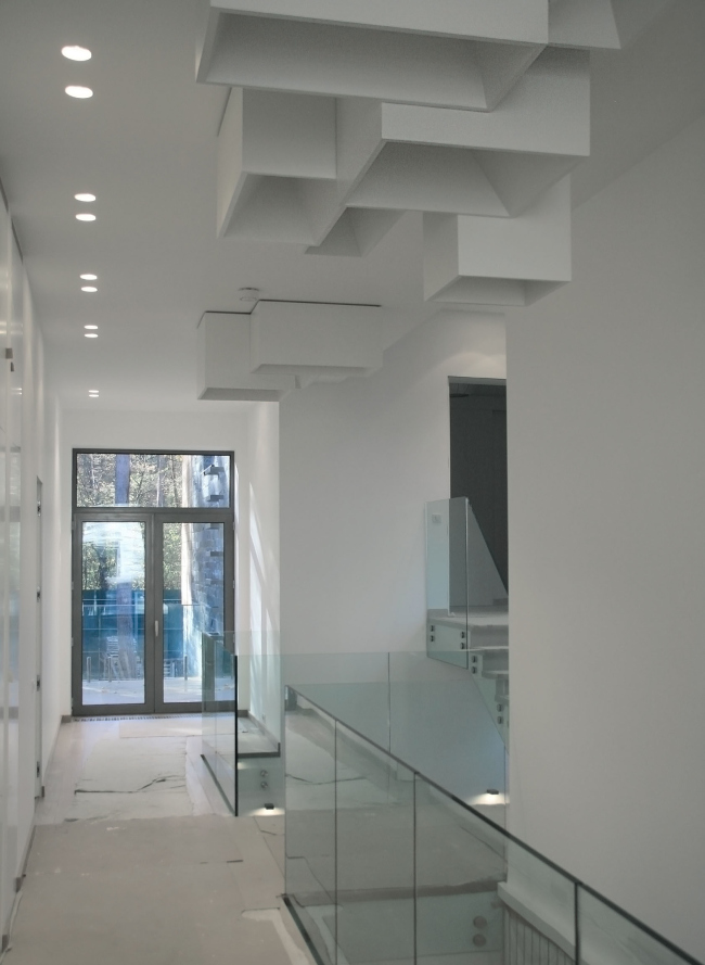
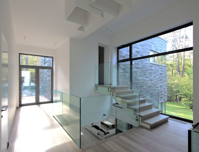
N.S.: We have designed an interior of one of the houses. It is made in the same minimalistic, calm style as the façade and is based on a natural color range and genuine materials. Contrasting with the façade the interior is dominated by light colors and only the central core with the console staircase is marked out by the same dark-grey slate of the façade.

 |
 |
 |
 |
 |
 |

 |

 |
 |

 |

 |


