По-русски

Caroline Bos: We, architects, could do more than we think

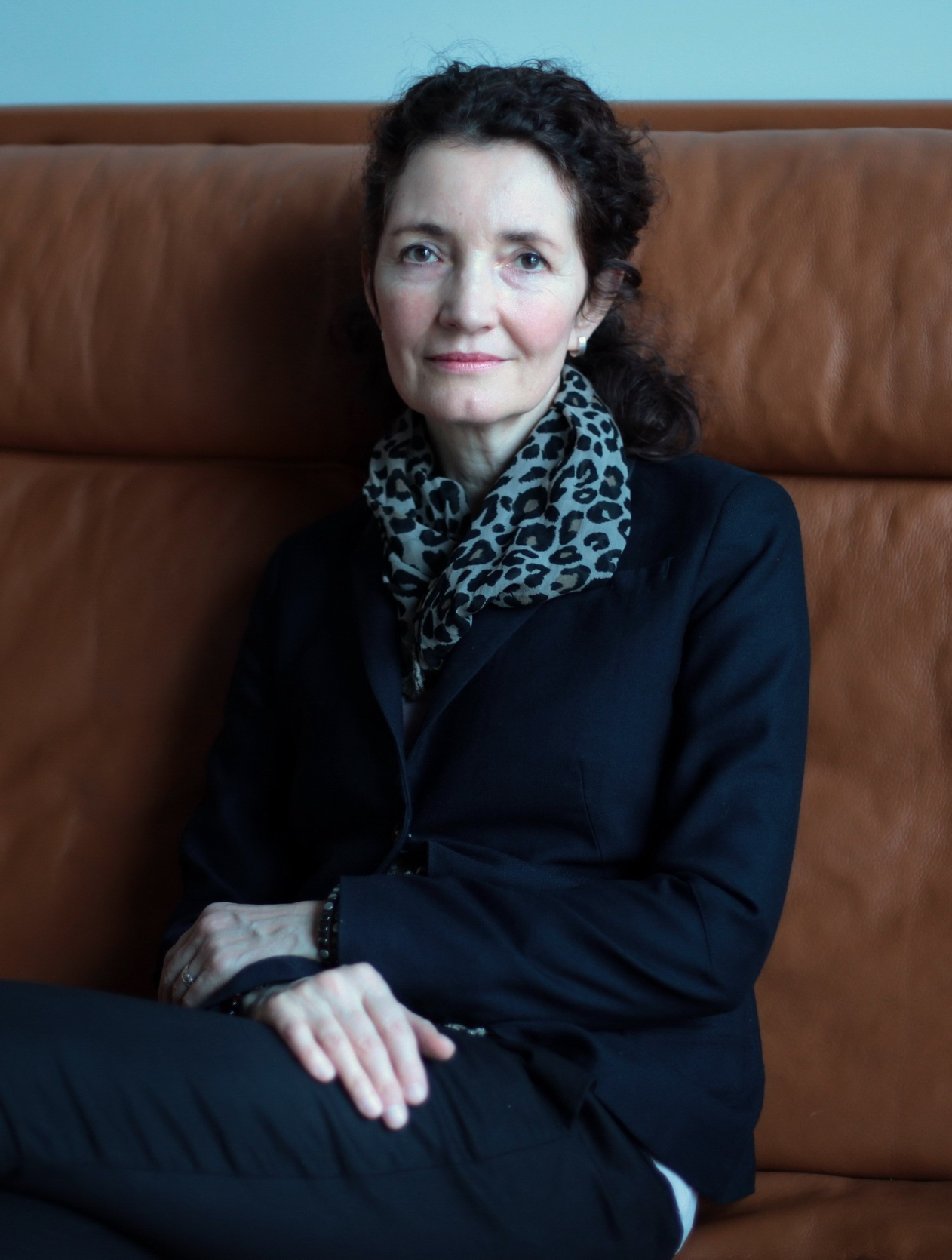
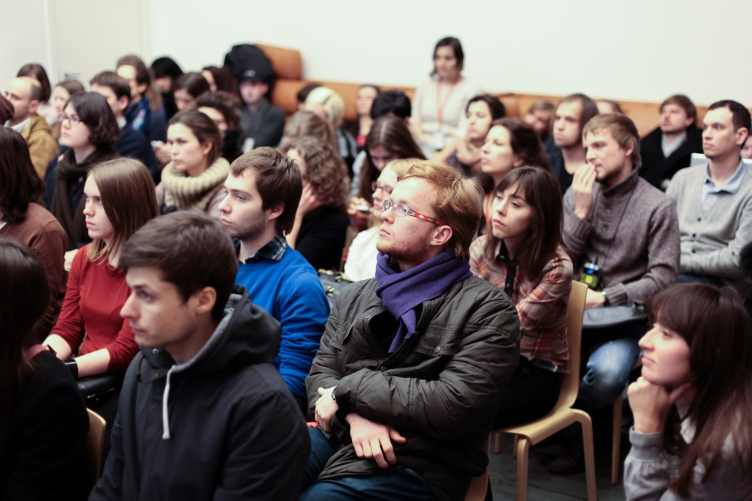
UNStudio co-founder Caroline Bos visited Moscow where she gave a lecture to the students of the Strelka institute and discussed architecture education and practice with Archi.ru

25 March 2013
Interview
mainImg
Archi.ru:
You have an extensive background of an educator. Has the educational environment itself changed over the course of your career? What is your prognosis for the near future?

Caroline Bos:
It is changing a lot all the time and there are so many different ways of architectural education. But there are two main systems that exist perennially to each other. We have technical universities and academies and then there are top universities where people can get a more advanced degree – some in the United States (Columbia University, Harvard) and maybe the Architecture Association in London. I think that the latter type is a bit more flexible, they can change the program and they always maintain a relationship with the practice by having guest professors that also practice. The technical universities and academies are often less flexible, as they have to be very careful so that they don’t completely lose the relationship with the practice because it’s very easy for that to happen — and this would be a very bad thing especially today because there is so much change in the world and today you have to practice to survive as an architect. So the biggest challenge for an educator is keeping up with how much the practice is now changing.

Archi.ru:
How would you describe your teaching method? Has it also changed with time?

Caroline Bos:
Yes, it has — a lot. For instance, 8 years ago I was teaching at Princeton and the focus was very much on organization: how do we organize the program, content, circulation, construction into an effective package. And now the focus is moving a little bit away from design per se: we have to think about the problems that architecture is faced with in a way that is not only project-related anymore. Of course, students still need to learn to design but they also need to learn to think far more about the real problems that we encounter in architecture and also about the technology that is needed to realize buildings today.

Archi.ru:
The research activity seems now to be crucial for any architecture practice. How could educators prepare their students for this task? I suppose it’s impossible to teach them economy, sociology, psychology and so on simultaneously to teaching them to design.

Caroline Bos:
Yes, it’s impossible to teach everything especially because knowledge is always changing, but we have to teach students to learn, to think, to innovate. They should learn the methodologies of thinking, analyzing how to approach design, so that they can practice for their whole working life.

Archi.ru:
Are the students prepared to start their own practice when they get their degree?

Caroline Bos:
At the moment a small practice is very difficult to maintain. Practices are getting bigger, and small practices are very much under pressure. So I don’t think students are ready to practice on their own when they finish their studies: if they do their practice will always stay a very small firm with very small projects. I would recommend in the current climate to do some time at a large practice in order to gain more experience and also because it is there that more interesting work is taking place.

Archi.ru:
So the research, the learning are central to the practice now. And how is the research activity organized at your practice?

Caroline Bos:
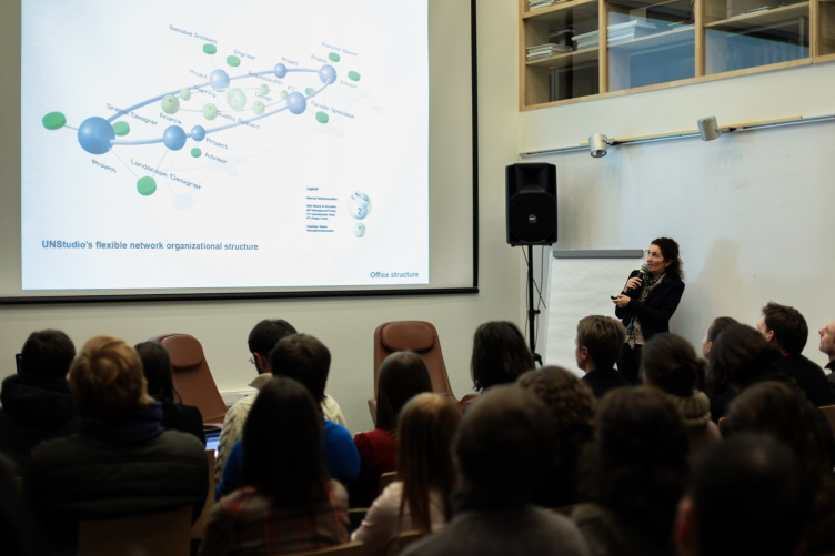
We have 4 knowledge platforms and everyone in our practice is also involved in knowledge development. This is completely integrated with the projects, so all knowledge is practice-related and it far more constitutes the core of the practice than design or the project itself. It is really about highly specific knowledge that is developed to make a project possible. A lot of architects experience difficulties when the construction of their building starts: all sorts of problems turn up — the budget is insufficient, or it turns out that there are technical problems, or there are regulation problems that put pressure on the design. And then you have to find ways to accommodate that and to solve those problems in a way that still keeps your design strong – and that is something that many architects never learn to master. They can’t work with restrictions and this just leads to compromise, or to frustration, or to an increase in the budget. But we can also learn to work in much smarter ways throughout the whole process, to be flexible, adaptable and also learn where you can make changes and where you can not make changes. Also how what we’re really talking about is how facades are constructed and so on. There is a lot of knowledge (often specialized technical knowledge) that we have gained through the series of projects and that has made it much easier for us now to keep being innovative and experimental with our practice within reasonable budgets and with short time limits also.

Archi.ru:
It is very interesting to know because architects are often complaining about all these things but rarely propose any solution.

Caroline Bos:
Yes, but we had to practice a lot to learn these lessons, we had to build a lot to learn these things.

Archi.ru:
You have built a lot and in various countries around the world, and you have taught at the universities in various countries. The profession becomes increasingly more global now. How could one adapt to this new situation, because as far as I understand it is difficult to work in one country in the known circumstances but to work internationally is much more difficult.

Caroline Bos:
Yes, it is not easy, but it is also very interesting. It is something that we find enjoyable because it would be boring to always work within your limits, within your own expectations. It’s good to push yourself and to keep learning, to be forced to innovate, be forced to learn. If we stay too much within our comfort zone we will get stuck and we will not produce anything interesting. It is a part of the culture of architecture to push itself forward.

Archi.ru:
So globalization is a good thing from your point of view?

Caroline Bos:
Yes, I think that it is a very good thing, and also healthy. I have learned how much we all have in common — globalization is also about that. When I work with colleagues in China or here or in Korea or in Italy we have a common language: it is our profession and we have a common goal and it’s very great to experience that. And I think that in the future it will be very important: we are going to have to solve together the real problems of our world. It has to do with all the crises that we are dealing with, the - most of all - environmental crisis. So I think it is very important to learn to discuss, to exchange, to collaborate.

Archi.ru:
What is the main challenge for an architect today?

Caroline Bos:
The main challenge is absolutely the sustainability challenge. We have to stop wasting resources, we have to build constructions that have more longevity, that can last longer and are adaptable and flexible, instead of buildings that have to be put up and taken down again because of any need for change. We have to think about making buildings more accommodating to the future and think of ways that lead to healthier life for people and the environment, a better future.

Archi.ru:
But not everything could be changed by the good intentions of an architect. There are also politicians, businessmen. How powerful is the influence of an architect now?

Caroline Bos:
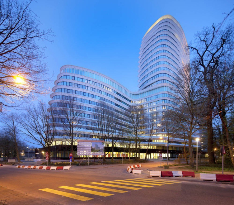
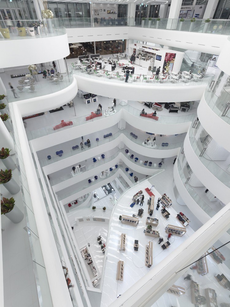
I think that we could do more than we think. We have done some projects where we also analyzed stakeholder relations and we came up with insights that really changed the perception of what that project would be. For instance, in Asia we have done a few department stores that really are about the public space inside: a more cultural, dynamic experience was created with the result that it’s more like being in a museum. And these things have been possible because we imagined and visualized it and it became interesting to a client. So, as you say, you can complain and think “well, the client doesn’t allow me this or that” but you can also make a proposal and first take an initiative yourself to put forward your vision and then the reality can follow.

Archi.ru:
You have a degree in art history – how has that enriched your practice as an architect? How important is this discipline for architecture students?

Caroline Bos:
I think that it is very important to know history: it is a living instrument, it’s really a tool that you can use as an architect. And this is also about a more analytical, thoughtful approach. I have already talked about the relationship between theory and practice but it goes both ways. Theory should not be taught in universities in a dry way — reading books and making summaries and taking an exam, but it should really be theory of practice. That I think is the most interesting topic in architecture.
zooming


25 March 2013

Headlines now
A Step Forward
The HIDE residential complex represents a major milestone for ADM architects and their leaders Andrey Romanov and Ekaterina Kuznetsova in their quest for a fresh high-rise aesthetic – one that is flexible and layered, capable of bringing vibrancy to mass and silhouette while shaping form. Over recent years, this approach has become ADM’s “signature style”, with the golden HIDE tower playing a pivotal role in its evolution. Here, we delve into the project’s story, explore the details of the complex’s design, and uncover its core essence.
Gold in the Sands
A new office for a transcontinental company specializing in resource extraction and processing has opened in Dubai. Designed by T+T Architects, masters of creating spaces that are contemporary, diverse, flexible, and original, this project exemplifies their expertise. On the executive floor, a massive brass-clad partition dominates, while layered textures of compressed earth create a contextually resonant backdrop.
Layers and Levels of Flight
This project goes way back – Reserve Union won this architectural competition at the end of 2011, and the building was completed in 2018, so it’s practically “archival”. However, despite being relatively unknown, the building can hardly be considered “dated” and remains a prime example of architectural expression, particularly in the headquarters genre. And it’s especially fitting for an aviation company office. In some ways, it resembles the Aeroflot headquarters at Sheremetyevo but with its own unique identity, following the signature style of Vladimir Plotkin. In this article, we take an in-depth look at the United Aircraft Corporation (UAC) headquarters in the Moscow agglomeration town of Zhukovsky, supplemented by recent photographs from Alexey Naroditsky – a shoot that became only recently possible due to the fact that improvements were finally made in the surrounding area.
Light and Shadow
In this article, we delve into the architectural design of the “Chaika” house by DNK ag architects, which was recently completed in 2023 as part of the collection of signature designs at ZILArt. As is well-known, all the buildings in this complex follow a design code, yet each one is distinct. This particular building stands out not only for its whiteness and minimalism but also for the refined use of a limited number of techniques that, together, create what can confidently be called synergy.
Casus Novae
A master plan was developed for a large residential area with a name of “DNS City”, but now that its implementation began, the plan has been arbitrarily reformatted and replaced with something that, while similar on the surface, is actually quite different. This is not the first time such a thing happens, but it’s always frustrating. With permission from the author, we are sharing Maria Elkina’s post.
Treasure Hunting
The GAFA bureau, in collaboration with Tegola and Arkhitail, organized an expedition to the island of Kilpola in Karelia as part of Moskomarkhitektura’s “Open City” festival. There, amidst moss and rocks, the students sought answers to questions like: what is the sacred, where does it dwell, and what sustains it? Assisting the participants in this quest were landscape engineer Evgeny Levin, artist Nicholas Roerich, a moose, and the lack of cellular connection. Here’s how the story unfolded.
Depths of the Earth, Streams of Water
In the Malaya Okhta district, the Akzent building, designed by Stepan Liphart, was constructed. It follows a classic tripartite structure, yet it’s what you might call “hand-drawn”: each façade is unique in its form and details, some of which aren’t immediately noticeable. In this article, we explore the context and, together with the architect, delve into how the form was developed.
Fir Tree Dynamics
The “Airports of Region” holding is planning to build an airport in Karachay-Cherkessia, aiming to make the Arkhyz and Dombay resorts more accessible to travelers. The project that won in an invitation-only competition, submitted by Sergey Nikeshkin’s KPLN, blends natural imagery inspired by the shape of a conifer seed, open-air waiting spaces, majestic large trees, and a green roof elevated on needle-like columns. The result is both nature-inspired and WOW.
​A Brick Shell
In the process of designing a clubhouse situated among pine trees in a prestigious suburban area near Moscow, the architectural firm “A.Len” did the façade design part. The combination of different types of brick and masonry correlates with the volumetric and plastique solutions, further enhanced by the inclusion of wood-painted fragments and metal “glazing”.
Word Forms
ATRIUM architects love ambitious challenges, and for the firm’s thirtieth anniversary, they boldly play a game of words with an exhibition that dives deep into a self-created vocabulary. They immerse their projects – especially art installations – into this glossary, as if plunging into a current of their own. You feel as if you’re flowing through the veins of pure art, immersed in a universe of vertical cities, educational spaces – of which the architects are true masters – and the cultural codes of various locations. But what truly captivates is the bold statement that Vera Butko and Anton Nadtochy make, both through their work and this exhibition: architecture, above all, is art – the art of working with form and space.
Flexibility and Acuteness of Modernity
Luxurious, fluid, large “kokoshniks” and spiral barrel columns, as if made from colorful chewing gum: there seem to be no other mansion like this in Moscow, designed in the “Neo-Russian-Modern” style. And the “Teremok” on Malaya Kaluzhskaya, previously somewhat obscure, has “come alive with new colors” and gained visibility after its restoration for the office of the “architectural ecosystem” as the architects love to call themselves. It’s evident that Julius Borisov and the architects at UNK put their hearts into finding this new office and bringing it up to date. Let’s delve into the paradoxes of this mansion’s history and its plasticity. Spoiler: two versions of modernity meet here, both balancing on the razor’s edge of “what’s current”.
Yuri Vissarionov: “A modular house does not belong to the land”
It belongs to space, or to the air... It turns out that 3D printing is more effective when combined with a modular approach: the house is built in a workshop and then adapted to the site, including on uneven terrain. Yuri Vissarionov shares his latest experience in designing tourist complexes, both in central Russia and in the south. These include houseboats, homes printed from lightweight concrete using a 3D printer, and, of course, frame houses.
​Moscow’s First
“The quality of education largely depends on the quality of the educational environment”. This principle of the last decade has been realized by Sergey Skuratov in the project for the First Moscow Gymnasium on Rostovskaya Embankment in the Khamovniki district. The building seamlessly integrates into the complex urban landscape, responding both to the pedestrian flow of the city and the quiet alleyways. It skillfully takes advantage of the height differences and aligns with modern trends in educational space design. Let’s take a closer look.
Looking at the Water
The site of Villa Sonata stretches from the road to the water’s edge, offering its own shoreline, pier, and a picturesque river panorama. To reveal these sweeping views, Roman Leonidov “cut” the façade diagonally parallel to the river, thus getting two main axes for the house and, consequently, “two heads”. The internal core – two double-height spaces, a living room and a conservatory, with a “bridge” above them – makes the house both “transparent” and filled with light.
The White Wing
Well, it’s not exactly white. It’s more of a beige, white-stone structure that plays with the color of limestone – smoother surfaces are lighter, while rougher ones are darker. This wing unites various elements: it absorbs and interprets the surrounding themes. It responds to everything, yet maintains a cohesive expression – a challenging task! – while also incorporating recognizable features of its own, such as the dynamic cuts at the bottom, top, and middle.
Urban Dunes
The XSA Ramps team designed and built a three-part sports hub for a park in Rostov-on-Don, welcoming people of all ages and fitness levels. The skate plaza, pump track, and playground are all meticulously crafted with details that attract a diverse range of visitors. The technical execution of the shapes and slopes transforms this space into a kind of sculptural composition.
Proportional Growth
The project for the fourth phase of the ÁLIA residential area has been announced. The buildings are situated on an elongated plot – almost a “ray” that shoots out from the center of the area towards the river. Their layout reflects both a response to Moscow’s architectural preferences over the past 15 years, shifting “from blocks to towers”, and an interpretation of the neighboring business park designed by SOM. Additionally, the best apartments here are not located at the very top but closer to the middle, forming a glowing “waistline”.
The “Staircase” Building
In designing the “Details” residential complex in New Moscow, Rais Baishev spiced up the now-popular Moscow theme of a “courtyard” building with an idea drawn from the surrealist drawings by Maurits Escher. He envisioned the stepped silhouettes and descending slopes as a metaphysical mega-staircase, creating a key void within the courtyard that gave the project an internal “spine”. This concept is felt both in the building’s silhouette and on its façades.
Projection of the Quarter
No one doubted that the building that Vladimir Plotkin designed as part of the “Garden Quarters” would be the most modernist of all. And it turned out just that way: while adhering to the common design code, the building successfully combines brick and white stone, rhythmically responding to the neighboring building designed by Ostozhenka, yet tactfully and persistently making a few statements of its own. This includes the projection of the ideal urban development composition “14–9–6”, which can be found right next door, mathematical calculations, including those for various types of terraces (and perhaps the only reminder of the Soviet past of the Kauchuk rubber factory!), and the white “cross-stitch” pattern of the façade grid.
Domus Aurea
In this issue, we examine the “Tessinsky-1” house, designed by Sergey Skuratov and completed in 2023. Located in the middle of the Serebryanicheskaya Embankment district, at the intersection of its main streets, this house assumes a sort of “nodal” role: it not only responds to everything around it and preserves many memories of the former EMA factory within itself, but it weaves all this into a newly directed pattern, reconciling bright “gold” and dark-colored brick, largely with the help of the new, modern-yet-archaic Columba brick, which, come to think about it, is the most precious element here.
The Chimney of Nikola-Lenivets
In this issue, we are examining the “Obelisk House” designed by KATARSIS and built for the Arkhstoyanie 2023 festival. However, it was only finished later on, and this is why we are examining it now. It seems to us that after the “Obelisk House” appeared in Nikola-Lenivets, a dialogue and a few inner connections appeared between the temporary structures built here. These houses no longer look like “accidental neighbors”, more of which below.
​Periscope by the Bay
The jury awarded the second place in the competition for a public and cultural center in Petropavlovsk-Kamchatsky to the companies GORA (“Mountain”) and M4. In the consortium’s proposal, the building resembles a sperm whale with a calf swimming next to it or a periscope, whose lenses capture the most spectacular views from the surrounding landscape.
From Arcs to Dolmens
While working on the competition project for Petropavlovsk-Kamchatsky, ASADOV Architects prioritized the value of the natural and urban environment, aiming to preserve the balance of the location while minimizing the resemblance of the volume that they designed to a “traditional building”. The task was challenging, and the architects created three versions, one of which having been developed after the competition, where their main proposal took third place. However, the point of interest here is not the competition result but the continuity of creative thinking.
Hide and Seek
The ID Moskovskiy house, designed by Stepan Liphart in St. Petersburg, in the courtyards near Moskovskiy Avenue beyond the Obvodny Canal and recently completed, is notable for several reasons. Firstly, it has been realized with considerable accuracy, which is particularly significant as this is the first building where the architect was responsible not only for the facades but also for the layouts, allowing for better integration between the two. On the other hand, this building is interesting as an example of the “germination” of new architecture in the city: it draws on the best examples from the neighborhood and becomes an improved and developed sum of ideas found by the architect in the surrounding context.
The Big Twelve
Yesterday, the winners of the Moscow Mayor’s Architecture Award were announced and honored. Let’s take a look at what was awarded and, in some cases, even critique this esteemed award. After all, there is always room for improvement, right?
Above the Golden Horn
The residential complex “Philosophy” designed by T+T architects in Vladivostok, is one of the new projects in the “Golubinaya Pad” area, changing its development philosophy (pun intended) from single houses to a comprehensive approach. The buildings are organized along public streets, varying in height and format, with one house even executed in gallery typology, featuring a cantilever leaning on an art object.
Nuanced Alternative
How can you rhyme a square and space? Easily! But to do so, you need to rhyme everything you can possibly think of: weave everything together, like in a tensegrity structure, and find your own optics too. The new exhibition at GES-2 does just that, offering its visitor a new perspective on the history of art spanning 150 years, infused with the hope for endless multiplicity of worlds and art histories. Read on to see how this is achieved and how the exhibition design by Evgeny Ace contributes to it.
Blinds for Ice
An ice arena has been constructed in Domodedovo based on a project by Yuri Vissarionov Architects. To prevent the long façade, a technical requirement for winter sports facilities, from appearing monotonous, the architects proposed the use of suspended structures with multidirectional slats. This design protects the ice from direct sunlight while giving the wall texture and detail.
Frozen Magma
A competition for the creation of a public and cultural center was held in Petropavlovsk-Kamchatsky. Three architectural companies made it to the final, and we consider it important to share about the work of each. Let’s start with the winner – the consortium led by Wowhaus.
Campus within a Day
In this article, we talk about what the participants of Genplan Institute of Moscow’s hackathon were doing at the MosComArchitecture booth at the “ArchMoscow” exhibition. We also discuss who won the prize and why, and what can be done with the territory of a small university on the outskirts of Moscow.