По-русски

Sports and Organics

The smoothly flowing façade outlines of the Mercure Hotel in the center of Saransk, designed, among other things, to accommodate for sports teams, became the result of long discussions and searching for the right form, originally based on the architects’ desire to reinterpret the Mordovia national motifs.

10 April 2019
Object
mainImg
Architect:
Sergey Oreshkin
Firm:
A-Len
Object:
Mercure Hotel
Russia, Saransk

2014 — 2015 / 2015 — 2018

The Mercure Hotel was built in the capital of Mordovia upon the initiative of Vladimir Gribanov, the President of KS Bank and also the Vice President of the Figure Skating Federation of Russia: he wanted to make a gift to the city that welcomes not only many tourists but also many athletes, this gift being a modern hotel capable of accommodating for guest teams with an appropriate level of hotel service. While the client and the architect were still trying to come to terms, discussing what the future hotel would look like, it turned out that Russia, and Saransk, among others cities, would be hosting the World Soccer Championship. This took the project to a whole new level: it aroused the interest of the head of the republic, a vacant land site for construction was found in the center of the city, an agreement was achieved with the hotel operator Accor Hotels and consultants from Arup company were invited.

Thanks to the initiative of the Arup experts, the architects were faced with a new task that they did not get to deal with for the entire 27-year period of their company’s existence – the building was engineered to maintain itself for a certain period of time in the case of a breakdown of all the main utility lines. “We installed a diesel generator that will make it possible to light and heat the hotel rooms for three days – the architects share – There is also a small stock of drinking water – 10 cubic meters”. Of course, this cannot ensure totally independent operation of the hotel like a space station but it sure can handle unexpected breakdowns of city infrastructure.

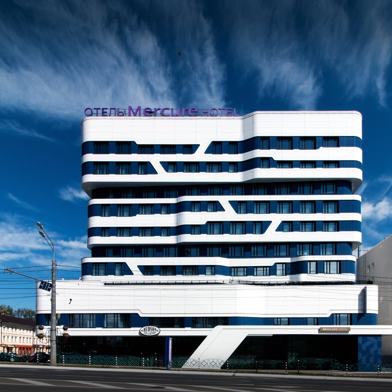
Mercure is situated in the very center of the city, at the crossing of Bolshevistskaya and Kommunisticheskaya streets, at an equal distance of 330 meters from the Church of Admiral Fedor Ushakov (who was canonized in 2000) and the bright-colored red-and-white sports complex Saransk Arena built in 2012. The hotel is surrounded on all sides by the city sites and buildings belonging to different architectural styles and epochs: the deep reddish-blue building of the music theater, the main post office with cathedral ambitions, and the building of Mordovia State University that looks very much like Moscow’s, but executed in alucobond. Headed eastward, the Kommunisticheskaya Street leads to yet another sports complex, the gigantic Mordovia Arena, built behind the Ansar River for the World Soccer Championship 2018. Therefore, for the guest athletes that come to town, the location of Mercure must be very convenient.

Mercure Hotel. Photograph
Copyright: © Alexander Shemetov
Mercure Hotel. Project 2014-2015
Copyright: © A.Len


Considering the diversity, not to say garishness, of the city context, the architects made a decision to refrain from responding to the surroundings – “no matter how hard you try, you just cannot please everyone”. At the same time, though, “according to their corporate rules, Mercure hotels must reflect the culture and history of their locations” – Sergey Oreshkin shares. Therefore, the search for the right set of images, based on meditation on the national motifs of Mordovia, was hard and took quite a long time, even though the idea of a wavy façade, as we can see from the sketches, came very early on.

Mercure Hotel
Copyright: © A.Len


Mercure Hotel
Copyright: © A.Len


From some of the sketches, one can see that the façade could have ended up looking like a piece of red-and-white cross-stitching work or a bright smooth surface but at the board meetings with the head of republic they asked the architects to reduce the expressiveness a little.

Mercure Hotel. Project.
Copyright: © A.Len


The black-and-white version did not satisfy the client either, and the architects ultimately settled on a combination of blue and white – the blue color reflecting, even if in a richer manner, the postmodernist building of the post office across the street, which still can be interpreted as a way of contextual reaction to the surroundings. The two buildings took on the role of propylaea of sorts, even though, apart from the blue color and similar height (a little under 50 meters, which is the allowed maximum for this location) they do not have anything in common – in fact, they belong to two completely different architectural styles and epochs.

Anyway, after numerous board meetings and revisions of the project, the motif of the traditional Mordovia ornaments transformed into small-sized diagonal streaks running between white horizontals. The ornamental mesh, which was supposed to be applied over the white surfaces, turned out to be prohibitively expensive and also had to go. A similar technique was successfully used by A.Len in the Russian Center of Science and Culture in Kabul, only in that case the architects covered the aluminum façades with ornaments characteristic for the white-stone Russian architecture.

Which, by the way, is a pity because the national pattern of rhythmically grouped quatrefoils would have made the façades multidimensional, both in terms of plastique and meaning, which is quite noticeable, for example, in the pictures of night backlights that display the lights of the ornaments running over the façade strips and looking like some modern electronic characters but based on a repetition of the traditional motif.

Mercure Hotel. Project. The first version of backlighting from “Martin Light”
Copyright: © A.Len


Mercure Hotel. Project. The second version of backlighting from “Martin Light”
Copyright: © A.Len


Mercure Hotel. Project. The second version of backlighting from “Martin Light”
Copyright: © A.Len


But then again, in the case of the Mercure building, the architects were able to keep the ornaments on the level of more localized and individual perception of the pedestrian or the guest’s: now we are seeing the ornaments on the pylon of the entrance group and in the print of the windows of the first floor.

Mercure Hotel. Photograph
Copyright: © Alexander Shemetov


Mercure Hotel
Copyright: © A.Len


Mercure Hotel
Copyright: © A.Len


On the other hand, the national decorative theme got reflected in the interiors of the hotel’s public spaces designed by Sundukovy Sisters, Russia’s only design studio that has a license for doing interior design for the Accor chain. The architects say that their chief source of inspiration was the museum of the Mordovian sculptor Stepan Erzya, also situated two steps away from Mercure. The design and decor have a lot of wood in them, the main colors being green and brown, just like the museum’s. The foyer is decorated with wooden structures of the local artisans and the pictures from the Mordovian mythology.

Mercure Hotel, interior design
Copyright: © Sundukovy sisters. Photo courtesy by A.Len


Mercure Hotel, interior design
Copyright: © Sundukovy sisters. Photo courtesy by A.Len


As for the façades of the building that are visible from a distance, what is left of the national Mordovian motifs in them is only the slim diagonal lintels between the corbel courses. Together they form a flexible framework whose sturdy curves outline the volume, rounding the corners and forming wave-shaped transitions.

For a person who is familiar with the context of modern architecture, Saransk’s Mercure will immediately bring up associations with Moscow’s famous Dominion tower, designed by Zaha Hadid. There are lots of similarities there, just as there are differences. What makes the two buildings look similar is the pattern of white stripes that is generally inherent in the modernist architecture, and the diagonals. But let us remember at this point that the search for the imagery of Saransk’s Mercure started with the “pleated” wavy stripes of the floors. The hotel design by Sergey Oreshkin is more compact, more vertical, and its outline is molded as being denser. The references to the business center designed by Zaha Hadid are pretty obvious yet they lie in the realm of the overall trend and the architects' urge to create a highly contemporary nonlinear shape. “Yes, I wanted to build here in the middle of Saransk a piece of bionic architecture, noticeable and completely belonging with our time” – Sergey Oreshkin says. 

The agile sculptured form is by no means cast in concrete but is realized by the wireframe and monolith method, with brick filling and aluminum sheet coating from a Russian-made composite material. At night, the building’s “power lines” are highlighted by diode backlights.

Mercure Hotel. Photograph
Copyright: © Alexander Shemetov


Mercure Hotel. Photograph
Copyright: © Alexander Shemetov


Mercure Hotel. Photograph
Copyright: © Alexander Shemetov


Mercure Hotel. Photograph
Copyright: © Alexander Shemetov


The building’s podium, which is marked by a diagonal white stela next to the entrance, is perceived as a large and broad pedestal that the building rests upon. It hosts a lobby, a restaurant and a bar, as well as a conference hall, a fitness center with a small spa, and the hotel management offices. The hotel’s seven floors are grouped into three layers separated by two dividing strips and slightly shifted in different directions – they serve as a metaphor for the three steps of the winner pedestal. The outstanding parts of the “band” host the premium-class suites – and the volumetric structure of the building reflects rather accurately its inner structure.


The hotel has 115 rooms in it, and, thanks to the nuances of the outlines of the outside walls and the differently sized windows, the floor plans are also pretty different: each room got an individual design of its own, also with “flowing” elements: “the work table flows into the head of the bed, which bleeds into part of the wall with a built-in bedside light” – Sergey Oreshkin explains. The smoothly flowing lines make a sharp contrast with the ornaments of triangles, squares, and hexagons on the floor, walls, and tiles. The hotel is a four-star one: it lacks two formal properties to become 5 stars: a swimming pool and a more capacious conference hall. 

According to Sergey Oreshkin, the end result is very close to the original 3D renders, and the architect is satisfied with his working with the client and with the end result as well: “We ended up getting noticeable architecture that is hot on Instagram and Pinterest, and people even ask, surprised: is this really Russia? We have three such projects – the Badminton Sports Complex, the SKA Hockey Arena and now Mercure – the brightest hotel we ever designed and built”.
Mercure Hotel. Facade
Copyright: © A.Len
Mercure Hotel
Copyright: © A.Len
Mercure Hotel. Master plan
Copyright: © A.Len
Mercure Hotel. Plan of the 1st floor
Copyright: © A.Len
Mercure Hotel. Plan of the 2nd floor
Copyright: © A.Len
Mercure Hotel. Plan of the 3-9 floor
Copyright: © A.Len
Mercure Hotel. Section view 2
Copyright: © A.Len
Mercure Hotel. Section view 1
Copyright: © A.Len


Architect:
Sergey Oreshkin
Firm:
A-Len
Object:
Mercure Hotel
Russia, Saransk

2014 — 2015 / 2015 — 2018

10 April 2019

Headlines now
The Secret Briton
The house is called “Little France”. Its composition follows the classical St. Petersburg style, with a palace-like courtyard. The decor is on the brink of Egyptian lotuses, neo-Greek acroteria, and classic 1930s “gears”; the recessed piers are Gothic, while the silhouette of the central part of the house is British. It’s quite interesting to examine all these details, attempting to understand which architectural direction they belong to. At the same time, however, the house fits like a glove in the context of the 20th line of St. Petersburg’s Vasilievsky Island; its elongated wings hold up the façade quite well.
The Wrap-Up
The competition project proposed by Treivas for the first 2021 competition for the Russian pavilion at EXPO 2025 concludes our series of publications on pavilion projects that will not be implemented. This particular proposal stands out for its detailed explanations and the idea of ecological responsibility: both the facades and the exhibition inside were intended to utilize recycled materials.
Birds and Streams
For the competition to design the Omsk airport, DNK ag formed a consortium, inviting VOX architects and Sila Sveta. Their project focuses on intersections, journeys, and flights – both of people and birds – as Omsk is known as a “transfer point” for bird migrations. The educational component is also carefully considered, and the building itself is filled with light, which seems to deconstruct the copper circle of the central entrance portal, spreading it into fantastic hyper-spatial “slices”.
Faraday Grid
The project of the Omsk airport by ASADOV Architects is another concept among the 14 finalists of a recent competition. It is called “The Bridge” and is inspired by both the West Siberian Exhibition of 1911 and the Trans-Siberian Railway bridge over the Irtysh River, built in 1896. On one hand, it carries a steampunk vibe, while on the other, there’s almost a sense of nostalgia for the heyday of 1913. However, the concept offers two variants, the second one devoid of nostalgia but featuring a parabola.
Midway upon the Journey of Our Life
Recently, Tatlin Publishing House released a book entitled “Architect Sergey Oreshkin. Selected Projects”. This book is not just a traditional book of the architectural company’s achievements, but rather a monograph of a more personal nature. The book includes 43 buildings as well as a section with architectural drawings. In this article, we reflect on the book as a way to take stock of an architect’s accomplishments.
Inverted Fortress
This year, there has been no shortage of intriguing architectural ideas around the Omsk airport. The project developed by the architectural company KPLN appeals to Omsk’s history as a wooden fortress that it was back in the day, but transforms the concept of a fortress beyond recognition: it “shaves off” the conical ends of “wooden logs”, then enlarges them, and then flips them over. The result is a hypostyle – a forest of conical columns on point supports, with skylights on top.
Transformation of Annenkirche
For Annenkirche (St. Anna Lutheran Church in St. Petersburg), Sergey Kuznetsov and the Kamen bureau have prepared a project that relies on the principles of the Venice Charter: the building is not restored to a specific date, historical layers are preserved, and modern elements do not mimic the authentic ones. Let’s delve into the details of these solutions.
The Paradox of the Temporary
The concept of the Russian pavilion for EXPO 2025 in Osaka, proposed by the Wowhaus architects, is the last of the six projects we gathered from the 2022 competition. It is again worth noting that the results of this competition were not finalized due to the cancellation of Russia’s participation in World Expo 2025. It should be mentioned that Wowhaus created three versions for this competition, but only one is being presented, and it can’t be said that this version is thoroughly developed – rather, it is done in the spirit of a “student assignment”. Nevertheless, the project is interesting in its paradoxical nature: the architects emphasized the temporary character of the pavilion, and in its bubble-like forms sought to reflect the paradoxes of space and time.
The Forum of Time
The competition project for the Russian Pavilion at EXPO 2025 in Osaka designed by Aleksey Orlov and Arena Project Institute consists of cones and conical funnels connected into a non-trivial composition, where one can feel the hand of architects who have worked extensively with stadiums and other sports facilities. It’s very interesting to delve into its logic, structurally built on the theme of clocks, hourglasses and even sundials. Additionally, the architects have turned the exhibition pavilion into a series of interconnected amphitheaters, which is also highly relevant for world exhibitions. We are reminding you that the competition results were never announced.
Mirrors Everywhere
The project by Sergey Nebotov, Anastasia Gritskova, and the architectural company “Novoe” was created for the Russian pavilion at EXPO 2025, but within the framework of another competition, which, as we learned, took place even earlier, in 2021. At that time, the competition theme was “digital twins”, and there was minimal time for work, so the project, according to the architect himself, was more of a “student assignment”. Nevertheless, this project is interesting for its plan bordering on similarity with Baroque projects and the emblem of the exhibition, as well as its diverse and comprehensive reflectiveness.
The Steppe Is Full of Beauty and Freedom
The goal of the exhibition “Dikoe Pole” (“Wild Field”) at the State Historical Museum was to move away from the archaeological listing of valuable items and to create an image of the steppe and nomads that was multidirectional and emotional – in other words, artistic. To achieve this goal, it was important to include works of contemporary art. One such work is the scenography of the exhibition space developed by CHART studio.
The Snowstorm Fish
The next project from the unfinished competition for the Russian Pavilion at EXPO 2025, which will be held in Osaka, Japan, is by Dashi Namdakov and Parsec Architects. The pavilion describes itself as an “architectural/sculptural” one, with its shape clearly reminiscent of abstract sculpture of the 1970s. It complements its program with a meditative hall named “Mendeleev’s Dreams”, and offers its visitors to slide from its roof at the end of the tour.
The Mirror of Your Soul
We continue to publish projects from the competition for the design of the Russian Pavilion at EXPO in Osaka 2025. We are reminding you that the results of the competition have not been announced, and hardly will ever be. The pavilion designed by ASADOV Architects combines a forest log cabin, the image of a hyper transition, and sculptures made of glowing threads – it focuses primarily on the scenography of the exhibition, which the pavilion builds sequentially like a string of impressions, dedicating it to the paradoxes of the Russian soul.
Part of the Ideal
In 2025, another World Expo will take place in Osaka, Japan, in which Russia will not participate. However, a competition for the Russian pavilion was indeed held, with six projects participating. The results were never announced as Russia’s participation was canceled; the competition has no winners. Nevertheless, Expo pavilion projects are typically designed for a bold and interesting architectural statement, so we’ve gathered all the six projects and will be publishing articles about them in random order. The first one is the project by Vladimir Plotkin and Reserve Union, which is distinguished by the clarity of its stereometric shape, the boldness of its structure, and the multiplicity of possible interpretations.
The Fortress by the River
ASADOV Architects have developed a concept for a new residential district in the center of Kemerovo. To combat the harsh climate and monotonous everyday life, the architects proposed a block type of development with dominant towers, good insolation, facades detailed at eye level, and event programming.
In the Rhombus Grid
Construction has begun on the building of the OMK (United Metallurgical Company) Corporate University in Nizhny Novgorod’s town of Vyksa, designed by Ostozhenka Architects. The most interesting aspect of the project is how the architects immersed it in the context: “extracting” a diagonal motif from the planning grid of Vyksa, they aligned the building, the square, and the park to match it. A truly masterful work with urban planning context on several different levels of perception has long since become the signature technique of Ostozhenka.
​Generational Connection
Another modern estate, designed by Roman Leonidov, is located in the Moscow region and brings together three generations of one family under one roof. To fit on a narrow plot without depriving anyone of personal space, the architects opted for a zigzag plan. The main volume in the house structure is accentuated by mezzanines with a reverse-sloped roof and ceilings featuring exposed beams.
Three Dimensions of the City
We began to delve into the project by Sergey Skuratov, the residential complex “Depo” in Minsk, located at Victory Square, and it fascinated us completely. The project has at least several dimensions to it: historical – at some point, the developer decided to discontinue further collaboration with Sergey Skuratov Architects, but the concept was approved, and its implementation continues, mostly in accordance with the proposed ideas. The spatial and urban planning dimension – the architects both argue with the city and play along with it, deciphering nuances, and finding axes. And, finally, the tactile dimension – the constructed buildings also have their own intriguing features. Thus, this article also has two parts: it dwells on what has been built and what was conceived
New “Flight”
Architects from “Mezonproject” have developed a project for the reconstruction of the regional youth center “Polyot”(“Flight”) in the city of Oryol. The summer youth center, built back in the late 1970s, will now become year-round and acquire many additional functions.
The Yauza Towers
In Moscow, there aren’t that many buildings or projects designed by Nikita Yavein and Studio 44. In this article, we present to you the concept of a large multifunctional complex on the Yauza River, located between two parks, featuring a promenade, a crossroads of two pedestrian streets, a highly developed public space, and an original architectural solution. This solution combines a sophisticated, asymmetric façade grid, reminiscent of a game of fifteen puzzle, and bold protrusions of the upper parts of the buildings, completely masking the technical floors and sculpting the complex’s silhouette.
Arch, Pearl, Wing, Wind
In the social media of the governor of the Omsk region, voting was conducted for the best project for the city’s new airport. We asked the finalists to send over their projects and are now showcasing them. The projects are quite interesting: the client requested that the building be visually permeable throughout, and the images that the architects are working with include arches, wings, gusts of wind, and even the “Pearl” painting by Vrubel, who was actually born in Omsk.
Architecture and Leisure Park
For the suburban hotel complex, which envisages various formats of leisure, the architectural company T+T Architects proposed several types of accommodation, ranging from the classic “standard” in a common building to a “cave in the hill” and a “house in a tree”. An additional challenge consisted in integrating a few classic-style residences already existing on this territory into the “architectural forest park”.
The U-House
The Jois complex combines height with terraces, bringing the most expensive apartments from penthouses down to the bottom floors. The powerful iconic image of the U-shaped building is the result of the creative search for a new standard of living in high-rise buildings by the architects of “Genpro”.
Black and White
In this article, we specifically discuss the interiors of the ATOM Pavilion at VDNKh. Interior design is a crucial component of the overall concept in this case, and precision and meticulous execution were highly important for the architects. Julia Tryaskina, head of UNK interiors, shares some of the developments.
The “Snake” Mountain
The competition project for the seaside resort complex “Serpentine” combines several typologies: apartments of different classes, villas, and hotel rooms. For each of these typologies, the KPLN architects employ one of the images that are drawn from the natural environment – a serpentine road, a mountain stream, and rolling waves.
Opal from Anna Mons’ Ring
The project of a small business center located near Tupolev Plaza and Radio Street proclaims the necessity of modern architecture in a specific area of Moscow commonly known as “Nemetskaya Sloboda” or “German settlement”. It substantiates its thesis with the thoroughness of details, a multitude of proposed and rejected form variants, and even a detailed description of the surrounding area. The project is interesting indeed, and it is even more interesting to see what will come of it.
Feed ’Em All
A “House of Russian Cuisine” was designed and built by KROST Group at VDNKh for the “Rossiya” exhibition in record-breaking time. The pavilion is masterfully constructed in terms of the standards of modern public catering industry multiplied by the bustling cultural program of the exhibition, and it interprets the stylistically diverse character of VDNKh just as successfully. At the same time, much of its interior design can be traced back to the prototypes of the 1960s – so much so that even scenes from iconic Soviet movies of those years persistently come to mind.
The Ensemble at the Mosque
OSA prepared a master plan for a district in the southern part of Derbent. The main task of the master plan is to initiate the formation of a modern comfortable environment in this city. The organization of residential areas is subordinated to the city’s spiritual center: depending on the location relative to the cathedral mosque, the houses are distinguished by façade and plastique solutions. The program also includes a “hospitality center”, administrative buildings, an educational cluster, and even an air bridge.
Pargolovo Protestantism
A Protestant church is being built in St. Petersburg by the project of SLOI architects. One of the main features of the building is a wooden roof with 25-meter spans, which, among other things, forms the interior of the prayer hall. Also, there are other interesting details – we are telling you more about them.
The Shape of the Inconceivable
The ATOM Pavilion at VDNKh brings to mind a famous maxim of all architects and critics: “You’ve come up with it? Now build it!” You rarely see such a selfless immersion in implementation of the project, and the formidable structural and engineering tasks set by UNK architects to themselves are presented here as an integral and important part of the architectural idea. The challenge matches the obliging status of the place – after all, it is an “exhibition of achievements”, and the pavilion is dedicated to the nuclear energy industry. Let’s take a closer look: from the outside, from the inside, and from the underside too.