По-русски

​Cité for Naro-Fominsk

The new neighborhood on an island in the center of Naro-Fominsk continues the ideas of developing the territory of the silk-weaving factory, around which the city actually formed. The authors skillfully mix different formats of mid-rise development and make the most of the island location, offering a variety of formats of interaction with water, available to all citizens. No wonder that the project is considered exemplary and worthy of duplication in the region. It is also an example of rare synergy between the client and the architects.

03 October 2023
Object
mainImg
Naro-Fominsk is a district center located in the southwest of Moscow region. Today, the town is predominantly a “dacha” one, although a fair share of its population commutes to Moscow for work. In addition, this town is a city of a large urban area, which begins from Aprelevka and the Central Ring Road and stretches way past Mozhaisk. This means that, being the center of a considerable territory of the Moscow region, this city will only grow and develop.
 
Moreover, in its central part, a project of integrated territory development is now unfolding. Both the clients – Ostrov Group – and the authors – DNK ag architects – are justly proud of it.
 
The process began back in 2018, when there was no concept of “integrated territory development” yet, but many people were already working on master plans for urban development, and the terms “comfortable living environment” and “transformation of industrial zones” already meant something. Then the Ostrov Group started redeveloping the silk-weaving factory, around which, in fact, Naro-Fominsk, the union of two working villages, had been formed at the end of the XIX century. The factory was abandoned, and the project of its revitalization, now largely completed, was entrusted to the Dutch bureau Mei architects and planners.

Igor Shapovalov, leader of Ostrov Group

We have been working in Naro-Fominsk for a long time, striving to handle this city, especially its center, carefully and attentively. In 2012, we accepted the proposal of the city’s mayor and, together with architect Ilya Zalivukhin, developed a master plan for the development of Naro-Fominsk. We engaged in sociology and big data. I must say that I was already very passionate about modern urban trends back then – concepts like the 15-minute city and a comfortable urban environment.
The territory of the factory and the island is crucial for the city; it is located right in the center but it had long divided it. We started working with the abandoned industrial zone and gradually returned it to the city. For several years now, we have been systematically restoring and preserving historical buildings, “uncovering” them; they are interesting and beautiful, they are the history of the place, what makes the city unique.
One of our goals is for the factory not to divide but to unite the city. We have already opened public spaces on the right bank of the river, but there is still much to do, including a new thoroughfare. Another task is to make the city multifunctional and comfortable, convenient, diverse both in height and character of spaces. The third important thing is to reveal the river to the city. None of the townspeople had seen the river. We literally removed tons of garbage, worked to remove some discharges, including unauthorized ones, and restored the river’s ecology. A boating station is already in operation, and plans include docks, light watercraft, and the opportunity for city residents to fully utilize the river. So, I would say we are pioneers in many aspects in the Moscow region; we are being held up as an example. I’m pleased that the Chief Architect of the Moscow Region, Alexandra Kuzmina, actively supports our initiatives, and we discuss all projects with her.


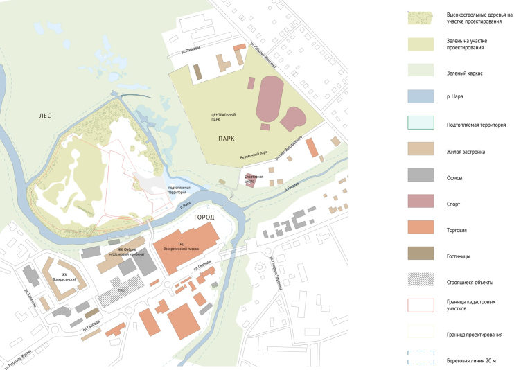
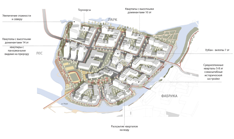
City on an Island. Urban planning analysis of the territory
Copyright: © DNK ag


  • zooming
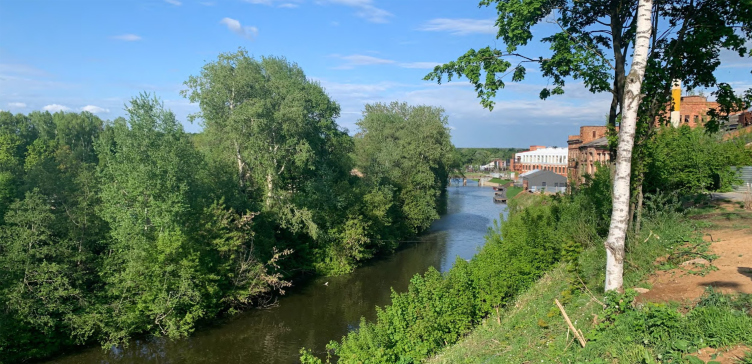
    Realized improvement of the left bank of the Nara River from the factory side
    Copyright: Provided by Ostrov Group
  • zooming
    Revitalization of silk weaving factory buildings in Naro-Fominsk
    Copyright: Provided by Ostrov Group

 
Continuation of development
 
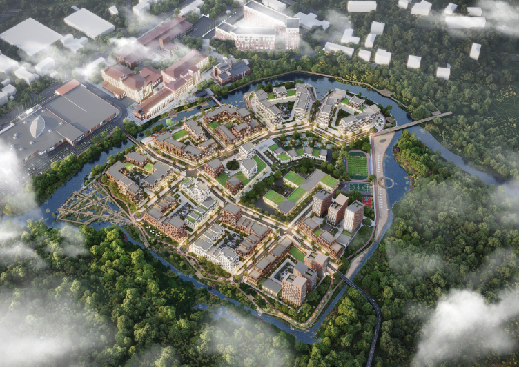
A logical continuation and the next step of Ostrov Group working with the factory and the city’s historical center will be a residential area on the Nara’s left bank – the so-called “island”, with an area of 19.27 hectares, situated between the factory and the city park. Throughout the 20th century, this territory lay undeveloped – it hosted a few warehouses, but essentially it was a wasteland. It received an “island” status because the extremely winding Nara River makes here another bend, and the land on its left bank was largely swamped – in order to drain it, they dug a channel that separated the “warehouse” wasteland from the forest, and the brook, which had separated it from the city park, had always existed.
 
Accordingly, the architects had to fulfill the following tasks: first, to develop ideas related to the revitalization of the factory, from the public spaces to the diversity of morphology and the interpretation of the district’s “central” location – and second, to maximize all the advantages offered by the water and natural environment.

Panorama of the island and the factory, view from the northeast side
Copyright: Photograph © DNK ag

 
DNK ag architects were invited to work on the concept of a new district in the center of Naro-Fominsk – it turned out to be that rare case when there was complete synergy between the client and the authors of the project.

The client’s wishes were formulated approximately as follows: canals, a strong emphasis on water, modern architecture, public spaces on the ground floors, a rich and diverse urban environment accessible to everyone – a human-scale environment, in short.
A professional challenge for us was the task of creating an environment that is atmospherically comparable to the historic part and includes the natural surroundings.
We had long wanted to do something like this. I’ll be straightforward; we dreamed of such a project. When we heard about it, we realized that it was the dream project, where the client wants to see everything that we consider right. From our perspective, this is the best type of development: medium-rise buildings with good, not overly wide proportions of all spaces. We were “on the same page” with the client – this is a great stroke of luck and rarity.

 
Connections, angles, and perspectives
 
One of the principles of historical development, as well as of modern urbanism, is that any district must be connected to its neighbors and must be accessed from different directions. This is why islands – think of Paris’s Île de la Cité – are usually strung along at least one urban artery. This is the way it happened here: the scale, of course, is smaller, but the principle is similar – a city street will pass through the island, and it will connect the city center and its main axial street with the highway leading to Kubinka and towards Minsk highway. The bridge over Nara, in place of the former factory bridge, is already under construction. The benefits are abundant, chief of them being development of the transportation framework, which Naro-Fominsk, as I know from my experience, badly needs – and this overcoming the “island” isolation. The automobile bridge will be supplemented by two pedestrian bridges for access to other parts of the city.

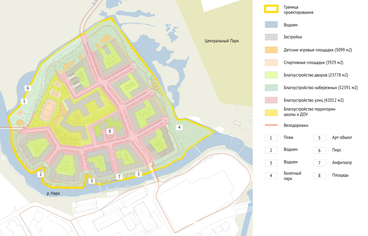
City on an Island. Scheme of landscaping and planting
Copyright: © DNK ag


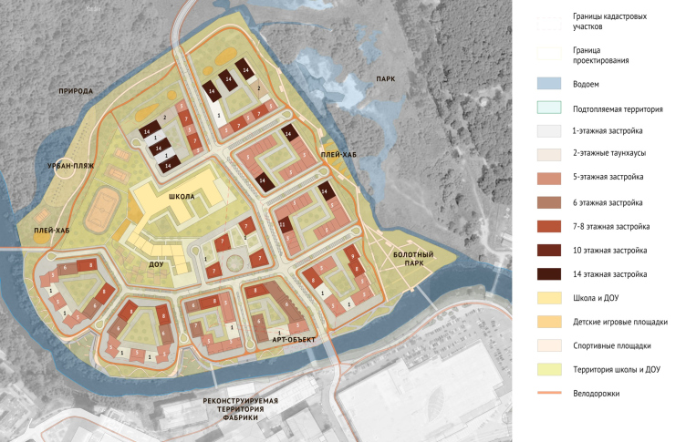
City on an Island. The master plan
Copyright: © DNK ag

 
The city and water
 
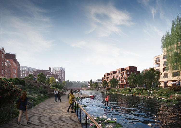
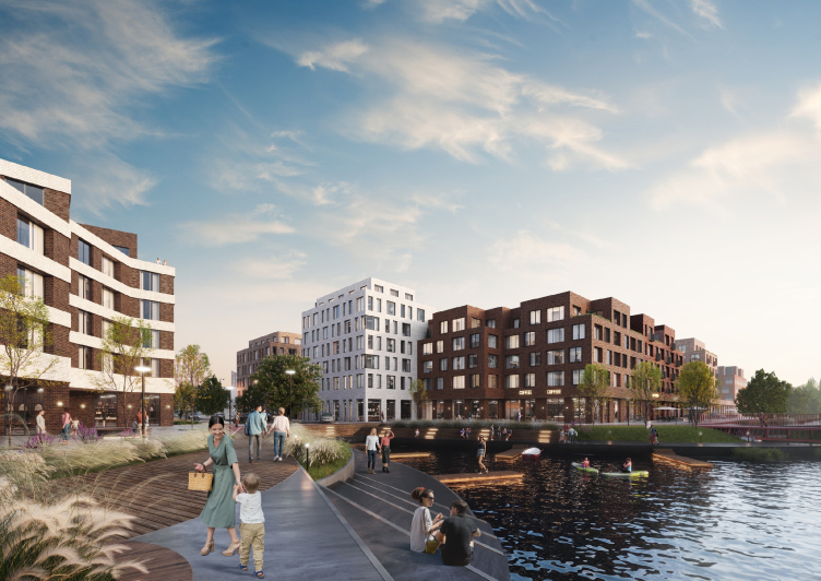
Meanwhile, the island location is as much of an advantage as it is a challenge: there is plenty of space for recreation, there are beautiful river views, and you can breathe in the moist air, go boating, go swimming and fishing.
 
We all know that the exposure of a modern (i.e. postindustrial) city to the water, and removal of obstacles, created earlier by industrial parks, is one of the favorite, not to say cornerstone, themes of modern town planning. And, again, what we are seeing is a textbook example. The architects of DNK ag quote a Christopher Alexander book “A Pattern Language”: 
 
“Our life grows weak if we cannot establish a full-fledged and steady contact with water. In most of the large cities, we are unable to do that”. 
 
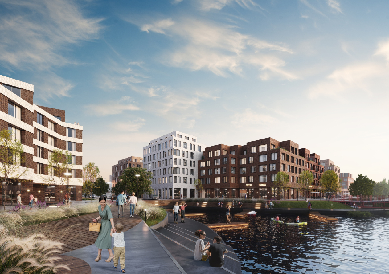
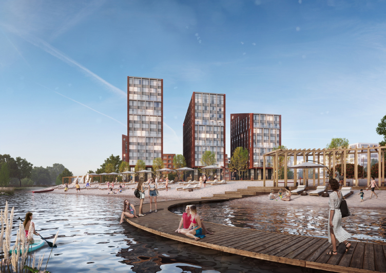
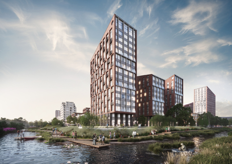
Grows weak? Well, maybe it does. But it should be emphasized that here we are seeing not just an embankment, but water on all sides, thin channels that need to be widened, a river that has already been cleaned, and a low-lying cape on which a Swamp Park with canopy walkways on supports is planned. Water-level boardwalks and amphitheaters, marinas, a beach and a “wild” natural shoreline for walking lie next to the tallest, 14-story houses in the northern part.

View of the city embankment from the side of the factory. City on the island
Copyright: © DNK ag


City waterfront. City on the island
Copyright: © DNK ag


Beach Recreation Area. City on an Island
Copyright: © DNK ag

 
Diversity

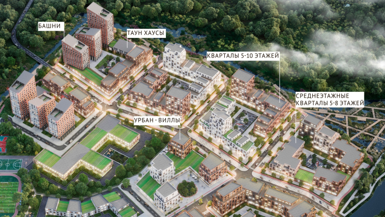
An important feature of the project is that it harmoniously combines both development and landscapes with different morphology: five or six types of urban construction within the framework of a reasonable number of floors ranging from 5 to 14. 
 
This is also a sign of today’s urban planning: at some point, everybody grew seriously tired of endless repetition, and one’s eyes were eager for diversity. However, diversity (yes, pun intended) can also be extremely diverse – in this case what makes it different is the fact that it is carefully motivated by the specifics of the surroundings, the riverbank, and the landscape in general.

The riverside landscape of the Island is diverse, and in our project, we made an effort to capture and enhance this diversity. Both the embankments and the city blocks respond to it, reflecting the character of both the architecture and the landscape. Consequently, as you move through the area, the impressions formed by its environment will constantly change. We emphasized and intensified this by creating different scenarios and directions of movement. Streets were curved to increase the number of perspectives.
One of the “actors” in the development of the area, in our view, is Time: long-term development of the project is envisaged, and the planning structure laid out in it has the potential for further evolution. This aligns well with our proposed version of the urban environment, combining different morph-types of construction and street space.


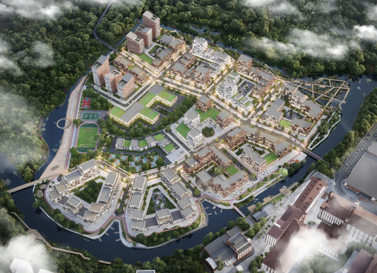
City on an Island. Axonometry
Copyright: © DNK ag

 
So, the development of the island that DNK ag is not just mid-rise and varied; it not only follows the rules of public floors and private courtyards, it’s more than that – the specifics of each fragment are built based on its location.
 
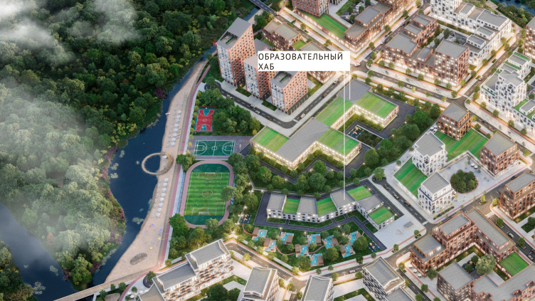
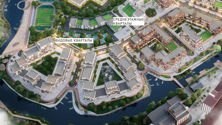
The school and kindergarten in the center form a large green spot, and the school stadium is adjacent to the beach. Closer to the factory quay, spaces with “urban” features are grouped together, forming a small square with short “urban villas” around it. Here is also a place for piers, a couple of bays, a boat station – since this is the side of the river, the other sides are still streams and canals, the river is larger. The river also provides panoramas, quite picturesque as it curves – so houses with the largest numbers of terraces on stepped roofs are clustered on this side.

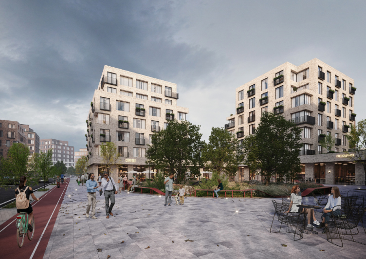
Inner plaza and urban villas. City on an Island.
Copyright: © DNK ag


City on an Island.
Copyright: © DNK ag


City on an Island.
Copyright: © DNK ag


City on an Island.
Copyright: © DNK ag

 
In the northern and northeastern part, on the side of the forest and park, the height of the towers increases – up to 14 floors, and so does the “natural” character of the surroundings. It is easy to guess what this is done for: more residents will be “immersed” in nature.

City on an Island.
Copyright: © DNK ag


City on an Island.
Copyright: © DNK ag


City on an Island.
Copyright: © DNK ag

 
Now the sketch concept has been agreed upon and DNK ag are finalizing the first part of the detailed concept of the project. The client, both according to the architects and my personal impression, is serious about implementing the project and is proud of its position as an exemplary example of small town center transformation – one in which the words “integrated development” are taken seriously and literally.
 

03 October 2023

Headlines now
The Golden Crown
The concept for a dental clinic in Yekaterinburg, developed by CNTR Studio, revolves around the idea of a “mouth full of gold”: pristine white porcelain stoneware walls are complemented by matte brass details. To avoid an overly literal interpretation, the architects focused on the building’s proportions, skillfully navigating between sunlight requirements and fire safety regulations.
Flexibility and Integration
Not long ago, we covered the project for the fourth phase of the ÁLIA residential complex, designed by APEX. Now, we’ve been shown different fence concepts they developed to enclose the complex’s private courtyards, incorporating a variety of public functions. We believe that the sheer fact that the complex’s architects were involved in such a detail as fencing speaks volumes.
A Step Forward
The HIDE residential complex represents a major milestone for ADM architects and their leaders Andrey Romanov and Ekaterina Kuznetsova in their quest for a fresh high-rise aesthetic – one that is flexible and layered, capable of bringing vibrancy to mass and silhouette while shaping form. Over recent years, this approach has become ADM’s “signature style”, with the golden HIDE tower playing a pivotal role in its evolution. Here, we delve into the project’s story, explore the details of the complex’s design, and uncover its core essence.
Gold in the Sands
A new office for a transcontinental company specializing in resource extraction and processing has opened in Dubai. Designed by T+T Architects, masters of creating spaces that are contemporary, diverse, flexible, and original, this project exemplifies their expertise. On the executive floor, a massive brass-clad partition dominates, while layered textures of compressed earth create a contextually resonant backdrop.
Layers and Levels of Flight
This project goes way back – Reserve Union won this architectural competition at the end of 2011, and the building was completed in 2018, so it’s practically “archival”. However, despite being relatively unknown, the building can hardly be considered “dated” and remains a prime example of architectural expression, particularly in the headquarters genre. And it’s especially fitting for an aviation company office. In some ways, it resembles the Aeroflot headquarters at Sheremetyevo but with its own unique identity, following the signature style of Vladimir Plotkin. In this article, we take an in-depth look at the United Aircraft Corporation (UAC) headquarters in the Moscow agglomeration town of Zhukovsky, supplemented by recent photographs from Alexey Naroditsky – a shoot that became only recently possible due to the fact that improvements were finally made in the surrounding area.
Light and Shadow
In this article, we delve into the architectural design of the “Chaika” house by DNK ag architects, which was recently completed in 2023 as part of the collection of signature designs at ZILArt. As is well-known, all the buildings in this complex follow a design code, yet each one is distinct. This particular building stands out not only for its whiteness and minimalism but also for the refined use of a limited number of techniques that, together, create what can confidently be called synergy.
Casus Novae
A master plan was developed for a large residential area with a name of “DNS City”, but now that its implementation began, the plan has been arbitrarily reformatted and replaced with something that, while similar on the surface, is actually quite different. This is not the first time such a thing happens, but it’s always frustrating. With permission from the author, we are sharing Maria Elkina’s post.
Treasure Hunting
The GAFA bureau, in collaboration with Tegola and Arkhitail, organized an expedition to the island of Kilpola in Karelia as part of Moskomarkhitektura’s “Open City” festival. There, amidst moss and rocks, the students sought answers to questions like: what is the sacred, where does it dwell, and what sustains it? Assisting the participants in this quest were landscape engineer Evgeny Levin, artist Nicholas Roerich, a moose, and the lack of cellular connection. Here’s how the story unfolded.
Depths of the Earth, Streams of Water
In the Malaya Okhta district, the Akzent building, designed by Stepan Liphart, was constructed. It follows a classic tripartite structure, yet it’s what you might call “hand-drawn”: each façade is unique in its form and details, some of which aren’t immediately noticeable. In this article, we explore the context and, together with the architect, delve into how the form was developed.
Fir Tree Dynamics
The “Airports of Region” holding is planning to build an airport in Karachay-Cherkessia, aiming to make the Arkhyz and Dombay resorts more accessible to travelers. The project that won in an invitation-only competition, submitted by Sergey Nikeshkin’s KPLN, blends natural imagery inspired by the shape of a conifer seed, open-air waiting spaces, majestic large trees, and a green roof elevated on needle-like columns. The result is both nature-inspired and WOW.
​A Brick Shell
In the process of designing a clubhouse situated among pine trees in a prestigious suburban area near Moscow, the architectural firm “A.Len” did the façade design part. The combination of different types of brick and masonry correlates with the volumetric and plastique solutions, further enhanced by the inclusion of wood-painted fragments and metal “glazing”.
Word Forms
ATRIUM architects love ambitious challenges, and for the firm’s thirtieth anniversary, they boldly play a game of words with an exhibition that dives deep into a self-created vocabulary. They immerse their projects – especially art installations – into this glossary, as if plunging into a current of their own. You feel as if you’re flowing through the veins of pure art, immersed in a universe of vertical cities, educational spaces – of which the architects are true masters – and the cultural codes of various locations. But what truly captivates is the bold statement that Vera Butko and Anton Nadtochy make, both through their work and this exhibition: architecture, above all, is art – the art of working with form and space.
Flexibility and Acuteness of Modernity
Luxurious, fluid, large “kokoshniks” and spiral barrel columns, as if made from colorful chewing gum: there seem to be no other mansion like this in Moscow, designed in the “Neo-Russian-Modern” style. And the “Teremok” on Malaya Kaluzhskaya, previously somewhat obscure, has “come alive with new colors” and gained visibility after its restoration for the office of the “architectural ecosystem” as the architects love to call themselves. It’s evident that Julius Borisov and the architects at UNK put their hearts into finding this new office and bringing it up to date. Let’s delve into the paradoxes of this mansion’s history and its plasticity. Spoiler: two versions of modernity meet here, both balancing on the razor’s edge of “what’s current”.
Yuri Vissarionov: “A modular house does not belong to the land”
It belongs to space, or to the air... It turns out that 3D printing is more effective when combined with a modular approach: the house is built in a workshop and then adapted to the site, including on uneven terrain. Yuri Vissarionov shares his latest experience in designing tourist complexes, both in central Russia and in the south. These include houseboats, homes printed from lightweight concrete using a 3D printer, and, of course, frame houses.
​Moscow’s First
“The quality of education largely depends on the quality of the educational environment”. This principle of the last decade has been realized by Sergey Skuratov in the project for the First Moscow Gymnasium on Rostovskaya Embankment in the Khamovniki district. The building seamlessly integrates into the complex urban landscape, responding both to the pedestrian flow of the city and the quiet alleyways. It skillfully takes advantage of the height differences and aligns with modern trends in educational space design. Let’s take a closer look.
Looking at the Water
The site of Villa Sonata stretches from the road to the water’s edge, offering its own shoreline, pier, and a picturesque river panorama. To reveal these sweeping views, Roman Leonidov “cut” the façade diagonally parallel to the river, thus getting two main axes for the house and, consequently, “two heads”. The internal core – two double-height spaces, a living room and a conservatory, with a “bridge” above them – makes the house both “transparent” and filled with light.
The White Wing
Well, it’s not exactly white. It’s more of a beige, white-stone structure that plays with the color of limestone – smoother surfaces are lighter, while rougher ones are darker. This wing unites various elements: it absorbs and interprets the surrounding themes. It responds to everything, yet maintains a cohesive expression – a challenging task! – while also incorporating recognizable features of its own, such as the dynamic cuts at the bottom, top, and middle.
Urban Dunes
The XSA Ramps team designed and built a three-part sports hub for a park in Rostov-on-Don, welcoming people of all ages and fitness levels. The skate plaza, pump track, and playground are all meticulously crafted with details that attract a diverse range of visitors. The technical execution of the shapes and slopes transforms this space into a kind of sculptural composition.
Proportional Growth
The project for the fourth phase of the ÁLIA residential area has been announced. The buildings are situated on an elongated plot – almost a “ray” that shoots out from the center of the area towards the river. Their layout reflects both a response to Moscow’s architectural preferences over the past 15 years, shifting “from blocks to towers”, and an interpretation of the neighboring business park designed by SOM. Additionally, the best apartments here are not located at the very top but closer to the middle, forming a glowing “waistline”.
The “Staircase” Building
In designing the “Details” residential complex in New Moscow, Rais Baishev spiced up the now-popular Moscow theme of a “courtyard” building with an idea drawn from the surrealist drawings by Maurits Escher. He envisioned the stepped silhouettes and descending slopes as a metaphysical mega-staircase, creating a key void within the courtyard that gave the project an internal “spine”. This concept is felt both in the building’s silhouette and on its façades.
Projection of the Quarter
No one doubted that the building that Vladimir Plotkin designed as part of the “Garden Quarters” would be the most modernist of all. And it turned out just that way: while adhering to the common design code, the building successfully combines brick and white stone, rhythmically responding to the neighboring building designed by Ostozhenka, yet tactfully and persistently making a few statements of its own. This includes the projection of the ideal urban development composition “14–9–6”, which can be found right next door, mathematical calculations, including those for various types of terraces (and perhaps the only reminder of the Soviet past of the Kauchuk rubber factory!), and the white “cross-stitch” pattern of the façade grid.
Domus Aurea
In this issue, we examine the “Tessinsky-1” house, designed by Sergey Skuratov and completed in 2023. Located in the middle of the Serebryanicheskaya Embankment district, at the intersection of its main streets, this house assumes a sort of “nodal” role: it not only responds to everything around it and preserves many memories of the former EMA factory within itself, but it weaves all this into a newly directed pattern, reconciling bright “gold” and dark-colored brick, largely with the help of the new, modern-yet-archaic Columba brick, which, come to think about it, is the most precious element here.
The Chimney of Nikola-Lenivets
In this issue, we are examining the “Obelisk House” designed by KATARSIS and built for the Arkhstoyanie 2023 festival. However, it was only finished later on, and this is why we are examining it now. It seems to us that after the “Obelisk House” appeared in Nikola-Lenivets, a dialogue and a few inner connections appeared between the temporary structures built here. These houses no longer look like “accidental neighbors”, more of which below.
​Periscope by the Bay
The jury awarded the second place in the competition for a public and cultural center in Petropavlovsk-Kamchatsky to the companies GORA (“Mountain”) and M4. In the consortium’s proposal, the building resembles a sperm whale with a calf swimming next to it or a periscope, whose lenses capture the most spectacular views from the surrounding landscape.
From Arcs to Dolmens
While working on the competition project for Petropavlovsk-Kamchatsky, ASADOV Architects prioritized the value of the natural and urban environment, aiming to preserve the balance of the location while minimizing the resemblance of the volume that they designed to a “traditional building”. The task was challenging, and the architects created three versions, one of which having been developed after the competition, where their main proposal took third place. However, the point of interest here is not the competition result but the continuity of creative thinking.
Hide and Seek
The ID Moskovskiy house, designed by Stepan Liphart in St. Petersburg, in the courtyards near Moskovskiy Avenue beyond the Obvodny Canal and recently completed, is notable for several reasons. Firstly, it has been realized with considerable accuracy, which is particularly significant as this is the first building where the architect was responsible not only for the facades but also for the layouts, allowing for better integration between the two. On the other hand, this building is interesting as an example of the “germination” of new architecture in the city: it draws on the best examples from the neighborhood and becomes an improved and developed sum of ideas found by the architect in the surrounding context.
The Big Twelve
Yesterday, the winners of the Moscow Mayor’s Architecture Award were announced and honored. Let’s take a look at what was awarded and, in some cases, even critique this esteemed award. After all, there is always room for improvement, right?
Above the Golden Horn
The residential complex “Philosophy” designed by T+T architects in Vladivostok, is one of the new projects in the “Golubinaya Pad” area, changing its development philosophy (pun intended) from single houses to a comprehensive approach. The buildings are organized along public streets, varying in height and format, with one house even executed in gallery typology, featuring a cantilever leaning on an art object.
Nuanced Alternative
How can you rhyme a square and space? Easily! But to do so, you need to rhyme everything you can possibly think of: weave everything together, like in a tensegrity structure, and find your own optics too. The new exhibition at GES-2 does just that, offering its visitor a new perspective on the history of art spanning 150 years, infused with the hope for endless multiplicity of worlds and art histories. Read on to see how this is achieved and how the exhibition design by Evgeny Ace contributes to it.
Blinds for Ice
An ice arena has been constructed in Domodedovo based on a project by Yuri Vissarionov Architects. To prevent the long façade, a technical requirement for winter sports facilities, from appearing monotonous, the architects proposed the use of suspended structures with multidirectional slats. This design protects the ice from direct sunlight while giving the wall texture and detail.