По-русски

Agility of the Modular

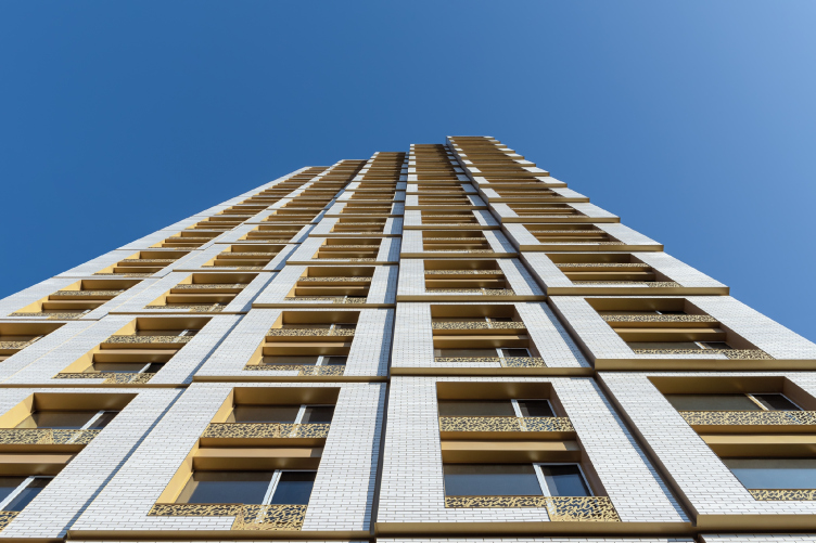
In the Discovery housing complex that they designed, ADM architects proposed a modern version of structuralism: the form is based on modular cells, which, smoothly protruding and deepening, make the volumes display a kind of restrained flexibility, differentiated element by element. The lamellar and ledged facades are “stitched” with golden threads – they unite the volumes, emphasizing the textured character of the architectural solution.

22 January 2021
Object
mainImg
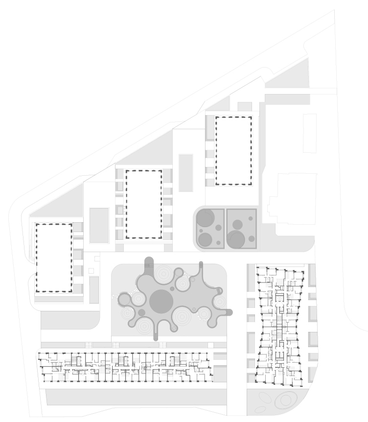
The residential complex in Moscow’s Khovrino, with the name of Discovery, ringing pleasant to the ear of the traveler and the motorist, is located at the intersection of Belomorskaya and Dybenko streets, surrounded by standard mass development of the 1980’s. The land site is an irregular rectangle with one strongly beveled side. The developer, MR Group, decided to split the project between two architectural teams: ADM architects, headed by Andrey Romanov and Ekaterina Kuznetsova, and “Tsimailo, Lyashenko, and Partners”. The architects did not immediately decide on the choice of areas of responsibility; they discussed and passed tasks to each other, and, at some point, they even tossed a coin during a telephone conversation. It was at that moment that all the stakeholders of the project reached an understanding, as the architects are reminiscing. Ultimately, ADM designed two tall buildings standing alongside the streets, an underground parking garage, and did the yard landscaping project, while Tsimailo, Lyashenko, and Partners designed the three towers in the depth of the yard, whose side walls face the beveled edge of the land site.

As for the overall composition, we did it together because we had to mutually agree on the layouts and insolation. Further on, however, when the overall composition was settled, the plastique of the facades was individually designed by each team, and we saw the final version developed by our partners in the very end. Our colleagues came up with more laconic buildings, we – with ones that were richer in plastique.


The master plan. Discovery housing complex
Copyright: © ADM


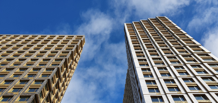
Thus, the task that was posed before ADM consisted, among other things, in accentuating the “façade” contour of the complex overlooking the city and consisting of two houses: the corner one (light) 31 stories high, and the other one (dark) – 23 stories high.

ADM architects proposed a dynamic technique: the volumes seem to be composed of two-tier cells, which become “mobile” at accent points, i.e. at the corners. It seems as though the architects took the cells, securely linked to one another by the force of inner stability, and slightly “tugged them at the corners”, giving extra plastique to the contour. The structure of these “agile” or “mobile” or “flexible”” cells looks like either a spread-out fan, or the stretched bellows of the accordion or a pleated fabric stretched over the frame.

Discovery housing complex
Copyright: Photograph © Alesya Malomuzh / provided by ADM architects


The side ends of both volumes became prominently diagonal, while the “light” corner house – which in this case occupies the main position – got a “waist” ledge on its elongated sides, so its floor plan began to look like an hourglass, and its volume – viewed both from the yard and from the road junction (which is more important from the town-planning standpoint) – began to look like an open book.

The “open book” house, which only remotely resembles the famous “open book” COMECON tower on New Arbat, is the main façade of the complex that draws everybody’s attention. The developer’s representatives share that the form luckily coincided with the develop-given name of “Discovery” – according to the brand book, the resident complex is positioned as a home for people who are “open to the world”, which is echoed by the open book shape and the large panoramic windows.

  • zooming
    Discovery housing complex
    Copyright: Photograph © Yaroslav Lukyanchenko / provided by ADM architects
  • zooming
    Discovery housing complex
    Copyright: © ADM


The “slab” house is completely subjugated to a diagonal motion – as if it “strides” along the drive – and its dark tone serves as a transition to the brown color of the towers designed by the colleagues in the yard – in combination with them, the building forms a “backdrop” that highlights the light color of the corner building, visually moving it to the foreground as the leader of the entire composition.

  • zooming
    Discovery housing complex
    Copyright: Photograph © Yaroslav Lukyanchenko / provided by ADM architects
  • zooming
    Discovery housing complex
    Copyright: Photograph © Yaroslav Lukyanchenko / provided by ADM architects


The two houses, virtually perpendicular to one another, similar in structure and patterns, but different in height and silhouette, form a couple, echoing each other contrastively, like light and dark, vertical and horizontal, or, maybe, even yin and yang.

The cells, which form the shape, are reminiscent of the structuralism stylistic device of the 1970’s, the only difference being that they change not so much their pattern as – gradually – their size. This ingenious kinetic fan-like shape is connected with the configuration of the apartments, albeit not directly. “Every developer wants their apartments to gradually grow from small to large with a small pitch. And they also want bigger apartments at the top, and smaller ones at the bottom. So, what it ends up being is that you design a single-room apartment, then with each next floor it grows a little bit bigger, and then it turns into a small two-room apartment. Then the two-room apartment, gradually growing, turns into a small three-room apartment after a few floors. In Discovery, this increase in size goes not just vertically, but also from center to periphery, with the windows growing wider. Of course, this is not a direct reflection of the apartment layout – we had to tweak a few things and bend a few rules to achieve that. Of course, we could have done this in the straight building but we preferred a more interesting option” – Andrey Romanov says.

  • zooming
    1 / 3
    Section view 1-1. Discovery housing complex
    Copyright: © ADM
  • zooming
    2 / 3
    Discovery housing complex
    Copyright: © ADM
  • zooming
    3 / 3
    Section view A-A. Discovery housing complex
    Copyright: © ADM


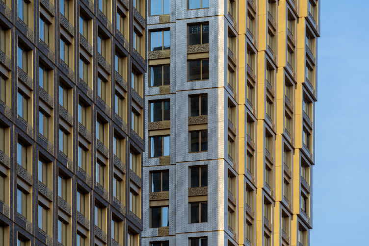
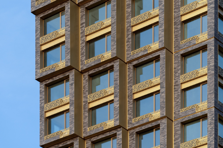
The two-story cells are articulated with brick frames (faced with ceramic tiles, visually indistinguishable from bricks). The cells look like construction blocks, already put by the crane in place, yet not assembled completely – as if they live this “modular idea” in front of our eyes, forming the image of the modular house – while in actuality the structures are, of course, monolithic. The modular cells create the form and give it a feel of movement. The human eye perceives them as being identical, which further works to create this “stretching” effect, a truly plastique paradox.

Discovery housing complex
Copyright: Photograph © Yaroslav Lukyanchenko / provided by ADM architects


Semantic allusions to the idea of a “prefabricated block house”, which may arise when studying the shape of both houses, are more than offset by the “precious” golden decoration – this anything but a cheap prefab project. Rather, these are the drawers of some precious antique piece of furniture. This theme is first of all supported by the ornamented frames of the windows, combined with the cases of the air conditioning units – made of spray-painted steel, golden window frames, and the color of inserts between the floors – all of this creates the effect of a precious “lining”, shading the main brick surface. The lattice pattern resembles some kind of dense, barely readable italics, as if the building were partly a letter written in gold ink.

Discovery housing complex
Copyright: Photograph © Yaroslav Lukyanchenko / provided by ADM architects


Discovery housing complex
Copyright: Photograph © Yaroslav Lukyanchenko / provided by ADM architects


All the golden elements, the lattices, and the “lining” come together to form “threads” that to an equal degree run through both facades, demonstrating their kinship with each other and emphasizing the relief; endowing the form with glitter and glow. The golden color works not just the sign of value and expensiveness, but also in a broader sense – as a color that unites everything, a visual analogue of a “force field”, which seems to hold this entire deconstructivism form on the edge of slight teetering of the matter.

  • zooming
    1 / 5
    Discovery housing complex
    Copyright: Photograph © Yaroslav Lukyanchenko / provided by ADM architects
  • zooming
    2 / 5
    Discovery housing complex
    Copyright: Photograph © Alesya Malomuzh / provided by ADM architects
  • zooming
    3 / 5
    Discovery housing complex
    Copyright: Photograph © Alesya Malomuzh / provided by ADM architects
  • zooming
    4 / 5
    Discovery housing complex
    Copyright: Photograph © Yaroslav Lukyanchenko / provided by ADM architects
  • zooming
    5 / 5
    Discovery housing complex
    Copyright: Photograph © Yaroslav Lukyanchenko / provided by ADM architects


The yard, delineated from two sides by a white and a black residential slabs, and from a third side by the three towers designed by the partner company, is landscaped by the ADM architects project. It is covered with grassy hills with trees growing from them, whose red and yellow foliage will become in fall a perfect match to the golden patterns of the facades. The coverage of the playgrounds has smooth forms, as if flowing in between the hills. Forms just as flowing are given to the climbing construction, compound and multilevel, yet at the same time a single whole and following the playground blueprint.

  • zooming
    1 / 4
    Discovery housing complex
    Copyright: Photograph © Yaroslav Lukyanchenko / provided by ADM architects
  • zooming
    2 / 4
    Discovery housing complex
    Copyright: Photograph © Yaroslav Lukyanchenko / provided by ADM architects
  • zooming
    3 / 4
    Discovery housing complex
    Copyright: Photograph © Yaroslav Lukyanchenko / provided by ADM architects
  • zooming
    4 / 4
    Discovery housing complex
    Copyright: Photograph © Yaroslav Lukyanchenko / provided by ADM architects


Back to the architecture, though: ADM architects are particularly expert at designing the plastique of the wall. Starting from the house on Berzarina Street, where the noble, old-brickwork-imitating, surface of brick tiles and French windows were complemented by curious wooden “shutters”, and ending with the dramatic composition of the housing  complex “Malaya Ordynka 19”, where the architects created not just one, but three kinds of textured surface: Klinker pleated texture with intricate lattices, stone with wooden inserts, and glass waves. The architects have considerable experience in this area. Solutions just as interesting were used in the façade tectonics of the Vitality housing complex.

The composition of the Discovery housing complex is reminiscent of Vitality, because it is also based on the counterpoint of two buildings, long and vertical, dark and light, and is endowed with accented plastique that reveals the depth and relief of the façade. Discovery, however – in full accordance with its name – goes a little bit further: it bends and molds its surfaces, embellishing and adding visual kinetics with discrete stylistic techniques,, balancing on the verge of a simple, restrained, yet appropriate and agile form. Which, doubtlessly, in combination with the “golden lining” adds to visual value the facades of the main high-profile buildings – just in accordance with the well-known maxim that an architectural solution can significantly increase the value of a project.

22 January 2021

Headlines now
Scheduled Evolution
ASADOV Architects unveiled the EvyCenter pavilion, a microcultural hub for fostering personal growth, organizing workshops, and doing gymnastics. Additionally, this pavilion serves as a prototype for a scalable country house, drawing inspiration from the “Loskutok” project, and constructed from CLT panels in a factory. This marks the beginning of a developer project initiated by the architectural firm (sic!), which is seeking partners to expand both small Evy settlements and even larger Evy cities, which are, according to Andrey Asadov, aimed at fostering the “evolutionary” development of the people who will inhabit them.
The Golden Crown
The concept for a dental clinic in Yekaterinburg, developed by CNTR Studio, revolves around the idea of a “mouth full of gold”: pristine white porcelain stoneware walls are complemented by matte brass details. To avoid an overly literal interpretation, the architects focused on the building’s proportions, skillfully navigating between sunlight requirements and fire safety regulations.
Flexibility and Integration
Not long ago, we covered the project for the fourth phase of the ÁLIA residential complex, designed by APEX. Now, we’ve been shown different fence concepts they developed to enclose the complex’s private courtyards, incorporating a variety of public functions. We believe that the sheer fact that the complex’s architects were involved in such a detail as fencing speaks volumes.
A Step Forward
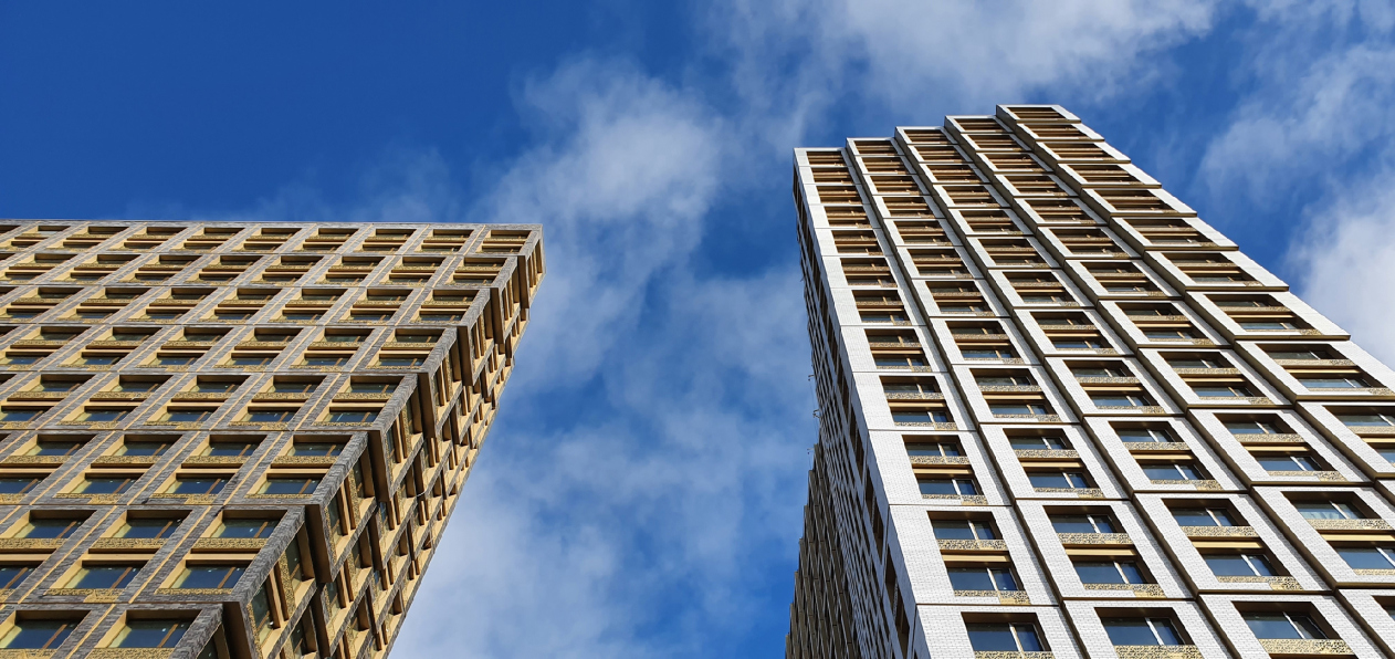
The HIDE residential complex represents a major milestone for ADM architects and their leaders Andrey Romanov and Ekaterina Kuznetsova in their quest for a fresh high-rise aesthetic – one that is flexible and layered, capable of bringing vibrancy to mass and silhouette while shaping form. Over recent years, this approach has become ADM’s “signature style”, with the golden HIDE tower playing a pivotal role in its evolution. Here, we delve into the project’s story, explore the details of the complex’s design, and uncover its core essence.
Gold in the Sands
A new office for a transcontinental company specializing in resource extraction and processing has opened in Dubai. Designed by T+T Architects, masters of creating spaces that are contemporary, diverse, flexible, and original, this project exemplifies their expertise. On the executive floor, a massive brass-clad partition dominates, while layered textures of compressed earth create a contextually resonant backdrop.
Layers and Levels of Flight
This project goes way back – Reserve Union won this architectural competition at the end of 2011, and the building was completed in 2018, so it’s practically “archival”. However, despite being relatively unknown, the building can hardly be considered “dated” and remains a prime example of architectural expression, particularly in the headquarters genre. And it’s especially fitting for an aviation company office. In some ways, it resembles the Aeroflot headquarters at Sheremetyevo but with its own unique identity, following the signature style of Vladimir Plotkin. In this article, we take an in-depth look at the United Aircraft Corporation (UAC) headquarters in the Moscow agglomeration town of Zhukovsky, supplemented by recent photographs from Alexey Naroditsky – a shoot that became only recently possible due to the fact that improvements were finally made in the surrounding area.
Light and Shadow
In this article, we delve into the architectural design of the “Chaika” house by DNK ag architects, which was recently completed in 2023 as part of the collection of signature designs at ZILArt. As is well-known, all the buildings in this complex follow a design code, yet each one is distinct. This particular building stands out not only for its whiteness and minimalism but also for the refined use of a limited number of techniques that, together, create what can confidently be called synergy.
Casus Novae
A master plan was developed for a large residential area with a name of “DNS City”, but now that its implementation began, the plan has been arbitrarily reformatted and replaced with something that, while similar on the surface, is actually quite different. This is not the first time such a thing happens, but it’s always frustrating. With permission from the author, we are sharing Maria Elkina’s post.
Treasure Hunting
The GAFA bureau, in collaboration with Tegola and Arkhitail, organized an expedition to the island of Kilpola in Karelia as part of Moskomarkhitektura’s “Open City” festival. There, amidst moss and rocks, the students sought answers to questions like: what is the sacred, where does it dwell, and what sustains it? Assisting the participants in this quest were landscape engineer Evgeny Levin, artist Nicholas Roerich, a moose, and the lack of cellular connection. Here’s how the story unfolded.
Depths of the Earth, Streams of Water
In the Malaya Okhta district, the Akzent building, designed by Stepan Liphart, was constructed. It follows a classic tripartite structure, yet it’s what you might call “hand-drawn”: each façade is unique in its form and details, some of which aren’t immediately noticeable. In this article, we explore the context and, together with the architect, delve into how the form was developed.
Fir Tree Dynamics
The “Airports of Region” holding is planning to build an airport in Karachay-Cherkessia, aiming to make the Arkhyz and Dombay resorts more accessible to travelers. The project that won in an invitation-only competition, submitted by Sergey Nikeshkin’s KPLN, blends natural imagery inspired by the shape of a conifer seed, open-air waiting spaces, majestic large trees, and a green roof elevated on needle-like columns. The result is both nature-inspired and WOW.
​A Brick Shell
In the process of designing a clubhouse situated among pine trees in a prestigious suburban area near Moscow, the architectural firm “A.Len” did the façade design part. The combination of different types of brick and masonry correlates with the volumetric and plastique solutions, further enhanced by the inclusion of wood-painted fragments and metal “glazing”.
Word Forms
ATRIUM architects love ambitious challenges, and for the firm’s thirtieth anniversary, they boldly play a game of words with an exhibition that dives deep into a self-created vocabulary. They immerse their projects – especially art installations – into this glossary, as if plunging into a current of their own. You feel as if you’re flowing through the veins of pure art, immersed in a universe of vertical cities, educational spaces – of which the architects are true masters – and the cultural codes of various locations. But what truly captivates is the bold statement that Vera Butko and Anton Nadtochy make, both through their work and this exhibition: architecture, above all, is art – the art of working with form and space.
Flexibility and Acuteness of Modernity
Luxurious, fluid, large “kokoshniks” and spiral barrel columns, as if made from colorful chewing gum: there seem to be no other mansion like this in Moscow, designed in the “Neo-Russian-Modern” style. And the “Teremok” on Malaya Kaluzhskaya, previously somewhat obscure, has “come alive with new colors” and gained visibility after its restoration for the office of the “architectural ecosystem” as the architects love to call themselves. It’s evident that Julius Borisov and the architects at UNK put their hearts into finding this new office and bringing it up to date. Let’s delve into the paradoxes of this mansion’s history and its plasticity. Spoiler: two versions of modernity meet here, both balancing on the razor’s edge of “what’s current”.
Yuri Vissarionov: “A modular house does not belong to the land”
It belongs to space, or to the air... It turns out that 3D printing is more effective when combined with a modular approach: the house is built in a workshop and then adapted to the site, including on uneven terrain. Yuri Vissarionov shares his latest experience in designing tourist complexes, both in central Russia and in the south. These include houseboats, homes printed from lightweight concrete using a 3D printer, and, of course, frame houses.
​Moscow’s First
“The quality of education largely depends on the quality of the educational environment”. This principle of the last decade has been realized by Sergey Skuratov in the project for the First Moscow Gymnasium on Rostovskaya Embankment in the Khamovniki district. The building seamlessly integrates into the complex urban landscape, responding both to the pedestrian flow of the city and the quiet alleyways. It skillfully takes advantage of the height differences and aligns with modern trends in educational space design. Let’s take a closer look.
Looking at the Water
The site of Villa Sonata stretches from the road to the water’s edge, offering its own shoreline, pier, and a picturesque river panorama. To reveal these sweeping views, Roman Leonidov “cut” the façade diagonally parallel to the river, thus getting two main axes for the house and, consequently, “two heads”. The internal core – two double-height spaces, a living room and a conservatory, with a “bridge” above them – makes the house both “transparent” and filled with light.
The White Wing
Well, it’s not exactly white. It’s more of a beige, white-stone structure that plays with the color of limestone – smoother surfaces are lighter, while rougher ones are darker. This wing unites various elements: it absorbs and interprets the surrounding themes. It responds to everything, yet maintains a cohesive expression – a challenging task! – while also incorporating recognizable features of its own, such as the dynamic cuts at the bottom, top, and middle.
Urban Dunes
The XSA Ramps team designed and built a three-part sports hub for a park in Rostov-on-Don, welcoming people of all ages and fitness levels. The skate plaza, pump track, and playground are all meticulously crafted with details that attract a diverse range of visitors. The technical execution of the shapes and slopes transforms this space into a kind of sculptural composition.
Proportional Growth
The project for the fourth phase of the ÁLIA residential area has been announced. The buildings are situated on an elongated plot – almost a “ray” that shoots out from the center of the area towards the river. Their layout reflects both a response to Moscow’s architectural preferences over the past 15 years, shifting “from blocks to towers”, and an interpretation of the neighboring business park designed by SOM. Additionally, the best apartments here are not located at the very top but closer to the middle, forming a glowing “waistline”.
The “Staircase” Building
In designing the “Details” residential complex in New Moscow, Rais Baishev spiced up the now-popular Moscow theme of a “courtyard” building with an idea drawn from the surrealist drawings by Maurits Escher. He envisioned the stepped silhouettes and descending slopes as a metaphysical mega-staircase, creating a key void within the courtyard that gave the project an internal “spine”. This concept is felt both in the building’s silhouette and on its façades.
Projection of the Quarter
No one doubted that the building that Vladimir Plotkin designed as part of the “Garden Quarters” would be the most modernist of all. And it turned out just that way: while adhering to the common design code, the building successfully combines brick and white stone, rhythmically responding to the neighboring building designed by Ostozhenka, yet tactfully and persistently making a few statements of its own. This includes the projection of the ideal urban development composition “14–9–6”, which can be found right next door, mathematical calculations, including those for various types of terraces (and perhaps the only reminder of the Soviet past of the Kauchuk rubber factory!), and the white “cross-stitch” pattern of the façade grid.
Domus Aurea
In this issue, we examine the “Tessinsky-1” house, designed by Sergey Skuratov and completed in 2023. Located in the middle of the Serebryanicheskaya Embankment district, at the intersection of its main streets, this house assumes a sort of “nodal” role: it not only responds to everything around it and preserves many memories of the former EMA factory within itself, but it weaves all this into a newly directed pattern, reconciling bright “gold” and dark-colored brick, largely with the help of the new, modern-yet-archaic Columba brick, which, come to think about it, is the most precious element here.
The Chimney of Nikola-Lenivets
In this issue, we are examining the “Obelisk House” designed by KATARSIS and built for the Arkhstoyanie 2023 festival. However, it was only finished later on, and this is why we are examining it now. It seems to us that after the “Obelisk House” appeared in Nikola-Lenivets, a dialogue and a few inner connections appeared between the temporary structures built here. These houses no longer look like “accidental neighbors”, more of which below.
​Periscope by the Bay
The jury awarded the second place in the competition for a public and cultural center in Petropavlovsk-Kamchatsky to the companies GORA (“Mountain”) and M4. In the consortium’s proposal, the building resembles a sperm whale with a calf swimming next to it or a periscope, whose lenses capture the most spectacular views from the surrounding landscape.
From Arcs to Dolmens
While working on the competition project for Petropavlovsk-Kamchatsky, ASADOV Architects prioritized the value of the natural and urban environment, aiming to preserve the balance of the location while minimizing the resemblance of the volume that they designed to a “traditional building”. The task was challenging, and the architects created three versions, one of which having been developed after the competition, where their main proposal took third place. However, the point of interest here is not the competition result but the continuity of creative thinking.
Hide and Seek
The ID Moskovskiy house, designed by Stepan Liphart in St. Petersburg, in the courtyards near Moskovskiy Avenue beyond the Obvodny Canal and recently completed, is notable for several reasons. Firstly, it has been realized with considerable accuracy, which is particularly significant as this is the first building where the architect was responsible not only for the facades but also for the layouts, allowing for better integration between the two. On the other hand, this building is interesting as an example of the “germination” of new architecture in the city: it draws on the best examples from the neighborhood and becomes an improved and developed sum of ideas found by the architect in the surrounding context.
The Big Twelve
Yesterday, the winners of the Moscow Mayor’s Architecture Award were announced and honored. Let’s take a look at what was awarded and, in some cases, even critique this esteemed award. After all, there is always room for improvement, right?
Above the Golden Horn
The residential complex “Philosophy” designed by T+T architects in Vladivostok, is one of the new projects in the “Golubinaya Pad” area, changing its development philosophy (pun intended) from single houses to a comprehensive approach. The buildings are organized along public streets, varying in height and format, with one house even executed in gallery typology, featuring a cantilever leaning on an art object.
Nuanced Alternative
How can you rhyme a square and space? Easily! But to do so, you need to rhyme everything you can possibly think of: weave everything together, like in a tensegrity structure, and find your own optics too. The new exhibition at GES-2 does just that, offering its visitor a new perspective on the history of art spanning 150 years, infused with the hope for endless multiplicity of worlds and art histories. Read on to see how this is achieved and how the exhibition design by Evgeny Ace contributes to it.