По-русски

​In Three Voices

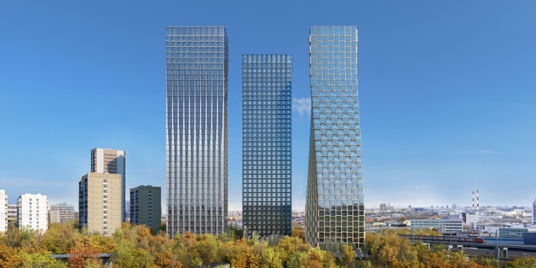
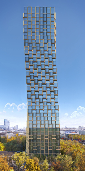
The high-rise – 41 stories high – housing complex HIDE is being built on the bank of the Setun River, near the Poklonnaya Mountain. It consists of three towers of equal height, yet interpreted in three different ways. One of the towers, the most conspicuous one looks as if it was twisted in a spiral, composed of a multitude of golden bay windows.

12 January 2021
Object
mainImg
Just a decade ago, high-rise projects in Moscow were relatively rare, the Moscow City complex being one of a kind, and there were only occasional conversations about building the “Big City” on the grounds of former industrial parks at a certain radius around it. Today, residential towers over 150 meters high are sprouting nearly in every part of the city, slowly but surely changing its skyline.

The residential complex HIDE is a vivid example of that: 41 stories high, about 150 meters tall. Designed by ADM architects, it is built by MR Group on the bank of the Setun River, in the part of Moscow that can probably be described as the zone of influence of the “Big City”: not far away from Kutuzovskaya and Studencheskaya metro stations, and from the park of the Poklonnaya Mountain, near the Moscow Central Circle and the Third Transport Ring running parallel to it. This proximity is contrastive, with a major city highway and a major city railroad on the one side, which, at the same time ensure good accessibility, and with the parkland of the Setun bank on the other. To get down to the Setun valley, the residents of the new complex will just have to cross the street.

The leader of ADM architects Andrey Romanov shared that the composition and the height of the project were defined by the sweeping panoramas opening from the land site. 

We at once decided that these will be skyscrapers. The very land site itself suggested such a solution because its main competitive advantage are the sweeping views that the apartment windows command.
What turned out to be the most challenging and responsible task in this case, was the search for the architectural imagery because the towers are 150 meters high, and they are visible from numerous vantage points. This is why our main task was to make this new complex fit in with the panorama of the surrounding city.


Still before the architects got down to the actual design process, they made a visual analysis of the grounds using drone footage, which showed that the future apartments will command breathtaking views. The windows gazing northwest will overlook the entire Presnya area and the already-mentioned Moscow City business center. From the east side, it will be the Berezhkovsky Bridge and the Novodevichy Monastery. The views in the southwestern direction from a height of 100-150 meters will include the green panorama of Luzhniki complex, Kosygina and Mosfilmovskaya streets, the high-rise building of the Moscow State University, the Sparrow Hills, and the picturesque bend of the Moskva River. Both the architects and the developer deemed this view to be the most valuable one, and this is why one of the two longer facades of each tower gazes southwest.

HIDE Housing Complex
Copyright: © ADM


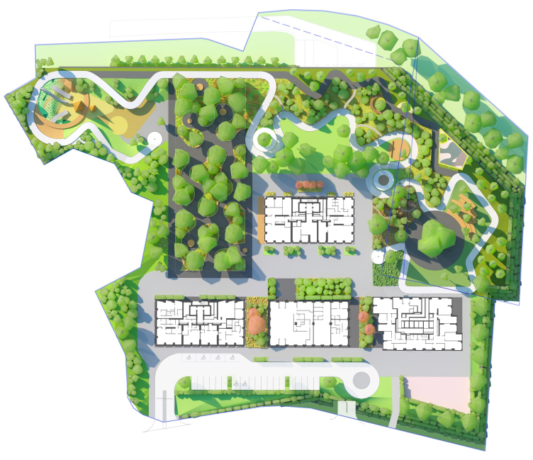
The land site is a compact spot with an overall area of about 2 hectares, a jagged contour, and a height difference about 5 meters from north to south. In the north and in the east, it borders on the Moscow Central Circle and a flyover junction of the Third Transport Ring, while its south border adjoins the 1st Setunsky Drive, from the opposite side of which the green riverbank starts. Farther east, almost coming up against HIDE, a small Soviet microdistrict begins: houses 9, 14, and 25 stories high, a large school, and a few kindergartens. The district is not really large, and is naturally curbed by the roads and the river, yet it does include an educational complex. In addition, one can notice that the construction of the towers began here a while ago – as early as in 1975 this place got a 25-story house on its western border, quite high for its time; in the late 1990’s, two more 25-story towers were built. The new housing complex is nearly twice their height, which means that in a sense it continues the town planning tradition that was started some time ago in this part of Moscow. 

The stylobate of HIDE includes an underground parking garage and occupied almost the entire construction blueprint, leveling out the height difference. The stylobate roof is a bit higher than the lines of the Moscow Central Circle, which puts some distance between the inner yard and the city’s transport arteries. The north and the east contours of the stylobate descend in the direction of the roads in a smooth green slope, and, if we are to look from this vantage point, the stylobate looks more like a natural mount – the idea is that the towers look as if they were sprouting from the hill and the trees, and not from some man-made construction. From the side of the drive, the stylobate stands back from the redline, leaving room for the overland parking lot for guests’ cars, a taxi alighting zone, and a small pedestrian street running along the facade of the complex.

The masterplan. HIDE Housing Complex
Copyright: © ADM


As for the towers themselves, rectangular on the plan and equal in height, 41 floors each, they are positioned along the driveway: two in the contour of the city street with a two-level public tier between them. The third one stands symmetrically between them pushed into the depth of the site. This arrangement of the towers in the south part is explained by the insolation requirements of the neighboring buildings: if you move the composition just a little bit to the left or to the right, a whole city block will end up covered by a huge shadow, as Andrey Romanov explained. Besides, arranged this way, the houses are huddled in the part that is closer to the city street, with the residents-only private yard situated behind them. The public and private grounds are zoned and unobtrusively separated; the yard, rich in vegetation, also provides extra noise protection for the lower floors of the towers.

HIDE Housing Complex
Copyright: © ADM


Unlike the volumetric and spatial solution, the architectural image was slow to come: the architects developed a lot of versions, which included both identical and totally different towers. However, the creative search did the project a lot of good, the authors believe.

  • zooming
    HIDE Housing Complex
    Copyright: © ADM
  • zooming
    HIDE Housing Complex
    Copyright: © ADM


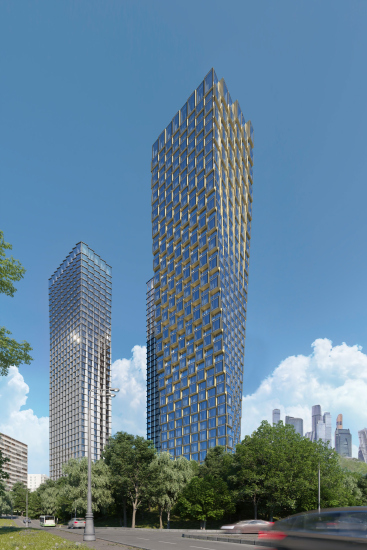
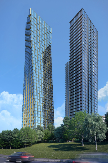
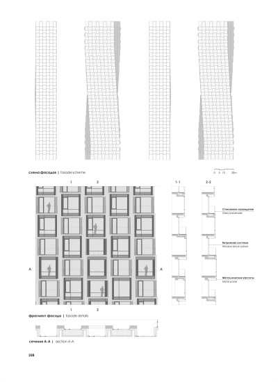
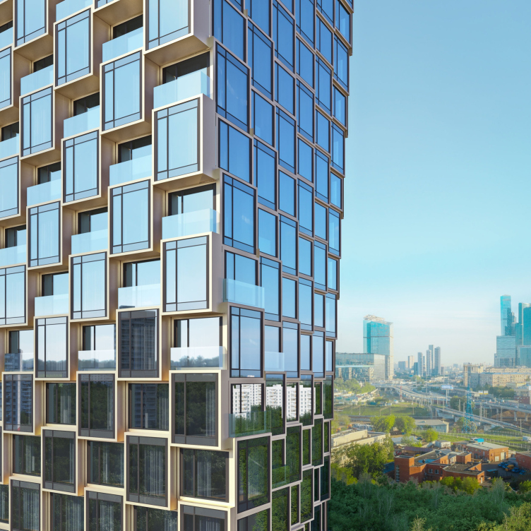
Ultimately, each of the high-rises got a unique image of its own, yet within a single concept they rather complement than compete with one another. The south tower, situated closer than the other two to the Moskva River and designed, among other things, to be viewed from the water and from the Sparrow Hills, is a particular highlight. Its plan is composed of three slabs, shifted with an equal pitch. The plastique of the facades is based on the checkered alternation of bay windows, encased in frames of golden anodized aluminum, and balconies with transparent barriers. Each element is situated with a slight shift on each floor – and this way the entire volume takes on an S-shaped contour – a diagonal contrapposto – a silhouette, distantly resembling a giant figure walking towards the river. We will note here that the ledges vary from not very deep at the top and bottom to very prominent “at the waist”, creating an effect of composite and even “undulating” matter, which seemingly transforms right in front of our eyes, which is felt particularly strongly when you view the complex from different vantage points. When you look from the front, the diagonal bend folds into a curved golden “profile”.

  • zooming
    HIDE Housing Complex
    Copyright: © ADM
  • zooming
    The facades. HIDE Housing Complex
    Copyright: © ADM


HIDE Housing Complex
Copyright: © ADM


The tower on the left gravitates towards the Setun valley, enters into a dialogue with the river. Looking to emphasize its natural character, in one of the versions the architects proposed to design its facades in red brick. Later on, however, for the sake of the integrity of the approach, the architects adopted hi-tech facades for all of the towers, based on glass and aluminum, characteristic for skyscrapers. The brick had to go – as a material but not as a texture.

The volume of the tower, sturdy and robust at the bottom, looks totally weightless at the top thanks to the wide vertical “ribs”, composed of tiny aluminum cassettes, which imitate brick both in color and texture. As they climb up the glass facade, the “ribs” grow thinner, and then dissolve completely against the background of the sky, together with the glass “crown” of the top of the skyscraper.

  • zooming
    HIDE Housing Complex
    Copyright: © ADM
  • zooming
    HIDE Housing Complex
    Copyright: © ADM


The central tower is the most material, robust, and static. It emphasizes its status with the grid of the cellular facade and its clear structure. Here the architects made the most out of the contrast, thus attracting as much attention as possible to the volume that has been moved into the background. Probably, this is the reason for its dark color. While in the case of the two other high-rises the golden and silver aluminum details merely complement the image, creating accents, here the metal dominates. The tower is all glass but all of the stained glass windows frames are made from dark metal. The window apertures are framed by aluminum frames of a rich bronze hue. The piers between them are pitch-black. And they look darker still due to their concave shape.

  • zooming
    HIDE Housing Complex
    Copyright: © ADM
  • zooming
    HIDE Housing Complex
    Copyright: © ADM


The architects emphasized the combination of different textures. Using for the facades of the towers only two active materials, they achieve a stunning diversity. You can see here lots of shades of color – golden, silver, brass, bronze, pitch-black – and an abundance of textures – from satin to high gloss – as well as various kinds of architectural stylistic devices, such as niches, ledges, and volumetric patterns. At the same time, this whole diversity of details virtually disappears in the upper floors, giving way to fine facets of glass and a small “attic” of penthouses, whose ceiling height is 5.2 meters, as opposed to the 3.5 meters in all the other stories.

  • zooming
    HIDE Housing Complex
    Copyright: © ADM
  • zooming
    HIDE Housing Complex
    Copyright: © ADM


The range of apartments is rather diverse – from studios to four-room apartments and penthouses on the 41st floor. The windows are panoramic, reaching down to the floor. The two-story entrance unit includes a central hall, a concierge service, lounges, cafes, and a restaurant with an outdoor terrace in front of the complex. In addition, it is planned that the bottom floors will include a supermarket, a bakery, a drugstore, a beauty salon, a fitness center, a preschool educational center, a co-working space, and meeting rooms. This way, the developer is planning to implement the trendy “vertical city” idea, when everything necessary for life and work is available within one building.

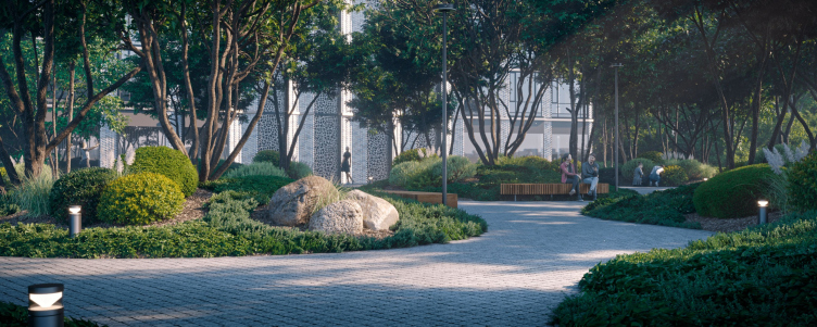
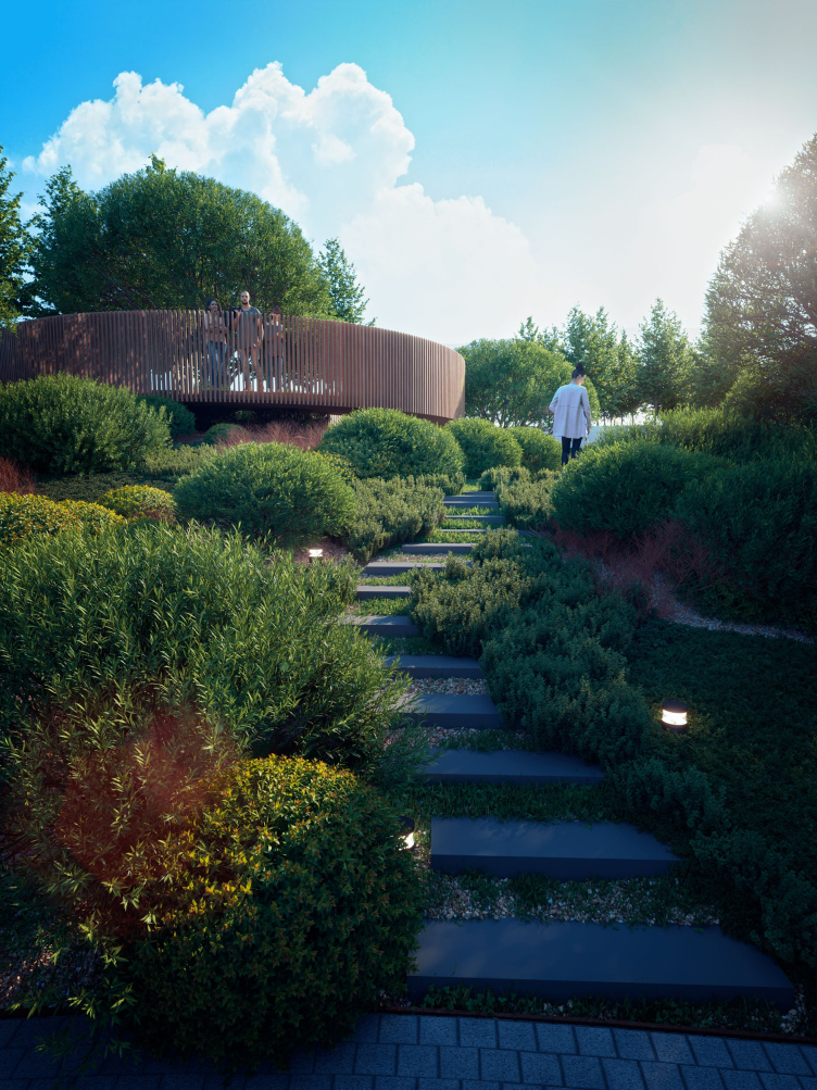
The central hall exits to the residents-only grounds of the complex, where ADM architects designed a veritable landscape park. For all the expressiveness of the facades, this park can be arguably considered to be one of the key advantages of the project. The park territory borrowed a lot of traits from the natural landscape – probably, due to the proximity to the Setun River – yet, at the same time, it has the orderly nature and the harmony of the traditional English park.

HIDE Housing Complex
Copyright: © ADM


HIDE Housing Complex
Copyright: © ADM


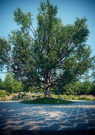
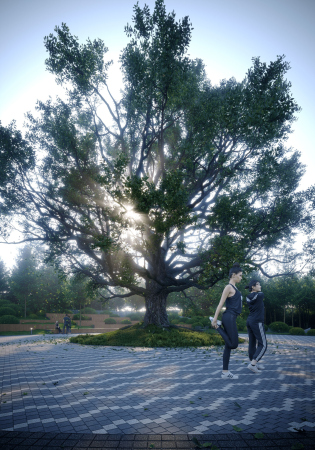
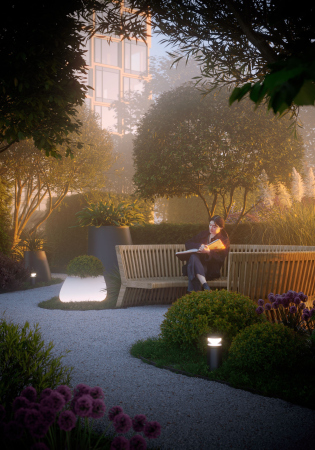
The yard, just as the entire architectural ensemble, rests on top of the stylobate and is visually raised above the carriageway of the Third Transport Ring. The place includes a large rectangular park, a “secret garden” with gazebos designed for solitary recreation, green lawns, yoga spots, a workout area, and an amphitheater with a view of a spreading oak, which is planned to be planted already perennial.

  • zooming
    1 / 4
    HIDE Housing Complex
    Copyright: © ADM
  • zooming
    2 / 4
    HIDE Housing Complex
    Copyright: © ADM
  • zooming
    3 / 4
    Secret garden. HIDE Housing Complex
    Copyright: © ADM
  • zooming
    4 / 4
    The Amphitheater. HIDE Housing Complex
    Copyright: © ADM


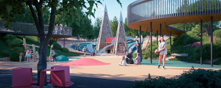
The whole territory is stitched with wide pedestrian roads. In the northernmost spot, there is a playground. The artificial green hills surround it from all sides, forming something like a shallow crater or a canyon, safely protected from the wind. The walking paths do not cross over to the playground but hand above it in beautiful loops of the bridges.

The playground. HIDE Housing Complex
Copyright: © ADM


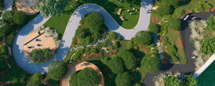
Top view. HIDE Housing Complex
Copyright: © ADM


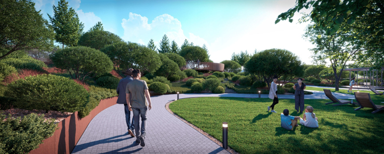
Surprisingly, the architects were able to find room for all of the elements of a modern park in this comparatively small land site. These are walking trails, sports facilities, playgrounds, quiet secluded corners for work and recreation, and, of course, lots of various green plants. There is also a bicycle trail – you can start your bicycle ride directly from the yard, exiting to the embankments of the Moskva River.

The pedestrian road. HIDE Housing Complex
Copyright: © ADM


The construction of HIDE is already underway. And, judging by the project, it must become a prominent member in the family of the residential skyscrapers that are changing Moscow’s skyline.

We will note that such towers are the ultra-modern type of housing designed for high quality of execution and for panoramic views from up high, from where Moscow is perceived in a fundamentally different way, like some impressive grand-scale singularity. We will repeat here that until recently such “Manhattan” type of housing was almost the sole prerogative of the Moscow City – and now the city is actively developing new projects of high-rise towers, each of which is looking to create a special and memorable image – because the high-rise status obliges to have a form that has been carefully molded. However, what makes the new residential towers (Hide being one of them) different from Moscow City (where nobody really cared about landscaping the territory for a long time) is the careful attention to the public outdoor space. Due to the significant number of floors, the houses can afford, stretching up, not to occupy the entire land site, but to allocate the maximum area in the lower tier to create a courtyard, or even a mini-park. Thus, the towers combine a subtly designed diverse shape and highly developed infrastructure that will work, among other things, for the city – and the ability to live at a bird’s eye view.

12 January 2021

Headlines now
Scheduled Evolution
ASADOV Architects unveiled the EvyCenter pavilion, a microcultural hub for fostering personal growth, organizing workshops, and doing gymnastics. Additionally, this pavilion serves as a prototype for a scalable country house, drawing inspiration from the “Loskutok” project, and constructed from CLT panels in a factory. This marks the beginning of a developer project initiated by the architectural firm (sic!), which is seeking partners to expand both small Evy settlements and even larger Evy cities, which are, according to Andrey Asadov, aimed at fostering the “evolutionary” development of the people who will inhabit them.
The Golden Crown
The concept for a dental clinic in Yekaterinburg, developed by CNTR Studio, revolves around the idea of a “mouth full of gold”: pristine white porcelain stoneware walls are complemented by matte brass details. To avoid an overly literal interpretation, the architects focused on the building’s proportions, skillfully navigating between sunlight requirements and fire safety regulations.
Flexibility and Integration
Not long ago, we covered the project for the fourth phase of the ÁLIA residential complex, designed by APEX. Now, we’ve been shown different fence concepts they developed to enclose the complex’s private courtyards, incorporating a variety of public functions. We believe that the sheer fact that the complex’s architects were involved in such a detail as fencing speaks volumes.
A Step Forward
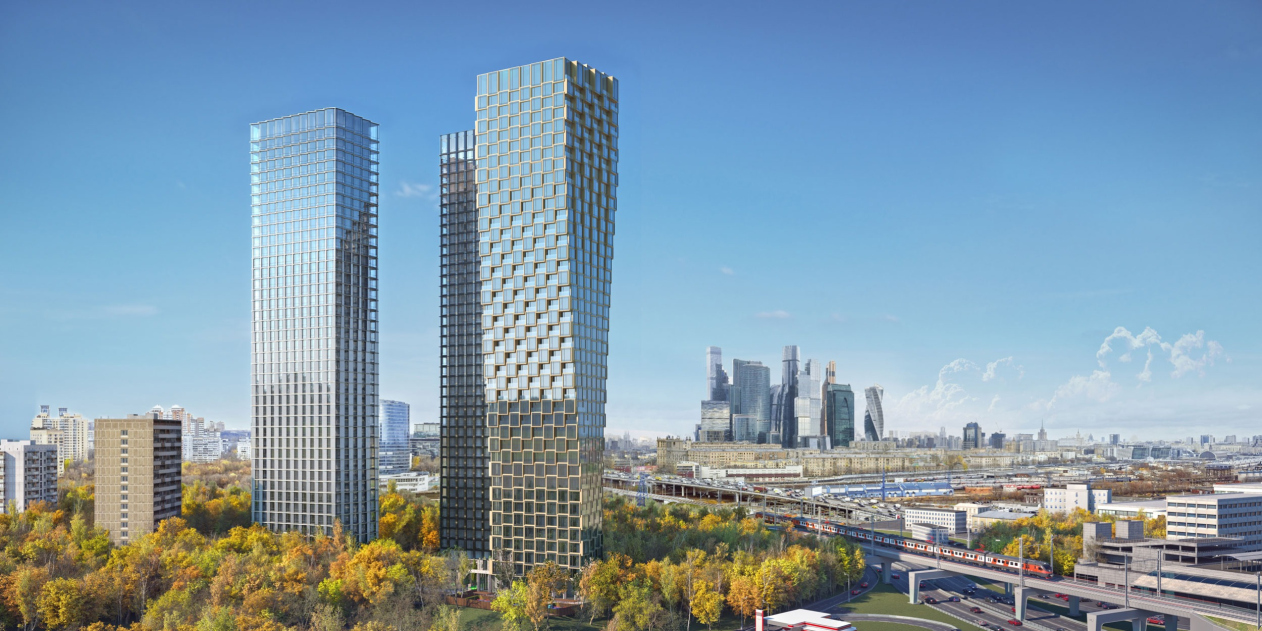
The HIDE residential complex represents a major milestone for ADM architects and their leaders Andrey Romanov and Ekaterina Kuznetsova in their quest for a fresh high-rise aesthetic – one that is flexible and layered, capable of bringing vibrancy to mass and silhouette while shaping form. Over recent years, this approach has become ADM’s “signature style”, with the golden HIDE tower playing a pivotal role in its evolution. Here, we delve into the project’s story, explore the details of the complex’s design, and uncover its core essence.
Gold in the Sands
A new office for a transcontinental company specializing in resource extraction and processing has opened in Dubai. Designed by T+T Architects, masters of creating spaces that are contemporary, diverse, flexible, and original, this project exemplifies their expertise. On the executive floor, a massive brass-clad partition dominates, while layered textures of compressed earth create a contextually resonant backdrop.
Layers and Levels of Flight
This project goes way back – Reserve Union won this architectural competition at the end of 2011, and the building was completed in 2018, so it’s practically “archival”. However, despite being relatively unknown, the building can hardly be considered “dated” and remains a prime example of architectural expression, particularly in the headquarters genre. And it’s especially fitting for an aviation company office. In some ways, it resembles the Aeroflot headquarters at Sheremetyevo but with its own unique identity, following the signature style of Vladimir Plotkin. In this article, we take an in-depth look at the United Aircraft Corporation (UAC) headquarters in the Moscow agglomeration town of Zhukovsky, supplemented by recent photographs from Alexey Naroditsky – a shoot that became only recently possible due to the fact that improvements were finally made in the surrounding area.
Light and Shadow
In this article, we delve into the architectural design of the “Chaika” house by DNK ag architects, which was recently completed in 2023 as part of the collection of signature designs at ZILArt. As is well-known, all the buildings in this complex follow a design code, yet each one is distinct. This particular building stands out not only for its whiteness and minimalism but also for the refined use of a limited number of techniques that, together, create what can confidently be called synergy.
Casus Novae
A master plan was developed for a large residential area with a name of “DNS City”, but now that its implementation began, the plan has been arbitrarily reformatted and replaced with something that, while similar on the surface, is actually quite different. This is not the first time such a thing happens, but it’s always frustrating. With permission from the author, we are sharing Maria Elkina’s post.
Treasure Hunting
The GAFA bureau, in collaboration with Tegola and Arkhitail, organized an expedition to the island of Kilpola in Karelia as part of Moskomarkhitektura’s “Open City” festival. There, amidst moss and rocks, the students sought answers to questions like: what is the sacred, where does it dwell, and what sustains it? Assisting the participants in this quest were landscape engineer Evgeny Levin, artist Nicholas Roerich, a moose, and the lack of cellular connection. Here’s how the story unfolded.
Depths of the Earth, Streams of Water
In the Malaya Okhta district, the Akzent building, designed by Stepan Liphart, was constructed. It follows a classic tripartite structure, yet it’s what you might call “hand-drawn”: each façade is unique in its form and details, some of which aren’t immediately noticeable. In this article, we explore the context and, together with the architect, delve into how the form was developed.
Fir Tree Dynamics
The “Airports of Region” holding is planning to build an airport in Karachay-Cherkessia, aiming to make the Arkhyz and Dombay resorts more accessible to travelers. The project that won in an invitation-only competition, submitted by Sergey Nikeshkin’s KPLN, blends natural imagery inspired by the shape of a conifer seed, open-air waiting spaces, majestic large trees, and a green roof elevated on needle-like columns. The result is both nature-inspired and WOW.
​A Brick Shell
In the process of designing a clubhouse situated among pine trees in a prestigious suburban area near Moscow, the architectural firm “A.Len” did the façade design part. The combination of different types of brick and masonry correlates with the volumetric and plastique solutions, further enhanced by the inclusion of wood-painted fragments and metal “glazing”.
Word Forms
ATRIUM architects love ambitious challenges, and for the firm’s thirtieth anniversary, they boldly play a game of words with an exhibition that dives deep into a self-created vocabulary. They immerse their projects – especially art installations – into this glossary, as if plunging into a current of their own. You feel as if you’re flowing through the veins of pure art, immersed in a universe of vertical cities, educational spaces – of which the architects are true masters – and the cultural codes of various locations. But what truly captivates is the bold statement that Vera Butko and Anton Nadtochy make, both through their work and this exhibition: architecture, above all, is art – the art of working with form and space.
Flexibility and Acuteness of Modernity
Luxurious, fluid, large “kokoshniks” and spiral barrel columns, as if made from colorful chewing gum: there seem to be no other mansion like this in Moscow, designed in the “Neo-Russian-Modern” style. And the “Teremok” on Malaya Kaluzhskaya, previously somewhat obscure, has “come alive with new colors” and gained visibility after its restoration for the office of the “architectural ecosystem” as the architects love to call themselves. It’s evident that Julius Borisov and the architects at UNK put their hearts into finding this new office and bringing it up to date. Let’s delve into the paradoxes of this mansion’s history and its plasticity. Spoiler: two versions of modernity meet here, both balancing on the razor’s edge of “what’s current”.
Yuri Vissarionov: “A modular house does not belong to the land”
It belongs to space, or to the air... It turns out that 3D printing is more effective when combined with a modular approach: the house is built in a workshop and then adapted to the site, including on uneven terrain. Yuri Vissarionov shares his latest experience in designing tourist complexes, both in central Russia and in the south. These include houseboats, homes printed from lightweight concrete using a 3D printer, and, of course, frame houses.
​Moscow’s First
“The quality of education largely depends on the quality of the educational environment”. This principle of the last decade has been realized by Sergey Skuratov in the project for the First Moscow Gymnasium on Rostovskaya Embankment in the Khamovniki district. The building seamlessly integrates into the complex urban landscape, responding both to the pedestrian flow of the city and the quiet alleyways. It skillfully takes advantage of the height differences and aligns with modern trends in educational space design. Let’s take a closer look.
Looking at the Water
The site of Villa Sonata stretches from the road to the water’s edge, offering its own shoreline, pier, and a picturesque river panorama. To reveal these sweeping views, Roman Leonidov “cut” the façade diagonally parallel to the river, thus getting two main axes for the house and, consequently, “two heads”. The internal core – two double-height spaces, a living room and a conservatory, with a “bridge” above them – makes the house both “transparent” and filled with light.
The White Wing
Well, it’s not exactly white. It’s more of a beige, white-stone structure that plays with the color of limestone – smoother surfaces are lighter, while rougher ones are darker. This wing unites various elements: it absorbs and interprets the surrounding themes. It responds to everything, yet maintains a cohesive expression – a challenging task! – while also incorporating recognizable features of its own, such as the dynamic cuts at the bottom, top, and middle.
Urban Dunes
The XSA Ramps team designed and built a three-part sports hub for a park in Rostov-on-Don, welcoming people of all ages and fitness levels. The skate plaza, pump track, and playground are all meticulously crafted with details that attract a diverse range of visitors. The technical execution of the shapes and slopes transforms this space into a kind of sculptural composition.
Proportional Growth
The project for the fourth phase of the ÁLIA residential area has been announced. The buildings are situated on an elongated plot – almost a “ray” that shoots out from the center of the area towards the river. Their layout reflects both a response to Moscow’s architectural preferences over the past 15 years, shifting “from blocks to towers”, and an interpretation of the neighboring business park designed by SOM. Additionally, the best apartments here are not located at the very top but closer to the middle, forming a glowing “waistline”.
The “Staircase” Building
In designing the “Details” residential complex in New Moscow, Rais Baishev spiced up the now-popular Moscow theme of a “courtyard” building with an idea drawn from the surrealist drawings by Maurits Escher. He envisioned the stepped silhouettes and descending slopes as a metaphysical mega-staircase, creating a key void within the courtyard that gave the project an internal “spine”. This concept is felt both in the building’s silhouette and on its façades.
Projection of the Quarter
No one doubted that the building that Vladimir Plotkin designed as part of the “Garden Quarters” would be the most modernist of all. And it turned out just that way: while adhering to the common design code, the building successfully combines brick and white stone, rhythmically responding to the neighboring building designed by Ostozhenka, yet tactfully and persistently making a few statements of its own. This includes the projection of the ideal urban development composition “14–9–6”, which can be found right next door, mathematical calculations, including those for various types of terraces (and perhaps the only reminder of the Soviet past of the Kauchuk rubber factory!), and the white “cross-stitch” pattern of the façade grid.
Domus Aurea
In this issue, we examine the “Tessinsky-1” house, designed by Sergey Skuratov and completed in 2023. Located in the middle of the Serebryanicheskaya Embankment district, at the intersection of its main streets, this house assumes a sort of “nodal” role: it not only responds to everything around it and preserves many memories of the former EMA factory within itself, but it weaves all this into a newly directed pattern, reconciling bright “gold” and dark-colored brick, largely with the help of the new, modern-yet-archaic Columba brick, which, come to think about it, is the most precious element here.
The Chimney of Nikola-Lenivets
In this issue, we are examining the “Obelisk House” designed by KATARSIS and built for the Arkhstoyanie 2023 festival. However, it was only finished later on, and this is why we are examining it now. It seems to us that after the “Obelisk House” appeared in Nikola-Lenivets, a dialogue and a few inner connections appeared between the temporary structures built here. These houses no longer look like “accidental neighbors”, more of which below.
​Periscope by the Bay
The jury awarded the second place in the competition for a public and cultural center in Petropavlovsk-Kamchatsky to the companies GORA (“Mountain”) and M4. In the consortium’s proposal, the building resembles a sperm whale with a calf swimming next to it or a periscope, whose lenses capture the most spectacular views from the surrounding landscape.
From Arcs to Dolmens
While working on the competition project for Petropavlovsk-Kamchatsky, ASADOV Architects prioritized the value of the natural and urban environment, aiming to preserve the balance of the location while minimizing the resemblance of the volume that they designed to a “traditional building”. The task was challenging, and the architects created three versions, one of which having been developed after the competition, where their main proposal took third place. However, the point of interest here is not the competition result but the continuity of creative thinking.
Hide and Seek
The ID Moskovskiy house, designed by Stepan Liphart in St. Petersburg, in the courtyards near Moskovskiy Avenue beyond the Obvodny Canal and recently completed, is notable for several reasons. Firstly, it has been realized with considerable accuracy, which is particularly significant as this is the first building where the architect was responsible not only for the facades but also for the layouts, allowing for better integration between the two. On the other hand, this building is interesting as an example of the “germination” of new architecture in the city: it draws on the best examples from the neighborhood and becomes an improved and developed sum of ideas found by the architect in the surrounding context.
The Big Twelve
Yesterday, the winners of the Moscow Mayor’s Architecture Award were announced and honored. Let’s take a look at what was awarded and, in some cases, even critique this esteemed award. After all, there is always room for improvement, right?
Above the Golden Horn
The residential complex “Philosophy” designed by T+T architects in Vladivostok, is one of the new projects in the “Golubinaya Pad” area, changing its development philosophy (pun intended) from single houses to a comprehensive approach. The buildings are organized along public streets, varying in height and format, with one house even executed in gallery typology, featuring a cantilever leaning on an art object.
Nuanced Alternative
How can you rhyme a square and space? Easily! But to do so, you need to rhyme everything you can possibly think of: weave everything together, like in a tensegrity structure, and find your own optics too. The new exhibition at GES-2 does just that, offering its visitor a new perspective on the history of art spanning 150 years, infused with the hope for endless multiplicity of worlds and art histories. Read on to see how this is achieved and how the exhibition design by Evgeny Ace contributes to it.