По-русски

A Younger Forest Brother

A guest house designed by Roman Leonidov bureau echoes its prototype - the main house - but it also creatively revises a few interesting and recognizable techniques.

07 April 2016
Object
mainImg

A few years ago, in the near-Moscow area, at a picturesque land site surrounded by a thick pine forest, upon the project of Roman Leonidov, a house was built of natural stone and dark wood. A little later on, its owners - people used to an socially active lifestyle - decided to build for their numerous guests yet another independent house of a smaller size. Being satisfied with the original result, they again turned to the same architects - Roman Leonidov and Anastasia Leonidova. 

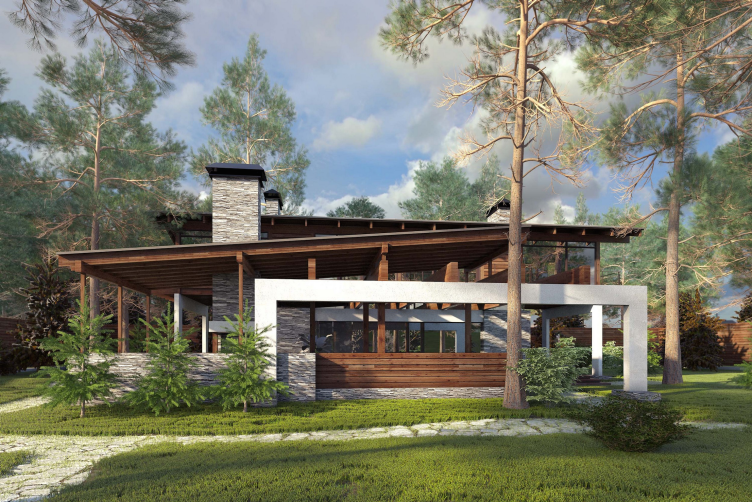
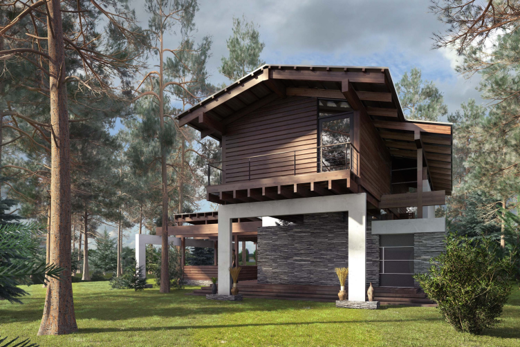
The project of "Forester Shack" guest house. View from the barbecue veranda side © Roman Leonidov architectural bureau
zooming
The manor house with a semicircular terrace © Roman Leonidov architectural bureau


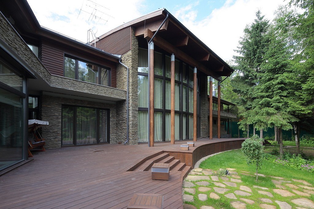
The guest house was named "forester shack", even though its total area is far from being a "shack" kind - 265 square meters - which, on the other hand, is about a seventh of the total square footage of the master's villa (1892 square meters). The "shack" is situated a little stretch away from the main house, on a well-lit clearing in the thicket of the pine forest, and, thus, it is all but invisible behind the tree trunks if viewed from the main house. Nevertheless, its architecture is resonant with its prototype, inheriting the themes that were set earlier on: just like its "elder brother", it us built upon the contrast between stone framework, dark wood and glass. However, the guest house looks more pristine. In any case, more pristine if compared to the main house that embraces its yard with a semicircle of terraces looking like porticos with their arrays of slender pillars; in the case of the guest house, however, all the lines are straight, and all the sections are right-angle ones.

The bulk of the first floor is made of concrete, and, just as the basement floor, is coated with thin stripes of rugged dark-gray stone with pipes shooting up asymmetrically on the sides. The top floor is wooden, and both floors are pierced through by lots of stained glass inserts and wide floor-to-ceiling windows that make the volumes look permeable and transparent, lighted up on the outside and opened to the beauty of the forest scenery from the inside. 

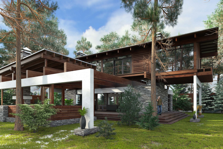
The project of "Forester Shack" guest house © Roman Leonidov architectural bureau


The project of "Forester Shack" guest house © Roman Leonidov architectural bureau


"In this project, we implemented the technology that in the recent years we have been actively developing together with Newood Company: it is about taking the half-timber structure and adding to it virtually any other material you can possibly think of - Roman Leonidov shares - In our specific case, it is timber and stained glass. In addition, I am a big believer in the potential of large-span structures that the glued wood technology provides".

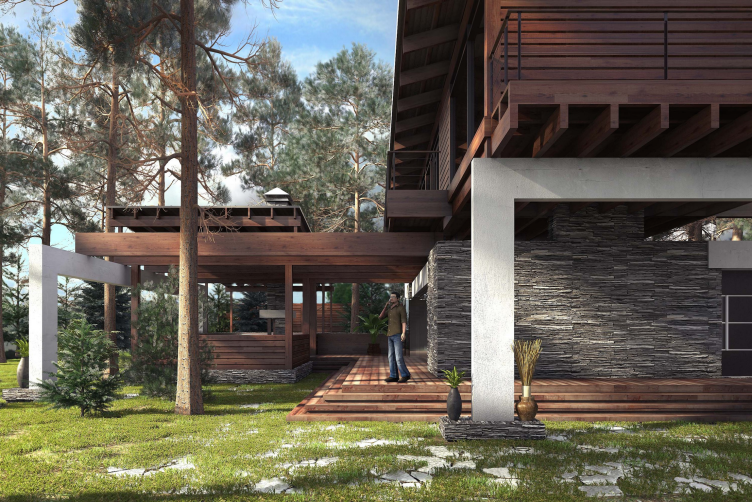
The house does actively interact with its environment by surrounding itself with a broad and differently-styled framework of terraces, stanzas, and balconies. The largest of them is the barbecue place situated parallel to the rectangle of the house and connected to it with a short bridge made of wooden floor-boards. Its upper border is formed not only by the sloping rain awning but also partially by the permeable grille of beams, run in between the volumes of the "stone" and "wooden" stories and creating an effect of "air layer" or maybe even of the levitation of the second floor that looks not so much as it is resting on the stone base but rather like it is ready to slide down the guides. In addition, one of the side surfaces of the second floor stands out in a deep cantilever above the base, so one might think that the second floor is actually already in motion. Yet another terrace - rather more like a stanza balcony - rests on the roof of the bottom tier on the other side of the house, opposite to the "barbecue" side. It must be said that the balconies, the long overhangs of the sloping roofs, and the stone basement of the bottom tier - all these are quite recognizable elements of an Alpine chalet; on the whole, however, the house looks very little like a chalet, it's just that some of it fragments can evoke the tell-tale associations, especially if one is a passionate skier. 

The project of "Forester Shack" guest house © Roman Leonidov architectural bureau


The balconies and the terraces, along with the unshielded beams and window frames resembling the portals of a stage box, surround the house with a curious kind of transparent semi-openwork construction. The resulting effect could be best described as "architectural deconstruction" - from the "spectacular" viewpoint, the house reveals to the observer almost the very core of its structure. An important part is also played by the theme of a garden gazebo, and the hot-lately theme of a ruin, also either of a "park" or "antique" kind: the white frames bear a resemblance, however distant, with the marble frames of the entrance sashes that are a rare sight but still to be seen sometimes at some late-Roman ruins. Letting your fantasy wander, one could imagine that he or she is standing in front of the remnant of some stone building that was later on overbuilt with wooden volumes but not completely - this way of thinking based on a fiction but still unobtrusive story is also rather topical nowadays. Besides, the house, opened up to the forest in a graceful and picturesque way, is quite appropriate for the tasks it is meant to perform: pastime in the forest, barbecue, tea parties on the terraces, and contemplating the pine trees from behind the awnings. 

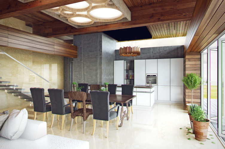
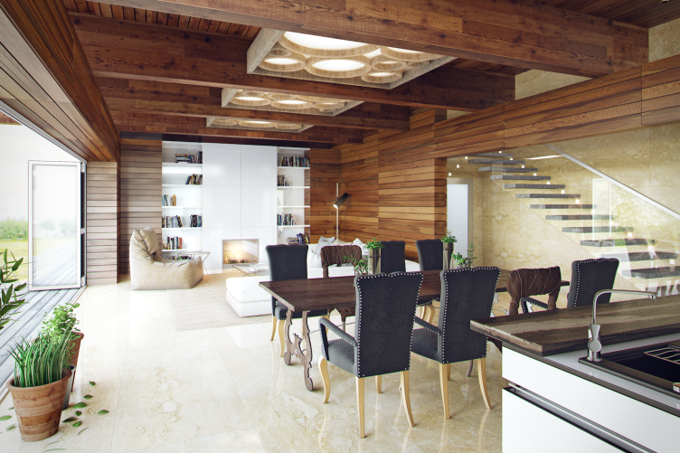
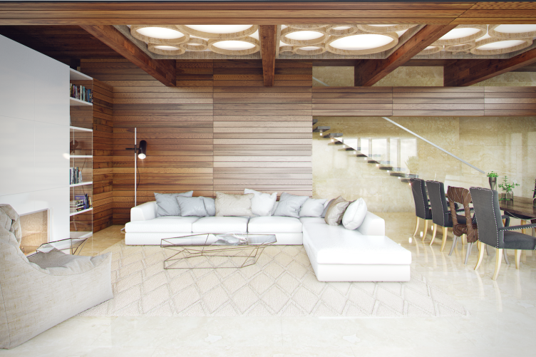
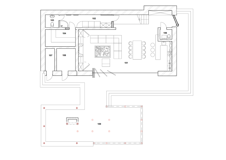
Widely opened into the space, the house is as light on the inside as it is on the outside. The first floor is almost completely occupied by a large living room - which is also the room with a fireplace, a kitchen, and a dining room. This is the main and the most eventful place in the house - with a recreation zone by the fireplace, a bar counter, and a large dinner table. The wall that faces the barbecue terrace is almost completely occupied by a pull-out glass partition - in the summertime, it will be possible to open it up completely. As the author of the interior design Anastasia Leonidova shares, apart from the visual rhymes with the main house, the customer asked to add "more color, more light, and more life". Hence - the contrasts of textures and colors, for example, the light travertine and the dark oak or the dark-gray concrete and the white surfaced of the kitchen furniture. In order to enrich the palette of emotions, the authors also indulged in using various textiles - carpets on the floor and light boxes on the ceiling, and even some eclectic notes: pieces of wooden Malaysian furniture go together with more democratic modern ones.

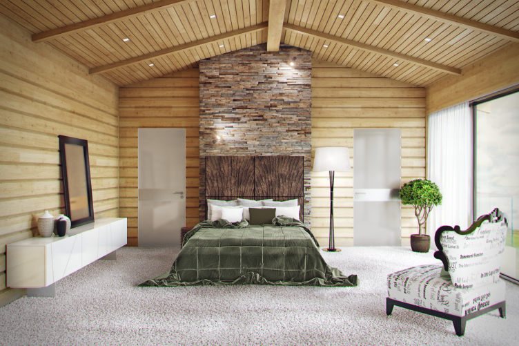
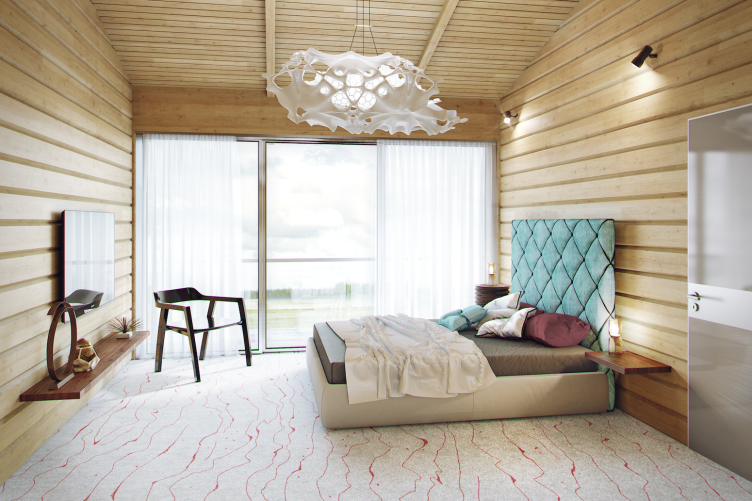
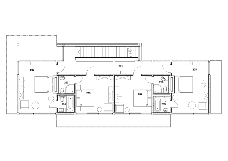
From the living room, a futuristic stairway leads up to the second floor: the concrete steps, growing "spontaneously" travertine wall, hang in midair, perfectly viewable through the transparent railing. The bedrooms on the second floor change the tense contrast for a cosy harmony of the light-colored walnut with an odd fraction of stone and opaque glass of the doors. 

The project of "Forester Shack" guest house. Interior © Roman Leonidov architectural bureau


The project of "Forester Shack" guest house. Interior © Roman Leonidov architectural bureau


The project of "Forester Shack" guest house. Interior © Roman Leonidov architectural bureau


The project of "Forester Shack" guest house. Interior © Roman Leonidov architectural bureau


The project of "Forester Shack" guest house. Interior © Roman Leonidov architectural bureau


The authors are convinced that that the house develops the tradition of organic architecture because it adapts to its natural environment and used natural materials. Which, obviously, is the case. From the plasticity standpoint, this project is reigned by the principle of a balanced contrast poising on the verge of tradition, deconstruction, and eco-minimalism. It not only provides the interflow of spaces and impressions but also ensures the cohesiveness of the architectural ensemble, the resonance between the major house and the minor one. And it also allows the observer to recognize the signature style of Roman Leonidov. 
The project of "Forester Shack" guest house. Plan of the 1st floor © Roman Leonidov architectural bureau
The project of "Forester Shack" guest house. Plan of the 2nd floor © Roman Leonidov architectural bureau


07 April 2016

Headlines now
The Golden Crown
The concept for a dental clinic in Yekaterinburg, developed by CNTR Studio, revolves around the idea of a “mouth full of gold”: pristine white porcelain stoneware walls are complemented by matte brass details. To avoid an overly literal interpretation, the architects focused on the building’s proportions, skillfully navigating between sunlight requirements and fire safety regulations.
Flexibility and Integration
Not long ago, we covered the project for the fourth phase of the ÁLIA residential complex, designed by APEX. Now, we’ve been shown different fence concepts they developed to enclose the complex’s private courtyards, incorporating a variety of public functions. We believe that the sheer fact that the complex’s architects were involved in such a detail as fencing speaks volumes.
A Step Forward
The HIDE residential complex represents a major milestone for ADM architects and their leaders Andrey Romanov and Ekaterina Kuznetsova in their quest for a fresh high-rise aesthetic – one that is flexible and layered, capable of bringing vibrancy to mass and silhouette while shaping form. Over recent years, this approach has become ADM’s “signature style”, with the golden HIDE tower playing a pivotal role in its evolution. Here, we delve into the project’s story, explore the details of the complex’s design, and uncover its core essence.
Gold in the Sands
A new office for a transcontinental company specializing in resource extraction and processing has opened in Dubai. Designed by T+T Architects, masters of creating spaces that are contemporary, diverse, flexible, and original, this project exemplifies their expertise. On the executive floor, a massive brass-clad partition dominates, while layered textures of compressed earth create a contextually resonant backdrop.
Layers and Levels of Flight
This project goes way back – Reserve Union won this architectural competition at the end of 2011, and the building was completed in 2018, so it’s practically “archival”. However, despite being relatively unknown, the building can hardly be considered “dated” and remains a prime example of architectural expression, particularly in the headquarters genre. And it’s especially fitting for an aviation company office. In some ways, it resembles the Aeroflot headquarters at Sheremetyevo but with its own unique identity, following the signature style of Vladimir Plotkin. In this article, we take an in-depth look at the United Aircraft Corporation (UAC) headquarters in the Moscow agglomeration town of Zhukovsky, supplemented by recent photographs from Alexey Naroditsky – a shoot that became only recently possible due to the fact that improvements were finally made in the surrounding area.
Light and Shadow
In this article, we delve into the architectural design of the “Chaika” house by DNK ag architects, which was recently completed in 2023 as part of the collection of signature designs at ZILArt. As is well-known, all the buildings in this complex follow a design code, yet each one is distinct. This particular building stands out not only for its whiteness and minimalism but also for the refined use of a limited number of techniques that, together, create what can confidently be called synergy.
Casus Novae
A master plan was developed for a large residential area with a name of “DNS City”, but now that its implementation began, the plan has been arbitrarily reformatted and replaced with something that, while similar on the surface, is actually quite different. This is not the first time such a thing happens, but it’s always frustrating. With permission from the author, we are sharing Maria Elkina’s post.
Treasure Hunting
The GAFA bureau, in collaboration with Tegola and Arkhitail, organized an expedition to the island of Kilpola in Karelia as part of Moskomarkhitektura’s “Open City” festival. There, amidst moss and rocks, the students sought answers to questions like: what is the sacred, where does it dwell, and what sustains it? Assisting the participants in this quest were landscape engineer Evgeny Levin, artist Nicholas Roerich, a moose, and the lack of cellular connection. Here’s how the story unfolded.
Depths of the Earth, Streams of Water
In the Malaya Okhta district, the Akzent building, designed by Stepan Liphart, was constructed. It follows a classic tripartite structure, yet it’s what you might call “hand-drawn”: each façade is unique in its form and details, some of which aren’t immediately noticeable. In this article, we explore the context and, together with the architect, delve into how the form was developed.
Fir Tree Dynamics
The “Airports of Region” holding is planning to build an airport in Karachay-Cherkessia, aiming to make the Arkhyz and Dombay resorts more accessible to travelers. The project that won in an invitation-only competition, submitted by Sergey Nikeshkin’s KPLN, blends natural imagery inspired by the shape of a conifer seed, open-air waiting spaces, majestic large trees, and a green roof elevated on needle-like columns. The result is both nature-inspired and WOW.
​A Brick Shell
In the process of designing a clubhouse situated among pine trees in a prestigious suburban area near Moscow, the architectural firm “A.Len” did the façade design part. The combination of different types of brick and masonry correlates with the volumetric and plastique solutions, further enhanced by the inclusion of wood-painted fragments and metal “glazing”.
Word Forms
ATRIUM architects love ambitious challenges, and for the firm’s thirtieth anniversary, they boldly play a game of words with an exhibition that dives deep into a self-created vocabulary. They immerse their projects – especially art installations – into this glossary, as if plunging into a current of their own. You feel as if you’re flowing through the veins of pure art, immersed in a universe of vertical cities, educational spaces – of which the architects are true masters – and the cultural codes of various locations. But what truly captivates is the bold statement that Vera Butko and Anton Nadtochy make, both through their work and this exhibition: architecture, above all, is art – the art of working with form and space.
Flexibility and Acuteness of Modernity
Luxurious, fluid, large “kokoshniks” and spiral barrel columns, as if made from colorful chewing gum: there seem to be no other mansion like this in Moscow, designed in the “Neo-Russian-Modern” style. And the “Teremok” on Malaya Kaluzhskaya, previously somewhat obscure, has “come alive with new colors” and gained visibility after its restoration for the office of the “architectural ecosystem” as the architects love to call themselves. It’s evident that Julius Borisov and the architects at UNK put their hearts into finding this new office and bringing it up to date. Let’s delve into the paradoxes of this mansion’s history and its plasticity. Spoiler: two versions of modernity meet here, both balancing on the razor’s edge of “what’s current”.
Yuri Vissarionov: “A modular house does not belong to the land”
It belongs to space, or to the air... It turns out that 3D printing is more effective when combined with a modular approach: the house is built in a workshop and then adapted to the site, including on uneven terrain. Yuri Vissarionov shares his latest experience in designing tourist complexes, both in central Russia and in the south. These include houseboats, homes printed from lightweight concrete using a 3D printer, and, of course, frame houses.
​Moscow’s First
“The quality of education largely depends on the quality of the educational environment”. This principle of the last decade has been realized by Sergey Skuratov in the project for the First Moscow Gymnasium on Rostovskaya Embankment in the Khamovniki district. The building seamlessly integrates into the complex urban landscape, responding both to the pedestrian flow of the city and the quiet alleyways. It skillfully takes advantage of the height differences and aligns with modern trends in educational space design. Let’s take a closer look.
Looking at the Water
The site of Villa Sonata stretches from the road to the water’s edge, offering its own shoreline, pier, and a picturesque river panorama. To reveal these sweeping views, Roman Leonidov “cut” the façade diagonally parallel to the river, thus getting two main axes for the house and, consequently, “two heads”. The internal core – two double-height spaces, a living room and a conservatory, with a “bridge” above them – makes the house both “transparent” and filled with light.
The White Wing
Well, it’s not exactly white. It’s more of a beige, white-stone structure that plays with the color of limestone – smoother surfaces are lighter, while rougher ones are darker. This wing unites various elements: it absorbs and interprets the surrounding themes. It responds to everything, yet maintains a cohesive expression – a challenging task! – while also incorporating recognizable features of its own, such as the dynamic cuts at the bottom, top, and middle.
Urban Dunes
The XSA Ramps team designed and built a three-part sports hub for a park in Rostov-on-Don, welcoming people of all ages and fitness levels. The skate plaza, pump track, and playground are all meticulously crafted with details that attract a diverse range of visitors. The technical execution of the shapes and slopes transforms this space into a kind of sculptural composition.
Proportional Growth
The project for the fourth phase of the ÁLIA residential area has been announced. The buildings are situated on an elongated plot – almost a “ray” that shoots out from the center of the area towards the river. Their layout reflects both a response to Moscow’s architectural preferences over the past 15 years, shifting “from blocks to towers”, and an interpretation of the neighboring business park designed by SOM. Additionally, the best apartments here are not located at the very top but closer to the middle, forming a glowing “waistline”.
The “Staircase” Building
In designing the “Details” residential complex in New Moscow, Rais Baishev spiced up the now-popular Moscow theme of a “courtyard” building with an idea drawn from the surrealist drawings by Maurits Escher. He envisioned the stepped silhouettes and descending slopes as a metaphysical mega-staircase, creating a key void within the courtyard that gave the project an internal “spine”. This concept is felt both in the building’s silhouette and on its façades.
Projection of the Quarter
No one doubted that the building that Vladimir Plotkin designed as part of the “Garden Quarters” would be the most modernist of all. And it turned out just that way: while adhering to the common design code, the building successfully combines brick and white stone, rhythmically responding to the neighboring building designed by Ostozhenka, yet tactfully and persistently making a few statements of its own. This includes the projection of the ideal urban development composition “14–9–6”, which can be found right next door, mathematical calculations, including those for various types of terraces (and perhaps the only reminder of the Soviet past of the Kauchuk rubber factory!), and the white “cross-stitch” pattern of the façade grid.
Domus Aurea
In this issue, we examine the “Tessinsky-1” house, designed by Sergey Skuratov and completed in 2023. Located in the middle of the Serebryanicheskaya Embankment district, at the intersection of its main streets, this house assumes a sort of “nodal” role: it not only responds to everything around it and preserves many memories of the former EMA factory within itself, but it weaves all this into a newly directed pattern, reconciling bright “gold” and dark-colored brick, largely with the help of the new, modern-yet-archaic Columba brick, which, come to think about it, is the most precious element here.
The Chimney of Nikola-Lenivets
In this issue, we are examining the “Obelisk House” designed by KATARSIS and built for the Arkhstoyanie 2023 festival. However, it was only finished later on, and this is why we are examining it now. It seems to us that after the “Obelisk House” appeared in Nikola-Lenivets, a dialogue and a few inner connections appeared between the temporary structures built here. These houses no longer look like “accidental neighbors”, more of which below.
​Periscope by the Bay
The jury awarded the second place in the competition for a public and cultural center in Petropavlovsk-Kamchatsky to the companies GORA (“Mountain”) and M4. In the consortium’s proposal, the building resembles a sperm whale with a calf swimming next to it or a periscope, whose lenses capture the most spectacular views from the surrounding landscape.
From Arcs to Dolmens
While working on the competition project for Petropavlovsk-Kamchatsky, ASADOV Architects prioritized the value of the natural and urban environment, aiming to preserve the balance of the location while minimizing the resemblance of the volume that they designed to a “traditional building”. The task was challenging, and the architects created three versions, one of which having been developed after the competition, where their main proposal took third place. However, the point of interest here is not the competition result but the continuity of creative thinking.
Hide and Seek
The ID Moskovskiy house, designed by Stepan Liphart in St. Petersburg, in the courtyards near Moskovskiy Avenue beyond the Obvodny Canal and recently completed, is notable for several reasons. Firstly, it has been realized with considerable accuracy, which is particularly significant as this is the first building where the architect was responsible not only for the facades but also for the layouts, allowing for better integration between the two. On the other hand, this building is interesting as an example of the “germination” of new architecture in the city: it draws on the best examples from the neighborhood and becomes an improved and developed sum of ideas found by the architect in the surrounding context.
The Big Twelve
Yesterday, the winners of the Moscow Mayor’s Architecture Award were announced and honored. Let’s take a look at what was awarded and, in some cases, even critique this esteemed award. After all, there is always room for improvement, right?
Above the Golden Horn
The residential complex “Philosophy” designed by T+T architects in Vladivostok, is one of the new projects in the “Golubinaya Pad” area, changing its development philosophy (pun intended) from single houses to a comprehensive approach. The buildings are organized along public streets, varying in height and format, with one house even executed in gallery typology, featuring a cantilever leaning on an art object.
Nuanced Alternative
How can you rhyme a square and space? Easily! But to do so, you need to rhyme everything you can possibly think of: weave everything together, like in a tensegrity structure, and find your own optics too. The new exhibition at GES-2 does just that, offering its visitor a new perspective on the history of art spanning 150 years, infused with the hope for endless multiplicity of worlds and art histories. Read on to see how this is achieved and how the exhibition design by Evgeny Ace contributes to it.
Blinds for Ice
An ice arena has been constructed in Domodedovo based on a project by Yuri Vissarionov Architects. To prevent the long façade, a technical requirement for winter sports facilities, from appearing monotonous, the architects proposed the use of suspended structures with multidirectional slats. This design protects the ice from direct sunlight while giving the wall texture and detail.